|
| Spring really is just around the corner, I swear. |
I think the dead of winter is God’s way of telling me it’s time to paint the figure, so I generally lay off plein air in the coldest months. The last day I painted out-of-doors was the day before Thanksgiving. But watching spring snow falling outside my studio window is a reminder that in a week or so, we can be outdoors, so it’s time to get my pack in order.
 |
| Is this the year I buy a new brush holder? Nah… |
I use the same palette indoors and out, but my umbrella, my backpack, and my field easel get stashed in a corner, from whence they silently reproach me for not going outside to play. The first order of business is to pull them out and inspect them for cracks, tears and other damage, and to thoroughly vacuum out my pack.
 |
If brush cleaner/conditioner doesn’t
salvage them, replace them. |
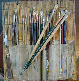
Then it’s time to consider what condition my brushes are in. A few need replacement every year, particularly the flats and
long filberts. Some need reshaping, and a few need to be rescued, but mostly I have to track down the ones that have wandered out of my brush holder into a coffee can in my studio.
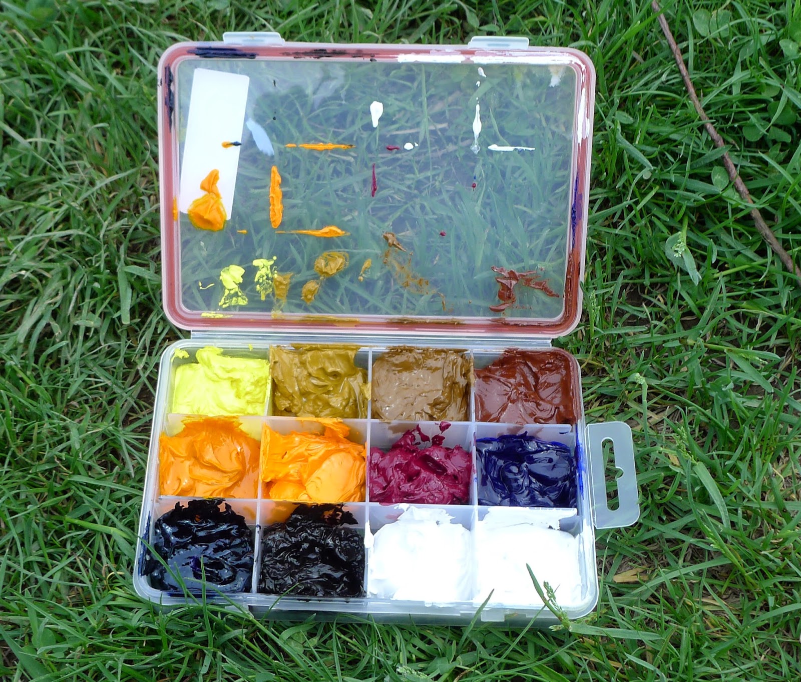
I don’t use tubes, but buy my paints in cans (from
RGH Paints in Albany). I keep my paints in this
segmented vitamin box, given me by my pal
Jamie Williams Grossman. Generally this box of paints will get me through a week of travel without reloading, and it weighs a fraction of what the same paints in tubes do. Having used this box without cleaning it since last May, this seems like a good time to clean out any residual old paint and wipe out the reservoirs. But it’s also a sensible time to check my supplies and order new paint.
 |
| Ditching tubes cuts down on weight. Cheap, efficient, and faster. |
More drawing means less struggling, so I carry them all: charcoal, watercolor pencil, graphite, greyscale markers for fast value studies, and a viewfinder/dry erase marker. I often use watercolor pencils and a straight edge when architecture is involved, and I particularly like that one can erase errors with a damp paper towel. I definitely need some new watercolor pencils this year.
 |
| Draw slow, paint fast. From left, charcoal, watercolor pencils and sharpener, grey-scale markers, graphite sticks and sketchbook, viewfinder and dry-erase marker. |
Another group of supplies that’s frequently looted over the winter is personal care supplies. I note that I need replacement suntan lotion and I need to track down my lucky painting cap, apron, and water bottle. The latex gloves are primarily for warmth, not cleanliness, so I’d better order
liquid gloves. (You Southerners will be surprised to learn that the hand warmers can be dropped out again after, say, July.) I always carry two ponchos—one for me, and one for my painting, because when it rains in the spring, it really rains. I put my IPod and my camera in this category, but they don’t need to be checked; they’re used every day.
 |
| Never discount the value of being comfortable. From left, insect repellent, baby wipes, poncho for my easel, hand-warmers, my poncho, latex gloves. |
I have two sets of tools, so my field ones generally don’t go walkies, but they still need to be checked, because they’re the most important tools I own: my compass (because I want to know where the sun is heading), palette knifes and a scraper, bungee cords, a level, S-hooks, clips, an all-purpose tool, a straight edge/angle finder, double pots, soap.
 |
| The most important part of my kit after paints and brushes. From top left: compass, two palette knives, scraper, bungee cords, level, soap, palette cups, angle finder/straight edge, all-purpose tool, clips, S-hooks. |
It’s time to order new
fast-dry medium, and check my supplies of mineral spirits. Because I want to travel light, I’ll repurpose the medium container to hold mineral spirits, and carry my medium in the tiny pot in the foreground (bought as part of a cosmetic travel set from my local dollar store). A hotel shampoo bottle serves equally well for this. I always carry a few plastic grocery bags for trash, and I stash the larger containers and a funnel in my car. I’ll go out in my shop and run a few rolls of paper towel through my chop saw so they’re half size, and I’ll be good to go.
 |
| You need a big bottle of mineral spirits in your car and a little one to carry, a big bottle of medium and a little one to carry, a brush-washing tank, some boards to paint on, and a way to move the finished paintings. |
I’ve been using thumbtacks, a strap and waxed paper to move wet paintings, but this year I think I’ll go all-out on a new carrier system made from cheap frames and big rubber bands, as suggested by my pal
Marilyn Fairman. And it’s definitely time to check my inventory of painting boards. I like
Ray-Mar boards and they always have a Memorial Day sale, so I always try to arrange my inventory to limp along until then. But this week I’ll sort my remaining inventory and count them so I know what I need to order.
That’s my routine for checking my oils. You can extrapolate the same checklist for watercolors and pastels—check your pigments, check your tools, check the stuff you need to be comfortable, reorder what’s gone, repair what’s broken. For a complete list of my recommended oil painting supplies, check
here. For watercolor supplies, check
here. For pastel supplies, check
here.