Found on Facebook

ā€œHalo of Autumn,ā€ Christina Perry Davisā€Ž

ā€œHalo of Autumn,ā€ Christina Perry Davisā€Ž
According to legend, when George Will signed up to become a syndicated columnist in the 1970s, he asked his friend William F. Buckley, Jr. ā€” the founder of National Review and a columnist himself ā€” ā€œHow will I ever write two columns a week?ā€ Buckley responded (Iā€™m paraphrasing), ā€œOh it will be easy. At least two things a week will annoy you, and youā€™ll write about them.ā€ (Jonah Goldberg)
Iā€™m often asked how I can write five days a week. I keep a list of topics, but I seldom get to them. Usually, something else catches my attention first.
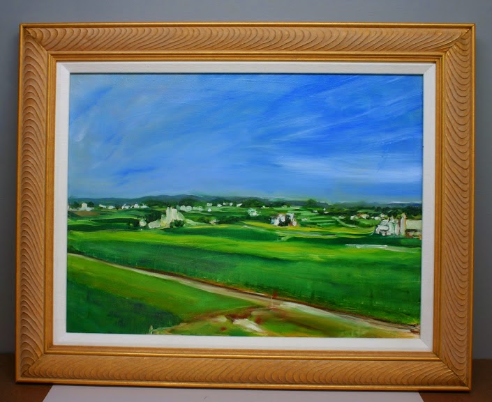
ā€œPine Point, Scarborough,ā€ Christina Perry Davis

ā€œPine Point, Scarborough,ā€ Christina Perry Davis
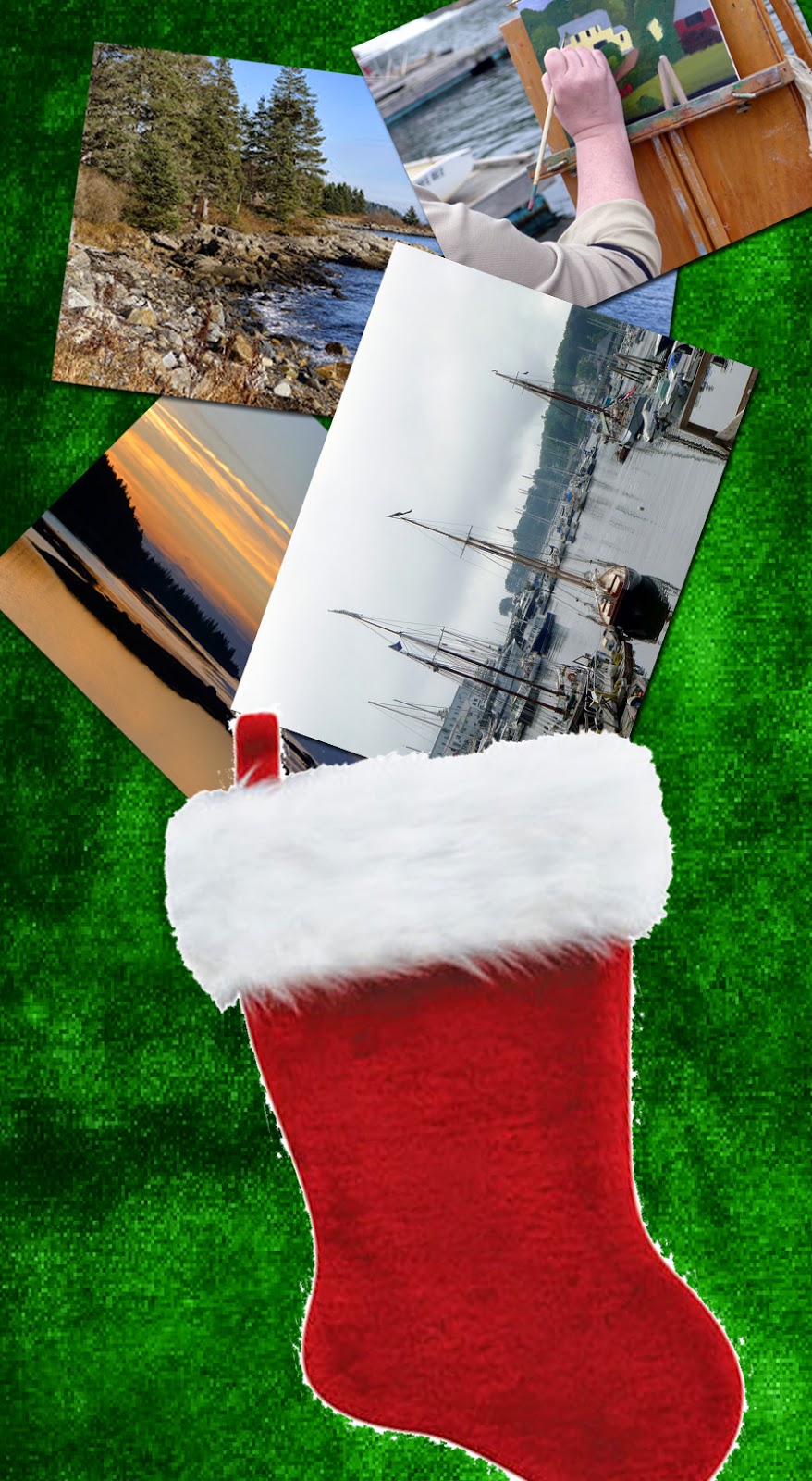
Such is the case with Christina Perry Davis. Her work appeared in my Facebook newsfeed. She doesnā€™t have a website, so what I know of her Iā€™ve learned from her profile. Sheā€™s 51 years old; she was raised in Westbrook, ME; she now lives in Scarborough, ME; and sheā€™s married.
ā€œI am a painter of landscapes mostly and am always drawn to the way color and light mingle but I look for the movement of grasses, clouds or light that surrounds what I see. I feel itā€™s necessary to capture this feeling because it is dramatic and freeing to tell the story of something that only last for such a short amount of time,ā€ she told me.
In other words, her subject is turbulence.
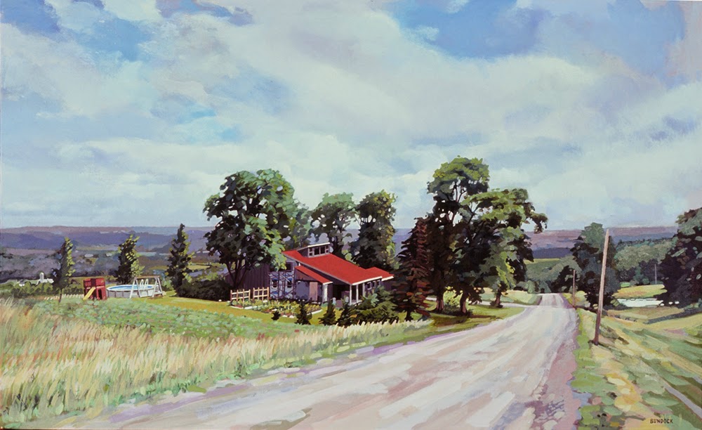
ā€œPrince Edward Island,ā€ Christina Perry Davis

ā€œPrince Edward Island,ā€ Christina Perry Davis
ā€œI have learned basic painting skills from my early days at Portland School of Art but recently have taken a class in pastel from Jacob Aguiar, which has opened a wonderful world of painting with pastel.ā€
ā€œI love drawing,ā€ Davis said. That shows in the perspective of her clouds and the way her buildings are seated in a receding landscape. Pastel, she says, allows her the opportunity to give drawing and painting equal emphasis in her work. That can be true of oil painting, of course, but it takes longer to get there.
Pastel is different, of course, because you can bore into it with hand pressure. Davisā€™ chromatic intensity and ferocious mark-making create a world of upheaval. Iā€™m interested in where she goes with this subject.
Tuesday 3
You can reach Davis by email, here.

Better than a marked-down sweater, any day

Sea & Sky Workshop
August 9-14, 2015 
Acadia National Park
If Santa Claus screwed up this Christmas, itā€™s up to you to remedy it, and I donā€™t mean by running down to the mall to score some great Boxing Day deals. By next summer, theyā€™ll be a distant memory, but weā€™ll be gearing up to paint at Schoodic Point from August 9-14, 2015
Youā€™ve got less than a week to get the $125 early-bird discount. Four slots of the twelve are already filled, but I DO want to be able to pass on these savings to you. And I canā€™t do that if I donā€™t have your registration in hand by January 1.
Corinne at Owl’s Head in 2013.
I spend a great deal of time stalking and bagging perfect venues for my workshops. Iā€™m really excited about this one. In 2014, we painted the ā€˜quaintā€™ Maine coastline, along the sheltering coast of Penobscot Bay. This year, weā€™re going for the thundering, open ocean.
Schoodic Point is far from the hustle of Bar Harbor, but it is has the same dramatic rock formations, pounding surf, and stunning mountain views that make Acadia a worldwide tourist destination.
The places we’ll go!
Open sea, stunning views of Cadillac Mountain, and veins of dark basalt running through red granite rocks are the dominant features of this ā€œroad less traveled.ā€ Pines, birch, spruce, cedar, cherry, alder, mountain ash, and maples forest the land. There are numerous coves, inlets, islands, and lighthouses.
Here is the brochure. Here is the registration form. Iā€™m off to Philly for the weekend, but take a moment to sit down and send your registration form in. I promise you it will be a lot more satisfying than a new sweater set in 2014ā€™s color of the year.

A painting to match the couch

Lancaster County, PA, 18X24, by Carol L. Douglas. It’s moving from my own bedroom to our guestroom, where it will better match the pale blue walls and furniture.
Artists kvetch about people who buy paintings to match their sofas, but it is a real consideration. A mismatch will never be to the paintingā€™s or the roomā€™s advantage.
Iā€™ve been putting away work from my Black Friday sale. Itā€™s been an opportunity to rearrange some of the artwork in my house (and, yes, to vacuum). Itā€™s interesting how some paintings look grand against some walls and bland against others.
Autumn floral, 16X20, by Carol L. Douglas. I think I’m going to see what this looks like in my dining room.
I had a mid-century street scene done by a cousin in Tennessee hanging in my living room.  Itā€™s a very accomplished painting, but it never looked good against the pale-turquoise-and-red dĆ©cor. To keep it safe during the sale, I slid it on a hook in my bedroom, which has navy walls and warm accents. Here in a room with fruitwood furniture and a related color scheme, the painting glows.
Where then, to put the high-chroma but abstract landscape that previously was in that spot? With its pale frame and cool colors, it looks far better in our guest room, which has pale blue walls and pale furniture.
And this pastel of geraniums has already relocated to the living room.
Most artists I know own too many paintings, of our own and others. We usually just plop new work on hooks wherever we can. This exercise has been a good reminder that a paintingā€™s inherent value can be obscured by bad interior design.

I will be teaching in Acadia National Park next August. Read all about it here, or download a brochure here


What does style mean?

A Pool With A View, by Bruce Bundock, is an example of the artist’s worldview.

The women I lived with last week are all at the top of their game, but paint in a variety of styles. Tarryl Gabel paints meticulously detailed, ethereal landscapes. Crista Pisanoā€™s are minute but less about detail and more about form. Mira Fink is a high-chroma pattern-maker, a lot like me but in watercolor. Kari Ganoung Ruiz paints in the subdued palette of her native Finger Lakes. The two pastel painters were as different as chalk and cheese: Marlene Wiedenbaum is a romantic, while Laura Bianco works in bold, fast strokes.

Baroque Arch, Rome, is an example of Brad Marshall’s meticulous drafting.
What do those differences mean? Do they reflect something about the personality? I doubt it. Brad Marshall (whose show Italia is opening at the Fischbach Gallery on September 12) is a far more methodical and controlled painter than me. Heā€™s more of a risk-taker in his 9-to-5 lifeā€”hanging from scaffolding on the side of tall buildingsā€”but there are no glaring differences between our values, our lifestyles, the cars we drive, or our homes.
Certainly the content of a painterā€™s work reflects his worldview. Consider, for example, Bruce Bundockā€™s Faces of Vassar: An Appreciation, which opened last February. I love his work because Bruce is less interested in the grand than he is in the everyday.
Millbrook Hill, a pastel by Marlene Wiedenbaum, is wonderfully romantic.
I had a conversation last week with a successful, professional painter lamenting her lack of formal art education. Many formal art programs teach very little about actual painting and most artists do most of their learning on their own, after the classes and workshops end. Since she paints beautifully and her style is fully realized, there is little she can gain from a teacher now, and much she could muddy up.
Whereas Autumn Glow, a pastel by Laura Bianco, is absolutely graphical.
I don’t think style comes from the personality, but I do think it comes from the soul. The goal in painting is to get rid of the stuff that stands between us and our true self. Personal style is whatā€™s left when we have tried our hardest to tell an accurate story with our brushes. Itā€™s an artifact of imperfection. True personal style canā€™t be taught or learned. It comes from within. That’s why teachers who try to create copies of themselves among their students inevitably fail to foster greatness.

Message me if you want information about next yearā€™s workshops. Information about this year’s programs is available here.


Seven days of wood smoke and crackling leavesā€”Little Ol’ Me

New York Catskill Farm, pastel. I decided to shun-pike from New York City to Rochester after Rye Painters on Location one year, and found this fantastic site along the way.

Iā€™m in Maine for my last 2013 painting workshop! The frost isnā€™t quite on the pumpkin (at least not in Rockland or Rochester) but autumn is in the air. Iā€™m leaving some fall landscapes for you.
As Iā€™m fishing through my memory for autumn paintings, I realize Iā€™ve painted a heck of a lot of them myself.  Perhaps thatā€™s because the Northeast is so glorious in the fall.

So here is a tour of some places I love to paint. I hope you get a sense of the spirit of place that drives my painting:
Nunda Autumn, pastel. This is the view from the Kellogg farm in the Genesee Valley, and I wish I could get back there soon to paint again.
Finger Lakes marshes in autumn. I have painted in the Finger Lakes more than anywhere else (often with my former painting partner Marilyn Feinberg). It’s where I realized that northeast landscapes are not about depth of field; they are about the tapestry of surface.
The Dugs in Autumn. Right after the Finger Lakes come the lower Adirondacks. This is a marsh formed by a beaver dam just north of Speculator.
Maine Surf. And then there’s Maine. Beautiful in every season. I painted this in Rockport several years ago, during a nice rainstorm.

Fall classes starting now!

The model’s eye point of view…

Studio in Art

Saturday, 10-1
Tuesday, 2:30-5:30

(Oil, pastel, acrylic, watercolor)This class focuses on still life as a fundamental tool for developing drawing and painting technique. It is appropriate for both beginning and advanced students. Instruction emphasizes direct painting, where paint is applied solidly rather than through glazing. For watercolor and acrylic, the emphasis is on alla prima techniques.

High school juniors and seniors interested in pursuing a BFA are especially encouraged to sign up for this class. I have an excellent track record in helping students develop outstanding college portfolios.

$100/month


Open Model Sessions, by invitation only

Our open model sessions are moved to Friday afternoons. Please contact me if you want more information.


Autumn is always a difficult time to schedule, since I have obligations elsewhere and there is a surfeit of holidays. If your class is cancelled, you have the option of taking the other class that week, receiving a refund, or taking a private lesson. Just ask me.


The schedule, as it currently appears

Note: we will still be painting outside, as long as the weather permits.

September, 2012  
Tuesday 9/11/2012 Open studio class 2:30-5:30 PM
Saturday 9/15/2012 Open studio class 10 AM-1 PM
Tuesday 9/18/2012 Open studio class 2:30-5:30 PM
Saturday 9/22/2012 Open studio class 10 AM-1 PM
Tuesday 9/25/2012 Open studio class 2:30-5:30 PM
Saturday 9/29/2012 NO CLASS: workshop 10 AM-1 PM

October, 2012  
Tuesday 10/2/2012 NO CLASS: workshop 2:30-5:30 PM
Saturday 10/6/2012 Open studio class 10 AM-1 PM
Tuesday 10/9/2012 Open studio class 2:30-5:30 PM
Friday 10/12/2012 Model  2 to 5 PM
Saturday 10/13/2012 Open studio class 10 AM-1 PM
Tuesday 10/16/2012 Open studio class 2:30-5:30 PM
Saturday 10/20/2012 Open studio class 10 AM-1 PM
Tuesday 10/23/2012 Open studio class 2:30-5:30 PM
Friday 10/26/2012 Model  2 to 5 PM
Saturday 10/27/2012 No CLASS 10 AM-1 PM
Tuesday 10/30/2012 Open studio class 2:30-5:30 PM

November, 2012  
Saturday 11/3/2012 Open studio class 10 AM-1 PM
Tuesday 11/6/2012 Open studio class 2:30-5:30 PM
Friday 11/9/2012 Model  2 to 5 PM
Saturday 11/10/2012 Open studio class 10 AM-1 PM
Tuesday 11/13/2012 Open studio class 2:30-5:30 PM
Saturday 11/17/2012 Open studio class 10 AM-1 PM
Tuesday 11/20/2012 Open studio class 2:30-5:30 PM
Saturday 11/24/2012 NO CLASS: Thanksgiving 10 AM-1 PM
Tuesday 11/27/2012 Open studio class 2:30-5:30 PM
Friday 11/30/2012 Model  2 to 5 PM

December, 2012  
Saturday 12/1/2012 Open studio class 10 AM-1 PM
Tuesday 12/4/2012 Open studio class 2:30-5:30 PM
Friday 12/7/2012 Model  2 to 5 PM
Saturday 12/8/2012 Open studio class 10 AM-1 PM
Tuesday 12/11/2012 Open studio class 2:30-5:30 PM
Friday 12/14/2012 Model  2 to 5 PM
Saturday 12/15/2012 Open studio class 10 AM-1 PM
Tuesday 12/18/2012 Open studio class 2:30-5:30 PM
Friday 12/21/2012 Model  2 to 5 PM
Saturday 12/22/2012 Open studio class 10 AM-1 PM
Tuesday 12/25/2012 NO CLASS: Christmas 2:30-5:30 PM
Saturday 12/29/2012 NO CLASS: Holiday 10 AM-1 PM
Tuesday 1/1/2013 NO CLASS: Holiday 2:30-5:30 PM

Oh, my! What should I buy?

My basic palette in my pochade box. 

I am happy to share my plein air supply lists with both my own students and others:

Ā·         Watercolor supply list.
Ā·         Oil painting supply list.
Ā·         Pastel supply list.
I have friends who are tremendously efficient plein air packers. I freely admit Iā€™m not up to their standard, but I do paint outdoors a lot, and successfully. Consider these lists not as gospels, but as starting points.
There is no one ā€œbestā€ palette for plein air (or any other kind of) painting. There are so many pigments available today that the artist is faced withā€”literallyā€”millions of possible combinations. The medium youā€™re using, your own taste in color , what you want in opacity and drying time all affect your final choices.
And the exact same paints being used for figure painting.
A little knowledge of pigment development is helpful in whittling down selections. The newer the pigment, the more intense and more durable it will be. A palette of earth tones might have a hard time coping with the addition of dioxazine purple or phthalo blue, whereas a vivid 20th century palette will fail to notice a delicate Renaissance lake color.
This is not to say that you should choose only an ā€œOld-Mastersā€ or an ā€œImpressionistā€ paletteā€”my own palette has paints from every period. But you can avoid a lot of waste by avoiding obvious mismatches.
The earths and earliest synthesized colors:

The oldest pigments are the earth pigments: the ochres, siennas, umbers and carbon blacks. These have been in use more than 15,000 years. They are as solid and everlasting as dirt. Over time artists have been tremendously wily about expanding their narrow range.
The Egyptians created the first chemical pigment, Egyptian Blue, around 5000 years ago. They also pioneered the use of minerals as pigments with malachite, azurite and cinnabar, and devised a method of fixing dyes to solids (ā€œlake makingā€) which is still in use today. The Chinese created vermilion and the Romans gave us lead white.
Renaissance alchemists must have been more focused on turning lead into gold, because although they made a few refinements to paints, they left the fundamental kit unchanged.
The industrial revolution:

The Industrial Revolution brought us a pigment revolution. Just a few examples are:
Cobalt Blue ā€“ 1802
Cerulean Blue ā€“ 1805
French Ultramarine ā€“ 1828
Zinc White ā€“ 1834
Cadmium Yellow ā€“ 1846  
Aureolin ā€“ 1862
Alizarin Crimson ā€“ 1868
Without the explosion of brilliant color in the 19thcentury, there could have been no Impressionism, no modern art.
Modern pigments:

The third tier of pigments are the highest-stain, most durable of colors, developed mainly for industry: ā€œHansaā€ yellows, titanium white, synthetic iron oxides (the ā€œMarsā€ colors) phthalocyanines, quinacridones, perylenes, and pyrrols. Some have replaced 19thcentury colors that have proven to be fugitive (such as quinacridone violet to make ā€œpermanentā€ alizarin crimson). Some have an uneasy place on the palette because of their extremely high stain, such as phthalo blue.
My basic field kit.
References: ā€œBright Earth: Art and the Invention of Color,ā€ by Phillip Ball. It is certainly the most fun book about color ever printed.

Gamblin Artist Colors has optional palettes here. (What is true for oils is generally true for acrylics.)
The most comprehensive guide to watercolor pigments I know of is here.
And my favorite resource for pastels is here.