Monday Morning Art School: what we can learn from pointillism

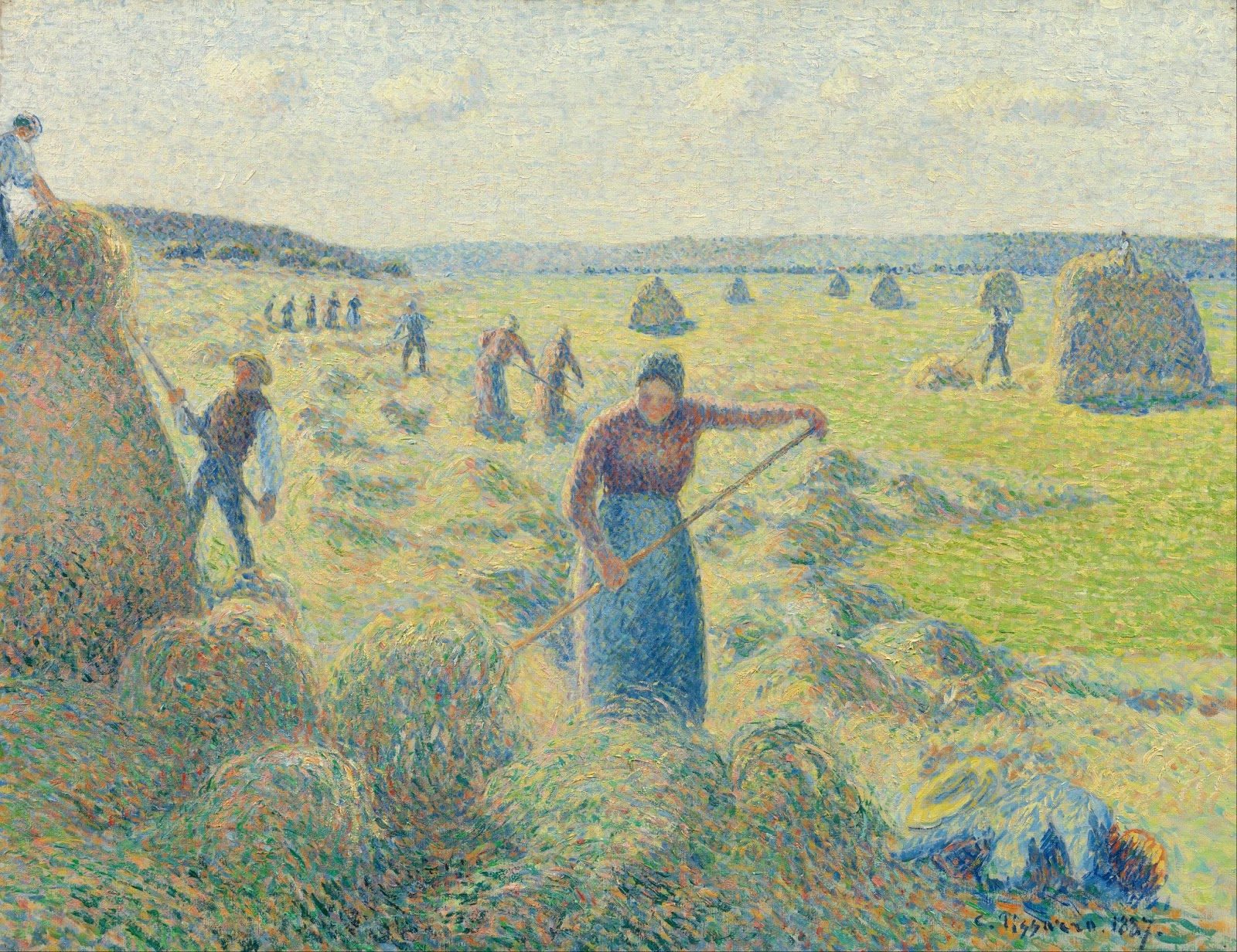
Not every color that’s on your painting must be there in real life.

A Sunday on La Grande Jatte, 1884, Georges Seurat, courtesy Art Institute of Chicago

Pointillismand its twin, Divisionism* developed as painters sought to advance and understand the optical revolution that was Impressionism. Their flagship painting—and the root of the concept—is Georges Seurat’smasterpiece, A Sunday Afternoon on the Island of La Grande Jatte. Seurat called his painting style ‘chromoluminarism,’ which hints at what he was striving for—a way to enhance the ability of canvas and paint to reflect light.

For the record, Seurat didn’t paint La Grande Jattein one sweep. It would have been close to impossible to hold that many ideas simultaneously. In the first pass, he used conventionally-mixed pigments including earths. In the second, he dispensed with the earths and limited the number of paints on his palette. It wasn’t until his last sweep that he introduced the dots of color that we see today. Remember that next time you want to toss a canvas that isn’t working.

The Pine Tree at Saint Tropez, 1909, Paul Signac, courtesy Pushkin Museum

Seurat believed that he could get more vibrant and pure colors by letting the viewer’s eye do the mixing, instead of mixing colors on the palette. In truth, what he was striving for—an additive color scheme—is impossible with paint; it remains subtractive because it’s reflecting light. What Seurat really wanted was digital painting, and it wouldn’t be invented for another 100 years.

Nevertheless, he did create an exciting new way of putting down paint. Placing contrasting colors next to each other causes an optical excitation that typical color mixing cannot achieve. In some way, every color in a Seurat painting manages to maintain its individuality while contributing to a larger whole.

Le séchage des voiles (The Drying Sails), 1905, André Derain, courtesy Pushkin Museum

To create these effects, the divisionist painter first identified the local color of objects. Then, he interspersed dots of yellow-orange in the sunlit passages, and blues, reds and purples in the shadows. Pointillists worked a little differently, thinking through the entire painting in raw color, much like modern printing creates an image in CMYK.

The impact of adjacent colors on perception is a well-known and -researched phenomenon, one that touches on the area of optical illusion. These optical sleights-of-hand are known as contrast effects. By putting dots of contrasting colors next to each other, pointillists hoped to recreate these contrast effects in their paintings.

Were the pointillists and divisionists able to make colors seem brighter than their peers who were still mixing and painting the conventional way? Perhaps slightly, because they avoided the muddiness that can happen in paint-mixing. However, that was a battle that had largely already been won by their Impressionist peers.

Portrait of Irma Sèthe, 1894, Théo van Rysselberghe, courtesy Musée du Petit Palais  

Nor were they able to entirely express shadow and light with hue; these still need some value shifts to make them intelligible.

Nevertheless, their optical experiments influenced a century of painting, ending in the experiments of op art in the 1960s. We don’t have to want to paint like them to learn from them.

The takeaway lesson of the pointillists is that not every color that’s on your painting must be there in real life. Your job as an artist is to represent the inner reality of a situation, not its photographic shell. If the trees are moving, perhaps a flash of orange will add a sense of motion. The sky may be blue, or it may be yellow; it’s hard to say.

The human eye craves interest, and as long as you have the value right, you can play fast and loose with the actual hue.

*What most of us call Pointillism is actually Divisionism but there’s really little point (ahem) in dividing them, at least for our purposes.

Mixing complements and making grey

Some people say it doesn’t work. Is that true?

All flesh is as grass, by Carol L. Douglas. Since the Impressionists we have mixed our grays with complements.

Painters use mixes of complementary colors to make neutrals: red and green, blue and orange, or yellow and purple. The exact mixes have to be juggled around depending on the paint, but it’s an efficient system to get soft greys and browns. It’s centuries old and it endures because it’s a useful system.

Yesterday, a student flummoxed me by asking why it works. I could answer in general terms—interference—but I really didn’t know in any detail. I started to read about it and came up with a striking problem: many people don’t believe it actually does work.
From The Natural System of Colours, 1776, by Moses Harris. Courtesy Project Gutenberg. 
The traditional color wheel is a concept that we’ve been tinkering around with since Sir Isaac Newtonand his experiments with light in the 17th century. By the time the Impressionists started their world-changing experiments with light and color, the color wheel was settled in the format we currently use: a triad of so-called primary colors (red, blue and yellow) with secondary colors inserted between them.
A complementary color pair is made up of a primary color and the secondary color that sits across from it on the wheel. For example, yellow is a primary color, and purple is made by mixing red and blue. When yellow and purple paint are mixed, all three primary colors are present.
L’air du soir, c.1893, Henri-Edmond Cross, courtesy Musée d’Orsay. Pointillism works because the eye averages adjacent spots of color into mixes.
Paints are what we call subtractive color. That means they absorb light. What we see is what’s allowed to bounce back to our eyes. Neutrals happen when no particular color bouncing back to us is able to dominate; the three primary colors cancel each other out.
So why do some scientists and artists say this system doesn’t work? Mostly, it has to do with the impurity of pigment. Historically, all pigments were approximations of pure color, based on what technology could produce.
Our paints never sit exactly on the point of a primary or secondary color. Furthermore, there are a million sets of complements. For this reason, I devised a class exercise based on Stephen Quiller’s painter-specific color wheel, so that my students could find beautiful combinations based on the pigments they actually use. If you missed this lesson, I encourage you to try it now.
Fish Beach, by Carol L. Douglas.
Traditional pigments also change with concentration. We’ve all experienced this: three different reds may look the same out of the tube but end up looking very different when diluted or mixed with white. These imperfections allow us to mix some odd combinations that shouldn’t be possible—ultramarine, which is a violet-blue, can still make a passable green. This is also why we can mix ultramarine and burnt sienna—both on the red side—and get wonderful greys. There are undertones to those pigments that gain prominence when we start manipulating them.
Twentieth century pigments were designed with industrial and commercial applications in mind. They don’t change color with concentration, so mixing historic and new pigments together sometimes yields surprising results.
It’s about time for you to consider your summer workshop plans. Join me on the American Eagle, at Acadia National Park, at Rye Art Center, or at Genesee Valley this summer.

The scientists of color

We owe a great debt to the engineers and scientists of the 19th century. In many ways, they invented modern painting.
In the Time of Harmony. The Golden Age is not in the Past, it is in the Future, 1893–95, Paul Signac, Mairie de Montreuil

A friend once told me engineers were ‘boring.’ Having now been married to one for 37 years, I can tell you that she was wrong. Equally importantly, we wouldn’t have much art without science and engineering. Art rests on discoveries in the physical world.

Bright Earth: Art and the Invention of Color by Philip Ball is a fun read. It also makes the serious point that art isn’t created merely by artists. Art incorporates the scientific and engineering innovations of its day.
Ball’s emphasis is on the advances made in pigment technology in the 19th century, and how they influenced Impressionism. That’s true as far as it goes, but scientific insight into perception also influenced how painters handled color.
Impression, soleil levant (Impression, Sunrise), 1872, Claude Monet, Musée Marmottan Monet. This painting is what gave the movement its name.
Michel Eugène Chevreul was a famous French chemist. He is best remembered for having invented margarine. He was also the director of the dye works at the Gobelins Manufactory in Paris. In trying to make a uniform black dye, he realized that a color was perceived differently based on its setting. This lead to the idea of simultaneous contrast, which in turn led to the Impressionist understanding of complementary colors.
Scientists have a great influence on art, but they are sometimes reactionary. Chevreul believed chiaroscuro was the most important element in creating natural, or lifelike, paintings. Instead, Impressionists turned to his color relationships to define light and shadows.
Scottish physicist James Clerk Maxwellis most famous for his theory of electromagnetic radiation, but his interests were wide. He was particularly interested in color perception, color-blindness, and color theory. Using linear algebra, he proved that all human color perception was based on three types of receptors. He is the father of colorimetry, or the systematic measurement of color perception.
An image of James Clerk Maxwell’s color photograph of a tartan ribbon. Scanned from The Illustrated History of Colour Photography, Jack H. Coote, 1993
Based on his research into the psychology of color perception, Maxwell designed the first color photography system. He proposed that a color photograph could be made by shooting three black-and-white pictures through red, green and blue filters and then projecting it in the same way. He demonstrated this first color photograph in 1861.
American physicist Ogden Rood was also an avid painter, a member of the American Watercolor Society. Rood divided color into three constants: purity, luminosity, and hue. In 1874 he gave two lectures to the National Academy of Design in New York on Modern Optics in Painting.
La Récolte des Foins, Éragny, 1887, Camille Pissarro, Van Gogh Museum.
Rood suggested that small dots or lines of different colors, when viewed from a distance, would blend into a new color. He believed that the complementary colors of his color wheel, when applied in pairs by the artist, would enhance the presence of a painting: “… paintings, made up almost entirely of tints that by themselves seem modest and far from brilliant, often strike us as being rich and gorgeous in colour, while, on the other hand, the most gaudy colours can easily be arranged so as to produce a depressing effect on the beholder.”
Rood’s theory of contrasting colors influenced Impressionism, and was particularly influential on  Georges-Pierre Seurat. Seurat called his new style chromo-luminarism; Pointillism was a derogatory term invented by his critics. We are now so used to optics experiments in painting that we hardly  give any thought to their origins. But we, along with the painters who came before us, owe a great debt to the work of Maxwell, Chevreul, Rood and others.