What is truth?

There’s more to truth than observable facts, and it’s your job to talk about that.
Last day of golden light, by Carol L. Douglas, oil on canvasboard

On Monday, Ken DeWaardand I went out to catch the last of the autumn gold before yesterday’s drenching rain. We met at a beautiful old farm in Hope, owned by an elderly lady who gave us some hollyhock seeds in the bargain.

There were two structures that interested me—a fine old Maine cape, and a white frame building glowing violet with a young maple blazing yellow in front of it. “You choose first,” we told each other. This is often the hardest—and always the most important—part of field painting. In the end, I chose the farmhouse and he chose the maple, and I proceeded to complain for the rest of the morning.

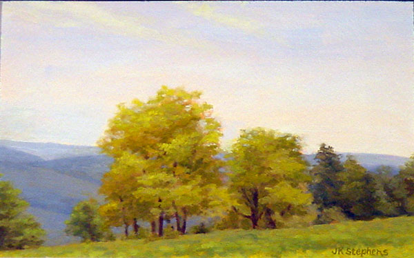
The scene I painted.
I know that narrative is very old-fashioned, but it has its place in grounding plein air paintings. The farmyard’s story was obvious. But with the building and tree, either the tractor would need to be included to explain the log pile, or some major narrative fudging would need to happen. That was out; the scene was inherently too delicately-balanced to muck with.
I believe in truth in painting as well as in life. But what does that mean? To a scientist, truth is what can be established through the scientific method. That viewpoint (itself not objective) has permeated our culture. It is, however, a very narrow definition. It leaves out aesthetics, ethics and the associative thinking that the human brain is so good at.
Snow on the forecast, by Carol L. Douglas
Today, we all know that Galileo was right, but by the scientifically-known facts of his time, he was wrong. In fact, part of what Cardinal Bellarmineargued was that heliocentrism shouldn’t be taught unless it could be proved.  What infuriates us moderns is the idea that the Inquisition could muzzle science, and we’re right to feel that way. But that’s based on an unprovable ethical argument: the idea that science should operate independently of church or state.
If you were to walk to the post office with me this morning, you probably wouldn’t notice the power lines. You’d see the elegant houses, grand old trees, and raking light across the harbor. That’s because we see with our hearts, and we focus on some things to the exclusion of others. When we’re very young and first investigating realism, we think we should include every detail. As we get older, we’re more attracted by that emotional truth, which has little to do with the objective truth.
The scene I was riffing off.
Yesterday, I managed to sneak in a tiny painting of the building that Ken originally painted. I was demonstrating limited palette. That’s another subject where truth is too complex to be boiled down to easy inanities. In theory, you can get to any color using just red, blue, yellow and white paint. But the chroma and clarity of those mixes depends on the pigments you use and the medium you’re working in.
It’s not that the paints transmogrify, it’s that each different pigment and base has different undertones. These mix well in some directions, but cancel each other out in other mixes. If you doubt me, try to make a classic chromatic black (cadmium yellow, cadmium red, ultramarine blue) with acrylics. You’ll get something that looks like you picked it up on your shoe.

The road home

How much of what we know is truth and how much is the convention of our times?

After the final cutting, Carol L. Douglas

In the 21st century, we are being driven inexorably toward higher and higher chroma (color intensity). This isn’t just happening in painting, but also in photography, home furnishings, and hair coloring. Occasionally an artist will take refuge in monochrome, but the delicately modeled colors of our predecessors are out of vogue. We live and die at 1280 x 720 pixels, and delicacy just doesn’t cut it on a computer monitor.
Yesterday, David Dewey spent a few hours with Clif Travers and me, going through a wealth of Joseph Fiore paintings. These are in storage and represent his entire career, from his studies at Black Mountain College until shortly before his death. Unlike most painters, Fiore didn’t run through clearly defined stylistic periods. He operated on parallel tracks of abstraction and realism, each informing the other.
Guardian of the Falls, 1983, Joseph Fiore, oil on canvas, 52 x 44, courtesy of the Falcon Foundation.
His folios are full of small studies in watercolor, oil, and pastel, now chemically stabilized. The majority are formal color exercises, many based on a mathematical grid of his own devising. David identified these as Bauhaus in character, which in turn takes us back to Paul Klee, Josef Albersand Wassily Kandinsky.
Klee closely connected color and music, making the connection between harmony and complementary colors, and dissidence and clashing colors (whatever they may be). Albers was a hands-on scientific colorist who taught at Black Mountain College when Fiore was there.
Field sketch forGuardian of the Falls (above), courtesy of the Falcon Foundation. It’s watercolor and about 12×16.
Fiore’s color studies are a balm to the eye starved for subtlety. There are grids of closely analogous greens and browns; grids punctuated with black. In addition to being beautiful, they fly in the face of our current color model. 
That just shows how much of what we think we know is the convention of our time, not eternal truths of painting. Take, for example, all of Kandinsky’s twaddle in Concerning the Spiritual in Art.  For much of the twentieth century, people took that seriously.
The artist’s job is to get through all that to the nut of the matter. The only way I know to do that is to paint—a lot.
David mentioned that he uses Arches 500 in his studio work, but mixes it up in the field. The accidents that ensue help him avoid staleness. This is exactly my goal in alternating between watercolor and oil in this residency, and in painting so big and fast. I am trying to shake up my oil painting.
I was able to maintain the truth of the landscape in my sketch.
Nature has a certain awkwardness. We landscape painters are taught to edit that away into a ‘better’ composition. After examining so many paintings, I wondered how much of that is also a fashion issue. I resolved to not do it in my afternoon painting, but to be completely faithful to what God and man had laid down in that field. I don’t think I succeeded. The personal impulse is just too strong to ignore.
But when I started painting, I succumbed to the urge to prettify.
With all that fizzing in our heads, Clif and I went back to the farm and returned to work. The lake was still unsettled from this week’s storm, so I painted the small private cemetery and its lane. The lake beyond made this very much a painting of the intersection between land, water and man.
Having spent the morning in study, I didn’t finish the painting to any high surface. It’s slightly easier to do that with watercolor, since it goes faster. But in either case, the pace is starting to tell on me. I’m getting tired.

Realism: the forgotten stepchild of the early 20th century

When abstract art became a worldwide phenomenon, great realist painters were marginalized and forgotten.

Hiking, 1936, James Walker Tucker, Laing Art Gallery

In the great pile of mail I collected yesterday were two packages. One contained a copy of Pictures, Painters and You by Ray Bethers. This belonged to the father of a friend.

The other was a catalog for True to Life: British Realist Paintings in the 1920s and 1930s. I’ve written about two of its artists before: Sir Stanley Spencer and Meredith Frampton.
Realism was a world-wide trend in the beginning of the 20th century. There were realists among the American Modernist movement—the Ashcan School, Georgia O’Keeffe and Rockwell Kent all come to mind. In Canada, the Group of Sevenwere turning out powerful, popular landscapes. And in Britain, a generation of fine painters were producing a lively, detailed record of the interwar period.
Dorette, 1932, Gerald Leslie Brockhurst, courtesy National Gallery, London
The term “realism” is a wide net. It can include symbolismmagical realism, social realism, objects pared down to their absolute minimum, or the finicky detail of trompe-l’œil. All found their expression during the interwar years, but each nation had its own preoccupations.
Gerald Leslie Brockhurst’s Dorette was a young model at the Royal Academy who went on to be his lover and ultimately his wife. With her portrait, Brockhurst was developing a style he would use with great success later in his career: adapting Renaissance technique to depict the hard-edged beauty of contemporary womanhood. Note the wispy background.
In fact, the British interwar artists were refuting trends in modern art. Their work runs a gamut of styles, but is united by careful drawing, meticulous craftsmanship, and controlled brushwork. They explicitly rejected expressionism and impressionism.
Elsie, 1929, Hilda Carline, courtesy Tate Museum
The show includes work by Hilda Carline, Stanley Spencer’s long-suffering wife. Her marriage was characterized by Alfred Hickling as “the most bizarre domestic soap opera in the history of British art.” That just understates her suffering. Elsie was the Spencers’ maid. Carline’s portrait of her shows just how much of her own talent was subsumed into her husband’s naĂŻve drama.
The Conscientious Objector, 1917, is almost certainly a self-portrait by David Jagger. A hundred years on, we have little concept of the opprobrium heaped on “conchies” in Britain during the Great War; Jagger’s own brother referred to him as “that great hulking lout in his mother’s shop.”
The Conscientious Objector, 1917, David Jagger, courtesy Birmingham Mail
The paintings do not ignore the tensions of interwar Britain. James McIntosh Patrick’s A City Garden, Dundee is a portrait of his own home, purchased for a song because of its proximity to the Tay Bridge, which might be a bombing target. His wife and daughter are in the garden, hanging out washing. Meanwhile, in the corner there’s an air-raid shelter being built. This was a British reality, and it is one we Americans can only ponder from the outside.
A City Garden, 1940, James McIntosh Patrick, courtesy Dundee City Council
Still, it is the pictures of everyday life that I like best. Hiking, by James Walker Tucker, shows three independent, fresh-faced Girl Guides calmly considering their immediate plans. It’s part of the British mania for rambling and a lovely, un-self-conscious feminist statement at the same time.
With the second World War, abstract art escaped from New York and became a worldwide phenomenon. On both continents, great realist painters were marginalized and forgotten. It’s a pity, because so many of them were stunning virtuosos.
There will be no Monday Morning Art School on New Year’s Day. Have a blessed, restful, refreshing holiday, and I’ll see you again in the New Year!

It’s not that I can’t do it, it’s that I don’t always want to.

The Wreck of the SS Ethie, by Carol L. Douglas.
You all know the Facebook game where artists are asked to post a painting every day for a week and tag another artist each day, right? (The one where, on the fourth day, you forget and never finish.) I love that game. I’m insatiably curious about other artists and their work.
Recently, my friend Elissa Gore played. She posted work from across her career, which has spanned four decades. Her early work was more detailed than her current paintings. That’s no surprise, since almost all of us are taught to paint literally before we learn to paint emotively.
Sometimes people who don’t paint make the error of thinking that non-realistic painting is somehow easier than strictly representational painting, that photorealism is the apotheosis of painting. “That looks just like a photo!” is not, in most cases, a compliment. Art is not about duplicating reality, but learning to step past reality and take your viewers with you.
The multi-colored shingle at Martin’s Point in Gros Morne National Park.
The problem with a subject like The Wreck of the SS Ethie is that it is already playing games with your head. The shingle on this lonely coast in Gros Morne National Park in Newfoundland is wildly-colored. What’s left of the boat is not an elegant wooden corpse subsiding into the surf, but its steel guts scattered down the shore. Simplifying or abstracting in my usual frenetic style would just confuse the viewer.
I love geology almost as much as I do painting. Each year when I do my workshop, I point out the basalt inclusions in Acadia and how they now shape the erosion of the granite bedrock. Sand might be easier on the feet, but rocks are exciting.
At times, rocks can be conveyed as rough, slashing brush strokes, but that only works for ‘normal’ scenes, where your mind can fill in the gaps. For the out-of-the-ordinary, more information is needed. The rocks at Gros Morne have been ground in the surf so hard, they look like they’ve been through a rock tumbler. Many are striped. That requires time and patient attention to detail.

Weathered parts of the Ethie are thrown everywhere.

While I wouldn’t want to paint like that every day, it felt good.

You can read about the wreck of the Ethie and the brave Newfoundland dog who saved her passengers here. I wrote about the abstraction that was the basis for this painting here. And you can read an ode to the wee pup himself here.

Not your grandfather’s abattoir

Carcass of Beef by Chaim Soutine, c.1924. This is part of a series that was painted in his apartment in Montparnasse, sans refrigeration.
Every art student knows Chaim Soutine’s Carcass of Beef series. Soutine—who didn’t always act as if both his oars were in the water—kept a beef carcass hanging in his studio to paint, bathing it daily in blood to keep it fresh. The stench drove his neighbors to call the flics. Soutine promptly lectured them on the importance of aesthetics over mere hygiene. At one point, the painter Marc Chagall saw the blood from the carcass leaking into the hallway outside Soutine’s room. He rushed out screaming, “Someone has killed Soutine!”
Rembrandt van Rijn’s Slaughtered Ox, 1655, was in the Louvre at the time Soutine painted his Carcassseries. Another version, very similar, is in Kelvingrove Art Gallery.
Soutine painted 10 works in his Carcass of Beef series. They were inspired by Rembrandt’s 1665 still life, Flayed Ox. The Christ-like aspects of Rembrandt’s steer carcass are often remarked on, but that probably reflects our modern separation from the slaughterhouse. We simply don’t see beef on the hook much anymore.
The similarities to a crucifixion noted in Rembrandt’s paintings probably come from the reality of slaughtering beef. Modern beeves are split in half before hanging.
I periodically buy a side of beef from a farmer in Niagara County, NY. I knew his grandfather, who farmed the same patch of land. The farmer has switched abattoirs to the one where we used to send our own steers back in the 1970s. It’s gone through two owners since then, so in a way I guess I knew the abattoir’s grandfather too. It’s still a small operation, but now it’s immaculate and odor-free.
Beef aging in a modern abattoir.
Either mid-century French beeves were a fraction of the size of modern American steers, or that old story about Soutine is flawed. The hanging weight of the steer we collected yesterday was just under 700 lbs. Soutine could not have humped that from the slaughterhouse up the stairs to his apartment. I doubt he could have paid for it unless it was already rancid, since he was perennially broke. A month-old Angus calf can weigh between 80 and 200 lbs., so I’m guessing those paintings should probably be called the Carcass of Veal series.
Gustave Caillebotte was an upper-class Parisian with an independent allowance. His Rib of Beef, 1882, is a much more sanitized affair.
I jumped at the opportunity to take a tour of the abattoir. We followed the workflow from the room where steers are stunned and killed, to the great coolers where they hang for a few weeks to age, to the newly installed smoker. The place was absolutely spotless. “When we kill a steer, we have both a veterinarian and a USDA meat inspector right here,” the butcher told me.
The stamps are from the USDA inspector.
Most of us eat meat but want to imagine that it originates in the plastic packaging in a grocery store. But there is nothing particularly revolting about a well-managed slaughterhouse. I am certainly more confident about a well-regulated abattoir in tiny Hartland, NY, than I am in the great slaughterhouses of the Midwest. And as a bonus, there are no plastic films, no Styrofoam trays, and no blister packs.
And, yes, I would jump at a chance to paint a hanging side of beef. They are beautiful, complex, corporeal, and colorful. Alas, the food inspectors would never allow it.
Lovis Corinth’s In the slaughterhouse, 1893, was painted during the first great reform movement of slaughterhouses.
Let me know if you’re interested in painting with me on the Schoodic Peninsula in beautiful Acadia National Park in 2015 or Rochester at any time. Click here for more information on my Maine workshops! Download a brochure here.

Abstract-Expressionism bails me out

Underpainting of a hailstorm. That’s painting #6 underpainted; one more to go.

When I had a composition problem on this underpainting of a hailstorm, I reached back to an old friend: the color field painter Clyfford Still.

Living on the Lake Plains as I do, I know that a level field is perfect for growing crops, but not so attractive for painting. It resolves into bands—a border of green at the bottom, an expanse of gold, a distant, straight hedgerow of green, and then the sky. (This is the same problem with painting Lake Ontario, with its regular shoreline.)
1956-D, 1956, by Clyfford Still
Clyfford Still’s compositions—while emphatically non-representational—still carry the whiff of the natural world about them. In part, this comes from their texture: they may be of color fields, but they are gloriously impasto. But in part it comes from the shapes themselves, which are evocative of the real world.
One of Still’s devices was to lay a contrasting band right along the edge of his canvas, which is then elegantly and perfectly balanced against the other shapes in his canvas. So when I find myself at a loss about how to deal with that edge band of grass that always shows up in a flat landscape, I go and potter among Still’s paintings for a while.
1952-A, 1952, by Clyfford Still
Perhaps it is because I grew up with them. Buffalo’s Albright-Knox Art Gallery owns 33 paintings dated between 1937 and 1963, and they are as familiar to me as my own skin.
That’s small potatoes compared to his oeuvre. The majority of his paintings were never sold in his lifetime and are now on display at the Clyfford Still Museum in Denver.

Let me know if you’re interested in painting with me in Maine in 2014 or Rochester at any time. Click here for more information on my Maine workshops!

Playing it safe

As-yet-untitled landscape of New Mexico by Cindy Zaglin, acrylic on canvas. Light, bright, abstract, and ultimately it looks like the place felt.

The working art world—as much as any clique—tends to be insular. Art markets are provincial communities that are inclined to distrust outsiders or new impulses. To really break out of the corner into which one has painted oneself, to violate the community’s intellectual, technical or social standards, can be tremendously difficult.
Because paintings are tangible objects, the culture of painting is less subject to mass media than are other art forms, and there are distinct regional differences.  Painting clubs and classes can be terribly restrictive. They draw their leadership and jurors from a constricted pool, so members tend to conform to a narrow style to be juried into shows or awarded prizes. That can be either conscious or unconscious, but it inevitably leads to derivative or dated technique. When I first went to Manhattan to study with her, Cornelia Fosslooked at my first exercise and said, “If this were 1950, I’d say, ‘Brava, Carol,’ but it isn’t.” That’s what came of learning to paint in Buffalo.
Of course in its own way Manhattan can be as provincial as anywhere else. Cindy Zaglin studied at the Art Students League in New York. She has never been one to tie herself blithely to someone else’s muse. “I was very unhappy. I was in class and would look at everyone’s realistic paintings and I could make mine look like theirs but it didn’t express me. I don’t care about the small details. I wanted to paint large swatches of color, use negative space, leave things out, replace things with color, and I was scared to do that.”
The problem with abandoning community is that one needs new ideas, and Zaglin struggles with how to maintain a healthy distance while still learning from others. “I still sometimes think what I’m doing isn’t ‘valid’.  Sometimes I know when it’s working; sometimes I don’t. I do want to learn from others including realist painters. Painting freely or abstractly isn’t just throwing colors or shapes on a canvas; you still need to know how to draw.”
Then there’s the marketplace. Mid-level art buyers are a curiously reticent bunch, embracing new things only after they have the imprimatur of other collectors. Too many painters temper their inner vision to the marketplace. We have all seen insipid artists sell while brilliant ones struggle in the trenches.
Spring Trees, oil on board, by Jean K. Stephens (image courtesy Oxford Gallery)
A decade ago, Jean K. Stephens was a respected Rochester landscape painter, with impeccable technique born of a very disciplined mind and a passionate love of the land. I’d heard she’d been through a painterly rite of passage; a mutual friend showed me some abstractions she’d done that I found painfully honest. When I came across a small nest painting of hers at Shop One² at Global Village recently, I wondered what made this seemingly established painter give up what she knew, and perhaps more importantly, what she knew would sell.
“I couldn’t not do them,” she said of those early abstractions. She had undergone a process of deep-tissue massage that, she said, brought her back to her birth experience. “I woke up in the middle of the night and did something I never do: I just started flinging paint. It was certainly not planned. It just spilled out that first night,” she said. “The next morning I went in the studio and said, ‘What just happened here?’”
What happened was more complex than a spiritual or psychological discovery, since Stephens had recently moved, had entered menopause, and had sold the rural property that had made her ‘big vista’ landscapes possible. Even as she’s moved past this work, she says it was and is a “true expression of my feminine self.”
Stephens’ current work embraces both that feminine expression and her capacity for realism. “I was in Maine with a bunch of friends. We had rented a house and I was doing the typical plein air. On the last day I looked down at my feet and said, ‘There’s the Great Mother!’ In our trips to Maine, I had always loved the rocks, but I felt like this work was the culmination of everything I had done to that point.”
So what happens when a painter known for her delicate, luminous landscapes suddenly starts exhibiting rock paintings that look like vaginas? “There’s always a risk in putting something different on the wall,” acknowledges Stephens. “I can take that risk. I do the work for me, but if people connect with it, that’s even better.”
In and Out, oil on panel, by Jean K. Stephens (image courtesy of Oxford Gallery). The complete series can be seen here.
Zaglin expressed a similar sentiment. “While I want others to be connected with my paintings I’m most interested in me being connected to my paintings. This year I started caring less about what others thought and started trusting that I did have a point of view.”
Last year was a time of personal crisis for Zaglin, and she thinks the upheaval changed her work. “Afterward, I decided I was wasting time not painting how and what I want,” she said. Which is, of course, true for all of us.

There’s still room in this summer’s Maine painting workshops! Check here for more information.