Why the details matter

Super-simplified paintings may intrigue at first, but do they have enough information to satisfy over time?
Snow at higher elevations, by Carol L. Douglas

Yesterday we let the software engineer out of his cage. He traveled down to Pecos National Historical Park with us. He could get a signal enabling him to work. Meanwhile, we painted a snow squall approaching across the Sangre de Cristo mountains. (We’re limited to satellite here on the ranch and a tethered hotspot is faster.)

As is true on the ocean, the sight-lines in the west are extended. You have hours to watch weather unfold. It made for great painting for us, and a nice work setting for him.
A friend once told me, “I’d never date an engineer; they’re too boring.” I’ve found exactly the opposite to be true. This one has an undergraduate arts degree and is a serious musician as well as being a programmer. When he talks about aesthetics, I listen.
An abandoned farmstead in the Sangre de Cristo Mountains.
We took him for a brief walk through a small, abandoned farmstead with log and stone barns. It was where I’d spent most of my time during Santa Fe Plein Air Fiesta last April. The difficulty, I’d found, was in the surfaces, which are textured and edgy and needed more definition than my usual painting style. How could I paint them convincingly without being too detailed?
“Alla primapainting applies a low-pass filter over everything,” he told me. “You need a way to convey high-frequency information in some places.” Huh?
Think about the sound of clapping. It’s impulsive and unexpected. If you were to look at a graph of it, you would see a spike. That’s what they call a high-frequency sound, and it’s exactly the same as a line, a dot, or an edge in your painting—in other words, it’s a big, sudden, value shift, packed with information. It gets your attention. It’s the opposite of low-frequency sounds, which are more like the hum of your dishwasher in the background.
Our office on the road. My trusty Prius is not up to this terrain. (Photo courtesy of Douglas Perot)
There are low-frequency passages in painting, too. A grey sky is an extreme example. Nothing much changes there. When you save a photo at too low a resolution and it gets blurry, it’s essentially been subjected to a low-pass filter.
When your teacher tells you, “focus on big shapes,” or “ignore the detail,” he or she is telling you to apply a low-pass filter to your painting. In general, that’s good advice—within limits.
And then there was snow, and a gravel road up a mountain ridge. (Photo courtesy of Douglas Perot)
In photography, those blurry, low-resolution photos may intrigue at first glance, but they aren’t that satisfying over time. In the long run, that may be true of paintings as well.
The trick, I think, is to vary high information passages with super-simplified ones. It’s a good goal but it’s not always possible in plein air painting, where you often have to quit before you think you’re finished.
Horno in the snow, by Carol L. Douglas. I haven’t looked out yet to see how much stuck.
And that was exactly what happened to us. One minute, it was dark and cold, and the next, snow was swirling everywhere, obscuring our view.  We slipped up the road back to the ranch. I’m hoping for snow-cover to last through today. If it doesn’t, I’m sure we’ll find something to paint.
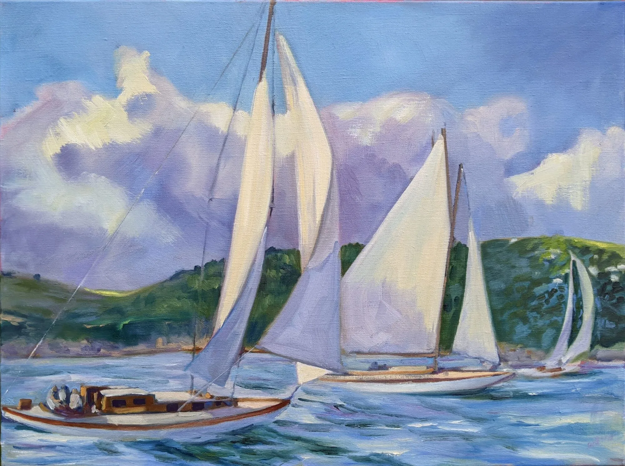
Monday Morning Art School: finding the super simple shapes

If you think it’s too complicated to draw, you’re looking at it all wrong.

Winch (American Eagle), by Carol L. Douglas, courtesy of Camden Falls Gallery.
This exercise builds on last week’s Monday Morning Art School, where we did simple drawings of our homes and then experimented with cropping them. The idea was to see beauty in the everyday, and to see how even big architectural drawings are just a combination of smaller shapes.
This week I want you to go back to your homes, find something prosaic, familiar and commonplace as a subject, and then analyze your drawings in terms of these simple shapes.
That painting is just a series of simple shapes.
I’m near-sighted. I just need to remove my glasses and I’m working in simple shapes. That’s more difficult for someone with perfect vision; you poor schmoes are going to have to squint. Either way, by blurring your vision, you can reduce the scene before you to a few basic elements.
When you blur your vision, smaller shapes fall away and form a few, larger shapes. It’s much easier to break down a scene if you can’t see it in sharp detail. You don’t have to do this for every drawing—just enough to grasp the concept of simplification.
Old Greek Revival farmhouse in Western New York.
Consider this elderly farmhouse I photographed in western New York. With my glasses on, it might seem daunting—a collection of windows, doors, pillars, peeling paint and overgrown shrubberies. But it’s easily broken down into a series of rectangles, triangles and circles. Anyone can draw those, even the people who tell me they can’t draw a straight line. “I’m going to draw an abandoned Greek Revival house” is a lot more daunting than “I’m going to nail down these few shapes.”
This is a computer estimation of what it looks like to me without my glasses.
Concentrating on the big shapes not only makes starting easier, it leads to more accurate measurement. It’s much easier to draw the big rectangle of the portico and fit the pieces into it than to start with one window and grow the shape outwards.
Either way, it breaks down to these approximate shapes. Anyone can draw them!
Once you’ve drawn the basic shapes, you can work inward to add detail. When you have a decent basic sketch, you can start thinking about the composition you might want to paint. A good composition has a variety of shapes and angles.
The painting at top is of the American Eagle in drydock. A boat is a long, lean thing, in or out of the water. A side view isn’t its most flattering angle. (Come to think of it, that’s true for me, too.) For this reason, it poses a compositional problem in drydock or at its berth. Here, I’ve reverse-engineered the drawing into a series of simple shapes, so you can see my solution to the problem. 
My house drawing from last week.
Let’s go back to my shape drawing of my house from last week. In the end, that can be reduced to a black-and-white cut-out (below). Simplified, is there a coherent black-and-white pattern? Is it pleasing enough to bother with? If the answer is no, then back to the drawing board. That is the point of a thumbnail. If it doesn’t work in a tiny sketch, it isn’t going to work in a painting.
Does it reduce to a few simple shapes that make a pleasing pattern? I think so.
Your assignment—like my class here in Rockport—is to choose a simple scene in or near your house and break it down to extremely simple shapes. How do they intersect? Is any one intersection more compelling than the rest? If so, that’s probably your focal point.