Painting the absurd

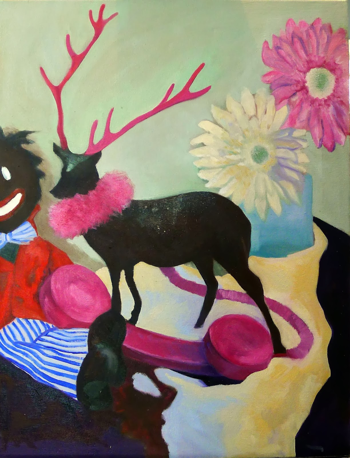
Still life by Sandy Quang. About 18X24, oil on canvas.
I’ve had several students painting and drawing a sprawling still life over the last few weeks. Sandy Quang has done a bang-up job with it.
Sandy has a BFA from Pratt and is finishing her MA from Hunter College, so I must share some credit for teaching her. However, she has studied with me since she was in high school. She is just now coming into maturity as a painter.
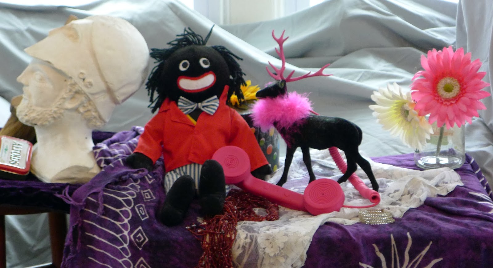
The still-life set-up includes an Altoids box, wallpaper brush, bust of Pericles, Golliwog, phone receiver, hatbox, beads, plastic reindeer, lace mantilla, and two ugly silk flowers. They were chosen so that students couldn’t fall back on narrative, historical patina, or folksy allure as crutches.
Her first draft was a funny idea—juxtaposing the Golliwog and bust of Pericles—but a mediocre composition. I included it here to remind people that even good painters mess up regularly. The difference between good and great is returning to the subject until you get it right.
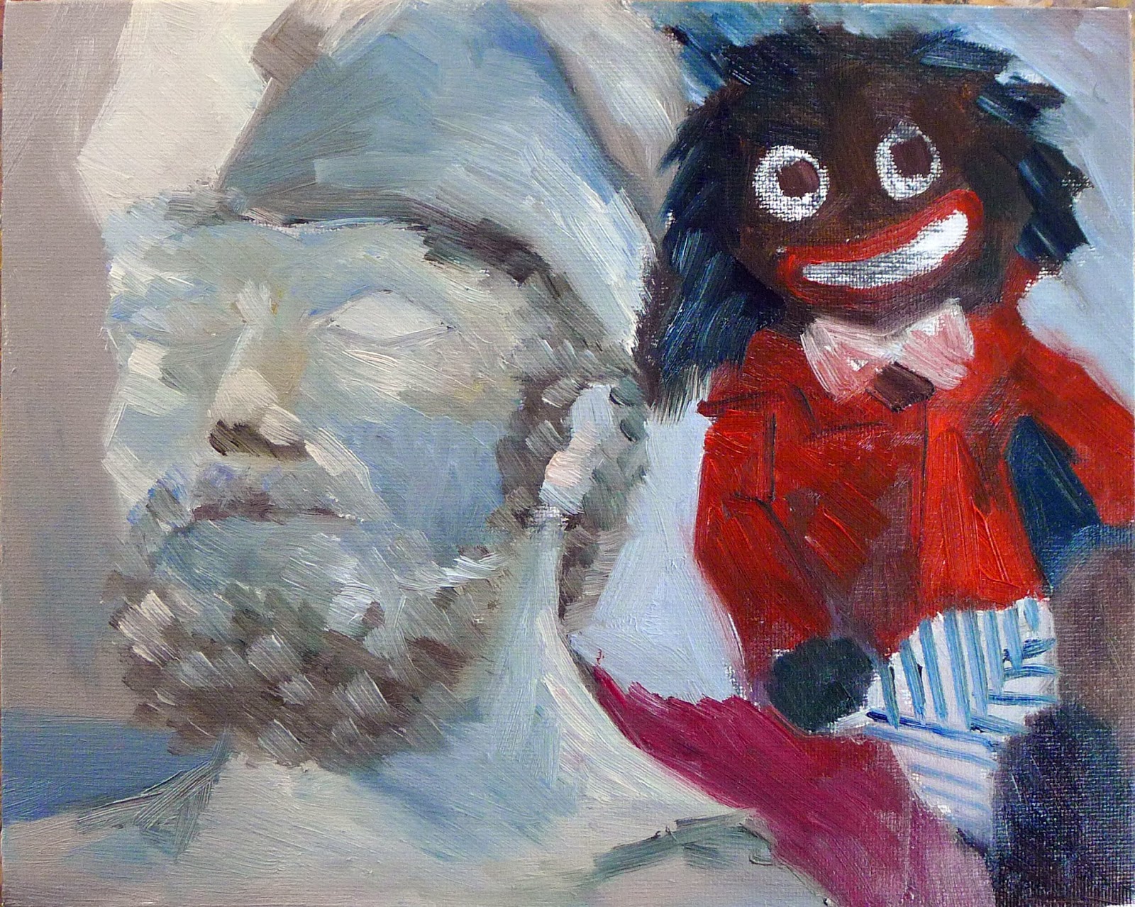
Sandy’s first draft, juxtaposing the Golliwog and bust of Pericles, was a good idea but a bad composition, so she jettisoned it.
Take the time to consider why her final painting works, because it is instructive. The objects themselves don’t have any narrative, historical patina, or folksy allure to use as crutches (which is why I chose them). She treats the painting not as a series of items but as a pattern on the surface of the canvas. It works as a value pattern and as a color pattern. Her drawing is very accurate. She doesn’t get hung up on the details, but she does include the over-the-top sparkles on the reindeer’s back.
A careful comparison of an earlier iteration with the finished painting shows you her extensive redrawing, until the finished work was simplified but accurate. Every brush-stroke should be toward the goal of greater accuracy.
Let me know if you’re interested in painting with me in Maine in 2014 or Rochester at any time. Click here for more information on my Maine workshops!

Culture of Excess

Butcher’s Stall with the Flight into Egypt, 1551,Pieter Aertsen
My friend Dan Gowing was writing his Sunday school lesson this week when he realized just how efficient Jesus was with the miracle of the loaves and the fishes. The Gospel of Mark records that there were twelve baskets left after feeding 5,000 men and their families. Dan’s conclusion is that you can’t actually get anything you want from Jesus’ restaurant but you just might find you get what you need.
My holiday motto generally is, “What’s worth doing is worth doing to excess.” In that I am a typical American. Our Thanksgiving dinner alone usually has about twelve baskets of leftovers.
Giuseppe Arcimboldo’s Rudolf II as Vertumnus, 1590, takes “you are what you eat” to its ultimate level. It’s not mere whimsy, but symbolizes “the majesty of the ruler, the copiousness of creation and the power of the ruling family over everything.” (Thomas DaCosta Kaufmann) He’s not Dutch, but he sure is good.

In November, I postedabout Norman Rockwell’s iconic Freedom from Want and how its table is almost bare by modern standards. When Rockwell painted this a mere 70 years ago our self-identity was still Puritan. Today we wallow in outsized appetites, and we’re all pretty fat. In fact, we’re far more like the Dutch Golden Age than our own recent ancestors. Of course, back then the Dutch were rich like us.
On the other hand, most of us miss the point of those Dutch paintings entirely. If we see them just as a celebration of bounty or a cock’s crow of vanity, we’re missing the warning sign buried in them.
Shop, with the Flight into Egypt, top, is in fact an allegory. The Holy Family, inset in a window frame, distributes alms to the poor as they leave. A merry group is seen eating shellfish (a symbol of lust) through the other window. The sign at the top tells you that the land is for sale, leading you to understand that all of this is available at a moral price.
Still life, 1644, Adriaen van Utrecht. This canvas includes almost all the elements common to great Dutch still lives. The presence of so much exotica points to the great wealth of the Dutch Republic. However, within this epic are buried memento mori:  the seashell represents human frailty; the spotted fruit, our own aging and decay; the music, the brevity of life. Like life, the peeled lemon is pretty to look at but bitter to taste.

Several cultural forces in the Dutch Republic led to their love of still life. The rise in interest in natural science in the 16th century supported a concurrent rise in realism in painting (trompe l’oeil being the highest expression of this). By the 17th century, the Dutch Republic dominated world trade and had a vast colonial empire. They operated the largest fleet of merchant ships in the world.
But while they were rich and famously religiously tolerant, they were also strictly Calvinist. Icons were forbidden in the Dutch Reformed Protestant Church. Painters were forced to deal with religious subjects through symbolism. Their vanitaspaintings point out the transience of our earthly pleasures.
Flowers in a Silver Vase, 1663, by Willem van Aelst, includes a pocketwatch (time), poppies (death), roses (Christian faith), tulips (folly), dragonfly (transience), and butterfly (resurrection).
This was particularly easy with flowers. A language of flower symbolism had developed through the Middle Ages. These were both positive (such as the rose and lily representing love in both its divine and human manifestation) and negative (the poppy representing death). 
The presence of symbols of impermanence, such as candles, hourglasses, a book with pages turning, or buzzing flies, reminded the viewer that sensory pleasures are ephemeral.
The modern equivalent, of course, is the food photograph. Its similarity is in the excess, but it lacks self-awareness.

Let me know if you’re interested in painting with me in Maine in 2014 or Rochester at any time. Click here for more information on my Maine workshops!

Amazing new diet plan! Take up drawing!

Watermelon & Cherries, by Brad Marshall, oil on canvas board, 11×14. Executing this luscious painting probably elevated Brad’s mood by 22%, but who can tell when he’s already so darn cheerful? It’s for Rye Art Center’s annual Painters on Location in September, and I imagine it will elevate the mood of some lucky collector too.
A report in the Journal of Behavioral and Brain Science suggests that drawing pictures of so-called comfort food can also have positive effects on mood, reportedthe Wall Street Journal.
It’s hard to imagine drawing Texas-style comfort food like King Ranch Chicken Casserole or Frito Pie, since they basically look like lumpy stew. So it’s a good thing this research was done at St. Bonaventure University (here in upstate New York) where “comfort food” means pizza and cupcakes.
Wayne Thiebaud, Four cupcakes, 1971. Oil on canvas, 27,9 x 48,3 cm. Is Thiebaud a very happy man? He certainly should be; he painted enough cakes.
Drawing pizzas improved the subjects’ mood by 28%, while depicting cupcakes and strawberries boosted spirits by 27% and 22%, respectively. Drawing peppers improved moods only by 1%.

Peppers, 6X8, oil on canvasboard, by little ol’ me. They made me more than 1% happier to paint, I swear.
 
Maybe it’s because they made the poor test subjects do their drawings on empty stomachs, but I find it hard to imagine that drawing anything would fail to elevate one’s mood. Especially peppers.

I know one thing that’s going to make me very happy: my July workshop in mid-coast Maine. Nothing is happier-making than painting with great friends in a brilliant place. There’s one more residential slot left in July; I’m dying to know who is going to fill it. August and September are sold out , but there are openings in October! Check here for more information.

Last week to see these paintings

 Final week! It’s been a good show and well-received, but it comes down November 1. If you want to see it, I’ll happily meet you there.
Address
Gallery Salon & Spa
780 University Ave
Rochester, NY 14607
Hours
Tuesday-Thursday 11am-8pm
Friday 11am-7pm
Saturday 9am-3pm

Meme of the Day—Kim Jong Il Looking at Things

Abi’s stuffed opossum and green wine glasses, 8X6″, oil on canvas

Kim Jong-Il Looking at Things is my current favorite blog. I suppose it amuses me because it reduces a frightening, insane tyrant to an object of ridicule. (I sure hope he doesn’t see it and melt half of Asia in response.)

Much of the time, he’s wearing a grey-and-lavender parka similar to one my dad used to wear. I assume they have no heat in North Korea and his factotums freeze during these photo ops, but, hey, he’s the dictator.

It dawned on me that in his parka he looks just like the opossum who was camping out in our basement, so that’s how I painted him. Used Abi’s “pet” opossum because the live one has been relocated to public housing elsewhere in the county.

Meme of the day–Back it up!

My new hard drive that just arrived in the mail, 6X8, oil on canvas

A note about these still lives: they’re exercises before my “real work”, a sort of a meme-inside-a-meme, considering how popular the painting-a-day movement is. They take an hour, more or less. And I do them because I find the classic still life boring to paint, but it’s too cold for me outside to paint plein air.

I figure by the time spring comes, water reflections will seem awfully simple in comparison to all this plastic wrap, tinfoil and bubble wrap.

Neko-nabe, or fat cat in a dish (with notes about how to draw the ellipse of the dish)

Neko-nabe, or fat cat in a dish, 8X6 oil on canvas

An ellipse is a plane curve with two foci which is symmetrical on both the vertical and positive axes, and intersects with these axes perpendicularly.

I recently heard a student tell another one, “She means not a racetrack and not a football.” Works for me, as long as it’s symmetrical both ways, as below.

Use that boring old method, a pencil held up in space, to measure the distances above the bowl’s ellipse and below it. You’ll be surprised at how often the bowl has very little showing below the rim, and a lot above the rim.

There is nothing like a contour drawing to check your composition. This is not time consuming, but the most important work you can do. The mantra of my studio is, “draw slow, paint fast” (and thank you to Rhea Horowitz for coining that). It’s a lot easier to correct mistakes in a pencil drawing than in a mush of paint.

Meme of the day–Ginger is so last year, but so’s this purse!

Sandy’s ginger purse, which I found lying on the floor, 6X8, oil on canvas

These memes of the day are tiny (6X8) still life paintings, warm-ups for my “real” paintings, and if they take me more than an hour, I get quite grumpy. (Girls, can I send this purse away now, or should it kick around your bedrooms for another few years before being properly buried?)

Internet meme of the day–girl falls into fountain while texting

Girl falls into fountain while texting, 6X8″, oil on canvas

And the steps to do it, in about an hour:
I start with either a watercolor pencil drawing. Easily erasable with a wet paper towel, allows me to fiddle endlessly with composition.

Then I block in colors and values, very roughly.
Then these shapes are gradually refined until I have to go pick up my son or yell at the dog or answer the phone..
The water reflections were added last. After I raised my phone up on a small support, I poured a pitcher of water over the rest of the stuff.