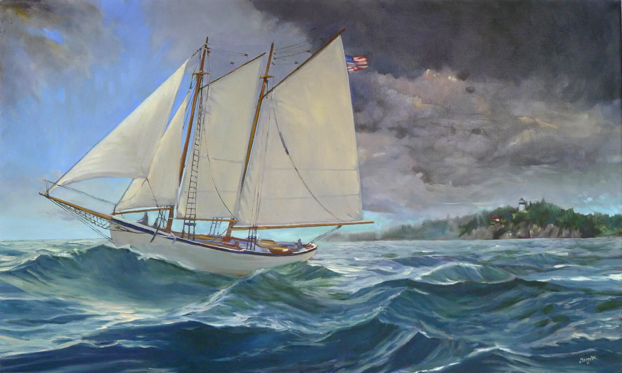
How do you paint the sunset without it looking like kitsch?
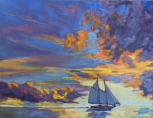 |
| Sunset Sail, oil on canvas, Carol L. Douglas, available. |
In class last week, a student said she’d painted the shadow areas of a sunset painting grey. “I wanted to avoid the Velvet Elvis look,” she said.
As with so many things in mid-century America, the popularity of velvet paintings in the 1970s was the result of one person’s mad ingenuity. Doyle Harden created a block-long factory in Ciudad Juárez, Mexico to mass-produce velvet paintings for the American market. “I never met many people who would even admit they would have them in their homes,” Harden said. “But I’ve sold more than $100 million worth of velvets, and to me it’s beautiful art.”
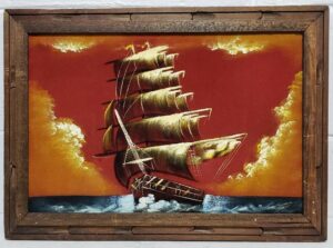 |
| A mid-century velvet sunset painting. |
(If you do have one, there’s a thriving secondary market on ebay. You may be able to recoup what Grandma paid for it.)
Black velvet painting, in fact, may be the reason that black paint fell out of favor at the end of the 20th century. What distinguishes black velvet painting is the inky blackness of the dark passages, created by the fabric itself. It’s a by-word for kitsch, and that’s what my student wanted to avoid.
But black is, in fact, what’s left optically in contrast to the sunset. Objects in relief in front of a sunset will read as dark neutrals or, at best, as inky indigo blue.
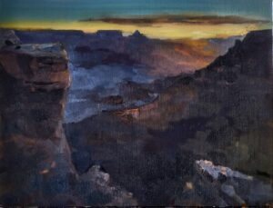 |
| Grand Canyon at sunrise, Carol L. Douglas, available. One issue with extremely dark paintings is that they’re tough to photograph. |
There will, however, be an aura of the sun’s light. It may be directly around the orb, as in the photo above, or it may reflect across a valley, as in my painting of the Grand Canyon at sunrise. Either way, everything in relief is not unremittingly black.
There will likely be shades of grey within that darkness. Here you can gain some relief by adding blues or even purples.
 |
| American Eagle at sunset, taken during my September Age of Sail workshop last year. |
We have two kinds of color receptors in our eyes—rods and cones. Rods work better at night, but are less receptive to the red end of the spectrum. This is the Purkinje effect, and it leaves us perceiving things as deep blue—right before we lose any sense of color at all.
Some objects are partially illuminated by the sunset light streaming through them. The flag of American Eagle, above, is an extreme example, but there are others, including glass and water.
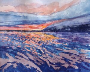 |
| Watercolor sketch of sunset, Carol L. Douglas, NFS. |
In addition, we can see some color in objects that are close to us. That’s because there’s still reflected light bouncing around us. However, a lot of that is remembered or implied color. For example, in the photo of American Eagle, we ‘see’ the name of the boat as gold, but sampling it in the photo tells you that it’s really a very desaturated greyish brown. A little color goes a long way in these dark passages.
But that’s optical perception, and on top of that you have to add emotional response. I ‘knew’ there were greens and reds in the Grand Canyon; I could just see the ghostly outlines of trees. Adding them into that stew of darkness was not a problem as long as I kept the value universally dark.
In watercolor, the problem is exacerbated by the fact that deep darkness is not always watercolor’s best look. One option is to run head-on into the darkness, as Bruce McMillan did here, to great effect.
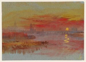 |
| The Scarlet Sunset, c. 1830-40, watercolor and gouache, JMW Turner, courtesy the Tate. |
Still, sunsets are overwhelmingly the province of oil painters, because of that darkness issue. The exception to the rule is Joseph Mallord William Turner, who painted them many times in watercolor and gouache. His solution is to lighten the dark passages considerably, letting them fade into inconsequence.
