A paean to black paint

Avoiding black keeps you from some of the most elegant colors available in painting.

Vineyard, 30X40, oil on canvas, available. Black can make a whole array of beautiful greens.

One of the absurdities of 20th century art education was the injunction to ‘never use black.’ That limits artists from some of the most elegant colors available in painting. The argument is supposedly based on Claude Monet’s palette; he never used black and you shouldn’t either. Like the so-called Zorn Palette, that’s a stew of half-truth and myth. Most artists’ palettes shift over time.

Asked in 1905 what colors he used, Monet said: â€œThe point is to know how to use the colors, the choice of which is, when all’s said and done, a matter of habit. Anyway, I use flake white, cadmium yellow, vermilion, deep madder, cobalt blue, emerald green, and that’s all.” But earlier in his career, he certainly used a wider palette, including black.

The Servant, 36X40, available. Black is invaluable in creating skin tones.

The argument went that Impressionists avoided black because it doesn’t exist in nature. Black certainly does exist in nature: in basalt, in deep shadows, and in the subtle undertones in animals and people.

Moreover, it was argued, the painterly effects created by managing warm and cool hues are richer and brighter than those created by manipulating tones and shades. They’re more brilliant, certainly, because adding black (or white) always reduces chroma. But part of painting is the dance between high chroma and neutrals.

Anyway, Monet’s buddy and fellow founder of Impressionism Édouard Manet used black paint by the bucketful.

Monet said a mouthful in that quote, however, and it wasn’t the list of colors (most of which would not be great choices in the 21stcentury). Most of us choose paint colors purely out of habit. We become familiar with them and develop deep loyalty to them. That’s smart, as long as we choose wisely to start with.

But then the painter often gets into the bad habit of only mixing colors in a certain way. And that, in the tail end of the 20thcentury, meant never using black.

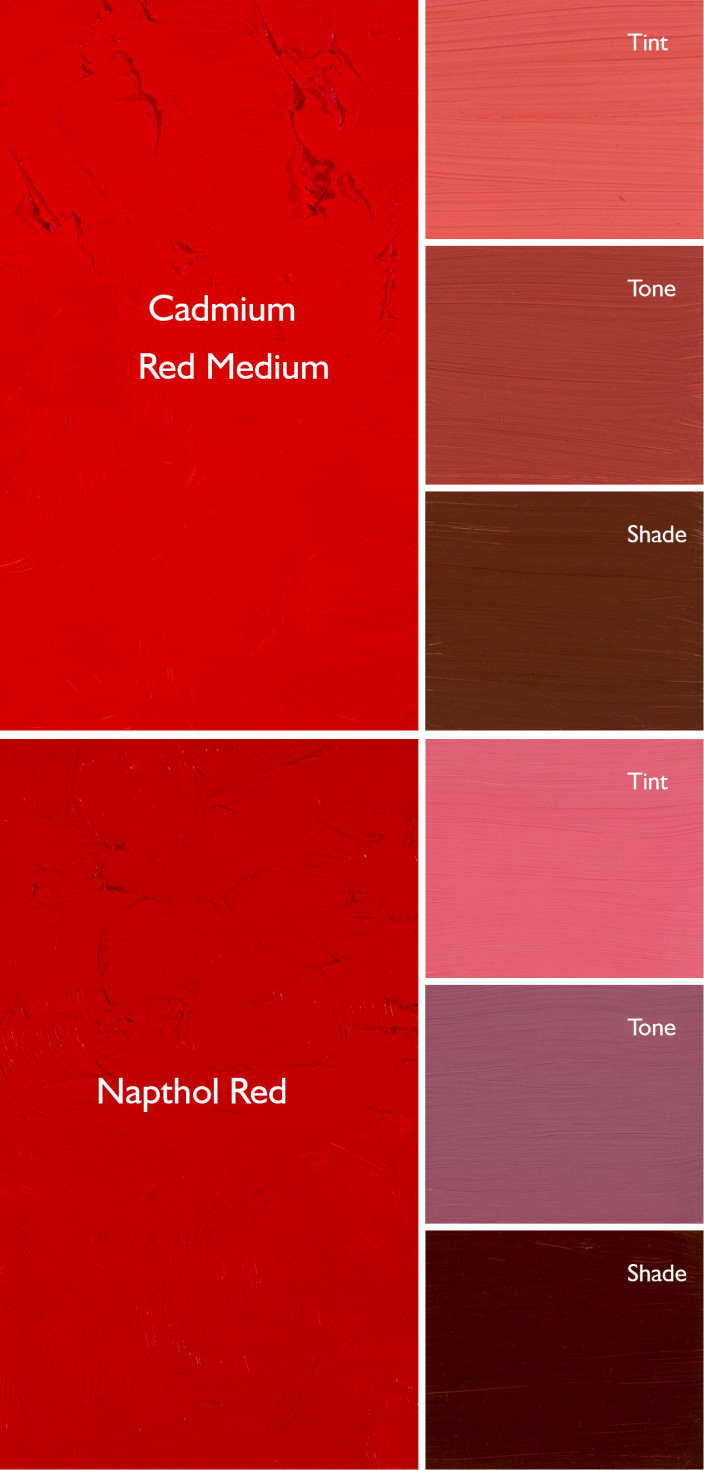
Obviously, you should never make grey by mixing black and white, because it’s lifeless. But there are many subtle colors available only through black admixture.

Black admixture chart of my palette. You should make one too.

In painting:

  • Tint is a mixture of a color with white;
  • Tone is a mixture of a pigment with grey (black plus white);
  • Shade is a mixture of a pigment with black.

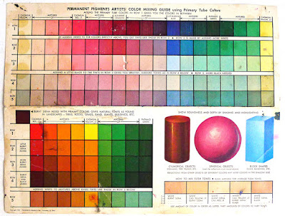
What we consider acceptable in color-mixing is style-driven, just like everything else. For example, see the Permanent Pigments Practical Color Mixing Guide of 1954, below. It’s all about making shades and tints. That’s a hint about why mid-century paintings looked so grey, and probably why the pendulum then swung so far in the other direction. A little shading goes a long way.

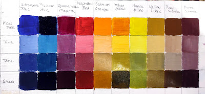
Yes, it’s a mess. It’s been kicking around various paint boxes in my family since 1954.

This antipathy to carbon-based blacks resulted in Gamblin’s introduction of chromatic black, which is a convenience mix and thus a waste of money. Like all ‘hues’ It simply doesn’t mix true.

This product was a response to market demand. It’s very hard to paint without some black on your palette, and the real stuff was banned by the cognoscenti. But when I was in school (she says with a geriatric cackle) chromatic black was something we were taught to mix. That’s a valuable exercise in complements. Buying it premixed in a tube circumvents the point.

Monday Morning Art School: don’t buy ‘hues’

The imperfection of paint is what gives it its liveliness and depth, but it also makes mixing colors tricky.
Autumn, by Carol L. Douglas. This painting contains no reds. The red tones are a combination of cadmium orange and quinacridone magenta.

A “hue,” is made a blend of less-expensive pigments that mimics more expensive ones. There is nothing inherently wrong with these pigments, but they don’t behave the same as the more expensive ones, and you should at least know what you’re buying.
Generally speaking, there’s little to be gained by buying a hue mimicking a more expensive pigment. If you are comfortable painting with a hue, then learn what’s in it and mix it yourself. You always have the greatest flexibility by working with pure pigments (rather than mixes) out of the tube.
How do you know if something is a hue, not a true pigment? First, ‘hue’ is often in the name, as in ‘cadmium yellow hue’. But you should learn to read the paint tubes, too. I’ve spelled that out in How to read a paint tube. It’s information every painter should know.
Three blues that look similar out of the tube, but behave very differently. The ‘glaze’ on the left is the undertone. Courtesy Gamblin paints
A mass tone is the color a pigment is straight out of the tube, dense and unmixed with another color. No real-world pigment is a pure color. While two pigments may look the same to the naked eye, their behavior when mixed can be radically different.
Undertone is the color revealed when a paint is spread thin enough that light bounces back up from the substrate. Some pigments are fairly consistent when moving from mass tone to undertone. Others have significant color shifts. This is where painting with hues can lead to muddy mixes, because they will not behave the same way as the original pigment.
Ultramarine, Prussian and phthalo blue are colors that shift radically from mass tone to undertone. They’re all so dark out of the tube that their differences aren’t apparent to the naked eye. But dilute them, and you’ll find a wide range of blues. Luckily, they’re all inexpensive pigments, so they’re never mimicked.
But they can be used to make hues of other colors—particularly phthalo, which is often found in viridian hue. Real viridian green (PG18) is a moderately staining, moderately dark and moderately dull blueish green. Viridian hue is terrifically staining and powerfully bright, because of its phthalo component.
Cadmium Red Hue is usually made with napthol red and a little white. They mix very differently, which is why the hue is a bad substitute for the real pigment. Courtesy Gamblin paints.
Cadmium red hue is usually a naphthol red with a small amount of white added. Out of the tube, the two paints are very similar, but they mix very differently. There’s nothing wrong with naphthol red; it’s my red of choice, but it doesn’t behave much like its cadmium cousin.
Even paints with the same pigments can have different undertones depending on the manufacturer. That comes back to the imperfectability of pigments and their essential complexity.
A drawdown test showing a paint’s undertone. Courtesy Utrecht paints.
If you’re considering two different pigments, or thinking about switching brands, you can test them. It’s fast and easy. To see their mass tone, put a small dab of paint on a smooth white board or glass palette and draw it down with a knife, creating a uniform, solid stripe that completely obscures the painting surface.
To see the undertone, draw the samples down again so they are translucent. You should be able to see minute variations in the color, and in the covering power.
This old paint chart from my childhood explains tints, shades and tones. It’s so old, it’s from before they banned black. 😉
But to understand the behavior of each more fully, you need to make tints, tones and shades of each sample.
  • A tint is a color plus white.
  • A shade is a color plus black.
  • A tone is a color plus black and white.
Even when the mass tone appears quite similar, two close colors will act very differently when mixed. Their unique qualities of tinting strength, chroma, undertone and color temperature come into play here. But mixing paint with white or black immediately adds another layer of complexity. Different blacks and whites have their own undertones. Titanium white is cool. Zinc white is warmer, but it’s also brittle and thin, making it a bad choice for general painting. Ivory black is slightly warm.

Monday Morning Art School: mass tones, undertones and mixing

The imperfection of paint is what gives it its liveliness and depth, but it also makes mixing colors tricky.
Autumn, by Carol L. Douglas. This painting contains no reds. The red tones are a combination of cadmium orange and quinacridone magenta.
Last week, I made a flippant remark about clashing colors. This weekend, I had an opportunity to see clashing at work, in an ottoman proposed for my living room. It was a cool rose tint and looked horrible with my sectional’s warm red cushions. I’m usually happy with putting closely analogous colors together but this combination would be terrible. The mass tones were fine; the undertones were all wrong.
A mass tone is the color a pigment is straight out of the tube, dense and unmixed with another color. No real-world pigment, however, is as pure as a color on a video screen. While two pigments may look the same to the naked eye, their behavior when mixed can be radically different.
Undertone is the color revealed when a paint is spread thin enough that light bounces back up from the substrate. Some pigments are fairly consistent when moving from mass tone to undertone. Others have significant color shifts. Not understanding those undertones tones can lead to muddy mixes.
Three blues that look similar out of the tube, but behave very differently. The ‘glaze’ on the left is the undertone. Courtesy Gamblin paints.
Ultramarine, Prussian and phthalo blue are colors that shift radically from mass tone to undertone. They’re all so dark out of the tube that their differences aren’t apparent to the naked eye. But dilute them, and you’ll find a wide range of blues.
Undertones are why buying “hues” instead of pure pigments can be such bad value. Take, for example, cadmium red hue, which is usually a napthol red with a small amount of white added. Out of the tube, the two paints are indistinguishable, but they mix very differently.
Cadmium Red Hue is usually made with napthol red and a little white. They mix very differently, which is why the hue is a bad substitute for the real pigment. (In its own right, napthol is a fine red, however.) Courtesy Gamblin paints.
Even paints with the same pigments can have different undertones depending on the manufacturer. I’m experiencing this right now with my quinacridone violets, which I’ve been replacing with whatever I can buy along the road. That comes back to the imperfectability of pigments and their essential complexity.
A drawdown test showing a paint’s undertone. Courtesy Utrecht paints.
If you’re considering two different pigments, or thinking about switching brands, you could test them. It’s fast and easy. To see their mass tone, put a small dab of paint on a smooth white board or glass palette and draw it down with a knife, creating a uniform, solid stripe that completely obscures the painting surface.
To see the undertone, draw the samples down again so they are translucent. You should be able to see minute variations in the color, and in the covering power.
To understand the behavior of each more fully, you now need to make tints, tones and shades of each sample.
  • A tint is a color plus white.
  • A shade is a color plus black.
  • A tone is a color plus black and white.

This old paint chart from my studio explains tints, shades and tones.
Even when the mass tone appears quite similar, two close colors will act very differently when mixed. Their unique qualities of tinting strength, chroma, undertones and color temperature come into play here. But mixing paint with white or black immediately adds another layer of complexity. Different blacks and whites have their own undertones. Titanium white has a cool undertone. Zinc white is warmer, but it’s also brittle and thin, making it a bad choice for general painting. Ivory black is slightly warm.
The imperfection of paint is what gives it its liveliness and depth. It’s also why I don’t use a limited palette, but a system of paired primaries, which I described here.