Monday Morning Art School: simplifying values

Thinking about the landscape as a series of planes will help you create depth in your painting. 
Ice Bound Locks, John F. Carlson, courtesy Vose Galleries

When Eric Jacobsen told us that he was teaching the theory of angles and consequent values in his recent workshop, I was baffled by the big words. “What’s that when it’s at home?” I asked him. Ken DeWaard was equally confused, responding in a torrent of emojis.

“C’mon, guys, it’s John F. Carlson 101!” Eric exclaimed. Björn Runquist immediately checked, and announced that there was nothing about any angles on page 101. (Actually, it’s in chapter 3; I checked.)

It’s no wonder that Eric’s no longer returning our calls.

Sylvan Labyrinth, John F. Carlson, courtesy of Virginia Museum of Fine Arts

All kidding aside, Carlson’s Guide to Landscape Painting is a classic. His theory, although it has a high-flown title, is actually quite intelligible to even the meanest intellects (and you know who you are, guys).

“Every good picture is fundamentally an arrangement of three or four large masses,” Carlson began. That’s as good an organizing principle as any in art. Value is what makes form visible, so we should see, translate, simplify and organize form into value masses.

Carlson wrote that any landscape would contain four groups of values bouncing off three major planes:

  • The horizontal ground plane;
  • The angle plane represented by mountain slopes or rooftops;
  • The upright plane, which is perpendicular to the ground plane, such as trees.

In the middle of the day—our most common circumstance for painting—the value structure would be as follows:

  • The sky is our light source. It should be the highest value in our painting.
  • The ground plane gets the most light bouncing off it, so it should be the next-lightest plane.
  • The angle planes such as rooftops or mountain slopes, are the next lightest planes.
  • The upright objects in our painting, such as trees, walls or people, should be the darkest value element.

Snow Lyric, John F. Carlson, courtesy of The Athenaeum

That doesn’t mean that the shapes are crudely simplified, as a glance at Carlson’s own paintings confirms. The shapes can be beautiful, elegant, complex, and lyrical without too much value overlap.

Thinking about the landscape as a series of planes will help you create depth in your painting. However, it can be tricky to see the landscape as a series of planes rather than objects. It can be helpful to keep each value group completely separate, with no overlap of values, but, in reality, there will always be overlap.

Your assignment is to find a photo among your own snapshots and reduce it to a series of four values. Then paint it.

As you try to integrate this idea into your painting, exaggerate the separation of planes.

Of course, there are many circumstances where this doesn’t hold true—where the sky is leaden and darker than a snow plane, or when the fading evening light is hitting the vertical plane rather than the ground. But understanding it will help you paint the exceptions in a more arresting way.
Monday Morning Art School: a simple exercise in composition

Diagonals keep us interested because they’re harder for us to “solve”.
The Artist’s Studio in an Afternoon Fog, 1894, Winslow Homer. Courtesy of Memorial Art Gallery.
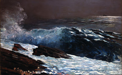
Winslow Homer’s most successful compositional motif was the long diagonal. He used it with great success from the beginning of his career right through to his mature Maine seascapes. Diagonals are particularly important in the latter, since they tie rock and sea together in a monolithic whole.
But diagonals are tricky, as I found last week. The Brandywine hillsides are lovely, but they’re not what I’m used to. They kept turning out stumpier than I wanted. Today’s exercise is designed to help us see the subtlety of the diagonal line.
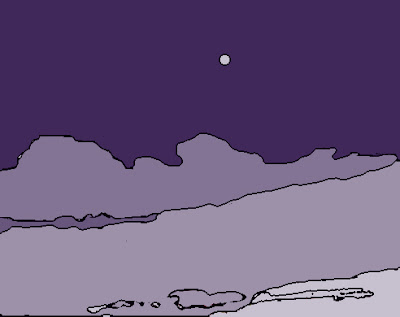
The basic structure of The Artist’s Studio in an Afternoon Fog, above. Use tracing paper to do this step.
Diagonals are more dramatic than vertical or horizontal lines. They draw us through the picture, tie disparate elements together, and create depth and perspective. They don’t need to be articulated; this is a good place for the lost and found edge. A diagonal can be implied by a value shift within a larger object.
Our minds like diagonals for the same reason we like space divisions like the Golden Ratio: they keep our interest because they’re harder for us to “solve”.
Experiment with different values within the painting’s structure.

Today’s exercise is one you can do with a printer and tracing paper. Unfortunately, I have neither, being still on the road, so I’ve approximated it in Photoshop. First, find a suitable Homer painting, one where the diagonal drives the composition. I’ve used an old friend: The Artist’s Studio in an Afternoon Fog, 1894. This painting is at home at the Memorial Art Gallery in Rochester, where I’ve studied it many times.
Sunlight on the Coast, 1890, Winslow Homer. Courtesy Toledo Museum of Art.
You can use this painting or another. All I require is that the broad sweep of motion be on the diagonal. I’ve included a few other possibilities as well.
Next, I want you to print a copy of the painting and trace its major shapes. When you’re done, you should have something that looks approximately like the outline above.
The Fox Hunt, 1893, Winslow Homer. Courtesy Pennsylvania Academy of the Fine Arts.
The last step is to experiment with different value systems inside Homer’s basic structure. He was working from reality, but you have no such limit. When you’re finished with this, what do you observe about the values he used versus the ones you’ve tried?
  
If you sketched in the smaller dashes with high contrast, those passages should drive your eye as much as the big shapes do.