Monday Morning Art School: simplification

This exercise, so critical to the success or failure of painting, is also important because it stresses the beauty inherent in all objects.

Prom shoes, 6×8, oil on canvas, Carol L. Douglas, $348 unframed

A major part of learning to paint is learning to see, and in the process, learning to draw. Part of this is not getting caught up in the details, but perceiving the big shapes and how they fit together. This is fundamental to how painting has been done since the middle of the 19th century.

This means we stop thinking of the object we’re looking at as things we can identify, and start to see it as a series of shapes, or more accurately, a light pattern. That’s very difficult at first. That’s why my students have studied draperiesand reflectionsover the past few weeks. They’re tough subjects, because they’re ever-changing. There’s no cheating with prior knowledge.

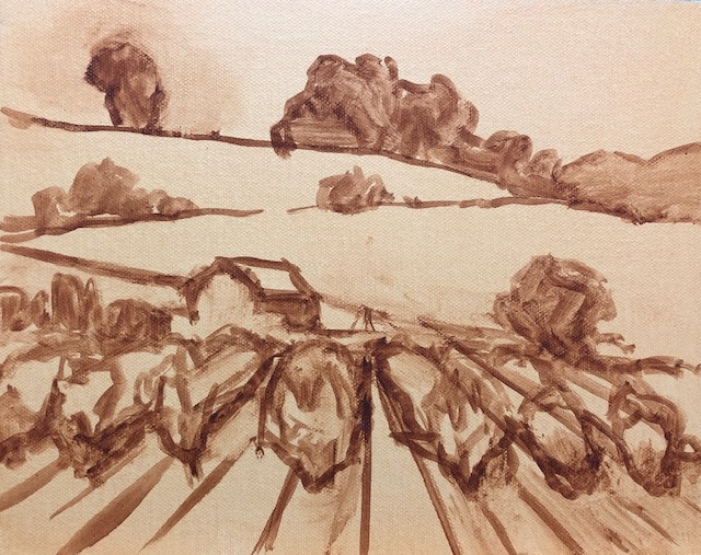
A rude little notan I did of my own house.

A few years ago, my student Sheryl drew the lobster-boat Becca & Meagan, which is moored year-round at Rockport Harbor. It’s painted a signature red, and I have painted and drawn it many times. Sheryl measured and drew, and I patiently corrected her. This went on for most of the class, until Sheryl finally insisted that I sit down and take measurements with her.

Whoops! It wasn’t Becca & Meagan at all. Its owner had launched a new boat, Hemingway. She was painted the same red and moored at the same buoy, but with her own unique configuration—“flat, wide, and deep on the keel,” as her builder said. I was so used to seeing Becca & Meagan that I had stopped really seeing at all. I was looking straight at one boat and seeing another.

Another rough notan of my house. That was back before my painter mislaid half our shutters.

Likewise, if I set a teacup in front of a student, he’s guided in part by what he knows about teacups—they’re rounded, squat and hollow. That gives him some checks on his drawing, but it also allows him to assume measurements and values. That can be very misleading.

He has to stop seeing a teacup and start seeing an array of shapes, planes and values. For most of us, that takes time. First, we must do a drawing to figure out what we’re looking at. Then, we need to ruthlessly simplify our drawing into a series of values. When we catch ourselves thinking “window” or “door” or “boat” or “tree”, we must stop and force ourselves to relabel those objects as merely light or dark shapes.

Yep, that’s a carrot, a lemon and an empty box. You can make an interesting painting out of anything, if you start with the simple shapes.

All objects can be reduced to a certain, limited number of shapes, which build on each other to make a whole. When you see things as abstract shapes, you expand your possible subject matter. A plastic pencil case is not, inherently, much different in shape from a shed. A shed, in turn has the same, simplified, forms as a house. If you start with a shed, you can ramp yourself up to Windsor Castle in no time.

Notanand all other value studies are, above all, about cutting the picture frame into shapes, what Arthur Wesley Dow called “space cutting.”

Dow wrote the definitive 20th century book on composition, which sets down fundamental principles still used today. He taught his students to restrict the infinite range of tonal values in the visible spectrum to specific values—perhaps black, white and one grey. He wanted students see all compositions as structures of light and dark shapes. The success or failure of a painting rests on whether those shapes are beautiful.

Monday Morning Art School: when you lose your drawing

You do a lovely underpainting and you lose it in the top layers. Why does that happen?

Fog Bank, by Carol L. Douglas. This will be on display at Maine Farmland Trust Gallery later this month.

The human mind loves complex, irrational space divisions. The same mind perversely regularizes what it paints and draws. A split-rail fence, where the gaps between posts diminish haphazardly into infinity, attracts us when we see it. However, unless we’re mindful, when we paint it, we regularize the spacing. The same thing happens with trees, flowers and clouds. In nature, they’re artfully erratic. We too often space them in neat lines. Bobbi Heath calls this anti-entropy. It’s a good description of the brain’s powerful impulse to push ideas, images and tones into patterns.

We’re best at drawing when we’re fresh. The challenge is to keep that freshness throughout the finished layers of a painting.

Visan Vineyard underpainting, by Bobbi Heath.

Bobbi graciously allowed me to share an example for this post. She painted the underpainting above last year in France and finished the work this month in her own studio. That in itself is a challenge. No matter how good your visual memory is, it diminishes over time. You’ll always be most accurate if you finish work quickly.

Bobbi made significant changes between the drawing and the final work. The far hill doesn’t rear up as energetically. The ends of the rows are lower on the canvas, and thus less important. More critically, she reduced the contrast, softened the perspective lines, and the ends are less incisive. She also changed the value of the midfield. In my opinion, the painting was weakened by these changes (although it’s still beautiful).

Visan Vineyard, by Bobbi Heath.

I stress drawing on paper before painting, instead of going straight to the canvas. It’s important to work out the compositional questions before you pick up a brush. It’s just as important to have reference to consult when the light changes or your painting gets distorted. A photo on your phone will just tell you what was there, not how you drew it.

Avoid too much solvent in the bottom layers. In alla prima painting, the bottom layer should have enough OMS in it to move fluidly, but not enough to run. You cannot keep a tight drawing if you’re painting over mush, nor can you keep the colors separated and bright. If you have laid down too much pigment (and it should be thin) lighten it up with a rag, not an OMS-soaked brush. If you can see reflections in your underpainting, it’s too goopy for clean alla prima painting.

It’s a fallacy to think that you draw first and paint second. Painting is continuous drawing, and the initial drawing must be restated constantly. I leave important lines showing until I’m certain I have finished the passage, and sometimes I don’t obliterate them at all. You can’t cover up your drawing and expect to reiterate the freshness of the original line. That early drawing will always be your most delightful.

Home Farm, by Carol L. Douglas. This will be on display at Maine Farmland Trust Gallery later this month.

I prefer to work large in general. It’s easier to be accurate and poetic with a large sweeping line. The smaller the canvas, the more jarring small errors of measurement become. For most brushwork, I recommend holding the brush at a point more than halfway back from the ferrule. That gives your brushwork bounce and grace. But for accurate fine drawing, hold it like a pencil.

Kudos to Bobbi for offering to let me critique her painting publicly. “I wish I’d showed it to you earlier so you could have told me to restate the drawing,” she said. That’s a pal.

A version of this post first appeared in October, 2019.

Monday Morning Art School: ditching the color

A painted value study is a great tool for understanding your subject.

Pile of rocks value study, by Jennifer Johnson

Last week, I had you find and identify the simple shapes within a drawing. The prior week, we learned how to do abstracted value studies of our own homes.  This week I want you to do a monochrome (black and white) painting based on a value drawing.

Jennifer Johnson is usually two steps ahead of me. At the end of Tuesday’s class she told me she’d done this assignment before I assigned it. She graciously offered her paintings to illustrate this post.
Jennifer started by doing this meticulous, detailed drawing of her pile of stones.
Before you can work successfully in color, you need to be able to work successfully in black and white. This is possibly the most valuable training an artist can give him or herself. I often do watercolor value studies before I paint in oils, but any painted medium will do for a monochrome study—gouache, watercolor, acrylic or oils.  It is not necessary to use a pricey substrate for this exercise: gessoed paper is sufficient for acrylics and oils; use any paper you have for gouache or watercolor.
Jennifer was trying to teach herself about rock structure, so she set up a pile of stones. First, she drew a meticulous, careful drawing of her subject. This step is akin to research; you are learning the details of your subject.
She traced the basic shapes for each iteration. It saved her tons of time and made it easier to do multiple iterations of the same idea.
Next, she simplified and redrew her picture in graphite, focusing on the values, not the fine details. She then painted the rocks in monochrome acrylic. She added a final step, using five different colors to represent five different value levels. If you want to add this step, the exact colors you use are immaterial, but they should go from warm to cool or cool to warm as they get darker.
Jennifer used tracing paper to redraw her outlines. That’s perfectly fine, since she didn’t get hung up on the drawing. You may find yourself doing a half-dozen drawings before you get the levels and composition just right. Your goal isn’t to simply copy reality, but to design a construction that pleases your eye. It may be almost exactly what you see, or it may be very different.
Next came a simple value sketch of the rocks.
Value is the first and most important visual element available to the painter. Get it right, and you can be wrong about a lot of other things and still produce a stellar painting. It’s a lot easier to experiment with value when you’re not fussing about color management at the same time.
Why use paint instead of a pencil for your value study? In practice, many students have trouble applying different pencil tones to paper. They leave most of the paper white. Moreover, it’s hard to differentiate four or five value steps with a #2 pencil.
In addition to her monochrome painting, Jennifer did a version where she assigned different colors to different values. If you do this, make sure the colors move warm-to-cool or cool-to-warm as they get darker or lighter.
Work from light to dark. When you’re done, check where the area of highest contrast is. If that’s not where you wanted the focal point to be, you may have a design problem. If so, just do it again until your work can be read like a story: first focal point, next focal point, next focal point, etc.
Don’t be timid about laying in darks and don’t worry about neatness. This is rough work, and it should be done fast.
Why not do your value studies on the canvas you intend to work on? Once you cover it up, you no longer have it for reference. That becomes very important as the light shifts. Having a value study on hand can make the difference between being able to finish a painting or not.

Monday Morning Art School: seeing abstract shapes

If you start with a shed, you can ramp yourself up to Windsor Castle in no time.

It all comes down to abstract shapes.
This week I gave my painting class the assignment of doing three thumbnail sketches of their own home or the view from it. This is an assignment with two goals:
  1. To see beauty in the everyday;
  2. To learn how to draw better thumbnails.

Most of us, including me, think we live in uninspiring houses. My first reaction when I started these drawings was that the shrubberies at the front of my house really need attention. I also realized that I have only a vague sense of what my house looks like from the outside. And it’s nothing special, just an old house that also needs its shutters painted.

My house, shivering in the first frost of the season.
Ultimately, though, everything comes down to a pattern of light and shadow. Will my viewers know I have vinyl siding and replacement windows, and that my house is located on busy Route 1? Or will they see it in its bones, as an old Maine farmhouse at the top of a hill? Unless I’m remarkably picayune with the details, it’s the essence that shows.
I think I like this view better. It’s what I used for the drawing at top.
A big part of learning to paint is learning to see. In my class we don’t use viewfinders. I also discourage doing thumbnails in pre-drawn boxes. That means creating a bounding box in the same aspect ratio as the final painting, and then drawing your thumbnail inside it. (If you don’t know what aspect ratio is, see here.)
Those devices defeat the purpose of the thumbnail, which is exploration.  A good thumbnail sprawls without boundaries, even though it’s quite small. When it’s finished, you can figure out how you want to crop it. Or, as in my example below, you may find that you need to crop it more than once to get it right.
First, figure out which border is critical. In my example, it’s the top; I don’t want that much tree. What’s the next most-important border? Since I want a little light sneaking into the background, it’s the right side. The bottom crop is at a natural point, below (but not too close to) the shed. After that, I approximated where the left line went to make the drawing fit a 12X16 canvas.
You may take a ruler to my drawing and determine that it’s not exactly the right aspect ratio. That doesn’t matter; it’s easy enough to make fix that on the fly. 
That wasn’t too hard, was it?
Let’s build on this exercise and do marker sketches of the same three views. By doing so, we start to see them as abstract shapes. That’s actually tricky to do, but it’s the key to all good drawing.
You must force yourself to stop thinking of the object you’re looking at as “my shed” and start to see it as a series of shapes. First, draw a series of pencil lines to indicate the overall shape. Then, using a pen or marker, doodle in the dark values. If you catch yourself thinking “window,” or “door,” stop and force yourself to relabel your object as merely a light or dark shape. Your brain will catch on, I promise.
If I painted my house from this angle, it would be about the shadows of the tree, which I didn’t even notice when I was drawing the thumbnail.
All objects can be reduced to a certain, limited number of shapes, which build on each other to make a whole. When you see things as abstract shapes, you expand your possible subject matter. A plastic pencil case is not inherently much different from a shed, which in turn has the same, simplified, forms as a house. If you start with a shed, you can ramp yourself up to Windsor Castle in no time.

Like this post? Monday Morning Art School is a weekly feature. Subscribe at right!

Monday Morning Art School: How to develop an oil field sketch

A fast, simple way to do a quick, finished field study.

Megunticook River, Camden, by Carol L. Douglas

 A few weeks ago I mentioned that I use Inktense pencils to mark out my paintings on canvas. This is a technique borrowed from my pal Kristin Zimmermann.

Value study in charcoal.

My first step is always a value study. Whether I do this with charcoal, greyscale markers, or pencil is immaterial—if the value structure doesn’t work, the painting won’t work. After writing my post about value studies with Inktense pencils, I realized I could just as easily use the Inktense pencils and water to do my value study on paper as well as the transfer. That removes one more extraneous item from my backpack.

Inktense pencil transfer.

Next, I draw the picture on my canvas with the watercolor pencil. This is never simply a question of transferring my rough value sketch, nor is it a finished drawing into which I paint. What I do is a carefully-measured map of the future painting. I find this particularly useful when painting architecture, where measurement matters a great deal.

Using a watercolor pencil allows me to erase to my heart’s content with water, but when I finally start painting in oil the drawing is locked into the bottom layer.
Big shapes, blocked in.
From this point, I block in the big shapes, paying attention to preserving the values of my sketch, and working (generally) from dark to light. This is especially important if you plan to take more than a few hours to do a painting, because it allows you to paint through significant changes in lighting.
I say “big shapes,” but while I focus on these, I do not obliterate all the drawing I did earlier.
I’d originally set this painting up without the framing walls on either side of the river. It was on reaching this degree of blocking that I realized that I wanted the wall on the left back in. Putting it in over wet paint (without a drawing) resulted in it being somewhat vague compared to the rest of the painting, but I don’t think that’s necessarily a bad thing.
Ironically, looking back at it five years later, I think the composition was better without the tight framing. That just points to how subjective these decisions are.
It’s about time for you to consider your summer workshop plans. Join me on the American Eagle, at Acadia National Park, at Rye Art Center, or at Genesee Valley this summer.