Regular readers know I’m serious about replacing heavy-metal pigments with their non-toxic equivalents. The hardest is the cadmiums, since they mix differently from their non-toxic analogs. However, I’ve done well with everything but cadmium orange.
Research suggests there’s a fugitive pigment problem with two common cadmium substitutions: naphthol red and Hansa yellow. However, the science is mixed. Are these colors going to fade over time? Yes, no, and maybe.
The binder matters
Compared to oil paints, watercolor pigments fade faster (which is why I use this watercolor site as my first stop in researching pigments). Oil paint is made with linseed (or walnut, or safflower) oil, which forms a durable film as it cures. That film offers some natural UV protection and binds the pigment tightly to the surface. Watercolors, on the other hand, rely on gum arabic and leave almost no film. The pigment is just sitting there exposed. So, all pigments last longer in oils than in watercolor, especially when the work is varnished.
The paint manufacturer matters a great deal. Cheap student grade paints are made with cheap pigments, and the result is often fading. If you’re serious about painting, choose serious paint.
I’m about to get into the weeds of pigment numbers. If you’re not familiar with how they work, read this on how to read a paint tube, or check the manufacturers’ websites. If they’re good paint-makers, they’re upfront about the pigments.
Is Hansa yellow fugitive?
Hansa yellow isn’t a single pigment—it’s a family of modern, synthetic yellows based on arylide chemistry. You’ll see them on paint tubes labeled as PY3, PY73, and a few other close cousins. Some versions are more lightfast than others, but all of them fall somewhere in the middle—not entirely fugitive like Alizarin Crimson, but not bulletproof. Add to that the fact that different brands formulate their paint with different binders and pigment loads, and the result is a maddening lack of consistency.
The ‘lemon yellow’ Hansas are the worst offenders. PY1 and PY2 are fugitive or marginally lightfast pigments. PY3 varies by manufacturer and batch. The medium and deep Hansas are more lightfast, including PY97, PY65 and PY74 (which is commonly found in acrylics).
Naphthol red
The fugitive Naphthol reds are PR3 and PR9 (developed primarily as a printing ink). Look for PR112, PR170 and PR188. Better yet, substitute a Pyrrole Red; they’re all lightfast. PR254 is one of the most light-stable reds available on the market today.

The sad story of the disappearing quinacridones.
I love all the quinacridone pigments—they’re lightfast, brilliant and inexpensive. But certain of them, especially on the yellow and red end, have disappeared or become very difficult to find.
The problem is industrial. Pigment manufacturers don’t exist for the art world. We’re a tiny sliver of their business. These pigments were originally developed for things like car paint and plastics. If a particular quinacridone pigment stops being profitable for auto manufacturers, it often gets discontinued. That’s exactly what happened with the original PO49 Quinacridone Gold—it was taken off the market because the volume sold to artists just couldn’t justify the cost of keeping it in production.
How to choose stable, long-lasting pigments
Always start by reading the pigment numbers, not just the names on the tubes. Don’t panic if your favorite paint changes—just test, adjust, and keep painting. Buy products from good manufacturers. And make peace with the idea that nothing lasts forever.
Got a favorite discontinued pigment or a lightfastness disaster story? Drop it in the comments—let’s commiserate together.
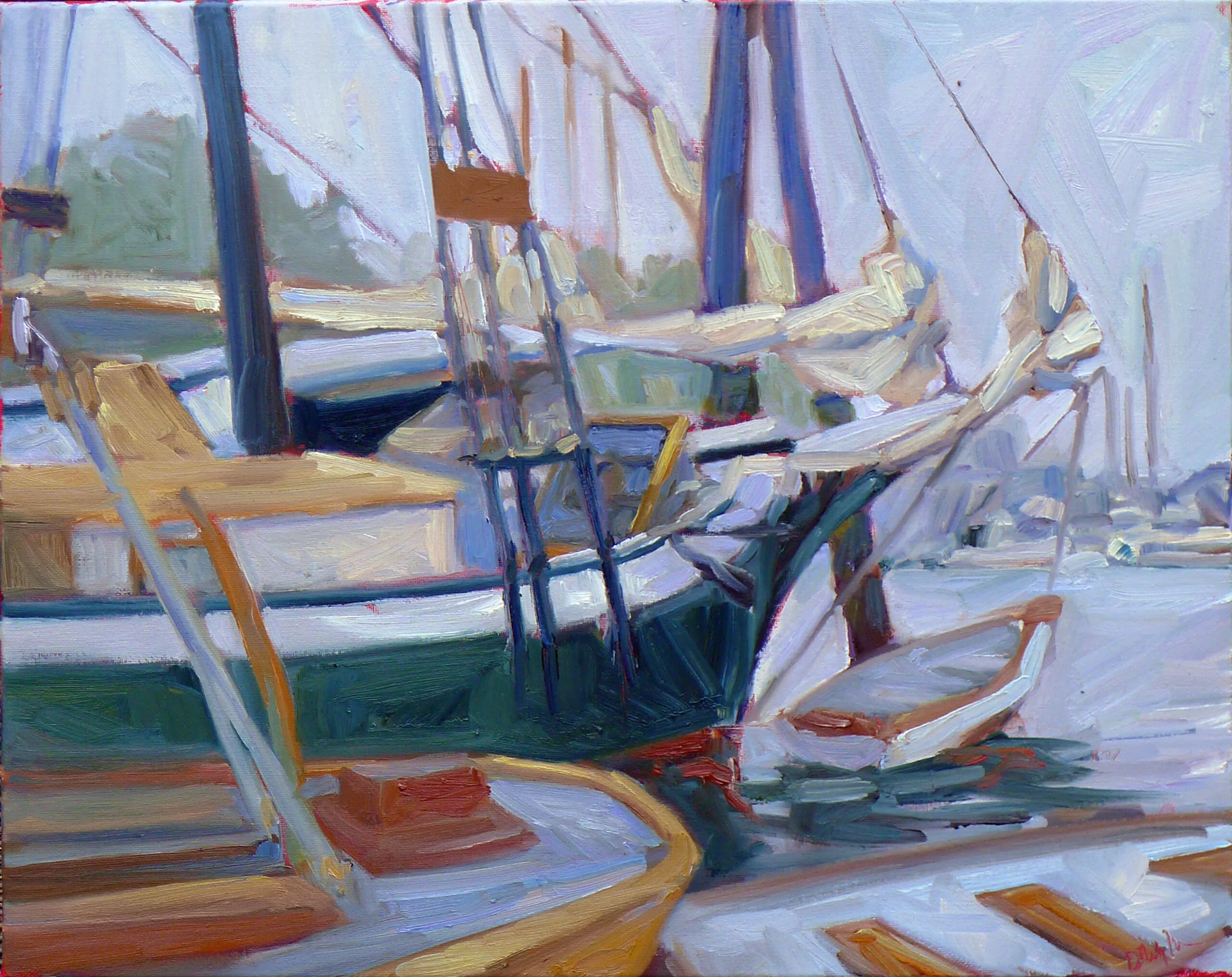

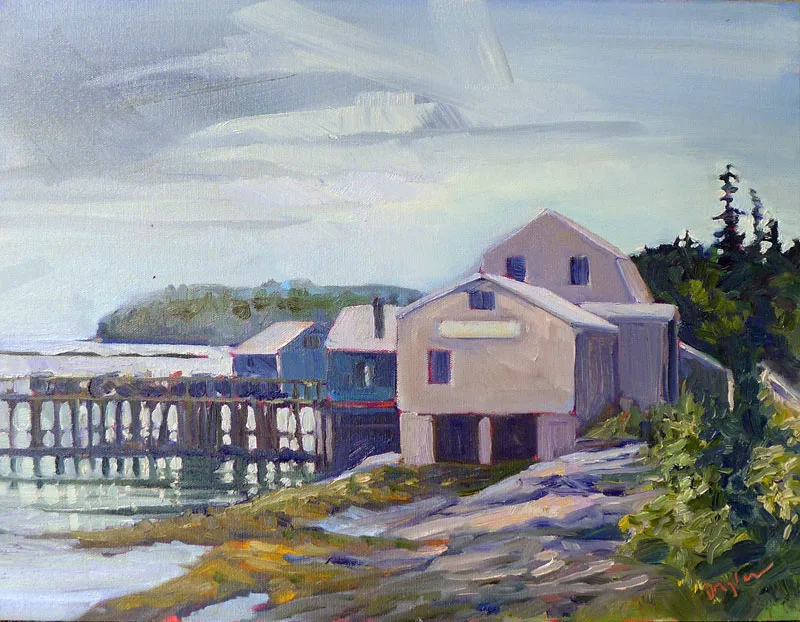
 Lobster pound, 12X16, oil on canvas, available.