Saying goodbye

Portraits of the dead are difficult, but they’re also satisfying and meaningful to paint.
Reunited with Jesus, by Carol L. Douglas

Occasionally I have the opportunity to do a portrait of someone who has shuffled off this mortal coil. These are the most difficult portraits to paint, because there are never good reference photos available. You’re changing angles and planes, guessing their height and weight, and dealing with terrible flash or shadows. Yet these are the best photos the family has.

It’s no wonder that they often feel overworked to me when I’ve finished; I’ve struggled to invent a structure from a snapshot. However, if Hans Holbein the Younger could paint his magnificent lost portrait of Henry VIII from a pattern, I’ve got nothing to complain about.
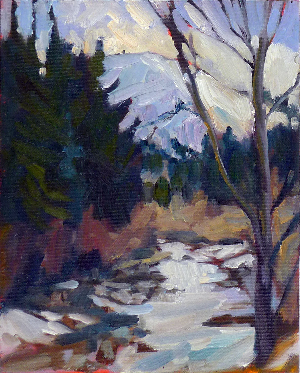
This infant died after birth, and all his mother had was a very blurry snapshot. It’s, unfortunately, the only photo I have of the painting.
Despite the technical difficulties, these reflections on mortality are among my favorite subjects. They’re a comfort to the survivors, who struggle to find meaning in their own personal disaster. They force me to draw from my own painting and drawing experience. Can I draw a plausible hand or foot with no reference photo at all? Most importantly, they’re thought-provoking.
Death is the deepest question facing mortal man. We all will die someday. That’s absolute. What will it be like? Where will we end up? Will we see our loved ones again? Will we work, or sing endlessly? (Will singing feel like work, or will I be able to belt out a tune like Kate Smith?)
The subject of this portrait passed away last summer, much too young—my age, in fact. Her daughter-in-law sought a way of comforting her husband on the loss of his mother, of reassuring him that her final destination was, indeed, Heaven.
This is someone I knew very well: my sainted Aunt Mary, who died the day before her sixtieth birthday. It’s a portrait of her servant’s heart.
I’d intended to concentrate on the figures and scumble a vague background. However, I’ve been thinking about angels for months. Angels are not cute putti or disembodied beings. They’re vigorous workmen in the Kingdom of God. It seemed like a good opportunity to paint them and think about what Heaven might be like. My deep subconscious apparently thinks that it’s a bustling kind of place.
For those unfamiliar with traditional Christian imagery, here’s some explanation: Jesus has a seat at the right hand of God because, in the Biblical era, that meant an honored guest shared eminence and authority with his distinguished host. But he’s relaxed enough to come down from his throne and welcome an individual to heaven, just as he was comfortable coming to earth to share our human struggles.
Only one person in this portrait is deceased. He’s dancing with his elegant and wonderful wife, in the Pennsylvania woods he loved so much.
The lamb on his seat-back is the Agnus Dei, the “lamb of God who takes away the sin of the world.” The figure to the right of God is the Recording Angel, mentioned by two Old Testament prophets. The orb in God’s hand is not a strictly Christian symbol. Its origin is the plain round globe held by the god Jupiter. This became a standard symbol of power in the post-Roman world. It came into Christian iconography through the Salvator Mundi. God’s outfit is quoted directly from God Inviting Christ to Sit on the Throne at His Right Hand (1645) by Pieter de Grebber. The floating cross on which the Throne of God sits is my own idea, although there’s certainly “nothing new under the sun.”
All this sounds very Catholic, and for good reason. During the time when Christian symbolism was evolving, the Catholic church was the only game in town. I was concerned that it would be too much for a modern client. It turns out that the recipient of the painting was raised as a Catholic. These will be familiar images to him. It’s just another example of how “all things work together for good for those who love God.”

Locking it in

How do you get to Carnegie Hall? Practice, practice, practice!

 Watercoloring at Schoodic Point with Rebecca Bense.
Sometimes, the people who struggle in painting class are the ones you’d least expect to have trouble. They’re accomplished in their professional life, and they’ve demonstrated the capacity to master complex subjects quickly.
That proficiency can be their undoing. When they don’t immediately understand the process, they’re flummoxed. Understand ideas helps, but it’s not everything. They have to learn another way of learning—grasping an idea from the hands, not the head.
The critic may understand all the elements that make a good painting, but it’s unlikely that he or she can paint or draw anything. The working artist may understand none of those things, but is still able to make enchanting paintings. It’s all about where they’ve concentrated their effort.
It’s not all about what the teacher says; it’s mostly about what you do with that information.
You’ll do better in a workshop or class if you aim to enjoy the process, rather than focus on the end result. You can’t expect perfection in a week. The more time you spend working on art, the better you’ll be.
In my classes, I concentrate on one aspect of painting each session. I’m limiting the scope of the project. Painting involves so many complex skills and techniques that if they were all thrown at us at once, we’d be overwhelmed. If you’re teaching yourself, you need to find ways to limit scope on your own. Choose one or two things that you want to improve—such as your color handling or mark-making—and concentrate on just those until you’ve made them better. Then move on to the next thing.
Painting buddies on Penobscot Bay.
A painting buddy is a great asset, as a coach, a sounding board, and for moral support. I love the interactions in my classes, because they’re uniformly positive. In most cases, people really do wish their friends the best.
Gaye Adamshas some shrewd advice about practice: “It is important to lock in the learning. Recognize that workshops shorten the learning curve, which is awesome, but they are not a substitute for easel time.”
It’s difficult to paint for a short time every day, because of the set up and clean up. However, you can always carry a sketchbook and draw. Drawing is the single best thing you can do to improve your painting, and it’s fun. Save the painting for those periods when you have a few hours of uninterrupted time.
Painting aboard American Eagle last summer.
Sometimes we need more support than can be offered by practice alone. In that case, a teacher is very helpful. Check out their class size, the work being done by their students, and—above all—if they’re painting in a style that pleases you.
My own August workshop at Schoodic Institute in Acadia National Park is sold out. However, there are still a few openings in my sketch-watercolor workshop aboard the schooner American Eagle, June 9-13, 2019. This is a class to learn how to catch landscape quickly and expressively in watercolor, pen and pencil. Materials are provided. For more information, see here, or email me for more information.

What mastery does for you

If you’ve learned to do one thing well, you can apply that technique to anything else you want to do.
Abstraction, by Carol L. Douglas. My hair looks a lot like this.
Those who know me will be surprised to learn that I occasionally brush my hair. I like it long, but it has more than a little ‘fro in it, which makes it hard to maintain. Earlier this year I went to a new hairdresser. Kim spent a great deal of time teaching me how to shape my hair without a hairdryer. When she was done, I looked smashing—until the next day, when it was back to its usual, out-of-control, self.
My first reaction was to just let it go, even though I hate it looking like a bottle brush. “But wait,” I thought. “If Kim could make this work, it means it’s possible. She showed me how; what I have to do is practice.” And so, I practiced. And while I’m still not as good at it as she is, somedays it doesn’t look half bad.
My friend Jane, by Carol L. Douglas. She’s taught me a lot of things over the years.
I see a physical therapist twice a week to work on my back. She’s very young, and she’s very tough. Every visit, she adds something new, kinky (in the pretzel sense) and too complex for me. “Now, remember to breathe,” she admonishes after she’s just given me eighteen other orders. I can’t seem to activate my back, contort my extremities, and draw air all at the same time. Every week, I leave feeling confused.
Yet I go home and try again, because I promised her that I’d practice three times a week. The first time is always awkward and messy. By the time I go back to my next appointment, though, I’ve got it more or less mastered. Three months ago, Krista told me, “Age is just a number.” I laughed; she’s my youngest daughter’s age. Now I’m starting to believe her. The improvement has been life-changing.
Listening in church, by Carol L. Douglas. Part of learning to paint is incessant drawing.
By the time we’re adults, we’ve all pretty well mastered something— CrĂȘpes Suzette, tax preparation, Greek diacritics, Morris dancing
 the list is as infinite and varied as humans ourselves. Here are some things I’ve mastered:
  1. Making pies;
  2. Cleaning;
  3. Numerical computations in my head;
  4. Driving;
  5. Folding laundry.

What about you? What are you good at?

For most people, it’s easier to enumerate our shortcomings than our successes, but that’s a mistake, as I wrote here. I certainly have things I’m not good at, starting with cookery. But I’m a bad cook because I have absolutely no interest in food.
That’s the first difference between success and failure: we succeed at what we love; we fail at what we dislike. “You could do it if you just tried,” I heard as a kid, and now I know it was true. Our failures represent disinterest far more than incompetence.
Bailiff in County Court, by Carol L. Douglas. Draw, draw, everywhere, even in court.
Thinking about our masteries is not a feel-good exercise; it’s an invitation to look at our learning process and figure out how it worked. I made my first pies in 4H. I found better recipes and techniques, other bakers gave me tips, and I’m still looking for ways to up my game.
It’s exactly the same with more complex activities like art, music and higher mathematics. Your successes determine the method you’ll use to keep developing. Other masteries not only tell you that you have the intellectual tools necessary to take on the challenge, but that you have a method of learning that works.
Notice that I’ve not said a word about talent here. It’s the most overrated quality in success. Thomas Edison was entirely right when he said, “Genius is one percent inspiration, ninety-nine percent perspiration.” Now get to work!

Painting outside in the cold spring weather

Your paints will work fine; you just need to dress properly.
Deer in snow, by Carol L. Douglas. I included this because I hit one on Saturday. She bounded off, but she’s gonna have a headache.
Normally, plein airstudents take it easy in the dead of winter, but not my current class. They’ve trooped faithfully to my studio through the worst weather. It’s still five days until Spring, but they’re all anxious to get outdoors.
Uninsulated spaces are pretty common in Maine, where the houses are attached to barns and sheds. One of my students has his studio in one of these outbuildings. In summer, it’s delightful, but in the dead of winter he switches to watercolor so he can work in his kitchen. Now that it’s warming up again, he wants to get back to oils, but even with a woodstove, he’s unlikely to raise the temperature much above the low forties. “Do you have any tips for me?” he asked.
Upper Reaches of the Pecos River, by Carol L. Douglas
It’s actually easier to stay warm outside, as long as the wind isn’t blowing. Even an overcast day will have some solar gain, whereas an unheated barn can get pretty damp and cold.
The most important part of your body to insulate is your feet. Standing in one place is far more taxing than walking around in the cold. A piece of carpeting on the ground or floor will help. Always wear insulated snow boots or snowmobile boats. Don’t have them? Get some oversize Wellies and several pairs of wool socks. Yes, you’ll waddle, but agility isn’t the issue here; insulation is. (This is a “do as I say, not as I do,” statement. I’m always going out in the wrong boots.)
I wear nitrile-palm fishing gloves to paint. They’re warm enough for all but the worst days, when I add a chemical hand warmer. And dress in layers, as you would for any winter activity.
If you’re working in pastel, you have no material-handling problems at all.
Will your paint work? Yes!
I regularly store my palettes outdoors in wintertime. I can pull them out of the snowdrift (assuming I can find them) and start painting immediately. Oil paints in a linseed oil binder don’t freeze until they reach -4.27° F or -20.15° C.
Even when we get below that point, oil paint seems to thaw with no problems. The oil binder doesn’t change color, viscosity or clarity, and nothing separates.
Haybales, Niagara County, by Carol L.Douglas. This was painted at -10° F., and the lumps are frozen paint. In addition, my cell-phone battery and my car battery both died from the cold. I must have been crazy.
In the summer, I move my palettes to a freezer. Most home freezers are set at about 0° F, so the paint is very chilled but not actually frozen. The cold temperatures slow down oxidation, which makes the paint stay open longer. (I had a dedicated chest freezer for my paints, but my husband insisted on filling it up with food. Now I keep my palette in a waterproof stuff sack so that it doesn’t contaminate our future dinners.)
As long as you’re above -4.27° F, your paints will work more or less normally. They may get slightly thick as you get close to 0°; just increase the amount of solvent very slightly and they’ll be fine.
Twilight on my stone wall, by Carol L. Douglas
If you use watercolor, you can add grain-alcohol, vodka or gin as antifreeze. A good rule of thumb is that you can add up to 20% booze to your paints before they get tipsy. But not all pigments can handle their liquor. Be prepared for excess paper staining, or different precipitation rates than you’re used to with plain water.
I know of no way, sadly, to keep acrylics from freezing. 
With any medium, you’re unlikely to have precise control of your brushes when you’re bundled up and your hands are in gloves. Work loose and don’t sweat the details.

Monday Morning Art School: the warm and cool of it all

Mixing paints is simple if you understand how pigments work.
Tilt-a-Whirl, by Carol L. Douglas. Painted plein air.
Let’s start with some simple review of the color wheel. Red, blue and yellow are the primary colors. Across the wheel from a color is its complement—the color that completes the circle. The complement of a primary color is always a secondary color. A secondary color is one made by mixing two primary colors.
The color wheel.
In theory, you can paint with just four pigments: red, blue, yellow and white. For beginning painters this is sometimes a good idea, because it’s the fastest way to learn color management in a hurry. It simplifies the thought process so you have only one decision to make at a time, and it is easier to get a more unified color scheme.
But there is a big limiting factor, and that’s the impurity of pigments. They all have overtones that muddy them up in certain mixes. That’s why your local paint dealer uses many, many more pigments than just red, blue, and yellow.
The takeaway lesson here is that different pigments may look similar out of the tube, but they reflect light (and thus mix) very differently. From Scientific Examination of Art: Modern Techniques in Conservation and Analysis, 2003, National Academy of Sciences.
Claude Monet’s palette shifted over time, but included these paints:
  • Chrome yellow
  • Cadmium yellow
  • Viridian green
  • Emerald green
  • French ultramarine
  • Cobalt blue
  • Madder red
  • Vermilion
  • Flake white
  • Ivory black (before 1886)

These are sets of paired pigments. That means he has a warm and a cool of each color. Gamblinmakes a modern version of this impressionist palette. It includes:
  • Cadmium yellow light
  • Cadmium yellow medium
  • Cadmium red light
  • Alizarin permanent (actually anthraquinone red)
  • Ultramarine blue
  • Cerulean blue hue (actually phthalo blue plus white)
  • Viridian
  • Ivory black
  • Flake white replacement (or titanium white)
Paired primaries.
Both Monet’s and Gamblin’s palettes are paired primaries plus green, white and black. I use paired primaries as well, omitting the green but adding in some other earths. (Here are my supply lists for oils,  acrylics, and watercolors.)
The distinction between warm and cool colors has been important in painting since the Impressionists. Warm colors are said to be hues from red through yellow and cool colors are said to be the hues from green through violet. Each hue around the color wheel also has a warm and a cool version.
  
There’s no factual hot or cold point because this is a poetical description that works, rather than a scientific fact. Much of what we believe about the psychology of color is hocus-pocus, but it’s true that if the light is what we call “warm,” the shadows are what we call “cool,” and vice versa.
When we say that lemon yellow is cooler than cadmium yellow deep, we mean that if you are trying to mix a greenish yellow, you’ll get a clearer shade with the lemon than you will with the cadmium. The warm-cool language is just a convenient way of saying that.
Different pigments may look the same when squeezed out of the tube, but there the similarity ends. Pigments are impure, and you have to learn and work around those impurities.
Today’s lesson is an experiment in working through those color shifts. I want you to make the above color chart, using three sets of paired primaries:
  • Prussian blue—Ultramarine blue
  • Quinacridone violet—Cadmium orange
  • Indian yellow—Lemon yellow

The purpose of this exercise is to understand how paired primary pigments work together, so that you can make neutrals when you want them, and avoid mud when you don’t.

Draw the chart onto a canvas, and then mix across and down for each square. The left column and the top row should be pure pigments. Fill it in, then, just like the multiplication tables of your youth. For example, the intersection of cadmium orange and ultramarine blue should be a 50-50 mix of those two colors.
Unless you’re painting in watercolor, the result should be opaque.
Let me know if you have any questions. And have fun!

Cause du Jour?

Be careful about reading your own times and beliefs into paintings.
Massacre of the Innocents, 1565-67, Pieter Bruegel the Elder, courtesy British Royal Collection
It has been, as my friend Poppy Balser from Nova Scotia noted yesterday, an unsatisfying season for winter painting along the North Atlantic. Squalls have resolved into freezing rain. That makes for bad optics and treacherous footing.
Monday, my pal Ed Buonvecchio and I had a date to paint. It stormed, so we rescheduled for Thursday. He texted me from Augusta in the morning. “0° here!” By 11 AM, it had reached a meager 16° F. with a light, biting wind. It’s one thing to be outside in those temperatures; it’s another to stand for hours in front of an easel. We’ll try again next week.
Artsy recently ran an essay about Pieter Bruegel the Elder’s winter landscapes and their relationship to the Little Ice Age, the intense cooling cycle of the earth that occurred between roughly 1300 and 1850. It’s interesting but hyperbolic reading, intent on making a statement about global warming.
Hunters in the Snow, 1565, Pieter Bruegel the Elder, courtesy Kunsthistorisches Museum
About Hunters in the Snow, Jonathan McAloon writes, “three men and their dogs—soggy, exhausted, and hunched against the cold—trudge home from a hunting expedition,” returning with only “a single small fox.” Yes, dogs and men are tired—as anyone is after hiking through deep snow—but there’s no reason to think they’re wet, and they certainly aren’t malnourished or dressed in rags.
There was much suffering during the Little Ice Age, including the Great Famine of 1315–1317, which took out millions of people worldwide. Seawater froze as far south as the Bosporus. The Swedes could march across frozen ocean straits to attack and defeat Denmark. Grains and vines failed in the northern reaches, and Norse settlements in the New World withered away.
Winter Landscape with (Skaters and) a Bird Trap, 1565, Pieter Bruegel the Elder, courtesy Royal Museums of Fine Arts of Belgium
But those settlements were themselves the result of another climatic fluctuation. The Little Ice Age followed on the heels of the Medieval Warm Period. The North Atlantic became so temperate that the Vikings sailed as far west as far as L’Anse aux Meadows, and probably beyond. Warmth in some regions of North America exceeded temperatures of the current (1990–2010) period. I’m not telling you this to ignite yet another tedious argument about global warming, but to set the context of Bruegel’s painting.
For three hundred years, Europe was warmer than normal, and then for 550 years, it was colder than normal. These weather shifts brought displacement, disease and drought. Naturally, people tried to explain them, but they also learned to exploit them.
The period in which Bruegel painted was bitterly cold, but it was also the third century of the Little Ice Age. To him, intensely cold winters were the norm. The people in Bruegel’s village are simply living through winter, much as we do today.
The Census at Bethlehem, 1566, Pieter Bruegel the Elder, courtesy Royal Museums of Fine Arts of Belgium
It’s important to link great paintings with their historical context; it teaches history, and it makes us understand the painter. But focusing on an imaginary struggle between the terribleness of winter and its harsh beauty deflects from Bruegel’s own focus. He was, of course, the first painter of snow, but he was also a faithful scribe of the Protestant Reformation.
Bruegel dealt with a problem which still bedevils us: how can the artist tell an ancient, unvarying story in a new language? His solution was to quote traditional Bible stories in the context of his own experience. This was not just the landscape, dress and activities of his times. It was the Reformation idea of priesthood of all believers, represented by the masses of people who inhabit his paintings. That marks him as a northerner as surely as the snow does.

The most expensive lesson I never learned

Sometimes it’s cheaper to let the pros do it.
Clary Hill, watercolor, by Carol L. Douglas
If you ever work in watercolor or pastel, you know the framing cost for those media is much higher than for oils. That’s because they’re fussy and difficult to frame properly. I occasionally use both in the field but not for events; I can’t deal with glazing and spacers in the high-tension moments at the end of a show. The worst injury I’ve ever sustained as a painter happened when I was levering a large sheet of glass into a frame. It snapped under its own weight and sliced my hand. That kind of thing makes you cautious.
Last autumn I did a residency at the Joseph Fiore Art Center. The result was eight oils and eight watercolors, all 24X36. One of each will be on display at the Maine Farmland Trust Gallery starting next week; later this year the whole set will go to the Jackson Memorial Library. It’s difficult to find a frame that works well with both oils and watercolor, but after much searching I found it in a deep, shadow-box moulding from Omega. I ordered enough material for sixteen frames. It has been sitting in the corner of my studio for a month, waiting for me to find the time to start.
Clary Hill, oil on canvas, by Carol L. Douglas
If you’ve done a lot of framing you should be wincing by now at the cost of this venture. The moulding was $800 for the stock alone. I went out yesterday to find the proper glazing material for the watercolors. (It’s easier to find a picture framer than a chain clothing store in my neck of the woods, and that’s how life should be.) The glazing would be between $90 and $140 per picture, depending on what I chose. Each watercolor would also need foam core, mat-board and spacers.
But being professionals, they wanted the frame in hand before they started cutting into their expensive materials. I’d have to return with it this morning.
Glade, watercolor, by Carol L. Douglas
“Then what,” I asked, “would the cost be to assemble the whole thing right here?” The price they gave me was only marginally higher than the materials cost. Bam! I’m dropping off the test picture this morning and they can do the fiddly bits. If it looks as good as I expect it will, they can do all eight of the watercolors.
I can usually copy most things I’ve seen built, and I take pride in craftsmanship, but I’m always working with home tools. I don’t, for example, have a power stapler; I join corners with careful gluing and brackets. Their joiners and staplers don’t just make things faster; they result in tighter, neater work. And while making things is fun, it’s hardly what you want to do when pressed, as I am right now.
Float, oil on canvas, by Carol L. Douglas
I’m in a point in my life where my scarcest asset is time, rather than money. But it’s never occurred to me to hire out work I can do myself. Still, maybe there are times it’s better to let the pros do it.
“I need an admin,” I whined to my upcoming portrait client yesterday afternoon.
“Virtual assistants are the thing. And usually at an attractive fee, too,” she responded. How that works, I don’t know, but perhaps it’s time to find out.

The pernicious practice of ‘feedback’

Ditch it, says a business consultant. We artists could learn something from him.
Blizzard, by Carol L. Douglas. We all want to be outside, so my students painted out the windows yesterday. I’ve done that a few times myself!

One of my students just came back from wintering in Australia. We’ve been practicing formal analysis in her absence. That means we consider a painting on the basis of its formal structure. This isn’t a like-vs-dislike process, but rather an objective one, talking about how the painter uses various techniques to advance his goals.

The protocol for criticism in my studio has always been the sandwich rule. We begin by pointing out something the person did well. We then discuss what might have been handled differently. We finish by pointing out something else that the person did well, so that each session ends on a positive note.
Snow squall, by Carol L. Douglas
This method has been mocked as “fluffy bun—meat—fluffy bun,” but that misses the point. Most people are all too aware of their failures and not aware of their strengths. Catch them doing something right and they’re likely to repeat it.
Since I hadn’t given my wanderer adequate instruction, she was lost. It didn’t help that the painting we were analyzing (by another student) was a stunner. It was all too easy to gush.
There’s nothing wrong with that, and we’ll continue to use the sandwich rule for our critique sessions. My goal in practicing academic criticism with them was different. I wanted to them to start seeing how form, shape, repetition and rhythm work together in painting. But I also wanted to take the judgment out of looking at art.
Tree line, by Carol L. Douglas
The Feedback Fallacy—an article that’s about to be released as a book—takes aim at the pernicious practice of feedback. Marcus Buckinghamwrites for a business audience, but what he has to say is applicable to the arts, in schools, and in families. He says our culture of criticism as based on three lies: 

  • The best way to help you is to show you something you’re too blind to see for yourself;
  • Learning is like filling an empty vessel—you lack abilities and it’s up to someone else to teach you;
  • Great performance is universal and measurable. Once defined, it can be transferred from one person to another, regardless of the recipient’s strengths and weaknesses. 

Focusing on an imaginary standard of greatness—and how we fall short—doesn’t enable learning. In fact, it shuts it right down. Learning happens when we see how we might do something better, not when our errors are pointed out to us. I can tell a student a hundred times to not dab, but it isn’t until I pick up his brush and show him how to make a proper mark that he will understand what “not dabbing” means. And it won’t be until he has made great marks—uniquely, idiosyncratically his own, with power and confidence—that he will have mastered mark-making.
My backyard, by Carol L. Douglas

Positive reaction, done right, is harder than negative criticism. You need to catch a person doing something right before you can comment. That means constant vigilance and a rock-solid understanding of process. It requires being able to differentiate between idiosyncrasy, style, and the real technical issues that can cause a painting to fail. Above all, it requires confidence. Nobody is supportive from a position of weakness.
We live in a corrosive culture, and it affects all our interactions. But one thing we can do is ditch the unnecessary feedback in the studio. If you’re ever wondering whether a ‘bit of advice’ to another painter is a good idea, just don’t.
Note: my next eight-week session in Rockport starts March 12. I think I’m full up, but if you want to be wait-listed, email me. Details on my classes are here.

Buying too many paints is a classic rookie error

Mix, don’t buy, your colors.
Grand Bahama palms, by Carol L. Douglas. There’s really no reason to buy any greens for oil painting, and just one will do for watercolors.

“[Our] watercolor instructor wants us to buy every color we need for a painting. I think it is unnecessary because you can mix colors to get the same or similar results. What is your opinion?” a reader asked.

I ask my students to buy a specific palette based on paired primaries, but that is very different from asking them to buy a specific pigment for a painting. An artist who regularly switches out his or her paints is akin to a pianist who rearranges the keys for each song.
Buying too many paints is a classic rookie error. It’s easy to get pulled into a revel of paint-buying when you’re feeling unsure. We’ve all done it.
Tomatoes, by Carol L. Douglas, was painted without any red or green on my palette. The red you see is violet and orange.
The clear leader in marketing romance, as Handprintcalls it, is Daniel Smith. I sometimes go to their website to feel the verbiage wash over me. “The mineral for our Red Jasper Genuine comes from India’s Gwalior region and is colored a rich red from iron. Historically it was often carved as amulets, vases and other decorative items.  India’s red jasper was one of stones used to beautifully embellish the Taj Mahal with other semi-precious stones that were carved and inlaid into the white marble in curvilinear flower forms
 Spiritually, red jasper is associated with the base or root chakra and helps to ground and energize/heal the body and provide balance and protection.”
I can infer it’s an iron oxide red. Not as romantic, but cheap and commonly available.
Headlights, by Carol L. Douglas. No black here, either. It’s ultramarine blue and burnt sienna.
Daniel Smith loves to tell people how to use each pigment: “Red Jasper Genuine is a wonderful color for landscapes, birds like the male common chaffinch and reddish egret, as well as animals who have a medium to light reddish coat like the red panda.” I imagine a studio with hundreds of tubes of their paint, in careful rows, tagged, “for sunlit shadows,” or “for moonlight,” or “for powerful, monolithic shapes.” It’s all very entertaining and poetic, but will do nothing for your painting.  
Get tough, Reader. Ask your teacher the purpose in all these single-use paints. If the answer isn’t satisfactory, it’s time to find a new instructor. Mixing color is so integral to painting that a class that avoids it isn’t going to teach you anything useful.
Ogunquit rocks, by Carol L. Douglas. All four paintings were done with the same palette.
On the heels of that note came another. “Do you teach color mixing by visual understanding or by paint name?” a reader asked. “The moment I understood that there was no such thing as red, blue, and yellow, the world changed and it became possible to see the nature of each color.”
I teach color mixing (as distinct from color theory) on the basis of pigment. I’ve developed, over the years, a stable palette that gives me the widest gamut (range) of color tones. They don’t include convenience mixes.
These are combinations of two or more pigments to approximate a different pigment. Many of them were developed as substitutes for antiquated pigments that may have been pulled from the market because they’re fugitive or toxic. They are limited, because:
  • Every time you add another color to a mix, you’re adding overtones;
  • You can easily make the mix yourself if you should need it and;
  • They’re inconsistent. Their marketing name tells you nothing.

How do I know what pigment(s) are in my paint? They’re written on the tubes, in tiny letters. Here’s a quick primer on how to read a paint tube. It sounds complicated, but it’s nothing compared to the frustration of painting with the wrong materials.

Monday Morning Art School: landscape from abstraction

Create a drop-dead painting from a so-so scene.
Wreck of the SS Ethie, by Carol L. Douglas
Certain places are fascinating for something other than their pictorial value. The angle, the light, and the setting aren’t conducive to a great composition. An example of this was the wreckage of the SS Ethie in Gros Morne National Park in Newfoundland. This is a lovely shipwreck story featuring a dog and a baby, but I’ve told it before.
I’d driven up the Great Northern Peninsula specifically to paint this wreck (and to visit the Viking site L’Anse aux Meadows.) When I arrived, I realized it was nothing more than a beautiful cove with a debris field spreading for thousands of feet along a rocky shore. There was no hulking wreck to paint, merely broken things lying around—much like my parents’ barnyard, in fact.
The actual debris field looks like this.
Hurricane Matthew was bearing down on us in the form of a blizzard, so I took photos and completed the painting elsewhere. However, I’ve used this technique successfully in plein air painting as well.
The cove itself is beautiful, and I could have painted a nice anodyne scene of it—lovely, but saying nothing about the wreck. I could have done a close up of one bit of machinery. Instead, I created an abstraction and fitted the details in to it. I do this whenever I’m feeling blocked, either because the subject matter isn’t fitting naturally, or because I’m too anxious.
Initial abstraction for Ethie, based on the word Maelstrom.
To do this, I improvise a series of shapes on a large canvas, much as if I were going to paint a non-representational painting. The only guidance I give myself is a word. In the case of the wreck, the word was maelstrom. When I demonstrated this technique last week for the Bangor Art Society, the word was mourning. Another painting I did recently started with a phrase, Dwight’s school bus. It was nonsensical; my son walked to school. That word is generally inspired by place or events, and it’s surprising how often the painting ends up reflecting the word I started with.
After the Bangor Art Society decided this was a tree, I turned it that way and started making it into one. Photo courtesy of Teddi-Jann Covell.
I start this process with a line. In the Bangor painting, it was a flat, thick line that crossed the canvas. In the Ethie painting it was rounded and rollicking. I never start this with a sense of up or down, and I often rotate the canvas while I work. This process can be the longest part of a painting. I’m searching for the composition from my subconscious, rather than from reality. Sometimes it’s based on my initial line and sometimes the line gets subsumed into something else entirely.
When the abstraction is done, I rotate the canvas to see how it might represent something real. At the demo, I asked participants to identify things they saw in my abstraction. Suggestions came fast and furious. I’d had them draw alongside me, so I then asked them to identify things they saw in their abstractions. Total silence. I asked them to trade with their neighbors and again the room was full of suggestions.
There’s a lesson here. We’re born with the capacity to recognize objects in abstract shapes; it’s part of what makes us intelligent and aware, and keeps us safe. A half-seen shape tells us, almost instinctively, when we belong on high alert. But we moderns tamp that down. We allow subliminal shapes to appear in our drawing, but then resolutely refuse to recognize them. That’s where turning the canvas is so helpful. The mind no longer sees it as ours, but as something new.
My demo painting for the Bangor Art Society. It’s not finished to a level I aspire to, but I was getting tired.
Once I find the objects in my abstraction, I hew to them fairly tightly, converting them into figurative art. But I don’t always solve all the corners of my paintings at the first run. After I’ve drawn in one thing, another suggests itself. And sometimes I change up passages on the fly.
“I feel like I had to understand a lot about light/shadow, perspective, and value before I could do an invented landscape with any authenticity,” a painter commented. This is true, but we all know more than we think we know. And painting from memory is a great way to expand one’s visual memory.
Furthermore, it’s not necessary to do this totally from memory. Try it outdoors, subbing in that rock over there or that tidal pool over there. You’ll end up with a sense of the place, rather than a literal transcription of the place. If you use photo reference, don’t start adding details until you’re well along in the design process. Remember that reality should always be subservient to design.
This reaching down inside yourself is difficult business. But it’s worth experimenting with. I hope you’ll try it and let me see your results.