Notre-Dame de Paris

Restoration and destruction both start with a spark. Which will it be?
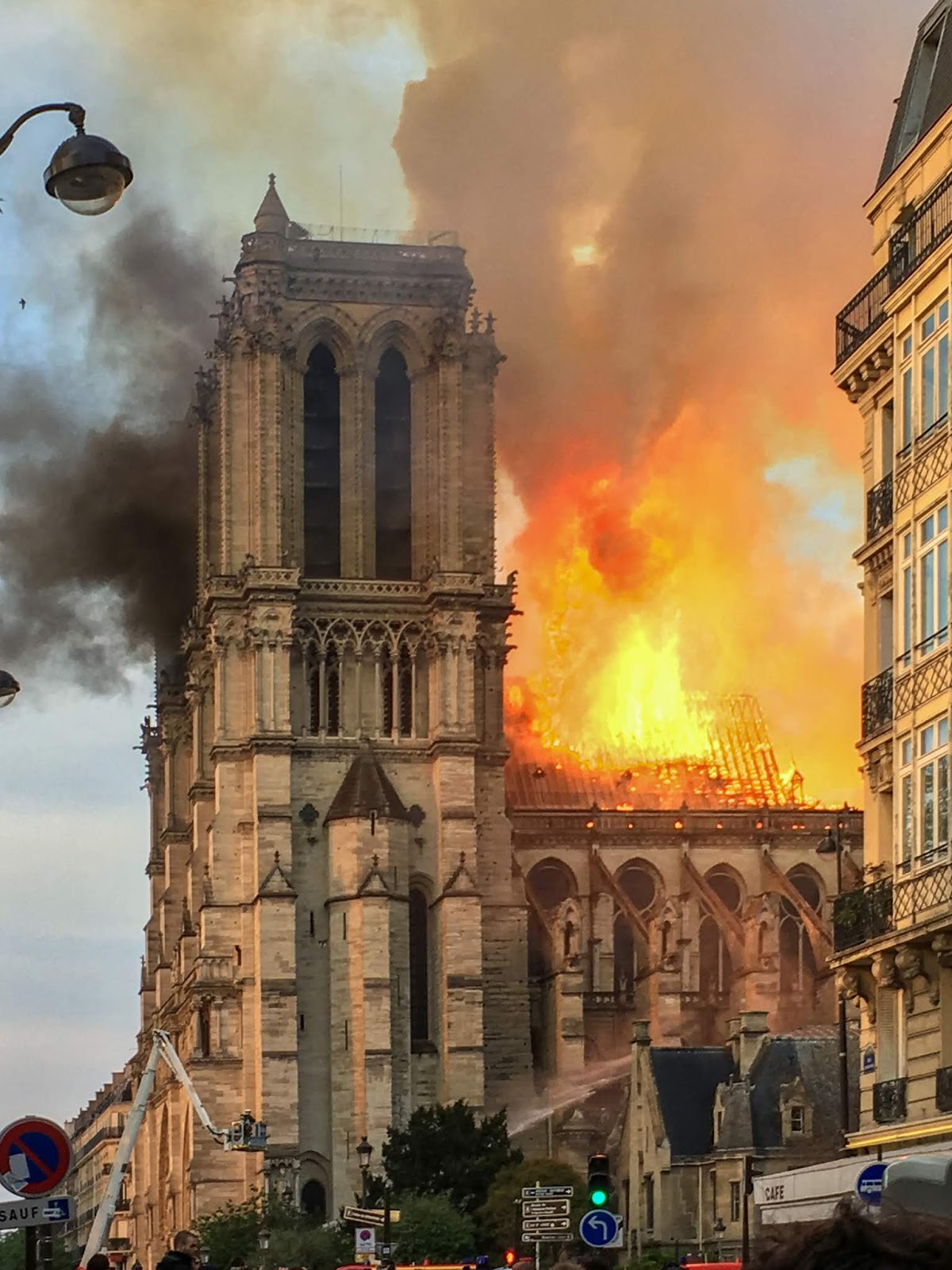
Notre-Dame on fire, April 15, 2019, courtesy LeLaisserPasserA38, Wikipedia.
I’ve never been to France, a deficiency I always meant to correct someday. Now I will never see Notre-Dame de Paris. Whatever is rebuilt there will not be the 800-year-old monument to a nation and a faith that stood there on Monday morning.
Before there were Christians, before there was a France, there was a Roman temple to Jupiter on the Île de la Cité. Around the time when Gaul was transferred from the Romans to the Franks, a basilica was erected on the site. It was dedicated to Saint Stephen, the first martyr of Christianity. In 857, it was remade as a cathedral (which is the seat of a bishop). Successive remodelings attempted to keep up with the growing population of Paris, always unsuccessfully.
The Pillar of the Boatmen is a monumental Roman column from the first century AD. It was found re-used in the 4th century city wall on the Île de la Cité, and indicates a shrine on this site before the conversion of Gaul. This block represents the gods Tarvos trigaranus and Vulcan. Courtesy Musée National du Moyen Age, Thermes de Cluny.
In 1160, Bishop de Sully embarked on an ambitious plan to raze the Cathedral and replace it in the trendy new Gothic style. The cornerstone was laid in 1163 in the presence of King Louis VII and Pope Alexander III. De Sully lived long enough to see the basic structure in place; his successor built the transepts and most of the nave. The west façade and the rose window were not finished until the 13th century, by which time the transepts were being remodeled. Better supports were added in the form of flying buttresses, one of the great engineering developments of the Middle Ages.
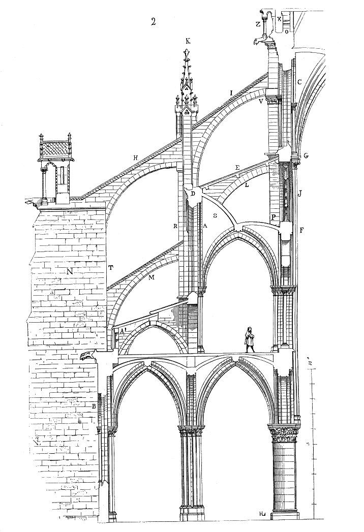
The complex, multi-tier flying buttresses of Notre-Dame.
This fire is not the first hit Notre-Dame has taken, but it’s the most serious. Huguenots destroyed some of its statuary in the iconoclastic fury that swept Europe in the 16th century. The Sun King updated it in the severe classical tastes of his time. As Robespierre and his radical brethren tried to stamp out Christianity during the French Revolution, the Cathedral was dedicated first to the Cult of Reason and then to the Cult of the Supreme Being. Of course, its treasures were destroyed or plundered. Twenty-eight statues of biblical kings on the west façade, mistaken by the mob for statues of French kings, were beheaded. The remaining statuary on the west façade, except for the Virgin Mary, was destroyed.
The Coronation of Napoleon, by Jacques-Louis David, 1805-07, courtesy of the Louvre.
Eventually, the church settled into life as a warehouse. Then Napoleon Bonaparte banned the cults and restored Catholicism. He was coronated at Notre-Dame in 1801.
By then, the Cathedral was a half-ruined mess. In 1844, an ambitious, 25-year reconstruction project ended with the Cathedral being renovated to its modern condition. It survived two World Wars mostly unscathed.
Notre-Dame in the Late Afternoon, 1902, Henri Matisse, courtesy Albright-Knox Art Gallery
Modern Catholics may feel that their church has been burning down around them for quite a while now. They’re under assault from within and without. In another sense, that’s true of the church as a whole, as Christians suffer martyrdom in unprecedented numbers worldwide. The blaze assumed a metaphorical power, coming, as it did, at the start of Holy Week. This is Christendom’s most solemn and significant observation.
The fire corresponded with the cremation of my missionary friend, Lori Delle Nij, in Guatemala. This morning she and Notre-Dame are in ashes, as you and I and everything else here in the Earthly City will ultimately be.
But it’s important to remember how Holy Week ends. I was moved by images of Parisians on their knees singing hymns as their Cathedral blazed in front of them. We are all promised Resurrection. “God moves in a mysterious way, His wonders to perform,” wrote the poet William Cowper. Let it be so.

Monday Morning Art School: Palette knife painting

If you’ve ever frosted a cake, you know how to use a palette knife.
Fishing village, by Carol L. Douglas
Most of what we artists use on our palettes are what are currently called “painting knives.” A palette knife, in current parlance, is flat like a putty knife. The ones with cranked necks are, according to purists, painting knives.
That’s not a distinction based in practice. Nobody wants to scrape their knuckles either on the palette or on the canvas, so small flexible knives are better for nearly everything. However, you do need a knife with a crook in the neck to paint, and it should be steel and flexible. (You’ll never get any kind of results with a plastic one.)
This demo painting was done on top of an unfinished study I did in the rain in Corea, ME. I never got past the underpainting that day. You can see the original drawing at the top.
Palette knife painting is an impasto technique, meaning it’s best done on top layers. Underpaint in the traditional way, with paint thinned with solvent. Here value is more important than hue. Because you may let certain areas of the underpainting show through, working with analogous colors in the underpainting can be good technique.
Excessive smearing in a palette-knife painting comes from either mixing your paints insufficiently or digging when you apply the paint. Either way, it takes away from the jewel-tone beauty of good palette knife painting. Thoroughly mix your colors before applying them. I add a drop of medium because I don’t want any oxidation in the top layers of my paintings. But limit it, because you can easily make the paint too thin.
Human Ingenuity, by Cynthia Rosen, courtesy of the artist. Note the clean edges and lines Rosen is able to achieve with her knife.
If you’ve ever frosted a cake, you know how to hold the knife. You want new layers of paint to glide over what’s there. A light hand prevents digging. Wipe the knife clean after each color, because it takes very little color to contaminate a stroke.
As with paint brushes, use big knives for big, flat passages and little knives for detail. In general, you’re going to paint using the edge of your knife or by dragging the point.
Palette knives excel at hard edges. They can be added to a brush painting to give less-studied marks to things like power lines, blades of grass, etc.
The Tide Pools, by Cynthia Rosen, courtesy of the artist. Note the pure colors, which were achieved by pre-mixing.
They’re also great for softening the edges where contrasting areas meet. For example, the traps in trees (sky holes) are easily made by floating the sky color across and over the tree-line. This is just a variation of the painting technique called scumbling, where a layer of broken color is added over other colors so that bits of the lower layers of color show through. Palette knives are also tailor-made for sgraffito, which just means scratching through the top paint layers to draw with an incised line.
One of the down-sides of palette-knife painting is the long dry time. You can’t paint over thick paint that’s not thoroughly cured. You’ll need to wait, often a significant amount of time, to rework passages.
This also affects the longevity of your work. If you layer thick paint with no respect to the “fat over lean” rule, it will be prone to cracking. A board is a better substrate, but if a canvas is necessary, you’re best off limiting the amount of paint you apply with a knife.
For those interested in further study of palette knife painting, I recommend Cynthia Rosen. My students’ assignment this week was to study her paintings, here. Note the clarity of her color (achieved by premixing), her incisive linework, and the drawing and composition that undergird her paintings. Everything that matters in brush painting also matters in palette-knife painting.

The romance of the sea

What makes a person buy a tapped-out wooden boat and then spend a lifetime restoring and operating it?
Breaking storm, oil on canvas, by Carol L. Douglas. I used American Eagle for my model, but the sea and sky are imaginary. Owl’s Head light is not, though.
American Eagle is one of a dozen windjammers plying the Maine coast. These historic schooners have been retrofitted from cargo or fishing as a niche vacation experience. Around 6000 people take an overnight schooner trip in Maine each summer. To put that in perspective, 164,513 people visit some part of Walt Disney World Resort every day.
There are no crowds, screaming kids, or queues on a schooner. There are, however, lines, which are sometimes called sheets, painters, or even ropes. A boat is a linguistic treasure-trove, but I digress.
Schooner captains wear three hats: they’re master sailors, fine carpenters and they run hospitality businesses. To make this work, they must have a stubborn streak of romanticism. Without that, all of these big boats would have been left to rot. Running a schooner business is incredibly hard work.
More work than they bargained for, by Carol L. Douglas. That’s the former Isaac H. Evans, now Boyd N. Sheppard, after a Coast Guard inspection. 
Our annual watercolor sketching trip aboard American Eagle is from June 9-13. (The practical details are here.) Here are some questions that readers have asked me:
How much time do we spend painting? We have to squeeze our work in between eating delicious meals and exploring islands, but we usually get about six hours of painting in every day.
I’m dieting so this is the part of searching through photos I don’t like. That was fresh caught salmon, cooked immediately. Courtesy American Eagle.
Can I help sail the boat?Guests are encouraged to participate in running the ship, including hoisting sails, taking a turn at the wheel, or helping out in the galley. Or they can read or watch the world go by.
What do we eat? Our meals are prepared on a woodstove below deck. They’re terrific. The mess-mate, Sarah, lives off the grid in her other life. The cook, Matthew, has adapted admirably to his 19th century work space. What they turn out from that kitchen is nothing short of miraculous.
I’ve never been on a boat before. What if I get seasick?  Motion sickness is less of a problem on schooners because they move more gently through the water than smaller vessels. And our part of the coast is protected from weather by the many islands lying offshore.
What should I bring?All your painting supplies are provided, but you’re welcome to bring other water-based media. As for clothing, Shary will send you a list before you get here.
Big-Boned, by Carol L. Douglas. That’s schooner Heritage taking her turn on the slipway.
How well-maintained are these vessels? Right now, they’re coming in to the slipway at the NorthEnd Shipyard for their annual spring fit-out, where they are scraped and repaired and undergo a rigorous Coast Guard inspection. They all carry modern navigation, rescue and communication devices.
Tell me about the boat we’re sailing on. She was launched in 1930 at Gloucester as Andrew and Rosalie, named for her first captain’s children. She was the last auxiliary schooner (powered by both sail and engine) to be built in that port, and was one of Gloucester’s last sail-powered fishing vessels.
Andrew and Rosaliewas used for fishing by Patrick Murphy and family until 1941, when she was sold to the Empire Fish Company. They renamed her American Eagle and converted her for use as a trawler.
I was derailed yesterday leaving home to paint Mercantile on the slipway. I forgot a few things: sketchbook, brush tank, wipe-out tool, and to cap it, my paints. Had to do this with the dribs and drabs on my palette, which explains the, er, limited palette. When I ran out, I went home.
In 1984, she was purchased by Captain John Foss and restored for the tourist trade. American Eagle is on the National Register of Historic Places and is a National Historic Landmark. She is the sole surviving representative of the transitional period between traditional sail-powered fishing vessels and more modern trawlers.
Boothbay Harbor’s Windjammer Days publishes a great list of the 16 boats that will visit their harbor for the 57th Annual Windjammer Days Festival this June. That includes Maine’s dozen and four interlopers from Massachusetts. It’s a fun event.

Try, fail and try again

I Got This, by Jane Chapin. For more information, see her website here.

How to get in a national art show:

  • Assemble all your best qualifying work in one room. Take the very best photos you can. Stare at them intently.
  • Pick your two favorites and eliminate them. 
  • Have a drink (I’m kidding—never drink when critiquing your own work)
Vendor, by Jane Chapin. For more information, see her website here.
Okay, so the truth is that there is no way to assure you get in. We all try to do our best work all the time and most of us are our own worst critics. At best, we can eliminate entering works with glaring compositional flaws, but there are a whole host of unknowns we cannot control.
Is your beautiful red barn the 358th red barn the juror looked at that day in a sea of 2500 paintings? We have all posted at least one thing on Facebook at some point that ticked someone off but the juror is probably not out to get you. Jurors do not set out to be subjective—they donate their time and painstakingly go through entries multiple times to get their ‘keepers’ and the last cuts are minute details. 
Lower Colonias, by Jane Chapin. For more information, see her website here.
How to be ok with rejection:
  • If you enter national shows, consider your entry fee a donation to the organization, rather than an expectation of a payoff.
  • Don’t take it personally. I am a signature member of 3 organizations and my batting average is about 50%. Some artists have much higher percentages and that’s ok too. 
  • It is not luck but perseverance and numbers. Sort of like the more you paint, the more truly good paintings you will have. The more you enter, the more chances that there is one that no one can deny you entry. 
  • Be happy for your friends who got in. Even if you feel yours was better, cheerfully congratulate them. At some point the shoe will be on the other foot. 
  • If you don’t agree with these competitions and don’t like the angst they produce, not doing them is an option. I know many fine painters who do not.
Shoeing Scout by Jane Chapin. For more information, see her website here.
It is truly astounding how may really good painters there are today. Among all levels there are paintings that are great and not so great. In museums there are paintings that would be rejected for shows. In famous artists’ books there are plein air sketches that would not get the artist into modern plein air competitions.
Relax, be kind to yourself and paint on. 
Jane Chapin’s work has been exhibited in Oil Painters of America, American Impressionist Society, Salon International, International Guild of Realism, American Women Artists and the Richard Schmid Fine Art Auction. Her plein air work has been accepted into juried shows in Easton, Callaway Gardens, Florida’s Forgotten Coast and San Diego Museum’s En Plein Air.  She has also served as an entry and awards juror for regional shows and as an instructor in both classroom and private venues. Her work can be seen here.

What happened to art school

For a long time, I regretted not getting an MFA. That might have been the best thing that ever happened to me.
Cape Elizabeth Cliffs, by Carol L. Douglas.

Over the last century, a profound revolution has taken place in art school. Art became more about making political and social statements and less about acquiring the skills to make a good picture.  “[A]nd so the study of art would change, because the taking of stands and the making of novel statements require less practice than painting well,” wroteartist Jacob Willer.

Willer was commenting on British art schools, but the same is true in America. In both countries, there are some notable exceptions. However, good private art schools are extremely expensive. Public universities, in general, teach art very badly. Their art departments enthusiastically embraced the interdisciplinary ideas of the 20th century. These held that art was important by nature of its intellectualism, not its craft.
Breaking storm, by Carol L. Douglas
As craft withered and died, a false distinction was drawn between thinking and making, with thinking being decidedly more important.
Matisse believed that the only way for a student to escape fashion was to become immersed in history, and to build his own tradition “by reconciling the different points of view expressed in the beautiful works by which he is affected.” Yet the arts educators of the 1960s thought their students were overburdened by fussy old masters. They had to “do some erasure.” Their tactic was to unpin art from history, a relationship that had endured for as long as we’ve made art.
Art from mid-century forward became an ever-more frenzied whirl of fashion and exploration, and much of this was good. Yet educators missed the obvious: the artists who were doing that work had been trained in the old regime. Beneath their ideas was a good working knowledge of painting, design, and draftsmanship.
Towpath on the Erie Canal, by Carol L. Douglas
“[I]f there is any creed that unites many young artists today it is the creed of anti; anti-intellectualism, anti-academicism, antiauthority,” wrote art historian Ernst Gombrich, who mercifully died before he could see his worst fears realized. “Art history is intellectual, it is academic, it is even authoritarian, for it teaches that Michelangelo was a great artist and you can like it or lump it.”
‘The attempt to turn artists into universal intellectuals left them embarrassing amateurs in everything,” wrote Willers. Craftsmanship has been replaced by “learned sociability and the comprehension of certain codes of behaviour.” If that doesn’t sound ultimately irrelevant, what does?
It was not until the 1980s that the purge of craft from the academy began to bear fruit. Those trained in the old ways retired or died, leaving no skills to teach. Since then, too many of our art graduates have been taught through theory alone, with craft and art history as optional add-ons.
Snow at higher elevations, by Carol L. Douglas
Today we’re beginning to see the wheel turn, but who is left to teach those traditional skills? Many of the current great masters of draftsmanship are working far away from academia.  “If you look at the best artists everyone has always looked at… eventually you’ll discover a standard for yourself. I think that’s the best we can do now,” write Willers.
Meanwhile, his essay has provoked the traditional defense of the indefensible. A return to traditional drawing and painting studies would be “completely misguided.” Some have even said it’s exclusionary, since the proper supplies are expensive.
Meanwhile, way out here in the hinterlands, there are traditional painters and draftsmen quietly honing their skills and passing them along to others. I rather like the idea of being a counter-revolutionary, myself. Don’t you?

Slow looking

Don’t blame people’s short attention spans. Blame your overstuffed museums.
Above the Eternal Tranquility, 1894, Isaac Levitan, courtesy State Tretyakov Gallery
A landmark study conducted at the Metropolitan Museum of Art in 2001 found that the mean amount of time visitors spent looking at great works of art was 27.2 seconds. However, the mode—the number seen most often—was just 10 seconds. In 2017, the study was repeated at the Art Institute of Chicago, with almost exactly the same results.
There was one striking difference, however; the later study found those times included people taking selfies with the work. This was common across genders, race and age. It meant that the already scant time that museum-goers were spending looking at paintings was being deflected into the act of making self-referential photos.
Westminster Abbey with a procession of Knights of the Bath, 1749, Canaletto
Recently, Tate Modern cited a study saying their average viewer spends eight seconds looking at a piece of art. Another study declared that gallery goers spend two seconds looking at the painting and eight seconds reading the label, a trend that depresses me more than the selfies. The illustration for the latter story was of a couple reading the label for a large solid-grey canvas. Perhaps two seconds was actually too long.
Clearly, people don’t spend much time looking at paintings when they visit museums. But for some reason, museums are very popular with tourists. Among the world’s leaders are the Louvre, with 8.1 million visitors; the Met, 7 million; the Vatican Museum, 6.4 million; Tate Modern, 5.6 million; and the (US) National Gallery, with 5.2 million. That’s a lot of people milling through buildings stuffed with things nobody wants to look at.
To combat this, Tate Modern is pitching something called slow looking. They want you to look at paintings for ten minutes, but saythat five minutes or half an hour are okay, too. “To keep track of time, set a quiet timer on your phone or try simply counting a number of breaths.”
Portrait of a Lady, c. 1460. Rogier van der Weyden, courtesy National Gallery of Art, Washington DC
Please, no. Painting and sculpture are unique in that they don’t impose obligations on our time. Once we open a book or take a seat at a movie, we’ve obligated ourselves to sit through a narrative whose duration is laid out for us. With painting, we’re free to walk right past or to take a bench and sit for an hour.
Obviously, nobody metered the time spent looking at all the works in any of these major galleries. The Metropolitan owns 2 million pieces; the Art Institute of Chicago has about 300,000. (Of course, only a fraction of them are on display.)
What works were they measuring? There’s more content in a Roger van der Weydenaltarpiece than a stripe painting by Kenneth Noland. There’s the architecture, the starched linen coifs, a blood vessel throbbing below a monk’s tonsure, the oddly-plucked hairline of a lady, and angels with wings that match their gowns.
The Harvesters, c. 1565, Pieter Brueghel the Elder, courtesy the Metropolitan Museum
One of the powerful attributes of visual art is how it can disengage you from time and place. Stand in front of a Canaletto and you’re suddenly in Venice. But that isn’t going to happen with someone at your elbow, silently pushing you along.
Of course, paintings were never intended to be hung in a crowded museum. They were originally in churches, dining rooms, drawing rooms, and public halls, as part of the experience of that place. People looked at them over many years. Perhaps the problem is not our digital age, but the massive warehouses of art we’ve created and called museums.

Monday Morning Art School: drawing a boat

This exercise is like learning perspective. You’ll never draw this way in the real world, but practicing it will improve your harborside skills.
Cadet, by Carol L. Douglas

I tell my students that it’s best to paint a boat from the deck of another boat or a floating dock. If you can’t, then keep your distance. The tides in Rockport average about 12 feet. That means that if you stand on the public landing painting the lovely and graceful Heron, her angle is going to shift more than 20° over six hours. That’s an impossible perspective shift to manage.

There aren’t tides on lakes, obviously, but the waterline-view of a boat is still often the loveliest view.
Two figure eights. The top one is going to be stern-facing; the bottom one is going to be bow-facing. Thus the lines on the right are straight for the sides of the transom, curved for the bow. I made the bow loop slightly bigger because in practice the bow is likely to be higher.
I learned to draw boats based on figure eights. This is simple. You can master it in the studio before you go out to tackle the real thing. Since the bow of a boat is generally higher than the stern, I draw that end of the figure eight higher. The figure mustn’t be two circles, but you can make it as short or long as you wish. There’s no reason the two loops must be equal, although you should try it that way first. It’s easiest to do this when you’re not trying to be overly precise.
The fattest points of your figure eight are going to be the stern and bow of your boat. The keel curves in the front, so that line is drawn as a curve. The stern may curve in a fantail or be a flat transom. That varies by the boat.
The next step is to erase the extra lines and add a little shading. I took the liberty of adding a little extra height to the bow on the bottom.
In the top example, I put the transom forward; in the bottom drawing I put the bow forward. The important thing to realize is that the figure-eight is just like an optical illusion: it can go either way. Once I draw the curve or cut off the transom, I just erase the extra lines and gussy it up with some shadows. 
In the very old days, small boats were sometimes clinker-built, meaning they had overlapping planks that made for beautiful curving lines beloved of artists. If you see those planks on a modern boat, they’re molded. I halfheartedly faked them in on my drawing, because I no longer entirely believe in them.
The actual direction of the boat is like an optical illusion; it can flip either way. The Scrumpy’s notch is a little crooked; sorry.
Drawing boats like this is like drawing perspective. You need to know how to draw 2-point perspective but you’ll never really draw those rays on your canvas while you’re working. It’s an exercise that teaches you a principle that you then incorporate into your work.
Dinghy, by Carol L. Douglas, shows how fast that can be done in practice. This was a workshop demo.
The same with this kind of boat drawing. The take-away lesson is this: as long as you have the relative heights of the pieces of your boat right, it can swing on its anchor all afternoon without significantly messing up your painting. Block it in with initial measurements and let it go from there. The parts will stretch out or grow shorter, but their heights will always remain the same. 
Once you see it as a process of squeezing and lengthening the horizontal shapes while leaving the heights the same, drawing moving boats is easy.
That liberates you from worrying when your boat—as it will—wanders around its mooring. I did the little sketch above to demonstrate that.
This was first published on February 12, 2018, but some things bear repeating.

Do you have the right mindset for learning?

The important thing you bring to class is not your prior painting experience, but your attitude.

To teach painting effectively, one must not only know how to paint, but be able to break that down into discrete steps and effectively communicate those steps to students. That’s straightforward, right?
What isn’t so straightforward is how one prepares to be a good student. Learning is a partnership, and students always bring attitudes, personality and preconceptions to the mix. Unless a class is marketed as a masterclass, you don’t need to worry overmuch about your incoming skill level. However, some rudimentary drawing experience will make you a stronger painter.
Photo courtesy of Jennifer Johnson.
More important is intellectual openness. This means the ability to receive correction and instruction without being defensive. (I’ll freely admit I came late to this myself.) The greatest teacher in the world is useless if you’re not prepared to hear what he or she has to say.
Nobody ever paints well when they’re integrating new ideas; it’s far easier to stick with the same old processes even when they don’t work particularly well. They’re familiar. Students should come to class expecting to fail, and even to fail spectacularly. “When I take a class, I produce some of the worst crap in the world, but I will have experimented,” one artist told me. The people who produce pretty things in class are often playing it safe. They’re scared of pushing themselves past what’s comfortable.
Are you worried that you’ll lose your style if you do it the teacher’s way? Your inner self will always bounce back, but hopefully you’ll have learned something that enhances that.
What we teach is a process. The primary goal is to master that process, not to produce beautiful art in any style. If that happens, it’s a bonus, but the real takeaway ought to be a roadmap you can follow long after your teacher is gone.
Photo courtesy of Jennifer Johnson.

The student has some basic responsibilities to his fellow students. He should be on time and bring the proper equipment and supplies. Furthermore, he should be polite, friendly, and supportive to his fellow students. The importance of this latter cannot be overstressed. An overly-needy or unfriendly student can ruin a workshop for everyone, as there’s no getting away from him.

I’ve written before about the pernicious practice of negative feedback, but it’s pervasive in our teaching culture. It takes a while for students to get the hang of recognizing their successes. Before we talk about what needs fixing, we need to trust each other. One way we learn distrust is the idea that, in a critique, we are required to say something unfavorable. Only talk about what’s broken if, in fact, it’s actually broken.
Photo courtesy of Ellen Trayer.
It helps progress to be optimistic, excited and motivated. I’m blessed with an unusually great class this session, and one of the things that distinguishes them is that everyone really wants to excel in painting. They all have a strong work ethic.
Lastly, I think a good student brings a measure of self-advocacy to class. I’m listening hard, and I’m watching carefully, and I still sometimes miss things. I like it when people bring problems or concerns to my attention. It makes me a better teacher.

The changing nature of green

Green is infinitely varied, by location and by season.
Spring allee (bridal path) by Carol L. Douglas

Earlier this week I gave readers my matrix for mixing greens. It’s a central console from which you can travel in any direction to meet the greens that you actually see. Greens shift by latitude, altitude, and by season of the year, but if you start there, you should be able to go anywhere.

In the northeast, we aren’t seeing much green yet. The willow twigs are yellow and the osier is a brilliant red but everything else appears dormant. Later this month we’ll see the first haze of spring foliage. That is often anything but green, depending on the color of the bud scales. Maples, for example, have distinctive red buds. You can expect to modulate your greens with yellows, blues or even orange in spring.
(The US Geological Service tracks tree budding here.)
Early spring, by Carol L. Douglas. Early spring colors can look just like autumn colors.
By June our foliage is hardening into its true summer color. From June to August, the northern forest is growing rapidly. Trees compete ferociously for sunlight. They crowd out the weak and aggressively send saplings into any open space.
Beach saplings, by Carol L. Douglas. By mid-summer, trees have assumed a fairly uniform green.
Leaves convert light into energy through photosynthesis. This happens in tiny organelles in the cells of the leaf that contain the pigment chlorophyll. During peak summer months, leaves are absolutely stuffed with chlorophyll. If one color represented mid-summer green, it would be chromium-oxide green. However, it would be a mistake to paint trees with this pigment. You’d have an undifferentiated, uniform mess of green. How do I know? I’ve done it.
Trees breathe through stomata, located on the undersides of deciduous leaves and in bands along evergreen needles. This is why leaves are paler on the underside.
Palm, by Carol L. Douglas. The greens of tropical areas are different from northern greens.
By late summer, replacement chlorophyll is blocked from traveling into the leaves. This results in autumn color. But green, albeit dulled, remains an integral part of the autumn landscape right until the last leaves fall. Dampen those brilliant greens by modulating with their complements.
There is also green in the dead of winter. The evergreens retain their dark foliage, which ranges from almost black to grey-greens.
Nunda barn, (pastel) by Carol L. Douglas. Even in the height of fall color, there is much green.
Conifer needles usually last around three years before they turn brown, yellow or red and drop off. This natural aging affects the color you see at a distance.
Most pines drop their needles in the fall. These turn yellow naturally from the top to the bottom of the tree. Spruces and firs also drop needles, but the change is usually less noticeable because their older needles are thinned progressively.
Snow at higher elevations, by Carol L. Douglas.
Usually, conifers are the only green we see in the winter landscape. These trees are biologically adapted to lousy soil and the weak sunshine of high latitudes. That gives them their dark-green coloration; it helps them absorb more sunlight. This is why the pines of the south are lighter in color.

Get a real job

Artists are catalysts for renewal and a powerful economic engine.

David Blanchard and me, practicing being tourist attractions inside a tourist attraction (Camden harbor) yesterday. Dave had lost his Old Salt hat to the wind, but luckily it landed inside a dinghy. Photo courtesy Jennifer Johnson.

We tend to think of the arts as intangible contributors to society. They help elevate our souls, but there’s not much money in them. That’s a misconception I try to correct. One can make a living in the arts, but one needs an entrepreneurial spirit and reserves of courage to overcome the negative messages our society sends artists.

The arts in America contribute more than $800 billion a year to our economy. That’s around 4% of our Gross Domestic Product (GDP). These numbers are part of an economic report released last month by the US Bureau of Economic Analysis (part of the Department of Commerce) and the National Endowment for the Arts.
The total contribution of the arts in America is equal to almost half of Canada’s GDP. The arts represent more of America’s GDP than the construction and transportation sectors, and nearly five times as much as the agriculture sector.
Teddi-Jann Covell at Camden harbor yesterday. Photo courtesy Jennifer Johnson.
Broadcasting is the giant in the room, with about $134 billion, and movies are a little behind that. Roughly $22 billion is generated by us independent artists, performers and writers. That’s more than museums, architects, fine-arts schools and performing arts companies. And as we all know, there are also significant grey-market earnings among professional artists (but not by me). Roughly five million people are employed in the arts and cultural sector of our economy, earning $386 billion in 2016.
The arts are one area where America runs a trade surplus. In 2016, we exported nearly $25 billion more in arts and cultural goods and services than we imported, a 12-fold increase over 10 years. (Our exports are largely driven by movies, television, advertising and video games.)
Robert Lichtman, Colleen King and me at class in Camden Harbor yesterday. Photo courtesy Jennifer Johnson.
What does this mean in a rural, relatively-poor state like Maine? Arts and culture, science and technology, and business management are three economic drivers that push regional development. The first category is one our state has exploited successfully. Rockland is a great success story of a town totally transformed by the arts.
There is a myth that artists congregate in cities. While it’s true that cities have the highest density of artists, there are many rural communities that attract creatives. Artists like affordable housing, vibrant art scenes, educated communities, and access to a market for their art. In 2017, about 36.7 million tourists visited Maine. (The 2018 numbers should be coming out any day now.) Part of what they wanted to see were artists painting, and part of what they like to buy is Maine art.
Ed Buonvecchio painting the tug Cadet at Camden harbor yesterday. Photo courtesy Jennifer Johnson.
Because art is handmade, it becomes tied to the place it’s created. That’s an economic-development boon, because the product can’t be outsourced. Artists are great gentrifiers. Their skill set includes entrepreneurism and figuring out how to make things. And an artist is unlikely to leave for another state or country because the Economic Development people offer him a better deal.