A sense of place

Everything that you paint should tell a real story, one that is authentic to you.
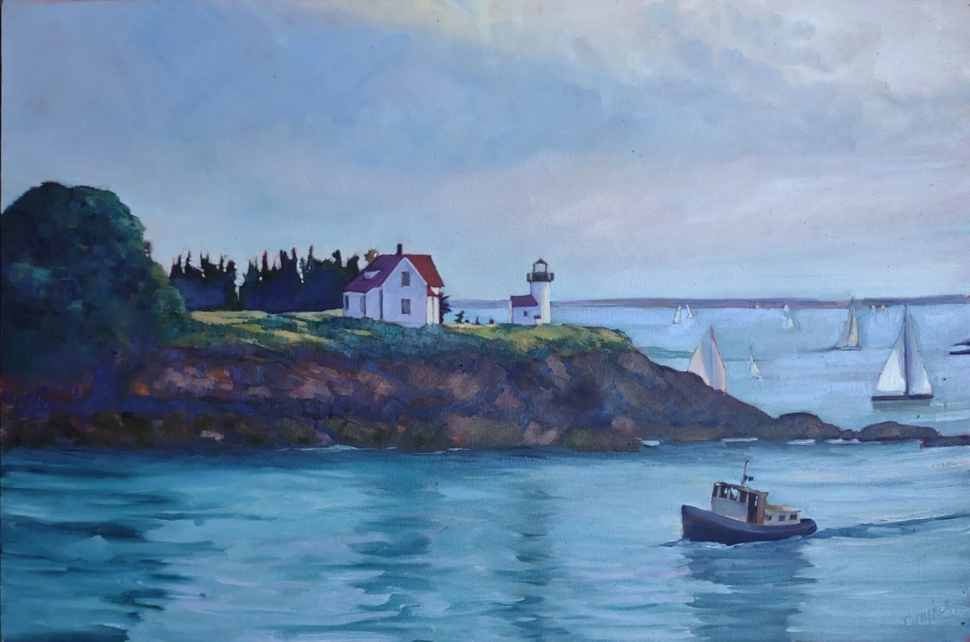
Big-boned, by Carol L. Douglas. As soon as I finish my taxes, I’ll be back at the boatyard painting schooners.

There is something about being in our favorite place that transcends detail. We know it by feeling rather than by specifics. As artists we are attempting to recreate that sense of place using only visual cues. That requires specificity and accuracy.

Artists become expert in oddly arcane matters. Marilyn Fairman can identify all the birds that sing in the understory. She told me she learned from one of those silly clocks they used to sell with a different bird call for every hour. And she paints without headphones on, so that she can hear the sounds of nature.
Sandra Hildreth of Saranac Lake is expert on the topography of the High Peaks region. She got that way because she has hiked all over the Adirondacks. Likewise, Bobbi Heath knows lobster boats because sheā€™s spent serious time cruising and painting the waters of Maine.
Winch, by Carol L. Douglas
I canā€™t say I know any of those things encyclopedically, but Iā€™m pretty strong on trees and rocks. So if you bring me a painting with brown, undefined lumps where the granite of Maine or the red sandstone of the Minas Basin should be, Iā€™m bound to say something.
Isnā€™t the important thing that you create a pleasing painting? Thatā€™s true, but squidging the details is amateurish. Whatā€™s the point of painting the Canadian Rockies if they end up looking like New Mexico? Last week, I mentioned Paul CĆ©zanneā€™s sixty paintings of Mont Sainte-Victoire. He experimented in all of them, but the mountain remains recognizable.
Coast Guard Inspection, by Carol L. Douglas
ā€œSense of placeā€ is a phenomenon that we canā€™t define, but we all know when we see it. As individuals, families, and a culture, we set aside certain places as being exceptional. Itā€™s why we have World Heritage Sites, National Parks, and National Scenic Byways.
When a place is without character, we sometimes say it is ā€œinauthentic.ā€ Once again, we canā€™t define that, but we all seem to know them when we see them: shopping malls, fast food restaurants, or new housing tracts. As Gertrude Stein once said, ā€œThere is no there there.ā€
More work than they bargained for, by Carol L. Douglas
How does a scene achieve a ā€œsense of placeā€ in our consciousness? It acquires a story, which is a finely- crafted pastiche of memory, events, and beauty. Our childhoods, in particular, shape our adult response to the physical world. Psychologists call the setting of our childhood our primal landscape. It becomes the bar against which we measure everything we see thereafter.
All of this argues against painting an anodyne landscape. And it argues for landscapes with lodestars. If youā€™re honest with your feelings, a lighthouse or grain elevator will not end up being clichĆ©d.
Everything that you paint should be something that youā€™ve experienced. It should tell a real story, one that relates back to you. Your canvas is not just a rectangle that you fill up with generic ā€˜natureā€™. It should be a little slice of a place.
Note: my websiteis completely updated. Itā€™s new work and a new, mobile-friendly platform, too. Wonā€™t you take a peek?

Monday Morning Art School: the need for green

A fast, easy route to mixing plausible summer greens.

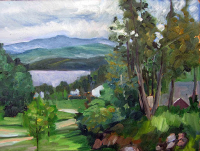
Overlooking Lake Champlain, by Carol L. Douglas. Every green in this painting came from the matrix below. And, yes, there’s a scrape in it. It tumbled off a bluff.

The need for green came early to class this year, paradoxically because itā€™s been cold this spring. Thereā€™s little green peeping out in nature, even here on the coast.
Last week in class we worked on salvaging failed paintings. That meant pulling out work from summers past. Most of them included some greens, so we had to mix a green chart.
A basic mixing chart for greens, made by my friend and student Victoria Brzustowicz.
We are only weeks away from painting greens again, in all their light, airy delicacy. Even now, the osier and willows have red and yellow in their branches. By June, we will be wrapped in a blanket of immature foliage ranging in color from pale emerald to pink. Itā€™s a good time to brush up on some color theory.
By August, the color will have settled into a deeper, more uniform tone. The only way to navigate this is to avoid greens out of a tube. A system of paired primaries gives you more options, avoiding the acidity of phthalo green, the weight of chromium oxide green, or the soul-sucking darkness of sap green.
If you look carefully at supposedly-uniform foliate, you will see patches where the color leans toward khaki, yellow, teal, violet and orange. They are what gives life to greens, just as accidental tones give life to human skin.
Michael Wilcox published a watercolor pigment guide called Blue and Yellow Donā€™t Make Green. Of course they do, but his point was that there are many routes to the same destination. One of the most useful landscape greens is black and cadmium lemon or Hansa yellow. Of all the greens I mix, this and ultramarine with yellow ochre are the two I use the most.
The above chart, mixed in oils. It works just as well in water-based media.

In my experience, bad paint mixing causes paintings to go wrong faster than anything else. Constantly over-daubing to modulate the paint color distorts the original drawing and makes a grey mush. If youā€™re confident of the color, you can apply it fast and accurately.

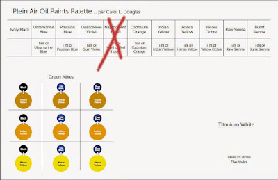
Above is the matrix of greens Iā€™ve used for almost twenty years. The range of results is infinite. It depends on the proportions you choose and the brand of paint you use. However, blue/black pigments are always much stronger than their yellow mates. In any mixture, you need about half the amount of blue or black as you do yellow. This has nothing to do with color theory. Itā€™s because darker pigments have more staining power than do lighter pigments.
Victoria Brzustowicz made this color chart based on my workshop palette. Here is a printable PDF.I crossed out the red on the chart because, while I do use it in the studio, in most field painting itā€™s unnecessary.
Once youā€™ve finished mixing that matrix, itā€™s time to tie it to the bigger palette. I encourage students to arrange their paints as above because:
  • Itā€™s efficient;
  • It allows you to mix without thinking;
  • It encourages you to use the full color range in every painting;
  • It prevents the beginnerā€™s error of modulating with white or black;

You can modulate your greens using tints of your other colors. For atmospheric greens, modulate with blues and violets. For warm, lighter greens, modulate with warmer tones.
Mount Hope Cemetery in the Spring, by Carol L. Douglas
Above is a photograph I took several summers ago. Your mission is to use the green chart Iā€™ve made and mix tones similar to the different greens in the photo. If you get the mixing right, painting this scene will be a snap.