Monday Morning Art School: paint like a fauve

When the light is bad, give yourself a jolt of color.
Hardwood, by Carol L. Douglas, 6X8, oil on canvasboard 
Driving from Boston to Philadelphia, the sky was full of light, fleecy cirrus clouds. Bobbi Heathand I watched them happily. We were due to start painting at Plein Air Brandywine Valleyat 3:30 in the afternoon. While I love the wooded, rolling hills of Brandywine country, itā€™s not my natural subject. But I know that a good sky drives everything, and we seemed set to have a great sky.
Unfortunately, by the time we arrived, the clouds had solidified into a solid, grumbling, low mass of grey. The site we were painting onā€”a sloping, treed lotā€”wasnā€™t helped by the lack of sunlight. My go-to answer in impossible situations is to think of how other, greater artists have handled the same situation. (That’s another good reason to know art history.)
It’s hard to get excited about this light.
I could have channeled Andrew Wyeth and romanced a figure into that bleakness, but that would have taken it outside the realm of observational plein air. Plus, we were limited to a 6×8 canvas. And I have no interest in luminismor tonalism, although they may be the right answer for you.
I saw Colin Page briefly at his opening last week. That sparked the question, ā€œWhat Would Colin Do?ā€ The answerā€”as well as I can understand another painterā€”would be to amp the color relationships up, systematically and logically. Of course, Colin does this fluidly and gracefully, because this is the visual space in which he lives.
Salt Marsh, by Carol L. Douglas
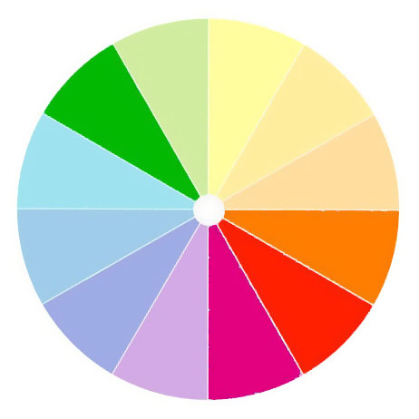
Last week, I posted on color harmonies. Two of my students did color harmony paintings last week, both very successfully. I might as well put my own instruction to the test, I thought. I chose a split-complement scheme of gold against green-violet-blue. In truth, the scheme flipped a bit as I went, becoming less systematic, but that was fine too.
Soft Wood, by Carol L. Douglas, oil on canvasboard. This was a rain soaked day.
This kind of painting is the reverse of adding color to a subject under dull light. Soft Wood, above, was painted in a rollicking rainstorm from a farm porch. Itā€™s a more typical way of adding color to a dull scene, and thereā€™s nothing inherently wrong with it. In fact, it relies on the same understanding of color harmonies.
Autumn trees in Durand Park, Carol L. Douglas, oil on canvasboard. A similar color sketch from long, long ago.
When I finished yesterday’s painting, I said it looked like a bad Van Gogh. Itā€™s probably more Fauvist. Post-Impressionistfor sure, and thatā€™s not a bad color space for a plein air painter to wallow for a while. Once Iā€™ve started down this rabbit hole, Iā€™m staying here for the nonce. Itā€™s dawning pink and blue here in Delaware, so who knows where the light will go?
Why do I go down these paths, when I already have a style that sells? Why does any artist do that? We’re always striving to get better. Artists are driven to paint because they’re essentially thinkers. When we stop thinking, we stop really painting.

The compensation question

Artists get asked for free work constantly. Only do it if you want to support the organization, because thereā€™s no business advantage for you.
Glade, by Carol L. Douglas, watercolor on Yupo.

Where are you in this story?

When I first started working as a photographer, I was doing so many jobs for free. Nobody would pay me, but theyā€™d offer dinner. Or drinks. Or publicity. Or experience. Or connections. Or insight. Even though I felt like my work was worth more, I never thought I was in a position to negotiate. Iā€™d become so small when discussing compensation. Iā€™d shrink. I needed everyone to like me. I assumed that if people liked me, theyā€™d respect me. Theyā€™d treat me with dignity. Theyā€™d value my work. And theyā€™d eventually pay me for it. But insteadā€”they kept asking me back without pay. I think itā€™s so hard for creators to get out of that cycle, but my mom gave me the best line to use: ā€˜Iā€™m sorry, but I canā€™t afford to do that for free.ā€™ I still do free gigs, but only on my terms. Only if they provide value beyond a personā€™s gratitude. Iā€™m never aggressive or mean. But Iā€™m clear. Iā€™m not sure what Iā€™m worth to them. But I know what Iā€™m worth to myself. And I want it put in writing. Iā€™m still nice about it. Iā€™m still polite. But Iā€™m more dominant. Well, maybe not dominant. Actually, I will say dominant. You can still be dominant and nice.ā€ (Humans of New York)
Every creator has found themselves running through this arc. Photographers and musicians get asked to perform for free, and painters get asked to donate work for fundraisers. Itā€™s a great way to help the world, but it delivers absolutely no business advantage to you.
Glen Cove, by Carol L. Douglas, oil on canvas
If I like the organization, Iā€™ll still send a painting, but Iā€™ve also noticed that unless the organization is arts-based, my work often sells for a fraction of its real value. The non-art audience thinks theyā€™re buying the equivalent of dĆ©cor, and bids accordingly.
For several years, I sent a customized piece to a fisheries-conservation group I really like. My donations consistently sold for about a tenth of their open-market value. Finally, I realized I could help more efficiently by just sending a check.
The Dugs, Carol L. Douglas, oil on canvasboard
Thatā€™s especially true because of an anomaly in our tax code. My cash donation is completely deductible; my painting donation is not. If I were to donate a painting by another artist, I could take a deduction (with certain limitations), but not for my own work. So, never donate work thinking youā€™re getting a tax deduction, because youā€™re not.
At the beginning of our careers, we usually donā€™t know how much our work is worth. The donation-auction can help create some kind of selling history. But setting your prices based on charity auction prices will keep them artificially low. Youā€™re better off to set them using a repeatable formula.
Adirondack Spring, Carol L. Douglas, oil on canvasboard. This is going to be auctioned to support the Gerhardt Neighborhood Outreach Center in Rochester, NY, on October 17.
Having said all that, I have a piece going up for auction to support the Gerhardt Neighborhood Outreach Center in Rochester, NY on October 17. This group provides a medical clinic, help with new babies, holiday baskets and backpacks for kids, transitional housing for women, counseling, vocational training, and a food pantry in one of the cityā€™s bleaker neighborhoods. Iā€™m happy to send them a painting, because I care about their work. If you want to know more about this event, contact Annie Canon here or at 585-288-0030.

Art history can make you a better painter

We are affected by what has happened before us, and we have the power to influence those who follow. 
Blueberry Barrens, Clary Hill, will be at Camden Falls Gallery’s Autumn Hues show, opening this Thursday.

I know a painter whose flawless technique is hitched to 19thcentury luminism. Another excellent painter watched him one day and sighed, ā€œif he knew any art history, heā€™d be brilliant.ā€ It was a sage comment. With a little understanding of modern art movements, my friendā€™s ability could be updated into something powerful, something that resonated with todayā€™s viewers.

Iā€™m not talking about putting on a new style like a shirt you bought at FatFace. That never works. Style is something that integrates oneā€™s training, technique, emotional state, and personality. Itā€™s whatā€™s left when youā€™ve eliminated everything but inner truth. Done right, the artist has no more control over his or her style than he does over his autonomic nervous system. Try to put on an acquired style, and youā€™ll immediately be recognized as a poseur.
Downdraft snow in the Pecos, by Carol L. Douglas, oil on canvas
But note that I included training in that equation. To paint like a 19th century luminist today means ignoring the impact of a century and a half of war, the horrors of government-sponsored genocide, and the relentless push-pull of modern urban living. It means ignoring abstract-expressionism, magical realism, the invention of movies, color photography, and the entire digital age. Thereā€™s a reason modern painting has an edge that 19thcentury painting didnā€™t.
Beach Erosion, by Carol L. Douglas, oil on canvasboard.
With rare exceptions, my art-history posts are the least-read of anything on this blog. (I moved to this platform in 2007 and have my stats since then, with the exception of the period I was writing for the Bangor Daily News.) Itā€™s always disappointing to write about a great artist of the past and realize nobody cares to read about him or her. But, like cod liver oil, I know art history is good for you, so Iā€™m going to continue to offer it regularly.
None of us stand alone in the great continuum of history. We are affected by what has happened before us, and we have the power to influence those who follow. But to do that, to take our rightful places as painters or teachers, we need to be part of our epoch. To do that, we must understand where we are and where we came from.
Tricky Mary in a Pea-Soup Fog, by Carol L. Douglas, oil on canvasboard
Thatā€™s not limiting; itā€™s liberating. For example, observing how Bronzino painted energy into apparently-static portraits can make us better landscape or still-life painters. Our predecessors have experimented in color and composition in ways that can give us a firm foundation for our own exploration.
Understanding the goals of Rogier van der Weyden or Kazimir Malevich doesnā€™t make us paint like them. But understanding their place in the great sweep of time helps us to position ourselves in our place. Ultimately, that is the most important thing we learn through art history. It is the difference between a pretty painting and one that will have meaning to future generations.

Monday Morning Art School: color harmonies

Understanding basic color harmonies will help you integrate color in your painting.

Split the color wheel in half like this and you have your cool tones on one side, warm ones on the left.
Color is comprised of three elements: hue, value and saturation. We see value first, but our emotional response is largely dictated by hue. There are some common color schemes, or chords, found in nature and by extension, in art.
The idea isnā€™t to be slavishly attached to these schemes, but to use them to perceive and point up color relationships in nature.
With all color schemes, one hue should dominate. 
Complementary
Complementary color scheme
These are colors that lie opposite each other on the color wheel. The most famous example is Christmasā€™ red and green.
This is a vibrant, high-contrast scheme. Itā€™s the basic schematic for the color of light, where shadows are always the complement of the light color. If the light is a warm gold, for example, its shadows will be cool blues.
Analogous
Analogous colors
Analogous color schemes use colors that lie next to each other on the color wheel. Using analogous colors can make what might be a garish scene (a sunset, for example) more serene.
Equilateral Triad
Equilateral colors
This uses colors that are evenly spaced on the color wheel. The most well-known example is the primary combination of red-blue-yellow.
Triadic color harmonies can be quite vibrant, even without high-saturation colors.  
Harmonic triads
A harmonic triad counting clockwise from the green
This variation counts 3-4-5 in either direction on the color wheel. Start with a key color, and count from there. This is a sophisticated variation on the equilateral triad.
Split-Complementary

Split complementary omitting the complement of blue

This is the color scheme I go to intuitively. Itā€™s a variation of complementary colors. It substitutes for the complement or includes the complement’s adjacent hues. Itā€™s as visually compelling as a complementary color scheme, but allows for much more variation in the accent colors.

Split complementary including the complement of green

Double complements
A symmetrical (square) double-complement color scheme
An asymmetrical (rectangle) double-complement color scheme.

The rectangle or tetradic color scheme uses four colors arranged into two complementary pairs. The colors can be in a rectangle or in a square.
Your assignment
Your assignment, should you choose to accept it, is to find these color schemes in your closet, in graphic designs, and in painting. Then paint a small still life using one of the color combinations youā€™ve located.

Reading (and writing) a painting

A good artist, like a good writer, controls how his painting is read.

Early November: North Greenland, 1932, oil on canvas, Rockwell Kent, courtesy the Hermitage

People are sometimes under the mistaken notion that Iā€™m intellectual. In fact, my taste in books is decidedly low-brow. Luckily, there are as many different books out there as there are readers. The same is true of paintings.

Reading a painting is similar to reading a book. First, thereā€™s an introduction. We enter every painting at some point, although the artist need not create a literal visual path in for us. Itā€™s just as likely that there are a series of focal points that the reader notices and absorbs in order. These are supported by incidental matter that contributes tone and information. A good artist, like a good writer, doesnā€™t leave this to chance. Itā€™s organized in the composition phase and then supported in the painting phase.
Whalers, c. 1845, oil on canvas, JMW Turner, courtesy Metropolitan Museum of Art. There are only three intelligible passages in this paintingā€”the whale, the whalers in their dories, and the ship. The water might as well be a wheatfield for all the information weā€™re given.
That requires that you, the artist, understands the basics of composition. You control the motive line of your painting. You know how to use contrast and color to encourage the viewer to read your work in a specific order. You know how to make some passages subservient to these main themes.
You must understand the focal points of your painting, either overtly or subconsciously. These are not necessarily the subject. In Rockwell Kentā€™s Early November: North Greenland, 1932, our eyes go first to the iceberg in the foreground. Kent has made it the most luminous, warmest part of the scene, and set it off against the briny depths. Next we look at the hillside behind, which is almost as bright as the iceberg. Only after that does our eye travel to the human activity at the bottom. Here weā€™re arrested by an ageless story: man wrestling against the vast power of nature for his very survival. We spend a long time looking at these tiny fishermen, which we wouldnā€™t have done had they been what we noticed first.
The Census at Bethlehem, 1566, oil on wood panel, Pieter Bruegel the Elder, courtesy Royal Museums of Fine Arts. As with the gospels, all the action is in the most inconspicuous corner.
Kent has borrowed a technique first used by Pieter Bruegel the Elder four hundred years earlier. In his Census at Bethlehem, all the bustle and contrast of the midfield drive our eyes down to the least important part of the painting, the corner. There the scene is laid for the birth of Christ. Just as in the Bible story, this great event happens in an unimportant place.
We know that because weā€™re bringing our own understanding to the painting. In both literature and painting, prior knowledge plays a profound role in how we read the work. There are symbols we must decode, and experiences we relate to. The thematic thread tying together the three paintings above is the insignificance of man. Every one of us has felt that some time. That feeling transcends the specific narrative.
The Charioteer of Delphi, 478 or 474 BC, courtesy Delphi Museum. We may know nothing of this young man, but his beauty and concentration speak through the ages.
Some of the great art of the past has lost its narrative power today. We donā€™t know enough Greek mythology or Bible to fully decode them. But the greatest still have the power to transport us. They touch a common chord of experience and emotion.
In our digital culture, we donā€™t often take time to read artwork quietly. But thatā€™s in the shopping phase. In the end, paintings will go home with someone, to be seen over long periods of time. To survive, they must have some story to tell, some depth of meaning, or they will be relegated to the attic. The work that compels the most on Instagram may be, sadly, the least successful in real life.

Global art

Trade has been with us for longer than we have written records. We trace it through art and craft.

The Meagre Company, 1633-37, Frans Hals and Pieter Codde. Courtesy Rijksmuseum, Amsterdam. One of the most important Asian imports to Europe was silk.
We think of global trade as a modern phenomenon, but trade has been part of human civilization since long before there were written records. Artwork is a primary tool for tracking that.
Glass beads were a high-status item in the late Bronze Age. Their manufacture was restricted to Egypt and Mesopotamia and traded as finished goods. By 1300 BC, raw glass itself was in international trade. The oldest glass ingots on trade routes were found in a 1300 BC shipwreck off the coast of Turkey.
The Riace Warriors, Greek, c. 460-50 BC, discovered in the sea off Calabria, Italy
Egypt didnā€™t invent this process, but it controlled it. All three ancient-world glass furnaces for raw ingot manufacture were in Egypt. This is where cobalt Egyptian blue glass and copper-based red glasses were first made. The Amarna Letters (c. 1350 BC) detail the military and other relationships between Egypt and its vassal states in Syro-Palestine; they contain frequent requests for glass. Glass beads were nearly as precious as gold and silver.
13th Century Statue of Saint Maurice, Magdeburg Cathedral. Maurice was the leader of a legion of ā€œsix thousand six hundred and sixty-six menā€ who converted en masse to Christianity and were martyred together. By the time this was made, there was enough European trade with Africa that the unknown artisan could represent African features.
By the eighth century BC, the Greeks and Etruscans were part of an active trade network around the Aegean and Mediterranean. One side effect was the Orientalizing of Greek art. Massive imports of raw materials and an influx of foreign craftsmen introduced new skills into Greece. Its influence was felt in Italy, Sardinia and the Iberian Peninsula. This trade network expanded to include the entire Mediterranean. Greek pottery has been found in Marseilles and Carthage to the west, Crete to the south and Sardis to the East.
Saint Jerome in his Study, 1480, fresco, Domenico Ghirlandaio, courtesy chiesa di Ognissanti, Florence.
The Roman Empire was built upon trade. No tariffs, a common currency, and secured trade routes led to world domination. They imported raw materials from as far as Britain to the west, Asia (along the Silk Road) to the east, and from Germanic and Slavic tribes far outside the empire. In return they exported Roman culture. Today we find Roman ruins, roads, coins, and mosaics across Europe.
When the Roman Empire was snuffed out, so were their trade networks. Trade was controlled by the Caliphates until the Renaissance. This brought middle eastern art into Iberia, but cut Europeans off from Asia and Africa. These networks werenā€™t restored until the Age of Sail.
A fifteenth-century painting by Domenico Ghirlandaioof St. Jerome is a map of contemporary global trade. The oriental carpet, glazed albarelli (drug jars) and crystal vases were all trade goods at the time. Note his spectacles, invented in Florence in the 13th century.
Adoration of the Magi, c. 1495ā€“1505, distemper on linen, Andrea Mantegna, courtesy of the Getty.
In Giovanni Belliniā€™s The Feast of the Gods, there is blue-and-white Chinese porcelain, painted from the family collection of the patron, the Duke of Ferrara. Porcelain from the same collection is visible in Andrea Mantegnaā€™s Adoration of the Magi, c 1500. The reservation of porcelain to gods and princes tells us just how precious it was.

In 1603, the Dutch seized a Portuguese carrack off the coast of Singapore. Its manifest is a record of the goods then being traded with Asia: 1,200 bales of raw silk, many chests of damasks and embroideries, innumerable sacks of spices and sugar, and 60 tons of porcelain.
The Return to Amsterdam of the Second Expedition to the East Indies, 1599, oil on canvas, Hendrik Courtesy Rijksmuseum, Amsterdam.
By the 16th century, the Netherlands was the center of free trade, which now ranged across the world. This can be seen in images of the boats they used, and the goods they brought home, including silk, spices, sugar and fruits.

Monday Morning Art School: the lost-and-found edge

Sometimes itā€™s what you donā€™t say that matters most.

Girl with the Red Hat, c. 1665-66, Johannes Vermeer, courtesy National Gallery of Art, Washington, DC.

I once had a painting teacher who told me that heavy edges were ā€œmy style.ā€ Like many younger artists, I just hadnā€™t learned how to marry edges in my painting. Beginning painters tend to give all edges equal weightā€”they are borders to be colored in. Part of the learning process is learning when to keep the edge and when to lose it.

Vermeerā€™s Girl with the Red Hat, above, perfectly illustrates the lost-and-found edge. The smooth transitions between the hair and the hat on the left, within her gown, and the lack of contrast in the shadow side of the modelā€™s face drive our eye to the highlighted passages. Squint and concentrate on just the shape of the highlighted passage for a moment. Itā€™s just one long, beautiful abstract shape in a sea of darkness.
In Church at Old Lyme, 1905, Childe Hassam softened the edges between leaves and sky by making them the same value. Courtesy Albright-Knox Art Gallery.
Losing the edges helps link visual masses into a coherent whole. It deemphasizes things that arenā€™t important. Itā€™s a way to create rhythm in a painting.
The human mind is adept at filling in blank spots in visual scenes (and seeing things that arenā€™t there). If you doubt this, squint while looking around your room. In any collection of similar-value objects, you donā€™t see edges, but you understand what youā€™re looking at. Your mind sorts it out just fine.
A careful drawing is different from a value study. Both are important, and the wise artist does them both. But a drawing explores the shapes and contours of an object. Itā€™s a fact-finding mission. A value study concentrates on the links between objects and the final composition.
The Daughters of Edward Darley Boit, 1882, John Singer Sargent, courtesy of the Museum of Fine Arts, Boston. 
In the oil painting The Daughters of Edward Darley BoitJohn Singer Sargent uses the great dark entryway as a framing device, a compositional accent, and a poignant social statement. Only a hint of light in the shape of a window implies what is behind. The girls recede into space in order of age, with the eldest (Florence, age 14) almost enveloped in the darkness of the drawing room. Florence and Jane have no accents in their hair; their dresses and stockings disappear into the murk.
The Bridge of Sighs, c. 1903-04, John Singer Sargent.
Sargent painted at least two versions of this study of the Bridge of Sighs; a mirror-image is in the Brooklyn Museum. In this version, Sargent placed a hard edge at the top of the arch where sky meets stone. The shadows on the left bleed without any attempt at architectural precision. This creates the same kind of murky dark passage as in The Daughters of Boit. (A note for watercolor puristsā€”the whites of the gondoliersā€™ clothes were done with white paint.)
In Two Women on a Hillside, 1906, Franz Marc tied the women to the background by repeating greens in their skin and garb. Courtesy Franz Marc Museum.
To lose an edge in painting, start by making both sides of the line the same value, even when theyā€™re different hues. Conversely, the highest contrast will give you the sharpest edge. You can add to either effect by softening or sharpening the paintwork with your brush. Introducing the color of the adjacent object will also soften the contrast between an object and its background, as in the Franz Marc painting above.
Detail from John Singer Sargentā€™s Lady Eden, 1906, courtesy Philadelphia Museum of Art.

Remember that the sharpest, most contrasting edges draw our eye. The trick is to find a balance that supports the composition. Sometimes only a small flick of paint is necessary, as with Sargentā€™s sequins in the detail from Lady Eden, above. These support the dynamics and direction of the composition. If they didnā€™t, theyā€™d undermine all his careful compositional work.

This essay was originally posted in July, 2018. I’m repeating it because I’ve been focusing on it in painting class and want my students to concentrate on it.

Five opportunities to study with me

And for my workshops, there are early-bird discounts available!

Four Ducks, by Carol L. Douglas. There are so many ways to paint water!

ā€œThereā€™s no phone reception out on the ocean,ā€ I casually mentioned to my electrical-engineer husband. He immediately outlined a low-cost plan to extend coverage offshore. I looked at him in wonder. ā€œPlease donā€™t. Thatā€™s the best thing about sailing!ā€

I leave this evening for my last workshop of the season, aboard schooner American Eagle. (As many times as I see her, I still have a crush on that boat.) Iā€™ve had so many inquiries about upcoming classes and workshops that I pulled them all together for you before leaving.
How to paint water: Iā€™m speaking to the Waterville Art Society on Thursday, October 3 on how to paint water. The meeting starts at 6 PM at Chace Community Forum, 150 Main Street, Waterville, ME. For more information, email here.
Dennis Pollock, right before he went for a swim during our weekly painting class. (Photo courtesy of Jennifer Johnson.)
Our next mid-coast Maine painting classes start on Tuesday, October 22. These classes meet on Tuesday mornings from 10-1, and this session runs six weeks, from October 22 to November 26.
This is primarily a plein air class.  Autumn is a fantastic time to paint in mid-coast Maine, as it stays warmer here longer than inland. When weather permits, we paint at locations in the Rockport-Rockland-Camden area. When the weather turns, we meet in my studio at 394 Commercial Street, Rockport. For more information, see here, or register here. (If youā€™re a returning student, you can just email me.)
Painting aboard schooner American Eagle with Diane Fulkerson, Mary Ellen Pedersen, and Lynne Twentyman.
Iā€™ll be teaching two watercolor sketch workshops aboard the historic schooner American Eagle next year. The first is during the opening run of the Maine windjammer fleet and includes the Gam, the annual fleet raft-up. Thatā€™s June 7-11. The second, from September 20-24, is timed for the coastā€™s peak foliage season.
All materialsā€”and theyā€™re professional gradeā€”are included, and if you want, you can help with the sailing too. More information is here.
Rebecca Bense and me, at Sea & Sky on Schoodic Point. (Photo courtesy of Jennifer Johnson.)
Last, but certainly not least, is my annual Sea & Sky workshop at Schoodic Institute. Itā€™s an opportunity to study painting in Americaā€™s oldest national park, surrounded by breathtaking nature, but insulated from the ā€˜madding crowdsā€™.
This workshop is five days long and includes all meals and accommodations. This year weā€™ve added a commuter option as well. This workshop was waitlisted last year, and for good reasonā€”itā€™s a fun and informative time, open to students in oils, pastels, watercolor, gouache or acrylic. More information can be found here.
Ellen Trayer and Lynne Twentyman, painting on a deserted island.
All of my workshops include an Early-Bird discountfor those of you signing up before January 1. (Workshops, of course, make great Christmas gifts for the painters in your life.) If you have any questions, you can email me.
I wonā€™t be able to answer until next week, of course, because in a few hours Iā€™m throwing my rope-soled shoes and duffle-bag in the car and heading down to the harbor. That also means no blog on Friday. Fair winds and following seas to you, and Iā€™ll see you on Monday.

Monday Morning Art School: letā€™s talk about line

The motive line in a painting is the most powerful design tool you have at your disposal.
Lions painted in the Chauvet-Pont-d’Arc Cave, c. 30,000-28,000 BC. This is a replica; the cave is sealed from human visitation. 
If you had to isolate the fundamental element of art, across all media and forms of expression, it would be the humble line. By definition, a line is a connection between two points. In math, thatā€™s an ideal, but in art, the line is a visceral reality. Lines can be broken or continuous, violent or serene, implied or obvious. But if you havenā€™t got a line, you probably donā€™t have much in the way of art.
Lines are also implicit, in their abstract form, in performing arts like dance and music.
In the drawing stage of a painting, I try to isolate the major line from which my compositions hang. This is the motive line, although it could also be called the kinetic line. Itā€™s the motive force that drives the energy of the painting. It is frequently interrupted, as in the lost-and-found edge. But:
  • It is tied to the major area of focus;
  • It divides two areas of different values, creating a high-contrast edge;
  • Itā€™s complex and carefully-drawn.

ā€œThe only stable thing is movement,” said Jean Tinguely, the sculpture who pioneered Kinetic Art. It is true in nature, and it has been true in art history since the Greeks, for whom contrapposto (counterpoise) represented a moment in motion (as I wrote earlier this month).
We think of Impressionism as a color movement, but it was also a great shift in how paintings were composed. Motion is suggested through a lack of equilibrium. Horses and people are off-balance in a way that suggests they must move to catch their balance.
Before the Race, 1882ā€“84, Edgar Degas, oil on panel, courtesy The Walters Art Museum, Baltimore
That extends to the very balance of the paintings themselves. Consider Before the Race, by Edgar Degas, above. The strongest line in the painting is not the horizon, but the bottom edge of the horses. The complex up-and-down eddies of the horsesā€™ legs breaks and softens as it moves to the right. The painting wouldnā€™t be nearly as compelling without that amazing see-saw of action.
The Artist’s Studio in an Afternoon Fog, 1894, Winslow Homer, courtesy Memorial Art Gallery, Rochester, NY
In Winslow Homerā€™s The Artist’s Studio in an Afternoon Fog, a line describes structure against sky. But the real motive force is created by the strong diagonal just below it, in counterpoint to the white froth of the sea. In fact, there is nothing to this painting but line. Drawing it is a good exercise in discovering the subtlety of powerful lines. Notice the subtle convergences; they are a hallmark of Homer paintings that give his work its incredible thrust.
Man and Pool, Florida, 1917, John Singer Sargent, courtesy Metropolitan Museum of Art
The motive line can be subtle as well. The value structure in John Singer Sargentā€™s watercolor, Man and Pool, Florida is choppy, to depict a brightly-lit ground. Still, the figure makes a diagonal leading down to the spot of light and contrasting, cool water. To support this, Sargent subtly scribed the outline of the leg in blue.
Your homeworkā€”should you choose to accept itā€”is to find and note the motive lines in nature, architecture, photos and paintings. They may be curved, straight, rough, smooth, intersecting, broken or complete. Each time you identify the strong linear element that holds together a scene, ask yourself what it might be like without that.

How do we respond to slowing sales?

Overall, the shows Iā€™ve done this summer have been flat, so itā€™s time to rethink my strategy.

Home Port, by Carol L. Douglas, available through Camden Falls Gallery.
Where is the art market going? This is a question I ask myself every year at this time. Itā€™s more important this year than ever, since my same-event sales have been flat.
I had an interesting conversation with artist Kirk McBride, after an event Iā€™ve been doing for six years seemed to let all the air out of its tires. ā€œI think there are too many plein air festivals,ā€ he said. He may be right. Theyā€™re in every town, and the smaller markets canā€™t support them year after year. That doesn’t mean the model is bad; it means the market needs adjustment.

(An important caveat: an individual show can buck all market trends, and there may be regional differences in how your own shows are going. It requires a lot of input to decipher what’s happening, which is why I’m asking for your comments below.)

But here are some sobering facts from Artsy, collected in 2019:
Adjusted for inflation, the global art market shrank over the last decade. It totaled $67.4 billion in 2018, up from $62 billion in 2008. However, these are nominal figures, not adjusted for inflation. Do that, and we see a market thatā€™s shrunk from $74 billion to $67.4 billion.
To compare, global luxury goods grew healthily. In adjusted dollars, they went from $222 billion to $334 billion in the same time period. In some ways, a HermĆØs bag is more useful to a person who already has everything. Itā€™s portable, easy to change, and you can store a revolving collection in the space that a painting takes up.
Midsummer, by Carol L. Douglas, currently on hold.
Over that same decade, the global economy roared, with global domestic product increasing from 3.3% to 5.4%, according to the IMF. That means art sales should have risen. Instead, just the costs of doing businessā€”rent, materials, and timeā€”increased.
I live in a boom market for galleries. Mid-coast Maineā€”led by Rocklandā€”has been an amazing success. Nationwide, weā€™re seeing galleries surviving better than small businesses in general. However, we arenā€™t seeing a lot of new galleries opening. Colin Pageā€™s new gallery in Camden is one of the wonderful exceptions.
I looked into buying an existing gallery earlier this year and walked away. I still might do something similar, but it wonā€™t involve expensive real estate or labor costs. Iā€™m not passionate about selling art, just making it, and thatā€™s not enough to carry a business.
Ottawa House, by Carol L. Douglas, currently on hold.
Thereā€™s been a significant change in the model of selling art. Weā€™re no more immune to globalization or to the internet than any other industry. Itā€™s time to face facts: while our educational institutions threw away technique starting in the 1960s, it was always being taught in Asia. Those painters have as much access to the on-line market as do we, and their aesthetic may be closer to whatā€™s wanted today.
ā€œAuction houses are going begging for people to buy antiques and art,ā€ Andrew Lattimore told me last week. ā€œKids donā€™t want their parentā€™s stuff. They want ā€˜experiences.ā€™ā€
Heā€™s right, and that impacts artists who sell to the merely well-to-do (vs. the biggest money players, who are buying an entirely different kind of art). The average United States millionaire is 62 years old. Just 1% of millionaires are under the age of 35, and 38% of millionaires are 65 and older. That means that the people with the cash to buy important paintings are of an age to be getting rid of stuff, and their kids donā€™t want it. Ouch.
Beaver Dam on Quebec Brook, by Carol L. Douglas, available through 

Gallery of the White Plains County Center

Then there are the ethnic patterns of wealth in America. Asian-Americans are the wealthiest Americans, led by people from the Indian sub-continent. Many of these very wealthy Americans are first- or second-generation citizens, so their aesthetic is more attuned to Asia than to traditional American painting.
Is this the death knell for painters like me? Hardly. We need to act as would any other industry in a time of flux. We adapt or die. That means rethinking pricing and reevaluating our sales channels. Perhaps it means a major strategic change in selling.
Iā€™m very interested in your thoughts on the subject. What kind of market did you experience in 2019? What are your experiences with marketing on the internet? Where do you think we should go from here?