Two contemporary artists to study

When I’m traveling, people often suggest that I look at the work of an artist I don’t know. Here are two I met this summer.
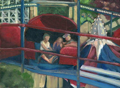
The Dinner Hour, 2006, egg tempera, Tom Forrestall, courtesy Mira Godard Gallery, Toronto 

Tom Forrestallis a magical realist, a term coined in the 1920s by art critic Franz Roh. He meant visual art that explores the inner mystery of our apparently mundane lives. That was in contrast to surrealism, which imposes magic on everyday life.

“[Magic realism] employs various techniques that endow all things with a deeper meaning and reveal mysteries that always threaten the secure tranquility of simple and ingenuous things…. it is a question of representing before our eyes, in an intuitive way, the fact, the interior figure, of the exterior world,” wrote Roh.
In my opinion, Andrew Wyeth is a magical realist, because his narratives transcend mere realism. Forrestall is often called the “Canadian Wyeth” because of his similarity to Wyeth, both in content and because of his meticulous application of egg tempera.
Moon, egg tempera, c. 1971, Tom Forrestall, courtesy Atlantic Fine Art
Forrestall rejects the notion that paintings should always be rectangular, and makes them in fanciful shapes. The Dinner Hour, at top, is an homage to his late wife, Natalie. Forrestall wrote on the back: “Natalie’s little cross over her kitchen door she hung there many years ago — true to her Acadian roots, it shall hang there while I’m still around.” He and Natalie married in 1958, and she ran his art business and household. “She managed things extremely well and it never rattled her with all these six kids,” Forrestall said.
Forrestall came from Nova Scotia’s Annapolis Valley. He attended Saturday morning art classes at the Nova Scotia College of Art in Halifax. He was awarded a scholarship to the Fine Arts department at Mount Allison University, where he studied with Canadian greats Lawren Harris and Alex Colville. He received one of the first Canada Council grants for independent study, which allowed him to travel throughout Europe. He has been a freelance artist since 1960. He was introduced to me by Nova Scotian artists Michael Fullerand Krista Wells.
Water Filled Quarry, oil on linen, Joellyn Duesberry, courtesy Joellyn Duesberry 
Last weekend at Rye Painters on Location, an auction-goer told me that my work reminded her of the late Joellyn Toler Duesberry. Duesberry once said of her art, “I am not interested in a realist painting, I am not interested in an abstract painting. I am interested in the tension.” That’s a sentiment that rings true to me, although I don’t really see too much similarity in our work.
Duesberry was raised in rural Virginia, and had a deep connection to landscape. “All my life I think I’ve unconsciously tried to re-create the place where bliss or terror first came to me,” she said. “Both emotions seemed so strong that I had to locate them outside of myself, in the land.”
She received a BA with Distinction in art history and painting from Smith College and was awarded a Woodrow Wilson Fellowship. She then earned her master’s degree at New York University Institute of Fine Arts.
Rainy Morning in Maine II, 2009, monotype, Joellyn Duesberry, courtesy Metropolitan Museum of Art
She moved to Denver in 1985, saying that the clearer air revealed more of the sharp bones of the landscape. But she also spent 40 years painting on the Maine coast. She cited John Marin and Milton Avery as the greatest influences in her art.
In 1986 she was awarded a National Endowment for the Arts grant. This enabled her to work with Richard Diebenkorn. He encouraged her to try monotype printing, and she began actively producing and exhibiting her monotypes along with her plein-air paintings.

Monday Morning Art School—adding figure to your landscapes

Animals, people, automobiles and other evidence of life add humanity to an otherwise static scene.

Erie Canal, by Carol L. Douglas. The figure is my daughter Julia.

Figures are best incorporated as part of the design, rather than added as an afterthought. Groups of people are such strong design elements that they can overwhelm a composition if they’re not planned in advance. In a different way, that’s equally true of a single animal in a landscape.

An individual figure can dominate a composition as well. We humans are innately curious as to what other people are doing, and a figure in a painting is an invitation for us to indulge in that curiosity.
Therefore, they’d better have a good reason to be where they are. Tossing in a figure or a gull or two to balance a composition is a Hail Mary pass that seldom works. Odds are, these last minute additions will overset your painting. It will look like it’s wearing one too many pieces of jewelry.
Tilt-a-Whirl, by Carol L. Douglas. Someday I’ll write about how to paint a spinning subject en plein air.
Is the figure important to the scene? I think beaches and street scenes benefit from having people in them, because they are how we experience those places. Streets generally have cars; in fact, they’re so ubiquitous that we barely notice them. I generally limit my own animal drawings to dogs or horses, but there are western landscape paintings that would be far less compelling if they didn’t have animals in them.
Decide in advance whether you’re painting a landscape, or a figure in a landscape. If it’s the former, keep detail to a minimum. If it’s the latter, then perhaps you should redesign your painting to be a figural or animal painting. If it’s primarily a landscape, added figures, cars, or animals should be there to complement, not dominate.
59th Street Bridge approach, by Carol L. Douglas. It’s impossible to paint in Manhattan without including cars.
That doesn’t mean you get away without drawing. In fact, drawing is paramount in these added elements. I’ve learned to stop painting and pick up my sketchbook when a figure nearby interests me. I draw it carefully and then insert it into the painting only when I’m sure it’s right, rather than trying to capture the person in two or three brushstrokes as they’re moving.
New Puppy, by Carol L. Douglas. This started as a sketch of the group; the beach is subservient. Available through Camden Falls Gallery.
The good news is that some of the details of drawing that bedevil the beginning artist—like fingernails, eye sockets or nostrils—must to be omitted. But proportion and placement are paramount, so it’s helpful to practice drawing people whenever you have the opportunity.
Castine lunch break, by Carol L. Douglas. Bicycles, cars, and boats are symbols of human activity that can stand in for the figure.
Even when the figure is the focal point, it must be integrated into the greater color scheme of the landscape. A fawn under the cool green canopy of the forest is not going to be as warm in tone as she would be nestled in a dry grass nest. The same is true for humans, and for their cars.
A critical aspect of figure is a sense of scale. That’s the most likely place to make a mistake. Often my figures are a pastiche of different people who’ve passed the site as I’ve been working. I start by drawing a dummy placeholder and checking its size in its position. (A few feet along a sidewalk can change the size dramatically.) Only when I have the scale right do I try to personify the character.

When you’re in the creative desert

Embrace the uncertainty. Don’t panic. Here are some tips.
Mamaroneck River, Carol L. Douglas. I’m really bad at shooting pictures of my Painters on Location work, but this one is from around 2010.
On Wednesday, I wrote about the tendency to paralysis when we start producing a body of work we think is awful. I see this among students, but it happens to all of us. Old-timers just recognize it as an unavoidable part of the job and plow through it, miserable as it is.
The dry desert is an inevitable stop along any creative journey. You have three possible paths out:
  • Scuttle back to what you were doing before;
  • Quit and do something else for a while;
  • Find ways to quiet that awful voice in your head.

Obviously, I choose the third path, but the other two are very common (and self-limiting) reactions. Start by reminding yourself of a basic fact: you haven’t suddenly forgotten how to paint. Dissonance is part of growth. Even experiments that fail are valuable; they’re an essential part of the painting process.
Beaver Dam on Quebec Brook, available through Gallery of the White Plains County Center through November, 2019. For more information, contact Adam Levi, Rye Art Center, (914) 967-0700.
Trusted friends
This morning I’m at Rye Painters on Location. At the first one, I baulked at the starting gate. Daisy de Pothod told me, “You know how to do this!” It snapped me back into reality.
Sometimes friends will suggest changes, but it’s more likely for them to say, “I really like that.” It helps me see past my own skewed judgment.
Regatta off American Yacht Club, by Carol L. Douglas. This is another painting from Rye of which I didn’t take a very good photo.
Ask a teacher or fellow professional
You may be wrestling with a technical, rather than emotional, block. Good painting teachers watch your process and redirect you. Identifying the trouble is more than half the battle. But what about the teacher who undermines your confidence? If there’s bad chemistry between you, I simply would not go back.
Painting-a-day disciplines
Painting-a-day programs are helpful at riding through low spots. Your goal isn’t greatness; it’s to finish something every day.  In the end, ironically, that’s usually when we do our best work.
There are many of them on the internet, but it’s just as easy to make up your own. I devise all kinds of these for myself and run through them whenever I’m stuck. They’ve taken the form of tree-a-day, still-life-a-day, fantasy-landscape-a-day, and more.
Morning fog over Whiteface Mountain, by Carol L. Douglas, is available through Rye Arts Center until September 14. It’s a silent auction starting at less than half the retail price. If you’re interested in bidding call Adam Levi at (914) 967-0700, or stop by the Rye Arts Center gallery at 51 Milton Road, Rye, NY.
Focus on the process instead of the results
I’ve given you protocols for oilsand watercolor. They’re not the only approach to painting, but they’re good general guides. Focus on them and let the results take care of themselves.
Many people baulk at imposing order on creativity, but it is the basis of every great artist’s practice. And running through the scales is oddly soothing when your soul’s in ferment.
Do exercises that support your weak spots enough that they cease to be weak spots
Are you flummoxed by color? Make color charts or mix matches to paint chips from the hardware. Are you trying to add architecture and people to your paintings but they look awful? Practice drawing. Is your perspective wonky? Find an exercise in perspective and practice until you understand it.

It’s too soon to wipe that painting out!

We’re our own worst critics. A little time and you might realize that painting has flashes of brilliance.

Adirondack Spring, 11×14 in a cherry frame, will be available through a fundraiser for the Gerhardt Neighborhood Outreach Center on October 17. This is a mission that provides medical care, job training, after school care and more to the residents of North Rochester, and one I’m delighted to support. If you’re interested in my work and in supporting a great city mission, contact Annie Canon.
As I set down my brush after a long painting session, I have one of two reactions. It’s either, “meh,” or “that’s pretty bad.” All I can see at that moment are the ways in which the painting has fallen short of my inner vision. I don’t see the things that are going right, like audacious composition, new ideas, or bravura brushwork.
I’ve been at this long enough to ignore that reaction. I no longer question whether the work is good or bad. I just ask myself if it’s finished.
Yesterday, Ken DeWaardspoke to the Knox County Art Society (KCAS). He said that he takes plein airwork back to his studio and leans it face-in against the wall for a few days. Only after the struggle has faded from memory does he turn it back around. Then he can dispassionately analyze what it needs.
Fog Bank, by Carol L. Douglas.
The worst self-doubt happens when you’re in a plein airevent and your work is overlooked by buyers and judges. It’s very easy to think you’re painting terribly. This happened to me this year with Fog Bank. I was unimpressed with it, since it’s largely atmosphere and no composition. Three months later, I like the painting more than anything else I did at that event. My goal was to show the movement of a North Atlantic fog, and I think it worked. That nobody else was thrilled by it is immaterial.
I had a similar reaction to another painting in 2017, They wrest their living from the sea. At the time, I thought the whole thing was too fussy and overworked. But set against my intention, the painting is a success. I wanted to contrast the tiny houses of Advocate Harbour with the vast landscape in which its people fish and farm. There are times when skies arefussy and detailed. Sometimes we have to square up to that and paint them realistically, instead of stylizing.
They wrest their living from the sea, by Carol L. Douglas
My old friend Marilyn often wiped out paintings she didn’t like. “Another board saved!” she would say. I don’t do that. Even failed paintings tell me something about my process.
Sometimes a painting is uncomfortable to look at because it’s pointing the way forward. It can seem like an awkward outlier when you do it. Five years later, you realize it was a bellwether and the best thing you painted that year. You’ll blunt your development if you wipe out everything that makes you uncomfortable.
In students, this discomfort with change can result in paralysis. They fuss and get nothing done in class. If that’s you, try falling back on strict exercises that force you to stop thinking in terms of results and start thinking in terms of process. (I’ll get into these on Friday.)
Grand Bahama Palms, by Carol L. Douglas
The last painting in this post is one I did on Grand Bahama in 2017. There is never any guarantee that a moment of beauty will be there when you return. This young palm is in one of the hardest-hit parts of the island, and I imagine it was drowned and broken. If the painting survived, I hope it reminds the owners of the former glory of their patch of land, and is a promise that beauty will return soon.

Monday Morning Art School: painting fall foliage

Autumn has started its great transition; here are some tips to paint it in a believable way.
Catskill Farm, pastel, by Carol L. Douglas. The light is definitely warm in Autumn, but the predominant landscape color is still green.
In the northeast, soft maples start to turn orange and pink at the end of August. There are similar phase changes happening throughout the north. For example, in the Canadian west the aspens are starting to turn yellow-gold and the larches prepare to shed their needles.
 
The transition from summer green to November’s dun will take roughly ten weeks, but the daily changes are incremental.
 
The Dugs, oil on canvas, by Carol L. Douglas. The earliest foliage change in the northeast is in the soft maples.
Don’t delete the greens
 
Until late fall, the predominant local color remains fairly cool: there is the blue of sky and water, and plenty of green leaves. Trees change at different rates. There are some that never change at all, but simply drop their leaves. Mowed grass remains green all year long. And, of course, there are evergreen spruces and pines.
Adirondack Spring, by Carol L. Douglas. The same colors that appear in early spring return in the fall, but in a brassier way.
There are far more colors than just red and gold
 
The same colors that appear in early spring foliage are repeated in autumn, but in a brassier way—reds, pinks, golds, chartreuse, teals, purples. In early fall, tinge the tops of trees with these hues; as the season progresses, they will become more dominant.
 
Know how trees change color
 
Where I live, the brilliant soft maples and ashes change first. Later, the oaks and beeches rattle mournfully in the wind. Each species has a characteristic color as well as a specific time to turn. Observe these changes, rather than just dashing color around.
 
Glade, watercolor, by Carol L. Douglas. This painting is at the Jackson Memorial Library, Tenants Harbor, ME, through September.
Pay attention to the understory
 
There are wildflowers blooming on the edges of fields—goldenrod, asters, blue chicory, and Queen Anne’s lace. These are less brilliant than their early-season counterparts, but the overall effect is a beautiful spangle against dried grasses. Meanwhile, hayfields are still bright green and there are apples in every hedgerow.
 
Underpaint the sky in last
 
When we put the sky in first, we have a tendency to paint it darker and brighter than it is. (That’s because of how our eyes respond to light.) It’s easy to then make the whole painting too dark.
 
That’s a great argument for the dark-to-light rule of oil painting, but what should watercolorists do? Start with a monochrome value study, so you hit the blues properly the first time out.
 
How dark are the leaves?
 
Trees are often among the darkest features of the landscape, especially when we’re below them. But yellows and golds are naturally light colors. That makes us perceive fall foliage as lighter than it is. We need to take care to check the value of foliage in the design phase.
 
Avoid white in your foliage mixes, except to articulate a sun-struck passage. Darken yellow-gold with yellow ochre rather than with its complement, or you’ll kill the chroma. And check the leaf values against tree trunks; in some cases, they may not be that different.
Keuka Vineyard, Carol L. Douglas, available through the Kelpie Gallery. This shows the earliest autumn changes, which in New York are in late August.
How intense is fall color?
 
It’s easy to overstate the chroma in any season. It’s especially easy in autumn, because we’re responding to unusual brilliance. But Nature has a wide variety of chromatic intensities, from the delicate robin’s egg blue of a winter sky to the dazzling reflections off the ocean. There are plenty of greys in the landscape, especially in autumn.
 
There are other ways to convey the brilliance of autumn than to just use bright colors. Set the subject tree against more neutral tones, or place an intensely warm tone against a cool tone.
 
Autumn has its own color temperature
 
Above, I wrote that autumn colors were still predominantly blue and green. But the overall color temperature is warm, because the sun spends a lot more time on the horizon than it does in midsummer.
 
Autumn is known for its magical lambent light—the “season of mists and mellow fruitfulness/Close bosom friend of the maturing sun,” as John Keats said.
 
Color temperature is a lengthy subject, and I’ve written about it here, here, here, hereand here(that’ll keep you out of the bars). The basic rule is that the color of the shadow is the complement of the color of the light. If light is golden, shadows are cool.
 
This was originally posted in September, 2019. Happy Labor Day, my friends!

My 2024 workshops:

Art and order

We think of art as a form of creative expression. It hasn’t always been that way.
Fowling scene from the Tomb of Nebamun, c. 1350 BC, courtesy British Museum. He’s with his wife, daughter and their tabby cat, relaxing in the afterlife.
Contemplating contrapposto (counterpoise)—as I did on Wednesday—inevitably makes me think about the art of ancient Egypt. Contrapposto is the door that separates modern sensibility from ancient thinking. On our side lies personal expression, naturalism, self-direction and change. On the other side was tradition, continuity and ritual. The Egyptians never stepped through.
In fact, looking at Egyptian culture as a whole is like looking at a distorted mirror image of our modern selves. Consider the very useful Pythagorean theorem. The relationship it describes was known to the Egyptians as early as 2000 BC as lists of numbers, but the ability to upgrade that into a predictive formula was lost on them. We had to wait until around 500 BC for the Greeks. This was not for lack of scientific intelligence, for the Egyptians were great builders, miners, and chemists. 
Mortuary figurine of a woman; 4400–4000 BC; crocodile bone. The workmanship gets more sophisticated over time, but the character and pose remain unchanged. Courtesy the Louvre.
Egyptian culture came into being as people were compressed into the Nile River Valley by desertification. Irrigation supported the development of a stable Egyptian culture. By the New Kingdom it was very powerful indeed, reaching around the Levant and down through the Nile Valley.
Egypt was both a fruitful and precarious place to live. Drought and famine were ever-present threats. The Nile, which gave Egypt life, was also home to deadly snakes and spiders, hippopotami and crocodiles. It’s no surprise that theirs was a very structured society. Going outside the rules could be fatal.
Wooden statue of the scribe Kaaper; c. 2450 BC; wood, copper and rock crystal, courtesy Egyptian Museum (Cairo).
In fact, order and continuity were the very hallmarks of Egyptian culture. Ancient Egypt was a series of stable kingdoms, divided by short, painful bursts of instability. These are the times we tend to study, because they’re so interesting. Take for example, the Amarna Period. Around 1350 BC, Amenhotep IV ascended the throne and instituted a series of reforms. He changed his name to Akhenaten, promoted the sun deity Aten as the sole deity, suppressed other gods, and moved his capital to the new city of Akhetaten.
But our fascination with the sun-worshipping pharaoh was not shared by his successors. Subsequent pharaohs, TutankhamunAy, and Horemheb, pointedly worked to erase Akhenaten’s name, ideas and works from Egyptian history. It was back to business as usual in Egypt.
Egyptian statue of the Persian king Darius the Great, c. 500 BC. The robes are Hellenistic, the pose is resolutely Egyptian. Courtesy National Museum of Iran. 
This same conservatism can be seen in their art. It spans a vastly long period as human civilizations go—from the 31st century BC to the 4th century AD. Through most of that time, it changed glacially slowly. Only at the very end, when Egypt was ruled by Achaemenid satraps and the Ptolemy pharaohs, did Hellenistic influences begin to bleed into Egyptian culture. And even then, the changes were subtle.
Of course, most surviving Egyptian art comes from tombs and temples. Religious art is, by nature, conservative and symbolic. Thus, Egyptian art might give us more insight into their religion than into their aesthetic ideas.
But of what we know, Egyptian art was essentially functional and bound up in ideology. There’s an amazing amount of it intact: paintings, drawings, pottery, jewelry, sculpture, architecture, glass and amulets.
But none of it is individual. Unlike the ancient Greeks, we can’t identify Egyptian artists, schools or styles. That’s because ritual art precludes individual expression. The poses, clothing and regalia, colors, and skin tones were all symbolic. Even the delightful worlds recreated in paint on the walls of tombs were idealized.
Art, in such a world, serves the purpose of maintaining cosmic order, rather than exploring new truths. And yet, even here, in the eyes of a scribe or the beating of wings among the reeds, you see glimpses of life. It’s mesmerizing.

A short history of the art model

Our naked selves have always been with us, but the nude art model is a relatively new phenomenon.

The Toilet of Venus (The Rokeby Venus), 1644, Diego VelĂĄzquez, courtesy National Gallery of London. He painted at least three nudes despite the official disapproval of the Spanish crown.
Although ancient Egyptians wore a minimal amount of clothing, nudity in their art meant a defenseless state, often representing the dead or vanquished foes. The earliest reference to figure modeling is a legend about the fifth-century BC Greek painter, Zeuxis. It was said that he couldn’t find a woman beautiful enough to represent Helen of Troy, so he used features from five models. He is also reputed to have died of laughter after an older, wealthy patron insisted on modeling for Aphrodite. There is no doubt that the Greeks used real models; the courtesan Phryne modeled for Praxiteles’ Aphrodite of Knidos, the first life-size female nude in western art. Sadly, all these works are lost to us today.
The ancient Greeks also bequeathed us contrapposto, or counterpoise. This means the figure standing with most of its weight on one foot so that its shoulders and arms twist from the hips and legs. 
Kritios Boy, c. 480 BC, is the first known example of contrapposto. Courtesy Acropolis Museum.
With the rise of Rome, art modeling disappeared in the west. It didn’t return until the late Renaissance. Michelangelo and Raphael started the study of the nude body. However, they didn’t intend to paint their models nude; they were just trying to understand the figure better for clothed painting.
In general, artists used their apprentices—always boys and young men—to model whatever figures they needed. There were exceptions, include Raphael, who made nude drawings of his mistress, and Lorenzo Lotto and Caravaggio, who used prostitutes as life models.
But in general, if non-apprentice models were used, they had a personal relationship to the artist. Many of these relationships are legendary: Rembrandtand his beloved Saskia, Botticelli and Simonetta Vespucci, Raphael and Margarita Luti. The working model, paid for his or her labors, did not yet exist.
Study of Kneeling Nude Girl for the Entombment, c. 1500-1501, black chalk, pen and ink, and white pigment on paper, Michelangelo. This is believed to be the first nude figure study in western art. Courtesy the Louvre.
The tension within Christendom about naked bodies was most extreme in the court of the art-loving Spanish King Philip IV, patron of Velázquez. Velázquez could paint the reclining Rokeby Venus under the king’s protection, because Philip owned many nudes himself. At the same time, painting or owning nudes—or even portraits in the fashionably-low necklines of the day—was officially discouraged.
In the 19th century, with the atelier system of training firmly established, professional artists’ models begin to appear. Olympe Pélissierwas a courtesan and model in Paris; she had been sold into sexual slavery twice as a teenage girl. Victorine Meurent (Édouard Manet’s Olympia) was a painter in her own right. Fanny Eaton was a Jamaican mixed-race charwoman who had a short, meteoric career modeling for the Pre-Raphaelites; her exotic features could represent a variety of characters. Fanny Cornforth was the model for, and mistress of, Dante Gabriel Rossetti.
Cornforth’s career was indicative of a disturbing trend that continued into the 20th century. Earlier artists painted women with whom they were intimate; the new artists became intimate with women they painted.
Study of a Seated Nude Woman Wearing a Mask, 1863-66, Thomas Eakins, courtesy Philadelphia Museum of Art. Modesty in Victorian ateliers was preserved by a mask for women and a loincloth for men.
Even as the need for figure and anatomy studies was publicly acknowledged, prudishness dictated that men wore loincloths and women had their faces covered while modeling. By 1886, Thomas Eakins had been teaching at the Pennsylvania Academy for ten years. He had transformed it into the leading art school in America.
In January 1886, lecturing about anatomy to a mixed-gender class, Eakins removed a loincloth from a male model so that he could trace the musculature of the pelvis (which supports the back and, in turn, the whole human body). He was forced to resign.
The 20th century brought a decline in figure painting as an art form, largely due to the decline of, historical and narrative painting. Still, drawing the human figure from life is considered a great way to learn draftsmanship. This is in part because the hierarchy of genres considered people more important than landscape or objects. It’s also because we have a connection to other people.
I’ll be teaching a class about modeling for the Knox County Art Society on Saturday, September 7. For more information, see here.

Monday Morning Art School: The color of light

The season of mist and mellow fruitfulness is upon us. Let’s talk about the color of light.
Boys on the Beach, JoaquĂ­n Sorolla, 1908. There is warm light with cool shadows, but there’s also a strong warm reflection from the sand on which the figures are resting. 
What we call “light” is really the narrow band of electromagnetic waves that our retinas can perceive. This narrow band is comprised of the colors of the rainbow, or what we sometimes call ROY G BIV. (There really isn’t an indigo; it’s there so that Roy has a pronounceable surname.) Each of Roy’s color names corresponds to a specific wavelength. For example, blue is about 475 nm; red is about 650 nm.
Valencian Fishwives, JoaquĂ­n Sorolla, 1903. Here the light is cool and the shadows are warmer.
When the whole visible light spectrum strikes your eye at the same time, you perceive white. This is not a color in itself, but the admixture of a bunch of colors. In the real world, this is never a pure mix. The atmosphere bends light just like a prism does, so what you see is always tinted. The light might be gold and peach at sunset and blue at midday. Impurities in the atmosphere also give us the energetic indigo-violet of the far distant hills—the farther away something is, the more likely dust has filtered out the higher wavelengths (the warm colors).
Return from Fishing, JoaquĂ­n Sorolla, 1894. The light is warm, the shadows are cool, and the places where the light is going through the sails are warmer still, since they’re filtered by the off-white fabric.
Just as all the colors together form white light, the absence of light is total blackness. But unless you’re in a cave or darkroom, that’s a theoretical construct. There’s always reflected light bouncing around in the shadows, and that light gives the shadows its color. It’s never black and it’s unlikely to be grey, either.
Looking for Shellfish, JoaquĂ­n Sorolla, 1905. A warm light comes from our side of the figure, but there are warm shadows—the result of local color reflection from the rock. Likewise the bottom half of the torso reflects strong cool tones from the water and anchors the boy into the sea.
If the color of the light is essentially warm, the color of the shadows is almost always going to be cool, and vice-versa. Knowing this and identifying the color of the light and shadow is the first step to a good landscape painting.
Catalonia: the Tuna Catch, from Visions of Spain, JoaquĂ­n Sorolla, 1919. In this case, most of the painting is in shadow, and what light there is, is filtered through the yellow awning. It is the distortion of the light-dark color scheme that tells us viewers that we are in an enclosed space.
The exception to this is an object in filtered light. Its shadows and lighter passages will be variations of the same color temperature. This is how we instinctively know that something we’re seeing is under an awning, for example.
Study the Spanish painter JoaquĂ­n Sorollato understand the color of light. He was a master at painting white fabric in a variety of circumstances, and comparing the light passages to the shadow passages will tell you much about managing the color of light in your painting.
This post was originally published in 2015. Let me know if you’re interested in painting with me aboard the schooner American Eagle in late September.

Two opportunities to hang out with me next Saturday

I have an opening in Tenants Harbor and am teaching a free modeling class in Camden. If you still miss me after that, it’s your own darn fault!

Glade, by Carol L. Douglas, watercolor on Yupo paper
There will be wine
I’m setting up right now for an opening next weekend, September 7, from 5 to 7 PM. This is a duo show with Midge Colemanat the Jackson Memorial Library in Tenants Harbor, ME. I’ll be showing work I did last September at the Joseph Fiore Art Center. These are eight sets of large paintings. One is in watercolor, its mate is in oils, and each pair is of the same subject. They address the question of how working in alternating media, back-to-back, would influence an oil painter. A year later, I have the answer, which I’ll share with you on Saturday evening.
This is the first time they’ll be shown as an integrated set, and the first time I’ve shown watercolors in a serious way. Students are sometimes surprised that I teach watercolor, but it’s a delightful medium that I’ve been painting in since I was very young. Watercolor has the advantage of being very portable and light.
Round Pond, by Carol L. Douglas, oil on canvas
That isn’t true of these paintings. The size was dictated by a watercolor full sheet, so both the oils and watercolors are 24X36” in dimension.
The Jackson Memorial Library is a gem—a perfect place to display artwork. It’s a new building set close to the school so that kids can walk a short distance through the woods for their library classes. It was tailor-made to be a great art space.
Saturday, September 7, 5-7 PM
Jackson Memorial Library
71 Main Street
Tenants Harbor, ME 04860
Michelle reading, by Carol L. Douglas, oil on canvas
You should be in the pictures!
Earlier, I’ll be teaching a free introduction to figure drawing for models and artists, offered by the Knox County Art Society at the Camden Lions Club. If you’ve ever toyed with the idea of being a figure model but are unsure about what it entails, this is for you. Artists get the free benefit of being there to draw along.
I’m an experienced figure teacher, but this is first time I’ve ever taught models how to strut their stuff. I’m working with an experienced figure model. She will demonstrate short, medium, and long poses. Prospective student models don’t have to doff their clothing for this session.
Artists interested in sampling a life drawing session are also invited to attend, to both observe the instruction and to draw.
I’ll be covering the history, practice and protocols of nude modeling; gestural/athletic poses; reclining, crouching, bending, standing poses; changing direction; considerations of negative space; torso twisting; working with the lighting; positioning of limbs; facial expressions; using props; and incorporating fabric folds.
Couple, by Carol L. Douglas, oil on canvas
If they wish, students completing the session will be considered for paid modeling assignments for Camden Life Drawing.
The session runs from 9:30 to noon and is free to all; the suggested donation for artists is $10. Advance registration is requested. Contact David Blanchard, 207-236-6468.
Saturday, September 7, 9:30 AM to noon
Camden Lions Clubhouse
10 Lions Lane
Camden, ME 04843

Super Easel

My Mabef tripod easel is older than my Prius, which is why I recommend it so often.

Two demos require two easels. Still in the value-study phase here. Photo courtesy of Jennifer Johnson.
I sometimes demo in watercolor and oils simultaneously, since I always have students in both media. I started as a way to kill time between watercolor layers. We all know how exciting it is to watch paint dry.
But it has another value, too, and that is to play up the intricate ways in which watercolor and oils are similar. We tend to focus on the differences, but we’re still working toward the same end in both media. That’s a composition that impels and compels the viewer.
There are challenges. Foremost is keeping the materials separated. I put the watercolor tools in one place (my chair) and the oil painting tools in another (my wagon) in the hope that I will not swish a watercolor brush through my Turpenoid or vice-versa. So far, it’s worked.
Whoops! That’s the first time I’ve ever done that!
My students tend to watch these demos from chairs, not standing. That requires that I keep my watercolor paper on the vertical. It’s hard to get dark washes to stay where you put them, and sometimes I have to double-coat my darks. That creates an opportunity to talk up test marks.
Mentally, it’s a question of switching off one protocol and switching on the other. It looks reasonably seamless to the student, but I find that, halfway through my three-hour class, I’m pretty tired.
Dave Blanchard calls this a “hat trick,” and pointed out that in fact I’d done a triple demo yesterday, since I’d drawn the original scene in charcoal on newsprint. That was so my ‘thumbnail’ was big enough to be seen by the group. I don’t do that when working on my own.
This hat trick is just a way to expedite demos so as not to waste my students’ time. Out of context, it would just be a stupid party trick. But it had an unexpected consequence yesterday. That was my Mabef easel falling into the water.
David Blanchard rescued my easel while I Instagrammed the experience. I’m useful like that.
I’ve never lost an easel in the ocean before, although I’ve tested the limits—on the deck of a moving boat, for example, or standing in the water in a rising tide.
I stood there looking at it while it floated below me, thankful that it wasn’t my oil-painting easel, which would have sunk like a rock. Fran Scannell ran to check if any dinghy owners had left their oars shipped, while Jennifer Johnson went for my hiking poles. Dennis Pollock found one of those mysterious plastic pipes that are always on fishing piers, and he handed it to Dave, who’d gone down the closest ladder. A moment later, my easel was back on land drying off. As you can see, I’m good in a crisis… for absolutely nothing.
And the easel went right back to work as if nothing had happened, while its dumb chum, my oil setup, stood around. Photo courtesy of Jennifer Johnson.
This easel is about twenty years old. It’s seen a lot of hard use and travel. It’s cracked in several places and held together with duct tape. The carriage bolt no longer catches, making it hard to set up. But after its salt-water bath, it swelled up and was Supereasel again. It carried us right through the demo, and when I finished, it exhaled and fell over, limp.
“It’s dried out again,” someone noted.
I always recommend Mabef tripod easels as great value for money. They’re lightweight and versatile, able to lie flat for watercolor or stand up for oils. They now come with optional arms, which are a great feature. And now I know that they float patiently by the dock when you inadvertently drop them into the sea.