fbpx

Delaware Water Gap

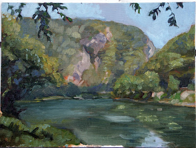
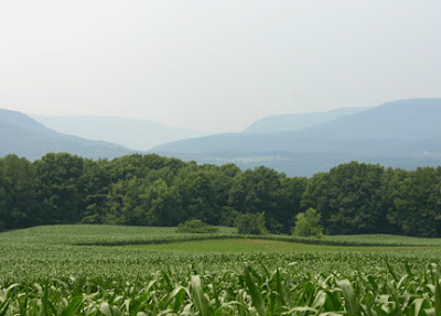
A water gap is a place where a river cuts a notch sideways through a mountain range. Geologists tell us this indicates a river which is older than the mountains it flows through. Pennsylvania is rich in these water gaps, and one of the most well-known is the Delaware Water Gap on the Delaware River between Pennsylvania and New Jersey.

Above: Lighting at 8:30 AM, 11:30 AM, and 2:30 PM

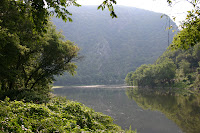
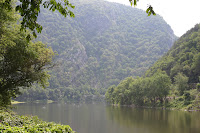
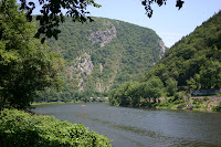
I started this painting around 8 AM or so and finished about 2:45 PM. The light shifted radically during this time. While the copse of trees on the opposite shore was delightful in the early morning, by midday the rock faces across the gap had emerged from mist. I was facing due east, so I knew the sun would track directly above me, gradually illuminating the scene before me.


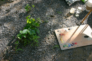
I started by making a terrible mistake. That plant you see to the left of my palette is New Jersey’s state flower, poison ivy. I had dumped my painting supplies on top of it without noticing. My paper towels went into the trash; the rest of my stuff (and my feet) I washed with baby wipes as well as I could. Nonetheless, I await the rash with trepidation.


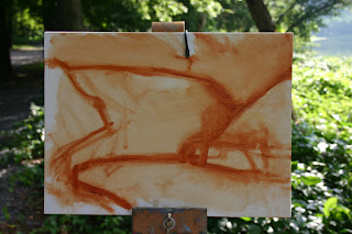
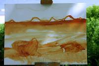
I started with a rudimentary sketch for placement. I was working on a small canvas (9X12) and I needed to scale the big landscape down to a workable size.


Next, I refined my sketch into a value study (meaning a sketch of the placements of darks and lights). This study is good for two things. You work out a pleasing composition, and you practice and refine your drawing.

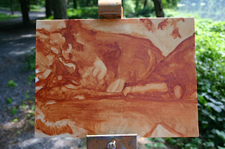
As I continue to study the Canadian Group of Seven, I realize how they framed the landscape in overhanging branches and screens of tree limbs. I have avoided this kind of device because in my hands it looked tacky. But I was determined to try it here. I realized that these branches couldn’t be an afterthought. Instead, they must be part of the original composition, as carefully drawn and realized as the rest of the painting.


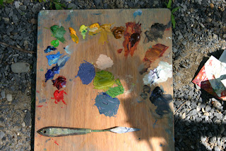
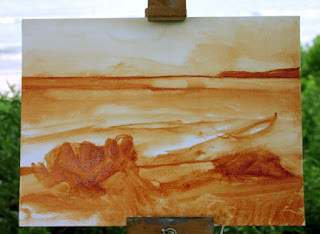
I mixed colors for the far hill with my palette knife. To paint with authority, you must mix enough paint. Mixing with a brush is bad for your painting and your brushes. The three colors at the bottom are for the trees—warm highlights and cool shadows on this summer morning. The two colors above are for the rock. Even though the slope hadn’t emerged from shadow yet, my knowledge of the Water Gap told me the faces would be pinkish with violet shadows. My midtone for the rocks was burnt sienna.


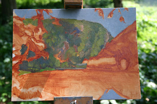
I am painting very dry—no turps and no medium, in an effort to keep each color clear and separate from its neighbors. This leads to my second error, about which more below.


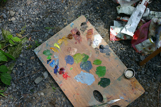
I’ve added three higher key colors for the closer mountain, on the right. As you can see, my palette is creeping dangerously close to the poison ivy again.


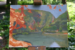
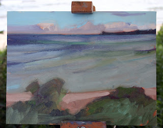
The problem I mentioned earlier becomes apparent. Because I’m painting very dry, there is little blending going on between paints. In the past I’ve relied on the underpainting to mute my painting automatically, but that wasn’t happening here. I had to go back and “dull” the background colors before I could begin to paint the foreground.


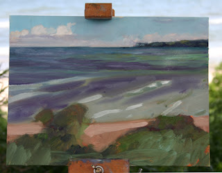
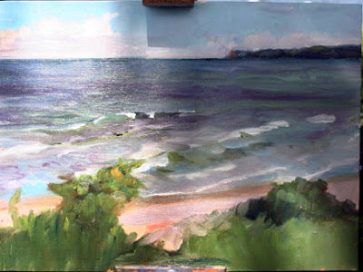
Here is my painting at the point when I quit. I need to resolve the sky a bit and reset the water on the left, which should be more of a grayish olive.

Cathedral of St. John the Divine, New York

Since Monday was a day of heavy rain, painting outdoors without shelter was out of the question (eventually the paint starts sliding off the canvas). The Cathedral kindly gave me permission to paint inside. I know the Cathedral fairly well, and have always been enthralled by Dutch church interiors (for example, see here, here, and here.)

My husband asked me, “How does it compare to Canterbury Cathedral?” It doesn’t have the patina of a thousand years of continuous use, but in fact it compares pretty well. For example, the stone carvings near the high altar are sensitive and traditional, yet very fresh and lively.

A serious fire swept through the north transept of the Cathedral in 2001, damaging tapestries, organ pipes and stone work. Today, the chancel and choir have been thoroughly cleaned and the great nave (601 feet long) should be finished by this fall. Perhaps this is my only complaint—I wish that in a thousand years, a docent could point high above to the vaulting and say, “These marks are traces of the Great Fire of 2001,” as a memorial to New York’s annus horribilis. For in addition to the World Trade Center cataclysm that year, the second-most-deadly plane crash in American aviation occurred in Queens in November. Although the Cathedral fire was far less important than the other catastrophes, it was etched into stone laid for perpetuity.

The Cathedral is a continual ongoing project. Although the cornerstone was laid in 1892, work has progressed in fits and starts (dictated by finances and two world wars) and is at this time moribund. I am totally charmed by the cinderblock-and-corrugated iron sheds along the south wall, which were built as temporary structures. It takes no effort to see them as wattle-and-daub huts pressed against medieval cathedrals-in-progress.

The light in the Cathedral was very dim, with the nave closed off and the high chancel windows dark on such a dreary day. That made paint mixing difficult, since I was literally guessing at color. Many tourists stopped to visit while I was painting, and I never let on that I was not from Gotham—it would have spoiled their fun.

Gwendolyn enters the room

Gwendolyn is a beginning watercolorist who is reengineering the world of plein air for her classmates (and for me). She has made her French easel more functional than I ever imagined possible. Look here to read her first entry, which explains her innovations to date. I plan to make one of her noodle brush holders tomorrow myself. Brava, Gwendolyn.

How did I end up with more than fifty tubes of paint in my studio?

OK, it’s not that I’m a packrat exactly, but how long do you suppose this tube of paint has been kicking around? (For the record, there are also 58 tubes of watercolors…)

I have the terrible habit of buying paints without checking my inventory first. There are paints from my teen years, squatters left by former students, and orphan colors I bought but don’t like. There are also specialty paints, including a few metallics and zinc white.

But most of the tubes of paint in my studio are there because of my carelessness. That’s how I ended up with seven started tubes of titanium white, five different dark reds ranging from alizarin crimson to mars violet, several phthalo green mixes, and many other overlapping pigments.

There is a four-character colour index international (CII) code listed on every tube of good paint. Recognizing pigments from these codes is an important skill for the painter.

Just as Benjamin Moore uses names like “Yukon Sky” to peddle grey paint, art paints are often marketed with evocative names. Generally these names appeal to our sense of tradition, even when the old paint has no relationship to its namesake. For example, Indian Yellow was once made from the urine of cattle which had been fed mango leaves. Today it is made from lightfast diarylide yellow (PY83).

Other obsolete paints are approximated by blends. Naples Yellow started as lead antimoniate, but today is approximated by a blend of four pigments.

Then there are the modern synthetic organic pigments, which I enjoy tremendously. These were developed for industrial purposes and have no historical antecedents. They are great for their high chroma and clarity when tinted with white. The problem comes when they are used to mimic more expensive pigments. For example, I once bought a paint called “viridian” which was not genuine but a blend including a phthalo green. It looked like viridian coming out of the tube but stained like crazy.

When I was sorting today, I found three tubes of cerulean blue. One is Gamblin’s cerulean (PB35), which is “true” cerulean, made of oxides of cobalt & tin. This is a pricey paint but invaluable in the plein air paint-box. The second is cerulean blue hue, which is a much less expensive paint designed to mimic the color and opacity of PB35. It is a mix of zinc white and phthalo blue (PW4, PB15). The third was an off brand which I chucked before noting the contents.

There are places I can substitute the hue for the real thing, but why buy a mix to do it when I already own both the phthalo and white? A good general rule is to stick to single pigment paints whenever possible and mix your own colors. This gives you the greatest latitude.

There are great resources on the web to learn more about pigments. For oils, see Gambin Paint, here. For watercolors, see Bruce MacEvoy’s Handprint.com, here. (I am personally grateful to my friend Kristin Zimmermann for teaching me about CII pigment identification.)

Rip-rap on the Lake Ontario Shore

I learned two important things today.

  1. When electronics (like your work camera) go missing, it’s wisest to start by looking in your teen’s bedroom;
  2. It costs $.25 per picture to upload photos from your cell phone.

This is my way of apologizing for not having “in progress” shots of this little sketch of rip-rap on the Lake Ontario shore. This was an extremely quick study, done in a few hours. The most memorable part was the surf rising and spraying my easel, my palette, and my feet.

These big rocks appear to be white marble and something else hard—gneiss? The prevailing stone here is Medina sandstone, which is soft and tints the soil pinkish. These big, hard white boulders look alien here. Although they are weathering beautifully, I hesitate to paint them in detail because they aren’t part of my essential Lake Ontario.

One more painting I want you to look at

Here is another picture that has been on my mind recently. It’s Sir Stanley Spencer’s The Resurrection, Cookham (1924-27, Tate Britain).

http://www.tate.org.uk/servlet/ViewWork?workid=13675&tabview=image

Sir Stanley Spencer is really three painters wrapped into one—a religious with a gentle, sweet view of “the resurrection and the life,” a superlative landscape painter, and a sexually tortured, brutally honest figure painter.

In April I visited the Church of St. Martin in Canterbury, which is England’s oldest parish church in continuous use, founded as the private chapel of Queen Bertha of Kent in the sixth century. As you can imagine, its graveyard is crowded.


I attended a funeral of a sweet eight-year old boy on Saturday in an old burial ground in rural New York. It doesn’t look that different from the churchyards at St. Martin’s or Cookham. What a comfort to imagine Tyler’s resurrection just as Sir Stanley Spencer saw it.

Talking about paintings in class

We are currently analyzing paintings in class. This week, Gwendolyn brought Franz Marc’s “The Yellow Cow,” 1911, Guggenheim—NYC.


Franz Marc, Yellow Cow (Gelbe Kuh), 1911. Oil on canvas, Solomon R. Guggenheim Museum, NY, NY.(http://www.guggenheimcollection.org/site/artist_work_lg_98_5.html)

Franz Marc is hard for me to peg. On the one hand his painting clearly evokes the anxiety of Europe at the beginning of a century of world war (the artist died on the battlefield in March, 1916, near Verdun-sur-Meuse, France). On the other hand, there is something Chagall-like in his delight in these animals, which is very appealing.

Opinion in class on Marc’s cow was decidedly mixed. While some responded positively to the color, others found the palette and angular cubism disturbing.

Marilyn brought J.E.H. MacDonald’s “The Tangled Garden,” 1915, National Gallery of Canada—Ottawa.


The Tangled Garden, 1915, Oil on Cardboard, National Gallery of Canada—Ottawa) (http://en.wikipedia.org/wiki/Image:JEH_MacDonald_-_Tangled_Garden.jpg#filelinks)

“The Tangled Garden” shares some traits with impressionism, in its color handling, wet-on-wet painting, and rich impasto. (The delightful color shifts are not as apparent in this high-contrast reproduction.) However, it is a very carefully drawn and mapped painting, and MacDonald makes no attempt to mask his draftsmanship.

J.E.H. MacDonald is one of Canada’s Group of Seven painters. We share a lot of landscape features with the Great White North so I think it will be interesting over the next weeks to consider more work by the Group of Seven painters and their associates. (See McMichael Canadian Art Collection and National Gallery of Canada for more information on the Group of Seven.)

From 99 Âş F to 65 Âş in two days

At Rochester, the shore of Lake Ontario is flat and covered with fine cobblestones. The shoreline is very even. It is hard to break up the strong horizontal and diagonal lines, except by putting in the dark overhanging trees.

What the lake lacks in architecture it makes up for with incredible light and color. On a windy day, the water shifts from violet to emerald as cloud shadows fly across its surface.

It was 65 º F when we got there with steadily strengthening winds. By noon, the wind was so strong, there were whitecaps on the lake and my hat had blown away. Of course, this fellow was happy…


I start with a crude sketch in Transparent Earth Orange (Gamblin’s transparent version of Burnt Sienna). My first pass is a very static composition, since I’ve divided the canvas into three equal spaces with two well-balanced lumps in the foreground.


I move the horizon line up gradually. I’d wanted clouds racing across the sky but realize you can’t have it all. I hope to break the bottom diagonal with little hummocks of plants along the shore.


The horizon moves even higher and only the clouds distant over Ontario remain. In truth, the only darks are in the foliage on the shore but I don’t want to weight the bottom of my painting so much. The shadow color on the water ranges from tints of ultramarine to quinacridone violet, depending on when you look. The green ranges from yellowish to emerald green.

My first pass is mainly to establish darks. Often the highest chroma in Lake Ontario is at the horizon line and the color of the water becomes less saturated the nearer you are to it. (This is the opposite of most long views, where the color becomes lower key the farther away you look.)


Next I establish an overall color scheme. I like this little sketch at this point, but I am concentrating so much on the water lighting that I don’t notice I’m “regularizing” the shapes in the foreground. The mind wants so much to balance things, but that same symmetry will dissatisfy me farther on. (The lump on the left is a young box elder and the wind at this point was bending it nearly double.)


I need to set the diagonals of the breakers, which appear to change angle as you scan the shore because they are rolling in from the west (over my left shoulder). Although the angle changes, the waves break at about the same distance from the shore no matter what direction you are looking.


I begin to consider the interstices between the breakers and develop the foliage in the front. Unfortunately, my painting pal has to leave, so we call it a day.


My biggest issue with this painting is to make the foreground shapes more interesting. I also want to refine the waves. But again, I want to do this on location, rather than in studio.

Painting on top of a ridge

This study is about half finished. It was done on a ridge above Naples, NY (in the Finger Lakes region). Since I don’t want to work from photos, I will go back next week.

The thermometer read 99Âş F; later we found out that was as high as it would go. The photo was taken at the end of our painting session and the light was then much bluer. The mountains were a more complex color earlier in the day.

My goals for next week are to refine the drawing/painting of the tree line and the fields in the foreground. There is an unfortunate confluence of line where the tree meets the valley—I need to resolve that too. My painting is a little cramped horizontally, but I won’t try to fix that on this draft; instead I’ll paint it again.

Here is the view from the top of the ridge.

One more time with feeling–Tilt-a-Whirl


My last attempt at blogging was so difficult it scared me away. But here I am, back for more.

This was done last Saturday at Seabreeze Amusement Park in Rochester. It was painted from about 30 feet away. The figures are imaginary because the cars were whirling too fast to see people. I loved the odd pulsating thing on the right which rises up and down like a sea monster. The canvas and lighted bulb actually conceal the mechanical arms of the Tilt-a-Whirl.

The best I could hope for in the chaos of an amusement park was a straight rendering of what was happening. I finished at dusk so was able to suggest the lights coming on.

I realize after the fact that most people hold themselves very rigid as the Tilt-a-Whirl spins. My figures are too relaxed.