Monday Morning Art School: the right support for your painting

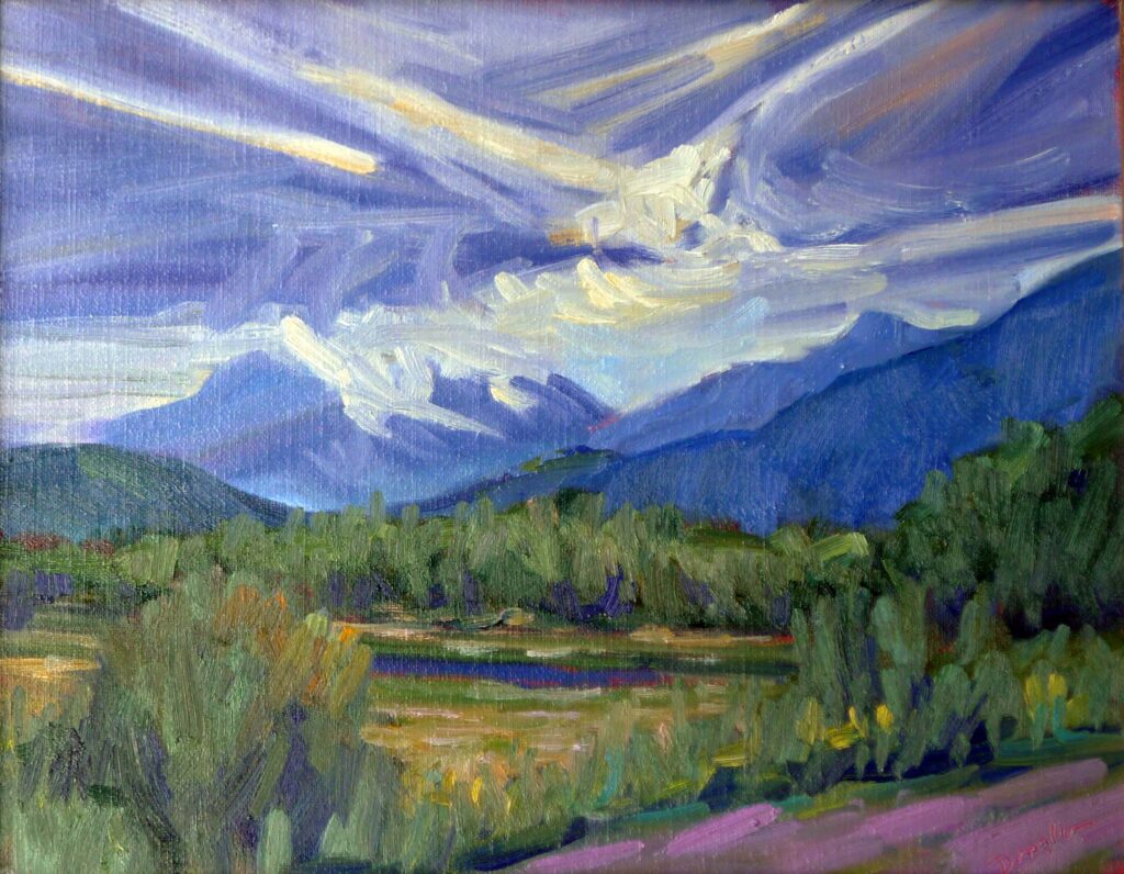
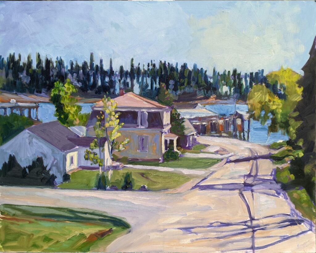
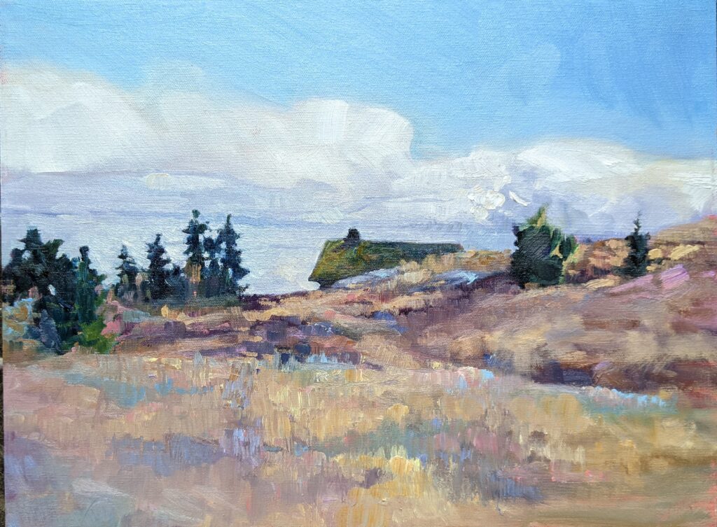
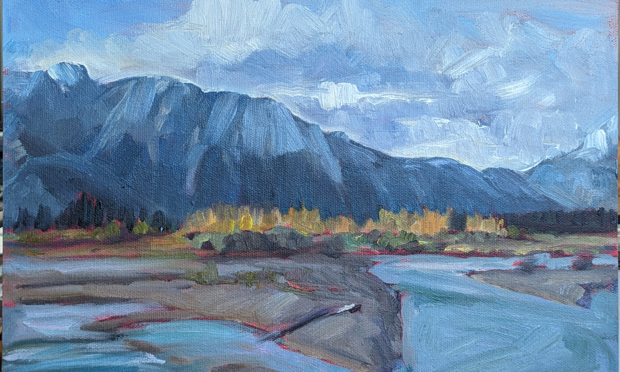
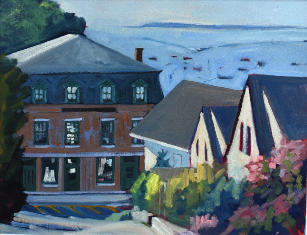
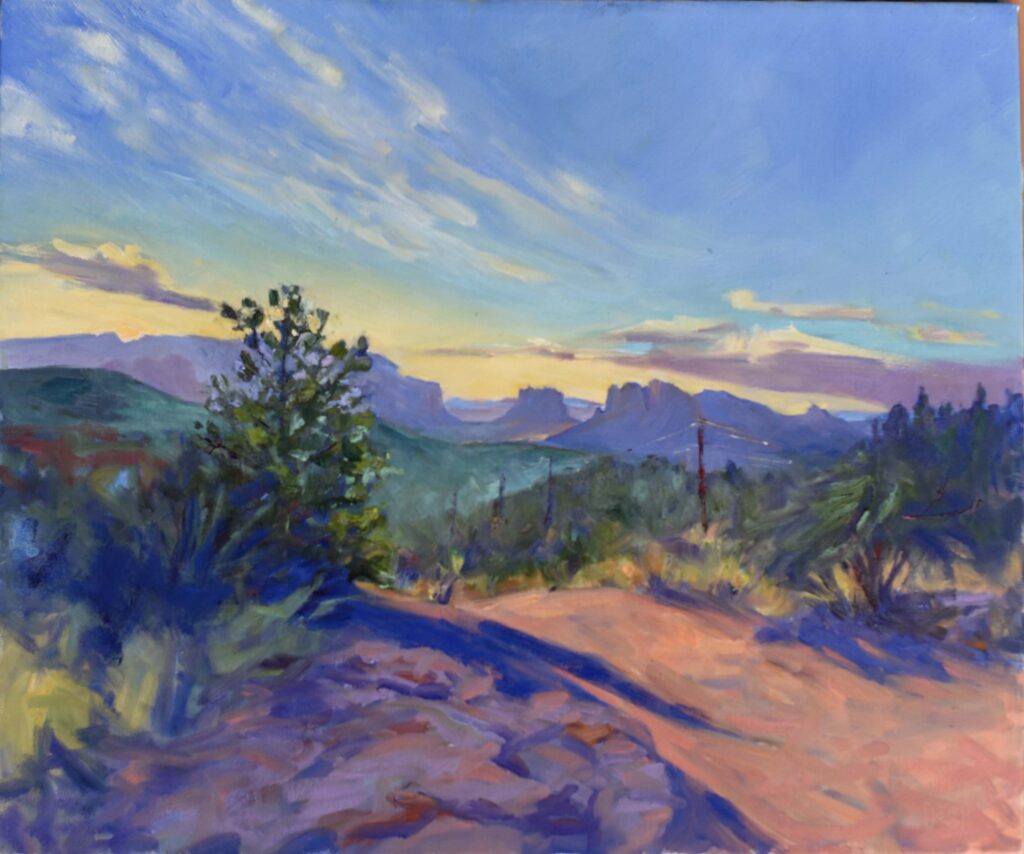
https://www.watch-me-paint.com/product/brooding-skies/Brooding Skies, 8X10, oil on archival canvasboard. Click on image for more information.

“What kind of paper/canvas should I buy” is among the first questions I’m asked by new workshop students. While I can’t recommend museum-grade panels to beginners, it’s disheartening to watch students struggle with cheap painting supports.

The painting support you choose affects how your paint behaves, how your marks read and whether your work lasts.

A quick note on classes before we get into it

My upcoming session of evening Zoom classes is selling fast; Painting water is already sold out. Claim your spot in Painting clouds or From field sketch to final studio work before they sell out too.

Let’s discuss medium first

Watercolor depends on controlled absorbency. The paint sits in the surface, not on top of it. That’s why the quality of watercolor paper matters so much. 100% cotton papers hold water evenly, allow controlled washes, allow for scrubbing out changes and resist breakdown over time. Cheaper wood-pulp papers buckle, blotch, and lose clarity.

The best support for gouache is heavy-weight paper (at least 140 lb.) that can handle water without warping. Because texture isn’t as important as for watercolor, hot-pressed paper—also known as Bristol—is ideal. Other options include illustration board, watercolor journals, and heavy mixed-media paper. Gouache can be painted on gessoed board, but it’s not necessary.

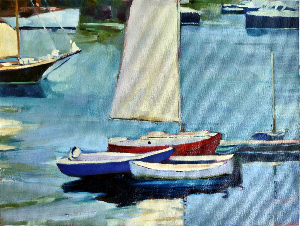
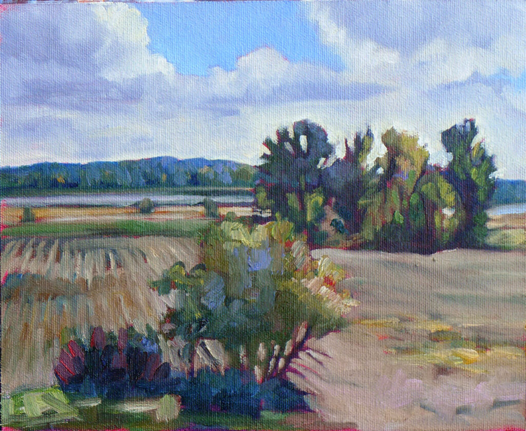
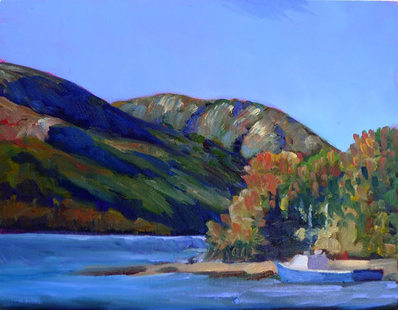
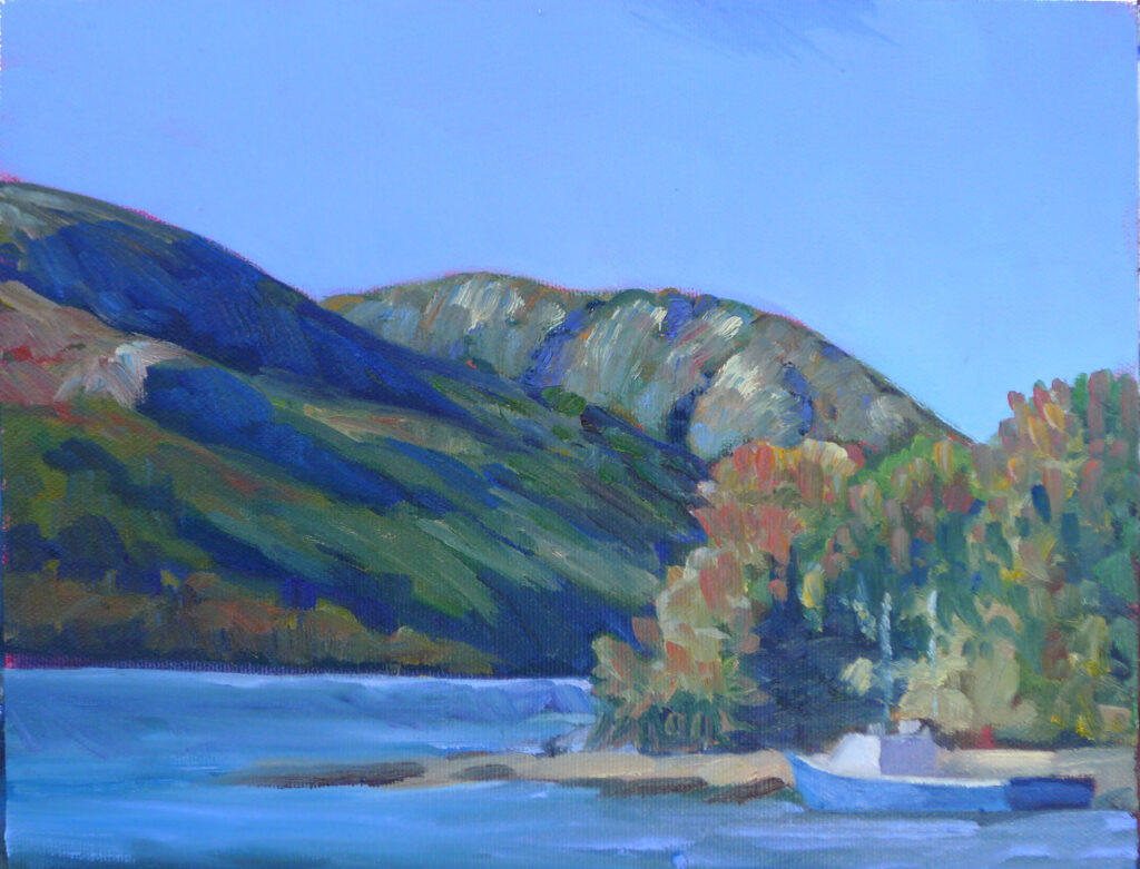
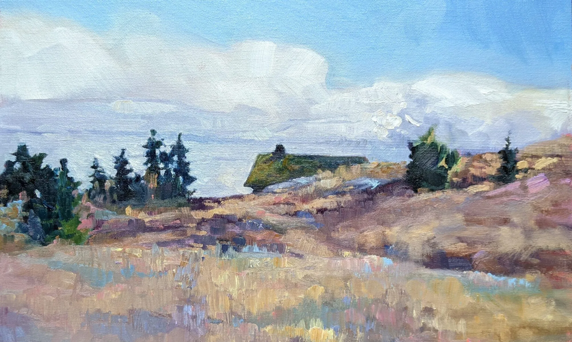
Lake of the Woods, 12X16, oil on archival canvasboard. Click on image for more information.

Acrylics will stick to almost anything, but a properly gessoed surface controls absorbency and prevents paint from sinking in unevenly. Cheap surfaces can feel draggy or dead.

Oils absolutely require a sealed, primed ground. Oil paint binders are acidic, which reacts with and destroys the support over time. If painting on paper or a wood board, prime with either clear or regular gesso.

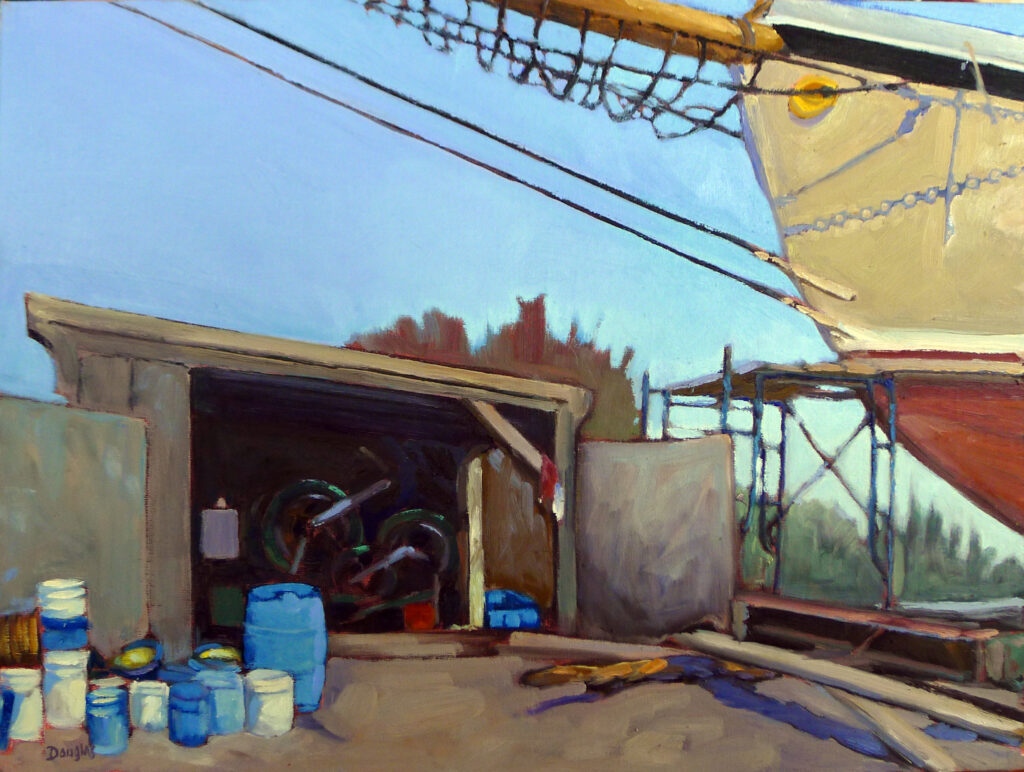
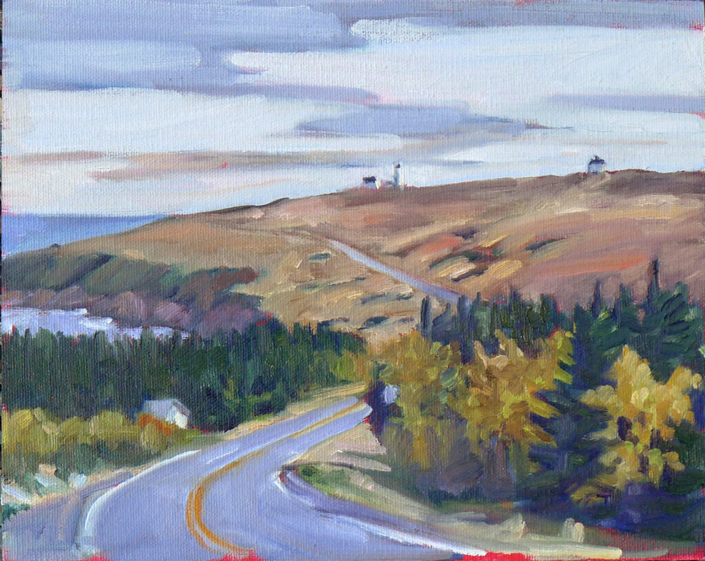
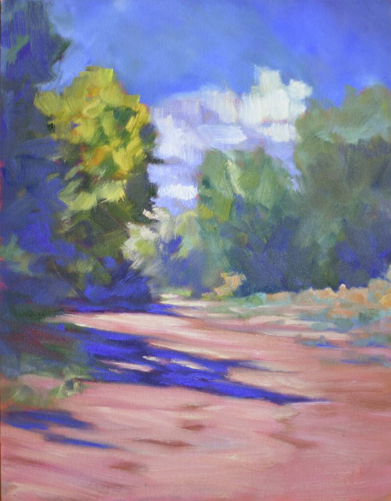
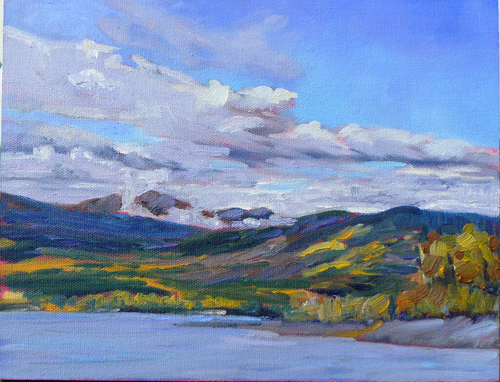
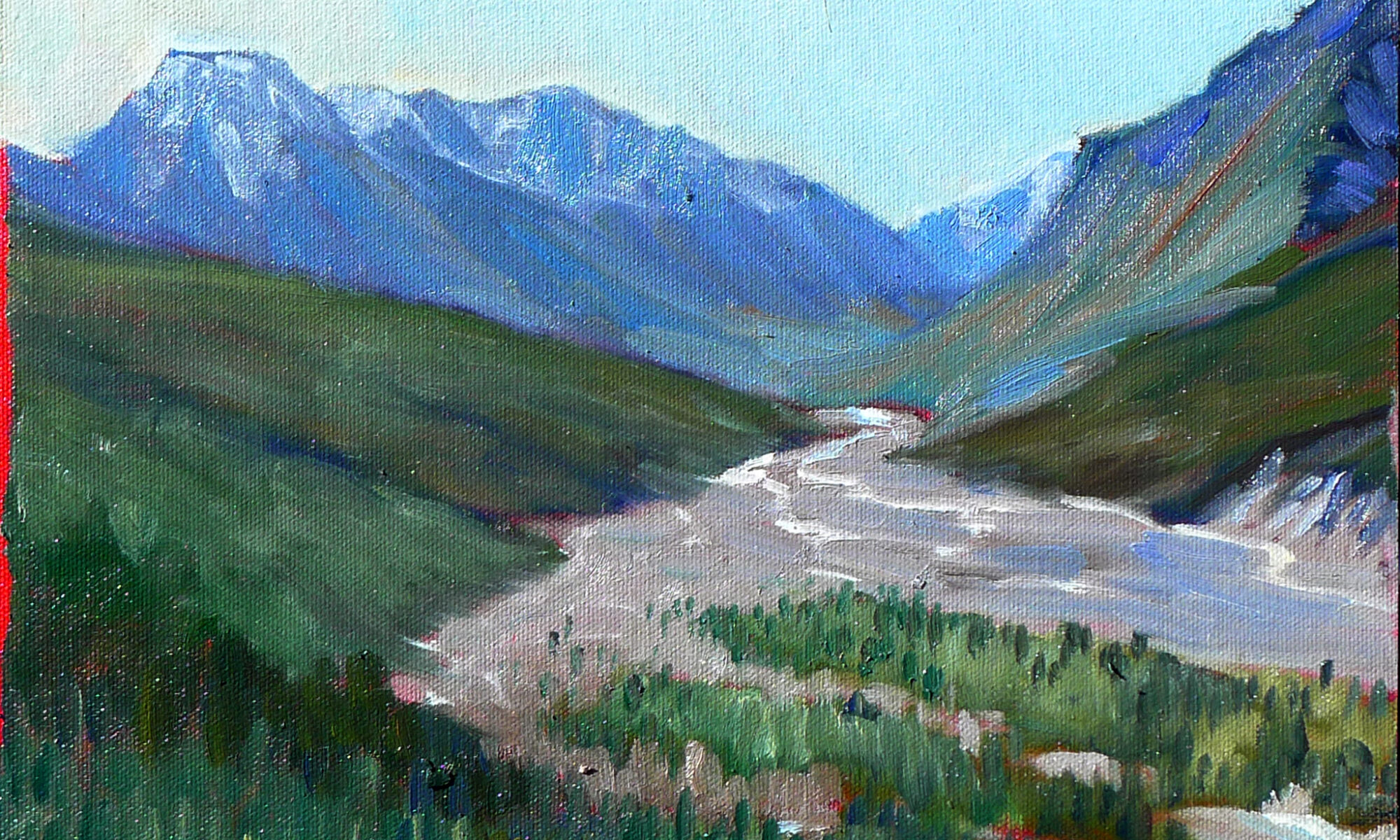
Maynard Dixon Clouds, 11X14, oil on archival canvas board. Click on image for more information.

Rigid versus paper supports

Paper is immediate and responsive. It’s ideal for watercolor and gouache, and perfectly good for acrylic studies. But quality varies wildly. Good paper has proper sizing (which controls absorbency) and consistent texture; poor paper acts like a blotter or warps under even modest moisture. Paper must be properly prepared for oil and acrylic painting.

There are many good paper watercolor boards on the market. They’re more convenient and less prone to buckling than watercolor paper, but they cost more.

For oils or acrylics, I use archival canvas-boards for all smaller paintings. They’re easier to frame and carry, and I don’t have to worry about light coming through the back of the canvas. However, larger boards can be prone to warping.

When I travel, I sometimes bring loose canvas and tape it to a board. That gives me less bulk when flying, but floppy wet sheets of canvas can also be difficult to transport.

Stretched canvas and linen are the traditional choices for oils and acrylics, and I use them for all larger work. It can sometimes be hard to determine the quality of packaged canvas, so research before you buy. Cheap canvas can sag or distort, and insufficient gesso allows paint to bleed through to the backing.

In practice student-grade panels and canvases are fine for students but can have inconsistent tooth and weaker priming.

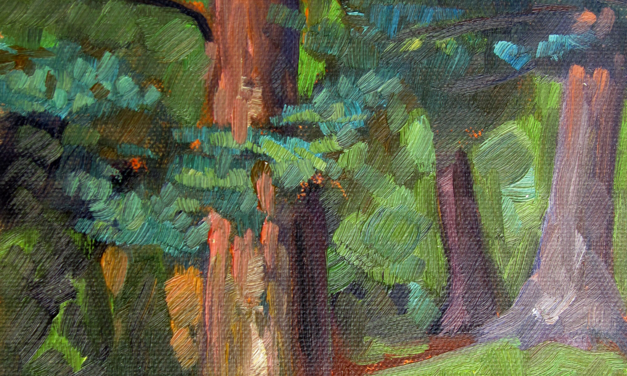
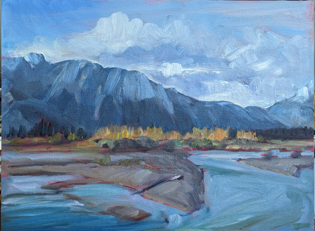
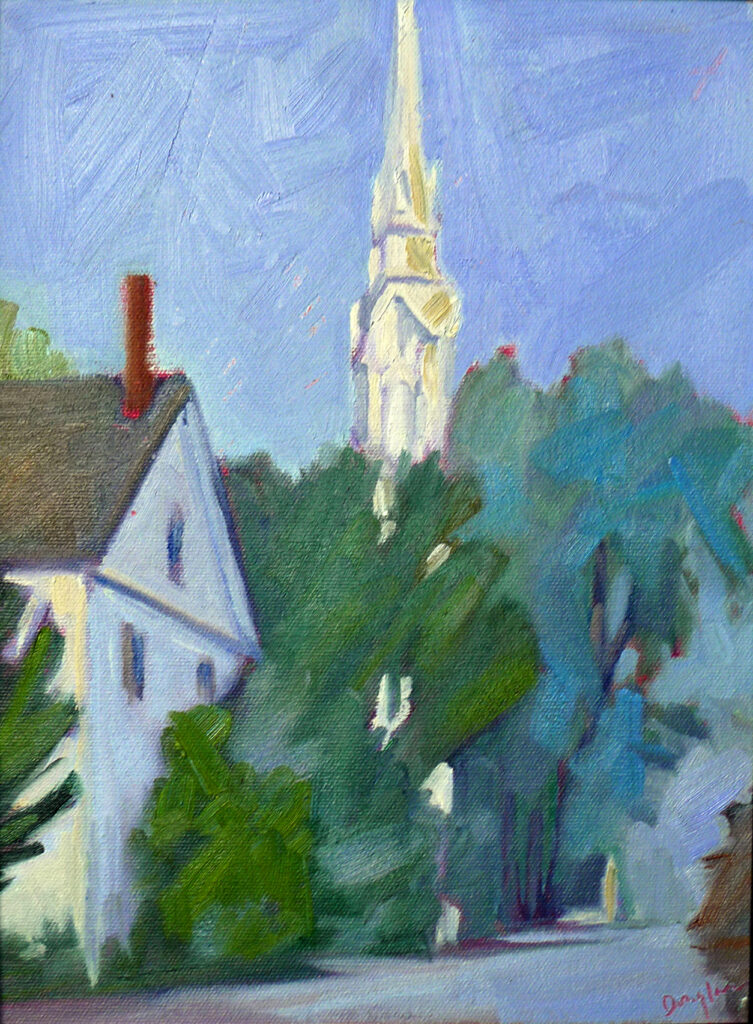
No Northern Lights Tonight, 6X8, oil on archival canvasboard. Click on image for more information.

Size matters

I tell students to prepare to paint two 9X12 paintings a day during a workshop. In practice, some will paint more, some less. Some students produce small jewels on 4”X5” canvases; others love working big. This is personal preference.

When preparing for an event, I usually bring canvases and frames in all sizes. I never know how a scene will inspire me.

What separates good from mediocre?

  • Absorbency control–good surfaces absorb just enough paint or water without sinking color or bleeding through.
  • Surface consistency—cheap painting supports have inconsistent surfaces. Good ones behave predictably.
  • Longevity—archival materials including cotton paper, proper sizing and rigid supports, keep your work intact over time.

The right painting support isn’t magic, but it will improve your painting.

Want to learn more?

I have three upcoming Zoom classes. In From Field Sketch to Final Studio Work (six weeks on Tuesday evenings) we talk about how your initial decisions carry through to a fully-realized studio painting. In Painting Clouds (a three-week Monday session), you’ll learn practical ways to paint these all-important natural phenomena.

Registration is now open for workshops in 2026! Reserve your spot:

Can’t commit to a full workshop? Work online at your own pace:
Seven Protocols for Successful Oil Painters

What’s the difference between plein air and studio painting?

The Vineyard, oil on linen, 30X40, for more details, click on image.

I can beat a plein air painting to death as well as the next artist, so it helps to occasionally remind myself of the difference between plein air and studio paintings.

A quick note on classes before we get into it

My upcoming session of evening Zoom classes is selling fast; Painting water is already sold out. Claim your spot in Painting clouds or From field sketch to final studio work before they sell out too.

In the field

Outdoors, I’m working against time. The light shifts, the shadows slide, the clouds roll by. I’m trying to capture something fleeting, and that forces me into clarity and economy of effort. I simplify, make snap decisions, commit. If I’m indecisive, it’s all over.

A good field sketch isn’t about detail; it’s all structure. It locks down the value pattern, major shapes and intent. It answers the essential question: what is this painting about? If you solve that outdoors, you’ve already done the hardest part.

Keuka Lake vineyard, oil on archival canvasboard, private collection. This was the nucleus of my idea for the studio painting above.

In the studio

I almost never revise my plein air paintings back in the studio, because I can improve them right into dust.

In the studio, everything changes. Time expands. I fuss and second-guess. It’s easy to lose the freshness of the original idea because the germ of the painting is no longer in front of me. It’s very difficult to avoid reinventing my idea.

I’d rather use plein air sketches to inform and define separate studio paintings. That allows plein air to be fresh and studio work to be refined.

Photos lie

There was a reason for the decisions you made in the field. Your value structure, focal points and big shapes all happened because something in the real world caught your imagination. You can’t duplicate that from a photo; your snapshots are an aide to memory, nothing more.

Photos encourage us to bore (in both senses of the word) into too much detail. That’s especially true when you have the leisure to overwork, to describe every branch and leaf.

This is another painting I did while working out the same idea. Private collection.

Vitality or polish?

If your field sketch was strong enough, edges can ultimately be clarified, color deepened, drawing corrected. You can push temperature relationships, unify passages and make sure the eye moves cleanly through the composition. But the raw, living thing you caught outdoors should never be overwritten. That sacrifices vitality for polish.

Frederic E. Church traveled throughout New England, New York, Virginia and Kentucky painting. He made two trips to South America and went to Mexico, Newfoundland, Labrador, the Middle East and elsewhere. He took his field sketches back to his studio and created monumental paintings that made him one of the most successful artists in American history.

Many painters get lost trying to compromise between plein air and studio painting techniques. The field demands boldness; the studio demands sophistication. To carry vitality into the studio, you cannot destroy the thing you loved. It’s the map that will give your studio paintings direction and life.

That’s exactly what I focus on in my From Field Sketch to Final Studio Work Zoom class (Tuesday evenings, June 2, 9, 16, 23, 30, July 7). We break down the process step by step so you stop fighting your own paintings and start building on them.

Camden Harbor, Midsummer, oil on canvas, 24X36. Although large, it was done entirely en plein air. For more information, click on the image.

Painting clouds

Of course, structure is only part of the story. If you can’t handle moving elements like water or shifting forms like clouds, your field work will always feel incomplete. That’s why I’m teaching a focused session on Painting Clouds (Monday evenings, June 22, 29 and July 6). The subject forces you to simplify, prioritize, and paint with authority. Both classes are really about the same thing: learning to make decisions that hold up from first sketch to final brushstroke.

Registration is now open for workshops in 2026! Reserve your spot:

Can’t commit to a full workshop? Work online at your own pace:
Seven Protocols for Successful Oil Painters

Mystifying, maddening jurying

Rachel’s Garden, ~24×35, watercolor on Yupo, museum-grade plexiglass. For more information, click on the image.

The other day I ran into an artist buddy on the trail. He lamented that he was rejected from a show he really wanted to get into, but told me that he got into one that I think of as tougher. Like all of us, he tried to parse why. If I had any great insights, I’d have shared them, but jurying paintings can be mystifying and maddening.

A quick note on classes before we get into it

My upcoming session of evening Zoom classes is selling fast; Painting water is already sold out. Claim your spot in Painting clouds or From field sketch to final studio work before they sell out too.

What is jurying?

Painters get nervous about the word jurying, as if it’s a verdict on their worth. It helps to think of it as a sorting tool. I’ve juried people into shows and for awards. At present, I’m jurying paintings for my Advanced Plein Air Workshop. It’s not about whether you’re the best or even good enough. The question is whether you’re appropriate for that particular event.

That can involve factors that artists never think about, such as whether there are enough watercolorists or geographical distribution. It can involve style, for no good show has everything look the same. And, frankly, it can be subjective. A lot of paintings we now acknowledge as masterpieces were rejected by jurors in their day.

Spring Allee, oil on archival canvasboard, 14X18. For more information, click on image.

Your recent work

Jurors usually ask that work be done in the last two or three years. That’s because the juror doesn’t really want to know where you’ve been; he or she wants to know where you’re going.

I’m generally scanning for patterns: how you organize value, whether your compositions hold together, how you handle edges, and whether your color decisions are intentional or reactive. I’m also looking for consistency.

What I’m not doing is rewarding polish. In fact, overly-finished work can be a red flag to me. It can mean the painter has settled into a formula that works. Growth requires the ability to take risks.

Spring Greens, 8X10, oil on archival canvasboard. For more information, click on image.

Practically speaking

Jurors look at a lot of work, often on their phones, and the first pass is usually at thumbnail size. If it doesn’t compel in that tiny format, nobody is going to give it a second look. As my gallerist friend Bernadette says, there are minimum standards, including cropping out extraneous background, lighting the work properly, and submitting it in a reasonably large file format.

Why am I asking for your portfolio?

An advanced plein air class only works if the whole cohort operates on the same level. That doesn’t mean painting in identical styles or having the same goals. It means a shared ability to see, simplify and execute. If half the group is still wrestling with basic drawing and the other half is trying to refine subtle color relationships, nobody gets what they came for. The class is fragmented and I lose my mind.

A strong, solid group changes everything. When everyone can handle the fundamentals, the conversation shifts. We’re no longer fixing obvious errors; we’re discussing choices. Why this composition instead of that one? Why compress the value range here and expand it there? Why push color in one passage and neutralize it in another? Those are advanced questions, and they require painters who can engage at that level.

If you’re ready for an advanced class, where the feedback is specific, the expectations are high and the group itself becomes part of the teaching team you can learn more here.

Apple Blossom Time, oil on archival canvasboard. For more information, click on image.

The process

When I review a portfolio, I’m looking for evidence of decision-making under pressure. Plein air painting is unforgiving. Light changes, weather shifts, time compresses. Can you simplify quickly? Do your value masses read from a distance? Are your edges controlled, or are they a byproduct of hesitation? These aren’t abstract ideas; they’re visible in the work.

I’m also paying attention to range. Do you always default to the same composition or the same depth and distance? Comfort can stall growth, and I want to challenge that.

Finally, I’m looking for readiness: the ability to hear feedback, test it and adjust without losing the thread of your own intent.

Registration is now open for workshops in 2026! Reserve your spot:

Can’t commit to a full workshop? Work online at your own pace:
Seven Protocols for Successful Oil Painters

Monday Morning Art School: glazing vs. scumbling

A very old painting by me, using indirect painting technique.

Being the World’s Oldest Living Person, I learned to paint from my old friend Rembrandt van Rijn. That meant I learned to paint indirectly, through glazes. When I went to the Art Students League, I jumped forward a few centuries and learned to paint directly, or alla prima.

A quick note on classes before we get into it

My upcoming session of evening Zoom classes is selling fast; Painting water is already sold out. Claim your spot in Painting clouds or From field sketch to final studio work before they sell out too.

Alla Prima

Alla prima painting is done in a continuous pass, or as close as you can get within the limitations of size and time. You mix colors and put them down in their final form. It’s characterized by immediacy and loose brushwork.

Indirect painting is built in stages, layer over layer, with drying time in between. Each layer modifies but doesn’t obscure the one beneath it. Indirect painting trades immediacy for control.

Most painters end up using a hybrid approach, especially when working large. Scumbling and glazing are opposite in method and effect, but can appear in the same painting (see Rembrandt’s self-portraits, for example). However, it’s hard to glaze over impasto, as the glaze sits in the valleys of existing paint.

Glazing is very useful in making revisions on a dry painting, provided there is little texture.

What is glazing?

Glazing is transparent. You take a thin, translucent layer of paint and lay it over a dry underpainting. In oils and acrylics, that paint is thinned with medium, not solvent. In watercolor, it’s thinned with water. In gouache, it doesn’t work.

If the layer underneath isn’t completely set, you’re not glazing, you’re just mixing. You’ll end up with mud. A proper glaze allows light to pass through the new layer, bounce off the layers below, and return to the viewer’s eye. That’s what creates depth and luminosity.

White, yellow ochre and other opaque pigments have no place in glazing. Only transparent and semi-transparent pigments work. How do you know which is which? Good paint manufacturers put it right on the tube.

Glazing can build rich shadows, unify color passages, and create atmospheric distance. A cool glaze over a warm passage can push it back in space. Done well, glazing doesn’t sit on the surface; it seems to glow.

Glazing is slow. It requires more patience, planning, and restraint than I’m currently capable of. I can’t brute-force my way through an entire indirect painting, but I do use glazing to make editorial changes.

You can’t scumble if the paint is too wet.

What is scumbling?

Scumbling, on the other hand, starts with heftier paint. In watercolor, that means less water; in oils and acrylics it means opacity. (All pigments can be made opaque with a drop of white or yellow ochre.)

Drag a lighter, drier layer of paint across the surface so that it skips over the high points of the texture, allowing bits of the underlayer to show through. Scumbling is broken, irregular, and tactile. It’s a very lively texture.

Scumbling can suggest the roughness of stone, the sparkle of light on water, or the haze of distant atmosphere. It’s especially effective over a darker, dry layer, where the broken application creates a vibrating edge between colors. Unlike glazing, which deepens and unifies, scumbling disrupts and enlivens.

The drier the paint and the more horizontal the brush, the more the painted line will break.

It’s all technique

For glazing, use a soft brush, plenty of medium and a light touch. The paint film should be thin and even. Don’t scrub; if you break the surface of the lower layer, you’ll make mud.

For scumbling, use a stiffer brush and reduce the water or medium. Physically drag the paint, keeping the brush at a low angle to the surface. The brush should skip. If it’s laying down a smooth, continuous stroke, you’re not scumbling.

Either can be overused

Too many glazes, and everything turns murky. The transparency that once created depth becomes mud. Too much scumbling, and your painting can look overworked, with no clear hierarchy of edges or forms.

These are advanced topics, and if you want to learn more, you’re a candidate for Advanced Plein Air Painting in Rockport, ME, July 13-17, 2026. This is for experienced painters ready to level up: work side‑by‑side with experienced painters to deepen skill and spark new ideas.

Registration is now open for workshops in 2026! Reserve your spot:

Can’t commit to a full workshop? Work online at your own pace:
Seven Protocols for Successful Oil Painters

What to leave out: the secret to strong composition

The Wreck of the SS Ethie, oil on canvas, 18X24. For more information, click on image.

Some days, I’m in the mood to leave modern life out of my paintings. Some days, I want to include all the pollutants, potholes and power lines. This isn’t so much an aesthetic decision as one based on mood. (Although the older I get, the more inclined I am to leave caustic commentary to others. What the world needs now is love, not division.)

It’s easy to see what to put in a painting. It’s harder to figure out what to leave out.

A quick note on classes before we get into it

My upcoming session of evening Zoom classes is selling fast; Painting water is already sold out. Claim your spot in Painting clouds or From field sketch to final studio work before they sell out too.

Compositional hierarchy in painting

Yes, keen observation equals better painting. That doesn’t mean we should transcribe every tree, window or ripple. Without compositional hierarchy in painting, you’re left with a muddle where everything has equal importance and therefore nothing is important.

Every strong painting has a clear compositional hierarchy: something that matters most, things that support it, and what I sometimes call ‘border work’—things that whisper from the sidelines. If you don’t decide what’s important, who will?

Main Street, Owl’s Head, oil on archival canvasboard. For more information, click on image.

What is this painting about?

When I teach critique, I start by asking the artist: “What is this painting about? What were you trying to say?” We could also ask, “What struck you the most about the subject?”

In most cases, that’s not a literal question, but a visual one. Is it light hitting a tree line? The sweep of a cloud bank? The gesture of a figure? The answer is the main determinant of what is important in the painting.

Anything that competes with that is a liability.

Let’s say your subject is the light raking across the roof of a house. That charming little mailbox on the edge of your scene may be delightful in real life, but if it pulls the eye away from your focal points, it belongs in its own, separate painting. That busy pattern of branches behind the roof might be absolutely accurate. However, accuracy isn’t your goal; clarity is. Simplify, soften or axe whatever doesn’t support your goals.

I don’t know why painters feel guilty when they do this, but people are always asking me if it’s okay to leave things out. Even hyperrealism relies on skillful editing.

Every element you keep must direct the eye around the painting through a series of focal points. It should also support the mood and message of the painting. If it doesn’t do those things, it’s not an addition to the painting; it’s a negative.

The Logging Truck, oil on archival canvasboard. For more information, click on image.

How do you control compositional hierarchy in painting?

You really have only a few tools to create focal points:

  • Contrast in value;
  • Contrast in hue;
  • Contrast in chroma;
  • Line (which can be literal or the boundaries between two shapes).

No amount of detail can make up for deficiencies in these elements.

Lobster pound, 14X18, oil on canvas. For more information, click on image.

Restraint is power

Preliminary studies are valuable in many ways. They tell whether the value structure is strong enough to carry an idea, but they also tell you what happens when you remove detail. Squint at the subject. Mass it into big shapes. Decide early what belongs and what doesn’t, and then stick to your guns.

I often tell my students, “If you can paint it once, you can paint it 1000 times.” That’s only necessary because they’ve managed to paint a clever detail in the wrong spot or the wrong value, which they could have avoided with a preliminary value sketch. Good painting requires ruthlessness. If you don’t cut in the sketch phase, you’ll end up doing it in paint. That’s far more painful.

Registration is now open for workshops in 2026! Reserve your spot:

Can’t commit to a full workshop? Work online at your own pace:
Seven Protocols for Successful Oil Painters

Painter, you are not a journalist (I hope)

Marshes along the Ottawa River, Plaisance, 8X10, oil on archival canvasboard. For more information, click on image.

“Is it okay to leave out the…?” is a question I hear often.

Many landscape painters approach scenes like journalists. They try to report what they see. Every tree is accounted for, every ripple on the water acknowledged, every color matched as faithfully as possible. It feels responsible. It feels honest. It also feels boring as hell.

I’ve worked as a journalist and I know that reporting is far from passive. It requires cultivation of sources, incisive questioning and a quick mind. But painters can’t assume the reportorial pose. There’s a difference between a news story and a narrative. One is factual and one is poetic.

A scene is raw material, not a conclusion. A painting is an allusion, and sometimes an illusion. It’s far closer to a novel than a news story.

I’ve written this blog three times a week for many years. When I was younger, I could write poetically, but I’ve trained that out of myself in favor of concise accuracy. I frequently regret that and hope I never do it in my painting.

The Pine Tree State, 6X8, oil on archival canvasboard. For more information, click on image.

From seeing everything to choosing something

Good painting composers decide what matters and what doesn’t. They decide where the viewer looks first, and where their eye rests next. They decide how light is organized, how values are grouped and how color is bent to serve the structure. None of that is accidental, and none of it is guaranteed by the subject in front of you. That’s especially true in plein air, where the subject flickers and changes. If you’re merely trying to report what you see, you’re doomed to failure. The scene in front of you could change completely in the next fifteen minutes.

When you’re stuck in reporting mode, your paintings can end up with competing focal points, values that are true but not compelling and boring edges. All of that might be faithful to what you see but unconvincing as a painting.

A good painter can make a persuasive painting from any scene or subject. Sadly, the opposite is also true. It’s quite possible to make a terrible painting from the most wonderful scene or subject. I speak from experience here.

The Vineyard, oil on linen, 30X40. For more information, click on image.

Authors edit, ruthlessly

Painting teachers teach an exercise from John Carlson’s Theory of Angles and Consequent Values. It involves knocking the scene into four values. Inevitably, someone will assume that if four values are good, eight are better. Well, actually, three are better. Yes, value is a continuous band between dark and light, but the human mind craves patterns. That starts with simplification. When we drop meaningless, fine distinctions we oddly strengthen our painting.

Color is another area where factual reporting is counterproductive. Instead, think in terms of relationships. Warm plays against cool; saturated against neutral—all while being aware of color harmonies. Accuracy should be secondary to cohesion.

Eastern Manitoba River, 6X8, oil on archival canvasboard. For more information, click on image.

You’re not just making it up

This doesn’t mean you abandon observation. Quite the opposite. The first step in painting is to realize what compels you about the scene or idea. That requires a lot of seeing and thinking. Observe carefully but use information selectively. You’re not copying the scene; you’re interpreting it.

One practical way to break the reporting habit is to set constraints. Make a value sketch before you start. Identify clear focal points and commit to them. These decisions force you to prioritize.

In the end, a successful painting isn’t a record of what was there. It’s a record of what you thought and felt about it.

Registration is now open for the following Zoom classes:

Painting Water (almost full)
Monday evenings, 6-9 PM
June 1, 8, 15

Water is often the most mesmerizing part of a landscape—the way it holds the light, mirrors the sky, and breathes life into a static scene. Click to sign up.

Painting Clouds
Monday evenings, 6-9 PM
June 22, 29, July 6

If you’ve ever picked out shapes in the clouds as they drifted by, this class is for you. This short, 3-week session is a great opportunity to give weekly Zoom classes a try. Learn more.

From Field Sketch to Final Studio Work
Tuesday evenings, 6-9 PM
June 2, 9, 16, 23, 30, July 7

This 6-week course is designed to help you breathe life into those “unfinished” sketches littering your studio. Learn more.

Registration is now open for workshops in 2026! Reserve your spot:

Can’t commit to a full workshop? Work online at your own pace:

Seven Protocols for Successful Oil Painters

Monday Morning Art School: master clouds, water and more in online painting classes

Hammerhead cumulonimbus cloud over Posse Grounds Park, 9X12, oil on canvasboard, private collection.

Online painting classes are a brilliant way to learn to paint. If you’ve never done them, you should give them a try.

What’s coming up in my online painting classes

On Mondays, I’ll be teaching two subject-based three-week sessions, and on Tuesday a longer, more in-depth session.

I’m reoffering Painting Clouds because last time it sold out in 24 hours (there’s a fifteen-student limit for my Zoom classes). If you’re interested, don’t shilly-shally; it’s painful to have to tell my friends no.

Before that, we’ll tackle the next-most-difficult subject in landscape painting: water and reflections. I’m hoping, in these shorter sessions, to get through the things that are the hardest during plein air season. Because of the shorter format, they’re also the perfect opportunity to give online painting classes a try.

Skylarking II, 18×24, oil on linen, for more details click on image.

Painting water

Monday evenings, 6-9 PM: June 1, 8, 15

Light, surface, and movement are the three important elements in painting water. If you don’t organize those three, you end up chasing ripples. Water is one subject where photos absolutely lie, because they freeze the motion that defines the sea.

We’ll focus on:

  • Reflection: How does the surface of water affect what you see? Where do reflections end up?
  • How edges and wave shapes describe motion in different kinds of seas;
  • How perspective works across the water;
  • Color and light on water (the ocean is very big and often surprising);
  • And more!

By the end of session three, you’ll have completed water studies and developed the confidence to tackle water paintings on your own. Class size is limited, claim your spot now!

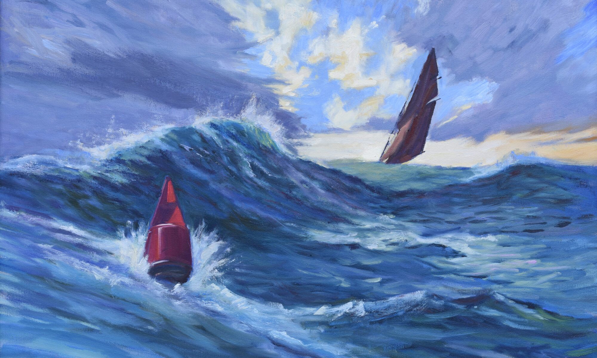
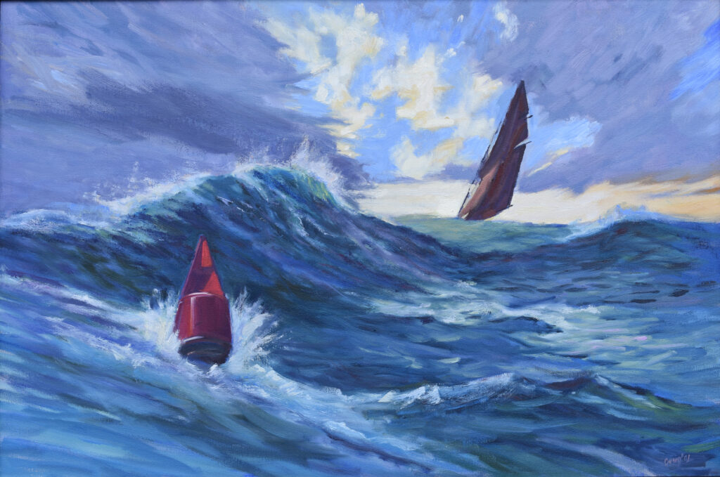
Heavy Weather (Ketch Angelique), 24X36, oil on canvas, for more details, click on image.

Painting clouds

Monday evenings, 6-9 PM: June 22, 29, July 6

Clouds are the ultimate teacher. They strip away the noise and force us to focus on the core of great painting: value, light, and composition. This short, 3-session class is designed to be a low-pressure way to sharpen your eye.

We’ll focus on:

  • Understanding how clouds form and the different kinds of clouds;
  • Capturing the unique volume of clouds, and applying our perspective skills to their shapes;
  • Studying the color and value of light and shadow within clouds;
  • Special lighting situations like sunset.

By the end of session three, you’ll have completed sky studies and the confidence to tackle the skies on your own. Class size is limited, claim your spot now!

The Vineyard, oil on linen, 30X40, for more details, click on image.

From field sketch to final studio work: turning a plein air or other sketch into a large studio painting

Tuesday evenings, 6-9 PM: June 2, 9, 16, 23, 30, July 7

A studio painting is never just an enlarged version of an oil sketch. A sketch can serve as our starting point, but it needs a broader concept to make a finished painting. Simply enlarging a sketch leads to empty passages and lifeless results. The larger the canvas, the more skill is required to keep the painting vital.

This is a class idea that’s grown from years of discussion with my students. Those unfinished sketches littering your studio are the seeds from which you’ll work. That mass of unfinished paintings will suddenly prove their worth.

The seed of a studio painting might be a small oil or watercolor painting, a drawing in your sketchbook, or a series of items. In these smaller works, we focus primarily on color or value relationships. We compose as well as possible within a limited time and we draw to the best of our ability. However, our main concern is capturing big forms, shapes or ideas. Even these must be reconsidered, refined and thoughtfully to make a larger studio painting.

Your first job for this class is going to be to sit down on the floor and go through all your smaller work (finished and unfinished, good and not-so-good) and sort them into general concepts.

Look at them intelligently, and your body of ideas will begin to crystalize into a Big Idea. Eventually, by sketching and thinking, you’ll develop a complete image to move forward. We won’t start painting until we’ve thought the image out as completely as if it were on canvas.

One of our first decisions will be the format of the canvas; will the subject be best expressed in a horizontal, square or vertical shape?

In addition to helping you realize larger paintings, this class should also give you the courage to stop overworking your plein air and studio sketches. Reserve your spot now!

Registration is now open for workshops in 2026! Reserve your spot:

Can’t commit to a full workshop? Work online at your own pace:
Seven Protocols for Successful Oil Painters

What do I mean, portfolio review?

I spend a lot of time getting from painter to painter. It’s a good thing I’m so dang young and fit! Hah!

Years ago, I took a master class from a Very Famous Artist who was, unfortunately, a jerk. In the middle of day two, he loudly asked his monitor, “how did some of these people get in here, anyway?” It was a question I’d asked myself, but would never have voiced out loud. The problem wasn’t with the people in the class; it was with the organization that had done improper vetting. The advanced painters were held back, and the beginners got nothing out of the class.

I like teaching beginner painters. I especially like them in my workshops, where they have all the time they need. There’s one exception, though, and that’s Advanced Plein Air Painting in July.

If you haven’t studied with me before, you’ll need to submit a portfolio to get in. I hate hurting people’s feelings, but everyone gets more out of a workshop that’s properly tuned to their current experience level.

Drying sails in Camden harbor.

July in Maine is a painter’s gift

In July, I remember why I live in New England. Long, luminous days. High, clean light bouncing off the Atlantic Ocean. Warm, salty ocean breezes. Evenings that stretch on forever, with color hanging in the sky long after you think it should be gone. Fresh lettuce at the farm stand.

July is so generous that you can almost make a good painting on enthusiasm alone. That’s why I’m so particular about who takes this workshop. We’re not there to paint by good luck; we’re selecting, organizing, and pushing the motif into something intentional.

My town is a very, very fine town…

What do I mean by portfolio review?

Do you understand the process of watercolors, gouache, pastel, oils or acrylic so well that it is automatic? Can you simplify a complex scene into strong shapes? Do your values hold together from across the room? Are you controlling edges, or are they controlling you?

A portfolio review isn’t about judging whether your work is good. It’s about seeing how you think. Of course, technical proficiency is very important, but I’m hoping to help students get past that.

Put ten plein air paintings from Rockport Harbor side by side and certain tendencies emerge. There are painters who chase every sparkle on the water, and that works. Others lock into strong composition. Some edit ruthlessly. Some are brilliant draftsmen. Very few can do all these things simultaneously, but I’m hoping to push all the participants in this workshop up to that professional level.

If you’re considering taking that next step, you can learn more about what we will work on in my course description, here. Or, if you have questions, just ask me.

This is a person who’s taken my instruction to heart. You know who you are!

What am I looking for?

Your portfolio should show range, not just success. Include studies that push value. Paintings where you took risks with composition. Work that didn’t entirely succeed but clearly aimed at something specific. I’d rather see a strong idea imperfectly executed than a safe painting that coasts on habit.

What I’m really reviewing isn’t just your past work. It’s your preparedness and readiness to move beyond it.

If you want to apply

First, read more here and decide if you’re interested. If so, send 3-5 images to my email here. Resist the urge to polish everything into sameness. Let the work show your thinking. Let it show your reach.

If you’ve taken a Zoom class or workshop with me during the past two years, you can bypass the portfolio review because I’m already familiar with your work; just send me an email. Or show me what you’ve been up to recently; I’m always game for that!

There is, by the way, a 15-person cap on all my workshops and classes. When they’re full, they’re full.

Registration is now open for workshops in 2026! Reserve your spot:

Can’t commit to a full workshop? Work online at your own pace:
Seven Protocols for Successful Oil Painters

The ‘good enough’ trap

Ravenous Wolves, oil on canvas, 24X30. For more information, click on image.

Art & Fear: Observations on the Perils (and Rewards) of Artmaking is the best book I know about the artist mindset. One of its central ideas is that artists often stop growing because they become attached to outcomes: approval, consistency, or the need to avoid failure. Artists also gravitate toward what gains them positive feedback.

There’s a moment in every painter’s development when things start to work. Drawing is competent, values are accurate, color is no longer embarrassing. People compliment your work and some of it sells. You’ve arrived.

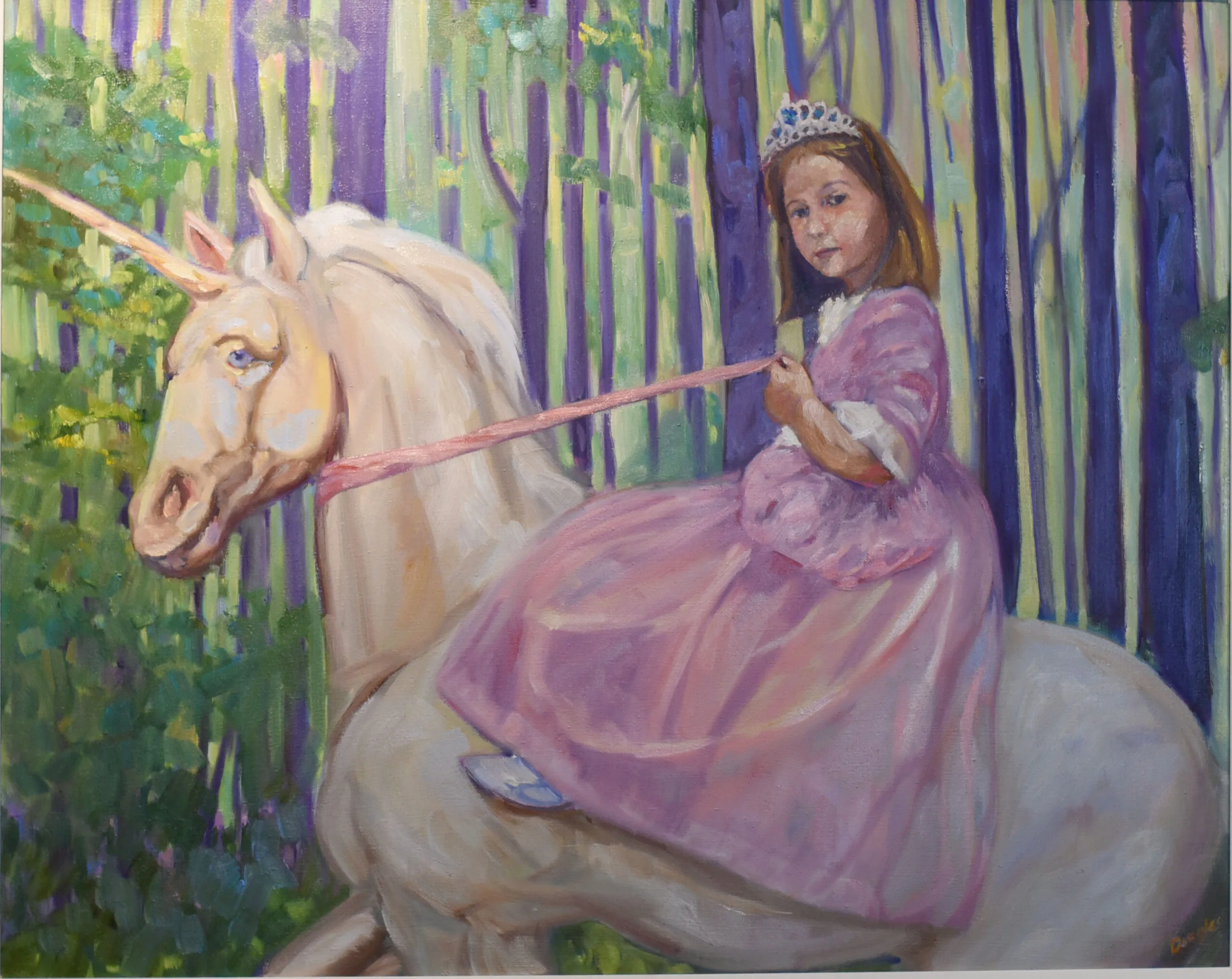
In Control (Grace and her Unicorn), 24X30. For more information, click on image.

Beware, it’s a trap.

It’s comfortable. You know how to solve most problems before they arise. You have a reliable process. Your paintings look like paintings. And because of that, it’s dangerously easy to stop pushing. After all, why fix what ain’t broke?

The problem is that technical proficiency, while necessary, is not the same thing as having an artistic voice. One is about solving visual problems. The other is about saying something that only you can say. They are very different goals.

You can be very good at painting and still produce work that feels generic. You lean into what you know works: safe compositions, familiar color harmonies, predictable brushwork. Over time, your paintings become polished, and interchangeable with so many others.

Hitting this point is an achievement, but it doesn’t mean you’ve arrived. Sadly, some never move beyond it. The way out isn’t more polish—it’s more risk.

If you’re ready to push past technical competence and start developing a stronger, more personal voice, I go much deeper into this in my advanced workshop in July. It’s all about voice, although we will discuss technical issues.

Best Buds, 11X14, oil on canvasboard. For more informatino, click on image.

You do you

An artistic voice means making decisions that aren’t strictly right (but based on a knowledge of the rules, as I mentioned last week). It means aggressively editing reality and choosing colors based on harmony, not because they’re really there. It means moving beyond the safety net and allowing yourself to fail.

I’ve watched many technically-proficient painters refuse this jump. They’ve worked so hard to minimize mistakes. Now I’m suggesting they reintroduce uncertainty. That feels like regression, but it isn’t.

Technique is about control. Voice is about intention. Without control, your intentions can’t be executed. But without intention, control is empty.

You can see this clearly when you compare paintings that are ‘correct’ with those that are compelling. The former check all the boxes—accurate drawing, believable light, competent handling. The latter might bend or even break some of those rules, but they carry conviction. They feel authored.

good enough trap, painting development, artist voice, advanced painting
Quebec Brook, oil on archival canvasboard. For more information, click on image.

How to escape the ‘good enough’ trap

Start by noticing where you’re playing it safe. A little voice in your head will be saying, “but this might not work.” Do you avoid subjects because they’re too hard? Default to the same compositions? The same color harmonies? Those patterns are clues that show you where you’ve built comfort, and where you need to push.

Paint something you don’t fully understand. Exaggerate values. Simplify more than feels comfortable, or complicate something you normally simplify. The goal isn’t to make a masterpiece. It’s to stretch your decision-making beyond autopilot.

In the end, good-enough painting isn’t a technical problem. It’s a creative one. And the only way through it is to risk not being good enough—for a while—until you push yourself into greatness.

Registration is now open for workshops in 2026! Reserve your spot:

Can’t commit to a full workshop? Work online at your own pace:
Seven Protocols for Successful Oil Painters

Monday Morning Art School: cast versus form shadows

Prom Shoes 2, oil on archival canvasboard, click on image for more information. One of the great benefits of painting still life is that it teaches you to manage form vs. cast shadows.

We tend to lump shadows together into one vague, dark idea, kind of like Halloween. Despite the dangers of noun-thinking in painting I’m going to throw two more labels at you: cast shadows and form shadows. When you understand the difference, your paintings will sit solidly in space.

Form shadow on a sphere.

Form shadows belong to the object itself. They describe the turning of a surface away from the light. Above, I’ve illustrated a sphere: one side faces the light, the other gradually rolls into darkness. That transition—from light into halftone into shadow—is a form shadow. It’s soft, gradual, and tied directly to the geometry of the object. Form shadows are what give volume. They’re how a circle becomes a ball.

Cast shadows, on the other hand, are thrown by one object onto another surface. A tree casts a shadow on the ground. A nose casts a shadow across a cheek. These shadows are graphic and shape-driven. Their edges depend on the sharpness of the light source. They primarily describe the interruption of light rather than the turning of form.

Cast shadows are opposite the light source.

Not all shadows behave the same way

Form shadows will have softer edges when they are created by gradual changes in light across a curved surface. The more matte the surface, the softer the shadow. Even in strong light, the transitions of a form shadow are rarely abrupt. A hard edge in a form shadow will flatten the object. When we paint with form shadows, we’re doing what’s called ‘modeling’.

Cast shadows, especially close to their source, tend to have firmer edges. They can soften as they move away from the object, and the softer the light source, the softer the shadow. But cast shadows are usually crisp near the object that’s casting them. If you paint cast shadows with mushy edges, your painting loses definition. Everything feels vague and unanchored.

Form shadows are part of the object’s local color family, darker and often cooler. Cast shadows, however, can drop dramatically in value; they represent areas where light is blocked entirely. That said, they’re rarely as dark as beginners make them. There is almost always reflected light bouncing into them, especially outdoors.

Where cast and form shadows meet

There may be almost no differentiation where cast and form shadows meet; they can sometimes run into each other as an unbroken dark. A great example is Johannes Vermeer’s Girl with a Red Hat, which is a delightful exercise in lost and found edges.

Color temperature

Form shadows will generally shift cooler relative to the light, particularly in natural light. Cast shadows also follow this general rule. However, depending on the environment, they can pick up surprising color such as warm, reflected light.

In either case, shadows can have reflected color in them. For example, the insides of daffodils—despite being in shadow—will be a clear, deep yellow. They’re reflecting the yellow back on themselves.

Baby spruce on the shoreline at Corea, 8X10, private collection.

This is a good place to ban black

Shadows may, in certain situations, appear black. If, for design purposes, that works for you, make yourself a chromatic black from ultramarine blue and burnt sienna or a blue-magenta-yellow combination if you’re working in severely-limited palette. Tube black is useful for making greens, for making tones and shades, or for painting your grand piano. But it has no place in your shadows.

But in any case, most shadows are simply more charming if they have color in them, or many colors in them.

Your practical takeaway

One of the great virtues of painting still life is learning to manage cast and form shadows differently. When you see a shadow, ask yourself what it’s doing. Is it describing the turning of a form, or is it being cast onto a surface? That will help you handle its edge crispness, its value and its color.

Registration is now open for workshops in 2026! Reserve your spot:

Can’t commit to a full workshop? Work online at your own pace:

Seven Protocols for Successful Oil Painters