Try reducing one of these paintings to a notan, and you’ll realize just how much drawing underpins this seeming simplicity.
 |
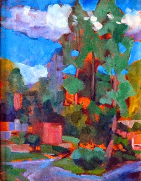
| Plein air painting by Tara Will, courtesy of the artist. |
“Why are you teaching us self-portrait?” a student recently asked me. The human face is the most demanding subject to draw, because very slight errors make a huge difference. It teaches the artist to use angles and distance to measure. And we might as well start with our own faces, since they’re the ones we know best.
“But I’m interested composition and color, not drawing!” my student responded. That’s like saying you’re interested in literature without first learning to sound out your letters. Drawing is the foundation of everything that follows.
 |
| Tara Wills’ lily pond painting from this week, courtesy of the artist. |
Yesterday, I came across the above plein air painting by Tara Will, a pastel painter from Maryland. I don’t know Tara well, but what I do know, I like—both personally and professionally. We met doing plein air events, where she created work that seemed fast, effortless, and stylish. That’s deceptive; her work is underpinned with strong fundamentals, and she works hella hard at it.
Like all great literature, Tara’s lily pond painting is a complex story told with great economy. Count the shapes; they’re limited. She’s abstracted her subject to its absolute essentials. That’s where uninformed critics of modern art sometimes go off the rails; they think simplified drawing should be easier than working out the details. In fact, it’s the culmination of years of thinking and winnowing.
Tara started with a perfectly-executed perspective drawing of the surface of the water. Note how she draws you back along that plane before crashing headlong into the far shore. Without that draftsmanship, the painting would have collapsed into an unintelligible mess. Lesser painters sometimes conceal their lack of drawing skills with a muddle of details. These ‘marsh paintings’ are drearily similar and uninspiring.
 |
| Plein air painting by Tara Will, courtesy of the artist. |
It would be nice to be able to buy a box of pastels and immediately tap into this sort of vibrancy, but color is more complicated than that. Resting under Tara’s effortless explosions of color is a complex and well-reasoned value structure.
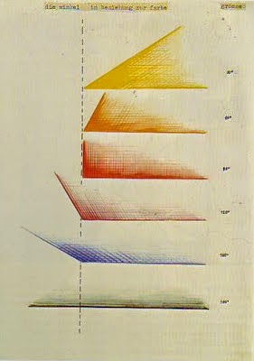
It’s been said that “value does all the work; color gets the credit.” That’s an absurdity, because value is just one aspect of color, along with hue and saturation.
However, it is true that value is the first thing the human eye and mind read when they see a color pattern. Our brains are strongly programmed to interpret value patterns, and great artists have always taken advantage of that. Think first of value, and you can substitute a range of hues and saturation for what’s really there. The viewer’s mind will interpret the pattern, and have fun doing it.
 |
| Plein air painting with strong contre-jour, by Tara Will, courtesy of the artist. |
But, again, that rests on a solid foundation of drawing and pattern making. The more Tara deviates from what’s there in terms of hue and saturation, the more she needs a solid value anchor. That’s especially true of contre-jourpainting, where the light comes from behind the subject, as in the painting above.
I picked out four of Tara’s recent plein air works to share with you. Her studio work is here. Try reducing one of these paintings to a notan, and you’ll realize just how much study underpins this seeming simplicity.