Monday Morning Art School: controlling edges

Creating hard and soft edges is largely a matter of practice.

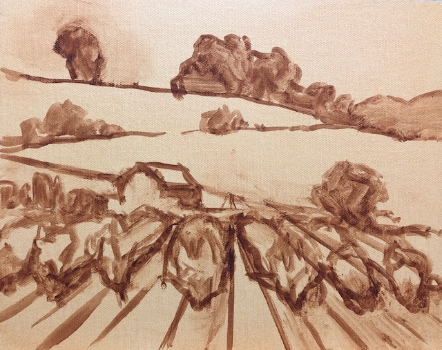
In Breaking Storm, the soft edges in the clouds were done by overbrushing with a dry brush. The hard edges in the sails and rigging were done with a flat brush on its side.

The lost-and-found edge is an important design principle, one that every painter should be familiar with. To do it successfully, one must feel confident painting not just shapes but lines. That requires understanding how your brush lays down paint. Edges are one area in which watercolors and oils behave very differently.

A softened edge creates a natural blurring, and it happens often in human perception. We just ignore the edges we’re not interested in. In painting, a soft edge can be achieved by keeping value, hue and saturation close between two shapes, but it’s most often achieved through brushwork.

A hard edge is an area that demands our attention. It should be related to the focal point of a painting. It can be achieved by separating hue, saturation and value, but it’s also a place where effective brushwork is important.

In oil painting, you can lay down a line and fiddle endlessly with its edge, but in watercolor you get only one shot at it (although you can tidy things up a bit after the fact). This is not permission to overpaint endlessly in oils. In either medium, constant tinkering is a sure-fire way to deaden your work.

In either medium, the smaller the brush, the harder the edge. That’s one reason your teachers harp on you to use a bigger brush.

The angle at which you hold your watercolor brush will determine how broken the line is.

In watercolor, the hardness of the edge must be considered in advance.

A truly hard edge is made by working an upright brush slowly across the work, allowing the pigment to flow onto the paper. The more slanted the brush and the less pigment and water, the more broken scumbling will result. This is a beautiful effect, worth practicing.

If you want to soften or blend an edge, you can’t wait until later. Your options are to:

  1. Lay down a line and immediately run clean water along the edge you want to soften;
  2. Work into a prewetted area, letting the paint bleed down along the edge you want to soften;
  3. Create the illusion of softness by unifying passages with an underwash.
Top sample, painted into damp paper with a dry edge at the top. Middle, painted into wet paper with a dry edge at the top. Bottom, edge wetted after painted onto dry paper. 

In the first two techniques, working too slowly will give you bloom (caused by rewetting a partially-dry area) or a hard edge where you don’t want it. A line or shape can have both a hard and a soft edge—just don’t soften the edge on that side of the paper.

A simple exercise in hard and soft edges in watercolor. Yes, kids, try this at home!

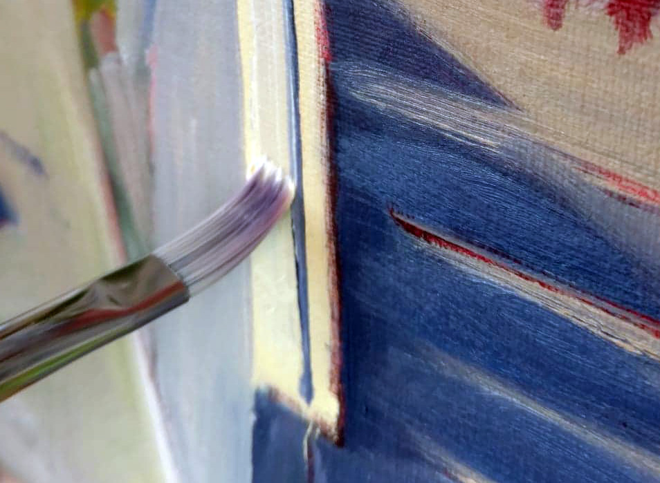
In alla prima oil painting, edges need to be married. That means making a shape or silhouette, and then pushing the background color against it. Not doing this will result in anemic shapes. After this is done, the edge can be softened by:

Using a dry brush to manually blur edges;

Introducing the background color into the foreground and vice-versa.

Three Machines, 1963, Wayne Thiebaud, courtesy De Young Museum. Note that he leaves the edges in the background as part of the design.

At times this will produce a halo around the object. I was taught to eliminate that halo. Recently in class, we were looking at paintings by Wayne Thiebaud, and I noticed how often he left that halo as part of his design. Whether or not you elect to brush the halo out, Thiebaud’s paintings vividly demonstrate how to marry the background to the foreground in oil paints.

The hardest, most precise line in alla prima oil painting can be made by using a flat brush on its side. If you’re painting onto a dry surface, you can get a hard, tight line with a rigger or fine brush as well.

Monday Morning Art School: when you lose your drawing

You do a lovely underpainting and you lose it in the top layers. Why does that happen?

Fog Bank, by Carol L. Douglas. This will be on display at Maine Farmland Trust Gallery later this month.

The human mind loves complex, irrational space divisions. The same mind perversely regularizes what it paints and draws. A split-rail fence, where the gaps between posts diminish haphazardly into infinity, attracts us when we see it. However, unless we’re mindful, when we paint it, we regularize the spacing. The same thing happens with trees, flowers and clouds. In nature, they’re artfully erratic. We too often space them in neat lines. Bobbi Heath calls this anti-entropy. It’s a good description of the brain’s powerful impulse to push ideas, images and tones into patterns.

We’re best at drawing when we’re fresh. The challenge is to keep that freshness throughout the finished layers of a painting.

Visan Vineyard underpainting, by Bobbi Heath.

Bobbi graciously allowed me to share an example for this post. She painted the underpainting above last year in France and finished the work this month in her own studio. That in itself is a challenge. No matter how good your visual memory is, it diminishes over time. You’ll always be most accurate if you finish work quickly.

Bobbi made significant changes between the drawing and the final work. The far hill doesn’t rear up as energetically. The ends of the rows are lower on the canvas, and thus less important. More critically, she reduced the contrast, softened the perspective lines, and the ends are less incisive. She also changed the value of the midfield. In my opinion, the painting was weakened by these changes (although it’s still beautiful).

Visan Vineyard, by Bobbi Heath.

I stress drawing on paper before painting, instead of going straight to the canvas. It’s important to work out the compositional questions before you pick up a brush. It’s just as important to have reference to consult when the light changes or your painting gets distorted. A photo on your phone will just tell you what was there, not how you drew it.

Avoid too much solvent in the bottom layers. In alla prima painting, the bottom layer should have enough OMS in it to move fluidly, but not enough to run. You cannot keep a tight drawing if you’re painting over mush, nor can you keep the colors separated and bright. If you have laid down too much pigment (and it should be thin) lighten it up with a rag, not an OMS-soaked brush. If you can see reflections in your underpainting, it’s too goopy for clean alla prima painting.

It’s a fallacy to think that you draw first and paint second. Painting is continuous drawing, and the initial drawing must be restated constantly. I leave important lines showing until I’m certain I have finished the passage, and sometimes I don’t obliterate them at all. You can’t cover up your drawing and expect to reiterate the freshness of the original line. That early drawing will always be your most delightful.

Home Farm, by Carol L. Douglas. This will be on display at Maine Farmland Trust Gallery later this month.

I prefer to work large in general. It’s easier to be accurate and poetic with a large sweeping line. The smaller the canvas, the more jarring small errors of measurement become. For most brushwork, I recommend holding the brush at a point more than halfway back from the ferrule. That gives your brushwork bounce and grace. But for accurate fine drawing, hold it like a pencil.

Kudos to Bobbi for offering to let me critique her painting publicly. “I wish I’d showed it to you earlier so you could have told me to restate the drawing,” she said. That’s a pal.

A version of this post first appeared in October, 2019.

Monday Morning Art School: mastering value

The essence of alla prima painting is to nail the color on the first pass.

The top of this canvas is a simple grisaille; the bottom is a single layer of paint applied right over that. This is the gist of alla prima painting. 

You cannot overstate the importance of valuein painting. Even when artists represent value with hue(a technique pioneered by the Impressionists) the dark shapes in a painting have a form. That form drives our perception and guides us through the painting. There are various ways to get this right, but the most common is a quick value sketch. I ask watercolor students to then make a value study in paint before they start their finished project. I have oil and acrylic students do their paint study in the form of a rough grisaille on their canvases. It has to be thin, and it has to be worked fairly dry, or you can’t paint over it.

Where early oil painters sometimes trip up is in making that bottom layer too dark, thick, or soupy. Then, they hope they can somehow lighten it up by adding white back in. Indirect painting works almost like this, so they may have seen something similar on a video. In indirect painting, the artist works into this dark layer; in modern direct painting, or alla prima, it’s there as a roadmap, so it’s applied more lightly.

Close-value mixing is the heart of painting, and the hardest mixing to do.

Direct painting requires great skill in color mixing, because the goal is au premier coup, or to nail it on the first strike. That goes not just the for darks, but every color in the picture. Even a painting with wonderful shadows and lights will have many middle tones, often closely related in value. These are actually the most difficult colors to mix accurately. If you have a painting that isn’t working, ask yourself if it has a full tonal range, or is it simply hitting the highs and lows. When people get in trouble painting texture, it’s usually because they’re overstating the contrast.

Plate IV-4 from Joseph Albers’ Interaction of Color, demonstrating how all color is relative. The inner violet colors are the same exact value, but what surrounds them influences how we perceive them.

All color is relative, and that’s particularly true when it comes to value. Above see a plate from Joseph Albers’ groundbreaking Interaction of Color. The inner violets are the exact same value. But the framing color influences how we see those values, so one looks much lighter than the other. This is why oil painters should tone canvases, by the way.

I made the oil-painting sample at the top of this page for my students. The top is the value study; the bottom is a finished painting. I keep it around to demonstrate that when we say “darks to lights” we don’t mean a thick mask of dark paint; we mean that we think through our values in that order. (In watercolor, we do the same thing, but the application is reversed to go from light to dark.)

Copy and print me.

To mix paint accurately you must become absolutely conversant with the colors on your own palette. You can download this pigment test chart and print it on watercolor paper (trimmed to size) on your laser printer. Or, just grid off a canvas or paper to match. (Don’t try doing this in watercolor on plain copy paper. It isn’t sized, and your pigment will just sink.)

Use the pigments you usually have on your palette (if there’s more than eleven, we may need to talk).

What is the natural value of your paint, straight out of the tube? Compare it to that scale above.


The first step is to identify the natural value of your paint, straight out of the tube. For oil painters, this is easy. For watercolorists, it’s a bit of work to figure out what that really darkest point is, because it’s never the same as it appears on your palette. The colors wetted are a better guide, but you’ll need a test paper handy to experiment.
Your finished exercise should look something like this.

When you figure out the darkest natural position of that pigment, paint it in the appropriate position on your scale. Then make lighter steps to match the greyscale strip you’ve printed from the sample above. For watercolorists, that means dilution. For oil and acrylic painters, that means cutting with white.

There are three things to remember:

  1. These judgments are subjective. There’s no reliable way to measure the value of a color. The camera is as subjective as the human eye.  
  2. You can’t get a color to go darker than its ‘natural’ value without distorting the hue or chroma. Thus, there is no natural dark version of cadmium yellow, so the shadows in a yellow object require a workaround.
  3. All pigments can make about the same number of discrete steps. While the yellows have a shorter range, the steps are more noticeable. Blues can mix from almost-white to almost-black, but the middle points are very similar. 

Monday Morning Art School: painting the details

It may seem like a fine brush is better, but that’s not true in wet-on-wet painting.

The Halve Maen passing Hudson Highlands, by Carol L. Douglas
One of the things painting teachers repeat over and over is, “use a bigger brush.” Students think they have better control with a smaller brush, but in many cases, the reverse is true. Smaller brushes hold less paint, and they waggle more when we tremble. To draw a juicy line, a brush has to be big enough to hold enough pigment.
It’s relatively easy to lay fine lines down in thin paint, either water-based or when glazing with oils. It’s not so easy in alla prima oil painting. The style tends to be looser and rougher. A fine line added with a rigger can lie on the surface looking silly, or it can melt into the lower layers and look like a grey streak of mush.
Working backwards allows you to make clean edges without being overly fussy.
One solution is to paint edges and lines in the underpainting, and then overlap the color in the top layers to meet the edges. This allows you to create a line that’s razor thin without looking fussy.
Of course, if you’re painting big to small, you don’t have lines or detail in the underpainting. They’re not important in the big-shape phase. You need a technique to remove the excess paint before you draw. For large corrections, I take off excess paint with a palette knife. For lines, I use a wipe-out tool. I had a very old one made by Loew-Cornell that I lost last summer. I replaced it with a Kemper wipe-out tool, and it works perfectly well. These tools are also great for signing wet canvases.
Start by getting rid of excess paint.
You must get rid of excess paint before you can paint your initial shape. You can’t draw into soup. Once you’ve prepared the surface, lay the line in first, before the surrounding background. This sometimes means a line of light-colored paint is laid in before its dark surround. Don’t worry that you’ve broken the dark-to-light rule. This rule is about overall composition, not the final details of a painting.
It’s easier to paint a line with a flat on its side than with a small round.
The side of a flat brush works better than a small round for straight lines. Flats are more stable and tend to track in the right direction. Or, use a palette knife or the edge of a credit card here. Go ahead and use a ruler if you need to, making sure to keep it from dragging the paint.
Your line should be made of fairly thin paint, with just enough medium to carry it smoothly. Too much oil and it will melt into its surround.
Then push the background color right up against the line.
Next paint the surrounding area, pushing up against the line with the background color. Use enough paint and be bold. It’s best to do this edging in a single stroke, but that takes practice. However, as a general rule, the more you touch the surface, the muddier the edges will get.
American Eagle in Dry Dock, by Carol L. Douglas
In my examples, I use two different brushes. The fine flat, made by Rosemary & Co., is very precise, but as with all synthetic fibers, it doesn’t carry much paint. The bright is old and clunkier, but it carries enough paint for a good, finished line. It may seem like finer is better, but that’s actually not true. What’s most important is getting enough paint on the canvas in one pass, evenly, so that your line doesn’t look anemic. With alla prima painting, hog bristles are almost always better.

Monday Morning Art School: accurate lines in oils

It may seem like a fine brush is better, but that’s not always true in wet-on-wet painting.
Sea Fog on Main Street, by Carol L. Douglas. When painting plein air, you don’t have time to wait for the painting to dry to draw lines.

I’m working on a commission that has a lot of architectural detail. I don’t want the end result to be fussy. I’m not a clean renderer like Frank Costantino. He can drop a fine line with a rigger and it falls into the painting, cool and elegant.

Watercolor loves fine lines. Alla prima oil painting doesn’t. It tends to be looser and rougher. A fine line added with a rigger can lie on the surface looking silly, or it can melt into the bottom layers and look like mush.
Working backwards allows you to make clean edges without being overly fussy.
My solution is to paint edges and lines in reverse. I lay down the line and then back the color up to meet it.
Lines should be happening on an already-wet surface, because they aren’t important in the big-shape phase. That means you need a technique for removing excess paint before you draw. For large erasures, I take off excess paint with a palette knife. For lines, I use a wipe-out tool. I had a very old one made by Loew-Cornell that I lost this summer. I replaced it with a terrible one I picked up on the road. But Bobbi Heath assures me this is the best one currently available.
Start by getting rid of excess paint.
Getting rid of that schmearof excess paint is an important first step. You can’t draw into soup.
Lay the line in before the surrounding background. With architecture, this often means a line of light-colored paint before its dark surround. Don’t worry that you’ve broken the dark-to-light rule. Lines are usually added toward the middle or end of a painting, so you should be past that point anyway.
In oils, the side of a flat brush always works better than a tiny round for straight lines. Flats are more stable and tends to track in the right direction. Go ahead and use a ruler if you want.
The line going on with a bright.
This line should be made of fairly thin paint, with just enough medium to carry it smoothly. Too much oil and it will blend into its surround.
It’s easier to paint a line with a flat on its side than with a small round.
Next paint the surrounding area, pushing up against the line with the background color. Use enough paint and be bold. It’s best to do this edging in a single stroke, but that takes practice. However, as a general rule, the more you touch the surface, the muddier the edges will get.
Then push the background color right up against the line.
In my examples, I use two different brushes. The fine flat, made by Rosemary & Co., was a gift this summer. It is very precise, but as with all synthetic fibers, it doesn’t carry much paint. The bright is old and clunkier, but it carries enough paint for a good, finished line. It may seem like finer is better, but that’s actually not true. What’s most important is getting enough paint on the canvas, evenly, so that your line doesn’t look anemic. I find that with alla prima painting, hog bristles are almost always better.
After two flags, a chair, and a lot of white trim, I was so cramped up by precision that I had to do this fast surf exercise to wash out my mind (and loosen up my hand).
I enjoyed painting with the Rosemary & Co. flat, but it was no good for surface work. Eventually, I realized I didn’t like my painting at all. I set it aside and did a fast exercise with big brushes that got rid of the stiffness that had crept into my painting from using the wrong brush.