
The color of white is the color of light. Mastering that will make all your paintings more exciting.
 |
|
Girl Arranging Her Hair, 1886, Mary Cassatt, courtesy National Gallery of Art |
Do you remember learning that “white is not a color; it’s the combination of all the colors”? That’s malarkey, although it’s based on a truth. Yes, Isaac Newton demonstrated that white light is a reflection of all the visible light spectrum. That doesn’t change the fact that white is a perceived color (as is black). Our perception is based not just on the physical light bouncing from the surface of an object, but on a whole host of contextual cues, which is why our brain is so easily fooled by optical illusions.

White is, in theory, a reflection of all the visible light spectrum. But that is never true in real life. Inevitably, all light shifts to either the cool (blue-violet) or warm (golden) side, depending on the time of day, season, and atmospheric conditions. Artificial light is even more limited in spectrum than sunlight, which is why it kills the colors in paintings, textiles, and human skin.
 |
|
Sita and Sarita, 1896, Cecilia Beaux, courtesy National Gallery of Art |
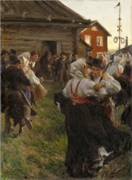
At the end of the 19th century, the Impressionist revolution in color had spread to painters like Anders Zorn, Joaquín Sorolla and John Singer Sargent. Nowhere does this show more than in their handling of white.
 |
|
The colors in her gown. |
Sorolla was painting in the brilliant light of his native Valencia. Zorn lived in Sweden, and many of his scenes have flat light. Sargent lived most of his life in western Europe. None were working in the same lighting conditions, but all of them adopted the same approach to color and light. It was a marriage of Impressionist color theory to more traditional brushwork. The combination still works today.
 |
|
Helen Sears, 1895, John Singer Sargent, courtesy Museum of Fine Arts, Boston |
By adding color to white, these painters were able to give their subject the sparkle and truth of natural light. To have painted their whites with just white or grey would have resulted in flat, dull canvases. This is because convincing whites, in the real world, are actually quite colorful.
 |
|
The colors in her dress. |
Sargent’s portrait of Helen Sears was painted under gaslight (and what a patient little child she must have been to tolerate all that primping and then all that standing). The little girl is thrown into stark relief by the dark interior, and the whole painting is drenched in warmth. What we perceive as blue is mostly a cool neutral. (Here is a photo of the girl taken by her mother, so that you can see Sargent’s liberal editing.) Even the blue-and-white hydrangeas are actually comprised of mostly warm tones. In this painting, the whites are influenced primarily by the light source.
 |
|
Mending the Sail, 1896, Joaquín Sorolla courtesy Museo d’Arte Moderna di Ca’ Pesaro. This is a warm-light, cool-shadow combination. |
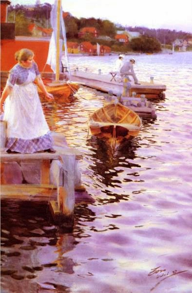
Zorn’s portrait, on the other hand, is mostly influenced by reflected color. It is set against a rich orange floor that influences everything in the foreground. The older girl’s dress is washed in its pinkish tones. The younger daughter recedes in space because of the less-saturated color in her clothes and the grey drapes. Despite all the warmth in the painting, we understand it’s under natural light by the cool highlights. It’s a masterful composition, a brilliant use of color, and above all, an insightful glimpse into the childish mind.
 |
|
The colors in Sorolla’s sail. |
I’ve picked six random ‘whites’ from each painting to show you just how varied whites could be in the hands of accomplished painters. Had I used Impressionist paintings, the tints would have been clearer and brighter.
 |
|
A Portrait of the Daughters of Ramón Subercaseaux, 1892, Anders Zorn, private collection |
I strongly encourage my students to premix tints (the tube pigment plus white) of every color except black on their palette, and then to ignore pure white. Their assignment this week—and now it’s your assignment too—is to paint a white object without using any straight white paint at all. It should go without saying that your neutrals (greys) should not be mixed with black, either. Everything in this exercise should have color.
 |
|
The colors in the older girl’s dress. It’s picking up the warmth from the carpet, which is in turn unifying the painting. |
The addition of white makes any other pigment opaque and somewhat cooler, since titanium white is cool in its pure state. Add too much white, and you’ve got a bleached, dull image. When you start this exercise, it’s best to err on the side of too much color, rather than too little.
 |
|
The tints in the second line drive this exercise. Graphic courtesy of Victoria Brzustowicz. |
What are some good white objects to paint? Eggs, roses, china dishes, clothing or sheets on the line are all options.
This post was revised from one originally appearing in 2019.


