What is the nature of compassion?

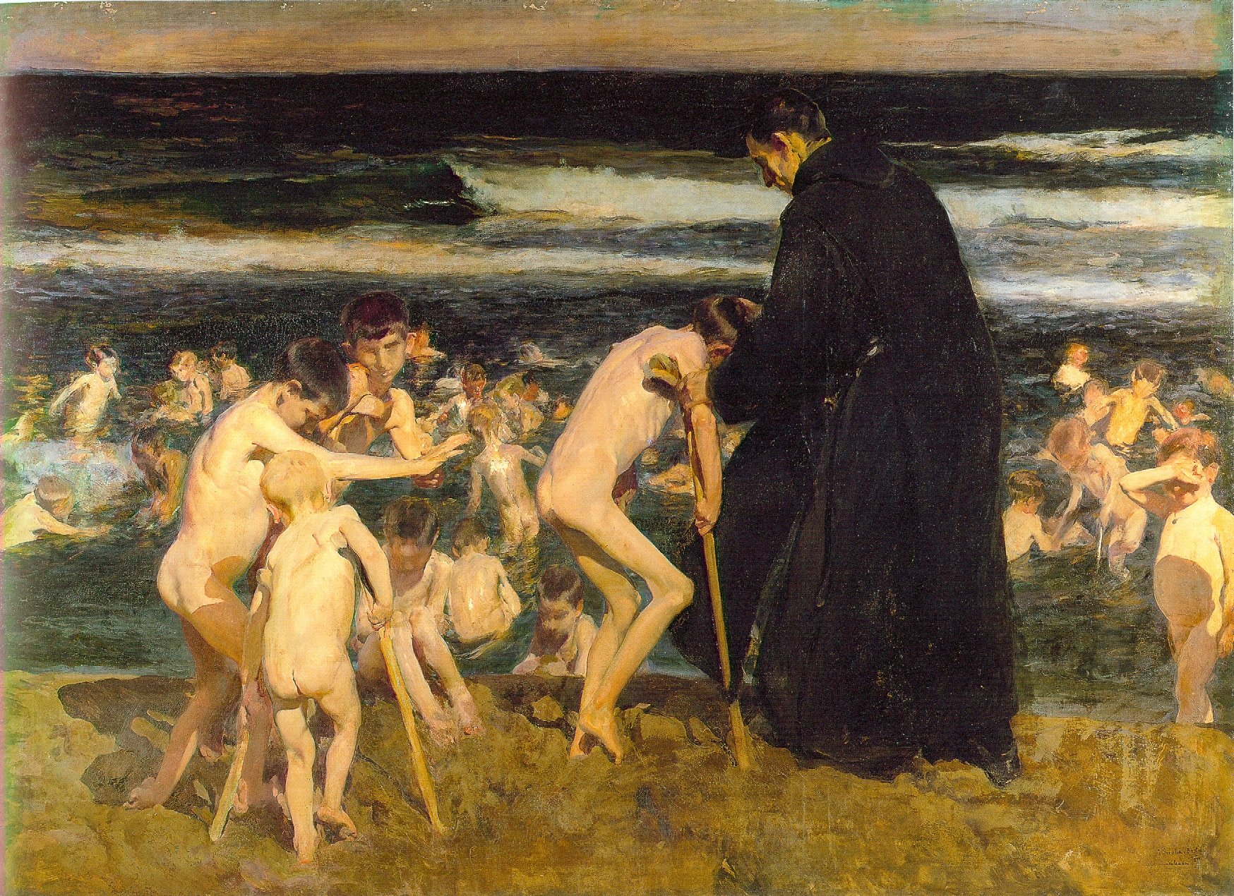
Triste Herencia (Sad Inheritance) by Joaquin Sorolla (1899)

In counterpoint to Joaquin Sorolla’smany light and luminous canvases of naked children playing on the beach, Triste Herencia (Sad Inheritance) is a dark painting of children in a dark sea. Examined carefully, the painting is a detailed catalogue of woes—blindness, club foot, leprosy, and above all, polio, which was just starting its reign of terror at the time this was painted.*
Sorolla’s Chicos en la Playa (1910) is more typical of his beach children.
 The monk at the center of it has been on my mind this week. In contrast to my mental image of a compassionate shepherd, this fellow, of the Orden Hospitalaria de San Juan de Dios, appears rather grim—almost intimidating, in fact. He has the stern face and bearing of a saint painted by ZurbarĂĄn, or the confessor or inquisitor of our imagination.  Yet he is with great delicacy doing a job few of us would volunteer for.
Dwarves have a long history as palace accessories to the European nobility, so it’s no surprise that they’ve been painted by many masters. Perhaps the most famous of these paintings is Diego Velázquez’s Las Meninas, which includes both an achondroplasticdwarf (Maria Barbola) imported from Germany and an Italian proportionate dwarf(Nicolas Pertusato), kicking the dog.
The Jester Calabacillas, Bobo de Coria or Juan de Calabazas (1637-1639) by Diego VelĂĄzquez
VelĂĄzquez painted an entire lexicon of dwarfism, and his portraits are notable both for the respect he shows his subjects and for the honesty with which he portrays their condition. His portrait of Don Juan Calabazas is a highly sympathetic portrait of mental retardation. Calabazas was nicknamed “Calabacillas” or “Pumpkinhead,” a nickname we would find utterly objectionable today. VelĂĄzquez does not shrink from Don Juan’s disabilities, carefully documenting his subject’s symptoms, including his vacant smile, the frantic gesturing of his hands, his crouching posture. But in spite of that, VelĂĄzquez painted him with as much respect and affection as he ever did Philip IV or his family.
Compare this to the most well-known American painting of disability, Christina’s World, by Andrew Wyeth(1948). One would never crawl across a Maine hayfield naked, so Anna Christine Olson’s disability is masked to some degree by her clothing. But beyond that, the painting tells us nothing about her. It is a carefully constructed, beautiful composition focusing on the surface of the field and the elegant shapes of the buildings. (Both the buildings and the figure are substantially altered from their reality.) 
Christina’s withered limbs are an addendum to a completely separate idea. They draw us into what otherwise would be “Triangular Composition: Girl in Pink Dress on a Grass Field.” Seen in its most cynical light, they’re there to sell the painting.
Christina’s World, by Andrew Wyeth (1948) is a very American view of disability.
That’s not an indictment, of course; Wyeth is just treating disability the way the rest of America does. As the parent of four children, I know that schools offer the disability label as a ticket to purchase compassion from an otherwise inflexible system, and the pressure to buy into this system is overwhelming.  All of this is a diminution to the truly disabled, many of whose withered limbs are hidden from us.
This being the season of the Compassionate Shepherd, I am reminded of his encounter with the Samaritan woman at the well, told in John 4:4-26.
The woman said to him, “Sir, give me this water so that I won’t get thirsty and have to keep coming here to draw water.”
He told her, â€œGo, call your husband and come back.”
 â€œI have no husband,” she replied.
Jesus said to her, â€œYou are right when you say you have no husband. The fact is, you have had five husbands, and the man you now have is not your husband. What you have just said is quite true.”
To our modern ears, that’s a pretty harsh exchange, but it was absolutely necessary that she acknowledge her reality before she could begin any process of renewal.
We moderns cannot be honest about the human condition because we are relativists; the only truth we understand as absolute is “don’t be judgmental.” But resolution requires honest assessment. Perhaps it is no surprise after all that Sorolla’s monk starts with the naked, brutal truth to help his poor charges. Perhaps it is no surprise that he is grim.

——

*I was shocked to read that polio epidemics were a 20th century scourge, although the disease itself has been known since antiquity. Before the 20th century, poor sanitation resulted in a constant exposure to the polio virus, which provided natural immunity from infancy. As sanitation improved in Europe, childhood exposure declined. The first localized epidemics occurred in Europe and the United States around 1900, the time Sorolla painted Triste Herencia.

Oh, my! What should I buy?

My basic palette in my pochade box. 

I am happy to share my plein air supply lists with both my own students and others:

¡         Watercolor supply list.
¡         Oil painting supply list.
¡         Pastel supply list.
I have friends who are tremendously efficient plein air packers. I freely admit I’m not up to their standard, but I do paint outdoors a lot, and successfully. Consider these lists not as gospels, but as starting points.
There is no one “best” palette for plein air (or any other kind of) painting. There are so many pigments available today that the artist is faced with—literally—millions of possible combinations. The medium you’re using, your own taste in color , what you want in opacity and drying time all affect your final choices.
And the exact same paints being used for figure painting.
A little knowledge of pigment development is helpful in whittling down selections. The newer the pigment, the more intense and more durable it will be. A palette of earth tones might have a hard time coping with the addition of dioxazine purple or phthalo blue, whereas a vivid 20th century palette will fail to notice a delicate Renaissance lake color.
This is not to say that you should choose only an “Old-Masters” or an “Impressionist” palette—my own palette has paints from every period. But you can avoid a lot of waste by avoiding obvious mismatches.
The earths and earliest synthesized colors:

The oldest pigments are the earth pigments: the ochres, siennas, umbers and carbon blacks. These have been in use more than 15,000 years. They are as solid and everlasting as dirt. Over time artists have been tremendously wily about expanding their narrow range.
The Egyptians created the first chemical pigment, Egyptian Blue, around 5000 years ago. They also pioneered the use of minerals as pigments with malachite, azurite and cinnabar, and devised a method of fixing dyes to solids (“lake making”) which is still in use today. The Chinese created vermilion and the Romans gave us lead white.
Renaissance alchemists must have been more focused on turning lead into gold, because although they made a few refinements to paints, they left the fundamental kit unchanged.
The industrial revolution:

The Industrial Revolution brought us a pigment revolution. Just a few examples are:
Cobalt Blue – 1802
Cerulean Blue – 1805
French Ultramarine – 1828
Zinc White – 1834
Cadmium Yellow – 1846  
Aureolin – 1862
Alizarin Crimson – 1868
Without the explosion of brilliant color in the 19thcentury, there could have been no Impressionism, no modern art.
Modern pigments:

The third tier of pigments are the highest-stain, most durable of colors, developed mainly for industry: “Hansa” yellows, titanium white, synthetic iron oxides (the “Mars” colors) phthalocyanines, quinacridones, perylenes, and pyrrols. Some have replaced 19thcentury colors that have proven to be fugitive (such as quinacridone violet to make “permanent” alizarin crimson). Some have an uneasy place on the palette because of their extremely high stain, such as phthalo blue.
My basic field kit.
References: “Bright Earth: Art and the Invention of Color,” by Phillip Ball. It is certainly the most fun book about color ever printed.

Gamblin Artist Colors has optional palettes here. (What is true for oils is generally true for acrylics.)
The most comprehensive guide to watercolor pigments I know of is here.
And my favorite resource for pastels is here.

A Child Walks With Jesus


This morning, I was in the sanctuary at St. Thomas’ Episcopal Church when I realized with surprise that the Stations of the Cross are on display—well, they would be, since they were made for Lent. (I don’t attend a Lenten-observing church anymore, and the calendar gets away from me.)


(If you would like to walk the Way of the Cross, it is done each Friday at 5:30 PM. The address is 2000 Highland Avenue, Rochester. Their full Lenten schedule is here.)
I made these Stations during my own personal annus horribilis, a year in which I was being treated for colorectal cancer. The quality is—looking back—uneven. No surprise there, since there were many days I could barely lift a pencil.
I was surprised to realize that they are also no longer on the internet in any form, so I dug deep into my archives and found copies of the illustrations and the original text, which I have reproduced here:
The idea of the Stations of the Cross originated in pilgrimages to Jerusalem, in the form of was later called the Via Dolorosa or “Way of Suffering”. This was an effort to understand in some small way the suffering of Christ by following him on the route of his conviction and execution.

 Gaudenzio Ferrari, Statue of Jesus climbs the Praetorian Steps, Polychrome wood, ca. 1510 Italy, Sacro Monte di Varallo (VC), Chapel XXXII

Of course, most devout Christians never get to Jerusalem. Attempts to replicate the Via Dolorosa experience for the rest of us appeared as early as the 5th century. Eventually these took the form of connected shrines, bas relief carvings on indoor or outdoor church walls, or woodcuts in bound books.
 Albrecht DĂźrer (1471 -1528), ‘The Large Passion: The Crucifixion’, Germany, About 1498
For both the points on the Via Dolorosa and the images disseminated throughout Europe, the term “Stations” was in use after about the 15th century.
By the 16th century, out-of-door Stations of the Cross were a regular sight on the approaches to many large churches—most commonly with seven settings, but ranging up to 30.

by Adam Kraft (1490) in Nuremberg
In 1731, Pope Clement XII fixed the number of stations at the modern 14. These are:

  1. Jesus is condemned to death
  2. Jesus accepts the cross
  3. Jesus falls the first time
  4. Jesus meets His Mother
  5. Simon of Cyrene carries the cross
  6. Veronica wipes the face of Jesus
  7. Jesus falls the second time
  8. Jesus meets the women of Jerusalem
  9. Jesus falls the third time
  10. Jesus is stripped of His garments
  11. Crucifixion: Jesus is nailed to the cross
  12. Jesus dies on the cross
  13. Jesus’ body is removed from the cross (Deposition or Lamentation)
  14. Jesus is laid in the tomb and covered in incense.
The problem for we literalist Protestants is that Stations 3, 4, 6, 7, and 9  have no clear basis in the Bible.
So how does an evangelical proceed when asked to make Stations of the Cross for an Episcopal church? The Episcopal Church frequently hearkens back to what it calls its three-legged stool, which is in itself a recapitulation of Richard Hooker’s hierarchical ranking of doctrine:
  1. “What Scripture doth plainly deliver.”
  2. That which may be concluded “by force of reason.”
  3. That which “the church by her ecclesiastical authority” thinks and defines as true.
No room there for Veronica, no matter how lovely the story is.
Ironically, I could have just waited for the Catholics. In 2007, Pope Benedict approved a new set of Stations for Catholics, called the Scriptural Way of the Cross. Those Stations are:
  1. Jesus in the Garden of Gethsemane,
  2. Jesus is betrayed by Judas and arrested,
  3. Jesus is condemned by the Sanhedrin,
  4. Jesus is denied by Peter,
  5. Jesus is judged by Pilate,
  6. Jesus is scourged and crowned with thorns,
  7. Jesus takes up His cross,
  8. Jesus is helped by Simon to carry His cross,
  9. Jesus meets the women of Jerusalem,
  10. Jesus is crucified,
  11. Jesus promises His kingdom to the repentant thief,
  12. Jesus entrusts Mary and John to each other,
  13. Jesus dies on the cross,
  14. Jesus is laid in the tomb.
One thing—the originals are the property of St. Thomas’ Episcopal Church, but the right of reproduction resides with me, the artist. And that I share freely with the world. Go ahead and share them with anyone who might enjoy it.

Joan of Arc

My friend John Nicholson and I have decided to try a new project. I will choose a painting based on a Biblical theme and write about it from an artist’s viewpoint; John will write about it from a pastor’s perspective on his blog, The Shepherd’s Staff.

John is a Baptist pastor from Alabama; I am an artist from New York. Can we find enough common ground in our Christian faith to make this work?


Joan of Arc, 1879, Jules Bastien-Lepage (French, 1848–1884)
Oil on canvas; 100 x 110 in. (254 x 279.4 cm)
The Metropolitan Museum of Art

Jules Bastien-Lepage’s portrait of Joan of Arc at the Metropolitan Museum of Art in New York never fails to make me catch my breath. I wander away from Rosa Bonheur’s gigantic The Horse Fair, which is a monumental, formal study of controlled energy, and am slapped in the face by The Maid of Orléans.

Joan of Arc was born into a bleak moment in French history. France and England were entering the penultimate phase of the Hundred Years’ War. The English had captured huge swathes of territory and secured the French crown under the Treaty of Troyes, which also declared the Dauphin Charles VII illegitimate. The French countryside was bearing the brunt of a century of fighting, depredation, and the Black Death 75 years earlier.

At about age 13, Joan began to hear voices. Eventually, she sorted these voices to be those of St. Catherine of Alexandria, St. Margaret of Antioch, and the archangel Michael. These coalesced into visions. At her trial, she said: “I saw them with these very eyes, as well as I see you.”

By the time she was 16, her heavenly counselors had become more insistent and specific. She never recounted her visions at her trial, but there is a record of them that slightly predates the relief of Orléans. A Flemish diplomat named De Rotslaer recorded “that she would save Orléans and would compel the English to raise the siege, that she herself in a battle before Orléans would be wounded by a shaft but would not die of it, and that the King, in the course of the coming summer, would be crowned at Reims, together with other things which the King keeps secret.”

The story of her initial rejection (“Take her home to her father and give her a good whipping”) and eventual triumph is worth studying. Two details touch me. The first is that the Dauphin subjected her to a careful theological examination before entrusting his troops to her. The second is that her career ended abruptly after her visions were fulfilled.

Jules Bastien-Lepage was part of a movement in European art and literature known as naturalism. This embraced realism but often was invested with an awareness of the condition of the poor, which in some cases makes the art into manifesto (see Charles Dickens as an example). At the same time, the nineteenth century saw an enormous population shift from the countryside to the cities, so there are elegiac overtones in the genre.

Jean-François Millet (1814-1875)
Gleaners, also called, The Gleaners
Oil on canvas
MusĂŠe d’Orsay
(for a far better, copy-protected reproduction, see
here)

Bastien-Lepage was temperamentally the heir of Jean-François Millet, who painted the incomparable Gleaners. About Millet, the Catholic Encyclopedia of 1913 said, “he has shown us how the trivial can be made to serve in the expression of the sublime, and how the Infinite and the Divine can be discerned in the humblest existence.” Vincent Van Gogh, Honoré Daumier, and Bastien-Lepage also had that sympathy, although it was tuned differently in each of them.

Bastien-Lepage painted Joan of Arc after the Franco-Prussian War. With their empire ruined and Alsace-Lorraine taken, the French identified powerfully with Joan. Bastien-Lepage’s painting is thus nationalistic, but to regard it as mere propaganda would trivialize it.

For one thing, there is the question of identification. Both the artist and the subject were from Lorraine. Joan was a peasant heroine and Bastien-Lepage was a peasant painter. She must have been an irresistible subject.


Jules Bastien-Lepage
Hay Making (Les foins), 1877
Oil on canvas
MusĂŠe d’Orsay (see here)

Bastien-Lepage’s most famous painting was Hay Making. Because it is a smaller and simpler canvas than Joan of Arc, you can make out the technique more easily on your monitor. His technique looks peculiar to us today. He married controlled realism in the figures to Impressionism in the background. These are two radically different ways of seeing and painting. As odd as this seems now, photography and Impressionism were both new in 1877, with no rigid rules. In fact, he synthesized the two approaches beautifully.

William-Adolphe Bouguereau
Tricoteuse, 1879
Owned privately

To understand the academic virtues of his painting, compare Joan of Arc to William-Adolphe Bouguereau’s Tricoteuse, painted the same year (Bouguereau vies with Caravaggio as the best painter of feet ever). The figures share the same perfection of drawing and modeling. But there the resemblance ends. In his best work, Bastien-Lepage used perfection only where it advanced his narrative, and there he pushed it to a photographic clarity—Joan’s loosely-laced jacket, the muddy shoes on the reaper. Bouguereau distilled detail to an ideal. His girl is an archetype of poverty, frozen in time.

In Joan of Arc, Bastien-Lepage introduced Catholic symbolism archaically, so we can almost read this painting like an icon. Joan’s own discarded spinning wheel (covered with wool so coarse we can practically smell it) stands in for St. Catherine’s wheel. Michael’s sword (Joshua 5:13–15) hovers in the air as a portent of the sword Joan would later find behind the altar in the chapel of Saint Catherine de Fierbois.

You can easily see Bastien-Lepage’s Impressionistic brushwork in the background of Hay Making, but it is also the device that allows the three saints to shimmer in Joan of Arc (we just can’t see it online). Moreover, he shoves us into the picture with Impressionist abruptness. We sense we’ve stumbled across Joan in her back garden. Compare this to Gleaners, which is profoundly powerful, but far more classical in its structure.

Nevertheless, Bastien-Lepage was not remotely an Impressionist. It is always Joan’s face to which I first respond. Her moment is awful in the deepest sense of the word. It is not that she has shut us out; instead, she seems to have stopped completely. Today many people see that frozen look as a failure, the result of painting from a reference photo. I disagree. It is a face of transfixion, of awed intelligence. After all, the face of the tedder in Hay Making, is hardly photographic, even though the painter was using the same technique. She is loose-jawed, beyond exhaustion.

This is where Bastien-Lepage diverges from the earlier naturalist painters. Millet saw nobility in the peasants’ suffering; Bastien-Lepage looked forward to the bleakness of the coming century. In the eyes of Joan and the tedder in Hay Makers, there are glimpses of the deep psychological pain of the German Expressionist Käthe Kollwitz.

Bastien-Lepage died young (at 36) and much of his work is either schmaltz or unformed. But some of it veers into greatness. I have to wonder what he would have produced had he lived longer.

(You can peruse Bastien-Lepage’s œuvre online here. You can read the transcript of Joan’s heresy trial here, and the nullification trial here.) In researching this, I also came across the delightful and idiosyncratic Hay in Art.)

The Opium Eater

This week’s figure class featured Gail Kellogg Hope modeling a Civil War era gown of her own devising, minus the ruffled hoop. (Readers interested in historic clothing can see Gail’s work here.) Because Gail’s hair was down and she was recumbent, I thought she looked charmingly like a 19th century laudanum addict.

I wanted to begin this essay on languid poses with an American painting, but I was unable to find an American Victorian example. I’m not sure such a painting exists—it would have been contrary to our national myth to see womanhood as anything other than industrious, thrifty, and alert.

“Baudelaire’s Mistress Reclining,” Edouard Manet, 1862, SzĂŠpmĂźvĂŠszeti Museum, Budapest. http://cgfa.dotsrc.org/manet/p-manet35.htm

Off to decadent France, then. The portrait above is of Baudelaire’s mistress, Jeanne Duval, who was a native Haitian of mixed race. Thus her coloring is more realistic than one might first suppose, although the blackness of the painting is Manet at his rebellious and intellectual best, as is the iconography (you can read an incredibly tedious essay on the subject here, although it doesn’t answer what is to me the most interesting question: why the title—not Manet’s doing—doesn’t dignify her by name).

“Lady Agnew of Lochnaw,” 1892-93, oil on canvas, The National Gallery of Scotland http://www.nationalgalleries.org/collection/online_az/4:322/result/0/5396?initial=S&artistId=4829&artistName=John%20Singer%20Sargent&submit=1

The fin de siècle painters were much more comfortable with slouching. I’ve included this example by Sargent largely because the chair resembles the one in my studio—before a century of wear and grime and burst seams. Sargent’s lady reclines, but she is anything but debauched. Instead, the pose is one of aristocratic grace. Although Lady Agnew levels her gaze at the viewer with the same assurance as Jeanne Duval, her chin is down and demure. Notice the right arm culminating in a firm grip—it belies the rest of the pose and points to why Sargent’s portraits are never dull.

“The Baths of Caracalla,” Sir Lawrence Alma-Tadema, 1899, private collection http://www.artrenewal.org/asp/database/image.asp?id=610

Sir Lawrence Alma-Tadema was proof that not every Dutch painter was brilliant, although he gets my respect for being silly and exuberant. He was, of course, a fine technician. Although not strictly a Pre-Raphaelite painter, he shares with them the tendency to see women as sensual and emotional creatures. In this painting, his Roman matron sinks comfortably into a hard marble bench. Perhaps the background hints that these baths were built by Rome’s most psychotic emperor, but the matron’s couture, coiffure, coloring and companions are strikingly, calmly English.

“The Green Sash”, Henri Matisse, 1919, Art Institute of Chicago http://www.artic.edu/aic/collections/citi/object?id=59919&artist=Matisse&keyword=

After that, it is a relief to return to the ambiguity of Matisse. This painting is austere; in fact it has a lot in common with the Manet above. There is no “setting” per se. As in the Manet portrait, the gown has presence and meaning of its own.

Note that in the portrait of Lady Agnew, Sargent is using Matisse’s patterns while in this painting Matisse is using Sargent’s beloved black paint.

“#13 from the book, 41 Etchings Drypoints,” 1965, Richard Diebenkorn, Fine Arts Museums of San Francisco http://www.thinker.org/imagebase_zoom.asp?rec=6339304212900030

We recognize this last work immediately as a mid-century American drawing by the hemline and the hair. As cloying as that was with Alma-Tadema, it is a virtue in this etching by Richard Diebenkorn. Why is that?

With the hand resting on the abdomen, we have come full circle back to the photo of our model. There seems to be nothing strange about that pose to me, but will future viewers see it as an idiosyncrasy of our age?

Five questions from Paul Abspoel

My friend Paul Abspoel (here) asked me five questions to be answered on this blog. I apologize for the time it’s taken, but here are the questions and the answers:

Please comment: ‘God is an Artist, but his art is not very accessible’

“Accessible” art has a message we easily grasp. Our response to Creation is visceral and consistent: from the molecular to the cosmic level we react with awe.

As the Book of Common Prayer says, “At your command all things came to be: the vast expanse of interstellar space, galaxies, suns, the planets in their courses, and this fragile earth, our island home. By your will they were created and have their being…”

Who do you consider to be the greatest Dutch painter: Rembrandt van Rijn, Johannes Vermeer, Vincent van Gogh, Pieter Mondriaan or Karel Appel? Tell us what you like about these famous Dutch painters and give us your explanation for the fact that there are so many artistic highpoints in the historic scenery of my flat little country.

Let us start with your last point—why your nation produced so many brilliant painters. Your weather (so damaging to frescoes and tempera) is the reason we have oil painting in the first place. It was developed by the Early Netherlandish painter Jan van Eyk.

Before there was the modern Netherlands, there were the Low Countries. This was the locus of northern Renaissance painting. There was a northern sensibility that was Protestant and Gothic, and which shaped a painting style that was intimate, naturalistic and religious. Unfortunately the Early Netherlandish painters are outside the purview of your question; they include many of my favorite artists.

Your country was birthed as a multicultural, polyglot nation. Flemish capitalists, Sephardic Jews and French Huguenots transformed sleepy Amsterdam into a wealthy world capital. That hybridization was similar to the one which created America, and it seems to work not only for commerce but for culture.

The Dutch Republic was unique in that your wealth was held by merchants and skilled tradesmen, not with the church or nobility. Your bourgeoisie’s tastes ran to portraits, still lives, landscapes and genre paintings, in an “accessible” style.

On to your painters:

I have often wondered how Rembrandt ever sold a single painting, since he cared so little for Dutch virtuosity. His sensitive character assessments, intentional gawkiness, and fluid brushwork were more suited to Romanticism than to his time.

Rembrandt’s work is often subject to crackpot theories of attribution. Art critics can’t believe that someone so great can be so awkward, but it’s essential to his work. There is a Rembrandt at the Frick called “The Polish Rider” (here) which has been the subject of raging debate about authenticity. I believe it is his, and it illustrates how his technical unevenness contributes to the greatness of his painting.

There are only 35 definitive Vermeers known, so we are blessed to have several in the United States. I am always struck by how tiny his canvases were, since he seems to open the window on entire lives.

Vermeer’s genius lies in the way he reins in his superlative skill. Not for him the luscious, overblown still lives of his peers. We understand that he could paint anything, so what he chose to paint matters. He was a brilliant narrator, opening a tiny window into a story or principle. My mother has had a print of “The Lacemaker” (here) hanging in her dining room for forty years; I appreciate the moral tale (diligence and concentration) but at the same time it is also a lovely painting.

There is another Golden Age painter I’d add to your list: Franz Hals. He is known for his virtuosity, and people assumed he painted in one fast pass. Recent analysis shows that he built his work up in the traditional manner and then applied loose brushwork at the top. His hardy, carousing Dutchmen match my inner vision of your country. His “Banquet of the Officers of the Civil Guard” (here) show how gifted he was, but his intimate portraits like this young knucklehead (here) are what I love the best.

Van Gogh is probably the single most important painter of the last two centuries. He stood between the Impressionists and the Expressionists but there is no easy label to affix to him. There is no theoretical detachment in his color study as with the Impressionists; there is no disregard for subject as with the Expressionists. His work was always yoked to drawing and composition, and it is a mistake to assume he worked in one pass, for his work was carefully considered and developed. His paintings were never intellectual exercises or mindless pastorals. He was not distorting reality, but rather painting his own reality.

I admire his landscape technique beyond words, but I also empathize with him as a failed missionary and preacher. There is no way I can pick an iconic painting for him so I will point out an unusual one: “The Good Samaritan” (after Delacroix, here).

Pieter Mondriaan was interested in Theosophy, which makes sense when considered along with his move from expressionism to intellectual color theory. His grids are nicer in life than as reproductions, since they have a hand-made quality that is lost in photos. They are, of course, beautifully composed. However, I would select the beautiful “Molen Mill” (here) as his iconic painting, even though it’s not what he is remembered for.

Unfortunately, Karel Appel doesn’t do a thing for me. Willem de Kooning was more sensitive, less retrograde, and had a better color sense. But neither belongs in a list of greatest Dutch painters. Sorry.

What is your favourite Psalm? Please also tell us why.

The 23rd. It’s short and memorable. The first three verses are a promise about the Kingdom of Heaven on this earth. The next two describe our special relationship with God. The last one points clearly to our resurrection, as it neatly segues from this life to the next.

What special qualities do you appreciate in your husband and children?

I met my husband at age 15, in high school. We have been married 27 years. He is a brilliant and talented man with utterly no hubris about him. He’s sacrificed a great deal of his personal ambition to support his family, but he’s stoic and uncomplaining. He is not a rigid thinker and therefore my best guide to working through a complex question. He is not particularly reverent, which makes him very funny. And he loves art and history, so we travel happily through life together.

My daughter Julia (18) is an outgoing, entertaining girl with the heart of a missionary. Laura (also 18) is introspective, intellectual, and very loyal. Mary (14) has the soul of an artist, and I think she is most like me: often in trouble, but with a good heart. Dwight (10) is too young to categorize, although I would describe him as affectionate, funny, and unusual.

Outside this interview, what’s the best question someone has ever asked you?

“Do you accept personal checks?”

Field sketch to finished painting

Here are two paintings by Tom Thomson which demonstrate how he went from a field sketch to a finished painting. He changes the aspect ratio a bit but it’s blown up roughly 3.5 times in the final work.


“The Opening of the Rivers: Sketch for ‘Spring Ice’” (1915)

oil on wood-pulp board21.6 x 26.7 cm (8.5X10.5 in)


“Spring Ice” (1916)

oil on canvas72 x 102.3 cm (28.3X40.3 in)
Both are owned by the National Gallery of Canada, http://national.gallery.ca/ and displayed on http://cybermuse.gallery.ca/.