Mixing paints is simple if you understand how pigments work.
 |
|
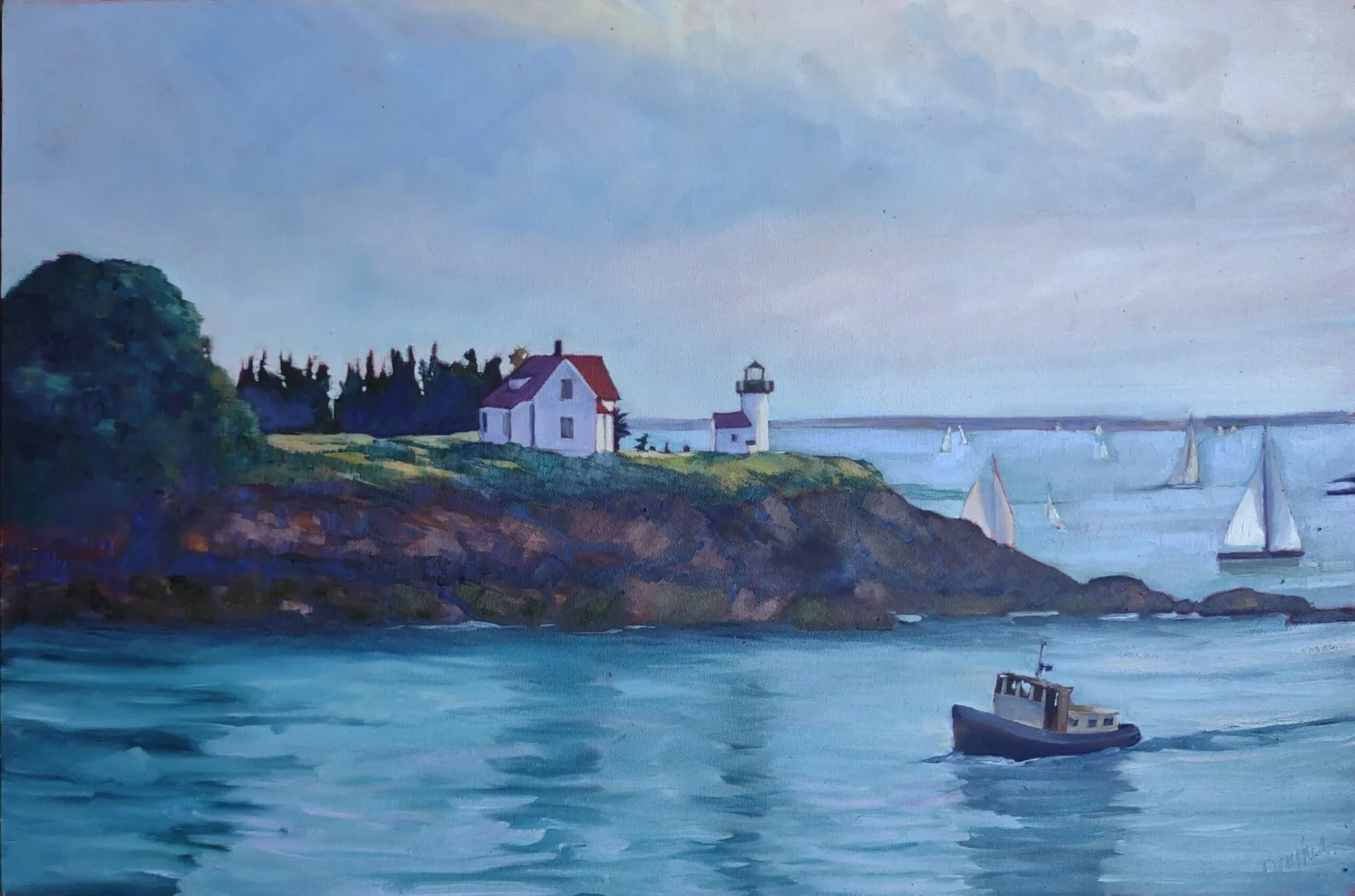
Tilt-a-Whirl, by Carol L. Douglas, plein air. |
But there is a big limiting factor, and that’s the impurity of pigments. They all have overtones that muddy them up in certain mixes. That’s why your local paint dealer uses many, many more pigments than just red, blue, and yellow.
|
Split the color wheel in half like this and you have your cool tones on one side, warm ones on the left. |
Claude Monet’s palette shifted over time, but included these paints:
- Chrome yellow
- Cadmium yellow
- Viridian green
- Emerald green
- French ultramarine
- Cobalt blue
- Madder red
- Vermilion (red)
- Flake white
- Ivory black (before 1886)
These are sets of paired pigments. That means he has a warm and a cool of each color, plus black and white.
I use paired primaries as well, omitting the green but adding in some other earths. (Here are my supply lists for oils, acrylics, and watercolors.)
The distinction between warm and cool colors has been important in painting since the Impressionists. Warm colors are said to be hues from red through yellow and cool colors are said to be the hues from green through violet. Each hue around the color wheel also has a warm and a cool version.
 |
|
Paired primaries from my palette. |
There’s no factual hot or cold point because this is just a poetic description that works. Much of what we believe about the psychology of color is hocus-pocus, but it’s true that if the light is what we call “warm,” the shadows are what we call “cool,” and vice versa.
 |
|
Winter sun along my hedgerow, by Carol L. Douglas, plein air. If the light is warm, the shadows are cool, and vice versa. |
When we say that lemon yellow is cooler than cadmium yellow deep, we mean that if you are trying to mix a greenish yellow, you’ll get a clearer shade with the lemon than you will with the cadmium yellow deep. The warm-cool language is just a convenient way of saying that.
Different pigments may look the same when squeezed out of the tube, but there the similarity ends. Pigments are impure, and you have to learn and work around those impurities.
 |
|
Three blues that look similar out of the tube, but behave very differently. The ‘glaze’ on the left is the undertone. Courtesy Gamblin paints. |
Mass tone is the color a pigment is straight out of the tube, dense and unmixed with another color. No real-world pigment, however, is as pure as a color on a video screen. While two pigments may look the same to the naked eye, their behavior when mixed can be radically different.
Undertone is the color revealed when a paint is spread thin enough that light bounces back up from the substrate. Some pigments are fairly consistent when moving from mass tone to undertone. Others have significant color shifts. Not understanding those undertones tones can lead to muddy mixes.
Ultramarine, Prussian and phthalo blue are colors that shift radically from mass tone to undertone. They’re all so dark out of the tube that their differences aren’t apparent to the naked eye. But dilute them, and you’ll find a wide range of blues.
Undertones are why buying “hues” instead of pure pigments can be such bad value. Take, for example, cadmium red hue, which is usually a napthol red with a small amount of white added. Out of the tube, the two paints are indistinguishable, but they mix very differently.
To see a pigment’s mass tone, put a small dab of paint on a smooth white board or glass palette and draw it down with a knife, creating a uniform, solid stripe that completely obscures the painting surface.
To see the undertone, draw the sample down again so it is translucent. You should be able to see minute variations in the color, and in the covering power.
 |
| Click to get a printable PDF |
Another way to test colors is to mix through what you have on your palette. Make the above color chart, using three sets of paired primaries:
- Prussian blue—Ultramarine blue
- Quinacridone violet—Cadmium orange
- Indian yellow—Lemon yellow
The purpose of this exercise is to understand how paired primary pigments work together, so that you can make neutrals when you want them, and avoid mud when you don’t.
Draw the chart onto a canvas, and then mix across and down for each square. When I say “mix”, I mean mix them before applying, rather than in the squares themselves.
The left column and the top row should be pure pigments. Fill it in, then, just like the multiplication tables of your youth. For example, the intersection of cadmium orange and ultramarine blue should be a 50-50 mix of those two colors.
If you’re painting in watercolor, use enough water to make a jewel-tone transparency. In oils, the results should be opaque.


