
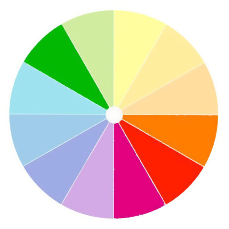
Understanding basic color harmonies will help you integrate color in your painting.
 |
| Split the color wheel in half like this and you have your cool tones on one side, warm ones on the left. |
Color is comprised of three elements: hue, value and saturation. We see value first, but our emotional response is largely dictated by hue.
There are some common color schemes, or chords, found in nature and by extension, in art.
The idea isn’t to be slavishly attached to these schemes, but to use them to perceive and point up color relationships in nature. What combinations are in ‘good taste’ and the reactions a color elicits are largely cultural responses. Nobody but me goes nuts about mauve today, but 170 years ago, it was all the rage.
With all color schemes, one hue should dominate.
Complementary
 |
| Complementary color scheme |
These are colors that lie opposite each other on the color wheel. The most famous example is Christmas’ red and green.
This is a vibrant, high-contrast scheme. It’s the basic schematic for the color of light, where shadows are always the complement of the light color. If the light is a warm gold, for example, its shadows will be cool blues.
Analogous
 |
| Analogous colors |
Analogous color schemes use colors that lie next to each other on the color wheel. Using analogous colors can make what might be a garish scene (a sunset, for example) more serene.
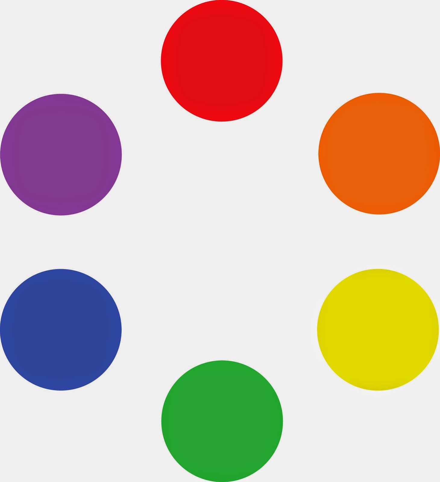
Equilateral Triad
 |
| Equilateral colors |
This uses colors that are evenly spaced on the color wheel. The most well-known example is the primary combination of red-blue-yellow.
Triadic color harmonies can be quite vibrant, even without high-saturation colors.
Harmonic triads
 |
| A harmonic triad counting clockwise from the green |
This variation counts 3-4-5 in either direction on the color wheel. Start with a key color, and count from there. This is a sophisticated variation on the equilateral triad.
Split-Complementary
 |
| Split complementary omitting the complement of blue |
This is the color scheme I go to intuitively. It’s a variation of complementary colors. It substitutes for the complement or includes the complement’s adjacent hues. It’s as visually compelling as a complementary color scheme, but allows for much more variation in the accent colors.
 |
| Split complementary including the complement of green |
Double complements
 |
| A symmetrical (square) double-complement color scheme |
 |
| An asymmetrical (rectangle) double-complement color scheme. |
The rectangle or tetradic color scheme uses four colors arranged into two complementary pairs. The colors can be in a rectangle or in a square.


