
 |
| Tilt-a-Whirl, 12X9, Carol L. Douglas. This was a plein air painting. Really. |
Yesterday I showed you a PDF of a palette chart I like my students to follow. Today I’m going to talk about the basic color theory underlying it.
 |
| The three primary colors we learned in primary school are red, yellow and blue. Forget about any other color space you’ve learned about; they’re not relevant to painting. |
Above are the three primary colors in subtractive color. This is the color space in which painters work. These three colors are the foundational building blocks on which all other colors are made.
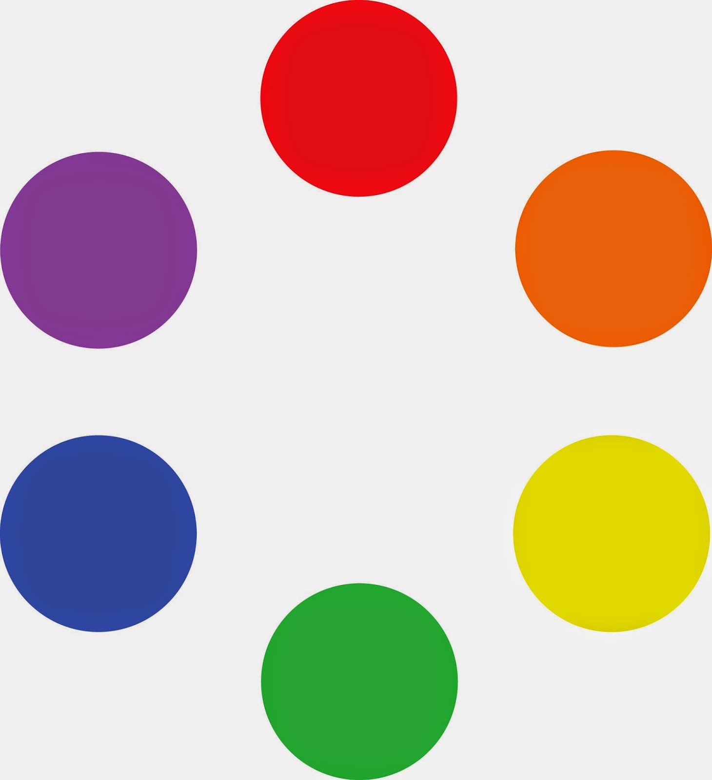 |
| Mix the primary colors in the first illustration with their neighbors and you end up with the secondary colors. A secondary color is always across the color wheel from a primary color. |
If you mix the primary colors with those adjacent to them, you get the secondary colors: green (blue and yellow), orange (yellow and red)and purple (red and blue). A secondary color is always across the color wheel from a primary color. If you want to neutralize a color in a hurry, a fast way to do it is to mix it with whatever’s across the color wheel.
This is the theory on which all limited palettes are based. Unfortunately, there are no pure paint pigments. They’re either too warm or too cool, or they have overtones that muddy them up in certain mixes. So all real-world limited palettes have holes in them, places you just can’t get to with the available pigments.
This is why I use paired primaries on my palette. I have a warm and cool blue, warm and cool red, and warm and cool yellow. This allows me to go almost anywhere on the color wheel without sacrificing chroma.
 |
| The colors on my palette are a riff on the primary colors. It’s the same principle, but there’s a warm and cool version of each of them. |
Why, then, do I have four more tones: yellow ochre, raw sienna and burnt sienna, and black? These are all iron-oxide pigments. They’re cheap and they make great modulators in places where white is inappropriate.
 |
| This allows you to go anywhere you want on the color wheel without sacrificing chroma (intensity). |
All the colors on my color wheel are modern synthetic pigments (with the exception of the cadmium orange, which is a 19th century organic pigment). The iron-oxide pigments are the most ancient known to man. For some reason, using the modern pigments to create hyper-saturated colors and using the ancient pigments to modulate them works.
Let me know if you’re interested in painting with me on the Schoodic Peninsula in beautiful Acadia National Park in August 2015. Click here for more information on my Maine workshops! Download a brochure here.