Monday Morning Art School: the coastal composition problem

It’s easy to throw all the weight to one side when painting on the coast. Here’s one way to fix that.
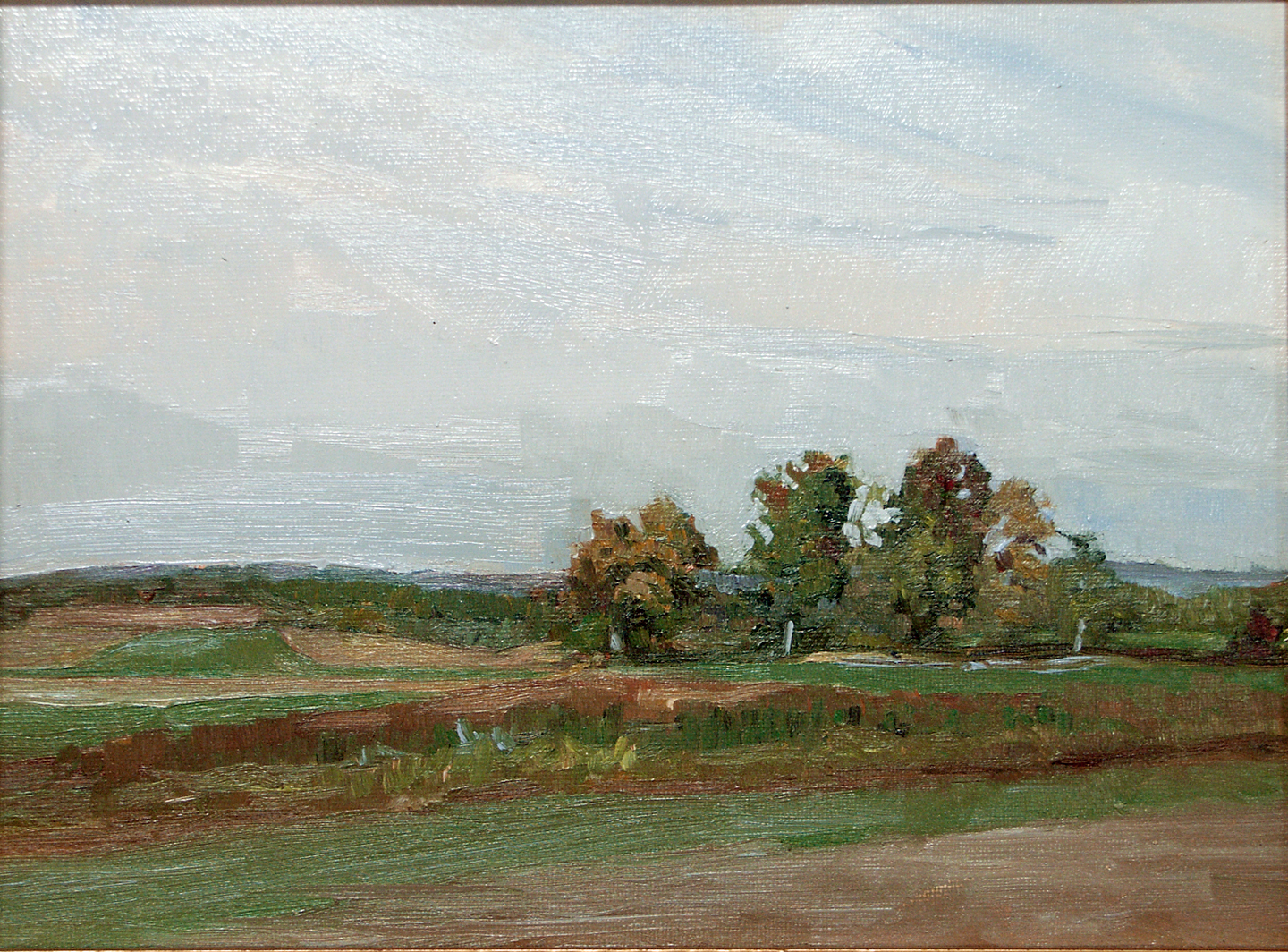
Roger Akeley’s solution to the coastal composition problem.
A few weeks ago, I got a message from student Roger Akeley. Roger had arrived at a drastic solution to the composition problem bedeviling his painting.
Squares are more static than rectangles, which is one reason I seldom paint in that format. However, that means their weightiness helps subdue out-of-balance compositions. More importantly, Roger cut off a good deal of the material that was pulling the painting to the left. That allowed the scree and seaweed at the bottom to take their proper place on the stage. It was a decisive solution.
Roger was dealing with a problem that regularly bedevils painters of ocean scenes: all the weight falls on one side. The second problem I commonly see (which he avoided) is a shoreline that’s an unbroken ellipse. It’s inelegant and unbelievable.
How can you avoid these problems?

Palm, by Carol L. Douglas
Seek out irregularity in the coastline. On the North Atlantic, this isn’t too difficult; great granite fingers reach out into the ocean. In the Bahamas, I found that significantly more difficult, as the coast was even and featureless and the surf lackluster. I used a foreground object—a palm—to create interest, above.
Historic Fort Point, by Carol L. Douglas
Still, there are places where the weight inevitably falls to one side, and there are no atmospherics to correct the scene. When this happens, I try to keep the values tight, as I did in my painting above. If the water isn’t significantly lighter than the trees, the composition will gel. The risk is in being boring, hence the high chroma.
For true mastery of this problem, we must consult that genius of coastal painting, Winslow Homer. In his watercolors from Cullercoats, he frequently used figures to break the horizon. His paintings from Maine, however, used two more elemental and powerful devices, which are ours for the looking.  

Sunshine and Shadow, Prout’s Neck, 1894, Winslow Homer (watercolor), courtesy Art Institute of Chicago
Homer was the master of the sweeping diagonal. He used this over and over to hold our visual interest, playing it off the strict horizontal of the horizon line. In the watercolor above, the whole charge of the painting lies in the interrupted diagonal silhouette and its counterpoint in the clouds and sinuous driftwood. Only after serious looking do we notice the beach roses at the bottom; they are completely subdued into the shadows.
Northeaster, 1895-1901, Winslow Homer, courtesy Metropolitan Museum of Art
Northeaster, above, uses a similar diagonal, this time playing against the towering white shape of the spray. In themselves, these two elements would have made a brilliant painting. But wait—as they say on late night TV—there’s more. The dark in the wave to the far right echoes the rocks. It’s a threatening element, but it also gives us an easy order in which to ‘read’ the painting. We see rock, the shadow on the breaker, the spray, and finally that wisp of light in the distant waves. It’s not painterliness that draws us through this work; it’s masterful composition.
The Artist’s Studio in an Afternoon Fog, 1894, Winslow Homer, courtesy Memorial Art Gallery, Rochester, NY.
I seldom ask my students to copy masterworks. The Artist’s Studio in the Afternoon, also by Homer, is an exception. I don’t care if you do it in paint or pencil, but take an hour and set down a copy of this painting. It is a perfect composition—energetic, spare, lively. When you’re done, please post a comment in Monday Morning Art School on Facebook telling me what you’ve learned.

Alone but not lonely

Technique is important, but it’s emotional power that draws people to paintings.
Reading, by Carol L. Douglas.
“I see artists who paint only flowers, only still life, only barns, only open landscapes, only portraits, only pets, only kitchen utensils, only books, only sailboats,” an artist said. “Why isn’t the artist painting more subjects, and trying new things?”
I’ve been painting long enough to have been there, done that. Some things I’ve tried simply don’t move me enough to focus on them. If I painted them, it would be only for mercenary reasons, and I don’t think that ever pays in the long run.
I paint still life when I can’t get out, but my interest is limited. Still, anyone who paints professionally ought to be able to paint a credible impression of almost anything in his or her line of sight.
Beach Grass (Goosefare Brook) by Carol L. Douglas
Ocean Park is typically crowded in the high season. If we were to be perfectly honest, our paintings would be full of people. I can draw people, so I don’t have much trouble adding them to my landscapes. Still, I don’t often do it. The problem is in meaning.
Yesterday, I set up downtown, looking at a table on a side-porch at the Curtis. There was nothing especially pictorial about the scene. But it had an evocative quality, suggesting a small, convivial party, relaxing after a day on the beach.
That’s the shell of sociability, and it’s as biographical as the clothes we wear. We recognize it in many places—a lonely writing desk, the objects in the console of another person’s car. In fact, much of still life is intended to suggest character that’s just briefly stepped away. Landscape can do exactly that, too.
Beach Toys, by Carol L. Douglas, 2017. In this painting, the figure is completely neutral, neither supporting nor distracting from the composition.
And yet the composition was still not satisfying to me. A person reading could add to the sense of stillness and anticipation, I thought. He or she should not be central to the frame, so I set a figure on the rail, feet dangling, a book in her lap. That was a mistake. The dangling legs interrupted the serenity of the scene. I turned the still androgynous figure to the right, in the classical languor of a Maxfield Parrishnymph. That didn’t work, either, because it’s a silly pose for 2018. However, it gave me the general bounding box of where the figure should fall.
A note: if you’re doing this, have a friend stand in the general area just long enough to make some marks to indicate their approximate height. Even the most perfectly-drawn figure will look ridiculous if it’s too large or small for the scene.
Later, Ed Buonvecchio and I went out to paint in the fog. It seemed like a good place to use my four-way flashers.
Why did I reject dangling feet and or a figure seated in a chair?  Either would have made a good subject for a painting, but they weren’t right for this one. I was feeling the terrific stillness of morning in Maine, and action and presence would have diminished that. In fact, too often, our last-minute tchotchkes end up damaging, not helping, our paintings.
As I was finishing, a lady carefully inspected my painting. It spoke to her on the same level as it spoke to me, so she commissioned me to do another version for her. There’s a lesson there for me: it’s not all composition or technique. People ultimately react to the emotional pull of place. Unless you feel it, they won’t, either.
I’ve got one more workshop available this summer. Join me for Sea and Sky at Schoodic, August 5-10. We’re strictly limited to twelve, but there are still seats open.

Monday Morning Art School: Visual Harmony

Five classic techniques for organizing your picture plane.
Kaikroddare by Anders Zorn (watercolor) uses the principles of opposition and transition.
Arthur Wesley Dow was a painter, printmaker, photographer and well-known art teacher in the beginning of the 20th century. He felt that composition was largely a question of proportion. He identified five elements of spatial harmony:
  • Opposition
  • Transition
  • Subordination
  • Repetition
  • Symmetry
Examples of Opposition. The intersections of lines are raw and unadorned.
Opposition is a principle we see both in nature and human objects. It’s when two lines meet or cross to form a simple and severe pattern. These crossings are always abrupt, and can even be violent.
The beauty of a door lies in its unmediated opposition and symmetry.
Transition tries to mediate opposition. A line or object is added at the join, softening the moment of impact. This is a strong and ancient goal for human designers. The columns at Karnak, which were started more than 4000 years ago, are softened with decorative capitals at the ceiling. We’ve been doing it ever since, with brackets, corbels, and other architectural elements to soften stark architectural lines.
Examples of Transition. A bracket is probably the most common example we see in everyday life.
Transitions also occur in nature. A beautiful example is the overlapping, trailing silhouettes of the Blue Ridge Mountains, which are far less stark than mountains looming black against the sky.
Kaikroddare by Anders Zorn, top, uses the principles of opposition and transition. The cross of the oars and arms is unopposed in the closer figure, who seems vigorous to us. The burden in the far boat softens the sharp lines of the oars, making that figure seem less vital.
Different forms of subordination.
Subordination: To form a complete group, elements of the painting are attached or related to a single dominating focal point. This is the fastest way to create unity out of complexity and confusion.
Subordination can happens in three ways:
  • By grouping around an axis, (leaf to stem or branches to trunk).
  • By radiating from a central point, such as petals in flowers, or water splashing over a rock.
  • By size, as with a mountain within in a mountain range, or a cathedral around its steeple.
Our Maine houses and barnyards are excellent examples of repetition.
Repetition: In a sense, this is the opposite of subordination, since the objects are generally the same size. It is made by repeating lines in rhythmical order. The intervals may be equal as in a fish weir, or unequal, as in a grove of trees. Our long run-on houses in Maine are visually pleasing because of their repetition.
A Bust of Amenhotep IV/Akhenaten in the Luxor Museum, Egypt.
Symmetry: This is a technique that we often avoid in contemporary western art, being more interested in balanced asymmetry (which is in itself a variation on the theme). However, the most obvious way to create balance is symmetry, where equal lines and shapes occur on either side of a central axis. I’ve included a portrait bust of Akhenaten as a demonstration of its effectiveness. Used carefully, it has the same severity and clarity as opposition.
None of these, of course, produce great art on their own. The skill lies in carefully using them to create harmonious outcomes. That requires practice.
Your homework.
The above illustration contains examples of each of the principles of design as identified by Dow. Your homework today is to identify which principle is at work and then draw your own version. Depending on your confidence, you can either copy his drawings or draw something of your own.
It takes a lot of trial and error to make something that’s visually harmonious, even for experienced artists. But the experiments are fun and easy. As always, I’d love to see you post your work on our Facebook page.
Interested in real-life learning? I’m teaching four plein air workshops in the coming year. Message me here for more information, or visit my website.
Today’s lesson and illustrations are from Composition, by Arthur Wesley Dow (Doubleday, Page and Company, 1920). Mr. Dow taught at the Art Students League, Pratt Institute, and Columbia University.

Monday Morning Art School: Repoussoir

If your landscape is flat and delicate, you can introduce drama using this framing device.
 
Paris Street; Rainy Day, 1877, Gustave Caillebotte (courtesy Art Institute of Chicago).

Repoussoir is a compositional technique where an object along the left or right foreground directs the viewer’s eye into the composition. The bracket is often done with a tree, but sometimes it’s a person. In Paris Street; Rainy Day(above) the man with the umbrella on the far right of the canvas drives your eye up. Note that he’s a simplified and non-distracting figure compared to the complexity and detail of the rest of the canvas.

The Art of Painting, 1665-68, Johannes Vermeer (courtesy Kunsthistorisches Museum)

Repoussoir was an important special effect of the 17th century. Vermeer used it in The Art of Painting, above. The great dark shape of the drapery drives our eye to the traceries of the map on the far wall.

El Río de Luz (The River of Light), 1877, Frederic Edwin Church (Courtesy National Gallery of Art)

The Dutch Golden Age painters particularly loved repoussioras a way to pop drama into the flat, Dutch landscape. So did the Hudson River School painters. The example above, is by Frederick Edwin Church. Church was keenly interested in the flora and fauna of the tropics. There’s a canoe in the distance and waterfowl in the middle-foreground, but the tree on the left conveys most of our factual information about the scene. But it’s still a framing device, and what lies beyond is even more important. That’s our impression of the terrifying sublimity of the steaming riverbed beyond. (You can look at the painting in detail here.)

Nunda Farm, by Carol L. Douglas. This is not repoussoir, but rather a path drawing you into the composition.

Repoussoir is still extensively used in modern photography and landscape painting. It is a different effect from creating a path into the composition. I’ve given you an example of that in Nunda Farm, above, where the corn stalks draw your eye through the composition.

Repoussoir gone bad, by Carol L. Douglas. Why do you think the evergreen on the right fails to draw you into the composition?

I’ve also given you a failed sketch by me as an example of how repoussoir can go wrong. I was searching for a way to give perspective to a scene of unbroken snow and darkness. The small pine at the right doesn’t exist in the real scene. I abandoned this composition because the tree conflicted with, rather than enhanced, the main subject. Why do you think it didn’t work?

Hedgerow in Paradise, by Carol L. Douglas. I’m deliberately blocking the viewer out here. Why do you think that is?

Hedgerow in Paradise is a painting of a farm in Bloomfield, New York. This is an area of delicate beauty, where the flat lake plains are tentatively breaking out into gentle rolling hills. I intentionally chose to let the long view sit alone, giving the viewer no framing and no path into the subject. In other words, there’s no real foreground, just a scene set in the middle distance.

Hedgerow in Paradise, reimagined with repoussoir. How does it change the composition?

Above, I’ve imposed a tree in the foreground. Does it add to or distract from the subject? How does it change the meaning of the composition?

In your work, do you have something similar to Hedgerow in Paradise? Your assignment is to do a sketch based on that painting or drawing, reframing the composition using repoussoir. If you don’t have a painting like this, use a photograph from the internet. I’m interested in the before-and-after. I used Photoshop, but you can do a simple sketch. It doesn’t need to be complicated. How is the scene changed with repoussoir? Do you like it better or not?
Repoussoir is a technique that’s particularly applicable to the midwestern plains and to ocean views. I’ll be stressing it at my Rochester workshop* because of the delicacy of the glacial landscape at Mendon Ponds, but it works well with water, too.
*Since this post was written, I’ve replaced my Rochester workshop with several other exciting locations. Register ASAP!

Monday Morning Art School: Mastering values

Value is the engine that drives composition. Here’s a great exercise to help you get it right.

Four value studies of my boots. From top left: flat light, side light, fill light, back light. There’s a diagram below.
I learned to paint in New York, where the sun don’t shine. I’m good with flat lighting; I still struggle with the often-dazzling light of coastal Maine. That’s one of the reasons I encourage doing value studies before pulling out all the stops in a plein air setting.
Value means the lightness or darkness of a color. There are two other attributes of color: hue (where it sits on the color wheel) and chroma (its saturation or intensity). The human eye perceives value first, so artists rightly concentrate on it.
This week, I’m pulling out an old exercise. I didn’t think it up; it has been handed down from teacher to student since the tenebrists.
The boots themselves, from top left: flat light, side light, fill light, back light.
I want you to do four different value studies of the same object. Choose an object appropriate for your drawing experience and the amount of time you have, as long as it’s not too regular or spherical. An avocado, coffee mug, or an apple will do. I used my boots. We’ve been very close friends over the past three weeks, but they were more time-consuming than was strictly necessary.
The first drawing you’ll do (top left) should be in ambient light in your studio or room, preferably during the day. The lighting should be flat, the contrast minimal. Then, add a spotlight to your process. Any table lamp minus its shade will do. Start with the light behind your right shoulder. In the third drawing, move it so that it is lighting your object directly from the side. In the fourth, bring it around as far as you can to back-light the object. (You’ll blind yourself if it’s shining directly in your eyes.)
Limit your drawing to three levels of grey and black. I used Prismacolor neutral grey markers because that’s what I use in my classes and workshops. You can use pencils, charcoal or pre-mixed paint. Just discipline yourself to keep your exercise strictly to three values.
Your starting line drawing should be no more complicated than this.
Start with a simple line drawing in your sketchbook, as I did with figure 1. Then divide this into light-medium-dark areas. Fill them in appropriately and see what you get.
Obviously, there is a gradual range from absolute dark to light in a real-world scene. How you break that into light-medium-dark is subjective. You will not see the jumps at the same place I saw the jumps. Experiment! And don’t worry about creating finished artwork—I didn’t. This is a process-driven exercise. It should result in a flurry of paper rather than a masterpiece.
You will lose lines, which are what we think of as defining shapes. That’s one of the major points of this exercise. Edges have their place, but their place isn’t everywhere.
Our lighting scheme. #1 was done with ambient room (flat) light, #2 with a fill light, #3 with a side light, and #4 was back lit.
What our minds read is, “boot sitting on a table (which your mother told you not to do).” What we actually see is a series of values, in which the back corners of those boots meld into darkness and the fronts stick out and reflect light. It’s in following the values and ignoring the lines that we begin to create an artistic vision.
This is not meant to replace the pencil sketch, which is invaluable in understanding an object. Rather, it’s an extra step in planning a painting. Working in masses of values helps you to:
  • Use the full range of values; 
  • Simplify shapes;
  • See in abstract compositional terms; 
  • Focus on the movement of the eye through the painting;
  • Create more depth.

Remember, there’s a Facebook page for Monday Morning Art School. I’d love to see your finished exercises there! 

Recovering from failure

What do you do when it’s all going wrong, and there’s an audience for your fiasco?

Can I finish this successfully? Gee, I hope so.
I am tossing around a theory that there’s a sweet spot in composition. On one side, you have the so-called ‘perfect composition.’ We’re always upset when these don’t win prizes, but—hint—they can be boring. On the other side is the total mess that breaks all rules, that is visually jarring and doesn’t satisfy.
Somewhere between them is where I aim to be. I have hit that at times by breaking rules (yes, the same rules I tell my students not to ignore). Not yesterday.
Carol’s Bell Curve of Composition
It was a horrible day painting. Nothing I touched worked, and I couldn’t focus. Why?
It’s possible I set myself up to fail. That morning, I told watercolorist Ted Lameyer that I almost never end up flailing around these days.
It’s also possible that physical discomfort was getting in my way. My back is bothering me. And after working for several days in hot sun with insufficient fluids, I have a background dehydration headache.
It’s more likely, however, that the problem lies in the challenges I’ve set myself. I want to scale up my field painting in general. The smallest painting I want to do here is 11X14.
The subjects I mapped out for this year are also difficult. They’re things I’ve shied away from in previous years. For example, Castine’s common is a lovely patch of green ringed by venerable white clapboard buildings. It’s quintessential New England, but it’s basically a void surrounded by subject, with the added fillip of a Civic War monument smack dab in the middle of every view. My solution—a head-on view of the Adams School—may interest me, but it’s going to be a tough composition to wrestle into submission.
Maxwell the boatyard dog. His interest makes me wonder if my late dog Max peed on my backpack.
Still, I have no option but to recover. How will I do that?
There are several painters at this event whose judgment I trust; I will consult them today. Why listen to them rather than my own internal voice, which I usually trust?
In the heat of the moment we often hate what ain’t bad. Last year at this event, I painted the British Canal. I spent half my time on it and disliked the results; I would have run over it and tossed it in the ocean had that been an option. It’s in a collection here in Castine and I saw it last night. It’s actually an interesting and edgy painting but I was too frustrated at the time to realize that.
I find it helpful to remind myself that I don’t have to prove that I can paint; I wouldn’t be here if I couldn’t. I try to block out what happened yesterday. Above all, I don’t perseverate over failing paintings; I move on.
And, lastly, I make sure I get enough sleep. Sometimes my worst failures are from simple exhaustion. Fix that, and I’m once again my usual chirpy self.

It’s all about the traps, man

The Blue Umbrella, by Carol L. Douglas. Even without detail, you should be able to see that there are three different species of palm in this painting.
There are 629 living species of conifer in the world. In contrast, there are 2600 known species of palm trees, with the greatest diversity being on islands. They range in shape from draping to spiky to fan-shaped to pom-pom.
Studying the differences between trees helps me get the structure right in my paintings. In Karl’s Garden, yesterday, there were three different species shading the table. It’s a challenge to paint them accurately without being pedantic.
I vary my compositional technique depending on the subject. When I’m unsure about positioning, I sketch on paper, crop my sketch, and transfer the result to my canvas. For boats and buildings, I use a watercolor pencil and a straight edge. I draw directly on the canvas, using water for erasure. 
In my studio, I often start with an abstracted grisaille. This can be risky in the field, since those sloppy wet darks can migrate up into the painting, creating mud. Being rigorous about the fat-over-lean rule helps prevent this. So does marrying the underpainting color to the final shadow color. For this reason, I often end up using a violet-blue rather than the more conventional desaturated reddish-brown.
The rare and elusive pom-pom palm, at Coral Beach in Freeport.
We couldn’t get odorless mineral spirits in the Bahamas. Our choices for solvent were conventional white spirit or turpentine. We chose turpentine. It dries very fast, making the bottom layer less squishy than it would be at home. Going directly to paint meant I could develop paintings that relied on patterning, rather than modeling.
I like complicated images (even though I usually regret them halfway through the painting). I look for angles, light, and, most importantly, the negative space created by the objects. Then I determine where on the canvas the most important elements should fall. Quite literally, I paint quick circles in those spots and then stretch and bend the other objects to fit into the space.
The branching structure varies widely, as do the evergreen, pinnate leaves.
There’s a limit to what a grisaille can tell you about composition. In addition to value structure, paintings have chromatic structure. That was where I went wrong with the painting I wiped out this week. I didn’t take into consideration the coolness of the sea and sky when I was doing my underpainting. If I had, I could have swept them through the painting.
I had a painting teacher once who liked to intone “there is no negative space.” She was trying to say that there are no areas of the painting where nothing important is happening. This is true. However, it is useful to have a term to describe the interstices between objects. In painting a complicated image, those negative spaces are critical. For trees, the silhouette is important, but the traps—that negative space where sky shows through the canopy—is paramount.
After we’d downed brushes for the last time, we took a short car ride. There a line of tankers waits to approach Grand Bahama. I didn’t want to paint it, but it was a lovely image.
My week of painting in the Bahamas is now over, and I head back to Boston this afternoon. “The real question,” I told Bobbi Heath this morning, “is, where am I heading next?”