Whoops, I should have listened to Ed

The human brain has an unfortunate tendency to skip over the parts of a plan it doesn’t like.

Desert long view, 9X12, oil on canvasboard, $696 unframed.

I never expected to be flying back from my workshop in Sedona with four wet canvases, so I only brought a two-canvas PanelPak. Whoops, bad planning—but it was based on prior experience. I seldom have time for anything but a basic demo when teaching workshops.

“Do you want me to mail those?” Ed Buonvecchio, my monitor, asked me. No, I could jury-rig something using waxed-paper and an elastic band. I’ve done it many times before, but this time, something slid. My dawn painting of the Grand Canyon smeared. Whoops, I should have accepted help when it was offered.

Camel Head, 9X12, oil on canvasboard, $696 unframed.

Oh, well. That gave me the opportunity to demonstrate glazing to my Monday night Zoom class, but I think the painting is irreparably damaged. It will have to be completely repainted, and at that point it’s no longer plein air, meaning I’m no longer interested.

That happened after I dropped both Grand Canyon paintings jelly-side down on the sidewalk. Whoops, I should have made two trips to the car.

That’s not usually a deadly problem, as I tend to paint leaner in the field than in the studio. Thin paint sticks to the canvas better than its juicy cousin. The twigs and leaf litter will brush out when the paintings are fully dry.

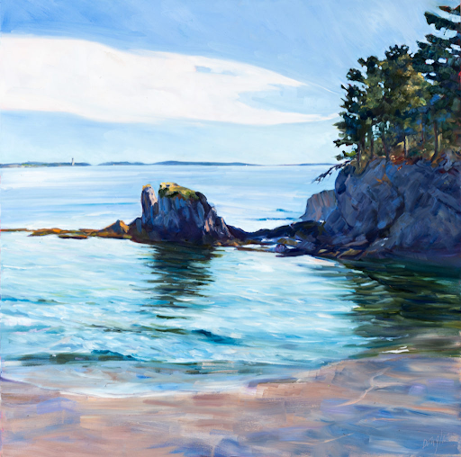
South Rim of the Grand Canyon, 9X12, oil on canvasboard, $696 unframed.

“Do you always do a value sketch first?” Ed asked me—with a small dash of skepticism—during the workshop.

“Only when I want my painting to come out well,” I replied.

The human brain has an unfortunate tendency to skip over the parts of a plan it doesn’t like, and the less articulated the plan, the more opportunities for bad assumptions. The consequences have come to be known as Murphy’s Law: anything that can go wrong, will.

We see that law of unintended consequences in every endeavor, not just painting. Looking back on mistakes, we can almost always identify where we went wrong. “If only I’d
” is our universal response. Advance planning can’t eliminate all disasters, but it sure cuts down on them.

Painting, super-briefly, at the Grand Canyon.

Planning means different things to different painters. To many (including me) it’s a simple, rough value sketch or notanoutlining the basic composition. To others, like Andrew Wyeth, it means a complex series of sketches working out all the problem areas in a painting.

But there is no planning hack in art that allows you to skim over the critical composition questions.

“I don’t want to spend all my time doing a sketch!” one student complained. It’s a common misconception that a painting moves faster and is more visceral if we don’t spend time on the value sketch and grisaille. But a painting without a plan takes longer to finish, is more tentative, and often is just a hopeful approximation of what we first envisioned.

But at dawn at the Grand Canyon, I ignored my own oft-stated instructions. Like everyone else, I have excuses: I was exhausted, it was still pitch-black, and the light would change fast. The result was a sub-optimal composition. So, I’m not really that heartbroken that the painting was ruined by my bad packing. It was the only one of the four that I was ambivalent about.

A marsh painting and why they can be truly terrible

I don’t begrudge people painting for fun, but I assume you read this blog because you’re interested in being the best painter you can be.

Beach Erosion, 8X10, Carol L. Douglas, available through Ocean Park Association.

I had finished writing a lecture I’d mentally subtitled “why am I torturing you like this?” That’s hard work, so I whirled away a few minutes on the internet. I came across a painting that took my breath away, for all the wrong reasons. It had no focal points, no energy, no depth of field. At the same time, the brushwork was easy and assured. It was obviously not this painter’s first rodeo.

I’m not interested in embarrassing another artist, so I made a fair copy of it while teaching my class. (That way you can laugh at my bad painting, not someone else’s.) I did mine on cheap demo paper, which means there isn’t much staccato in the scumbling, but that’s really the only difference. That I could copy it while talking about something else is a good indicator of its lack of complexity.

My fair copy of a boring marsh painting.

This is an example of what I call “marsh painting.” I really need a better term, for there are brilliant painters of marshes. My pal Mary Byrom is a great example. She reduces the salt marshes of southern Maine into simple shapes that are dynamic, colorful and evocative. The secret, of course, is that Mary draws brilliantly and works tirelessly at her craft.

The bad marsh painter is visually lazy. He or she does not look at the marsh as a surface that recedes in space, but as a series of flat bands that overlap the horizon. Norman Rockwell and Winslow Homer demonstrated that it’s possible to do this very well, but neither of them did it in lieu of drawing.

Inlet, 9X12, available through Camden Public Library.

A marsh painter may have heard that he “needs a path into the painting,” and will put a stream running back in S-curves to the distance. This recommendation was meant as a visual, not a literal, recommendation. It really means that you need some kind of compositional structure to anchor your painting. If that’s an S-curve, it ought not be as blatant as a lazy river.

The marsh painter shies away from anything difficult. Houses, people, automobiles, and boats are all tough to draw. It’s far better to stick to trees and grasses. And there—they believe—they’ve found their mĂ©tier, in the tireless (and tiresome) representation of blades of grass and branches. But detail is never a substitute for good painting.

I don’t begrudge people painting for fun, but I assume you read this blog because you’re interested in being the best painter you can be. Learning to draw is the first requirement. Anyone can learn to draw. Period. And drawing will give you the courage to tackle more difficult subjects in paint. Since I can’t teach everyone, I recommend this book.*

*Since this was first published, I’ve released an online course, which means I actually can teach everyone! Most relevant here is Step 2: The Value Drawing and Step 3: The Correct Composition. You can certainly benefit from the entire series.

Prom Shoes, 6X8, Carol L. Douglas. $435 framed. It’s all about that negative space, baby!

But, moving beyond drawing, there are basic principles to good painting:

I’ve just given you a reading list that will keep you out of the bars until Thanksgiving. Enjoy!

You can’t abstract if you can’t draw

Try reducing one of these paintings to a notan, and you’ll realize just how much drawing underpins this seeming simplicity.

Plein air painting by Tara Will, courtesy of the artist.

“Why are you teaching us self-portrait?” a student recently asked me. The human face is the most demanding subject to draw, because very slight errors make a huge difference. It teaches the artist to use angles and distance to measure. And we might as well start with our own faces, since they’re the ones we know best.

“But I’m interested composition and color, not drawing!” my student responded. That’s like saying you’re interested in literature without first learning to sound out your letters. Drawing is the foundation of everything that follows.

Tara Wills’ lily pond painting from this week, courtesy of the artist.

Yesterday, I came across the above plein air painting by Tara Will, a pastel painter from Maryland. I don’t know Tara well, but what I do know, I like—both personally and professionally. We met doing plein air events, where she created work that seemed fast, effortless, and stylish. That’s deceptive; her work is underpinned with strong fundamentals, and she works hella hard at it.

Like all great literature, Tara’s lily pond painting is a complex story told with great economy. Count the shapes; they’re limited. She’s abstracted her subject to its absolute essentials. That’s where uninformed critics of modern art sometimes go off the rails; they think simplified drawing should be easier than working out the details. In fact, it’s the culmination of years of thinking and winnowing.

Tara started with a perfectly-executed perspective drawing of the surface of the water. Note how she draws you back along that plane before crashing headlong into the far shore. Without that draftsmanship, the painting would have collapsed into an unintelligible mess. Lesser painters sometimes conceal their lack of drawing skills with a muddle of details. These ‘marsh paintings’ are drearily similar and uninspiring.

Plein air painting by Tara Will, courtesy of the artist.

It would be nice to be able to buy a box of pastels and immediately tap into this sort of vibrancy, but color is more complicated than that. Resting under Tara’s effortless explosions of color is a complex and well-reasoned value structure.

It’s been said that “value does all the work; color gets the credit.” That’s an absurdity, because value is just one aspect of color, along with hue and saturation.

However, it is true that value is the first thing the human eye and mind read when they see a color pattern. Our brains are strongly programmed to interpret value patterns, and great artists have always taken advantage of that. Think first of value, and you can substitute a range of hues and saturation for what’s really there. The viewer’s mind will interpret the pattern, and have fun doing it.

Plein air painting with strong contre-jour, by Tara Will, courtesy of the artist.

But, again, that rests on a solid foundation of drawing and pattern making. The more Tara deviates from what’s there in terms of hue and saturation, the more she needs a solid value anchor. That’s especially true of contre-jourpainting, where the light comes from behind the subject, as in the painting above.

I picked out four of Tara’s recent plein air works to share with you. Her studio work is here. Try reducing one of these paintings to a notan, and you’ll realize just how much study underpins this seeming simplicity.

Monday Morning Art School: simplification

This exercise, so critical to the success or failure of painting, is also important because it stresses the beauty inherent in all objects.

Prom shoes, 6×8, oil on canvas, Carol L. Douglas, $348 unframed

A major part of learning to paint is learning to see, and in the process, learning to draw. Part of this is not getting caught up in the details, but perceiving the big shapes and how they fit together. This is fundamental to how painting has been done since the middle of the 19th century.

This means we stop thinking of the object we’re looking at as things we can identify, and start to see it as a series of shapes, or more accurately, a light pattern. That’s very difficult at first. That’s why my students have studied draperiesand reflectionsover the past few weeks. They’re tough subjects, because they’re ever-changing. There’s no cheating with prior knowledge.

A rude little notan I did of my own house.

A few years ago, my student Sheryl drew the lobster-boat Becca & Meagan, which is moored year-round at Rockport Harbor. It’s painted a signature red, and I have painted and drawn it many times. Sheryl measured and drew, and I patiently corrected her. This went on for most of the class, until Sheryl finally insisted that I sit down and take measurements with her.

Whoops! It wasn’t Becca & Meagan at all. Its owner had launched a new boat, Hemingway. She was painted the same red and moored at the same buoy, but with her own unique configuration—“flat, wide, and deep on the keel,” as her builder said. I was so used to seeing Becca & Meagan that I had stopped really seeing at all. I was looking straight at one boat and seeing another.

Another rough notan of my house. That was back before my painter mislaid half our shutters.

Likewise, if I set a teacup in front of a student, he’s guided in part by what he knows about teacups—they’re rounded, squat and hollow. That gives him some checks on his drawing, but it also allows him to assume measurements and values. That can be very misleading.

He has to stop seeing a teacup and start seeing an array of shapes, planes and values. For most of us, that takes time. First, we must do a drawing to figure out what we’re looking at. Then, we need to ruthlessly simplify our drawing into a series of values. When we catch ourselves thinking “window” or “door” or “boat” or “tree”, we must stop and force ourselves to relabel those objects as merely light or dark shapes.

Yep, that’s a carrot, a lemon and an empty box. You can make an interesting painting out of anything, if you start with the simple shapes.

All objects can be reduced to a certain, limited number of shapes, which build on each other to make a whole. When you see things as abstract shapes, you expand your possible subject matter. A plastic pencil case is not, inherently, much different in shape from a shed. A shed, in turn has the same, simplified, forms as a house. If you start with a shed, you can ramp yourself up to Windsor Castle in no time.

Notanand all other value studies are, above all, about cutting the picture frame into shapes, what Arthur Wesley Dow called “space cutting.”

Dow wrote the definitive 20th century book on composition, which sets down fundamental principles still used today. He taught his students to restrict the infinite range of tonal values in the visible spectrum to specific values—perhaps black, white and one grey. He wanted students see all compositions as structures of light and dark shapes. The success or failure of a painting rests on whether those shapes are beautiful.

Monday Morning Art School: painting from photographs

There’s a world of difference between copying a photo and creating a painting using photos for reference.

Skylarking 2, 18×24, $1855 unframed. It’s difficult to paint boats under sail en plein air, so mostly we use photographs for that.

It is not true that I never paint from photos; I just prefer painting from life. However, there are times (winter) and subjects (boats under sail, babies) that lend themselves to painting from photographs. Size is also a limiting factor; nobody can finish a painting much larger than 40×40 in the field without two stout oafs to stabilize the canvas.

What I don’t do is slavishly follow a single photo. Instead, most of my studio paintings are compilations of images.

All flesh is as grass, oil on linen, 36×48, $6231 framed.

Start with an idea. Let us say, for example, that you want to paint the “season of mists and mellow fruitfulness/Close bosom-friend of the maturing sun,” as John Keats put it. Symbols of that idea might include apple orchards, golden light, morning fog over the blueberry barrens.

Gather photos, from your own stash. I have tens of thousands of reference photos on my server; you probably have a few thousand on your phone alone.

Think of this step as similar to the interior decorator’s design board or a Pinterest board. Your goal is not to find a photo you’ll ‘paint from,’ but to find ideas you want to incorporate into your painting. I do this on my laptop (as most of you probably will) but there’s no reason it can’t be done the old-fashioned way, on a bulletin board.

After allowing these images time to percolate, identify the major motif of your painting. That’s its focal point. Then, do a sketch balanced around that motif. It’s helpful to set your reference material aside at this point, and let the sketch bubble up from your subconscious. If that doesn’t work for you, think about compositional armatures. Place your focal point accordingly, and work out from there.

Then it’s simply a matter of borrowing a bit from here, a bit from there, until you have a coherent, cohesive sketch.

Do not simply trace or grid a photo and expect to get a good painting from it. The whole point of painting is to allow room for your subconscious mind to enter the dialogue. You should be drawing from your photo until you have a powerful picture, then building on that drawing in your painting. If you can’t draw well enough to do this, then you need to improve your drawing skills, stat!

Vineyard, 30X40, oil on canvas, $5072 framed. This started life as the field painting below, and was painted again in the studio using the process outlined in this post.

If your goal is wild-animal portraiture, you should work with a good camera with a telephoto lens, but for most reference photos, a modern cell phone is sufficient. The images are large enough and the controls good enough that they outshoot most pocket cameras. There are situations, such as in Argentina, where I will bring a ‘real’ camera, but most of my photos are taken with my cell phone.

Other than for animals or glaciers, extreme telephoto lenses are not great for reference photos. They create pincushion distortion that can seriously muck up a drawing. Cell phones have wide-angle lenses. These create different problems, but they’re easier to correct in the drawing phase.

When I take photos for reference, I always leave in more background than I would have if I were shooting for the photo’s sake. I can always crop later, but there’s no way to add back in the missing information if I decide I need it.

Never try to replicate the out-of-focus background of a photo with a shallow depth-of-field. That’s not how human perception works, and it’s a dead giveaway that you simply copied a photo, rather than created a picture using reference photos.

Vineyard, 9×12, courtesy private collection

Try to keep the lighting the same in all your reference photos. In general, it’s wise to avoid high-contrast pictures for painting. When whites are bleached out and darks are black, we lose all the information that might have been in those passages, and they inexorably lead us to paint in excessive contrast.

While I use my own photos almost all the time, there are times when I use photos from the internet. It makes no sense for me to hunt down a Friendship sloop to check its rigging when the information is right there in someone else’s photo. It goes without saying that you shouldn’t be copying substantive portions of other people’s work without permission. However, you can use the internet for research into how a shoe might reflect light, or the color of cornflowers, or what the mist looks like in an orchard in April.

Monday Morning Art School: Precision

A good painting requires a good plan. What does that mean? 

This last weekend I was painting in the 14thannual Paint for Preservation for the Cape Elizabeth Land Trust. This always involves a big canvas, and this year was no exception: I painted 30×40.

I always start with a drawing in my sketchbook; when I’m working this large, the drawing becomes paramount. To look at my canvas from a distance meant climbing down into a small ravine and back up the next finger of rock, so I didn’t do it often. Accuracy in that situation requires planning. I transfer the drawing faithfully to my canvas, gridding if necessary. Then the sketchbook lies at my feet so I can consult it for values if necessary.

Foghorn Symphony, 36×40, by Carol L. Douglas, will be available through the Cape Elizabeth Land Trust in late August.

“You write numbers on it?” said Ken DeWaard, who’d stopped by with his morning coffee.

“Numbers and colors,” I said. That’s not my idea; it’s one I stole from an old guy named Vincent van Gogh, who often wrote the colors alongside his sketches. The sun at dawn on Saturday was a lemony yellow, and it would have been easy to remember it as richer and deeper. That would have overridden the sense of a transient sea-fog in the distance, which was causing the five lighthouses of greater Portland to play a fog-horn symphony.

Plein air events like Paint for Preservation have no do-overs. We’re required to put out a good painting. There are two options. You can paint more than one, and choose the best. That seldom works for me, since I’m no judge of my own work in the thrust-and-flow of an event. It’s also a lot of work.

Zeb Cove, 40×40, was my 2020 painting for CELT’s Paint for Preservation.

.
I go with the second, which is to paint one good one from the start, using all the tools at my disposal. Since a painting always goes wrong in the planning stages, I make sure my plan is solid, and then I stick with it.

What makes a good plan?

Precision of drawing

This means proper perspective and measurement. You might think this is irrelevant when the subject is rocks and the sea, but it’s as important there as with architecture. Drawing is the only clue about the distances involved. There’s a contemporary Maine style, which involves fast, loose brushwork, but it rests on a foundation of perfect drafting. In fact, bad initial drawing is a great way to end up with a tight painting, since you’ll constantly have to redraw with your brush.

Four Ducks, 30×40, was my 2019 painting for CELT’s Paint for Preservation.

Precision of composition

This means understanding the motive line, energy, and value structure of your painting from the beginning. A 30×40 painting will take from 8-12 hours to finish. The tide will have gone through one full cycle, and the sun will beat its way across the sky as you’re painting. In order to retain the light structure you started with, you must lay it out in advance—and then you must stick with it.

Precision of color

Nothing makes for a muddier painting than constantly restating colors because you didn’t get them right on the first try. Make a grisaille, and check your mixed colors against it.

Rocky, 36×36, was my 2018 painting for CELT’s Paint for Preservation. I’m detecting a theme here.

To mix color properly, you must be absolutely conversant with the pigments on your own palette. This requires practice. The goal is au premier coup, or to nail it on the first strike. That goes not just the for darks, but every color in the picture. Even a painting with wonderful shadows and lights will have many middle tones, often closely related in value. These are actually the most difficult colors to mix accurately. If you have a painting that isn’t working, ask yourself if it has a full tonal range, or is it simply hitting the highs and lows. 

The viewer wants to know

Which is more important, narrative or design? The answer is yes.

Main Street, Owl’s Head, 16X20, oil on gessoboard, $1623 unframed.

Thomaston, ME, is a community of lovely, large Victorian homes that somehow maintain a whiff of the 19th century. It’s a little off the beaten path and the streets are quiet. I try to teach there at least once a season, focusing on perspective and architecture.

Ann Clowe and Cassie Sano had elected to paint the same house on Knox Street, an 1851 Cape that’s dwarfed by its attached barn (in the Maine way). It’s a strange shade of red that looks warm in some places and cool in others. Ann had painted it unsuccessfully three times before. She refused my suggestion that she look at other houses on the street. She was making her stand; she was going to defeat those red walls.

Victoria Street, 14X18, oil on linen, $1275 unframed.

One of the most common questions students ask me about architecture is whether they should include that door, that window, or that bit of moulding. The answer depends on the design and focal point of the painting. If one is focused on the house, the details are important. If the house is an incidental part of the landscape, it’s possible to reduce it to a mere silhouette.

Every painting—even stark hyperrealism—has some extraneous detail edited out. One of the great virtues of painting over photography is that we can eliminate the telephone lines, gas grill and other impedimenta of modern life. We do this both for design reasons and to make the narrative stronger.

Fishing shacks, 11X14, oil on canvasboard, $869 unframed.

Cassie, in asking me whether she should include a door, said, “but the viewer wants to know how these people get in to their house.” She’d answered her own question, and created a good test for whether to include something:

  • If it’s an important part of the narrative, leave it in.
  • If it’s not, make your choice based solely on design criteria.

In the 20th century, narrative became a bit player in painting; abstract design was key. Only the reactionary Wyeth family and a few others were still telling stories in their paintings. That impulse hasn’t totally died, but it’s a trend, not an eternal verity. Storytelling appeals to something so primary in our psyche that we’ll never eliminate it entirely from painting.

Three Chimneys, 12X16, oil on canvasboard, $1159 unframed.

Storytelling ought to include telling the unvarnished truth about our current reality. That sometimes includes gas grills, cars, and telephone poles. As Cassie joked, “the viewers might want to know how they get their mail.”

The red house has a handicapped-access ramp running to the side door. It made a brilliant diagonal slash of light in the painting, but it was hardly in keeping with the house’s original design. It also told a story that’s achingly familiar to many of us. If it had been my painting, I would have included the ramp, and even focused on it. It says something laudable about our moment in history: we want to keep the elderly in their own homes as long as possible.

Spring finally comes to Maine

This point, where charcoal meets paper, is where a painting’s future lies.

Spring on Beech Hill, 8×10, available. Dark skies may not give you great shadows, but they deepen color saturation.

Yesterday was the first truly lovely day of the year, with soft still air, limpid light, and a hint of color in the bare trees. I had already chained myself to the mast of updating my website so I met Ken DeWaard at Spruce Head in late afternoon. As if ordered up by some great old Hollywood director, golden light poured over the fishing shacks. It was so composed and serene that even a novice could have painted a great painting.

I, therefore, made a hash of the whole process.

My struggling composition. Ouch.

I’ve been teaching an intensive series on composition. I swear it’s scrambled my brain, since this is the third painting in a row where my composition has been utter dreck. I tell my students that my first rule is “don’t be boring,” and then I keep breaking that rule myself.

I swear, the next time I’m having one of these brain cramps, I’m going to just copy off Ken’s panel. It’d be easier on him. When Carol isn’t happy with her painting, Carol whines. After listening to me for what felt like an hour, he asked a salient and obvious question: what was my painting about?

That stopped me cold.

“Well,” I hesitated, “I think what interests me is that collection of blue bins on the dock.” That’s where I should have stopped and redrawn the whole thing, cropping in much closer, but I didn’t. I was still seduced by the grandeur all around me.

Boatyard, 12X16, oil on canvasboard, available. This painting is growing on me.

This point, where charcoal meets paper, is where a painting’s future lies. All the seagulls I could tack in there later, all the beautiful brushwork I could slather over the canvas, can’t save a teetering composition.

Everyone has a mistake they make repeatedly. Mine is always trying to cram more than one painting onto a canvas. “Respect the picture plane,” I tell my students, and then proceed to not do so myself.

Then there’s this painting of fishing shacks that I haven’t finished yet, but I think has promise.

In this case, I was trying to shove an entire world of manmade and heavenly beauty into one small rectangle. But I can tell you in words that it was sublime: ducks quacking in the distance, the tide beginning to trickle in from the far channels, the perfect still reflections in the water, even the pungent smell of saltwater soil awakening from spring. It was all dancing deliriously in front of me, and I couldn’t push it all onto canvas fast enough.

The beauty of the artist’s life is the number of redos we get. I have to go to New York today, but Spruce Head will still be there when I come home. I can take a deep breath and try again, and maybe, just maybe, I won’t be overwhelmed by the perfection of it all.

You might think I find all this failure depressing, but actually I see it as a hopeful sign. When I suddenly start regressing, it means I’m subconsciously incorporating something new in my painting. I can’t wait to see where I go.

Monday Morning Art School: designing value masses

How could I have even taken a photo this bad, let alone make a painting out of it?

Early November: North Greenland, 1932, Rockwell Kent, courtesy the Hermitage.

The focal points of a painting are not necessarily the subject. In Rockwell Kent’s Early November: North Greenland, above, our eyes go first to the iceberg in the foreground. Kent has made it the most luminous, warmest part of the scene, and set it off against the briny depths. Next, we look at the hillside behind, which is almost as bright as the iceberg. Only after that does our eye travel to the human activity at the bottom. Here we’re arrested by an ageless story: man wrestling against the vast power of nature for his very survival. We spend a long time looking at these tiny fishermen, which we wouldn’t have done had they been what we noticed first.

Kent has borrowed a technique beloved of Pieter Bruegel the Elder four hundred years earlier. In his Census at Bethlehem, all the bustle and contrast of the midfield drive our eyes down to the least important part of the painting, the lower left corner. We nearly miss the Holy Family and their donkey, in the center bottom. Just as in the Bible story, the critical event happens in an unimportant place.

The painter must get used to thinking in terms of composition instead of subjects. Every representational painting has (we hope) a subject, but if we just drop that subject in the center of the canvas, there will be no drama or order to the painting.

Why did we read Rockwell Kent’s painting in that order? Because the light and dark masses drove our eyes inexorably through the painting in a planned way.

Often the beginning painter is fixated on the details, but it’s the value masses that will ultimately carry the painting. Start by figuring out a way to stop seeing detail. I’m slightly nearsighted; I take off my glasses and detail dissolves. Those of you blessed with better eyesight have to squint. But if you do so, you’ll realize that you can easily fool the brain into seeing big shapes rather than detail. Minor differences in values disappear.

A really bad photo of a cypress swamp near Marion, Alabama, taken by yours truly.

It’s a little more difficult when working with reference photos, where the detail is always there, teasing you. Above, I’ve posted a snapshot I took in a swamp in Alabama. In terms of subject matter, it interests me; I’m from the north where we don’t have trees with knees. In terms of composition, it’s awful. How could I have even taken a photo this bad, let alone make a painting out of it?

I have to address three questions:

  1. Where does the visual strength in these cypress knees lie? There’s power in almost any image, although you sometimes have to dig for it.
  2. How can the picture plane be broken into light and dark passages?
  3. How will I crop my picture to strengthen the composition?
Shapes that I can base a painting on.
I identified two things in this cypress swamp that are powerful: repetition and reflection. I based my sketch on them, but I could just have easily emphasized the diagonal shadows. The photo is peripheral in this design phase; it was there primarily to give me a source for shapes and motifs. My initial drawing looks more like a Clyfford Still painting than anything ‘real’, and that’s a good thing, since it means my focus was on design, not facts. Get that right and it’s a relatively simple matter to apply realism to the stronger abstract masses.
Looking at this on the computer, I really wish I hadn’t chosen the crop I did. I’m blaming the lack of coffee and the dog, who’s begging for a walk.

Will it paint? Not with that crop, but it’s an easy enough fix when I’m still at the sketch stage.
Give me back that breathing space! (And sorry about the terrible photography.)

It’s Easter Monday, or Dyngus Day, as we observe in Buffalo, NY. The dog is pestering me, and I have things to do and places to go. But for now, I have a pattern of lights and darks upon which I can hang a painting.

Monday Morning Art School: why does composition matter?

It’s been said that a painting needs to be compelling at three inches, three feet and thirty feet. That’s simple enough, but how does the artist make that happen?

Erosion, 9×12, by Carol L. Douglas, available through Ocean Park Association.

Looking at a painting from a distance (or on the tiny screen of your phone), you’re not compelled by brushwork or even—mainly—by subject matter. You’re being drawn by the internal structure and abstract masses of value and hue on the canvas.

Music, sculpture, poetry, painting, and every other fine art form relies on internal, formal structure to be intelligible. This is easiest to see in music, where even the rank beginner starts by learning chords and patterns. These patterns are (in western music, anyway) pretty universal, and they’re learned long before the student transforms into another Bach or Ray Davies. In other words, you start at the very beginning.

Mountain Fog, by Carol L. Douglas, available from the artist.

This structure has nothing to do with the subject matter and everything to do with inherent beauty. It starts before the artist first applies paint, in the form of a structural idea—a sketch, or a series of sketches in monochrome, that work out a plan for the painting.

What composition isn’t is the sudden realization, when you’re halfway finished, that you have a lot of boring canvas with nothing going on. Slapping a sailboat in there isn’t going to fix an essentially deficient construction.

Hiking boots and toilet paper, by Carol L. Douglas. Boy has this become the symbol of my past year! (Available from the artist.)

Music is an abstract art because it’s all about tonal relationships, with very little realism needed to make us understand the theme. (Think of the cannonade in the 1812 Overture, which comes at the very end, but we’ve all gotten the point long before that.) A composer doesn’t need little bird sounds to tell us he’s writing about spring, although they can be cute. Done right, the painter doesn’t need to festoon little birdies on his canvas to tell us he’s painting about spring, either. That should already be apparent in the light, structure and tone of his work.

Abstraction is harder for the representational artist to grasp, even when we understand the critical importance of line and abstract shapes. We still have to stuff a huge three-dimensional reality into a two-dimensional picture plane. That’s a big job and it must be handled with deliberation.

Inlet, by Carol L. Douglas, available from the artist.

Just as with everything else, some of us are naturally better composers than others, but that only takes us so far. We all fail when we don’t put composition at the beginning of our painting process.

All of us have closets full of bad paintings we can’t resolve. (“How long did that take you?” “Just the ten bad ones I did before I did this one good one.”) In almost every case, the problem is far deeper than modeling or paint application—it comes from ignoring the fundamentals of composition.

How can you avoid this and reduce the number of bad starts in your painting collection?

Respect the picture plane: the four ‘walls’ of your canvas are the most important lines of your painting. All composition must ultimately relate to them.

Armature: the fundamental lines of movement that connect the main elements of the painting must be dynamic and clearly articulated;  

Abstract shapes: these are the building blocks of painting; they must relate as values and colors before they ever become real objects.

Then, and only then, can you move on to specific subjects and painterly detail.

“Remember, that a picture, before it is a picture of a battle horse, a nude woman, or some story, is essentially a flat surface covered in colors arranged in a certain order,” wrote one of the fathers of modern painting, Maurice Denis. As the direct heirs of Modernism ourselves, we would do well to listen.