My first step is always a value study. Whether I do this with charcoal, greyscale markers, or pencil is immaterial—if the value structure doesn’t work, the painting won’t work. After writing my post about value studies with Inktense pencils, I realized I could just as easily use the Inktense pencils and water to do my value study on paper as well as the transfer. That removes one more extraneous item from my backpack.
Inktense pencil transfer.
Next, I draw the picture on my canvas with the watercolor pencil. This is never simply a question of transferring my rough value sketch, nor is it a finished drawing into which I paint. What I do is a carefully-measured map of the future painting. I find this particularly useful when painting architecture, where measurement matters a great deal.
Using a watercolor pencil allows me to erase to my heart’s content with water, but when I finally start painting in oil the drawing is locked into the bottom layer.
Big shapes, blocked in.
From this point, I block in the big shapes, paying attention to preserving the values of my sketch, and working (generally) from dark to light. This is especially important if you plan to take more than a few hours to do a painting, because it allows you to paint through significant changes in lighting.
I say “big shapes,” but while I focus on these, I do not obliterate all the drawing I did earlier.
I’d originally set this painting up without the framing walls on either side of the river. It was on reaching this degree of blocking that I realized that I wanted the wall on the left back in. Putting it in over wet paint (without a drawing) resulted in it being somewhat vague compared to the rest of the painting, but I don’t think that’s necessarily a bad thing.
Ironically, looking back at it five years later, I think the composition was better without the tight framing. That just points to how subjective these decisions are.
Inexpensive, portable, and way fun, you can use watercolor pencils anywhere you normally sketch.
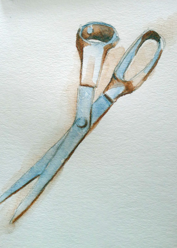
One advantage of being a lefty is that nobody borrows your scissors.
I use Derwent Inktense watercolor pencils to draw my sketches in field paintings. On a gessoed board, you can erase with a damp cloth. When you start laying oil paint down, the watercolor drawing freezes in place. I’ve been doing this for so many years, I’d forgotten why I bought the pencils in the first place. That is, until Mary Byromreminded me last week that they’re great for pocket drawings and value studies.
This and a multimedia sketchbook is all you need to carry.
I buy them in packs of six in burnt sienna and ultramarine. This is a warm-and-cool combination that makes great neutrals in every medium. I use it for watercolor value studies and for my dark neutrals in oil colors. I can flip from warm to cool instantly with this mix, making it perfect for setting darks.
I always start with a pencil sketch.
The simplest (and most important) value study looks at the ways in which you can translate an image into simple black and white. At the same time as you’re thinking about black and white, you can also think about cool vs. warm. This is the modern, post-impressionist way of looking at value.
All light has color. An overcast sky has a color temperature of about 10,000K (blue). A room lit by candles has a color temperature of about 1,000K (orange). The most neutral light is sunlight at noon.
This photo of Mission San Jose in San Antonio starkly demonstrates the color of light. All the walls are white.
Of course, the ambient light color is also affected by the objects it’s bouncing off. I took the photo above in Mission San Jose in San Antonio to demonstrate this. The walls are white, but there was incandescent light above the loft. The lower part of the room was lit by daylight or in shadow. The effect was to make it appear that the room had been painted in blue and gold.
An aqua-flow brush is the easiest way to move Inktense around.
The color of shadow is always the complement of the color of the light. Of course, this is all mutated by the color of the objects being lit. A red sphere in warm light will appear crimson in the light spots and more purplish in the shadows. That’s just red mixed with orange light and blue shadows. We simplify matters by saying that if the light is cool, the shadows are warm and vice-versa.
The principle’s the same whether the light is warm or cool, as long as it is consistent and matches reality.
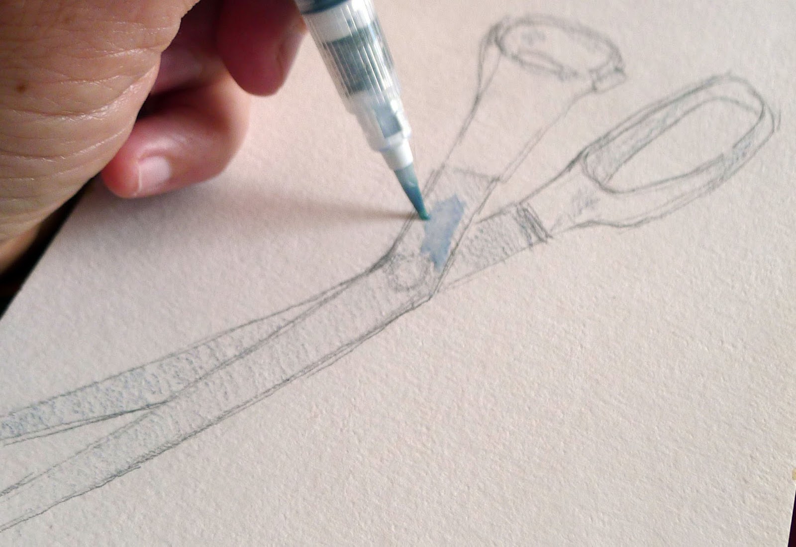
Watercolor pencils allow you to add in color temperature as you think about value. Ignoring their actual color and modeling, I made a simple contour drawing of my sewing scissors. I set the lighter half of my value range in blue. It’s simple to soften Inktense with a water-brush. Just fill it and run it over your pencil drawing. When that was done, I added my shadows in burnt sienna. You can get fairly intense darks with Inktense pencils.
Two different watercolor pencils can take you almost anywhere.
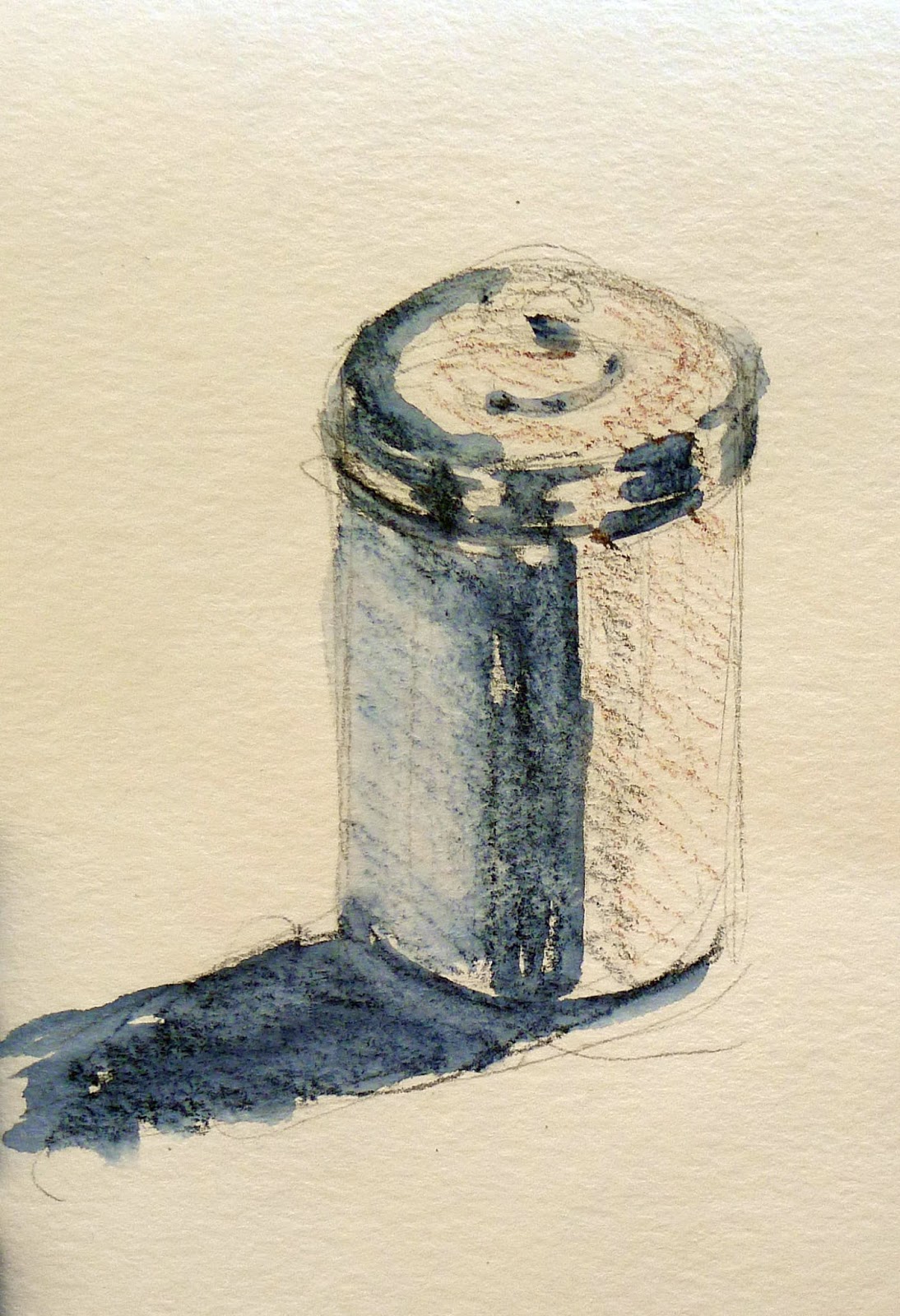
My fantasia was hardly inspired, but I’ve included it to show you how much depth you can get out of watercolor pencils. You can buy two Inktense pencils, a water-flow brush and a small pad of watercolor paper for around $20. The combination is no bigger than a sketchbook and pencil.
ADDENDUM: Susan Hanna points out that Derwent doesn’t have those color names. I should have checked first. My burnt sienna WAS a color called Venetian Red; they don’t market it as that any more. Try Red Oxide. Try Deep Blue for ultramarine. Once again, caught in the trap of romance naming for pigments.
SECOND ADDENDUM: Another reader mentions that Inktense pencils are fugitive. She prefers Caran d’Ache watercolor pencils. I’ve not tried them so can’t comment.
Registration is now open for workshops in 2026! Reserve your spot: