Monday Morning Art School: drawing draperies

Whether you want to make a drawing as detailed as Prud’hon’s or as simplified as Gauguin’s, the process is the same.

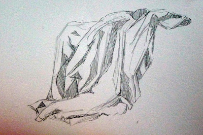
My precious linen drape.

If you’re lucky enough to own a worn mid-century linen tablecloth, don’t get rid of it. It can stand in as a drape under a still life, or as a sheet in a figure drawing. You can even iron it and put it over the deal table in your garret when company comes. If you don’t have one, you need a cotton sheet for today’s exercise. Throw it over something and let’s get going.

In the late eighteenth century, Neoclassicism brought drapery studies back to the forefront of art training. Their challenge and appeal were the same as in antiquity. Drapery plays peek-a-boo with the human form, exaggerating and pointing up the body’s activities. That artfulness is lost on modern viewers, and so is the skill of draping.
Same linen cloth, appearing as a sheet in The Laborer Resting, by Carol L. Douglas
Modern man wanders around in jeans and t-shirts. We don’t tend to draw people in them; most figure classes are done with nude models. We don’t learn much about rendering fabric, or about rendering people in clothes.
Free form curves are measured as straight line segments, as on the right, and then smoothed into their final shape.
We’ve talked about ellipses, but free-form curves appear often in the natural world, and especially in drapery. They’re wild and sinuous, and they can be very confusing. It helps to visualize them as straight-line segments that are joined up and smoothed, as in the above illustration. For a refresher on how to use your pencil to measure, click here.
This is done the same way; there are just more line segments.
In my first pass, I have drawn all the curves of the drapes as straight-line segments. Pay no attention to value at this point. As always, measurement comes first. The most complicated shapes and shadows are still just a collection of angles, proportions and alignments.
With practice, you’ll be able to measure the curves as you draw them. You’ll still be measuring; you’ll just be doing it automatically.
Place the shadows. You get white or dark and that’s it. No shades of grey.
In your second pass, define the large areas of shadow. There is no detailed modeling done in this step, just placement of the large shapes. (If you’re nearsighted, you can take off your glasses for this step.) Don’t use value steps as we did two weeks ago: you get white and dark, and that’s it. Don’t refine your shapes, either.
Now you can start focusing on the details.
In your third pass, you can begin to explore the subtlety of the shapes and the relative values of each fold. Erase if you want, be more careful with your linework. If you love detailed drawing, start big and revel in this phase; it’s fun. Because you set the value relationships up front, you can’t really go wrong focusing on the details.
Drapery study, 1813, Pierre Paul Prud’hon, black and white chalk with stumping on blue paper, some squaring in black chalk (courtesy Metropolitan Museum of Art)
Why do I never finish these Monday Morning Art School drawings to the level of Pierre Paul Prud’hon’s wonderful drapery study at the Met, above? That kind of high finish is actually the easiest part of drawing, requiring just loads of time (and interest) to finish. It’s not where most people need help. They need help knowing how to fit all the puzzle pieces together at the beginning.
Whether you want to make a drawing as detailed as Prud’hon’s or as simplified as Gauguin’s, the process is the same—start by figuring out the shapes, then work out the shadow structure and then—and only then—worry about detailed modeling and mark-making.

Monday Morning Art School: pie plates and pies

Learn how to draw a pie plate, dish, cup, or vase. I’m throwing in my secret pie crust recipe, so you can learn that too.

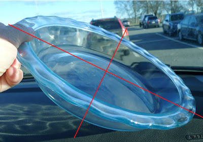
When drawing round objects, we have to look for the ellipses, which are just elongated circles. Ellipses have a horizontal and a vertical axis, and they’re always symmetrical (the same on each side) to these axes.

The red lines are the ellipse and its vertical and horizontal axes. The two sides of the axes are mirror images of each other, side to side and top to bottom.

Same axes, just tipped.

This is always true. Even when a dish is canted on its side, the rule doesn’t change; it’s just that the axes are  no longer vertical or horizontal to the viewer.

This is where I learned that I can’t balance a pie plate on the dashboard while traveling.

As always, I started by taking basic measurements, this time of the ellipse that forms the inside rim of the pie plate. (My measurements won’t match what you see because of lens distortion.)

The inside rim of the bowl.

An ellipse isn’t pointed like a football and it isn’t a race-track oval, either.

It’s possible to draw it mathematically, but for sketching purposes, just draw a short flat line at each axis intersection and sketch the curve freehand from there.
The horizontal axis for the bottom of the pie plate.

There are actually four different ellipses in this pie plate. For each one, I estimate where the horizontal axis and end points will be. The vertical axis is the same for all of them.

Three of the four ellipses are in place.
Next I find the horizontal axis for the rim, and repeat with that. It’s the same idea over and over. Figure out what the height and width of each ellipse is, and draw a new horizontal axis for that ellipse. Then sketch in that ellipse. The pencil marks are freehand; the red is measured on my computer. 
Four ellipses stacked on the same vertical axis.

Because of perspective, the outer edge of the rim is never on the same exact horizontal axis as the inner edge, but every ellipse is on the same vertical axis. We must observe, experiment, erase and redraw at times. Here all four ellipses are in place. Doesn’t look much like a pie plate yet, but it will.

The suggestion of rays to set the fluted edges.
If I’d wanted, I could have divided the edge of the dish by quartering it with lines. I could have then drawn smaller and smaller units and gotten the fluted edges exactly proportional. But that isn’t important right now. Instead, I lightly sketched a few cross did lines to help me get the fluting about right. It’s starting to look a little more like a pie plate.
Voila! A pie plate!
Now that you’ve tried this with a pie plate, you can practice with a bowl, a vase, a wine glass, or any other glass vessel. Meanwhile, here’s my pie-crust recipe. Nobody in their right mind would ask me to cook, but I can bake. This week I noticed that while I have a written recipe, I’ve changed it around enough that it’s unrecognizable.

I use a food processor, but the principle is the same doing it by hand.

Double Pie Crust
2.5 cups all-purpose white flour, plus extra to roll out the crusts
2 tablespoons sugar
1 Âź teaspoon salt
12 tablespoons lard, slightly above refrigerator temperature, cut into ½” cubes.
8 tablespoons butter, slightly above refrigerator temperature, cut into ½” cubes.
7 teaspoons ice water
Thoroughly blend the dry ingredients. Cut in the shortening (lard and butter) with either a pastry blender or by pulsing your food processor with the metal blade. It’s ready when it is the consistency of coarse corn meal. (If it’s smooth, you’ve overblended.) Sprinkle ice water over the top, then mix by hand until you can form a ball of dough. If the dough seems excessively dry, you can add another teaspoon of ice water, but don’t go nuts.

Divide that ball in two and flatten into disks. Wrap each disk in wax paper, toss the wrapped disks into a sealed container and refrigerate until you’re ready to use them.
Don’t worry if the dough appears to be incompletely mixed or the ball isn’t completely smooth; mine comes out best when it looks like bad skin.
Let the dough warm just slightly before you start to roll it out. And while you don’t want to smother the dough with flour when rolling, you need enough on both the top and the bottom of the crust that it doesn’t stick. If you’re doing this right, you should be able to roll the crust right up onto your rolling pin and unroll it into your pie plate with a neat flourish.

(If you’ve never rolled out a pie crust, watch this.)
I use this crust for single- or double-crusted, fruit and savory pies.

Seeing the wrong boat

I missed the obvious, but my student was more observant.
Becca & Meagan iced in at Rockport Harbor in 2015.

My class was drawing at Rockport Harbor yesterday. A red lobster boat was pulled up along the dock near Rockport Marine. There’s been a red lobster boat in Rockport harbor for as long as I can remember. I paid it little mind, even when a student said she didn’t like the red hull paired with a green waterline, which is not how I remember it being painted.

Since that boat has a mooring in the harbor, I figured it was only at the dock for a few moments. I cautioned my students not choose it as their subject, but, instead, to focus on the dinghies at their feet.
Of course, the dinghy they chose left not half an hour after they started drawing. The red lobster boat stayed in place all morning. It wasn’t until I got home that I realized that it isn’t the boat I assumed. That was the Becca & Meagan. This is its replacement, the Hemingway, and it was built by Rockport fisherman Kenny Dodge. If you like boats, you should read this wonderful piece from the PenBay Pilot. It’s Dodge’s own design, built of wood from his home and blending features from Nova Scotia and Maine lobster boats. It’s a behemoth: 47 feet long, almost 15 feet in the beam.
Hemingway at the dock.
Which is why I should have looked closer when my student was having trouble drawing it. She had already pointed out the waterline was different, and she was telling me it was like nothing she’d seen before. I was looking right at it, and still I didn’t notice that it wasn’t, in fact, Becca & Meagan.
This is her second summer with me and she’s made good, resolute progress. Yesterday, something clicked with her.
Carefully measured drawing by my student.
Boats, in general, are hard to draw, which is why so many artists avoid them. You can’t get away with a general swirl of activity, as you can with a farm field or a marsh. You must measure, measure, measure, and when you’re done, you end up adjusting all those measurements another time.
Yesterday, S. measured like a pro, and observed better than a pro. She corrected herself and me repeatedly. By doing that, she got a good representation of the dinghy at her feet and of the lobster boat in the distance. They’re not refined, nuanced, shaded drawings, but they have the most important principle down: the parts line up according to their real-world counterparts. A lot of experienced painters can’t seem to do that.
Carefully measured drawing by my student.
Becca & Meaganis a beautiful boat of traditional Maine design. I’ve seen it so often I’ve stopped really looking. Shame on me. I missed the obvious, but my student was more observant.

Perception and self-perception

Artists have a toolkit by which to objectively gauge the world. It’s our drawing skill.

From Richard Scott’s Sketching: From Square One to Trafalgar Square.
Early in Richard Scott’s excellent* Sketching: From Square One to Trafalgar Square, he asks readers to sketch the simple shape above.
Go ahead, do it. I’ll wait.
Scott points out that we tend to look at an object only long enough to identify it. Once we see it as “a rectangle,” we stop observing. We know what it is, and we draw what we know. Few people move on to the realization that its height is twice its width.
Scott then illustrates some shapes students might draw. “They are almost correct, but not entirely correct,” he notes. They are rectangles, but they are not this rectangle.
From Richard Scott’s Sketching: From Square One to Trafalgar Square.
The tools of drawing are observation, measurement, interpretation and reiteration. These are dispassionate, non-emotive skills, but they are the underpinning of all great art.
This weekend I heard a story that qualifies as a Great American Tragedy. Most people would call its protagonist a very successful man. He holds an advanced degree from one of America’s finest universities. He’s a VP at a large, successful company. However, he’s not a VP in the executive suite he covets. He bemoans that a choice made as a young man “ruined” his career.
You and I would look at this guy and see a skyscraper, a tall rectangle many times its width. He sees a stunted version of that rectangle. Just as we project what we already know on the rectangle we’re supposed to be drawing, we also project our preconceived ideas on people, including ourselves.
A great place to see this is in presidential politics, where we all project our fears and aspirations on whomever holds the seat at the time.
I mentionedrecently that artists usually don’t like their own, autobiographical brushwork. That’s why we rush to cover it up with stylishness (in contrast to style). Our self-criticism can easily spill over to self-loathing, as it has in the case of the man above.
Armor from the Metropolitan Museum of Art, by Carol L. Douglas. Drawing gives you great tools for social interaction.
Most of us go through life with the strong sense that we’re potting along in our Ford Fiestas, being passed left and right by people in Cadillacs. That’s true of even very successful people. It’s particularly true in the arts. There are no absolute benchmarks of success as in other fields. Criticism and approbation are subjective and often don’t stand the test of time.
We have an image of “success” imprinted in our mind. It’s fast, meteoric, and—most importantly—we don’t have it. I once knew an artist who’d had a very splashy entry into the art world in her early twenties. By the time she was in her fifties, she was substitute teaching and very poor. She was still passionately interested in art but produced almost none. Part of what bound her up was her early success. It set a bar she could no longer reach.
We artists have a toolkit we can use to avoid that trap. It’s the rationality that we learn through drawing. Measure, observe, reiterate, interpret, and you will be able to see more clearly than most.
*I mentioned this book earlier, but now that I have it, I can wholeheartedly recommend it.

A #2 pencil is a pretty cheap way to find your joy

Put down your cell phone and pick up a pencil.

A quick sketch of captive models, by Carol L. Douglas
On Friday, I suggested a list of drawing books for those who want to improve their drawing skills but don’t have access to a class. Reader Michael Schaedler of Jay has the traditional Maine opinion that it’s silly to spend money on something you can find for free. He located a text online and has been faithfully doing its exercises. It’s Dorothy Furniss’ Drawing for Beginners and it runs through all the basic subjects.
Looking at old drawing texts, I’m reminded of what an unlettered generation ours is. We want the technical stuff, fast, and don’t want to waste time on rhetoric. I’m as bad as anyone; I buy art books mainly for the pictures. Still, in this week of enforced solitude, I’ve found myself reading and appreciating these older writers and their thoughts on the craft of drawing.
Teenage boy sleeping through church, , by Carol L. Douglas
A reader asked me for tips about figure drawing. That’s a separate subset of knowledge from drawing inanimate objects.
George B. Bridgman (1865–1943) was a Canadian-American artist. He taught anatomy for artists at the Art Students League of New York for 45 years. His books were the standard for 20th century instruction on the subject. They can still be purchased today. Start with his Complete Guide to Drawing from Life.
Most of the time, you’ll find very boring stuff when you wait at doctors’ offices. But occasionally, you’ll find a skeleton. By Carol L. Douglas.
I think every studio should have a copy of Frank H. Netter’s Atlas of Human Anatomy. It’s useful to know how things work. Pressured by his family, Dr. Netter left a career in art to go to medical school. The Great Depression had the last laugh; there was more work for a medical illustrator than there was for a doctor. His anatomy book is a masterpiece, and it explains to the visual learner what parts go where.
Bailiff at Hall of Justice, by Carol L. Douglas
My reader should be practicing gesture drawings constantly—one or two-minute sketches of people done from life. Gesture drawing is very personal; it’s an impression of a form. There’s no ‘right way,’ but it should be fast. If it goes more than two minutes, it’s no longer a gesture drawing.
The only true gesture drawing I have on my laptop is of a horse. Figures. By Carol L. Douglas.
The more he draws people, the more skill he will develop. Modern life presents all kinds of opportunities to draw surreptitiously. They just require that we put down our cell phones and pick up a pencil.
Note: This week, art conservator Lauren R. Lewis shared resources for those of you dealing with hurricane clean-up, here. Since then, she found this fantastic resource. It includes hotlines as well as tips for first-phase cleaning of flood-damaged artwork. May nobody need it.

Those darn kids

Kids usually stop drawing when they hit puberty. That might be preventable.
12-year-old Cora Pahucki and her painting from Ellicott City Plein Air.
It’s the season when plein air painters hit the road. I expect to see Chrissy Pahucki twice this summer, first at Castine Plein Airnext week, and then at Adirondack Plein Air in August.
Chrissy has three kids. Usually, she has one or more of them with her. As they’ve gotten older they’ve started painting alongside her, sometimes even entering open-to-the-public quickdraw events with her. “Ben calls dibs on Castine every year,” she told me. “Cora will be at Morristown, NY, with me. Samantha will do the Adirondacks.”
During the off-season (meaning the other ten months of the year), Chrissy teaches art at CJ Hooker Middle School in Goshen, NY. She’s an award-winning teacher as well as painter, and she must have nerves of steel, since she has been known to take her class plein air painting.
One of Chrissy Pahucki’s paintings (unfinished) from Ellicott City Plein Air
This weekend, she was at the Ellicott City (MD) Plein Air Festival. Her daughter Cora, age 12, was with her. Kids painting in these events are so unusual that Cora scored a mention in the Baltimore Sun, here.
Each time I see their work, I wonder what kind of adult artists Ben, Samantha and Cora will end up being.
Meanwhile, I have houseguests. My three nephews range in age from 17 to 11. All of them carry sketchbooks with them when they travel, but Gabriel, who’s going into the 11th grade, is a marked man. He has that book in his hand everywhere he goes, and he uses it.
People often tell us artists about kids or grandkids who love art and show great promise at it. Sadly, most of them will stop drawing when they hit adolescence. Only a few will continue to express themselves with pencil or brush.
Another painting of Cora’s from Ellicott City Plein Air.
Cartoonist Lynda Barry has speculated that paper ceases to be the same thing for adults that it was for kids: “[W]ith kids, a piece of paper is a place for something to happen. And for adults, it’s a thing.”
Very little study has been done on the question of why kids stop drawing. What we know suggests that at puberty kids suddenly realize their efforts are unsatisfactory. Young children don’t care about proportion and perspective; they are working expressively. Older school-age kids want realistic results. If they can’t solve drafting problems to their satisfaction, they give up.
Another painting by Chrissy Pahucki from Ellicott City Plein Air.
Of course, drafting skills aren’t intuitive; they must be taught. Our western tradition has by and large abandoned teaching the discipline of drawing in favor of fostering genius and self-expression. It’s the rare child who perseveres through that, or has an art teacher who understands the importance of drawing.

In every class, there are one or two kids who’ve reasoned out how to draw. The rest of their class believe that these kids are blessed with some mysterious “talent” that sets them apart, but what they really had was the opportunity to see how drawing is supposed to work. 
I’ll bring Gabriel along with me for my last regular class of this session. “Hey!” said his younger brother when I announced this. “I like to draw, too!” But I know that lad. He’ll be off collecting seashells and I’ll be thinking up ways to stop him from slipping into the ocean, rather than concentrating on my class. Unlike Chrissy Pahucki, I can’t do two things at once.

Everyone should make art

Why spend money teaching kids arts and music when we can drug them into submission?

Not only did yesterday’s painting class develop their brains, they watched an osprey family on that nest on the pole.

 As a parent, I skirmished with my kids’ school about doodling. I agreed to an Individualized Education Program (IEP) for my youngest just so they would let him doodle in class. To me it was obvious that doodling helps kids who are stressed from sitting in one place for too long.

A few years ago, I wrote about a teenager arrested for doodling. Sadly, it wasn’t the only time it happened.

I tell my students to carry a sketchbook at all times, mostly to help them improve their drawing chops. I draw whenever I’m waiting or listening. I’ve drawn through twenty years of church sermons, and I don’t think it’s damaged my ability to hear what my pastors have said.
Sadly, my kids’ school didn’t agree. Even with an IEP, drawing in class was eventually banned for my son. (The good news is, as an autonomous college student, his grades are great.)
Gwendolyn Linn taught a class within one of my painting classes. Her audience was rapt.
Science tells us that doodling-repression is flat-out wrong. A recently study at Drexel University used fNIRS (functional near-infrared spectroscopy) technology to measure blood flow in the so-called ‘reward pathway’ of the brain while subjects drew.
They were tested while doing three different short activities: coloring in a mandala, doodled within or around a pre-marked circle, and free drawing. All three activities caused an increase in activity in the medial prefrontal cortex.
Of course, the medial prefrontal cortex is not just the ‘happy button’ that gets turned on when you do something enjoyable or misuse drugs. It’s also involved in planning, personality, decision-making and moderating social behavior. Among its more important processes is the development of a sense of self and that Holy Grail of educators, executive function.
Nancy Woogen working on her pre-frontal cortex in my Sea & Sky Workshop a few years ago.
Doodling in or around the circle had the greatest neural impact, followed by free drawing and coloring. Mostly, the differences weren’t significant. The exception was for subjects who self-identified as artists. For them, coloring inside the lines turned out to be a negative experience.
There have been many studies with similar results. Training in drawing is associated with an increase in brain gray matter and changes in the prefrontal cortex. Making art improves the functional connectivity between cortices. Even passive engagement with art helps brain function.
Studies have shown similar positive results on the brain from making and listening to music.
Still, the arts are the orphan stepchildren of our educational system. They’re the first thing cut. But why spend money teaching our kids arts and music when we can drug them into submission?
Corinne Avery rearranging dinghies at another workshop, this time at Camden harbor.
Note: I’m demoing painting today at Windjammer Days in Boothbay Harbor from 1-4 PM. My pals Ed Buonvecchio and Bobbi Heath will also be there, along with my two favorite schooners, American Eagle and Heritage. If you’re free, come see us. You may discover a whole new way of lighting up the neural pathways in your brain.

Consider the source.

Canaletto did not use a camera obscura. People repeat that because they’re uncomfortable with the fact that they can’t draw.
Westminster Abbey with a procession of Knights of the Bath, 1749, Canaletto
It has long been held that Canaletto achieved the amazing accuracy in his vedute through the use of the camera obscura. This is not a modern thesis, although it is widely repeated as fact. It came down to us from Canaletto’s earliest biography, written in 1771, but it’s convenient for our modern sensibilities. After all, Canaletto’s landscapes are so perfect, they could not have been rendered from life—could they?
The Royal Collection Trust has released a report that seems to prove, conclusively, that this theory is wrong. While infrared technology is often used to examine what’s under the surface in oil paintings, it’s not commonly used on drawings. The Trust applied this technique to their collection of Canaletto’s works on paper. This is significant; they own a third of known Canaletto drawings.
They discovered the ruler edges, pencil markings and other traces of the drawing process under the finished surfaces. It was enough for the curators to state “categorically” that the stories of Canaletto’s use of the camera obscura were mythical.
Architectural Capriccio, drawing, Canaletto. “Capriccio” means it’s a fantasy landscape.
There is nothing inherently wrong with the camera obscura or any other mechanical aid to drawing. Nor was David Hockney revolutionizing the art world when he proposed that our ancestors used it. Leonardo da Vincidescribed its workings in 1502, and a similar pinhole drawing device was illustrated in Albrecht Dürer’s Four Books on Measurement. For Canaletto, born simultaneously with the Age of Reason, the temptation to try the camera obscura would have been overwhelming. But he would have quit for the same reason many mature artists stop working directly from photos:
The results are boring.
The Stonemason’s Yard, 1726–29, is considered Canaletto’s early masterpiece.
What is seen by the human eye, with its pronounced center pole, is so much more interesting than the flattened line of ‘real’ optics. That is why our photographs so often disappoint us, and why photography really is a lot more complicated that simply pointing a camera and firing away.
The popularity of the Hockney thesis lies in an uncomfortable fact: by and large, moderns don’t draw well. We haven’t put in the hours with ruler, pencil and paper. We rely on viewfinders, photographs, and other devices for our underpaintings. Rather than face up to that deficiency, it’s easier to imagine that drawing is impossible.
Of course, it’s not, and nobody can really paint until they master the elements of drawing. Too often, modern landscape painting is about fragment and impression. Is that because fragments are so interesting, or because we’ve given up on drawing?

Why paint from life? For one thing, you can’t wander through a photograph

This is the site from which I did Friday’s painting of the Chugach Range. Which is more “realistic”? My painting, of course. The mountains in Anchorage are an everpresent force, not a nice little outline in the background.
“Why should a painter work from life rather than photos?” a reader asked me. “I can see that work painted from photos can lack a certain depth, but I don’t understand why.”
First, let me be clear: almost all painters work from photos at times, if only to clarify something they didn’t understand out in the field. On a morning like today, when Mother Nature is creating a ruckus, there’s no way I’m going to be anywhere but in my studio, with slippers on. And that means working from photos.
But that should be the lesser part of the experience, not the greater.
I mentioned last week that neither the human eye, nor the camera, nor my monitor are objectively correct about the color of distant mountains. If I had used photos to paint my trip across Canada, the mountains would have been large cutouts in blue-violet shapes because that’s what my camera recorded. In real life, they had dimension, shadows, and rocky ridges—all things that disappeared in the photographic record. A better camera would have given me a better image, but no camera can equal my own eyes, as old as they are.
Chugach range from Anchorage, oil on canvasboard, by Carol L. Douglas. The colors in my painting are warmer, and the mountain is more important and detailed.
“Digital adds lots of cyan to an image, usually about 30% in the lighter and mid-tones. And RGB color space doesn’t ‘see’ as many colors as a human’s eye/brain perceives,” responded Victoria Brzustowicz, who, in addition to being a painter is a graphic designer.
The human eye is a dynamic sensor. The resolution in the center of our eyes is far higher than at the edges, so we create images by shifting our focus very, very fast—so fast, in fact, that we’re not aware of it. We do a similar thing with darks and lights—although our eyes have less dynamic range than cameras, we just record the full range of impressions in our memories, stitching them seamlessly into an image we think we see.
Put away the camera and draw, draw, draw. You can draw anywhere, and in this climate, you can bring your own still life with you.
We don’t see in rectangles, either, but in a cone shape that somehow takes in lots of information at the periphery. That’s the big reason I don’t like my students using viewfinders in class. Viewfinders reduce what is possible to what can be contained inside a rectangle. Often, what’s actually there in life includes something amorphous and looming that gives character to the whole scene. Yes, it’s harder to capture that, but that’s the difference between an artist and a scribe.
Cameras also distort our sense of space. There is no one lens that exactly duplicates our range of vision. We humans see in neither telephoto nor wide-angle. The photographed view is, sadly, a choice somewhere between the two. That doesn’t match human perception.
My hiking poles, along with my tam (left) and mittens (above) went to church with me on Sunday. I’m listening to every word, but I’m also keeping my hands busy.

Years ago I took an anatomy-of-drawing class from the late Nicki Orbach. I had the shape of the shoulders wrong. “Get up and look at him from the other side,” she suggested. It was only then that I could see how I’d ignored the pull of the trapezius muscles, which control the neck but are mainly visible from the back. You can’t get up and wander through a photo to collect more information, and it’s something I do surprisingly often.

It’s a fake, darn it!

“Women working in wheat field, Auvers-sur-oise,” 1890, Vincent van Gogh

“Women working in wheat field, Auvers-sur-oise,” 1890, Vincent van Gogh.
I often say I’m not a big believer in an art genius, any more than I’m a believer in a math genius or a language genius. Almost everyone can learn to draw, just as almost everyone can learn to do sums, write or sing. To make this point, I frequently point people to Van Gogh’s drawing. By dint of hard work, his drawing went from pedestrian to splendid in just a few short years.
Vincent van Gogh: the Lost Arles Sketchbook was published simultaneously this week in France, the United States, Japan, Britain, Germany and the Netherlands. Its author, Bogomila Welsh-Ovcharov, is a respected Van Gogh scholar from the University of Toronto. “When I opened it up, the first thing I said was, ‘No, unbelievable!’ The first drawing that I took out and held in my hands, it was a moment of total mystical experience: ‘Oh my goodness, this is impossible!’” said Welsh-Ovcharov.
The book is based on a folio purported to contain 65 recently-discovered Van Gogh drawings from his mature period. Van Gogh’s drawings are very instructive. He used a pencil or pen with the same flourish as a brush, creating works with energetic and detailed mark-making using an enormous range of technique. Even at the nosebleed list price of $85, the book was making my credit card hand start to itch.
“Small house on road with pollarded willows,” 1881, Vincent van Gogh.

“Small house on road with pollarded willows,” 1881, Vincent van Gogh.
But wait, there’s more! On Tuesday the Van Gogh Museum in Amsterdam—the accepted top dogs on the subject—released a statement saying that the drawings are fakes. Among other things, they say that the drawings do not show the rapid development in skill that was the hallmark of this period in his work.
I wouldn’t need anything more to convince me, because that’s the defining characteristic of his drawing career. However, the Museum also notes that the drawings include topographical errors. Van Gogh was a meticulous recorder of reality. It is inconceivable that any painter would forget the details of a place in which he lived and worked. Drawing has a way of deeply imprinting them on your being.
“Vincent's boarding house In Hackford Road, Brixton, London,” 1873, Vincent van Gogh

“Vincent’s boarding house In Hackford Road, Brixton, London,” 1873, Vincent van Gogh.
I feel like a kid who just got socks for Christmas instead of the toy I really wanted. This doesn’t, however, negate what Van Gogh’s drawings say to me as an artist and teacher: to paint, you need to be able to draw, and you need to do it as regularly and naturally as you brush your teeth.