The four steps of landscape drawing

Being technically accurate frees up your subconscious mind to analyze and interpret what you see.

Main Street, Owls Head, 16X20, oil on gessoboard, $1623 unframed.
Observation

I once took an artist on a long loop to see all my favorite painting sites here in midcoast Maine. “But there’s nothing to paint,” she wailed. She was suffering an extreme case of sensory overload. We all experience this to some degree when we’re forced to buckle down to work. We’re asking ourselves to choose one subject among an infinite number of possibilities. And the obvious and iconic may not make the best (or most interesting) painting.

We all want to jump quickly into painting, but the better path is to spend some time relaxing and looking. I prefer to do this with a sketchbook and a lawn chair. If you’ve spent 10 minutes just drinking in the beauty, and then do four thumbnails of different scenes, you haven’t ‘wasted time.’ You’ve saved yourself immeasurable amounts of work on mediocre paintings, by answering the following questions:

  • Where does the visual strength in this composition lie?
  • How can the picture plane be broken into light and dark passages?
  • How can I crop my drawing to strengthen the composition?
Belfast Harbor, 14X18, $1594 framed.
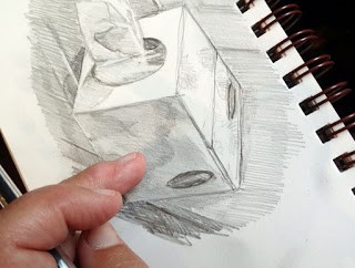
Measurement

At some point, you need to get precise. Fast, loose painting rests on a base of good drawing. If you haven’t been taught to measure with a pencil, start here, hereand here.

People tell me all the time, “I can’t draw a stick figure.” It depresses me, because drawing is a technical exercise, and anyone can learn it, just as they learn to write or do arithmetic.

I recommend the book Sketching from Square One to Trafalgar Square, by Richard E. Scott. It’s a comprehensive introduction to drawing from observation. Books and classes that focus on the interpretive side of drawing are not useful for the artist who needs to get things right, so before you sign up, make sure that teacher, video, or book is actually teaching drawing, not some form of self-analysis with a pencil.

Beach erosion, 8X10, oil on canvasboard, $522 unframed.

Interpretation

Being technically accurate, oddly enough, frees up your subconscious mind to analyze and interpret what you see. We all paint through the filter of our own experience, values and aspirations. That’s why one artist will edit out the power lines and trash cans on a street scene, and another will focus on them.

But there’s a deeper level at which this happens, and that’s in the colors, forms and shapes themselves. They’re tied to your subconscious. Within the rubric of ‘good composition’ or ‘good taste’ are infinite variations. What you perceive is highly individual, so your interpretation will also be individual.

Marshall Point, 12X9, oil on canvasboard, $696 unframed.

Reiteration

The first three phases are all essentially input—identifying, measuring, and analyzing the subject you’re painting. The final business of producing a work of art is collecting all that input and restating it on your canvas or paper. If you’ve done the first three steps conscientiously, this last step should be relatively relaxed and free. It should also go quickly. Your own ‘handwriting’, in the form of brush or pencil work, will be unfettered and loose.

Hard-earned ease

It’s a paradox: we achieve looseness by mastering the small, precise details of our craft.

Tom Sawyer’s Fence, oil on canvas, Carol L. Douglas

Painting students often express the desire to paint more loosely. That’s not easy to attain. Painter Tom Root described it best when he called it “hard-earned ease,” likening it to a ballet dancer with bloody feet.

It’s paradoxical, but dancers achieve grace and fluidity by practicing a bone-aching number of precise movements. It’s the same in painting: we achieve lyricism by mastering the small details of our craft.

That starts with drawing. It’s shocking how many people try to be painters without mastering this basic skill, and how many teachers let them get away with it. Drawing is the basic reverse-engineering process of art. It’s how we analyze an object before we rebuild it on canvas.

Clouds over Whiteface, oil on canvasboard, Carol L. Douglas

You can’t develop fluid style if you can’t draw. You will flail around, guessing where things are, and then overstating everything with excessive, tight brushwork. You won’t be able to express depth or distance if you haven’t explored where depth and distance start and stop.

Conversely, if you take the time to learn to draw, your painting has room to be looser. In my class on Tuesday, a student drew a complex Anasazi pot with astounding fidelity. She was able to put the pot down in a few brushstrokes because she’d already done the hard business of figuring it out with her pencil.

Best Buds, oil on canvasboard, Carol L. Douglas

Drawing is actually easy. It doesn’t require ‘talent’; it’s for the most part a mechanical measuring process. There are many good books on the subject, and I’ve also gone into it extensively; just go to the search box to the right on this blog and type in “how to draw.” The investment is minimal; a mixed-media Strathmore Visual Journal is around $5 at our local job lots store. Use any #2 pencil with an eraser. Anything else is just refinement.

The second requirement for fluidity is process. For some reason, the arts have a reputation for attracting non-conformists, but I don’t know a single successful painter who doesn’t repeat a process with every painting. These have variations, but the components—at least in painting—are nothing new. The basic order of operations has been set in stone for centuries; only the materials get updated.

Bracken Fern, oil on canvasboard, Carol L. Douglas

If you want to find your true authentic voice, start by mastering the process. For most of us, the easiest way to do this is with a teacher, but there are fine videos and books out there as well. Practice your process so many times that it becomes second nature. Then—and only then—you will find your own, loose brushwork emerging.

Notice that I said nothing about style. It’s important, but elusive. It emerges when one has done the grunt work of developing good technique. Don’t try to pin it down too early, or you’ll box yourself into something you can’t grow past.

I’m off to Tallahassee on Sunday to teach my last workshop of the season. Next year’s dates (so far) are now on my website. Here’s hoping that 2021 is a better year for all of us!

Monday Morning Art School: anyone can draw

Drawing is a series of actions, rather like dance. It can be learned, just like any other process.

Teachers sometimes tell their students to hold the pencil fully outstretched. I disagree, because moving it up and down and sideways makes you move in an arc, as Sandy demonstrates, above. 

Drawing starts with measurement. Get that right, and everything else is just details.

1. Put yourself a few feet from the object you want to draw. Make sure you’re comfortable.

2. Hold your pencil between your thumb and fingers as shown. Most art teachers tell you to do your measurements with your arm completely outstretched; I prefer to have my arm loose and to visualize an imaginary plate glass window I’m running my pencil along.

Instead, hold your pencil loosely and comfortably, as if there were a plate glass window along which you were running the pencil. You will have to recheck your measurements frequently, but you should be doing that anyway.

3. Close one eye and focus on the pencil.

4. Holding your pencil upright and straight, align the point of your pencil with the top of the vase.

5. Slide your thumb down the pencil until it is at the bottom of the vase. This is now one unit of measurement in space.

Your pencil is your ruler. You are measuring ratios and then transferring them to the paper. (Note: my ratios look slightly different from what Sandy was seeing because I drew the picture later, from a slightly different angle.)

6. Put marks on your paper where you want the top and bottom of the vase to end up. This is now one unit of measurement on your paper. It doesn’t have to be the same size as your unit of measurement on your pencil.

7. Go back and line your pencil up again with the vase so that it fills the pencil from the point to your thumb. Now raise the pencil so you are measuring the flowers. Are they as tall as the vase?  Twice as tall? Half as tall? When you’ve determined this, add another mark to your paper to indicate where the top of the flowers should be. This should be the same ratio on paper as it was in space. But one unit on your pencil does not need to be one unit on your paper. What you draw can be much bigger than what you measure, as long as they are proportional.

Recheck the height with your pencil and then flip it to see how the width of the vase compares. It’s that simple. 

8. Go back and recheck the measurement on the vase height. Then just flip your pencil sideways and see how wide the vase looks in comparison to its height. Is the object as wide as it is tall? Twice as wide? Half as wide? Once you’ve determined this, go ahead and put horizontal marks on your paper to represent the width of the vase.

9. Turn your pencil to the side and observe that the flowers are about 2 or 2.5 times as wide as the vase (depending on where you’re standing).  Make those marks on your picture.

It really doesn’t matter where you start measuring or what order you measure in. You will figure out a system that works for you.

10. Once you have the proportions of the objects marked out, mark in the big shapes with a light pencil and then start breaking them down into smaller shapes. You are well on your way to drawing the object. 

Once you have the measurement hash marks in place, draw in the big shapes and start breaking them down into smaller shapes. The rest is just details.

Your assignment is to practice this. The more you practice accurate measurement, the better your painting will be. Next Monday I will talk about using angles and negative space to measure.

Monday Morning Art School: why this subject?

Create clear priorities and a compelling reason for people to engage with your painting.

Lobster fleet at Rockport Harbor, by Carol L. Douglas

With modern cameras, you can snap a view and think through why you liked it later, cropping and manipulating the photo to enhance the subject. When drawing, you have to set pencil to paper somewhere. Pause at that point, because it’s usually what interests you most about the subject or idea. Why have you chosen it? What first attracted your eye? It’s bound to be one of the following:
  • The subject matter;
  • Patterns of lights and darks;
  • Abstract shape(s);
  • Atmosphere, tonal values or lighting effects;
  • Beautiful line;
  • Color;
  • Symbolism.
Bracken Fern, by Carol L. Douglas.

By purposefully noting what you notice, you create clear priorities for your painting. This makes you less likely to include every detail. Not slavishly recording everything is one secret to becoming looser as a painter.

This is where a habit of sketching comes in. Imagine you’ve just stumbled down to Camden Harbor for the first time. It’s beautiful—and overwhelming. There are swank yachts and luxury cruisers cheek-by-jowl with old wooden schooners and family sailboats. How do you sort this into a pattern?
Tricky Mary in a Pea-Soup Fog, by Carol L. Douglas
You could take your camera and shoot a thousand images, intending to assemble them into a painting in the studio. That’s not likely to produce a great painting. Instead, sit down at a bench and sketch what interests you—not one drawing, but a series of quickies. Usually, you have more time than you realize, and it behooves you to do this in gentle stages. Getting the subject and composition right is the most important part of painting.
After you’ve had time to think with your fingers, you can return to the subject that most interested you, and reduce and reframe the subject into its basic elements.
What you’re looking for is a compelling reason for someone to want to engage with your painting. That is as varied as there are people, but certain things ought to be present:
  • Energy;
  • A pleasing pattern of light and dark;
  • A strong focal point, supported by line and contrast.

If they’re not, then go back to the drawing board before you touch paint to canvas. A weak composition is one thing that you can’t fix along the way.

Sea Fog, by Carol L. Douglas is available through Folly Cove Fine Art, Rockport, MA.

Sometimes, things happen in nature that are too quick to allow for this careful set-up. I occasionally chase them, and doing so has about a 50-50 chance of succeeding. Atmospheric effects are the easiest, because they cover the canvas. People are the most difficult.

When I’m smart, I do the chasing with pencil and paper and transfer my drawing to canvas. A few weeks ago I was down in the North End Shipyard with Ed Buonvecchio. The crew of the Stephen Taber took a break in the spring sunshine, seated on the spruce planks that line the shipyard. Beautiful and poetic, they’d have made my painting. But instead of drawing them, I went right to paint. The result was terrible. At my age, I should have known better.

Monday Morning Art School: ellipses with a recipe thrown in

Learn how to draw a pie plate, dish, cup, or vase. I’m throwing in my pie crust recipe, so you can learn to make a pie, too.

When drawing round objects, we have to look for the ellipses, which are just elongated circles. Ellipses have a horizontal and a vertical axis, and they’re always symmetrical (the same on each side) to these axes.
The red lines are the ellipse and its vertical and horizontal axes. The two sides of the axes are mirror images of each other, side to side and top to bottom.
This is always true. Even when a dish is canted on its side, the rule doesn’t change; it’s just that the axes are no longer vertical or horizontal to the viewer.
Same axes, just tipped.
As always, I started by taking basic measurements, this time of the ellipse that forms the inside rim of the pie plate. (My measurements won’t match what you see because of lens distortion.)
This was where I learned that I couldn’t balance a pie plate on the dashboard in my husband’s old minivan.
An ellipse isn’t pointed like a football and it isn’t a race-track oval, either.
It’s possible to draw it mathematically, but for sketching purposes, just draw a short flat line at each axis intersection and sketch the curve freehand from there.
The inside rim of the bowl.

There are actually four different ellipses in this pie plate. For each one, I estimate where the horizontal axis and end points will be. The vertical axis is the same for all of them.

The horizontal axis for the bottom of the pie plate.

Next, I find the horizontal axis for the rim, and repeat with that. It’s the same idea over and over. Figure out what the height and width of each ellipse is, and draw a new horizontal axis for that ellipse. Then sketch in that ellipse.

Three of the four ellipses are in place.

Because of perspective, the outer edge of the rim is never on the same exact horizontal axis as the inner edge, but every ellipse is on the same vertical axis. We must observe, experiment, erase and redraw at times. Here all four ellipses are in place. Doesn’t look much like a pie plate yet, but it will.

Four ellipses stacked on the same vertical axis.

If I’d wanted, I could have divided the edge of the dish by quartering it with lines. I could have then drawn smaller and smaller units and gotten the fluted edges exactly proportional. But that isn’t important right now. Instead, I lightly sketched a few crossed lines to help me get the fluting about right. It’s starting to look a little more like a pie plate.

The suggestion of rays to set the fluted edges.

Now that you’ve tried this with a pie plate, you can practice with a bowl, a vase, a wine glass, or any other glass vessel.

Voila! A pie plate!

Meanwhile, here’s my pie-crust recipe. Nobody in their right mind would ask me to cook, but I can bake.

Double Pie Crust

2.5 cups all-purpose white flour, plus extra to roll out the crusts
2 tablespoons sugar
1 Âź teaspoon salt
12 tablespoons lard, slightly above refrigerator temperature, cut into ½” cubes.
8 tablespoons butter, slightly above refrigerator temperature, cut into ½” cubes.
7 teaspoons ice water
Thoroughly blend the dry ingredients. (I use a food processor, but the process is the same if you’re cutting the fat in by hand.) Cut in the shortening (lard and butter) with either a pastry blender or by pulsing your food processor with the metal blade. It’s ready when it is the consistency of coarse corn meal. (If it’s smooth, you’ve overblended.) Sprinkle ice water over the top, then mix by hand until you can form a ball of dough. If the dough seems excessively dry, you can add another teaspoon of ice water, but don’t go nuts.
Divide that ball in two and flatten into disks. Wrap each disk in wax paper, toss the wrapped disks into a sealed container and refrigerate until you’re ready to use them.
Don’t worry if the dough appears to be incompletely mixed or the ball isn’t completely smooth; mine comes out best when it looks like bad skin.
Let the dough warm just slightly before you start to roll it out. And while you don’t want to smother the dough with flour when rolling, you need enough on both the top and the bottom of the crust that it doesn’t stick. If you’re doing this right, you should be able to roll the crust right up onto your rolling pin and unroll it into your pie plate with a neat flourish.
(If you’ve never rolled out a pie crust, watch this.)
I use this crust for single- or double-crusted, fruit and savory pies.

Monday Morning Art School: start with drawing

Before you can paint successfully, you have to learn to draw.
I love drawing in church, especially when there are sleepy teenagers. This drawing started with simple analysis of shape.

One of the problems with writing about ‘how to do art’ is that you’re speaking to all levels of experience. Today we’re going right to the beginning of measurement. Almost everyone can get the details of a drawing right. Where they go wrong is with overall proportion. Drawing is, first and foremost, a technical exercise in seeing size relationships. Get that right, and the details hardly matter.

All objects can be broken down into simple shapes and angles.

You’ve all seen artists holding a pencil up to an object. What they’re doing is rough measuring. It’s simple to do, but tough to photograph. Hold your pencil up like a ruler in front of the object you’re drawing. Move it around to see the relative height and width of the thing. For example, the toy truck below is about 1.5 times as wide as it is tall. Figure that out by holding your pencil first along the vertical access, then along the horizontal access, and comparing where the lengths stop along the pencil.

It’s not just an affectation; it’s really how artists measure.

A common beginner error is thinking that you have to transcribe the lengths exactly to the paper. The drawing can be any size you want. Start by figuring out how big you want the object to be on your paper, and make two hash marks to represent that. Then, if your object is half as wide as it is tall, figure out that relationship and mark it too.

Start by measuring out the simple shapes and angles.

You can also use your pencil to figure out the other important thing in drawing: the angles of lines. Formal perspective is important, but not as important as learning to see angles. If you develop the ability to see angles, you’ll have better natural perspective than if you try to fit up what you see to a theory.

Next, rough in the values. That means the lights and darks.

Do your measuring with one eye closed, especially if you’re working in a tight space. Art books will tell you to measure with your arm straight out. That’s not always practical. Instead, try to have the pencil the same distance away from your eye each time you take a measurement. I do that by noting how my arm is cocked.

Today’s exercise is based on a tissue box I drew in church. It had lovely angles. However, what you see in the photo isn’t what I saw while working. A drawing from life will never match what the camera records. Cameras lie just as much as artists do.

Begin to refine and strengthen the light and dark shapes.

All drawing starts with simple shapes. After laying them down, I check and correct them. I do this by analyzing each large shape. Where does the back of the box intersect the tissue column? Is the curve of the cutout fat enough? I discovered that my cube wasn’t really tall enough, so I added some to the bottom. 

The next step is to establish some overall values.  â€œValue” just means how light or dark something is. This box was sitting on a south-facing windowsill behind a person who was casting another shadow. Thus, the window-frame behind the box was in deep shadow, but not nearly as dark as the photograph. I roughed in those darks first. They helped me know how to shade the box properly.

If you’re using graphite or charcoal, you can blend with your finger. Otherwise, use a stump, a tortillon, or a bit of rag.

Next, I set shadows on the tissue box itself. I am more concerned with the column of tissue, so with each pass, I spend more time on that.

Finally, I did some blending, using the handiest tool I carry: my finger. You should use a stump or tortillon on work you care about, but in a pinch, your finger works great. But don’t blend pigments other than graphite or charcoal with your finger; they may contain toxic metals.

Voila! I have a tissue box drawn and my pastor is just winding down his peroration.
Note that I never bother much about my mark-making. It can take care of itself. I’m mostly interested in applying accurate values. I did this drawing with a mechanical pencil, which will never be as luscious as a good graphite stick, but it survives banging around in my purse week after week.
Some general rules:
  • Draw everyday objects. The better you get with these, the better you’ll be with complex subjects. There’s amazing beauty in everyday things.
  • Draw any time you get the chance. I did this drawing in church, and I didn’t miss a word. Drawing and language don’t use the same channels of your brain.
  • Measuring is the most important part of drawing. Keep checking and correcting sizes.
  • Start with big shapes and break them down into little shapes. If the big shapes are right, the smaller parts will slip into their spots just fine.
  • Value is relative. How dark something is, is only important in terms of how dark its neighbor is.
  • Constantly recheck shapes and values as you go.

Monday Morning Art School: what I learned from losing 50 pounds

I rapidly gained a hundred pounds after my first cancer in 1999. It’s taken me this long to get serious about getting rid of it. As I reach my halfway goal, I realize that much of the discipline of losing weight is the same as the discipline of learning to paint and draw.
Peppers, by Carol L. Douglas
Being self-taught has its limits
After each of my pregnancies, I used Weight Watchers and exercise and bounced back. That didn’t work with my post-cancer weight. I tried many diets without success. The only solution the medical establishment offered was bariatric surgery. I’d seen too many mixed results to consider it.
I switched PCPs, and my new nurse-practitioner had a different idea. “Try this,” he said, and handed me a book. I’d have dismissed the plan as unsound had it not come from a medical professional.
When I first took classes at the Art Students League, Cornelia Foss looked at my work and said, “If it were 1950, I’d say ‘brava,’ but it’s not.” I’d still be painting derivatively today if it weren’t for her. Sometimes, a trained guide is necessary.
Dish of butter, by Carol L. Douglas
It takes longer than you ever believed possible
My weight loss seemed fast in the beginning. Now, it’s much slower, but it is still there. The same thing happens when you start to paint. Many people quit dieting when it gets tough, and they quit painting then, too. The secret of success is to maintain your discipline through these parched times, because that’s when you’re making real improvement. If it’s going to be meaningful, change is incremental.
Weight Watchers works for millions of people because it registers these incremental changes and encourages you through them. Painting teachers do the same thing. However, if you quit, you’ll make no progress at all. I started this diet in February; I thought I’d be down a hundred pounds now. I’m not, but I wouldn’t have lost a single pound had I not done it. While I didn’t meet my self-imposed goal, the last nine months have not been wasted in self-recrimination, either. 
Home made wine, by Carol L. Douglas
Chaos is not helpful
I realized that my travel schedule had stalled my weight loss, despite my faithfulness to the plan. Then I started to look at my painting in the same light. All these road miles were not helping my painting, either. There’s tremendous value in travel, both as a painter and a person, but months on the road are corrosive. Most improvement is going to happen in your own studio.
Acrylic paints, by Carol L. Douglas
The method isn’t the issue
The method I’ve used to lose this weight is Haylie Pomroy’s Fast Metabolism Diet. It isn’t for everyone. But I’ve come to believe that the method is far less important than your own self-discipline.
The same is true in painting. There is no inherent superiority to alla prima oil painting, although it’s what I practice. One can paint beautifully indirectly in oils, or in acrylic, gouache, or pastel. Mastery comes from within, not from the pigment.
There’s a spiritual element
I believe that God loves me and wants me to be happy, so I can work through the lean times without losing my courage. I can afford to take risks and be intrepid. That’s true in dieting, in painting, and in my business model. If you lack courage, you need to take a long, hard look at why that is.
Toy monkey, by Carol L. Douglas
Ultimately, it’s all about you
I have a friend who’s unsure how she can embrace a radical diet when so much of her family life revolves around food. Likewise, I have friends whose family commitments mean they have to cut back on their painting time. I have lived both those realities, and I am not downplaying them.
But in the end, it’s all about you. Families are remarkably resilient when they realize how much it means to you to succeed. If you’re conflicted about whether your art or your diet are ‘worth it,’ that conflict will spill over to your home and play itself out in your relationships.
My own children survived my tofu lasagna, and holiday dinners with nudes on the walls. They grew up with a working mother in a working studio, and they’re accomplished, good citizens. There’s no reason to sacrifice yourself on an altar of ‘how things should be’ or listen to your own self-destructive thoughts. Yes, you can do this.

Monday Morning Art School: how to draw teeth and other anatomical details

Work big shapes to little shapes, and don’t perseverate on the details.
Skeleton, by Carol L. Douglas. Most of the time, our teeth are concealed behind our lips.
I’ve been in Buffalo this weekend. My son-in-law—the one who discovered Line-of-Action, the online figure-drawing class—showed me his sketchbook. One page was of human mouths.
“How do you draw teeth?” he asked me. The question points up one of the differences between working from a model and working from photos. People grin into photographs, but when painted from life, their mouths are almost always closed. It’s hard to hold a smile for any length of time. It rapidly degenerates into a rictus of pain.
I have a lot of old figure drawings and paintings on my laptop. I went through them looking for any teeth drawings. The only one I have is of the skeleton above. In fact, the only toothy paintings I can think of are those of Frans Hals, who made a specialty of laughing people. I don’t know his working method, but I assume he spent lots of time sketching people as they got smashed.
Michelle and I talking about polygamy, by Carol L. Douglas. Most of the time, we don’t show our teeth. This was a sketch I did while my model and I were chatting; as you can see, her hands are more important than her teeth.
The answer to Aaron’s question is the same for hands, ears, feet and other anatomical parts we generally skip right over: work from big shapes to little shapes. The hands, for example, have four very individual fingers, but they tend to fold and move in unison. You can always draw a rudimentary hand by thinking of it as a large folding shape with an appendage (the thumb) attached. Toes move in even closer coordination. Once you’ve established the big flipper shapes, break them down into smaller ones.
We perceive the human face as flat, because that’s the way it looks when we’re talking to another person. The face, however, isn’t flat, cylindrical, or even round. It’s a complex shape that can only be described by drawing.
Feet, by Carol L. Douglas. As individual as our toes are, they still tend to move in unison.
The front part of our teeth, however, form a cylinder. The visible edge of the biting surface of our teeth, then, is not a straight line, but part of the ellipsethat’s made by any round thing in space. In other words, it curves very slightly. Our top teeth close neatly over the bottom ones, making the lower ones essentially unseen.
You could draw each tooth individually, but teeth are very light in value compared to anything else on the human body. Because of this, we don’t pay much attention to their contours. Focus on cast shadows instead, and do not overstate the teeth.
Boy sleeping in church, by Carol L. Douglas. I miss those somnambulant teenagers every Sunday. Fingers fold as a unit, and the ear’s all-important.
Ears are far more important. Getting their position right is more than half the battle. The ear is behind the farthest attachment of the jaw. Immediately behind the ear is the mastoid process, where the muscles of your neck attach. The top of the ear lines up (more or less) with the brow, and the bottom with the bottom of the nose.
In fact, our ears are just about centered on the skull, and they’re pivotal, both figuratively and literally. We understand the movement of the head from the position of the ears as much as from anything else. When the model looks up, the ears seem to drop. When the model looks down, the ears are higher.

Monday Morning Art School: think in contours

The closer the object, the more foreshortening and distortion there is. Objects at a distance appear to have almost no perspective at all.
Shoes, by Carol L. Douglas
Every object, we have been famously taught, is comprised of simple shapes—globes, cylinders, cubes—stacked together. That’s absolutely true… until it stops being true. There are some shapes that are organic and asymmetrical. A shoe is a great example. It has evolved to accommodate the human foot, not to obey the laws of symmetry.
When we draw these shapes, we must draw their contours. This is different from a contour drawing, which is just an outline. I’m talking about contours in the sense of a topographic map, which shows us the bumps on the earth’s surface.
I drew my examples during church on Sunday. It was so crowded I sat behind the sound booth. There was a molded plastic wastebasket which is neither rectangular nor round; instead it’s a splashy combination of the two.
I started by drawing the cross at the top to give me the orientation of the bin. From there I drew the best approximation of the shape that I could come up with, but it wasn’t until I segmented it into planes that I could correct my drawing errors.
This looks like a very simple drawing, and it’s quite small (about 1.5 inches tall). However, it took a long time to get the contour lines right. I measured, erased, and measured again. Shading and detail is almost irrelevant; In the end, it’s getting the contour right that makes a drawing successful.
I repeated the process with a Dunkin Donuts cup. It was on a ledge above my head, so its perspective is reversed from what we usually expect. Its symmetry made the drawing easier, since it is really just a series of cylinders of differing widths. But again, it’s getting the contour lines right that make the drawing work.
This was so much fun that I decided to apply the same system to a gentleman sitting nearby. It’s always the same system, whether it’s a glass, a person, or a building—find the shapes and mark out their planes.
Rockport Harbor, by Dwight A. Perot (courtesy of the artist)
I was sitting close to the cup and the wastebasket, so their perspective is quite pronounced. The closer the object, the more foreshortening and distortion there is. In the photo above, you can see the reverse effect, as happens with a telephoto lens. Objects far away from us appear to have almost no perspective at all. The telephoto lens faithfully records that, and it looks ‘wrong’. From a long distance the difference in scale and, thus the foreshortening, is almost meaningless.
Your assignment—should you choose to accept it—is to find an object in your house that’s rounded; in other words, one that’s not a box. Break it down into contour lines indicating the shifting planes and curves.

Monday Morning Art School: a simple exercise in composition

Diagonals keep us interested because they’re harder for us to “solve”.
The Artist’s Studio in an Afternoon Fog, 1894, Winslow Homer. Courtesy of Memorial Art Gallery.
Winslow Homer’s most successful compositional motif was the long diagonal. He used it with great success from the beginning of his career right through to his mature Maine seascapes. Diagonals are particularly important in the latter, since they tie rock and sea together in a monolithic whole.
But diagonals are tricky, as I found last week. The Brandywine hillsides are lovely, but they’re not what I’m used to. They kept turning out stumpier than I wanted. Today’s exercise is designed to help us see the subtlety of the diagonal line.
The basic structure of The Artist’s Studio in an Afternoon Fog, above. Use tracing paper to do this step.
Diagonals are more dramatic than vertical or horizontal lines. They draw us through the picture, tie disparate elements together, and create depth and perspective. They don’t need to be articulated; this is a good place for the lost and found edge. A diagonal can be implied by a value shift within a larger object.
Our minds like diagonals for the same reason we like space divisions like the Golden Ratio: they keep our interest because they’re harder for us to “solve”.
Experiment with different values within the painting’s structure.

Today’s exercise is one you can do with a printer and tracing paper. Unfortunately, I have neither, being still on the road, so I’ve approximated it in Photoshop. First, find a suitable Homer painting, one where the diagonal drives the composition. I’ve used an old friend: The Artist’s Studio in an Afternoon Fog, 1894. This painting is at home at the Memorial Art Gallery in Rochester, where I’ve studied it many times.
Sunlight on the Coast, 1890, Winslow Homer. Courtesy Toledo Museum of Art.
You can use this painting or another. All I require is that the broad sweep of motion be on the diagonal. I’ve included a few other possibilities as well.
Next, I want you to print a copy of the painting and trace its major shapes. When you’re done, you should have something that looks approximately like the outline above.
The Fox Hunt, 1893, Winslow Homer. Courtesy Pennsylvania Academy of the Fine Arts.
The last step is to experiment with different value systems inside Homer’s basic structure. He was working from reality, but you have no such limit. When you’re finished with this, what do you observe about the values he used versus the ones you’ve tried?
  
If you sketched in the smaller dashes with high contrast, those passages should drive your eye as much as the big shapes do.