Monday Morning Art School: finding the super simple shapes

If you think it’s too complicated to draw, you’re looking at it all wrong.

Winch (American Eagle), by Carol L. Douglas, courtesy of Camden Falls Gallery.
This exercise builds on last week’s Monday Morning Art School, where we did simple drawings of our homes and then experimented with cropping them. The idea was to see beauty in the everyday, and to see how even big architectural drawings are just a combination of smaller shapes.
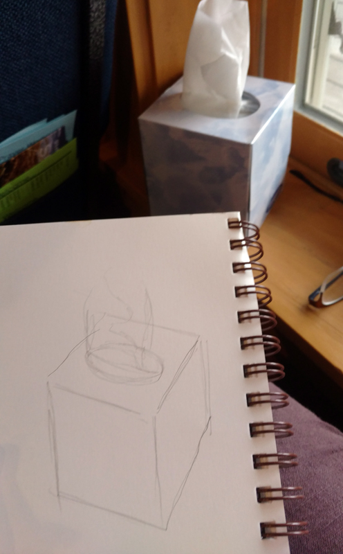
This week I want you to go back to your homes, find something prosaic, familiar and commonplace as a subject, and then analyze your drawings in terms of these simple shapes.
That painting is just a series of simple shapes.
I’m near-sighted. I just need to remove my glasses and I’m working in simple shapes. That’s more difficult for someone with perfect vision; you poor schmoes are going to have to squint. Either way, by blurring your vision, you can reduce the scene before you to a few basic elements.
When you blur your vision, smaller shapes fall away and form a few, larger shapes. It’s much easier to break down a scene if you can’t see it in sharp detail. You don’t have to do this for every drawing—just enough to grasp the concept of simplification.
Old Greek Revival farmhouse in Western New York.
Consider this elderly farmhouse I photographed in western New York. With my glasses on, it might seem daunting—a collection of windows, doors, pillars, peeling paint and overgrown shrubberies. But it’s easily broken down into a series of rectangles, triangles and circles. Anyone can draw those, even the people who tell me they can’t draw a straight line. “I’m going to draw an abandoned Greek Revival house” is a lot more daunting than “I’m going to nail down these few shapes.”
This is a computer estimation of what it looks like to me without my glasses.
Concentrating on the big shapes not only makes starting easier, it leads to more accurate measurement. It’s much easier to draw the big rectangle of the portico and fit the pieces into it than to start with one window and grow the shape outwards.
Either way, it breaks down to these approximate shapes. Anyone can draw them!
Once you’ve drawn the basic shapes, you can work inward to add detail. When you have a decent basic sketch, you can start thinking about the composition you might want to paint. A good composition has a variety of shapes and angles.
The painting at top is of the American Eagle in drydock. A boat is a long, lean thing, in or out of the water. A side view isn’t its most flattering angle. (Come to think of it, that’s true for me, too.) For this reason, it poses a compositional problem in drydock or at its berth. Here, I’ve reverse-engineered the drawing into a series of simple shapes, so you can see my solution to the problem. 
My house drawing from last week.
Let’s go back to my shape drawing of my house from last week. In the end, that can be reduced to a black-and-white cut-out (below). Simplified, is there a coherent black-and-white pattern? Is it pleasing enough to bother with? If the answer is no, then back to the drawing board. That is the point of a thumbnail. If it doesn’t work in a tiny sketch, it isn’t going to work in a painting.
Does it reduce to a few simple shapes that make a pleasing pattern? I think so.
Your assignment—like my class here in Rockport—is to choose a simple scene in or near your house and break it down to extremely simple shapes. How do they intersect? Is any one intersection more compelling than the rest? If so, that’s probably your focal point.

Monday Morning Art School: pie plates and pies

Learn how to draw a pie plate, dish, cup, or vase. I’m throwing in my secret pie crust recipe, so you can learn that too.

When drawing round objects, we have to look for the ellipses, which are just elongated circles. Ellipses have a horizontal and a vertical axis, and they’re always symmetrical (the same on each side) to these axes.

The red lines are the ellipse and its vertical and horizontal axes. The two sides of the axes are mirror images of each other, side to side and top to bottom.

Same axes, just tipped.

This is always true. Even when a dish is canted on its side, the rule doesn’t change; it’s just that the axes are  no longer vertical or horizontal to the viewer.

This is where I learned that I can’t balance a pie plate on the dashboard while traveling.

As always, I started by taking basic measurements, this time of the ellipse that forms the inside rim of the pie plate. (My measurements won’t match what you see because of lens distortion.)

The inside rim of the bowl.

An ellipse isn’t pointed like a football and it isn’t a race-track oval, either.

It’s possible to draw it mathematically, but for sketching purposes, just draw a short flat line at each axis intersection and sketch the curve freehand from there.
The horizontal axis for the bottom of the pie plate.

There are actually four different ellipses in this pie plate. For each one, I estimate where the horizontal axis and end points will be. The vertical axis is the same for all of them.

Three of the four ellipses are in place.
Next I find the horizontal axis for the rim, and repeat with that. It’s the same idea over and over. Figure out what the height and width of each ellipse is, and draw a new horizontal axis for that ellipse. Then sketch in that ellipse. The pencil marks are freehand; the red is measured on my computer. 
Four ellipses stacked on the same vertical axis.

Because of perspective, the outer edge of the rim is never on the same exact horizontal axis as the inner edge, but every ellipse is on the same vertical axis. We must observe, experiment, erase and redraw at times. Here all four ellipses are in place. Doesn’t look much like a pie plate yet, but it will.

The suggestion of rays to set the fluted edges.
If I’d wanted, I could have divided the edge of the dish by quartering it with lines. I could have then drawn smaller and smaller units and gotten the fluted edges exactly proportional. But that isn’t important right now. Instead, I lightly sketched a few cross did lines to help me get the fluting about right. It’s starting to look a little more like a pie plate.
Voila! A pie plate!
Now that you’ve tried this with a pie plate, you can practice with a bowl, a vase, a wine glass, or any other glass vessel. Meanwhile, here’s my pie-crust recipe. Nobody in their right mind would ask me to cook, but I can bake. This week I noticed that while I have a written recipe, I’ve changed it around enough that it’s unrecognizable.

I use a food processor, but the principle is the same doing it by hand.

Double Pie Crust
2.5 cups all-purpose white flour, plus extra to roll out the crusts
2 tablespoons sugar
1 ¼ teaspoon salt
12 tablespoons lard, slightly above refrigerator temperature, cut into ½” cubes.
8 tablespoons butter, slightly above refrigerator temperature, cut into ½” cubes.
7 teaspoons ice water
Thoroughly blend the dry ingredients. Cut in the shortening (lard and butter) with either a pastry blender or by pulsing your food processor with the metal blade. It’s ready when it is the consistency of coarse corn meal. (If it’s smooth, you’ve overblended.) Sprinkle ice water over the top, then mix by hand until you can form a ball of dough. If the dough seems excessively dry, you can add another teaspoon of ice water, but don’t go nuts.

Divide that ball in two and flatten into disks. Wrap each disk in wax paper, toss the wrapped disks into a sealed container and refrigerate until you’re ready to use them.
Don’t worry if the dough appears to be incompletely mixed or the ball isn’t completely smooth; mine comes out best when it looks like bad skin.
Let the dough warm just slightly before you start to roll it out. And while you don’t want to smother the dough with flour when rolling, you need enough on both the top and the bottom of the crust that it doesn’t stick. If you’re doing this right, you should be able to roll the crust right up onto your rolling pin and unroll it into your pie plate with a neat flourish.

(If you’ve never rolled out a pie crust, watch this.)
I use this crust for single- or double-crusted, fruit and savory pies.

Monday Morning Art School: How to draw almost anything

There’s now a Facebook group for you to post your homework, folks. 
You’ve all seen artists holding a pencil up like the clip art below. What they’re doing is rough measuring. It’s simple. Just hold the pencil up like a ruler in front of the object you’re drawing. Move it around to see the relative height and width of the thing. For example, a vase may be twice as tall as it is wide. That’s all you’re figuring out; you can make the vase any size you want on the paper.
It’s not just an affectation.
You can hold your pencil up to figure out the other important thing in drawing: the angles of lines. I could give you a formal perspective lesson before we start drawing, but it’s not as important as learning to see angles. If you develop the ability to see angles, you’ll have better natural perspective than if you try to fit up what you see to a theory.
I used my pencil as a measuring tool to get the relative sizes and angles right.
The tissue box I was drawing in church yesterday had lovely angles. However, what you see in the photo isn’t what I saw while working. A drawing from life will never match what the camera portrays. Cameras are not as subjective as artists, but they lie just as much as we do.
You should do your measuring with one eye closed, especially if you’re working in a tight space, as I was. Art books will tell you to measure with your arm straight out. I find that uncomfortable. Instead, I just shoot for always having the pencil the same distance away from my eye as I work.
Then I checked the sizes and angles and corrected them. The box was taller than I originally thought.
All drawing starts with simple shapes. After laying them down, I check and correct them. I do this by analyzing each large shape. Where does the back of the box intersect the tissue column? Is the curve of the cutout fat enough? I discovered that my cube wasn’t really tall enough, so I added some to the bottom.
After I was reasonably confident I had the shapes right, I added some overall values.
The next step is to establish some overall values.  “Value” just means how light or dark something is. This box was sitting on a south-facing windowsill behind a person who was casting another shadow. Thus, the window-frame behind the box was in deep shadow, but not nearly as dark as the photograph. I roughed in those darks first. They helped me know how to shade the box properly.
I added shadows to the box itself, and developed some detail.
Next, I set shadows on the tissue box itself. I am more concerned with the column of tissue, so with each pass, I spend more time on that.
Finally, I did some blending, using the handiest tool I carry: my finger. You should use a stumpor tortillonon work you care about, but in a pinch, your finger works great.
Blending using the side of my finger.
Note that I never bother much about my mark-making. It can take care of itself. I’m mostly interested in applying accurate values. I did this drawing with a mechanical pencil, which will never be as luscious as a good graphite stick, but it survives banging around in my purse week after week.
Time to go home!
Some general rules:
  1. Draw everyday objects. The better you get with these, the better you’ll be with complex subjects. There’s amazing beauty in everyday things.
  2. Draw any time you get the chance. I did this drawing in church, and I didn’t miss a word. Drawing and language don’t use the same channels of your brain.
  3. Measuring is the most important part of drawing. Keep checking and correcting sizes.
  4. Start with big shapes and break them down into little shapes. If the big shapes are right, the smaller parts will slip into their spots just fine.
  5. Value is relative. How dark something is, is only important in terms of how dark its neighbor is.
  6. Constantly recheck shapes and values as you go.

A #2 pencil is a pretty cheap way to find your joy

Put down your cell phone and pick up a pencil.

A quick sketch of captive models, by Carol L. Douglas
On Friday, I suggested a list of drawing books for those who want to improve their drawing skills but don’t have access to a class. Reader Michael Schaedler of Jay has the traditional Maine opinion that it’s silly to spend money on something you can find for free. He located a text online and has been faithfully doing its exercises. It’s Dorothy Furniss’ Drawing for Beginners and it runs through all the basic subjects.
Looking at old drawing texts, I’m reminded of what an unlettered generation ours is. We want the technical stuff, fast, and don’t want to waste time on rhetoric. I’m as bad as anyone; I buy art books mainly for the pictures. Still, in this week of enforced solitude, I’ve found myself reading and appreciating these older writers and their thoughts on the craft of drawing.
Teenage boy sleeping through church, , by Carol L. Douglas
A reader asked me for tips about figure drawing. That’s a separate subset of knowledge from drawing inanimate objects.
George B. Bridgman (1865–1943) was a Canadian-American artist. He taught anatomy for artists at the Art Students League of New York for 45 years. His books were the standard for 20th century instruction on the subject. They can still be purchased today. Start with his Complete Guide to Drawing from Life.
Most of the time, you’ll find very boring stuff when you wait at doctors’ offices. But occasionally, you’ll find a skeleton. By Carol L. Douglas.
I think every studio should have a copy of Frank H. Netter’s Atlas of Human Anatomy. It’s useful to know how things work. Pressured by his family, Dr. Netter left a career in art to go to medical school. The Great Depression had the last laugh; there was more work for a medical illustrator than there was for a doctor. His anatomy book is a masterpiece, and it explains to the visual learner what parts go where.
Bailiff at Hall of Justice, by Carol L. Douglas
My reader should be practicing gesture drawings constantly—one or two-minute sketches of people done from life. Gesture drawing is very personal; it’s an impression of a form. There’s no ‘right way,’ but it should be fast. If it goes more than two minutes, it’s no longer a gesture drawing.
The only true gesture drawing I have on my laptop is of a horse. Figures. By Carol L. Douglas.
The more he draws people, the more skill he will develop. Modern life presents all kinds of opportunities to draw surreptitiously. They just require that we put down our cell phones and pick up a pencil.
Note: This week, art conservator Lauren R. Lewis shared resources for those of you dealing with hurricane clean-up, here. Since then, she found this fantastic resource. It includes hotlines as well as tips for first-phase cleaning of flood-damaged artwork. May nobody need it.

Learning to draw without a teacher

Can you learn to draw from a book? Absolutely! Here are some suggestions, and I’d love to hear about your favorites.


Occasionally, I’ll send a student home from a workshop with the advice that he or she should take a basic drawing class. I’ll see that person the following summer only to learn that there wasn’t a drawing class in his town.
Drawing is, to the outsider, the most mundane of the arts. It’s not splashy and it can seem mechanical. To the insider, it’s the guts on which everything else rests. It’s a great shortcut to work out problems of design. To paint without knowing how to draw is to practice surgery without ever having anatomized. You could have all the skill in the world in your hands, and you’d still be clueless about what you’re doing.
No pianist ever got anywhere without first playing études and scales. Think of drawing like that, and practice a little every day. It’s the single best thing you can do to improve your painting.
Drawing is easy; it can be learned from books. Realizing this, I asked Bobbi Heath, Poppy Balser and Mary Byrom for recommendations. Their ideas, along with mine, follow.
The Practice and Science of Drawing is a classic text from the early twentieth-century. Harold Speed was an English painter and renowned teacher. His book includes both practical instruction and intelligent commentary on the nature of art. It’s available on Project Gutenberg here, if you want a preview.
How to Draw What You See is the granddaddy of self-help drawing books. It is based on the premise that all objects are basic shapes, stacked and refined. It is very good, but you’ll have to substitute 21st century examples—the plates haven’t been updated since I used it in the early 1970s.
Betty Edwards’ classic Drawing on the Right Side of the Brain is a book about which I’m conflicted. I’ve had it since the first edition was published in 1979. The exercises are fine, and it’s a great starting point for the timid. However, it spends too much time on her brain theories and not enough on measuring. Still, it’s one of the top-selling how-to-draw books of all time.

Poppy recommends Andrew Loomis, author of Successful Drawing and Figure Drawing for All It’s Worth. “I haven’t ‘read’ them as they aren’t instructive texts in the true sense,” she told me. “But I do pore over them when I’m looking for help with figures or division of space.”
Drawing for the Absolute Beginner is a good basic primer on how to handle a pencil. As with all good how-to books, it includes basic exercises.
Sketching from Square One to Trafalgar Square was recommended by Bobbi, and I’m adding it to my own library. It takes you through both the mechanics and the visualization necessary for field drawing. Both are important.
Perspective Made Easy, also recommended by Bobbi, outlines the rules of perspective drawing. This is a purely mechanical subject, so it’s easily learned from a book. Perspective is deceptively simple, and it trips up more artists than any other aspect of drawing.
Art of Sketching was recommended by Mary. It is out of print now but available on the used-book market. It emphasizes dry-media mark-making, something most painters could use to focus on. It’s another book I am adding to my own library, since I’ve seen how Mary’s sketches powerfully inform her finished work.
Is there a drawing book you love? I’d like to hear about it! Please comment.

It’s all about the traps, man

The Blue Umbrella, by Carol L. Douglas. Even without detail, you should be able to see that there are three different species of palm in this painting.
There are 629 living species of conifer in the world. In contrast, there are 2600 known species of palm trees, with the greatest diversity being on islands. They range in shape from draping to spiky to fan-shaped to pom-pom.
Studying the differences between trees helps me get the structure right in my paintings. In Karl’s Garden, yesterday, there were three different species shading the table. It’s a challenge to paint them accurately without being pedantic.
I vary my compositional technique depending on the subject. When I’m unsure about positioning, I sketch on paper, crop my sketch, and transfer the result to my canvas. For boats and buildings, I use a watercolor pencil and a straight edge. I draw directly on the canvas, using water for erasure. 
In my studio, I often start with an abstracted grisaille. This can be risky in the field, since those sloppy wet darks can migrate up into the painting, creating mud. Being rigorous about the fat-over-lean rule helps prevent this. So does marrying the underpainting color to the final shadow color. For this reason, I often end up using a violet-blue rather than the more conventional desaturated reddish-brown.
The rare and elusive pom-pom palm, at Coral Beach in Freeport.
We couldn’t get odorless mineral spirits in the Bahamas. Our choices for solvent were conventional white spirit or turpentine. We chose turpentine. It dries very fast, making the bottom layer less squishy than it would be at home. Going directly to paint meant I could develop paintings that relied on patterning, rather than modeling.
I like complicated images (even though I usually regret them halfway through the painting). I look for angles, light, and, most importantly, the negative space created by the objects. Then I determine where on the canvas the most important elements should fall. Quite literally, I paint quick circles in those spots and then stretch and bend the other objects to fit into the space.
The branching structure varies widely, as do the evergreen, pinnate leaves.
There’s a limit to what a grisaille can tell you about composition. In addition to value structure, paintings have chromatic structure. That was where I went wrong with the painting I wiped out this week. I didn’t take into consideration the coolness of the sea and sky when I was doing my underpainting. If I had, I could have swept them through the painting.
I had a painting teacher once who liked to intone “there is no negative space.” She was trying to say that there are no areas of the painting where nothing important is happening. This is true. However, it is useful to have a term to describe the interstices between objects. In painting a complicated image, those negative spaces are critical. For trees, the silhouette is important, but the traps—that negative space where sky shows through the canopy—is paramount.
After we’d downed brushes for the last time, we took a short car ride. There a line of tankers waits to approach Grand Bahama. I didn’t want to paint it, but it was a lovely image.
My week of painting in the Bahamas is now over, and I head back to Boston this afternoon. “The real question,” I told Bobbi Heath this morning, “is, where am I heading next?”

How to paint, in five easy steps

"Historic Fort George," by Carol L. Douglas

“Historic Fort Point,” by Carol L. Douglas
While it was fresh in my workshop students’ minds, I shot pictures showing the step-by-step progression of a painting. I took these while participating in the Third Annual Wet Paint on the Weskeag this past weekend.
The site I chose was the ruins of Fort St. George, overlooking Thomaston. Not much remains but a raised berm, but it is peaceful, pretty, and shadowed by oaks. I parked by Wiley’s Corner Spring and eyeballed the stream. It looked perfectly wonderful, but I have been fooled by drinking-water sources before. Putting caution before curiosity, I resisted and turned to hike the half-mile to the fort site. It was an easy trail, but I was glad I had my super-light pochade box.
I settled down on a rock outcropping, bracing my tripod below me on the uneven boulders.
My sketch. The problem with rocky outcroppings is that they can create an unbalanced composition. On a grey day, it's hard to use the sky to fix that.

My sketch.
The problem with rocky outcroppings along water is that they can create unbalanced compositions. All the weight is on the land side. On a grey day, there’s little sky action to counterbalance that.
I never use viewfinders of any kind. To me the most exciting part of painting is figuring out how to transfer all that grandeur into an arresting composition. The rest is just details.
After I had a composition,  I transferred it to my canvas. I copied my sketch rather than drawing from the view.

First draft of a drawing.
After I had a composition I liked, I transferred it to my canvas. I generally copy my sketch rather than drawing again from the view. After I have the major pieces in place, I go back and redraw to conform to reality.
My palette. I always mix my greens and tints before I start painting. It keeps the color clean.

My palette.
I always mix my green matrix and tints of my pigments before I start painting. It keeps my color clean. And, yes, I use a palette knife.
For more information on how I chose this palette, see the pigment and color theory posts here.
Next, I map in the colors.

Next, I map in the colors.
I’m mostly concerned with drawing accuracy and color when I do my underpainting. This is a color map made with thin layers of paint and a minimal amount of solvent. I want it as dry as is possible when I do the next layer. Odorless mineral spirits or turpentine dry faster than linseed, walnut or poppy oil.
If anyone suggests using medium or oil at this phase of your painting, back away slowly. One of the first mantras of painting is “fat over lean.” That means applying oily paint over less-oily paint to create a stable, elastic paint film that doesn’t oxidize. Paintings made this way last for centuries.
I am familiar with some teachers who encourage their students to coat the surface with medium and paint into it to create a sort of faux luminism. These paintings are drowning in oil and varnish, which will darken and crack over time. It’s terrible technique and should not be encouraged.
This is more or less the point at which I start using larger quantities of paint and medium. I used a filbert on this, about a size eight.

This is more or less the point at which I start using larger amounts of paint and add medium.
Start adding medium when you start adding paint volume. Go light on the stuff. It can makes an unmanageable soup very quickly. I use a larger brush than you would expect. In the painting above I used a #8 filbert throughout, only pulling out a larger flat to smooth down some surfaces.
As I headed back to the Kelpie Gallery to turn in my finished painting, I took one more long look at Wiley’s Corner Spring. Oh, heck, I thought. Why not live dangerously? The water was smooth and sweet, and created no aftershocks.
Surprise, surprise! The finished piece won the "Juror's Choice" award, which is the top prize.

The finished piece won the Juror’s Choice award. If I’d expected that, I’d have pressed my blouse.
That was important, because by the time you read this, I should be most of the way to Montreal, from whence I am flying to Edinburgh. I plan to do some simple watercolor sketches along the way, but until I return, keep on painting… and go light on the medium, for heaven’s sake!