Painting better, at last

What causes the droughts in our creative life, when we’ve apparently forgotten everything we ever knew about painting?
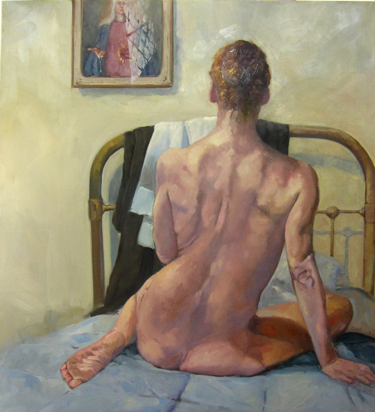
Ottawa House, oil on canvas, Carol L. Douglas, available.

I’m back in Nova Scotia for a two-week residency at Parrsboro Creative. A few years ago, they decided their little community at the top of the Bay of Fundy ought to be a major art center. A series of artist residencies is part of their master plan.

One of my goals is to paint some of the scenes I haven’t gotten to during three years at Parrsboro International Plein Air Festival (PIPAF). The first of these is historic Ottawa House. Built around 1770, it became the summer home of Sir Charles Tupper in 1871. Tupper was a well-known politician who once served as Prime Minister of Canada for 69 days.
The only way to paint the scene is to set up along a hairpin turn. The right side of the road is a blind spot for drivers whipping around the bend, so I faced oncoming traffic.
My home-away-from-home for the next two weeks.
A local stopped. “Two weeks ago, two girls lost control on this corner and plowed into the guardrail there.” He pointed to a spot about thirty feet away. “If it weren’t for these cables, they’d have gone over the embankment. Took two posts clean out.”
I began to think about Grant Wood’s Death on the Ridge Road. “Those cables have been there since the Second World War,” said the man, patting a post fondly. They certainly have the whiff of age about them, and are battered and twisted from impacts across the years.
I’m starting to know people in Parrsboro, and one of them stopped to chat as I worked. “You’ve chosen a dangerous spot,” he started.
That was my clue to move along. The affair was starting to remind me of that joke that ends with God saying, “First I sent you a canoe, then a boat, and then a helicopter. What more did you want?”
Four Ducks, oil on canvas, Carol L. Douglas, sold.
Sandwiched between my visits to Nova Scotia was Cape Elizabeth Land Trust’s 12thAnnual Paint for Preservation. I wrote last week about the disparity in pricing and awards for women artists, and how Parrsboro Creative was turning the tide. That trend continued at Cape Elizabeth, where the top price was earned by Jill Hoy
Still, all except two of the top 20% were men. I was the other woman. While I’m pleased, I also want to see my paint-spattered sisters consistently getting their due.
I’ve spent the better part of a week pondering why I painted so well at Cape Elizabeth and so badly at PIPAF the prior week. Robert More reminded me that the creative space is elusive, showing up where and when it wants. I was certainly tired and rushed when I arrived in Parrsboro.
Despite my workmanlike approach to painting, there are times when it all goes bad. The advantage to being older is that you’ve gone through this many times before, and you know it’s a transient problem. “You can’t create when the well runs dry,” my friend Jane Bartlett says. Prayerful reflection, sleep, reading and recreation all refill the well. I’ve done those things, and I’m back on track. Let’s hope it continues.

Nobody owns technique

One can learn a lot from books, but one can’t learn everything.
This recipe doesn’t spell anything out for you; it presumes you understand how to bake. (BTW, confectioners sugar no longer weighs out at 2.5 cups to the pound. I’d guess it’s milled differently today.)
In 1954 a woman named Doris passed this cookie recipe along to my mother. Its telegraphic style always makes me smile. In the 1950s, baking technique did not need to be explained by one married woman to another. Today, those of us who learned to bake from our mothers or through 4H can follow this recipe without a problem. Those who didn’t, probably can’t. It presumes a basic understanding of baking that is no longer common today.
Once a friend was fretting about how she couldn’t find an uncomplicated muffin recipe. “But they’re all just lists of ingredients,” I said. “You always assemble them in the same order: sift the dry ingredients together, beat the wet ingredients together, and then fold the two mixtures into each other.”
I showed this recipe to Jane Bartlett, who remarked that when she teaches Shibori she frequently tells her students that nobody owns technique. This is a very apt observation for both baking and the fine arts. There is nothing one can patent about artistic technique, any more than one could patent the order of operations for baking.
Dance of the Wood Nymphs, by Albert Pinkham Ryder. It was probably a lovely painting when he finished it, but his disregard of commonly-accepted protocol meant it was an archival disaster.
Painting is so straightforward that departing from the accepted protocols is often foolish. A few years ago, some of my students attended a workshop teaching painting into thin layers of wet glaze. The tonalist Albert Pinkham Ryder did that in the 19th century, and his works have almost all darkened or totally disintegrated.
One can learn a lot from books, but one can’t learn everything.  A kid in my studio announced her intention of making an apple pie the other day. (She is an excellent cook but her food heritage is non-western.) I gave her a cookbook and the supplies and left her to it. Imagine my surprise when this was what she came up with:
Elegantly layered, but it’s not an apple pie. Not everything can be learned from books.
To make an apple pie, one needs to know what an apple pie looks and tastes like, but it also helps to have assembled an apple pie under someone else’s tutelage. The same is—of course—true of painting and drawing. Yes, one can learn something about them from books, videos, and the occasional visit to an art gallery, but a good teacher really does help.
This post was originally published on October 4, 2013. If you live in mid-coast Maine and are interested in painting classes, my next session starts January 8. Email me for more information.

Party dogs

What is art? That’s something nobody can agree on.

Great Danes and Doberman Pinschers talk about what they plan to wear to my daughter’s wedding.
Last night I assembled an august panel of artists to help me with a project. Barb is a printmaker with an art degree from University of Maine. Sandy is a gallerist with degrees from Pratt and Hunter College. Together, we dressed 42 dogs in wedding finery. (As so often happens in sweatshops, I ‘forgot’ to pay them.)
“Is this art?” I asked two other artist friends.
“It’s like asking if a soy product in the shape of a chicken leg is food,” said one. “Technically, yes, but it’s bad food.”
“I guess the individual sculptures are art,” hedged the other, who then raised the question of whether they’re craft or even, just possibly, crap.
Two coats of silver and three of glitter… good taste, by the way, is repressive at times.
‘Artistry’ is easier to define than art itself. That means the skill necessary to produce a work of the imagination. But what defines the product of the imagination as art rather than engineering or craft?
Ars longa, vita brevis, wrote Hippocrates. He probably meant that it takes a long time to acquire and perfect artistry, but that the practitioner has only a short lifespan in which to practice. We repeat it, instead, to mean, “art lasts forever, but life is short.” That is, of course, a modern conceit. The ancients understood that “what is seen is temporary, but what is unseen is eternal.” (2 Cor. 4:18)

Barb felt that a DeWalt glue gun was not the tool for the job.
Platosaid that art is always a copy of a copy, an imitation of reality. This leads us from the truth and to illusion, making art inherently dangerous. (Rich words from a philosopher!) Elsewhere, he hinted that the artist, by divine inspiration, makes a better copy of truth than may be found in everyday experience. This makes artists prophets of sorts.
A lot of artists have had a go at defining art. Many are coy, like Marc Chagall, who said that “Art is the unceasing effort to compete with the beauty of flowers–and never succeeding.”
Even in non-traditional art, imitation is a recurring theme. “Art is either a plagiarist or a revolutionary,” said Paul Gauguin. What makes an Andy Warhol painting of soup cans different from the soup cans themselves? Intent and meaning. Pablo Picasso said that art is a lie that makes us see the truth.
In some way, art is the taking of an idea and making it manifest. Otherwise, it’s just a fleeting thought.
Sandy and I sewed their garments, Barb dressed them.
People frequently debate the line between art and craft. Art is useless in practical terms; it exists solely to drive emotion and thought. Fine craft does that and more. It must serve a practical purpose along with being beautiful. Since I didn’t drill their noses out to hold flowers, my party dogs fall on the side of art. 
Neither fine art nor fine craft are mass-produced, however. That is manufacturing. Those brass birds from Home Goods, as inscrutable as their meaning and purpose might be, qualify as neither art nor craft.
“The craftsman knows what he wants to make before he makes it. The making of a work of art… is a strange and risky business in which the maker never knows quite what he is making until he makes it, wrote R.G. Collingwood in The Principles of Art. That sounds very nice, until I think of dye-master Jane Bartlett throwing pots of color into the snow to see what shows up. Her textiles end up as clothing, but her process is wildly unpredictable.

Color deceives

Next time you look at that ‘great deal’ of a shirt, realize that while it may look fashionably blue, it might run red.
Plate from Interaction of Color by Josef Albers (Yale University Press)

 In order to use color effectively, it is necessary to recognize that color deceives continually. (Josef Albers)

Josef Alberswas a ground-breaking art educator, and he meant this in its most literal sense. He returned to the idea over and over, saying things like, “The concern of the artist is with the discrepancy between physical fact and psychological effect,” or “Every perception of colour is an illusion.”
Albers’ exercises from Interaction of Color still have much to offer. For its 50th anniversary, Yale University Press offered an app of the exercises from the book. Buy the book and use paint chips instead. Our retinal sensitivity runs into millions of different colors. Monitors aren’t nearly as sensitive, and they work on a different principle of color than printing or paints (additive rather than subtractive).
Plate from Interaction of Color by Josef Albers (Yale University Press)
Albers’ quote can be applied almost anywhere. Consider applying it to race relations. I’m not ‘white,’ any more than my friend Helen is ‘black.’ But we live in a world where color names are shorthand for our social stations, often wrong.
I found myself thinking about Alber’s dictum after reading excerptsfrom the Anti-Fashion Manifesto of trend forecaster Lidewij Edelkoort.
“How can a product that needs to be sown, grown, harvested, combed, spun, knitted, cut and stitched, finished, printed, labelled, packaged and transported cost a couple of Euros? On the hunt for cheaper deals, volume companies, but also some luxury brands, have trusted the making of their wages to underpaid workers living in dire conditions. What’s more, these prices imply the clothes are to be thrown away, discarded like a condom before being loved and savoured, teaching young consumers that fashion has no value.”
Plate from Interaction of Color by Josef Albers (Yale University Press)
We keep slaves like our 19th century ancestors did. We’ve just moved them to the other side of the world. Ironically and sadly, many of those slaves still work in the cotton fields.
“Children, especially girls, are employed by farmers in order to cut costs, as they are paid well below the minimum wage and the wages paid to adult workers,” reported the International Labor Rights Forum of India.
“The child workers are often in a state of debt bondage since their employers pay an advance to the children’s parents and then they must work to meet the amount paid. The children generally work at least nine hours a day, but during the winter, they often work up to 12 hours a day.”
Homage to the Square, 1965, Josef Albers
According to the Australian Walk Free Foundation, in 2016 there were 46 million people enslaved worldwide. Two-thirds are in Southeast Asia, which is where much of our cheap clothing is made.
The garment industry has a history of labor abuses, going back to the Napoleonic Wars. That doesn’t excuse our involvement.
We can’t avoid foreign-made goods. It’s difficult to determine what’s made by slave labor, since it infiltrates the high-end market as well as discount stores. Why not “buy a few remarkable things and wear the heck out of them,” as designer Jane Bartlettsuggested?
Next time you look at that ‘great deal’ of a shirt, realize that while it may look fashionably blue, it might run blood-red. As Josef Albers told us half a century ago, color deceives.

Paint what you love

Daddy’s little helper, oil on Belgian linen, 14X18, by Carol L. Douglas
When I’ve laid off painting for a while, I “play scales” to limber up. Usually that’s in the form of a still life, but yesterday I decided to paint my grandson, Jake. Jake is three months old, and painting babies is decidedly out of my comfort zone. But if you want to be energized as an artist, paint what you love.
Yesterday’s post about consistency sparked a lively discussion on Facebook. Cindy Zaglin said, “I’ve been told people should be able to look at a group of work and know it’s yours (or someone else’s.) But I like the freedom of experimenting and sometimes a piece will not look like my other work. I wonder how to marry ‘brand’ and experimentation.”
As always, I start with an oil grisaille. The gridding is because I needed to doublecheck the proportions of that massive head. Even so, in the final rendering, I couldn’t believe it, and I narrowed his head slightly (and incorrectly).
Cindy doesn’t have to worry; her work is iconic and highly recognizable. She has wide latitude in subject because her style is rock solid. That doesn’t mean she hasn’t grown and changed in the decade I’ve known her. The important thing is that those changes were incremental, not a frenzied trying on of different techniques.
If you can put into concrete terms what is unique about your paint handling, then you probably don’t have a style, but an affectation. In other words, “I always leave big patches of raw canvas showing,” would be an affectation, whereas, “I start off intending to be super careful but inevitably a fury takes over and I’m left with this mess” is probably more of a mature style.
No matter what I am painting, I approach it the same way. Same primer, same brushes, same underpainting, same pigments, same medium. For this reason, my portrait of Jake is stylistically linked to my paintings of sailboats at Camden Harbor, even though the subjects are worlds apart. And of course, this painting is slyly political, as so many of my paintings are. (I like the quaint idea of fathers married to babies’ mothers.)
After the gridding, I filled in masses, and from there worked in more detail. In short, the usual, regardless of the subject.
“Brand is both an identifier and a trap,” said Jane Bartlett. “I’ve seen celebrated artists who are trapped by what they have created and become known by, especially painters. The audience they built leaves the moment significant changes are made either in subject matter or paint application. It’s as though they are starting over. The loss of audience drives them back to what they had been doing and often to boredom.”
I think of that as the Hello Kitty-ism of art. Tom Otterness’ The Creation Myth, at Rochester’s Memorial Art Gallery, is a case in point. It’s interchangeable with all his other public works. There are, sadly, too many visual artists who have commodified themselves in this way. They may as well be stamping out engine blocks at Ford.

Let me know if you’re interested in painting with me in Maine in 2015 or Rochester at any time. Click here for more information on my Maine workshops! Download a brochure here.

Hold the date

The Servant, by little ol’ me, will be in this show.
Sitting in my living room on a cold spring day, Stu Chaitand Jane Bartlett and I were trying to track down the threads that connect us. We have many friends in common, but unless you’ve done a meet-cute, most of us slide into friendships without too much fanfare. After some thinking, Stu and I could be precise: we met in the Ellwanger Garden on a glorious September afternoon to paint en plein air. Stu and Jane met at a mutual friend’s opening. Jane and I no longer even remember, we go so far back.
We’ve all travelled a long way since then: Jane concentrates on contemporary dye-work and clothing design. Stu left realism entirely, working with watercolors on canvas. And I am peripatetic, wandering fromplein air assignments elsewhere to figure work in my own studio.
Why is this one of my favorite pieces of Jane Bartlett’s dyework? Because it is mine!
What links us as artists? All three of us are zealous about craftsmanship. Despite that, all three of us are intentionally loose in our handling, content to find the happy accident that allows a piece to transcend our intentions. Beyond that, we work in highly complementary forms and color palettes.
Vitis, by Stu Chait.
This is all ever so cool, because the three of us are having a three-person show together at RIT-NTID’s Dyer Gallery this July. The opening is tentatively scheduled for July 18. Mark your calendars, and be there or be square.


Let me know if you’re interested in painting with me in Maine in 2014 or Rochester at any time. Click 
here for more information on my Maine workshops!

Everything I know about stretching canvases I learned in 4H

Start, as you always do, by squaring off the stretchers. Use a mallet to get them true and check all four corners.
Last month I was building the large canvases for my spring show when Jane Bartlett stopped by. “Any bimbo can build a small canvas of cotton duck,” I fretted, “but sometimes these linen beasts get out of true, and then they’re a bear to frame.”
Once I had the fabric true on the warp and weft, I carefully folded it in quarters and set it aside.
Stretcher bars are designed to float with atmospheric changes, hence the little wooden “keys” that come with them. While having a solid hardwood stretcher makes life a lot easier for the canvas-builder, there is no long-term benefit in locking down the corners by stapling or screwing them together. When it shrinks, a big sheet of loom-state linen is going to pummel its stretchers into compliance.
Lining up the creases with the marked midpoints of my stretchers assures me the canvas will be truly square.
Little canvases sit quietly on a table begging to be stapled. After a certain size, you have to start manhandling them. The easiest way to prevent them from being knocked out of true is to temporarily screw them together at a 45° angle. But that in itself is a lot of work, requiring some woodworking skill, and you should remove the screws when you’re done stapling.
The first staples should be hand-tight, no more.
Jane (who is a textile designer) suggested I stop thinking of it as a construction problem and start thinking about it as a textile problem. So I applied some of my dimly-remembered 4H sewing knowledge.
And, yes, you will probably have to remove and replace staples to get the cross straight, but it’s worth it. 
The weft in fabric isn’t necessarily perpendicular to the warp, particularly if it’s from the bottom of a bolt. While you can use the reel to align your horizontal (weft) cuts, you’ve got no guarantee you’re cutting along the grain. The only true straight-edge you have is the selvage edge of the fabric. But using that, you can find any number of true vertical (warp) lines with careful measuring. You can cut down the fabric to the right size along these verticals.
Work around the canvas in a circle, adding a staple to each side until you reach the edges. The linen doesn’t need to be drum-tight,.
Then enlist a friend to help you fold the fabric in half along the vertical. Grasping each corner firmly, tug it diagonally in alternating directions. Eventually, you will get it more or less squared off. (If you’re doing it right, the ends will probably be cockeyed.)
Trim the edges when you finish. (If you want to make gallery-wrap canvases, I can’t help you; I frame everything.)
Once I was certain I had my fabric with the warp and weft more or less perpendicular, I folded each piece in quarters. Loomstate linen takes a crease beautifully, so the creases became my stapling guide.
Then check the square again when you’re finished.
I marked each stretcher bar’s midpoint with pencil. By lining the creases up with these pencil marks, I was sure I was creating a canvas that would pull tightly on the square. The first set of staples, across the midriff of the canvas, should be hand-tight, no tighter. From there I stapled the vertical set. Yes, I had to take staples out at this point and adjust them, but if those four staples yield a straight cross at the right tension, the rest of the canvas must line up true.
Finally, time to pour a little acrylic gesso on your loomstate linen. (If you want the disquisition about why I don’t use PVA and oil-based gesso, just ask.)
From here I was back on familiar territory. I used canvas pliers and worked out from the center, adding two staples to each side and then rotating 90 degrees. The goal isn’t to tighten the fabric as far as you can; the goal is to tighten it as evenly as you can. Watch the fabric grain as you go; if it’s out of line, you’ve messed something up.
Use your strigil to push the gesso into the grain. At this stage, less is more; it’s easier to add more gesso than to remove a gloppy excess from a canvas.
I did eight 40X48” canvases with this technique. It was a lot faster than fixing the corners, and the canvases (now finished) look true to me.

And do the edges and clean up any ridges with an old spalter brush and you’re done. Go have a beer; you’ve earned it!
Let me know if you’re interested in painting with me in Maine in 2014 or Rochester at any time. Click here for more information on my Maine workshops!

Nobody owns technique

This recipe doesn’t spell anything out for you; it presumes you understand how to bake. (BTW, confectioners sugar no longer weighs out at 2.5 cups to the pound. I’d guess it’s milled differently today.)
In 1954 a woman named Doris passed this cookie recipe along to my mother. Its telegraphic style always makes me smile. Those of us who learned to bake from our mothers or through 4H can follow this recipe without a problem. Those who didn’t, probably can’t. It presumes a basic understanding of baking.
Once a friend was fretting about how she couldn’t find an uncomplicated muffin recipe. “But they’re all just lists of ingredients,” I said. “You always assemble them in the same order: sift the dry ingredients together, beat the wet ingredients together, and then fold the two mixtures into each other.”
I showed this recipe to Jane Bartlett, who remarked that when she teaches Shibori she frequently tells her students that nobody owns technique. This is a very apt observation for both baking and the fine arts. There is nothing one can patent about artistic technique, any more than one could patent the order of operations for baking.
Dance of the Wood Nymphs, by Albert Pinkham Ryder. It was probably a lovely painting when he finished it, but his disregard of commonly-accepted protocol meant it was an archival disaster.
Painting is so straightforward that departing from the accepted protocols is often foolish. A few years ago some of my students attended a workshop teaching painting into thin layers of wet glaze. The tonalist Albert Pinkham Ryder did that in the 19thcentury, and his works have almost all darkened or totally disintegrated.
One can learn a lot from books, but one can’t learn everything.  A kid in my studio announced her intention of making an apple pie the other day. (She is an excellent cook but her food heritage is non-western.) I gave her a cookbook and the supplies and left her to it. Imagine my surprise when this was what she came up with:
Elegantly layered, but it’s not an apple pie. Not everything can be learned from books.
To make an apple pie, one needs to know what an apple pie looks and tastes like, but it also helps to have assembled an apple pie under someone else’s tutelage. The same is—of course—true of painting and drawing. Yes, one can learn something about them from books, videos, and the occasional visit to an art gallery, but a good teacher really does help.

One more workshop left this year! Join me in October, 2013 at Lakewatch Manor—which is selling out fast—or let me know if you’re interested in painting with me in 2014. Click here for more information on my Maine workshops!

Start with the canvas!

Autumn leaves…. as done by a painter.

When the gifted Shibori dye-master Jane Bartlett offered to help me make fancy cookies for an event, the planning revolved not around the baking, but what array of icing colors would yield the most natural fall colors.
“I suppose I have to get up early and make the dough,” I sighed.
“Yes, you must start with the canvas!” she answered.
The canvas: my mother’s Christmas cookie recipe.
My trusted assistant Sandy Quang (who has a BFA from Pratt) also pitched in. At one point I was lamenting that the maples leaves I made with fuchsia and chartreuse looked good; the ones with fuchsia and green did not. “That’s because the pink and green are too close in value,” Sandy observed. I’m so happy that her pricey art education is paying off.

Jane Bartlett puts her dye-mixing skills to work, in a medium she’s never used before.
“The reason male artists are more successful than their female counterparts is that they never get sidetracked into projects like this,” I grumbled as the hours stretched on.
She left the color streaky, to imitate the veins of the leaves.
“No, they get sidetracked into furniture-making. This is ephemeral art,” Sandy chirped.  
A good array of pre-mixed pigments speeds the job up.
I suppose that label could be applied to all good food preparation, which certainly gives humanity more joy than, say,  Mark Quinn’s Self, which is a frozen cast of the artist’s head made of his own blood. 
Sandy specialized in oak leaves; I specialized in maple leaves. Jane was a generalist, but nobody particularly liked doing the sumac leaves.
Each time I teach a workshop at Lakewatch Manor, my students react with joy to the artistic, delicious meals they are served. I observe that the innkeepers seem to take equal joy in making them.

One more workshop left this year! Join me in October, 2013 at Lakewatch Manor—which is selling out fast—or let me know if you’re interested in painting with me in 2014. Click here for more information on my Maine workshops!

The Winnowing Fork

I threw out 90% of my drawings, keeping only those of sentimental value. This could be nobody but my friend, clothing designer Jane Bartlett, posing for a quick sketch.

I recently bought new pads of newsprint , and they tipped me into chaos. I finally faced the truth that there wasn’t a single corner in which to shove one more thing in my studio. It wasn’t a simple question of emptying one drawer to accommodate the newsprint, either. My whole studio had become a tangled skein of art supplies, finished work, and projects under way.

And this, of course is my long-term plein air pal Marilyn Feinberg, being unusually still.
Twelve man-hours later, the winnowing fork has done its duty, and I can think again.
Of sentimental value for a totally different reason. This is the cartoon for a painting I envisioned of my doctor removing my staples after my first cancer surgery. I probably will never paint it, of course, but it would have been more fun than the surgery. Imagine that green florescent hospital lighting of old…
Artists tend to be pack-rats—after all, one never knows when that beaver skull or fake mustache will come in handy. But at a certain point, the clutter overwhelms. I paint best in a spare, very ordered environment, and much of my working day is spent trying to stop myself from trashing that.
The plein air board stash. Neatly reduced (although I suspect there’s another box of them in my frame shop).
Out went the acetate and rubylith left over from the days when designers stripped in pages. Out went stained or marked paper.  Out went damaged prints.
About a decade ago I decided to save all my gesture drawings. I have no idea why; I’ve never looked at any of them since. Out they went, too, netting me a full flat-file drawer for other purposes. I tossed a large stack of mediocre drawings, keeping only a few of sentimental value and a couple of painting cartoons that still amuse me.
I’ve finally realized that rubylith and amberlith and hand-stripping tabloid-size pages are never coming back. OK, I realized that a decade ago, but I still thought I could think of something to do with all that stuff. It’s on the curb now.
About once a year, I toss out several pounds of paintings I no longer like. I slash these canvases and boards, because I never want them returning, zombie-like, to embarrass me in the future. I reserve the right to edit the story of my life, and that includes my work.
What remains is a mixture of unfinished work that is in some way instructive, finished work that’s just “resting” outside frames for a short while, and a whole range of stuff I’m still not sure about.

Next up, my frame shop. That’s a scary thought.

Now that I’m so darn organized, I can start thinking about what’s coming up. There is only one slot open for my July workshop at Lakewatch Manor in Rockland, ME, and August and September are sold out.  Join us in July or October, but please hurry! Check here for more information.