What constitutes a beginner painter?

I don’t want painting students to pass a test before they start with me; I just want them to be able to thread their metaphorical sewing machine on their own.

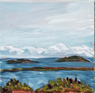
 Midsummer, 24×36, $3985 framed. In honor of Canadian Thanksgiving, which is Monday, let’s feature paintings I’ve done in Canada.

As soon as I announced that I wasn’t taking beginners anymore, a number of my students expressed trepidation about continuing with me. “But I’m a beginner!” they said. In some cases, they’re right, but they’re already on the path to understanding painting. In other cases, they don’t have a clue how well they’re painting, and how much they’ve learned.

When I said ‘beginning painters,’ I meant people on their first date with a brush. They’re unclear on the materials and what they’re used for. They’ve never mixed paint or handled a brush. They’ve never heard or considered basic terms like hue, saturation or value.

Anyone who’s taken one of my classes is past this newbie-phase, by definition. And anyone who’s studied with another teacher or taught themselves with the aid of books or videos is unlikely to be a beginner, either.

Ottawa House, 16X20, oil on canvas, $2029 framed. All these paintings were done en plein air.

My friend and student Jennifer Johnson—who taught quilting for many years—says that she would have students in her classes with advanced design skills, and others who’d never threaded a sewing machine before. “Neither of these things are more important than the other,” she said. “But I spent 90% of my time rethreading the machine for the beginner.”

I’m trying to describe something analogous in paint. I don’t want painting students to pass a test before they start with me; I just want them to be able to thread their metaphorical sewing machine on their own.

In fact, I think it’s important to have a class of different levels. Hearing the steps justified and explained to a less-experienced painter is often helpful to the more-experienced painter. Sometimes, an essential principle hasn’t really clicked. Or, our willful brains just forget something important.

Clouds over Teslin Lake, Yukon Territory, 8×10, oil on canvasboard, $522 unframed.

As with every discipline, painters improve at different rates. How fast they learn depends on their natural quickness, how much time they can practice outside of class, distractions, anxieties, and other factors. I could start twelve painters at exactly the same level, teach them the same lessons for a year, and there’d still be a wide range of achievement at the end. That’s natural, and if you’re someone who learns more slowly, it’s nothing to worry about.

The greatest painting classes are marked by camaraderie and good will. The best way to learn something is to explain it to someone else. Those painters generous with their own knowledge are helping themselves as much as they’re helping their friend.
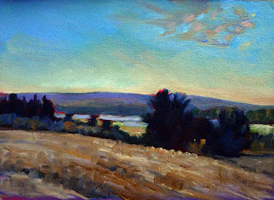
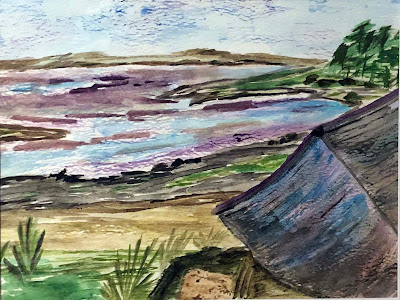
Cobequid Bay farm, oil on canvasboard, 6X8, $348 unframed.

Having said all that, Bobbi Heath tells me she has run up against a problem and will not be offering her introductory oil-painting class this fall. That means that for the short term, new oil painters will still be coming to me (subject to space limits in my classes, of course). Cassie Sano will still be offering introductory watercolor classes, concurrent with my own fall classes.
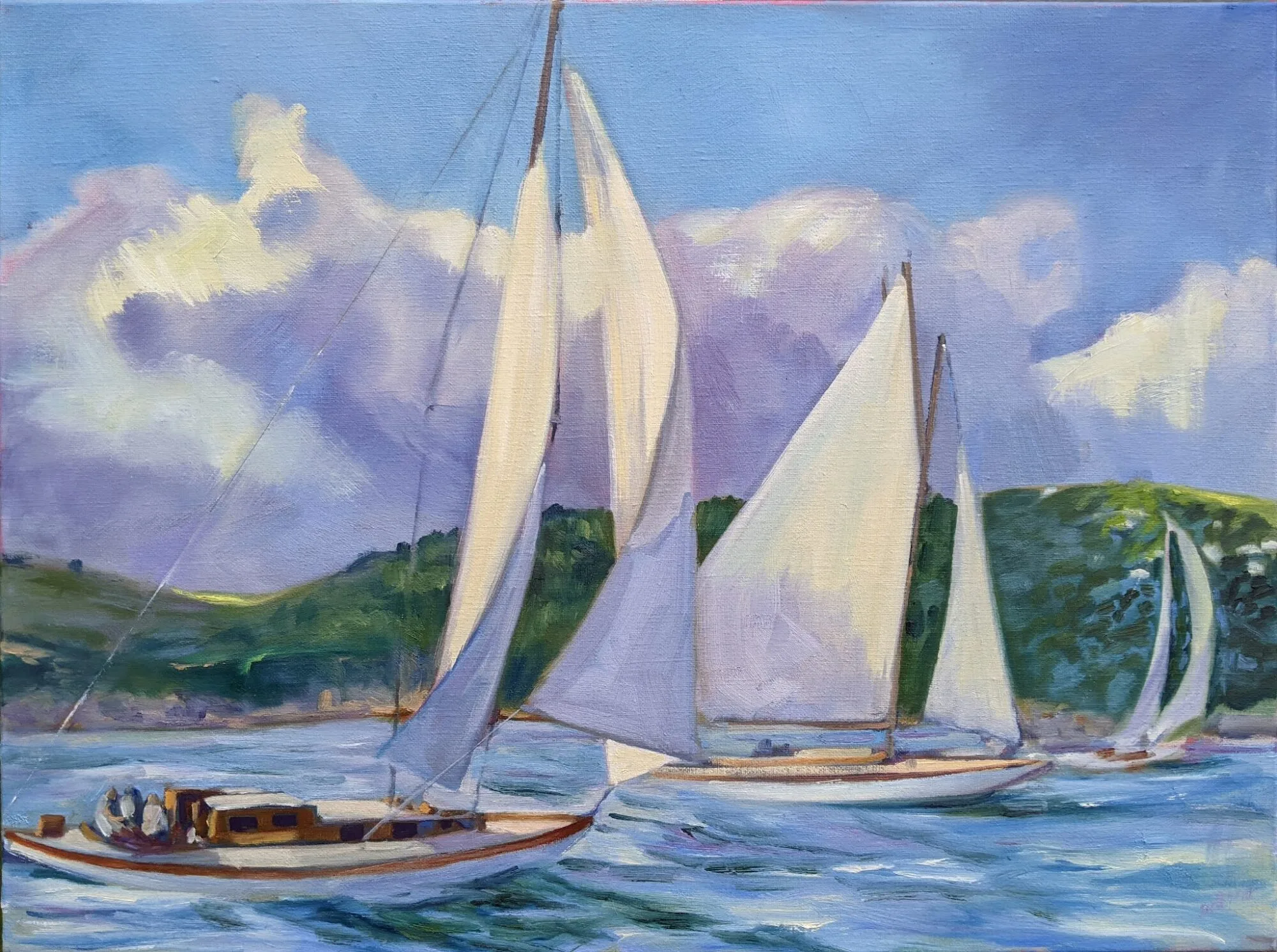
A game of chance

Fog has color, movement, and attitude, and is a great tool to understand atmospheric perspective.

Fog Bank, 14X18, oil on canvasboard, by Carol L. Douglas, $1275 unframed. 

I appreciate the care with which the National Weather Service makes hour-by-hour graphical forecasts. They’re the plein air painter’s best friend, since they predict not only the chance of rain, but the sky cover and the wind. However, they’re often wrong for areas near deep water. Mother Nature is impulsive and unpredictable where warm air first encounters the cold sea. Yesterday I drove to Warren, which is 12 miles to the southwest of me. I traveled through a band of dense fog, a band of brilliant blue, and ended up under a dour, dull sky.

That makes planning my plein air class a game of chance. My primary goal is to teach fundamental skills, but along with that I want my students to master every possible light situation. Yesterday’s nominal subject was value-matching and patterning. However, with a fog as rich and deep as the one we encountered at Owls Head, it seemed a pity to not concentrate on the atmospherics.

Early Spring, Beech Hill, 8X10, oil on canvasboard, $522 unframed.

Few things are more beautiful than fog—or more annoying to the painter who insists on golden sunlight in every painting. Fog has color, movement, and attitude. It’s a great tool to understand atmospheric perspective—and to teach patience with the passing scene. It moves in and out, obliterating a major compositional point here, and adding one there.

The more I teach, the more I realize how much I have to learn about teaching. My student, Jennifer Johnson is in a transitional phase where nothing she paints looks good to her. That’s painful, but it’s a sign she’s about to make a giant leap forward—if she allows it. The fainthearted painter will retreat back into the shell of the familiar. The courageous will allow herself to experience the “I hate everything I’m painting” phase and wrench forward into new discovery. Jennifer is, of course, one of the courageous.

Jennifer Johnson is working her way through her period of dissatisfaction by returning to first principles. That means starting with thumbnails and gridding them onto her canvas.

If you play a musical instrument, you’ve had the experience of mastering a piece part-by-part. You get the left hand down fine. Then you try to add the right hand, and what you’d learned in the left hand falls apart. But if you persist, your brain will integrate the two tasks. Adding new ideas to painting works the same way.

To ride through this, Jennifer has sensibly returned to first principles. One of these is thumbnails and value sketches, which are then transferred to the canvas in the form of a grisaille. Her example, above, from last week’s class, is far better than any I’ve ever made.

What I realized from watching her is how frequently students can do each step well, but not integrate them as a whole. That’s something I need to focus on more. The sense of being needed put a spring in my step. It seemed like only fifteen minutes had passed and the three-hour class was done. Rats.

Frank Costantino with Ann Clowe, Nancy Lloyd and Lisa Siegrist.

Yesterday’s students had the opportunity to watch a real watercolor master at work. My buddy Frank Costantino is in town, and they looked over his shoulder as he painted the lobster boat Daphne Lee. If he can stand more fog, we’ll go out again today.

Monday Morning Art School: working in triplicate

A 45-day challenge to make you a better painter.

A quick watercolor sketch by me. You become a better painter through
 consistent everyday practice, not in great fits of genius.

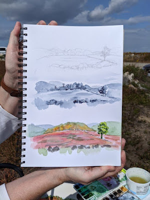
My workshop monitor, Jennifer Johnson, has spent several winters in Australia. There she bought watercolor paper in an A4 size, which is long and narrow. She’s been bringing it to class. One day she decided to do all three phases as thumbnails on the same page. I immediately saw the value in her idea. I’ve been introducing it to my watercolor students at workshops and classes.My students follow a strict protocol. It starts with a pencil sketch. Oil painters then move that to their canvases as a grisaille; watercolor painters have an intermediate step of a greyscale (monochrome) painting. This helps them make stronger compositions, and allows them to experiment early in the process, when bad choices are easy to reverse.

Jennifer’s field notebook that started this all.

One of these is Becky Bense, who’s a crackerjack watercolorist. She’s also a friend, so we made a pact at the end of my annual Sea & Sky workshop. We will each do thirty of these three-part compositions over the next 45 days. It wasn’t 30-in-30 because Becky’s more realistic than me. That’s a good thing, because my surgery last week has set me back rather sharply. I’m going to be lucky to finish the thirty by Thanksgiving.

I frequently recommend the book, Art & Fear: Observations On the Perils (and Rewards) of Artmaking, by David Bayles and Ted Orland. Their takeaway message is that art gets made through consistent everyday practice, not in great fits of genius. Do a little every day, and you’ll get better and better. As a teacher, I see tortoises and hares among my students. The ones who succeed are the persistent ones. Even if you only draw for five minutes a day, you’re advancing your skills.

An example by me. Note that I’m testing the colors on the margins before I lay them down. And I also knocked the garlic bowl over before the last step. Don’t do that.

Less-experienced painters tend to perseverate, “licking the paint,” as my pal Poppy Balser calls it. That’s because they think their errors can somehow be undone at last minute. They bury their own beautiful brushwork in these last-minute corrections. Working fast, with no great investment in time, prevents that.

Facing a blank slate every day can be daunting. Why not dial it back a little by experimenting with this process? So, without consulting Becky, I’m inviting you to join us. Oil painters can play this game too: all they need is an inexpensive gouache kit. Everything else works the same as for watercolor.

You will grasp the process by looking at the pictures, but I’ll spell it out: do a sketch at the top, a greyscale in the middle, and a small, color painting at the bottom. Ignore the idea of cropping; these are by definition thumbnail sketches. Don’t belabor any of it; half an hour is a good amount of time to do the whole thing.

Sadly, we can’t buy watercolor paper in A4 in the US (at least not easily). You can either buy 12X16 sheets and cut them in half, or buy 9X12. Either is close enough.

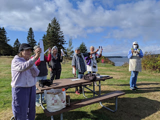
It’s all about value. Here are some of my students looking at value at Sea & Sky earlier this month.

From beginning to end, you’ll be concentrating on value. The sketch is simple, just a drawing with a #2 pencil, but it still should be a value sketch, not just a line drawing. For the monochrome (greyscale) middle picture, mix two complements. I suggest burnt sienna and ultramarine, but you can experiment. Your goal with the final, color, painting is to lay down the paints as immediately, and freshly, as you can. That means hitting the values right on the first try. To do that, mix and check them against your greyscale painting.

I have one more workshop left this season: Find Your Authentic Voice in Plein Air in Tallahassee, Florida, November 9-13. There are enough students to go, but there are still openings, so I’d be excited if you signed up.

From there on in, it’s all Zoom, Zoom, Zoom until the snow stops flying. My Tuesday morning class is sold out; there are still openings for Monday night Zoom classes.

Speed and confidence

They’re a feedback loop—speed creates confidence, and confidence in turn generates speed. Once you enter that loop, your painting will change very fast.

From behind Rockefellar Hall, by student Carrie O’Brien (all photos courtesy of Jennifer Johnson, and I apologize for the color; they were taken indoors).

The ferocious winds yesterday kicked the surf up and blew the last remaining clouds out to sea. Unfortunately, it also blew the last warmth away. It’s a chilly 42° out there this morning. However, the beauty of autumn is cold nights and warm days, and it will be sweater weather by the time we lift our brushes.
From Frazer Point, by student Rebecca Bense.

I have a location in mind for each day’s lesson; yesterday’s was to be the Mark Island overlook. This gives us a beautiful view of the Winter Harbor Lighthouse and the islands of Mount Desert Narrows. Unfortunately, it’s on the west side of the peninsula, backed by a mountain. The winds were roaring in from the northwest. Becky and Jean, who got there first, told us it was an untenable situation; something or someone was bound to be blown down the rocks.
From Blueberry Hill, by student Ann Clowe.

Instead, we sheltered in the leeward side of Rockefeller Hall, which is a massive faux-Tudor pile that houses Schoodic Institute’s offices. That gave us a shimmer of water through a screen of trees—a classic Canadian Group of Seven subject, and one that is ripe for personal interpretation. Lesser artists might look at that deceptively-simple screen of trees and lawn and decide there was nothing there. My students embraced the idea that they were certain timeless forms waiting to be rearranged in any order they chose.

Surf by student Linda DeLorey.

The greatest impediment to good, clean painting is flailing around—not having a well-thought-out plan, or not sticking to it. A consistent painting process not only gives you a bright, clean result, it also allows you to paint a good field sketch in three hours. That’s not important because you can churn out more paintings, but because the freshness of alla primapainting lies in its immediacy. I have several students in this class who are at that point already, and the rest are getting close.

From Frazer Point, by student Beth Carr.

Speed and confidence are a feedback loop—speed creates confidence, and confidence in turn generates speed. Once a student enters that feedback loop, his painting will change very fast. It is more important to concentrate on painting a lot than on painting perfectly, a point drilled home by David Bayles and Ted Orland in their classic Art & Fear: Observations On the Perils (and Rewards) of Artmaking.

From Blueberry Hill, by student Jean Cole.

Because these students have embraced process so avidly, we’ve been able to move beyond questions of paint application to more advanced issues like pictorial distance and the lost-and-found line. We’ve spent a lot of time working on clean traps and edges and avoiding mush. Today, we’ll be painting boats, which are the maritime equivalent of architecture.

And like that—boom!—another week at Schoodic is done. Dang.

Jack pines by student Jennifer Johnson.

After this, there’s Find Your Authentic Voice in Plein Air in Tallahassee, Florida, in early November. Today’s the deadline to register, but Natalia Andreevais painting in Apalachicola and has no signal, so you’ve got the weekend. After that, I have a few more plein air classes in Rockport, ME. From there on in, it’s all Zoom, Zoom, Zoom until the snow stops flying. For a year when nothing was happening, time has sure flown by.

Monday Morning Art School: Where is the “me” in that painting?

Every line we paint, if we paint it honestly, tells the story of us and our feelings about the subject.

Sometimes it rains, by Carol L. Douglas, available through Ocean Park Association.

My husband is a stylish bass player. He says that he seldom thinks about style; instead, it’s that space between what he is technically capable of playing and what he’s visualized. I recognize that the same thing is true in my own painting.

I never get into questions of style with my students. It’s ineffable. I once had a teacher who lauded the heavy lines in my painting. “It’s your style,” he said. Actually, I didn’t like it but I hadn’t learned to marry edges yet.

Jennifer Johnson rode up to Schoodic Institute with me yesterday; this is her fourth year at my Sea & Sky workshop. She’s learned to produce a competent painting in a reasonable amount of time. “But how do I put my own emotion, my own self, into my painting?” she asked me. I had to laugh. Her paintings are as lively and quirky as she is.

Tom Sawyer’s Fence, by Carol L. Douglas, available.

No two artists paint the same scene the same way. Coincidentally, most of my plein air class on Tuesday chose the exact same long view to paint: a majestic vista down Clary Hill’s blueberry barrens. Each painting was markedly different.

Every line we paint, if we paint it honestly, tells the story of us and our feelings about the subject. Style is not something you add into a painting; it’s a reflection of your personality.

That doesn’t mean we shouldn’t paint deeper subjects. I don’t paint boats just because they’re beautiful, but because they’re meaningful symbols of the human journey. But the essential self-expression happens not in the content, but in the paintwork itself.

Blueberry barrens, Clary Hill, by Carol L. Douglas. Available through Maine Farmland Trust Gallery.

I’ve noticed that artists—myself included—often want to obliterate the very things in our painting that are most honest and autobiographical. Our brushwork can feel crabbed to us even if other viewers see it as intense or lyrical. We want to make things that are smooth, refined, and loose even when we’re uproarious or unsettled.

Yet the painters we most admire are often the ones who were most self-revelatory. For every Van Gogh, Toulouse-Lautrec, Seurat, Pissarro, Monet, or Manet, there were hundreds of other painters hanging around Paris whom we don’t remember. They trotted out carefully produced, well-designed, even stylish canvases that have no ability to move us today.

Any decent critic can tell you what makes a good painting. It’s harder to identify what makes a great painting, but I think it must include big concepts: tragedy, sublimity, beauty, ugliness, joy, terror. A masterwork is of course a product of its time, but to transcend that, it must tell essential truths that transcend time and place.

Mountain fog, by Carol L. Douglas. Available.

For those to be in your painting, they must be in you in the first place, and you have to be willing to be honest. I’ve learned to set aside paintings that irritate me and revisit them in the future; like Wildfire(which I wrote about here) they sometimes have the capacity to surprise me. This is why I discourage people from tossing ‘failed’ paintings too soon. Sometimes our conscious minds need time to catch up with our sympathetic intelligence.

None of this negates the importance of instruction, by the way. We all learned to write in cursive in the same way, but every person’s handwriting ends up so individualized that experts can determine when it’s forged.

I’m teaching my annual Sea & Sky workshop in Acadia National Park this week—two months later than its usual August date. After that, there’s Find Your Authentic Voice in Plein Air in Tallahassee, Florida, in early November, and a few more plein air classes in Rockport, ME. From there on in, it’s all Zoom, Zoom, Zoom until the snow stops flying.

Where are they now?

I asked last summer’s workshop students to share what they’re working on now. Some are painting like mad; others are weighed down with work, elder-care or other responsibilities, but they’re all doing art. That, to me, is their greatest success.

Ann Trainor Domingue


“I’m using small collage pieces to design much larger paintings. Exploring more graphic, simpler design, with my ‘relationship’ series. I’m basically continued on my coastal-inspired work but contemplating how to include aspects of the sailing adventure. In the above watercolor-and-ink I have used a rocky coastline with evergreens as found along the coasts we sailed past on the American Eagle.
 â€œCollage has been new for me. It is a way to simplify my designs, and I love using found small flat papers, packaging, fabric to build design I wouldn’t have using a drawing tool.”

(Note: Ann Trainor Domingue will be teaching a workshop in my studio on June 6. For more information, click here.)

Lisa Magoun

“I’ve been painting since this summer in watercolor.  I also take a class painting in acrylics with a palette knife. I sometimes run out of subjects and should paint the same thing more than once.  But I rarely do.” 

Jennifer Johnson


“I am currently enjoying a year full of endless summer by painting in Australia. Most of my efforts have been attempted inside because the annoying bush flies are worse than ever and it is hard to paint wearing a black bug net/veil.”

Patty Mabie


I am ‘wintering’ in Florida for the first time! We are staying in Key West until the end of February, then driving across the country and back in March, to visit our kids in Birmingham and LA, with stops in New Orleans, Austin, Tucson, the Grand Canyon and who knows where else along the way. Then Myrtle beach in April, and Colorado after that to go to the Plein Air Convention and do some painting with friends in the mountains.
I bring paints everywhere and even knock one out in the car once in a while (while someone else is driving, obviously), with my Guerilla pochade box and some Gamsol in the cup holder. I’ve been doing boat studies and palm trees. I found some local art organizations and a plein air group that meets on Wednesdays here, which is great. I’m also doing an online mentoring program with Matt Smith through Tucson Art Academy Online.

Rhea Zweifler


I’ve been very interested in paths and keying up local color and the interplay of compliments together in color instead of just copying one of the Group of Seven.

Jennifer Little


Since I returned from Maine, I have had more energy for painting than I’ve had since my twenties! That week of painting really opened up something, so thank you!  
Currently I am working from photos, some from Schoodic, but a theme I’m working on is related to humans and nature/the sea. I use family photos. There is something about the atmosphere in the candid shots – family dynamics, some have tension, some so serene. I am also exploring glazing geometric and hopefully dynamic skies with these organic sea scenes.

Rebecca Bense


I painted a study of sky every day in June, July and August. Then September came and I went back to my ‘real’ life, thinking I was going to keep this up for a year, but I found on day 10 of September that I was 5 days in arrears and what I had done was phoning it in. So, I stopped. Long and short: not much painting has been going on. I find myself exhausted. I decided to keep a sketch book-journal/planner and I have been doing these mandala type doodles out of ink and whatever I might have a hand. I am finding these so much fun and so little pressure to produce something. Also (not coincidentally) my drawing skills have improved.
I am teaching a drop-in watercolor class and about 80 students at a Montessori school. They range from 3 to 14 years of age. I also teach a differently-abled adults art class.
I get together with my plein air friends as much as I can. We paint outside when possible and often have at least one meal together. Nice bunch of peeps!

Sandy Waldo


The holidays are over and now winter settles in. With the business of the season painting became less of a priority. We had some snow over the weekend which inspired this view of my favorite walking trail.

Mary Ellen Pedersen


I worked on this for months in multiple versions. The boat was too big – too small – didn’t fit the right angles. I was working from a photo.  Then I just said it was my painting, not the photo, and was free. I was able to be creative with it and it now hangs in my daughter’s apartment in Tennessee. I actually like my dory and the age of the vessel. I think it looks old and well used. The water and sky are a combination of dry brush with paint and paper.

Robin Miller

I have applied new learnings to an old backlog of unfinished projects with commendable results, and completed three new paintings. They were not, alas, painted outside. I probably won’t do much plein air until I can retire. But the new tools have definitely been helpful in moving through projects more quickly. And, since I tend to think of my work as a giant art project anyway, it has made that more fun as well. All in all, the Schoodic Workshop was excellent mind expansion, artistically and otherwise.
You can learn more about my workshops aboard schooner American Eagle here, or at Schoodic here. Rumor has it I’ll be teaching in New Mexico in September, but since the details aren’t yet finalized, just send me an emailif you want to learn more.

Spirit repellent?

It’s the season of ghosties and goblins and night hags. Try some blue for relief.
Haint blue porch ceiling. Photo courtesy of Lake Lou.
Like many Americans, I painted my porch ceiling a soft, watery blue (when I had a porch). I knew it was originally a Southern custom, but it’s one that also has surprising traction in the Northeast. No matter what color your house is, it’s a pretty, restful detail, especially on an overcast day.
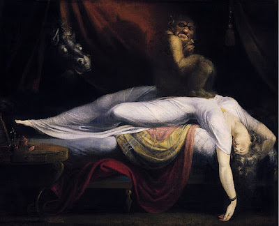
I didn’t realize that we get that tradition from Hoodoo. That’s the folk magic of the low-country Gullahpeople. It has African and Creole roots, overlaid by the Bible. The Boo Hag is a regional variation of the night hag.This is a worldwide mythological idea that gives us the modern expressions nightmareand hag-ridden.
The Nightmare, 1781, by Henry Fuseli. Courtesy Detroit Institute of Arts. The night-hag was a worldwide explanation for sleep paralysis, nightmares, shortness of breath, and waking up feeling tired.
Hags gain strength from riding or sitting on their victims. Boo Hags, in particular, get sustenance from their victim’s breath. Because they have no skin, they’re red. So, to be less obvious, they steal human skin and wear it for as long as it lasts. Talk about disposable ‘fast fashion.’
Once the hag finds a potential victim, she gains access to the house and then hovers over her victim sucking out its breath. Of course, the hag must be back in its hole by dawn, so the victim either awakes as if out of a terrible dream, or feeling tired and out of sorts. Like my husband this morning.
Back to the blue paint. That color was originally called ‘haint blue’ and was made with the fermented leaves of the indigo plant. Adding lye causes the color to precipitate into something that can be pressed, dried and powdered and—voila! It’s a stunner of a color, still worn all over the world in the form of blue jeans.
Indigo dye. Photo courtesy of Evan Izer (Palladian)
Indigo is among the oldest dyes known to mankind, and therein lies its first mystery. Its development and manufacture originated in India and southeast Asia, but the oldest known example of indigo-dyed fabric (6000 years) was discovered in Peru.
By the time our slave trade was being developed, indigo was a plantation crop in the American south. How the paint color became a talisman to ward off haints and hags is conjecture. Either it mimicked the appearance of the sky so spirits could pass right through, or it looked like water, which ghosts couldn’t cross.
Or, there was something about the color that repelled insects. That actually might be true, although it isn’t true today. Indigo dye was made with lye, and there was lime in the historic milk (casein) base. The resultant paint may indeed have been a good bug repellent.
Remnants of Haint Blue ceiling at Owens-Thomas House slave quarters. Photo courtesy of Telfair Museums.
The Gullah people used this beautiful blue far more liberally than we do today. They painted it on their porches, doors, window frames, shutters, even ceilings. It barred entrance, and if the haints got in, it encouraged them to scoot.
I can tell you, however, that haint blue doesn’t repel the short, costumed witches, goblins and other creatures of modern Halloween. As long as we had a blue-ceilinged porch, they came out in droves, like locusts. And it was great fun.
A special thanks to Jennifer Johnson, who told me this story in painting class yesterday.

Super Easel

My Mabef tripod easel is older than my Prius, which is why I recommend it so often.

Two demos require two easels. Still in the value-study phase here. Photo courtesy of Jennifer Johnson.
I sometimes demo in watercolor and oils simultaneously, since I always have students in both media. I started as a way to kill time between watercolor layers. We all know how exciting it is to watch paint dry.
But it has another value, too, and that is to play up the intricate ways in which watercolor and oils are similar. We tend to focus on the differences, but we’re still working toward the same end in both media. That’s a composition that impels and compels the viewer.
There are challenges. Foremost is keeping the materials separated. I put the watercolor tools in one place (my chair) and the oil painting tools in another (my wagon) in the hope that I will not swish a watercolor brush through my Turpenoid or vice-versa. So far, it’s worked.
Whoops! That’s the first time I’ve ever done that!
My students tend to watch these demos from chairs, not standing. That requires that I keep my watercolor paper on the vertical. It’s hard to get dark washes to stay where you put them, and sometimes I have to double-coat my darks. That creates an opportunity to talk up test marks.
Mentally, it’s a question of switching off one protocol and switching on the other. It looks reasonably seamless to the student, but I find that, halfway through my three-hour class, I’m pretty tired.
Dave Blanchard calls this a “hat trick,” and pointed out that in fact I’d done a triple demo yesterday, since I’d drawn the original scene in charcoal on newsprint. That was so my ‘thumbnail’ was big enough to be seen by the group. I don’t do that when working on my own.
This hat trick is just a way to expedite demos so as not to waste my students’ time. Out of context, it would just be a stupid party trick. But it had an unexpected consequence yesterday. That was my Mabef easel falling into the water.
David Blanchard rescued my easel while I Instagrammed the experience. I’m useful like that.
I’ve never lost an easel in the ocean before, although I’ve tested the limits—on the deck of a moving boat, for example, or standing in the water in a rising tide.
I stood there looking at it while it floated below me, thankful that it wasn’t my oil-painting easel, which would have sunk like a rock. Fran Scannell ran to check if any dinghy owners had left their oars shipped, while Jennifer Johnson went for my hiking poles. Dennis Pollock found one of those mysterious plastic pipes that are always on fishing piers, and he handed it to Dave, who’d gone down the closest ladder. A moment later, my easel was back on land drying off. As you can see, I’m good in a crisis… for absolutely nothing.
And the easel went right back to work as if nothing had happened, while its dumb chum, my oil setup, stood around. Photo courtesy of Jennifer Johnson.
This easel is about twenty years old. It’s seen a lot of hard use and travel. It’s cracked in several places and held together with duct tape. The carriage bolt no longer catches, making it hard to set up. But after its salt-water bath, it swelled up and was Supereasel again. It carried us right through the demo, and when I finished, it exhaled and fell over, limp.
“It’s dried out again,” someone noted.
I always recommend Mabef tripod easels as great value for money. They’re lightweight and versatile, able to lie flat for watercolor or stand up for oils. They now come with optional arms, which are a great feature. And now I know that they float patiently by the dock when you inadvertently drop them into the sea.

Monday Morning Art School: ditching the color

A painted value study is a great tool for understanding your subject.

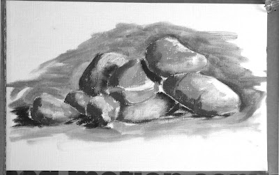
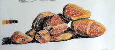
Pile of rocks value study, by Jennifer Johnson

Last week, I had you find and identify the simple shapes within a drawing. The prior week, we learned how to do abstracted value studies of our own homes.  This week I want you to do a monochrome (black and white) painting based on a value drawing.

Jennifer Johnson is usually two steps ahead of me. At the end of Tuesday’s class she told me she’d done this assignment before I assigned it. She graciously offered her paintings to illustrate this post.
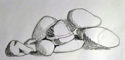
Jennifer started by doing this meticulous, detailed drawing of her pile of stones.
Before you can work successfully in color, you need to be able to work successfully in black and white. This is possibly the most valuable training an artist can give him or herself. I often do watercolor value studies before I paint in oils, but any painted medium will do for a monochrome study—gouache, watercolor, acrylic or oils.  It is not necessary to use a pricey substrate for this exercise: gessoed paper is sufficient for acrylics and oils; use any paper you have for gouache or watercolor.
Jennifer was trying to teach herself about rock structure, so she set up a pile of stones. First, she drew a meticulous, careful drawing of her subject. This step is akin to research; you are learning the details of your subject.
She traced the basic shapes for each iteration. It saved her tons of time and made it easier to do multiple iterations of the same idea.
Next, she simplified and redrew her picture in graphite, focusing on the values, not the fine details. She then painted the rocks in monochrome acrylic. She added a final step, using five different colors to represent five different value levels. If you want to add this step, the exact colors you use are immaterial, but they should go from warm to cool or cool to warm as they get darker.
Jennifer used tracing paper to redraw her outlines. That’s perfectly fine, since she didn’t get hung up on the drawing. You may find yourself doing a half-dozen drawings before you get the levels and composition just right. Your goal isn’t to simply copy reality, but to design a construction that pleases your eye. It may be almost exactly what you see, or it may be very different.
Next came a simple value sketch of the rocks.
Value is the first and most important visual element available to the painter. Get it right, and you can be wrong about a lot of other things and still produce a stellar painting. It’s a lot easier to experiment with value when you’re not fussing about color management at the same time.
Why use paint instead of a pencil for your value study? In practice, many students have trouble applying different pencil tones to paper. They leave most of the paper white. Moreover, it’s hard to differentiate four or five value steps with a #2 pencil.
In addition to her monochrome painting, Jennifer did a version where she assigned different colors to different values. If you do this, make sure the colors move warm-to-cool or cool-to-warm as they get darker or lighter.
Work from light to dark. When you’re done, check where the area of highest contrast is. If that’s not where you wanted the focal point to be, you may have a design problem. If so, just do it again until your work can be read like a story: first focal point, next focal point, next focal point, etc.
Don’t be timid about laying in darks and don’t worry about neatness. This is rough work, and it should be done fast.
Why not do your value studies on the canvas you intend to work on? Once you cover it up, you no longer have it for reference. That becomes very important as the light shifts. Having a value study on hand can make the difference between being able to finish a painting or not.

That pesky style thing

Painting, at its best, is about honesty and truth-telling.

Winter Harbor lighthouse with Cadillac Mountain, by Becky Bense.

Yesterday, one of my students heaved a great sigh and told us about a girl she knew when she was in school. “She could draw these fine, detailed, curlicued things. And here I was, drawing these big, massive shapes. Of course, she was the art teacher’s pet.”
I immediately imagined this kid in my mind’s eye, her blonde hair lightened with Sun-In, parted in the middle and sweeping back like Farrah Fawcett’s. (She probably didn’t look like that, but that was the style of the girl who held the whip-hand back in the 1970s.) I laughed, because my student—who is, like most of my students, also a friend—is none of the above. She’s whip-smart, rock-solid, organized, and fiery. Her drawing reflected that even as a kid.
Mt. Desert Narrows, by Jennifer Johnson
That should be the primary stylistic goal of painters—not to paint like someone else, and certainly not to leave a workshop painting like me. Style, in my opinion, is the gap between the internal vision you have and what actually comes out of your brush. It’s a shifting thing, because your skills are (hopefully) constantly improving.
We’re all group normed in a million decisions, whether it’s how we dress, where we live, or what we choose to do for a living. That’s true of painting as well, something I wrote about here. It happens whenever you bring your work to a gallery, participate in a plein air event, or even compare work with another artist. We’re herd animals and we feel most comfortable when we fit in.
Winter Harbor lighthouse, by Claudia Schellenberg
On the other hand, we’re also products of our time. In the 20th century, that meant painting anxiety, angst, fear of the Bomb, world war. Those things radiate through the great artists of the past century. The spirit of the times in the 21st century is still open for discussion, of course; we’re barely there.
Before I do a workshop, I look up my artists online to get an idea of their skill level and where they might want to go. (I also ask about what they want to learn.) In general, plein air attracts an intrepid type of person; they can’t be too fearful and want to deal with the inconveniences of working in the woods. But beyond that, people are a constant surprise.
Rocks by Linda Delorey
It would be easy to tell them, “do it this way,” and create a miniature Carol Douglas. I don’t want to do that, however; I want to explain the process of applying paint and then give them their heads. But I can’t help them advance if I don’t know what they’re looking for. That comes back to the question of honesty in painting.
Coastline by Diane Leifheit
Another student, following up on this subject of truth-telling, asked me what I think of Pablo Picasso. I can find something to like in almost all art. However, Picasso is a closed door to me. I think it’s a question of his honesty, which reveals his character, and that I don’t seem to like very much. This is not because of his biography; I’ve never read very much about him. It’s what comes through in his paintings. That’s a sign of his power as a painter.