Monday Morning Art School: the color of light

In winter, we’re in warm light from sunup to sunset, because the sun never really climbs very high in the sky. That’s our payoff for putting up with this weather.

Three photos of the golden hour, courtesy of Jennifer Johnson

The golden hour is that period after dawn and before sunset when the light is warm and the shadows are long and blue. The farther north you go, the longer the golden hour lasts. In winter in the northern United States, we’re in warm light from sunup to sunset, because the sun never really climbs very high in the sky. That’s our payoff for putting up with this weather.

Most of us prefer to paint that winter light from the comfort of our studio, but cameras lie. That’s the same black glove, below; the image on the left is with a cellphone camera and the one on the right is with a DSLR. In attempting to correct exposure, the cellphone is interpreting that black as purple.

Two photos of a black glove, courtesy Dwight Perot

So too does your eye-brain connection see things interpretively. You may see the same blue shadows in the three photographs at top, but I’ve sampled them and they’re not the same at all. In fact, they’re not even blue, but rather three variations of a soft blueish-grey. Your mind is interpolating what it knows to be true, which is that those shadows are cool. In this case it’s better to trust your mind than the hard ‘facts’ of camera and laptop.

Looking for Shellfish, JoaquĂ­n Sorolla, 1905. A warm light comes from our side of the figure, but there are warm shadows—the result of local color reflection from the rock. Likewise the bottom half of the torso reflects strong cool tones from the water and anchors the boy into the sea.

What we call light is really the narrow band of electromagnetic waves that our retinas can perceive. This narrow band is comprised of the colors of the rainbow, or what we sometimes call ROY G BIV. (There really isn’t an indigo; it’s there so that Roy has a pronounceable surname.) Each of Roy’s color names corresponds to a specific wavelength. For example, blue is about 475 nm; red is about 650 nm.

When the whole visible light spectrum strikes your eye at the same time, you perceive white. This is not a color in itself, but the admixture of a bunch of colors. In the real world, this is never a pure mix. The atmosphere bends light just like a prism does, so what you see is always tinted. The light might be gold and peach at sunset and cool at midday. Impurities in the atmosphere also give us the energetic indigo-violet of the far distant hills.

Valencian Fishwives, JoaquĂ­n Sorolla, 1903. Here the light is cool and the shadows are warmer.

The farther away something is, the more likely dust has filtered out the longer wavelengths, i.e., the warm colors. That’s why your plein airpainting teacher keeps telling you that the reds drop out first, then the yellows, leaving you with blue.

Just as all the colors together form white light, the absence of light is total blackness. But unless you’re in a cave or darkroom, that’s a theoretical construct. There’s always reflected light bouncing around in the shadows, and that light gives the shadows its color. It’s never black and it’s unlikely to be grey, either.

Return from Fishing, JoaquĂ­n Sorolla, 1894. The light is warm, the shadows are cool, and the places where the light is going through the sails are warmer still, since they’re filtered by the off-white fabric.

If the color of the light is warm, the color of the shadows is almost always going to be cool, and vice-versa. Knowing this and identifying the color of the light and shadow is the first step to a good landscape painting.

The exception to this is an object in filtered light. Its shadows and lighter passages will be variations of the same color temperature. This is how we instinctively know that something we’re seeing is under an awning, for example.

Catalonia: the Tuna Catch, from Visions of Spain, JoaquĂ­n Sorolla, 1919. In this case, most of the painting is in shadow, and what light there is, is filtered through the yellow awning. It is the distortion of the light-dark color scheme that tells us viewers that we are in an enclosed space.

Study the Spanish painter JoaquĂ­n Sorolla to understand the color of light. He was a master at painting white fabric in a variety of circumstances, and comparing the light passages to the shadow passages will tell you much about managing the color of light in your painting.
Monday Morning Art School: white on white

The color of white is the color of light. Mastering that will make all your paintings more exciting.

Girl Arranging Her Hair, 1886, Mary Cassatt, courtesy National Gallery of Art

Do you remember learning that “white is not a color; it’s the combination of all the colors”? That’s malarkey, although it’s based on a truth. Yes, Isaac Newton demonstrated that white light is a reflection of all the visible light spectrum. That doesn’t change the fact that white is a perceived color (as is black). Our perception is based not just on the physical light bouncing from the surface of an object, but on a whole host of contextual cues, which is why our brain is so easily fooled by optical illusions.

White is, in theory, a reflection of all the visible light spectrum. But that is never true in real life. Inevitably, all light shifts to either the cool (blue-violet) or warm (golden) side, depending on the time of day, season, and atmospheric conditions. Artificial light is even more limited in spectrum than sunlight, which is why it kills the colors in paintings, textiles, and human skin.

Sita and Sarita, 1896, Cecilia Beaux, courtesy National Gallery of Art

At the end of the 19th century, the Impressionist revolution in color had spread to painters like Anders ZornJoaquĂ­n Sorolla and John Singer Sargent. Nowhere does this show more than in their handling of white.

The colors in her gown.

Sorolla was painting in the brilliant light of his native Valencia. Zorn lived in Sweden, and many of his scenes have flat light. Sargent lived most of his life in western Europe. None were working in the same lighting conditions, but all of them adopted the same approach to color and light. It was a marriage of Impressionist color theory to more traditional brushwork. The combination still works today.

Helen Sears, 1895, John Singer Sargent, courtesy Museum of Fine Arts, Boston

By adding color to white, these painters were able to give their subject the sparkle and truth of natural light. To have painted their whites with just white or grey would have resulted in flat, dull canvases. This is because convincing whites, in the real world, are actually quite colorful.

The colors in her dress.

Sargent’s portrait of Helen Sears was painted under gaslight (and what a patient little child she must have been to tolerate all that primping and then all that standing). The little girl is thrown into stark relief by the dark interior, and the whole painting is drenched in warmth. What we perceive as blue is mostly a cool neutral. (Here is a photo of the girl taken by her mother, so that you can see Sargent’s liberal editing.) Even the blue-and-white hydrangeas are actually comprised of mostly warm tones. In this painting, the whites are influenced primarily by the light source.

Mending the Sail, 1896, JoaquĂ­n Sorolla courtesy Museo d’Arte Moderna di Ca’ Pesaro. This is a warm-light, cool-shadow combination.

Zorn’s portrait, on the other hand, is mostly influenced by reflected color. It is set against a rich orange floor that influences everything in the foreground. The older girl’s dress is washed in its pinkish tones. The younger daughter recedes in space because of the less-saturated color in her clothes and the grey drapes. Despite all the warmth in the painting, we understand it’s under natural light by the cool highlights. It’s a masterful composition, a brilliant use of color, and above all, an insightful glimpse into the childish mind.

The colors in Sorolla’s sail.

I’ve picked six random ‘whites’ from each painting to show you just how varied whites could be in the hands of accomplished painters. Had I used Impressionist paintings, the tints would have been clearer and brighter.

A Portrait of the Daughters of RamĂłn Subercaseaux, 1892, Anders Zorn, private collection

I strongly encourage my students to premix tints (the tube pigment plus white) of every color except black on their palette, and then to ignore pure white. Their assignment this week—and now it’s your assignment too—is to paint a white object without using any straight white paint at all. It should go without saying that your neutrals (greys) should not be mixed with black, either. Everything in this exercise should have color.

The colors in the older girl’s dress. It’s picking up the warmth from the carpet, which is in turn unifying the painting.

The addition of white makes any other pigment opaque and somewhat cooler, since titanium white is cool in its pure state. Add too much white, and you’ve got a bleached, dull image. When you start this exercise, it’s best to err on the side of too much color, rather than too little.

The tints in the second line drive this exercise. Graphic courtesy of Victoria Brzustowicz.

What are some good white objects to paint? Eggs, roses, china dishes, clothing or sheets on the line are all options.

This post was revised from one originally appearing in 2019.

Monday Morning Art School: The color of light

The season of mist and mellow fruitfulness is upon us. Let’s talk about the color of light.
Boys on the Beach, JoaquĂ­n Sorolla, 1908. There is warm light with cool shadows, but there’s also a strong warm reflection from the sand on which the figures are resting. 
What we call “light” is really the narrow band of electromagnetic waves that our retinas can perceive. This narrow band is comprised of the colors of the rainbow, or what we sometimes call ROY G BIV. (There really isn’t an indigo; it’s there so that Roy has a pronounceable surname.) Each of Roy’s color names corresponds to a specific wavelength. For example, blue is about 475 nm; red is about 650 nm.
Valencian Fishwives, JoaquĂ­n Sorolla, 1903. Here the light is cool and the shadows are warmer.
When the whole visible light spectrum strikes your eye at the same time, you perceive white. This is not a color in itself, but the admixture of a bunch of colors. In the real world, this is never a pure mix. The atmosphere bends light just like a prism does, so what you see is always tinted. The light might be gold and peach at sunset and blue at midday. Impurities in the atmosphere also give us the energetic indigo-violet of the far distant hills—the farther away something is, the more likely dust has filtered out the higher wavelengths (the warm colors).
Return from Fishing, JoaquĂ­n Sorolla, 1894. The light is warm, the shadows are cool, and the places where the light is going through the sails are warmer still, since they’re filtered by the off-white fabric.
Just as all the colors together form white light, the absence of light is total blackness. But unless you’re in a cave or darkroom, that’s a theoretical construct. There’s always reflected light bouncing around in the shadows, and that light gives the shadows its color. It’s never black and it’s unlikely to be grey, either.
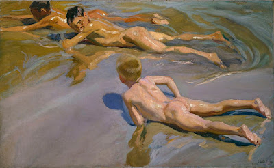
Looking for Shellfish, JoaquĂ­n Sorolla, 1905. A warm light comes from our side of the figure, but there are warm shadows—the result of local color reflection from the rock. Likewise the bottom half of the torso reflects strong cool tones from the water and anchors the boy into the sea.
If the color of the light is essentially warm, the color of the shadows is almost always going to be cool, and vice-versa. Knowing this and identifying the color of the light and shadow is the first step to a good landscape painting.
Catalonia: the Tuna Catch, from Visions of Spain, JoaquĂ­n Sorolla, 1919. In this case, most of the painting is in shadow, and what light there is, is filtered through the yellow awning. It is the distortion of the light-dark color scheme that tells us viewers that we are in an enclosed space.
The exception to this is an object in filtered light. Its shadows and lighter passages will be variations of the same color temperature. This is how we instinctively know that something we’re seeing is under an awning, for example.
Study the Spanish painter JoaquĂ­n Sorollato understand the color of light. He was a master at painting white fabric in a variety of circumstances, and comparing the light passages to the shadow passages will tell you much about managing the color of light in your painting.
This post was originally published in 2015. Let me know if you’re interested in painting with me aboard the schooner American Eagle in late September.

White on white

The color of white is the color of light. Mastering that will make all your paintings more exciting.
Girl Arranging Her Hair, 1886, Mary Cassatt, courtesy National Gallery of Art
The colors in her chemise.
White is, in theory, a reflection of all the visible light spectrum. But that is never true in real life. Inevitably, all light shifts to either the cool (blue-violet) or warm (golden) side, depending on the time of day, season, and atmospheric conditions. Artificial light is even more limited in spectrum than sunlight.
At the end of the 19th century, the Impressionist revolution in color had spread to painters like Anders Zorn, JoaquĂ­n Sorollaand John Singer Sargent. Nowhere does this show more than in their handling of white. Sorolla was painting in the brilliant light of his native Valencia. Zorn lived in Sweden, and many of his scenes have flat light. Sargent lived most of his life in western Europe. None were working in the same lighting conditions, but all of them adopted the same approach to color and light. It was a marriage of Impressionist color theory to more traditional brushwork. The combination still works today.
Mending the Sail, 1896, JoaquĂ­n Sorolla courtesy Museo d’Arte Moderna di Ca’ Pesaro. This is a warm-light, cool-shadow combination.
The colors in Sorolla’s sail.
By adding color to white, these painters were able to give their subject the sparkle and truth of natural light. To have painted their whites with just white or grey would have resulted in flat, dull canvases. This is because convincing whites, in the real world, are actually quite colorful.
Helen Sears, 1895, John Singer Sargent, courtesy Museum of Fine Arts, Boston
The colors in her dress.
Sargent’s portrait of Helen Sears was painted under gaslight. The little girl is thrown into stark relief by the dark interior, and the whole painting is drenched in warmth. What we perceive as blue is mostly a cool neutral. (Hereis a photo of the girl taken by her mother, so that you can see Sargent’s liberal editing.) Even the blue-and-white hydrangeas are actually comprised of mostly warm tones. In this painting, the whites are influenced primarily by the light source.
A Portrait of the Daughters of RamĂłn Subercaseaux, 1892, Anders Zorn, private collection
The colors in the older girl’s dress.
Zorn’s portrait, on the other hand, is mostly influenced by reflected color. It is set against a rich orange floor that influences everything in the foreground. The older girl’s dress is washed in its pinkish tones. The younger daughter recedes in space because of the less-saturated color in her clothes and the grey drapes. Despite all the warmth in the painting, we understand it’s under natural light by the cool highlights. It’s a masterful composition, a brilliant use of color, and above all, an insightful glimpse into the childish mind.
Sita and Sarita, 1896, Cecilia Beaux, courtesy National Gallery of Art
The colors in Sarah’s gown.
I’ve picked six random ‘whites’ from each painting to show you just how varied whites could be in the hands of accomplished painters. Had I used Impressionist paintings, the tints would have been clearer and brighter.
I strongly encourage my students to premix tints(the tube pigment plus white) of every color except black on their palette, and then to ignore pure white. Their assignment this week—and now it’s your assignment too—was to paint a white object without using any straight white paint at all. It should go without saying that your neutrals (greys) should not be mixed with black, either. Everything in this exercise should have color.
The tints in the second line drive this exercise. Graphic courtesy of Victoria Brzustowicz.
The addition of white makes any other pigment opaque and somewhat cooler, since titanium white is cool in its pure state. Add too much white, and you’ve got a bleached, dull image. When you start this exercise, it’s best to err on the side of too much color, rather than too little.
What are some good white objects to paint? Eggs, roses, china dishes, clothing or sheets on the line are all options.

Monday Morning Art School: repetition, pattern and rhythm

Variation is your friend when you’re striving for movement in your painting.

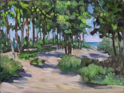
Beach Saplings, Carol L. Douglas
“You have a great sense of visual rhythm,” I told the young artist.
“I’m not sure I even know what that means,” he answered.
“Well, I’m not sure I do either, but I’m sure that between the two of us, we can figure it out,” I replied.
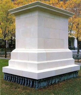
Public Figures, Do-Ho Suh 2001 Art Experience:NYC. The artist understood how to create movement enough that he intentionally suppresses it for a powerful political statement.
Rhythm creates visual tempo that provides a path for the viewer’s eye to follow. It’s closely aligned to movement and action, and it’s usually achieved through the repetition of lines, shapes and colors.
Rhythm builds on two other artistic concepts: Repetition, which is one object or shape repeated, and pattern, which is a combination of elements or shapes repeated in a recurring and regular arrangement. Rhythm is the song produced from these elements. It can be random, as in a pottery glaze, or obviously patterned.
The basic building block of rhythm is a motif. It need not be a real object. It can just as easily be an abstract shape.
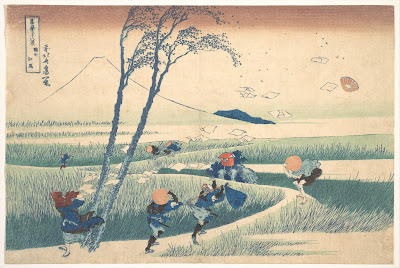
Ejiri in Suruga Province, c. 1830, Katsushika Hokusai, courtesy Metropolitan Museum of Art
Ejiri in Suruga Province demonstrates the importance of motifs, rhythm and repetition in creating a sense of movement. Katsushika Hokusai wanted us to understand that it was a very windy day. The blowing papers, the pattern of the grasses, the figures themselves and the doubled tree trunks are different motifs. They’re running across each other in different rhythms, giving an intense sense of motion to the foreground. This contrasts with the utter stillness of Mount Fuji in the background.
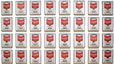
Campbell’s Soup Cans, 1962, Andy Warhol, courtesy MoMA

Repetition can lift the prosaic into a new level, as Andy Warhol’s Campbell Soup Cans illustrate. Warhol went to his local grocery store and bought every flavor of soup Campbell was then making, 32 in all. Alone, one can of soup was meaningless; blocked together on shelves as at a grocery store, they created an immediately-recognizable symbol of the plentitude of American culture. (When asked why he painted soup cans, Warhol said, “I used to drink it, I used to have the same lunch every day, for twenty years.”)

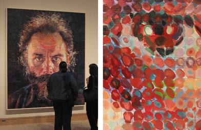
Lucas, 1986-87, by Chuck Close, fair use. His changing mark-making provides the only relief in these remarkably static portraits.
The work of American painter Chuck Close demonstrates the ability of rhythm to gin up an otherwise static painting. His first  paintings were monumental monochrome hyperrealistic portraits. By the 1980s, he was superimposing a grid over them, breaking down the image into a series of dashes, dots, thumbprints, paper, or shapes. The pixelization gives them a degree of dynamism the earlier paintings don’t have.
How can you apply those principles of rhythm to your work?
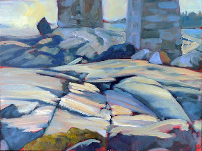
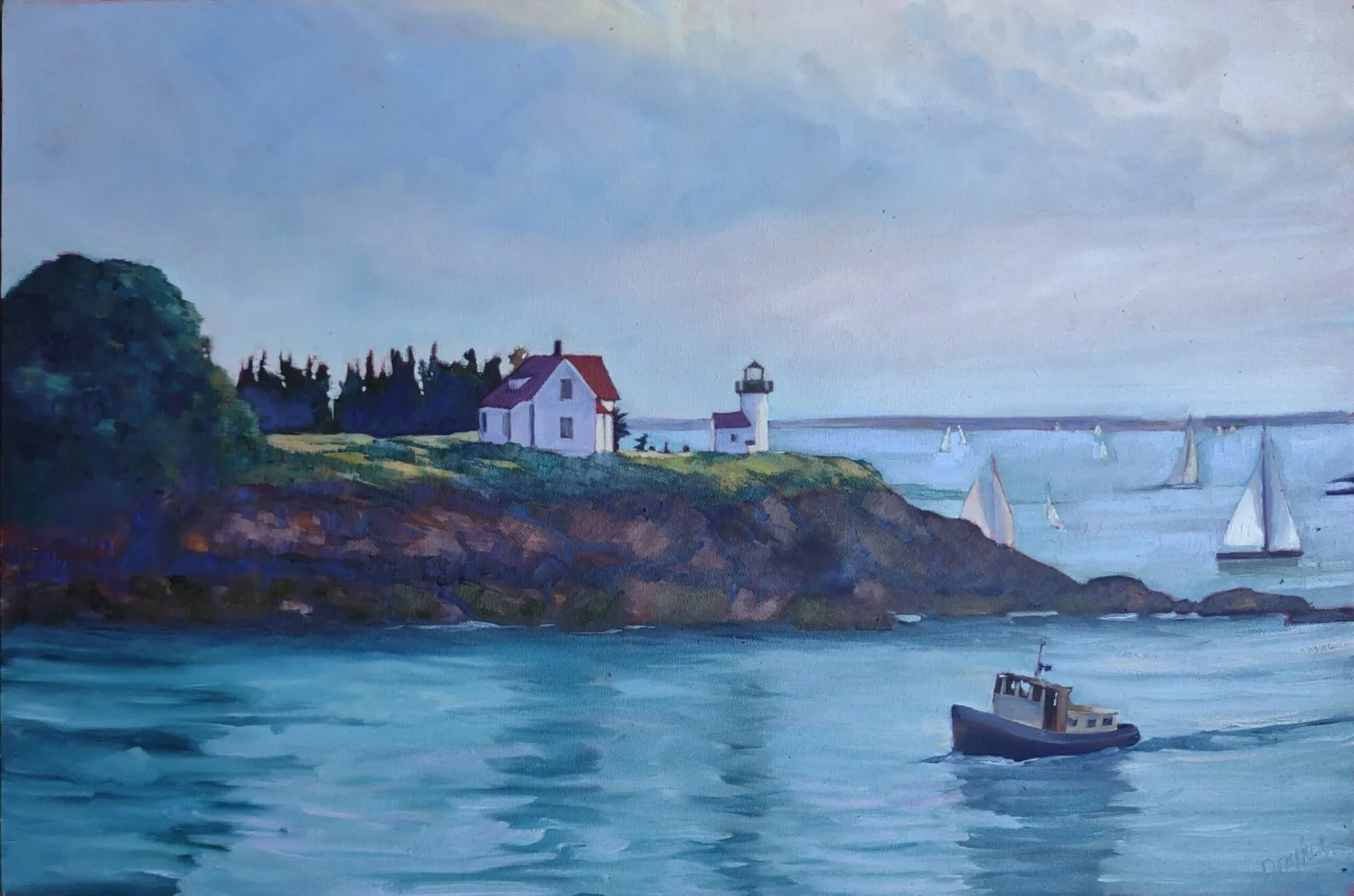
Under the Marshall Point Light, Carol L. Douglas
Don’t be so quick to eliminate all evidence of the built world from your landscape paintings. Cars, telephone poles, houses and roads all create interesting visual patterns.
Be conscious of the rhythmic motifs in your subject before you start painting. Overlapping hills, granite outcroppings, tree patterns, and water ripples are all complex rhythmic patterns. Rhythm is a fundamental attribute of nature. Focus on it.
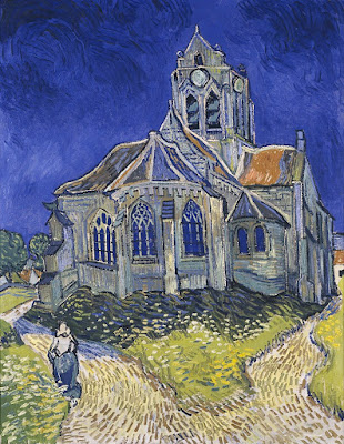
The Church in Auvers-sur-Oise, View from the Chevet, 1890, Vincent Van Gogh, MusĂŠe d’Orsay
Mark-making is an excellent way to insinuate rhythm into a painting. You can drive the viewer’s eye around your canvas by changing the thickness, length and direction of your strokes. The greatest practitioner of this was Vincent van Gogh; study his work to see how you can apply this technique.
Children on the beach, 1910, JoaquĂ­n Sorolla, Museo del Prado, Madrid

Color is a powerful tool for repeating motifs. See how JoaquĂ­n Sorolla uses color temperature alone to make a pattern of ripples around his bathing children, above. Understand and use color temperature.
Your assignment—should you choose to accept it—is to find and draw a naturally recurring motif in your immediate environment.

Our blessings

Roosevelt called for freedom worldwide. Norman Rockwell’s paintings were so distinctly American, however, that they came to represent us.

Freedom from Want, c. 1941-45, Norman Rockwell, courtesy National Archives at College Park

I had a painting teacher who hated Norman Rockwell. She was in tune with the art establishment of her time, which derided him as ‘just an illustrator.’ In fact, Rockwell understood painting just fine. Very few artists of any time could have balanced the plane of the table in Freedom from Want so elegantly.

Norman Rockwell’s Four Freedoms were meant to illustrate a passage from President Franklin Roosevelt’s State of the Union address of January 6, 1941. Nazi Germany occupied most of Western Europe, and the outlook for western culture looked grim. America was still steadfastly isolationist. Roosevelt exhorted his fellow Americans to think beyond our own borders. His Four Freedoms were universal rights of mankind, and he felt an obligation for America to help preserve them in Europe.
Freedom of Speech, c. 1941-45, Norman Rockwell, courtesy National Archives at College Park
Norman Rockwell’s paintings, however, were so idiosyncratically American that they have come to represent us. Freedom from Want is now irrevocably entwined with the American holiday season, which kicks off tomorrow.
The foil for the whole painting is the white-on-white table, surrounded by a wreath of faces. If you’ve ever wondered about Rockwell’s legacy as a painter, study that table. He’s as brilliant with the whites as JoaquĂ­n Sorolla, but in a cooler, more American way.
Freedom of Worship, c. 1941-45, Norman Rockwell, courtesy National Archives at College Park
He painted the figures from life, using his friends and neighbors as models. About the turkey, Rockwell said, “Our cook cooked it, I painted it and we ate it. That was one of the few times I’ve ever eaten the model.”
There’s almost no other food on the table. Such is the magic of his realism that Rockwell makes you believe it’s an overloaded table. In fact, that was the criticism of it at the time, that it depicted indulgence while Europe was starving.
Freedom from Fear, c. 1941-45, Norman Rockwell, courtesy National Archives at College Park
We’re so swamped in bad news that it’s easy to forget how blessed we are. “No famine has ever taken place in the history of the world in a functioning democracy,” wrote Nobel-winning economist Amartya Sen. Americans are particularly blessed with freedom of speech: in 2015, the Pew Research Center polled 38 countries around the world in 2015 and found that Americans are more tolerant of free speech than other nations.
Fear is tough to measure as it’s subjective. However, attacks on American soil have been blessedly few; most of our wounds are self-inflicted. And we are free to worship where we want, and to have lively debates in court and the media when religious rights and other rights intersect.
If you say grace tomorrow, you could do worse than thanking God for the four freedoms enumerated by President Roosevelt all those years ago.
Have a very blessed holiday! (There will be no blog tomorrow.)

Monday Morning Art School: how to be painterly

Bravura brushwork rests on a foundation of practice and skill.
Wheatfield with Crows, 1890, Vincent Van Gogh, courtesy Van Gogh Museum, Amsterdam
“Painterly” describes a painting that is comfortable in its own skin. It uses the paint itself to create movement and expression. It’s a quality found in every medium; even sculpture is sometimes described as painterly. Painterly works are loose and emotive, and they lead with their brushwork.
This is a sensual, rather than intellectual, quality. It comes from experiencing the paint itself. You’re there when you no longer fight the paint, but work with it. It’s the opposite of photorealism, where the artist works hard to conceal all evidence of his process. A painterly painting doesn’t fuss over the details.
Does that mean it must be impasto? No. Peter Paul Rubens, JMW Turner and JoaquĂ­n Sorolla were all painterly painters, and none of them wallowed in paint. There are many fine contemporary painters who work thin and expressively.
Cloud study, watercolor over graphite, 1830–35, John Constable, courtesy of the Metropolitan Museum of Art. We don’t usually think of Constable as painterly, but he was in his plein air work.
The term “painterly” was coined in the 20th century by art historian Heinrich Wölfflin. He was trying to create an objective system for classifying styles of art in an age of raging Expressionism. The opposite of painterly, he felt, was “linear,” by which he meant paintings that relied on the illusion of three-dimensional space. To him this meant using skillful drawing, shading, and carefully-thought-out color. Linear was academic, and painterly meant impulsive.
That didn’t make the Old Masters inevitably linear, however. Rembrandt and Lucian Freud are both painterly painters. Richard Estesand Sandro Botticelliare both linear.
Today, we don’t see accurate drawing as an impediment to expression. In plein air work, acute drawing is often overlaid with expressive brushwork. The idea of painterliness—of being loose and self-assured—is treasured even as we strive for accuracy.
House in Rueil, 1882, Ă‰douard Manet, courtesy National Gallery of Victoria, Melbourne
How do we develop painterliness?
First, master the fundamentals. “You can practice shooting eight hours a day, but if your technique is wrong, then all you become is very good at shooting the wrong way,” said basketball great Michael Jordan. “Get the fundamentals down and the level of everything you do will rise,” he said. That’s very true of painting, where there is a specific protocol for putting paint down.
Then practice, practice, practice. “I’m not out there sweating for three hours every day just to find out what it feels like to sweat,” said Jordan.
Expect failure. It comes with pushing your technique. “I have missed more than 9,000 shots in my career. I have lost almost 300 games,” said Jordan. “On 26 occasions I have been entrusted to take the game winning shot… and missed. And I have failed over and over and over again in my life. And that is why I succeed.”
Beach at Valencia, 1908, JoaquĂ­n Sorolla, courtesy Christie’s
You can’t teach yourself to be relaxed; you can only get there through experience. The only way to be painterly is to paint. I can show you expressive brushwork techniques, but there are still no shortcuts. It happens automatically and naturally with experience. You stop focusing on the mechanics, and start focusing on what you see. Your eye is on the ball.
Many times, artists only realize their painterly styles in old age. That is when Titianstarted painting in blotches, in a style that came to be known as spezzatura, or fragmenting. “They cannot be looked at up close but from a distance they appear perfect,” wrotethe Renaissance art critic Giorgio Vasari. Rembrandt is another painter who started out painting precisely but ended up loose. Édouard Manet is still another. In fact, the list is inexhaustible.
Vincent Van Gogh is the personification of painterliness. He died at 37, but still managed to produce around a thousand paintings (that we know of).
Bravura brushwork simply rests on the foundation of all those paintings that went before.
I’m at Saranac Lake, prepping for Adirondack Plein Air, which starts this morning. I wrote Extreme Art: Painting inside the Blue Line just for this event. It’s not on my blog, so if you’ve ever been interested in what goes on at a plein air event, enjoy.

Doggone brilliant

Portrait of a Jack Russell, by JoaquĂ­n Sorolla (1909)
A reader sent me this Portrait of a Jack Russell, by Joaquín Sorolla (1909). She knows I have an ancient Jack Russell and love Sorolla’s treatment of white and black.
Some of the tones Sorolla used to make white fabric and dog in the painting above.
This painting has no white in it whatsoever and most of the black is modeled with browns and plums, but we understand the dog to be white and black, seated on an off-white drapery, with light coming from the left.

The human mind interprets these colors to be black and white because, in fact, when we look at a black and white object in light, we see neither true black nor true white. Every object’s local color is tempered by the color of the light reflecting off it.

Some of the tones Sorolla used to make the black fur in the painting above.
Remember that color is composed of three characteristics:
Hue: the position on the color wheel, like red, blue and yellow;
Chroma (Saturation): how strong or weak the color is;
Value: how light or dark the color is.
The painting in gray-scale loses depth, because it is modeled with hue as well as value.
In gray-scale, the lighting on Sorolla’s dog is far less striking. That is because Sorolla uses the color of light to define shapes.  His light is warm and his shadows are cool.
I used Photoshop to make a rough hue map of the painting. It is clear that hue is driving this painting at least as much as value is.
Hue map of Sorolla’s painting, above. Clearly the light is coming from the left.

Let me know if you’re interested in painting with me on the Schoodic Peninsula in beautiful Acadia National Park in August 2015. Click here for more information on my Maine workshops! Download a brochure here.

The color of light

Boys on the Beach, JoaquĂ­n Sorolla, 1908. There is warm light with cool shadows, but there’s also a strong warm reflection from the sand on which the figures are resting. 
What we call “light” is really the narrow band of electromagnetic waves that our retinas can perceive. This narrow band is comprised of the colors of the rainbow, or what we sometimes call ROY G BIV. (There really isn’t an indigo; it’s there so that Roy has a pronounceable surname.) Each of Roy’s color names corresponds to a specific wavelength. For example, blue is about 475 nm; red is about 650 nm.
Return from Fishing, Joaquín Sorolla, 1894. The light is warm, the shadows are cool, and the places where the light is going through the sails are warmer still, since they’re filtered by the off-white fabric.
When the whole visible light spectrum strikes your eye at the same time, you perceive white. This is not a color in itself, but the admixture of a bunch of colors. In the real world, this is never a pure mix. The atmosphere bends light just like a prism does, so what you see is always tinted. The light might be gold and peach at sunset and blue at midday. Impurities in the atmosphere also give us the energetic indigo-violet of the far distant hills—the farther away something is, the more likely dust has filtered out the higher wavelengths (the warm colors).
Valencian Fishwives, JoaquĂ­n Sorolla, 1903. Here the light is cool and the shadows are warmer.
Just as all the colors together form white light, the absence of light is total blackness. But unless you’re in a cave or darkroom, that’s a theoretical construct. There’s always reflected light bouncing around in the shadows, and that light gives the shadows its color. It’s never black and it’s unlikely to be grey, either.
Looking for Shellfish, Joaquín Sorolla, 1905. A warm light comes from our side of the figure, but there are warm shadows—the result of local color reflection from the rock. Likewise the bottom half of the torso reflects strong cool tones from the water and anchors the boy into the sea.
If the color of the light is essentially warm, the color of the shadows is likely to be cool, and vice-versa. Knowing this and identifying the color of the light and shadow is the first step to a good landscape painting.

Catalonia: the Tuna Catch, from Visions of Spain, JoaquĂ­n Sorolla, 1919. In this case, most of the painting is in shadow, and what light there is, is filtered through the yellow awning. It is the distortion of the light-dark color scheme that tells us viewers that we are in an enclosed space.
Study the Spanish painter JoaquĂ­n Sorolla to understand the color of light. He was a master at painting white fabric in a variety of circumstances, and comparing the light passages to the shadow passages will tell you much about managing the color of light in your painting.

Let me know if you’re interested in painting with me on the Schoodic Peninsula in beautiful Acadia National Park in 2015 or Rochester at any time. Click here for more information on my Maine workshops! Download a brochure here.

What is the nature of compassion?

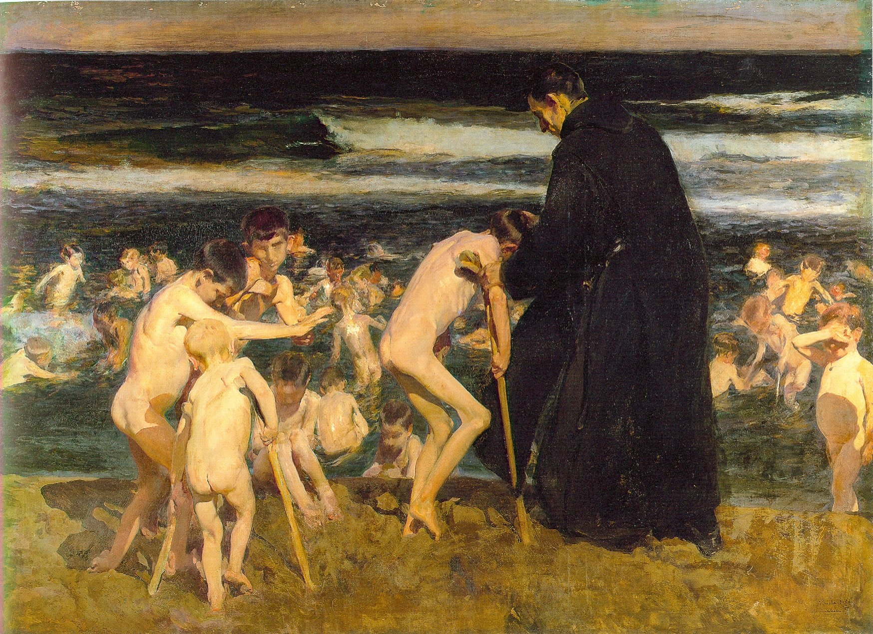
Triste Herencia (Sad Inheritance) by Joaquin Sorolla (1899)

In counterpoint to Joaquin Sorolla’smany light and luminous canvases of naked children playing on the beach, Triste Herencia (Sad Inheritance) is a dark painting of children in a dark sea. Examined carefully, the painting is a detailed catalogue of woes—blindness, club foot, leprosy, and above all, polio, which was just starting its reign of terror at the time this was painted.*
Sorolla’s Chicos en la Playa (1910) is more typical of his beach children.
 The monk at the center of it has been on my mind this week. In contrast to my mental image of a compassionate shepherd, this fellow, of the Orden Hospitalaria de San Juan de Dios, appears rather grim—almost intimidating, in fact. He has the stern face and bearing of a saint painted by ZurbarĂĄn, or the confessor or inquisitor of our imagination.  Yet he is with great delicacy doing a job few of us would volunteer for.
Dwarves have a long history as palace accessories to the European nobility, so it’s no surprise that they’ve been painted by many masters. Perhaps the most famous of these paintings is Diego Velázquez’s Las Meninas, which includes both an achondroplasticdwarf (Maria Barbola) imported from Germany and an Italian proportionate dwarf(Nicolas Pertusato), kicking the dog.
The Jester Calabacillas, Bobo de Coria or Juan de Calabazas (1637-1639) by Diego VelĂĄzquez
VelĂĄzquez painted an entire lexicon of dwarfism, and his portraits are notable both for the respect he shows his subjects and for the honesty with which he portrays their condition. His portrait of Don Juan Calabazas is a highly sympathetic portrait of mental retardation. Calabazas was nicknamed “Calabacillas” or “Pumpkinhead,” a nickname we would find utterly objectionable today. VelĂĄzquez does not shrink from Don Juan’s disabilities, carefully documenting his subject’s symptoms, including his vacant smile, the frantic gesturing of his hands, his crouching posture. But in spite of that, VelĂĄzquez painted him with as much respect and affection as he ever did Philip IV or his family.
Compare this to the most well-known American painting of disability, Christina’s World, by Andrew Wyeth(1948). One would never crawl across a Maine hayfield naked, so Anna Christine Olson’s disability is masked to some degree by her clothing. But beyond that, the painting tells us nothing about her. It is a carefully constructed, beautiful composition focusing on the surface of the field and the elegant shapes of the buildings. (Both the buildings and the figure are substantially altered from their reality.) 
Christina’s withered limbs are an addendum to a completely separate idea. They draw us into what otherwise would be “Triangular Composition: Girl in Pink Dress on a Grass Field.” Seen in its most cynical light, they’re there to sell the painting.
Christina’s World, by Andrew Wyeth (1948) is a very American view of disability.
That’s not an indictment, of course; Wyeth is just treating disability the way the rest of America does. As the parent of four children, I know that schools offer the disability label as a ticket to purchase compassion from an otherwise inflexible system, and the pressure to buy into this system is overwhelming.  All of this is a diminution to the truly disabled, many of whose withered limbs are hidden from us.
This being the season of the Compassionate Shepherd, I am reminded of his encounter with the Samaritan woman at the well, told in John 4:4-26.
The woman said to him, “Sir, give me this water so that I won’t get thirsty and have to keep coming here to draw water.”
He told her, â€œGo, call your husband and come back.”
 â€œI have no husband,” she replied.
Jesus said to her, â€œYou are right when you say you have no husband. The fact is, you have had five husbands, and the man you now have is not your husband. What you have just said is quite true.”
To our modern ears, that’s a pretty harsh exchange, but it was absolutely necessary that she acknowledge her reality before she could begin any process of renewal.
We moderns cannot be honest about the human condition because we are relativists; the only truth we understand as absolute is “don’t be judgmental.” But resolution requires honest assessment. Perhaps it is no surprise after all that Sorolla’s monk starts with the naked, brutal truth to help his poor charges. Perhaps it is no surprise that he is grim.

——

*I was shocked to read that polio epidemics were a 20th century scourge, although the disease itself has been known since antiquity. Before the 20th century, poor sanitation resulted in a constant exposure to the polio virus, which provided natural immunity from infancy. As sanitation improved in Europe, childhood exposure declined. The first localized epidemics occurred in Europe and the United States around 1900, the time Sorolla painted Triste Herencia.