Painting by Numbers

That’s not a lighthouse, but the Summerville Coast Guard Station in Rochester. And it sold fast, so maybe they know what they’re talking about with this blue.

Maine lighthouses are among the most iconic of images. Does that mean that painting them is a good idea?

It depends on what you’re after and how you execute your work. Thomas Kinkade made a fortune painting lighthouses. Still, he died unhappy, and he’s unlikely to be remembered as a seminal figure in American art.
The problem with Thomas Kinkade isn’t that he couldn’t paint, and it isn’t that he spent too much time reading Komar and Melamid… it’s that all his buildings look like they are on fire. (Split Rock Light by Thomas Kinkade.)
Nevertheless, it’s perfectly possible to paint a sensitive, honest lighthouse or lobster boat. They are iconic for a reason: they speak to us of labor, of man’s relationship to nature, and of the sea.
Surf in Maine. Not iconic at all, and the size of a paperback novel. Oops. Oh, well… I still like it.
In Painting by Numbers: Komar and Melamid’s Scientific Guide to Art, the authors—who are themselves artists—set out to determine what were the “most wanted” and “least wanted” paintings in various countries. Most of the book describes, laboriously, the methodology of their polling process. It’s so absurd it’s funny.

America’s least-favorite painting is:

·         Paperback book size;
·         Thick, textured surfaces;
·         Geometric patterns;
·         Darker shades;
·         Sharp angles and bold stark designs;
·         Colors kept distinctly separate;
·         Gold, orange, peach and/or teal.
America’s most-favorite painting is:

·         Dishwasher-size;
·         “Realistic-looking;”
·         Outdoor scenes;
·         More vibrant shades;
·         Wild animals in their natural settings;
·         Persons in group, fully clothed and at leisure;
·         Fall scene;
·         Soft curves and playful, whimsical designs;
·         Colors blended;
·         Visible brush strokes;
·         Blue.
OK, that’s a lighthouse, and I personally like it. Well, I painted it, so I ought to. Whole lotta blue.
It turns out that lots of people like landscapes, and they also like blue. If that’s true, and if they’re also satisfying to paint, why turn our noses up at them?
Whether you want to paint an iconic view of Maine or something more individual, there’s still room in this summer’s Maine painting workshops. Check here for more information.

The Poetry Pole

The Poetry Pole in the depths of Spring.

Of the lovely things to sprout in my neighborhood, the one with the longest-lasting bloom is the Poetry Pole around the corner. I first noticed it on March 18 while walking with friends; the poem was Mary Oliver’s Wild Geese, a seasonal and apposite statement, for when women walk in flocks, they frequently “Tell me about despair, yours, and I will tell you mine.”

And, what the heck, here are some of those wild geese.

At the beginning of last week, the poem had changed. Once again our neighborhood Poetry Vendor touched not only on the season, but (quite innocently, since the world hadn’t exploded into violence yet) on the spirit of the week* to come.

Suddenly the archetypal  
human desire for peace  
with every other species  
wells up in you. The lion  
and the lamb cuddling up.
The snake and the snail, kissing.
Even the prick of the thistle,  
queen of the weeds, revives  
your secret belief
in perpetual spring,
your faith that for every hurt  
there is a leaf to cure it.
(from Amy Gerstler’s In Perpetual Spring)
I don’t know who the Poetry Vendor is; I know who I could ask, but I like receiving this generous gift from a stranger. As I sort through my complex feelings about this wonderful little town in which I live, I wonder how common Poetry Poles are, anyway. Do you have one, or something like it, where you live?
The leaf that cures my hurt flow in streams of living water…
*This being the age of rapid communication, we no longer have time for any “spirit of the age.” A week is all we can remember at one time.

Count Your Blessings

Man at the blood lab today, sketched by little ol’ me.

I set out each day with a plan. Today (as usual) it had crumbled before 8 AM. My son hasn’t felt well, so instead of heading to my studio, I took him to a lab to have blood drawn.

Between the news from Boston and the news from West, Texas, it’s been a dreadful week. One can barely look away from the news, but focusing on it leaves us feeling deflated. But if faith is the opposite of fear, then this black hole of fear and grief is an unacceptable place for the child of God to linger.
Easer to say than do, egh?
As is my wont, I pulled out my sketchbook to draw. My attention was drawn to a man in the prime of life (in other words, about my age), with alert, intelligent eyes. He was well-dressed and well-groomed. He was also assisted by an aide and wearing a helmet and on a walker. As I sketched him, I pondered what cataclysm had laid him low.
My mother liked to say, “You don’t have to look very far to count your blessings.” She did not mean that we should take pleasure in others’ misfortune, but that around every corner is a person who would rejoice at the blessings we take for granted.
It was a long wait. An elderly man said loudly to his wife, “Now, I’ll have to divorce you.” A bad joke, I thought, between an obviously affectionate and long-married couple. Then I listened closer. Her sharp looks as he talked to the phlebotomist were to catch him before he stumbled, for he was suffering from dementia.
People at the blood lab today, sketched by little ol’ me.
A man came in with his middle-age daughter. He leaned forward and fell asleep as she did a crossword puzzle. Occasionally he would startle awake and say, “It’s slow here today,” and then doze again.
We are all given a choice—we can focus on the grief that swirls around us, or on the gift of life, the enormous mystery and miracle that is the breath we take every few seconds. We can focus on the long line at the phlebotomist’s office, or the fellow travelers sharing the wait with us.
Have a blessed weekend.
There’s still room in this summer’s Maine painting workshops. Check here for more information.

About that Dove Beauty thing

High school self-portrait from life by Zeyuan Chen, now a graduate student at UC Davis.

My newsfeed is full of comments about Dove Real Beauty Sketches. I tried to watch it, but couldn’t get past the first three seconds. A woman with impossibly thin thighs—automatically triggering envy in 99.9% of female viewers—was whining about wanting fuller lips. It isn’t exactly a news flash that some women have lousy self-images, or that society tends to reward beauty (or whatever it is that we designate as such).
Every painting student of mine will eventually be asked to paint or draw a self-portrait. No working from photographs here: I will plop you in front of a mirror and insist you draw yourself. That’s pretty raw self-analysis, and so I’ve seen countless examples of how people perceive themselves.
High school self-portrait from life by Sandy Quang, now a graduate student at Hunter College.
A very few of their self-portraits have come close in self-abnegation to those Dove “real beauty” sketches. I’ve come to think the problem might actually be that hyper-attention to distressing detail is a stand-in for something more profound. There is something about their inner selves that dissatisfies them, but they express that through the superficial.
Not a portfolio piece, but a self-portrait by my former model, Gail Kellogg Hope.
But the vast majority of self-portraits look an awful lot like the artists who did them. Neither excessively flattering nor excessively grotesque, they record their own real looks to the best of their abilities. Does this mean that artists have better self-images than most people, or does it mean that the Dove campaign is built on a lie?
High school self-portrait from life by Sam Horowitz, now an undergraduate at RIT.
Ethereally beautiful models who don’t like their own looks tend to live in places like New York. It is a city of façades, necessary because of its high concentration of population. “I was on the subway, and there was a gang on the train,” one of my kids told me recently. “Two children put their hands over their ears trying to not hear the racist profanity being spitted out. The mother told them to put their hands down. She was afraid they would draw attention to themselves and it would be dangerous.” That’s an extreme example of the kind of protective coloration assumed all the time in a city, but it has a distorting effect on what one perceives and what is real.

High school self-portrait from life by Matt Menzies, now an undergraduate at RISD.

There’s still room in this summer’s Maine painting workshops, where we will teach you to love yourself, and where it doesn’t matter what you wear. Check here for more information.

Is anyone out there?

A constantly-changing installation on my morning route. I’m sure many people just run right through it, judging by how frequently it’s been kicked around when I get there.

Sometimes I produce artwork that goes into galleries, where people come to say nice things about it (and occasionally even buy some). Other times, I produce work for which I can’t gauge the audience’s response, such as this Facebook album documenting the destruction and construction of a new grocery store in my neighborhood.
Much modern art is now open-source, which curtails any in-depth communication between the creator and his audience. YouTube, your blog, and your website will count your visitors, but that’s a pretty one-dimensional view of your audience. Pinterest and Facebook don’t even give you that. Either you’re the meme-of-the-week or you feel like you’re laboring inside a dark box, totally cut off from the world.
The original art at this site was this wire flower, which bloomed in mid-March.
I pass by a little arrangement of rocks, twigs and pine cones every day on a pedestrian bridge over an expressway.  It changes every day, and it always brings a smile to my face. It started with a wire flower, which then sagged into a drooping bloom during Holy Week, and was then replaced by the current collection.
Unless this artist is hiding in the shrubbery watching, he or she has no idea that I’m a fan. I see it as a sort of special greeting directed specifically to me. But how can the artist possibly realize that? In fact, I frequently see the arrangement kicked out of place by unmindful pedestrians.
By accident or design, the flower drooped during Holy Week, matching perfectly the pensive mood of that season.
 Ray Davies of the Kinks once sang

“Are you listening?
Are you listening to me?
Can you hear me?
Can you hear me clearly?
Around the dial…”
I hope that unknown artist on the pedestrian bridge doesn’t give up on me. I’m listening.
There’s still room in this summer’s Maine painting workshops. Check here for more information.

Process vs. Product

Gesture drawings are just so cool.

My son is curled up in a chair making skins for Minecraft. He likes animating, drawing, electronic music, writing games, programming, and—of course—video games. He’s a kid, and kids have an ability to slip into activities with no regard for their value. It’s a trait that usually eludes us “mature” adults.
By the time kids are high school juniors, they no longer spend most of their time exploring the by-ways of human knowledge, arcana and experience.  They’ve had that drilled right out of them by the school system. They strive for AP credits, SAT scores, and a good class ranking.
But dispensable, which is why we frequently throw them on the floor.
Then the lucky few end up in my studio to do portfolio prep, and I tell them, “Forget the results. Right now your portfolio requirements don’t matter. What matters is that you sink into the process of making art, and the portfolio will come in time.”
The paradox of making art is that the more one focuses on results, the less satisfying those results are. Conversely, the more one focuses on the process, the better the results turn out. This state of total immersion goes by many names: in the moment, in the zone, on a roll, present, in a groove, or centered. But whatever you call it, it’s difficult to make good art without it.
Gesture drawings are the perfect way to explore the idea of process. Nobody cares what the results are; they exist simply as warm-up exercises. And yet, in 35 seconds to a minute, the artist often captures the essence of the model.
My beautiful model Michelle Long was so excited to play her ukelele today.
I had two new students experiencing their first model session today. Both are young, and both are relatively inexperienced drawers. Both quickly grasped the principle of flowing with the process, and the quality of the work they did reflected that.
Learning to draw an ellipse is a process, not a destination.
A note: I do my model sessions in natural light, which I find far preferable to spotlights. If you’re interested in joining us, feel free to contact me.
There’s still room in this summer’s Maine painting workshops, and I assure you I will be totally in the zone. Check here for more information.

Carol and Carol make a break for it

Let’s call it Genesee River in Full Spate. 9X12, oil on canvasboard, by li’l ol’ me.

Remember a few weeks ago I suggestedyou get your outdoor painting kits together because eventually it would stop snowing? Evidently, that was a case of “do as I say, not as I do,” because the fair day finally dawned and I was unprepared.
I could have spent it organizing my kit, but that would have been no fun. Carol Thiel and I threw together some basic painting supplies and headed to the Pont de Rennes bridge instead.  Carol didn’t bring an easel and I forgot a palette knife, most of my brushes, and a lot of other interesting things.
A tourist offered to take our photo. 

 Rochester’s High Falls is, like Niagara Falls, a plunge basin over a limestone shelf left over from glacial Lake Iroquois. The Niagara River, being a strait between two great lakes, carries much more water, but the Genesee is in full spate right now due to last week’s rains. The Genesee River drops almost 2000 feet from its Pennsylvania headwaters, through hills, meadows and the fabulous Letchworthgorge. In the course of its explorations it also roars over six waterfalls.  It tends to be turbid when it’s feeling its oats, and today it was the color of wet concrete.

This is the composition I wished I’d painted. The ruin to the right proved to be not as interesting as I’d expected.

A icon being dismantled! The smokestack at High Falls will soon be no more.
This is the heart of Rochester’s historic manufacturing district, and the Genesee drops almost a hundred feet through a tight corset of stone, concrete and brick. A rail line presses down on it from above. I never tire of this landscape, because it connects us so closely with our industrial past. This is what Niagara Falls once looked likebefore it was cleaned up for tourists. No parkland serenity here, but a distinctly urban, muscular landscape.

Carol’s partially finished painting. We met when she took my Adirondack workshop.
Nevertheless, we talked to tourists from all over the world today. How wonderful that their window on Rochester was so sunny and gloriously warm.
There’s still room in this summer’s Maine painting workshops, and the weather there is always exhilarating! Check here for more information.

Three Abstractions in Search of a Conclusion

Any project that’s a fun project is already a successful project. My collaborators, pals, and students: Catherine Bullinger and Brad Van Auken.
This being the dirty shirt-tail of a long winter, we inmates are longing for color. Three of us hit upon the scheme of collaborating on non-objective paintings. We would switch canvases each week until we’d each painted on every canvas. The only rule was that the first week would be treated as an underpainting, with flat, thin paint.

As-yet-untitled abstraction by Brad Van Auken, Catherine Bullinger and Carol Douglas, 16X20, oil on canvas.

 For some, a blank canvas is the most difficult part of painting, but for us—heedless wanderers that we are—that first step was surprisingly easy.
As-yet-untitled abstraction by Carol Douglas, Brad Van Auken and Catherine Bullinger, 16X20, oil on canvas.
During the second week, Catherine Bullinger painted multicolored balls all over the canvas started by Brad Van Auken. The shapes built on the underpainting in a way that strongly reinforced the light streaming out of the center of the canvas. I, on the other hand, flailed around for about an hour before I realized that I should have asked Catherine about her intentions in laying down such rosy, sinuous base.  After all, it’s not collaboration if one runs roughshod over one’s collaborators.
As-yet-untitled abstraction by Catherine Bullinger, Carol Douglas, and Brad Van Auken, 16X20, oil on canvas.

The third week was easiest for me and most difficult for Catherine. She was left with a painting that had two wildly disparate ideas vying with each other. Her answer was to tread lightly. Brad happily laid organic shapes over what had gone before, and his style married those earlier layers well. Since I was faced with an already-completed idea, I contented myself with simply tidying things up a bit.
The first week, Brad painted a pastel composition grid and then mashed it up, Catherine painted a sinuous snaking form in red tones, and I painted something that looked distressingly creepy.
The second week, Catherine painted a series of balls on the first canvas, cleverly tying them to Brad’s frame with color temperature. I seem to have painted a human face into the second canvas, although my primary goal was to cool down the reds and give the painting more depth. Brad painted a gazillion gold Cheerios a la Gustav Klimt, leaving Catherine with a tough job to unify the two levels.
We batted around ideas for another collaboration:

— An enormous landscape on which we all paint simultaneously;
— A multimedia project starting with modeling paste moving up through various media;
— An assigned subject where the single variable is the palette each person can use—one getting lights, one midtones, and one darks.
Do you have any suggestions? We’d love to hear them, especially since the forecast for next Saturday is—stop me if you’ve heard this before—more  snow.
There’s still room in this summer’s Maine painting workshops, and I promise you it won’t be snowing! Check here for more information.

Playing it safe

As-yet-untitled landscape of New Mexico by Cindy Zaglin, acrylic on canvas. Light, bright, abstract, and ultimately it looks like the place felt.

The working art world—as much as any clique—tends to be insular. Art markets are provincial communities that are inclined to distrust outsiders or new impulses. To really break out of the corner into which one has painted oneself, to violate the community’s intellectual, technical or social standards, can be tremendously difficult.
Because paintings are tangible objects, the culture of painting is less subject to mass media than are other art forms, and there are distinct regional differences.  Painting clubs and classes can be terribly restrictive. They draw their leadership and jurors from a constricted pool, so members tend to conform to a narrow style to be juried into shows or awarded prizes. That can be either conscious or unconscious, but it inevitably leads to derivative or dated technique. When I first went to Manhattan to study with her, Cornelia Fosslooked at my first exercise and said, “If this were 1950, I’d say, ‘Brava, Carol,’ but it isn’t.” That’s what came of learning to paint in Buffalo.
Of course in its own way Manhattan can be as provincial as anywhere else. Cindy Zaglin studied at the Art Students League in New York. She has never been one to tie herself blithely to someone else’s muse. “I was very unhappy. I was in class and would look at everyone’s realistic paintings and I could make mine look like theirs but it didn’t express me. I don’t care about the small details. I wanted to paint large swatches of color, use negative space, leave things out, replace things with color, and I was scared to do that.”
The problem with abandoning community is that one needs new ideas, and Zaglin struggles with how to maintain a healthy distance while still learning from others. “I still sometimes think what I’m doing isn’t ‘valid’.  Sometimes I know when it’s working; sometimes I don’t. I do want to learn from others including realist painters. Painting freely or abstractly isn’t just throwing colors or shapes on a canvas; you still need to know how to draw.”
Then there’s the marketplace. Mid-level art buyers are a curiously reticent bunch, embracing new things only after they have the imprimatur of other collectors. Too many painters temper their inner vision to the marketplace. We have all seen insipid artists sell while brilliant ones struggle in the trenches.
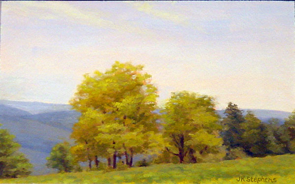
Spring Trees, oil on board, by Jean K. Stephens (image courtesy Oxford Gallery)
A decade ago, Jean K. Stephens was a respected Rochester landscape painter, with impeccable technique born of a very disciplined mind and a passionate love of the land. I’d heard she’d been through a painterly rite of passage; a mutual friend showed me some abstractions she’d done that I found painfully honest. When I came across a small nest painting of hers at Shop One² at Global Village recently, I wondered what made this seemingly established painter give up what she knew, and perhaps more importantly, what she knew would sell.
“I couldn’t not do them,” she said of those early abstractions. She had undergone a process of deep-tissue massage that, she said, brought her back to her birth experience. “I woke up in the middle of the night and did something I never do: I just started flinging paint. It was certainly not planned. It just spilled out that first night,” she said. “The next morning I went in the studio and said, ‘What just happened here?’”
What happened was more complex than a spiritual or psychological discovery, since Stephens had recently moved, had entered menopause, and had sold the rural property that had made her ‘big vista’ landscapes possible. Even as she’s moved past this work, she says it was and is a “true expression of my feminine self.”
Stephens’ current work embraces both that feminine expression and her capacity for realism. “I was in Maine with a bunch of friends. We had rented a house and I was doing the typical plein air. On the last day I looked down at my feet and said, ‘There’s the Great Mother!’ In our trips to Maine, I had always loved the rocks, but I felt like this work was the culmination of everything I had done to that point.”
So what happens when a painter known for her delicate, luminous landscapes suddenly starts exhibiting rock paintings that look like vaginas? “There’s always a risk in putting something different on the wall,” acknowledges Stephens. “I can take that risk. I do the work for me, but if people connect with it, that’s even better.”
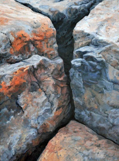
In and Out, oil on panel, by Jean K. Stephens (image courtesy of Oxford Gallery). The complete series can be seen here.
Zaglin expressed a similar sentiment. “While I want others to be connected with my paintings I’m most interested in me being connected to my paintings. This year I started caring less about what others thought and started trusting that I did have a point of view.”
Last year was a time of personal crisis for Zaglin, and she thinks the upheaval changed her work. “Afterward, I decided I was wasting time not painting how and what I want,” she said. Which is, of course, true for all of us.

There’s still room in this summer’s Maine painting workshops! Check here for more information.

Images of Old Maine

The image on the left was shot with a Canon SD850 IS and printed on a plastic banner in 2008. It’s about 20X24. The image on the right was shot with a 2.25×2.25 format Ciro-Flex in 1981 and printed a few years after that. Both are fading, but the image on the left has spent considerably more time in the light than the one on the right, which has been stored in a flat file. On the other hand, that photo is still holding up a lot better than I am. (Yep, that’s me and my trusty dog.)

The truth is, I lied: I can’t show you any images of Old Maine. They’re locked up in a medium I can’t easily access: Kodachrome slides. In fact, my entire life prior to 2001 (when I purchased my first digital camera) is more or less stacked in a cabinet in the living room. Yes, I can show them to my children by fishing the carousel projector out of the garage and pointing it at the kitchen wall, but they lose a lot in translation. Kodachrome was the gold standard for transparency film, but unless you have a modern-day Magic Lantern, a lot of that is lost.
Of course, our slides are stored in a dry, dark, temperature-controlled environment, in which Kodachrome is remarkably stable. Future archaeologists are free to reclaim them, if they get there before someone dumps them.
My photographic lock-box, a/k/a slide carousels.
My father took tens of thousands of photographs, starting with photos of his mother in their cold-water flat in depression-era Buffalo. He was a professional photographer during and after WWII. His plates languished in his darkroom until they were tossed out earlier this year. There went a tremendous bit of history and art, lost forever.
(Ironically, it was his paintings that have survived. It’s unequivocally true that painting is an obsolete medium, largely supplanted in our day-to-day existence by photography and to a lesser degree graphic design. But that actually elevates its importance. The same people who blithely toss out photo albums of Grandma’s wedding wouldn’t dare to dispose of a painting of Grandma, for example.)
My first digital camera—a Minolta Dimage 7—did not take particularly good pictures compared to the Canon EOS film camera and lenses I was abandoning. However, the marginal cost of gazillions of pictures was exactly nil, and the images were tremendously easy to store compared to their film predecessors.
In 2001, we still thought of photos in terms of printing. Our hard drives were lock-boxes out of which we had to coax images via blurry printers with unstable inks. A mere decade later, our primary platform for showing pictures is the internet. Today, physical photos have become lock-boxes of a different kind.
And within a few short years, the quality of digital cameras and digital printing had improved tremendously. Above see two prints. The one on the left was taken with a $200 pocket camera (a Canon PowerShot) and printed on a plastic banner in 2008 (it has subsequently been hung outside in all kinds of weather). The image is about 20X24.
The one on the right is an older photo, taken in 1981 with a 2.25×2.25 format Ciro-Flex twin lens reflex with Kodacolor film. That camera was, comparatively, a much higher-market item than the Canon, selling for about $110 in 1948. Of course, one telling difference is that a 33-year-old camera wasn’t completely obsolete then. With film photography, as long as you could figure out the exposure and the lenses and back were intact, you were good to go, whereas I’ve replaced my digital cameras on average about every three years.
The photo of Antietam on the left is by me. The one on the right is by Matthew Brady, of course. It took a fraction of the time for me to find these two images on my server and on the internet than it took me to find the hard copies of the photos above.
Last summer I spent a few hours at Antietam. I am familiar with this photoby Matthew Brady; I of course took a corresponding photo of it myself. But how was I familiar with that photo? Not from the bound copy of “The Photographic History of the Civil War in Ten Volumes” that sat on a shelf in our home when I was growing up—it was too valuable for children to touch. I’d seen the pictures online, of course.
One of my favorite of my own works has been a day-to-day account of the replacement of my local grocery store with a new, contemporary version—a two-year project that isn’t yet finished. I publish it on Facebook, of course, because there it gets a larger viewership than it would in any gallery. (You can see it here.)
I’m mercifully free of the need to monetize my every transaction, which makes it possible for me to exploit and enjoy the open-source world of the internet. But truthfully I’m as baffled about where it’s going next as I was about where digital photography was leading us. I hope my art stands a better chance of surviving than did my father’s, but who knows?