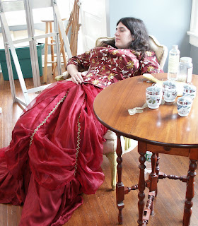
This week’s figure class featured Gail Kellogg Hope modeling a Civil War era gown of her own devising, minus the ruffled hoop. (Readers interested in historic clothing can see Gail’s work
here.) Because Gail’s hair was down and she was recumbent, I thought she looked charmingly like a 19th century laudanum addict.
I wanted to begin this essay on languid poses with an American painting, but I was unable to find an American Victorian example. I’m not sure such a painting exists—it would have been contrary to our national myth to see womanhood as anything other than industrious, thrifty, and alert.
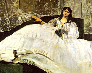
Off to decadent France, then. The portrait above is of Baudelaire’s mistress, Jeanne Duval, who was a native Haitian of mixed race. Thus her coloring is more realistic than one might first suppose, although the blackness of the painting is Manet at his rebellious and intellectual best, as is the iconography (you can read an incredibly tedious essay on the subject
here, although it doesn’t answer what is to me the most interesting question: why the title—not Manet’s doing—doesn’t dignify her by name).
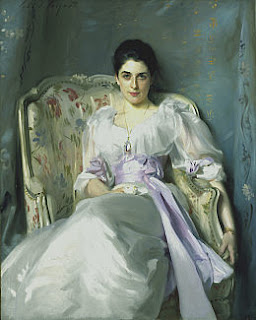
“Lady Agnew of Lochnaw,” 1892-93, oil on canvas, The National Gallery of Scotland http://www.nationalgalleries.org/collection/online_az/4:322/result/0/5396?initial=S&artistId=4829&artistName=John%20Singer%20Sargent&submit=1
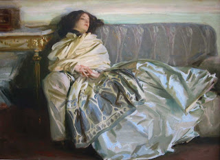
The fin de siècle painters were much more comfortable with slouching. I’ve included this example by Sargent largely because the chair resembles the one in my studio—before a century of wear and grime and burst seams. Sargent’s lady reclines, but she is anything but debauched. Instead, the pose is one of aristocratic grace. Although Lady Agnew levels her gaze at the viewer with the same assurance as Jeanne Duval, her chin is down and demure. Notice the right arm culminating in a firm grip—it belies the rest of the pose and points to why Sargent’s portraits are never dull.
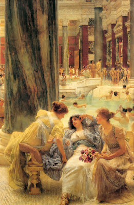
“The Baths of Caracalla,” Sir Lawrence Alma-Tadema, 1899, private collection http://www.artrenewal.org/asp/database/image.asp?id=610
Sir Lawrence Alma-Tadema was proof that not every Dutch painter was brilliant, although he gets my respect for being silly and exuberant. He was, of course, a fine technician. Although not strictly a Pre-Raphaelite painter, he shares with them the tendency to see women as sensual and emotional creatures. In this painting, his Roman matron sinks comfortably into a hard marble bench. Perhaps the background hints that these baths were built by Rome’s most psychotic emperor, but the matron’s couture, coiffure, coloring and companions are strikingly, calmly English. 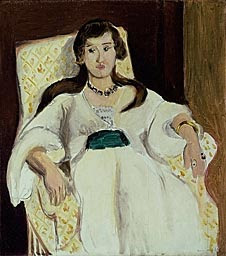
“The Green Sash”, Henri Matisse, 1919, Art Institute of Chicago http://www.artic.edu/aic/collections/citi/object?id=59919&artist=Matisse&keyword=
After that, it is a relief to return to the ambiguity of Matisse. This painting is austere; in fact it has a lot in common with the Manet above. There is no “setting” per se. As in the Manet portrait, the gown has presence and meaning of its own.
Note that in the portrait of Lady Agnew, Sargent is using Matisse’s patterns while in this painting Matisse is using Sargent’s beloved black paint.
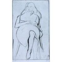
“#13 from the book, 41 Etchings Drypoints,” 1965, Richard Diebenkorn, Fine Arts Museums of San Francisco http://www.thinker.org/imagebase_zoom.asp?rec=6339304212900030
We recognize this last work immediately as a mid-century American drawing by the hemline and the hair. As cloying as that was with Alma-Tadema, it is a virtue in this etching by Richard Diebenkorn. Why is that?
With the hand resting on the abdomen, we have come full circle back to the photo of our model. There seems to be nothing strange about that pose to me, but will future viewers see it as an idiosyncrasy of our age?

 Studio in Art


