Experimenting

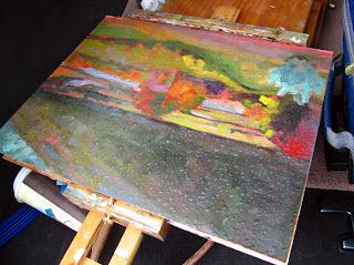
Cloud moving in over Oxbow Outlet, Oil on canvasboard, 16X20

I stopped to see my pal Jamie Grossman last week, and we fell into a conversation about sketchbooks. We both use them religiously, but (unlike Jamie) I tend to use the cheapest sketchbooks available and fill them with scribbled notes. Ever generous, Jamie gave me a Stillman & Birn Alpha Series sketchbook and suggested I try using it with watercolors, gel pens, acrylics, or ink instead of simply drawing with a pencil or graphite stick.
Sketch #1, from the seat of my car.
Jamie does lovely sketchbooks that hover on the line of being artist’s books—very lovely, very lively. I’m not interested in going there, but I can see the value in doing color sketches instead of pencil sketches. And all mental stretches are a good thing, right?
Balanced sketchbook on top
of my pochade box. 
I like to sketch whenever I have to sit, so I brought it with me to church last Sunday. However, a dynamic young rapper named CuevasWalker was preaching, and he defied capture in any form except the loosest gesture drawing.
I am in a self-imposed hermitage this week, which seems like the perfect opportunity to test Jamie’s idea. I brought only a #2 pencil and a Cotman pocket watercolor kit (with its one brush). My reasoning is that if my sketch kit expands beyond what I can put in my pocket, it’s useless.
Sketch #2. I still can’t bring myself to
paint across the spread like Jamie does…
Obstacle number one was apparent as soon as I reached my location: sketchbooks don’t fit on easels; they need to be balanced. My first sketch, therefore, was done from the driver’s seat of my trusty Prius—and I worked very fast because I was parked in a fire lane.
I tried again, balancing the sketchbook on top of my pochade box. That worked just fine, but I don’t think this sketch told me more about my composition than a pencil drawing would have.
Bug repellent… a necessity in
the spring in the Adirondacks.
Then I moved to oils. And that ended up being one of those transcendent experiences where one is totally engrossed in the process of painting, and whether it turns out well is immaterial (although, looking at these sketches, I do wish I’d worked from my original vantage point). 

I will try this process again today. Marilyn Fairman joins me to paint for two days. I’m both excited to paint with her and sad to see the solitude end.

P.S. Sorry about my month’s absence. We were marrying off our eldest, and that was an amazing project in itself, one which left no time for other creative ventures.
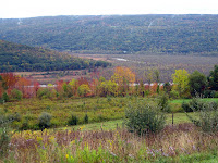
The place itself…

Flailing around

“Spring fever”(figure sketch, oil on canvas, 24X30)
Inevitably, someone will ask me, “How long did that painting take you?” This is a question I dread, as it is unanswerable.

This figure sketch was done last Saturday and took me about four hours of actual painting time—three hours with the model, and one hour to rough in a background. But that’s misleading.

I have painted this model for years. My studio is full of paintings of her—good, bad and indifferent. To some degree, every one of them was practice for this painting, just as this painting is practice for ones that will follow. Some were trips down dead ends. Some are works that stand up in their own right.

At this point, the model and I know each other pretty well. When she’s under the weather, my canvas shows it. And when she’s full of beans (far more often than not) it shows that too.  Painting the same model or a small cadre of models allows the artist to learn the subject and produce work that’s perhaps not as superficial as might otherwise happen. (The same is true of painting the same locale repeatedly.)

Occasionally, a student will complain about this repetition, but I feel pretty secure in saying that they have my permission to complain after they nail it perfectly. Since I never do, I don’t expect any of them to be calling my bluff any time soon.

The Saturday before last was one of those days of—as my friend Brad Marshall so aptly describes it—“flailing around.” But in that bad day of painting (and I’ve embarrassed myself by showing you just how bad it gets) was the germ of the following week’s better (albeit hardly perfect) painting.

I’m distracted: it’s income tax time, and my oldest child is being married in four weeks. On top of that, it has been an enchantingly warm spring and I can’t help but think about being outdoors right now. Neither could  the model, evidently. During a break I looked up to catch her staring out the window—and that was, in fact, the pose I was looking for. (More frequently than not, the pose I want to paint is one taken by the model when she’s not consciously posing.)

Headed for the slops pile: the prior week’s figure attempt. Promise you won’t let it get around.
So this prior painting will go in the slops pile, where I will allow it to ferment until I am absolutely certain there is nothing left to be mined from it, at which point I’ll slash it and get rid of it. Because for every painting that is decent, there is one or more that are… not failures, exactly, but stops on the way. My friend Marilyn Fairman, who is more fiscally conservative and scrapes down paintings she doesn’t like, calls those moments “saving the canvas,” as in, “I drove over to Piseco and saved a canvas today.” (She says it’s far better than leaving it to suffer.)

We all recognize those misfires as essential to producing the work we really want to make. As my pal Mary (a writer) says, “I’m typing along, and I’ve got an awning and a flowerpot and whatever else I can throw in there; it’s really bad, it’s schlock, but I keep typing and then suddenly, if I persevere, something comes together.”

The important thing is to get past the idea that “this work is good; ergo I’m a good artist.” A good painter is simply one who persists at painting.

Urban painting/Queensboro Bridge

Usually, when we say “field sketch,” people think of pastorals, but the term can apply equally to urban landscapes. I went on a tear painting the Queensboro (or 59th Street) Bridge with my friend Kristin. Here are a few examples.

Construction on the Queensboro Bridge, oil on board, 12X9

Just as urban plein air painters complain about the “endless green” of the woods, pastoral painters are overwhelmed by the grey of the city. But just as there are many different greens, there are many different greys. The trick is to find them, and to find the accidental notes in either landscape.


Queensboro Bridge approach, oil on canvasboard, 16X20

How do you avoid dreary, dull greys? First, avoid using black as a base. I was taught that this was because of the large grains in carbon-based blacks, which may or may not be true. But for whatever reason, black has a way of making cool colors look muddy and warm colors look more opaque, and that’s a bad basis for greys.

Under the Queensboro Bridge, oil on canvasboard, 12X16

I normally paint foliage using a matrix of nine mixed greens plus one from a tube (chromium oxide). There are at least that many greys present in the urban landscape. I prefer to mix them not in matrices, but in threads, so that every permutation is easily available.

Some of my favorite grey threads, from left to right:

Cadmium orange and Prussian blue;

Raw sienna and Prussian blue;

Yellow ochre and quinacridone violet;

Burnt sienna and ultramarine blue.

Remember, every manufacturer’s paint handles somewhat differently, and unless you’re using RGH paint, you’re unlikely to duplicate my results exactly. But the principle is simple: just choose two colors from opposite sides of the color wheel and add white.

In addition, I think it’s very helpful to use a warm-toned canvas or canvas board.

Rained out!

I love October in the High Tor wildlife management area south of Canandaigua Lake. This area is full of deep ravines with waterfalls, such as this one:


You can get some unusual fall colors there, such as these pink trees:


But it is the muckland at the bottom of the lake, with its tawny reeds, that most fascinates me, and today I painted it from above.

About a decade ago, M. and I braved a driving October rain to work down among the reeds. Perched on the footings of a collapsed bridge, we tried to ignore the driving rain and wind until our paintings were literally washed off our boards. Since then, we’ve painted in a lot of stupid settings, but that remains the epitome of cold to both of us. Even painting in deep snow in a hilltop vineyard didn’t seem as cold (although M’s paint froze; a real inconvenience).


Today, we were both prepared for cold and wet. Waterproof boots, thermal underwear, rain gear, mittens. And we still couldn’t handle the 42º F driving rain. Especially when it again threatened to wash the paint off our boards.


Tomorrow is another day. Unfortunately, there’s rain on the forecast.

Painting at the Irondequoit Inn in Piseco, NY

Beaver Dam near Speculator, NY. 14X18.


Canoes at Irondequoit Inn, 8X10.

Apple tree at Irondequoit Inn, 8X10.

Piseco Outlet in a spitting rain, 14X18.

Reed beds at Irondequoit Inn, 16X20.

Here are some oil sketches I did this weekend in Piseco and Spectator, NY. It was unseasonably cold, ranging down into the 40s at night to the high fifties during the day, and spitting rain non-stop. I did six sketches and gave one to the innkeeper, and here are the other five.
I plan to do a workshop at the Irondequoit Inn next autumn (the good Lord willing and the creek don’t rise). It will not suit the person who wants a Jacuzzi and a thousand cable channels. But if you prefer rockers on a veranda with a million-dollar view, free-range eggs and organic pork sausage for breakfast, beautiful vistas, access to miles of hiking trails, wonderful kayaking and canoeing, and above all, fascinating company, this is the place. I’ve stayed and painted there twice now, and recommend it highly.