Monday Morning Art School: some basic color theory

Mixing paints is simple if you understand how pigments work.

Fallow field, 12X16, oil on canvasboard, available.

In theory, you can paint with just four pigments: red, blue, yellow and white. For beginning painters this is sometimes a good idea, because it’s the fastest way to learn color management. It simplifies the thought process so you have only one decision to make at a time, and it is easier to get a more unified color scheme.

But there is a limiting factor, and that’s the impurity of pigments. They all have overtones that muddy them up in certain mixes. That’s why your local paint dealer uses many, many more pigments than just red, blue, and yellow.

Claude Monet’s palette shifted over time, but included these paints:

  • Chrome yellow
  • Cadmium yellow
  • Viridian green
  • Emerald green
  • French ultramarine
  • Cobalt blue
  • Madder red
  • Vermilion (red)
  • Flake white
  • Ivory black (before 1886)

These are sets of paired pigments. That means he has a warm and a cool of each color, plus black and white. 

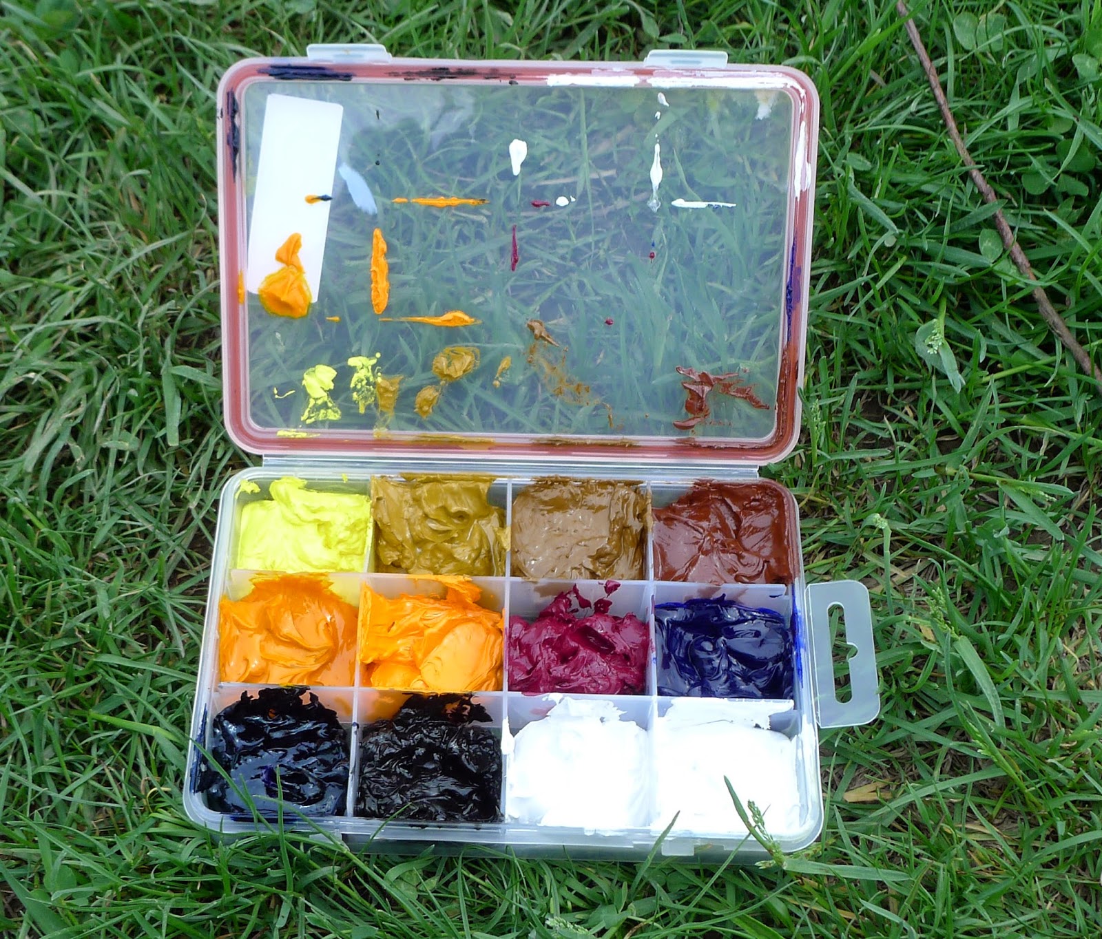
I use paired primaries as well, omitting the green but adding in some other earths. (Here are my supply lists for oils,  acrylics, and watercolors.)

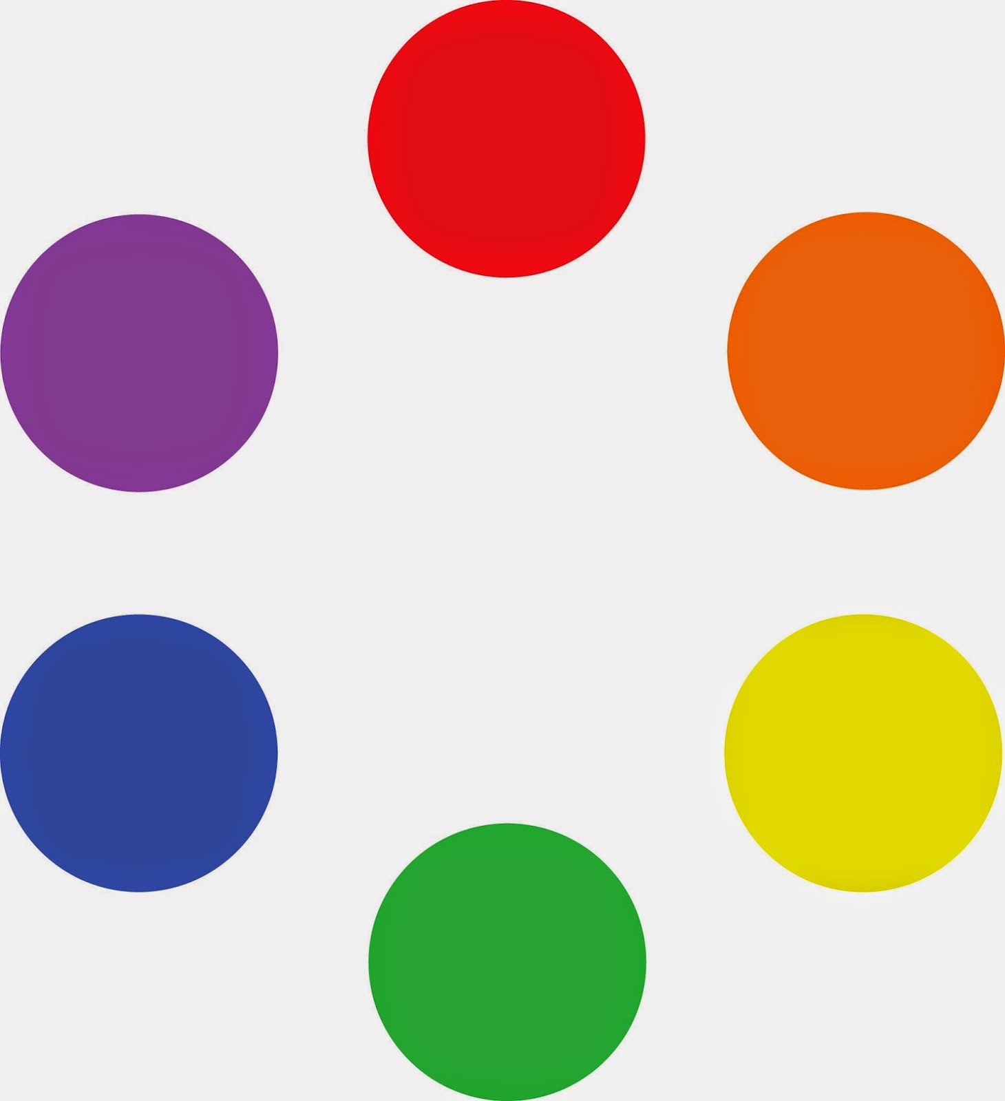
The distinction between warm and cool colors has been important in painting since the Impressionists. Warm colors are said to be hues from red through yellow and cool colors are said to be the hues from green through violet. Each hue around the color wheel also has a warm and a cool version.

There’s no factual hot or cold point because this is just a poetic description that works. Much of what we believe about the psychology of color is hocus-pocus, based on the teachings of 19th century cult leader Madame Blavatsky. However, it’s true that if the light is what we call “warm,” the shadows are what we call “cool,” and vice versa.

Paired primaries are simply warm and cool versions of each color.

When we say that lemon yellow is cooler than cadmium yellow deep, we mean that if you are trying to mix a greenish yellow, you’ll get a clearer shade with the lemon than you will with the cadmium yellow deep. The warm-cool language is just a convenient way of saying that.

Different pigments may look the same when squeezed out of the tube, but there the similarity ends. Pigments are impure, and you have to learn and work around those impurities.

To better understand color space, watch Gamblin’s excellent video on the subject, here.

Three blues that look similar out of the tube, but behave very differently. The ‘glaze’ on the left is the undertone. Courtesy Gamblin paints.

Mass tone is the color a pigment is straight out of the tube, dense and unmixed with another color. No real-world pigment, however, is as pure as a color on a video screen. While two pigments may look the same to the naked eye, their behavior when mixed can be radically different.

Undertone is the color revealed when a paint is spread thin enough that light bounces back up from the substrate. Some pigments are fairly consistent when moving from mass tone to undertone. Others have significant color shifts. Not understanding those undertones tones can lead to muddy mixes.

Ultramarine, Prussian and phthalo blue are colors that shift radically from mass tone to undertone. They’re all so dark out of the tube that their differences aren’t apparent to the naked eye. But dilute them, and you’ll find a wide range of blues.

Cadmium Red Hue is usually made with napthol red and a little white. They mix very differently, which is why the hue is a bad substitute for the real pigment. (In its own right, napthol is a fine red, however.) Courtesy Gamblin paints.

Undertones are why buying “hues” instead of pure pigments can be such bad value. Take, for example, cadmium red hue, which is usually a napthol red with a small amount of white added. Out of the tube, the two paints are indistinguishable, but they mix very differently.

To see a pigment’s mass tone, put a small dab of paint on a smooth white board or glass palette and draw it down with a knife, creating a uniform, solid stripe that completely obscures the painting surface.

To see the undertone, draw the sample down again so it is translucent. You should be able to see minute variations in the color, and in the covering power.

Monday Morning Art School: the color of Spring (part 1)

It’s time to assemble the proper pigments to paint beautiful greens this spring.
Fog over Whiteface Mountain, by Carol L. Douglas.
If March didn’t exactly come in like a lamb this year, it at least came in like a sheep. Don’t be fooled. Some of our most brutal winter storms have been known to happen in March. Walking to church, I pondered the depleted state of our woodpile. I wasn’t the only person thinking on these lines. My pal Naomi told me she was going home to move wood “while the ground is still frozen.”
That doesn’t mean that color is not peeping through here and there. The days are growing longer. We may see snowdrops and winter aconite appearing along granite foundations this week. Back in western New York, two witch hazels ought to be blooming, planted by me.
Spring arrives in a host of rich colors, and we’ll discuss that next week. But we must start with the predominant color, which is green. In my own yard, the green moss on the stone wall and my shed roof are the only visible cues that the season is changing. They tell me that growth and warmth are happening under the surface.
Beaver Dam on Quebec Brook, by Carol L. Douglas
Michael Wilcox published a famous watercolor pigment guide called Blue and Yellow Don’t Make Green. Most of what it tells you can now be found on the internet, but it’s where I first got the idea to add back the banned black.
His point was that there are many routes to the same destination, and that to really mix colors, you need to understand what pigments you’re using, not work from trade names for colors. Consider sap green, for example—a staple of many plein air painters’ toolkit. It’s really a convenience mix made of a phthalo blue and some kind of yellow. The same is true of Hooker’s Green.
Mixed greens, in oils.
The single-pigment (‘true’) greens available are chromium oxide green, viridian, and cobalt green. Chromium oxide green is a lovely, heavy, natural green. Unfortunately, it outweighs everything it’s mixed with. Viridian and cobalt green are lovely, but expensive. Beware viridian hue—it’s just another phthalo in disguise. Any other greens you buy in a tube are just variations of those pigments, or convenience mixes.
To make a whole range of beautiful greens, make sure you have the following pigments in your toolkit. Since they’re all-around useful colors, they make a lot more sense than carrying several greens.

  • Black
  • Ultramarine blue
  • Prussian (or phthalo) blue
  • Hansa (or Cadmium lemon) yellow light
  • Diarylide (“Indian”) yellow
  • Yellow ochre

The rookie error of landscape painting is to make all your greens using the same basic color, modulating lighter or darker for highlights and shadows. You’ll have much more life in your trees if you know all the different ways you can get to leafy green. 

Chart courtesy of Victoria Brzustowicz
In fact, the best way to navigate the colors of foliage is to avoid greens out of a tube altogether. A system of paired primaries gives you more options, avoiding the acidity of phthalo, the weight of chromium oxide green, or the soul-sucking darkness of sap green.
In my experience, bad paint mixing causes paintings to go wrong faster than anything else. Constantly over-daubing to modulate the paint color distorts the original drawing and makes a grey mush. If you’re confident of the color, you can apply it fast and accurately.
Green modulation swatches by student Jennifer Johnson.
I make my greens on a matrix, which I’ve shown you both mixed and on a chart. After mixing greens according to the chart, you can then experiment with modulating your resulting greens with tints (meaning a mix of white and a color). The specific tints are unimportant, but the most useful one for landscape is a mix of white, ultramarine and quinacridone violet, making a pale lavender. It is great for atmospheric perspective.
Note that blue/black pigments are much stronger than the yellows. You need about half the amount of blue or black as you do yellow.

Monday Morning Art School: why these specific paints?

All real-world limited palettes have gaps in them. Paired primaries work best.

The Athabasca River, by Carol L. Douglas
Savvy folk in the far north often reserve their peregrinations until March. That way, winter’s back is broken by the time they arrive back home. I knew that meant my current painting class would be scattering to the four winds soon. I had a neat little map of lessons laid out for them before they left town. Then my new grandson arrived early, and they didn’t get them in order. I’ll try to correct that here.
The three primary colors we learned in primary school are red, yellow and blue. Forget about any other color space you’ve learned about; they’re not relevant to painting.

Above are the three primary colors in subtractive color. This is the color space in which painters work, and it predates modern color theory. These three colors are the foundational building blocks on which all other colors are made.


Mention this to your nearest teenager, and he’s likely to pepper you with comments about other color systems. Ignore him. This is the color system in which pigments work.
Mix the primary colors in the first illustration with their neighbors and you end up with the secondary colors. A secondary color is always across the color wheel from a primary color.
Back in elementary school, we learned that if you mix a primary color with one adjacent to it, you get the secondary colors:
  • Green (blue and yellow)
  • Orange (yellow and red)
  • Purple (red and blue).

Importantly, a secondary color is always across the color wheel from a primary color. When you want to dull down (reduce the chroma) a color in a hurry, the fastest way to do it is to mix it with whatever’s sitting across the color wheel.
All blues are not created equal: the wavelengths of common painting blues, from Multispectral Imaging of Paintings in the Infrared to Detect and Map Blue Pigments, by John K. Delaney, Elizabeth Walmsley, Barbara H. Berrie, and Colin F. Fletcher, Scientific Examination of Art: Modern Techniques in Conservation and Analysis, the National Academies Press, 2005
All limited palettes are based on a simple red-blue-yellow color scheme. Unfortunately, in the real world, there are no pure paint pigments. They’re either warm or too cool, or they have overtones that muddy them up in certain mixes. This means that all real-world limited palettes have gaps in them, places you just can’t get to with the available pigments.
In practical terms, this can be useful to the beginning artist, as limited-palette paintings always feel integrated. That’s because they hit a limited range of notes. For the beginner, that avoids discordance, but it also means that he or she will never learn how to mix through the whole color universe.
The colors on my palette are a variation of primary colors. It’s the same principle, but there’s a warm and cool version of each of them.
This is why I use paired primaries on my palette. I have a warm and a cool blue, warm and cool red, and warm and cool yellow. This allows me to go almost anywhere on the color wheel without sacrificing chroma.
Why, then, do I have four more tones: yellow ochre, raw sienna and burnt sienna, and black? You don’t need these colors, actually; you can mix to get to any of these points. I use these iron-oxide pigments because they’re cheap and they make great modulators in places where white is inappropriate.
This allows you to go anywhere you want on the color wheel without sacrificing chroma (intensity).
All the colors on my color wheel are modern synthetic pigments (with the exception of the cadmium orange, which is a 19th century organic pigment). Conversely, the iron-oxide pigments are the most ancient pigments known to man. We know they’re not fugitive. Engraved ochre has been found that dates from around 75,000 years ago.

Monday Morning Art School: the need for green

A fast, easy route to mixing plausible summer greens.

Overlooking Lake Champlain, by Carol L. Douglas. Every green in this painting came from the matrix below. And, yes, there’s a scrape in it. It tumbled off a bluff.

The need for green came early to class this year, paradoxically because it’s been cold this spring. There’s little green peeping out in nature, even here on the coast.
Last week in class we worked on salvaging failed paintings. That meant pulling out work from summers past. Most of them included some greens, so we had to mix a green chart.
A basic mixing chart for greens, made by my friend and student Victoria Brzustowicz.
We are only weeks away from painting greens again, in all their light, airy delicacy. Even now, the osier and willows have red and yellow in their branches. By June, we will be wrapped in a blanket of immature foliage ranging in color from pale emerald to pink. It’s a good time to brush up on some color theory.
By August, the color will have settled into a deeper, more uniform tone. The only way to navigate this is to avoid greens out of a tube. A system of paired primaries gives you more options, avoiding the acidity of phthalo green, the weight of chromium oxide green, or the soul-sucking darkness of sap green.
If you look carefully at supposedly-uniform foliate, you will see patches where the color leans toward khaki, yellow, teal, violet and orange. They are what gives life to greens, just as accidental tones give life to human skin.
Michael Wilcox published a watercolor pigment guide called Blue and Yellow Don’t Make Green. Of course they do, but his point was that there are many routes to the same destination. One of the most useful landscape greens is black and cadmium lemon or Hansa yellow. Of all the greens I mix, this and ultramarine with yellow ochre are the two I use the most.
The above chart, mixed in oils. It works just as well in water-based media.

In my experience, bad paint mixing causes paintings to go wrong faster than anything else. Constantly over-daubing to modulate the paint color distorts the original drawing and makes a grey mush. If you’re confident of the color, you can apply it fast and accurately.

Above is the matrix of greens I’ve used for almost twenty years. The range of results is infinite. It depends on the proportions you choose and the brand of paint you use. However, blue/black pigments are always much stronger than their yellow mates. In any mixture, you need about half the amount of blue or black as you do yellow. This has nothing to do with color theory. It’s because darker pigments have more staining power than do lighter pigments.
Victoria Brzustowicz made this color chart based on my workshop palette. Here is a printable PDF.I crossed out the red on the chart because, while I do use it in the studio, in most field painting it’s unnecessary.
Once you’ve finished mixing that matrix, it’s time to tie it to the bigger palette. I encourage students to arrange their paints as above because:
  • It’s efficient;
  • It allows you to mix without thinking;
  • It encourages you to use the full color range in every painting;
  • It prevents the beginner’s error of modulating with white or black;

You can modulate your greens using tints of your other colors. For atmospheric greens, modulate with blues and violets. For warm, lighter greens, modulate with warmer tones.
Mount Hope Cemetery in the Spring, by Carol L. Douglas
Above is a photograph I took several summers ago. Your mission is to use the green chart I’ve made and mix tones similar to the different greens in the photo. If you get the mixing right, painting this scene will be a snap.

Equipment troubles

It’s time to make some hard choices about my two wooden easels.
The last cutting, v. 2, by Carol L. Douglas. Watercolor, same subject as yesterday, but turned the other way. This is one of those times where a square canvas would be appropriate.

 On Wednesday, I realized I’d lost my watercolor palette on Clary Hill. The palette—$14.79 at Jerry’s—is no big deal. It was, however, fully loaded with paint. That’s an expensive nick in the wallet.

I use an old Mabef tripod swing easel for watercolor. I’ve had it forever. It has been replaced by a larger version in most catalogues, but this old friend has been a reliable, versatile workmate for several decades. A few years ago, the head cracked on one side. I compressed and glued it so it worked again. The thumbscrew no longer tightens enough to hold the arm perfectly stable, so I prop it up with my knee when painting. For big boards, I’ve been taping the support to the easel’s head rather than trying to hold it mechanically. I seem to end up using this easel in preference to newer, snazzier ones.
On Tuesday in the dripping rain, that original crack opened back up again. I duct-taped it tightly and hoped for the best. Yesterday, the other side of the head cracked. Again, I taped it together. However, with no tension in the head, the arm is free to bounce around willy-nilly on its pivot. I’m afraid my old friend may be headed for the woodstove.
With both sides of the head cracked, there is nothing to keep tension on the pivot head, and the arm can swing willy-nilly.
There are many reasons to love wooden easels—they’re relatively cheap, they’re stable in high winds, and, properly cared for, they can last for years. However, they have two shortcomings. The first is that wood is heavy. Few modern-day plein air painters have donkeys or servants to carry our equipment up steep hillsides. When I was forty, this wasn’t a big issue. As I approach sixty, it has become a limiting factor. An aluminum pochade box and a lightweight tripod weigh a fraction of what a decent wood easel does.
Wood is hygroscopic. That means the moisture content changes depending on the relative humidity. That’s the killer for all unfinished wood used outdoors, and easels are no exception. My Gloucester easel—also old, purchased used many years ago—requires a rock to hammer the pins into place, because they’ve swollen over time.
Painting earlier this year with a Gloucester easel. It’s the only easel tough enough for on-shore winds. Photo courtesy of Karen Lybrand.
That’s an easel with an interesting history. It is a traditional European design that was brought to Gloucester, MA, at the turn of the last century by painter Oscar Anderson. He made and sold them to fellow artists; old ones bear his name-plate.  The Anderson easel became known generically as a “Gloucester easel.” Today there are two versions available—a beautifully milled, expensive one called the Take-It Easel, and a mass-produced one called the Beauport Easel. They work exactly the same, although I imagine the better-made one will last longer.
It’s a very stable design, and it has the great advantage of allowing work to tilt forward toward a sitting painter. Still, I don’t like to carry it any farther than I can trundle it in a wagon. Not only is it big and cumbersome, it is held in the folded position by only a canvas strap. (Mine rotted away years ago.) And it’s useless for watercolor, because the head doesn’t pivot.
Meanwhile, the unsettled Atlantic is giving us some very interesting sunrises. This was yesterday’s; this morning we were socked in with fog.
I have a spare pivot-head easel in my studio in Rockport, and I’ll collect it on Saturday. It’s a Guerilla painter head that I adapted to hold a larger board. With its tripod, it weighs a ton, but that won’t matter for this residency. After that, I’ll take apart both my wooden easels and make some hard choices. Can they be rehabbed, or must they be replaced?

Some basic color theory

Tilt-a-Whirl, 12X9, Carol L. Douglas. This was a plein air painting. Really.

Yesterday I showed you a PDF of a palette chart I like my students to follow. Today I’m going to talk about the basic color theory underlying it.

The three primary colors we learned in primary school are red, yellow and blue. Forget about any other color space you’ve learned about; they’re not relevant to painting.

Above are the three primary colors in subtractive color. This is the color space in which painters work. These three colors are the foundational building blocks on which all other colors are made.

Mix the primary colors in the first illustration with their neighbors and you end up with the secondary colors. A secondary color is always across the color wheel from a primary color.
If you mix the primary colors with those adjacent to them, you get the secondary colors: green (blue and yellow), orange (yellow and red)and purple (red and blue). A secondary color is always across the color wheel from a primary color. If you want to neutralize a color in a hurry, a fast way to do it is to mix it with whatever’s across the color wheel.

This is the theory on which all limited palettes are based. Unfortunately, there are no pure paint pigments. They’re either too warm or too cool, or they have overtones that muddy them up in certain mixes. So all real-world limited palettes have holes in them, places you just can’t get to with the available pigments.
This is why I use paired primaries on my palette. I have a warm and cool blue, warm and cool red, and warm and cool yellow. This allows me to go almost anywhere on the color wheel without sacrificing chroma.

The colors on my palette are a riff on the primary colors. It’s the same principle, but there’s a warm and cool version of each of them.
Why, then, do I have four more tones: yellow ochre, raw sienna and burnt sienna, and black? These are all iron-oxide pigments. They’re cheap and they make great modulators in places where white is inappropriate.

This allows you to go anywhere you want on the color wheel without sacrificing chroma (intensity).
All the colors on my color wheel are modern synthetic pigments (with the exception of the cadmium orange, which is a 19th century organic pigment). The iron-oxide pigments are the most ancient known to man. For some reason, using the modern pigments to create hyper-saturated colors and using the ancient pigments to modulate them works.

Let me know if you’re interested in painting with me on the Schoodic Peninsula in beautiful Acadia National Park in August 2015. Click here for more information on my Maine workshops! Download a brochure here.

How to mix any color

Plastic wrap, by Carol L. Douglas. Red—although a primary color—is largely superfluous on the palette, unless you’re using it to modulate greens. You can get to almost every naturally-occurring red with quinacridone magenta and orange.
The last thing I want is to create a school of mini-me painters with a slavish fidelity to my style. But there are ways to make painting easier, and people wouldn’t take my classes and workshops if they didn’t want to learn that.
Victoria Brzustowicz made this color chart based on my workshop palette. Here is a printable PDF.I crossed out the red on the chart because in most cases, it’s unnecessary.

On the other hand, I’m emphatic about how the beginner’s palette is set up. One of my students made the nifty little paint chart above and gave me permission to share it.
Why do I ask my painters to set up like this?
  • It’s efficient;
  • It allows you to mix without thinking;
  • It prevents the beginner’s error of modulating with white or black;
  • It teaches how to mix greens.

The color tints are there as a substitute for straight-up white. If the light is cool use a cool tint; if the light is warm, use a warm tint. (I make an added puddle of lavender to modulate my greens; often that is the most appropriate cool modulator for our northern forest of mixed greens.)
I crossed out the red on the chart because in most cases, it’s unnecessary.
Admittedly, it’s a bit scruffy, but I’ve got all my landscape greens and all my figure skin hues built on the same system.
Is this the only palette organization that works? Of course not! I recently had a funny conversation with a fellow teacher who swears by phthalo green, a paint that I think should be banned by international convention. We each have our rationale, but the pigments we each use are part of our own coherent systems, not purchased higgledy–piggledy. In time, you will branch out in your paint buying, but it makes sense to start with a proven system.
Let me know if you’re interested in painting with me on the Schoodic Peninsula in beautiful Acadia National Park in August 2015. Click here for more information on my Maine workshops! Download a brochure here.

Choosing your paints

My own palette contains no greens. I mix them.
There are millions of possible palette combinations out there, and there is no one ‘correct’ system. My goals in choosing pigments are:
¡          Lightfastness
¡          Transparency
¡          Single pigment
¡          Position on the color wheel
¡          Environmental friendliness
Understanding the difference between pigments and colors is essential in buying the right paint. Almost all paints sold in the US carry a Pigment CI name in tiny letters somewhere on the label. Learn to buy paint from this, rather than the poetic color name under which the paint is marketed.
Top row: hansa yellow, yellow ochre, raw sienna, burnt sienna. Second row: Indian yellow, cadmium orange, quinacridone violet, ultramarine blue. Bottom row: Prussian blue, ivory black, titanium white. The carrier was Jamie Grossman’s idea and I’ve used it for several seasons instead of tubes.
The single-pigment paints are made with only one pigment. Thus, cobalt blue contains only the pigment PB28; Prussian Blue contains onlythe pigment PB27. Paint manufacturers often blend pigments to approximate discontinued historic colors (Naples yellow or Alizarin Crimson) or to sell cheaper ‘hues’ of pricier paints, like the cadmiums.
My own palette doesn’t usually contain a true red, but when I use one, it’s generally naphthol red, because I’m concerned about the consequences of cadmium manufacture in China. Sadly, I’ve not found a substitute for cadmium orange, which is one of the three solid opaque pigments I use (the others being titanium white and yellow ochre).
Long after my own palette was written in stone, I came across this in a Grumbacher book and realized what I’m doing is pairing primaries.
My palette is roughly based on the idea of paired primaries. This means I have two blues—a warm and a cool—two yellows—a warm and a cool—and two ‘reds’, which in this case are quinacridone violet and cadmium orange. I fill these out with a variety of ‘earth tones’ because these are inexpensive paints and save me a lot of mixing.

Let me know if you’re interested in painting with me on the Schoodic Peninsula in beautiful Acadia National Park in 2015 or Rochester at any time. Click here for more information on my Maine workshops! Download a brochure here.

My paint list

With the palette I outline below, you can get anywhere you need to go on the color wheel. 
I’ve been using RGH paints for several years. I like them because they’re relatively inexpensive, they have a high pigment load, and they don’t add driers. In addition, they’re made in a small workshop in Colonie, NY.
On Friday I stopped at RGH to talk to them about finalizing a paint list for my students.
Paints are often sold with poetic names like “Naples Yellow” that mean nothing. The real pigment by that name, antimony yellow, is toxic. Alizarin crimson and Indian yellow are both fugitive (meaning they fade). When people buy paints using those old romantic names, they are in fact buying a mixture of pigments that approximate the handling and color of the original pigments.
Colors like cerulean are very expensive, so manufacturers make mixes that approximate them, which are labeled as “hues”. But mixes of any kind give you less value and flexibility than buying the straight colors and learning to mix yourself.
Even when manufacturers use the same pigments there can be wide variations in color in the finished product, depending on the pigment load, how finely the pigment is ground, what oil is used for the binder, etc.
I carried my palette box into RGH’s shop and Roger and I spent an hour comparing pigments. This is the palette I am now recommending to all my students, or to anyone else who wants to paint like me:

Burnt sienna
Cadmium orange
Cadmium yellow light
Indian yellow transparent
Ivory black
Mars yellow deep
Prussian blue
Quinacridone magenta
Raw sienna
Titanium white
Ultramarine blue

For all colors except Titanium white, a 37 ml tube is sufficient. For Titanium white a 150 ml tube is necessary. Order them here.
I buy my paints in cans and put them in a plastic pill box but for most painters tubes are fine.
Note that this palette contains neither a red nor a green. I’ve concluded that neither is necessary on the everyday palette. If I were to add them, I’d add chromium oxide green (the color of summer foliage in the northeast) and naphthol red, which approximates cadmium red but doesn’t dry out as fast (or cost as much).
If you want to learn more about pigments, the best source of information is the Handprint website. Although designed for watercolor, its information is true across all media.

Sorry, folks. My workshop in Belfast, ME is sold out. Message me if you want a spot on my waitlist, or information about next year’s programs. Information is available here.

Hey, Carol, what am I supposed to buy for this workshop?

Years ago, I took a figure workshop from a well-known American figure painter. On receiving his supply list, I noted several pigments that are not normally on my palette. Two were transparent earth colors; one was Naples yellow; one was cadmium green. I duly bought them, took the workshop, and came home having never touched them. The transparent earths were occasionally useful for glazing, but that $20 tube of cadmium green sat in my cabinet until it thickened and died.
I never want to do that to anyone. (Not that I’m totally immune to it; my oldest students will remember my infatuation with Payne’s Grey back in the day.)
Here are my paint supply lists for both local plein air painting (in Rochester) and workshop painting in Maine this summer:
¡         Watercolor
¡         Pastels
¡         Oils
I expect that experienced painters already have a palette they like and tools they’re comfortable with. If you have questions about why I have something included, just ask; you may already have something that can substitute.
Nevertheless, there are certain paints I recommend at the expense of others. For example, it never makes sense to buy alizarin crimson. The real thing (PR83) is extremely fugitive,*
so many manufacturers have decided to make “hue” formulations that mimic it. Many of these are either also fugitive and or so high-stain that they tend to bleed up through drying paint. Yet alizarin crimson is a staple in the paintboxes of so-called traditionalists.
How much more sensible it is to buy straight up quinacridone magenta (PR122) and mix it to the color you want when you need it!
Another example is Naples yellow, which was originally made of yellow antimony (PY 41) and is one of the oldest of pigments. Unfortunately, it’s also extremely toxic. There are a million proximates on the market—so called “convenience mixes”—because that dense, chalky yellow is extremely useful in landscape painting. But why carry a convenience mix when you can make up something equally as useful from yellow ochre and white, which both have a million other uses on the palette? (Yes, I know some of you watercolorists take great pride in never using white, but when you use a Naples yellow you’re using white whether or not you admit it.)
On the other hand, there arepigments that make reasonable substitutions. For example, I want oil painters to have a high-stain greenish blue, but phthalo blue cyan (PB15:3) will just do as well as Prussian blue (PB 27) if that’s what you have.
Recently I wrote about hues and the Color Index system. Handprint has a more detailed explanation here. For the sake of efficient painting, I urge you to avoid hues and convenience mixes. Single pigment paints are most efficient in the field.
And if you haven’t signed up for my Rochester classes or Maine workshops, what on earth are you waiting for? August and September are sold out for my workshop at Lakewatch Manor in Rockland, ME… and the other sessions are selling fast.  Join us in June, July and October, but please hurry! Check here for more information.

*”Fugitive” just means the pigment fades over time, and real alizarin crimson—an extract of the madder plant—is among the most fugitive pigments of all.