
To understand refraction, just remember that hideous invention of the 1970s, the wet t-shirt contest.
 |
| The Logging Truck, 16X20, oil on linen, on exhibit this month at Camden Public Library. |
Opacity (or ‘hiding strength’, if you prefer) is a simple way of describing a paint’s refractive index. Opaque pigments refract, or bend, more light. Transparent pigments (which really ought to be called ‘translucent’) allow light to pass through to bounce off the substrate before it returns to you. Understanding the opacity or transparency of your paints gives you more control in color mixing and glazing. This is obviously important for watercolors, but it matters in oil paints and acrylics as well.
The hiding power of a paint is also dependent on the ability of a pigment to absorb light. That’s why black is opaque—it’s bouncing no light back at us. For most pigments, it’s a combination of these two properties—the ability to absorb and scatter light—that give us opacity.
 |
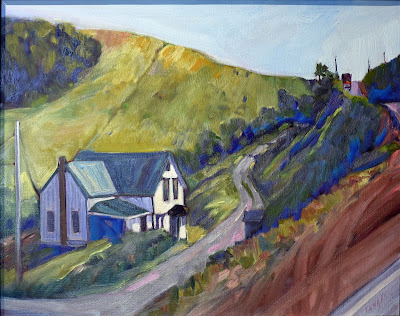
| Mountain Path (the Susurration of Dried Leaves), 11X14, on exhibit this month at Camden Public Library. |
Most 20th century pigments, like ultramarine, are milled very small. They have a particle size of less than 1 micrometer (something akin to white flour). Milled mineral pigments can have particle sizes of over 100 micrometers (more like sand). Moreover, the size of these mineral pigments isn’t consistent; they are, after all, basically ground-up rocks. Some of these mineral pigments can cause an effect called granulation, which watercolor painters prize.
In watercolor, smaller particle size gives you higher tinting strength, more transparency, and more staining, because the pigment particles more easily penetrate the paper. In oils and acrylics, smaller particle sizes make the pigments more transparent and saturated. In watercolors, there’s just less pigment covering the paper, which allows the paper to show through. Even opaque pigments look more transparent when diluted, although they do not usually excel at being treated like transparent pigments.
 |
| Spring Allee, 14X18, on exhibit this month at Camden Public Library. |
That brings us to the question of paint quality. Students are often instructed to ‘buy good paints’ without any idea why that is important. Pigment load is the primary consideration. Manufacturers make paint more cheaply by adding less of the good stuff. Compensating for inferior pigment load can build bad habits in the beginning painter. Buy a good student-grade paint from a good manufacturer, like Gamblin, Winsor & Newton, or Grumbacher.
The boiled linseed oil you buy at the hardware store is never appropriate for oil painting. It darkens and turns yellow with age.
A pigment’s natural refractiveness is only one consideration. The binder it’s suspended in also affects what’s refracted. You have only to think of that hideous invention of the 1970s, the wet t-shirt contest, to understand this. (And then ask yourself: what the #@$ were those young women thinking?) A t-shirt that appears opaque when dry will suddenly become transparent when wet. Air does not have the same refractive index as water. That’s why watercolor shifts in color as it dries.
And of course, acrylic and linseed oil binders also play a role in refraction. They never disappear on drying, so their refractive index, if close to that of the pigment, can render some paints permanently transparent.
 |
| Evening in the Garden, 9X12, is on exhibit this month at Camden Public Library. |
We know that, as linseed oil ages, the refractive index increases. This can cause oil paint to lose its hiding strength, which is why we see pentimentiappearing hundreds of years after masterworks were painted. To avoid this, painters need to learn to use sufficient quantities of paint. And, of course, acrylics, alkyds, and water-miscible oils have not been around long enough to have any track record on the subject.
Most paints fall somewhere in the middle of the continuum of opacity and transparency. The most opaque are titanium white, carbon black, raw sienna, burnt umber and yellow ochre. We typically use white to create opacity, but there are times when its lightening properties make that inappropriate. In those instances, one of the other opaque pigments is appropriate.
Zinc white, sold as China white to watercolor painters, is not as opaque as titanium white. (It’s also more brittle.) That’s why its application in oil painting is limited to glazing, but is also why it’s so useful in watercolor.
(I have two more openings in my Tuesday AM online class and one in my Monday night class, starting January 3-4. If you’re interested, the information is here.)