The photograph lies but my sketch yells the truth

Stop taking snapshots you’ll never use and start sketching instead.

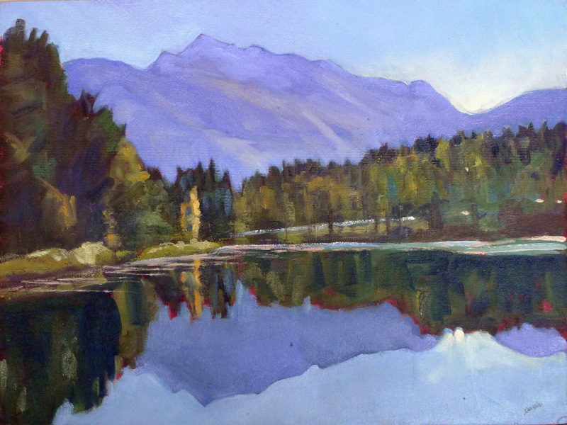
Collapsing shed, 9X12, oil on canvasboard, Carol L. Douglas, $696 unframed, 25% off this week.

“The photograph lies but my sketch yells the truth,” I told my student, and then gawped at what I’d just said. In our culture, we talk about ‘photographic proof’ as if it is an absolute. If you’re looking for evidence to nail a drug dealer or your philandering husband, photographs are great—although by now we all know they can be manipulated.

For guiding a painting, photos have their limits. They distort distance and spatial relationships. Modern point-and-shoot cameras (especially cell phones) blow contrast up, because that’s what buyers like. In exchange, subtle value shifts disappear.

“Great!” you answer. “You’re always telling me that paintings are an interplay of light and dark, warm and cool, so exaggerating the value structure will help, right?”

Unfortunately, the exaggeration of light and dark happens at the expense of warm and cool. On Wednesday, I painted a sketch of lupines in a field, above. There was a soft haze of mauve at the far edge of the field, created (I assume) by the immature seed heads of the grasses. In the foreground, rain-beaten weeds reflected a cool aquamarine. The light shining through the lupine leaves was yellow-green. I recorded those color shifts as accurately as I could.

My snapshot. Who would be interested in painting that wall of green?

Compare that to my snapshot of the scene. All those subtle shifts in color are washed away. We are left with a wall of green that would be horribly uninteresting in a painting. The subtle shifts in color that make lupines so beautiful are all washed out; in fact, they’re ugly in the photo. There’s nothing in this photo that would inspire me to paint.

Pincushion distortion from a telephoto lens.

Cameras are great at creating depth in the picture frame; excessively so, in fact. Cell phones are made with wide-angle lenses so we can all crowd into our selfies. Wide angle lenses expand space. Objects look further apart and more distant than normal. This exaggerates the size difference between the foreground and background, creating an illusion of greater depth than is really there.

That’s great for photos of the Rockies. It makes for laughable results when shooting pictures of the Bidens with the Carters. It also makes your photos of a barn in the middle-distance appear flat and uninteresting.

But let’s say you’re a keen photographer and you’ve invested in a top-end Nikon with interchangeable lenses (as I did before my Argentina trip). You can also create equally-bad distortion with a telephoto lens. They compress space, making objects appear larger and closer together than normal. That spatial compression creates great abstractions, but it also distorts perspective.

Prospettiva accidentale di una scala a tre rampe, eseguita con il metodo dei punti misuratori, 1995, Luciano Testoni, courtesy Wikipedia.

The farther away we are from an object, the flatter the perspective. In the beautiful drawn example above, the top line is the horizon. The closer we get to the it (our furthest point), the flatter the lines get. So, if you take a photo of a beautiful building on a far hill with your 300 mm telephoto lens, the perspective will be flattened out of all recognition.

Photos have their place, but for recording impressions, working from life is always better. That means sketching instead of taking snapshots. The human brain has a remarkable capacity to interpret and interpolate information. We can access that quickly, with nothing more complex than a pencil and paper. In a world filled with lies, you can usually trust your own eyes to tell you the truth.

Monday Morning Art School: taking a reference photo

On vacation? Here are some tips for taking reference photos you can work from later.

Winter Lambing, 48X36, oil on linen, Carol L. Douglas.

My workshop aboard American Eagle included a professional filmmaker who once studied with Ansel Adams. She was taking pictures with her iPhone, a tool Adams could never have dreamed of. She used it like a ‘real’ camera, cropping, composing and controlling exposure on the fly. She wasn’t waiting for a scene to pass by her; she was making something magic happen. “You don’t take a photograph, you make it,” Adams is famous for saying, and that’s exactly what she was doing.

A great photograph does not necessarily translate into a great painting; in fact, in my experience, it’s very rare that it does. The photographer seeks to move us emotionally; the artist wants a picture that preserves information. The same spatial relationships that make a great photograph can appear contrived in a painting. High contrast blows out the details that the painter needs.

And here is the reference photo. It was a snowdrift, nothing more.
Photograph what really interests you. It’s so easy to get sucked into what we ‘should’ take pictures of that we sometimes miss the essential object that we will need later. Go ahead and take fifty photos of the jack pine on the cove, and then put them in a folder labeled “jack pine cove.” On the day that you need a lonely tree for a composition, you’ll have it on hand. After all, film is cheap these days.
Don’t over-crop your photos. Often, I’ve found that the information I needed to finish something was just to the left of the edge of my frame. “You need a camera with a zoom,” one of my students told me. Actually, I don’t. Most modern digital cameras take such high-resolution photos that a small fraction of the frame can be blown up and used for painting.
All Flesh is as Grass, 48X36, oil on linen, Carol L. Douglas.
I have a Panasonic Lumix camera with a Leica lens. It wasn’t terribly expensive. It’s excellent in low-light situations, which means I can take even interior reference shots without a flash. That’s far more important than getting the details of the main topmast right from a quarter of a mile away. I can look those up; I can’t replace the details that get lost in bad light or by using a flash.
Of course, if I were a wildlife painter, I’d need a totally different outfit. Then a massive zoom lens would be important.
Bracket your exposures. This means you should take one photo at a higher value and one at a lower value than what your camera chooses automatically. Even if you have the most basic point-and-shoot camera, you can do this by hovering on lighter and darker parts of the picture. If you’re unsure about how this works, consult your instruction manual!
The above painting relied heavily on photos I took of an apple tree being cut down across the street from me. They were wonderful pie apples, too, but the new owners wanted more conventional landscaping.
Understand the limitations of reference photos. The camera is as subjective as the human eye. It misrepresents color relationships, depth-of-field, and size relationships. It obliterates subtle differences in color temperature. Reference photos are invaluable, but they should be the slave to your sketches and field notes, not the other way around. You’re under no obligation to represent every detail.
Which comes to my last and most important point: you shouldn’t be painting from other people’s photographs. This is more than just a question of legality (although that’s a real consideration). This is a question of ideas. A well-realized photograph is a complete artistic statement in itself. You have nothing to add. Anyone who has painted a commission from someone else’s snapshot knows just how much emotional information is missing when you weren’t there at the beginning.

The greatest maritime photographer

Wallace MacAskill’s images of the Age of Sail became popular as we careened closer to world war.

A Snug Harbor, Wallace MacAskill
My father was a WW2 Army-Air Force Photographer. He kept his service-issue Speed Graphic. I had plenty of time to mess with it as a kid. As a still camera, it was great, but capturing action was hard.
The only photo I’ve found of Wallace R. MacAskill at work shows him holding an even larger reflex camera. With it he took some of the most famous photos of the Age of Sail.
MacAskill was born in 1887 at St. Peters, Cape Breton, Nova Scotia. This is a watery place, perched on a narrow strip of land separating the Bras d’Orfrom the Atlantic. MacAskill bought his first small sailboat at age eleven. He taught himself to sail. A year later, a tourist sent him a camera. At that point, he was grounded in the two pursuits that would define his life.
MacAskill left for New York at seventeen to study photography. At that time, Alfred Stieglitz and Pictorialismdominated the New York photography scene. Pictorialism was an atmospheric, painterly style of photography. The artist strove to project emotional content with soft focus, duotone printing, and markings on the negative.
Gray Dawn (Schooner Bluenose), Wallace MacAskill, was influenced by Pictorialism.
By the time MacAskill graduated in 1907, he had thoroughly absorbed this aesthetic.
Returning to Nova Scotia, he opened a studio in his home town, then one in Glace Bay. In 1915, he moved to Halifax to work for WG MacLaughlan, the city’s official military photographer. From there he moved to a job as a printer in a commercial studio.
In 1920, he moved to the Commercial Photo Service, where he met his future wife, fellow photographer Elva Abriel.
Hand-colored prints of The Road Home were popular wedding gifts.
MacAskill was as avid a sailor as he was a photographer. He joined the Royal Nova Scotia Yacht Squadron in 1921. At the helm of his yacht Highlander (a WJ RouĂ© design), he won the Prince of Wales Cup from 1932-34 and again in 1938. He was Vice-Commodore of the Royal Nova Scotia Yacht Squadron in 1934-35 and Commodore in 1936.
In 1929, MacAskill opened a studio under his own name in Halifax. In 1937, he published his first book, Out of Halifax, which is sadly also now out of print. This established his reputation as an art photographer.
The Bluenose stamp of 1929.
It was MacAskill’s association with Bluenosefor which he is most remembered. This boat, designed by RouĂ© and captained by Angus Walters, was a Canadian icon in the 1930s. MacAskill’s images were used on Canada’s 50-cent stamp of 1929 and the Canadian dime of 1937.
By WW2, Halifax’s shipyards were no longer turning out wooden fishing boats. Instead they were building destroyers for the Royal Canadian Navy, and repairing the thousands of ships damaged in the Battle of the Atlantic. As the world careened into world war, images of quaint fishing villages and schooner races seemed safe and reassuring. MacAskill’s popularity rose with the demise of his subjects.
Bluenose Sailing Away, by Wallace MacAskill
MacAskill died at his home in Ferguson Cove, Nova Scotia, in 1956. His widow sold his negatives and business to a Halifax photographer. His images and film reels were eventually donated to the Public Archives of Nova Scotia. They have almost 5000 of them, and they are tightly controlled. You can view them here.

Why paint from life? For one thing, you can’t wander through a photograph

This is the site from which I did Friday’s painting of the Chugach Range. Which is more “realistic”? My painting, of course. The mountains in Anchorage are an everpresent force, not a nice little outline in the background.
“Why should a painter work from life rather than photos?” a reader asked me. “I can see that work painted from photos can lack a certain depth, but I don’t understand why.”
First, let me be clear: almost all painters work from photos at times, if only to clarify something they didn’t understand out in the field. On a morning like today, when Mother Nature is creating a ruckus, there’s no way I’m going to be anywhere but in my studio, with slippers on. And that means working from photos.
But that should be the lesser part of the experience, not the greater.
I mentioned last week that neither the human eye, nor the camera, nor my monitor are objectively correct about the color of distant mountains. If I had used photos to paint my trip across Canada, the mountains would have been large cutouts in blue-violet shapes because that’s what my camera recorded. In real life, they had dimension, shadows, and rocky ridges—all things that disappeared in the photographic record. A better camera would have given me a better image, but no camera can equal my own eyes, as old as they are.
Chugach range from Anchorage, oil on canvasboard, by Carol L. Douglas. The colors in my painting are warmer, and the mountain is more important and detailed.
“Digital adds lots of cyan to an image, usually about 30% in the lighter and mid-tones. And RGB color space doesn’t ‘see’ as many colors as a human’s eye/brain perceives,” responded Victoria Brzustowicz, who, in addition to being a painter is a graphic designer.
The human eye is a dynamic sensor. The resolution in the center of our eyes is far higher than at the edges, so we create images by shifting our focus very, very fast—so fast, in fact, that we’re not aware of it. We do a similar thing with darks and lights—although our eyes have less dynamic range than cameras, we just record the full range of impressions in our memories, stitching them seamlessly into an image we think we see.
Put away the camera and draw, draw, draw. You can draw anywhere, and in this climate, you can bring your own still life with you.
We don’t see in rectangles, either, but in a cone shape that somehow takes in lots of information at the periphery. That’s the big reason I don’t like my students using viewfinders in class. Viewfinders reduce what is possible to what can be contained inside a rectangle. Often, what’s actually there in life includes something amorphous and looming that gives character to the whole scene. Yes, it’s harder to capture that, but that’s the difference between an artist and a scribe.
Cameras also distort our sense of space. There is no one lens that exactly duplicates our range of vision. We humans see in neither telephoto nor wide-angle. The photographed view is, sadly, a choice somewhere between the two. That doesn’t match human perception.
My hiking poles, along with my tam (left) and mittens (above) went to church with me on Sunday. I’m listening to every word, but I’m also keeping my hands busy.

Years ago I took an anatomy-of-drawing class from the late Nicki Orbach. I had the shape of the shoulders wrong. “Get up and look at him from the other side,” she suggested. It was only then that I could see how I’d ignored the pull of the trapezius muscles, which control the neck but are mainly visible from the back. You can’t get up and wander through a photo to collect more information, and it’s something I do surprisingly often.

I’m my own restorer!

Mount Rundle, oil on canvas, by Carol L. Douglas

While the storm raged outside my studio yesterday, I retouched paintings from my Canada trip. I’m nearly done with this task.

I’m working on paintings whose emulsion was damaged by being stacked before they were completely dry. There isn’t much thinking involved, since I did all that on site. I just mix the proper color, fill in scratches and smears, and restore the original appearance.
A typical smear.
How did they get banged up in the first place? I had wet-storage for about a dozen paintings. Generally, after that, work is dry enough to be wrapped and binned with wax paper liners. It may have been the constant cold, but for some reason, they weren’t setting up very fast. I was constantly shuffling paintings to keep the wettest ones to the top.
No Northern Lights tonight, oil on canvasboard, by Carol L. Douglas
In addition, the roads were jaw-breakingly bad in many places. Part of our daily routine was to check the tailpipe and repack the back of the truck. All that bouncing meant that some things were inevitably going to be damaged.
Muncho Lake, oil on canvasboard, by Carol L. Douglas
In only one of these paintings did I make a material change. That was to add reflections on Muncho Lake. I knew they were there at the time, and they were important for the composition. However, Mary was sick, sleeping in a motel room at Toad River. I’d been gone all day and that was long enough.
Avalanche Country, oil on canvas by Carol L. Douglas
I don’t have much need for reference pictures at this stage. Since I didn’t take many, that’s a good thing. In comparing my trip photos with my paintings, I notice how blue all my photos look, and how vague the structures of the mountains are. It seems to me that my little pocket Panasonic camera perceives atmospheric haze more than my aging eyes do.
Chugach range from Anchorage, oil on canvasboard, by Carol L. Douglas
My eyes, my camera, and my monitor are all subjective observers, so none of them can be called objectively “true” at the expense of the others. It’s just another caution about painting from photographs, and another thing to ponder in regards to Truthiness.
I also started my second studio painting from the trip, of the Athabasca Glacier. That day, there was a ferocious, ripping wind. Even with an airtight hood, my ears rang. My easel spun helplessly on its tripod. There was no way to paint on site, so I settled for a hike and some photographs.
Underpainting of Athabasca Glacier, by Carol L. Douglas
This underpainting is not an abstraction, just a vast simplification. It reminds me a little of Rockwell Kent. Having no real desire to go down that road, I sigh and tell myself this is probably the high point of the painting.
Before anything more can happen in my studio, however, I have a driveway to shovel out. The morning dawned clear, still and cold, as if denying that it had ever stormed yesterday. “Liar!” I shout up at the sky, but to no avail.
Shovel I must. I’m having lunch with a student visiting from Tennessee. Later, a friend from Alabama is stopping by to teach me how to make biscuits. Maine is an out-of-the-way place to be the Crossroads of America, but a lot of the time it feels that way.

Victorian Death Portraits

The art of living is more like wrestling than dancing. (Marcus Aurelius)
I’ve been reminded of that a lot this week as I watch a friend struggle with her husband’s end-stage cancer. It makes one keenly aware that life isn’t exactly a picnic.
There is a misunderstanding that Victorian parents were somehow distanced from their children because they lost so darn many of them. 19thcentury literature, with its recurrent cry of loss, tells us otherwise. It was a period of great innovation but death rates did not drop; in fact it was the Dark Ages of child mortality in the western world. Urbanization, industrialization, poverty, war and unsanitary obstetrical practices were ruthless killers of people of all ages, but especially children.
If you were wealthy, you could hire a sculptor to immortalize your late son in marble, as here, in the Blocher Memorial in Forest Lawn Cemetery in Buffalo.
Consumption, or tuberculosis, was the “family attendant” in all too many Victorian households:
I paid a sad call at the Worths where 2 children seem to be at the point of dying, the poor terrible little baby has constant fits & little Madge two years old, who has been ill 12 days with congestion of the lungs. This is the second time I’ve seen them in this illness
we went into next door where we saw poor little Miss Lee evidently very near the end, but sweet and affectionate as ever. (Louisa Baldwin’s diary, 26 April 1870)
If you were middle-class, your posthumous family portrait was done in daguerreotype.
The spread of the daguerreotype photographic process made portraiture more commonplace, but until late in the century most people had never been photographed. This was especially true of children. To the parent who had unsuccessfully nursed a beloved child through a cruel illness, the steady slow erasure of memory was the final blow.
These portraits were not ghoulish memento mori; they were keepsakes to remember specific people. The practice remained in vogue until Rochester’s own George Eastman standardized photography equipment and film, making picture-taking an everyday art form.
Early examples took advantage of the slow exposure of daguerreotypes (and the required stiffness of their posing) to make the subject look lifelike. The deceased was photographed in poses with living family members, braced on furniture, or with a favorite toy.

The family grouping with dead child would probably be the only photo of the kids together.
There was very little palliative care for the dying Victorian. Most people died in their homes. Yet the idea of assisted suicide or “death with dignity” would have been inconceivable to them. It is a thoroughly modern concept.
I have done one death portrait, of a newborn baby. I don’t have a photo of it since I delivered it hurriedly to the family, but it was (I think) one of the most important things I’ve ever painted. It is rare that artists have the chance to help with healing.

Message me if you want information about the coming year’s classes and workshops.

MacGyvered

One of Alexey Kljatov’s exquisite snowflake photos.
Albrecht Durer was renowned for his skill in painting detail. There’s a legend that he was once asked by the artist Giovanni Bellini for the brushes with which he painted hair. Durer handed Bellini an unremarkable brush. ‘I do not mean this, I mean the brushes you use to paint several hairs with one touch,’ Bellini answered. Durer proceeded to demonstrate that it was all in the technique, not the tool.
A still life by Alexey Kljatov. He moves a flashlight around and then meshes images in Photoshop to make this effect.
Macro photos of snowflakes popped up all over my newsfeed last month. These were shot by one Alexey Kljatov. Evidently, in Moscow when you decide to take up macro photography you don’t run down to 42ndStreet Photo and drop a grand or more on a new camera with interchangeable lenses. You buy a used Russian-made lens from an old film camera (currently available on ebay for about $25) and tape it to your decidedly down-range Canon Powershot, using a chunk of wood as a stabilizer and a black garbage bag to keep out light.
That’s an old Russian-made SLR lens taped to an ‘extension bellows’ taped to a Canon Powershot, all stabilized with a piece of wood.
Kljatov’s snowflakes are detailed, luminous, and, most of all, fascinating. A similar hack he did to take telescopic shots of the moon rendered weirdly wavery but inviting images of our planet’s closet friend. When he’s not outside freezing, Kljatov does a series of layered still lifes using a handheld flashlight and lots of hours on his computer.
The moon, shot by Alexey Kljatov. In this instance, he used rubber bands to affix a telephoto lens to his Canon Powershot.
Kljatov’s camera is a 2007-vintage, mid-range Canon Powershot. In fat, sassy America, those cameras (if they’re still around) are used for nothing more than shooting snapshots of the passing scene.
Every once in a while I stop at my local art store to ponder the locked case of $250 watercolor brushes by the counter. Is it really necessary to spend so much money in pursuit of creativity? Or is creativity to be found in the exact opposite of such luxury?

Let me know if you’re interested in painting with me in Maine in 2014 or Rochester at any time. Click here for more information on my Maine workshops!

Giving it away for free—the journalism question

Low Bridge (Erie Canal), oil on canvas, by Carol L. Douglas. Go ahead, copy it, print it, and hang it on your wall. Satisfying? I doubt it. But you can contact me and buy the original, and I guarantee you it will bring you joy.
No discipline has suffered more from the internet than journalism. Its unemployment rate is higher than that of art historians, even though it was once the “something practical” that artists were told they should major in.
I worked as a stringer for a local paper in the late ‘80s. I made fifteen bucks a story back then, for which I sat through interminable board meetings. Said paper doesn’t even hire stringers any more. Evidently the water-and-sewer-line stories now gather themselves, and democracy in its most immediate form operates sub rosa.
“How do you publish photos on the internet so you don’t lose your copyright?” I was asked recently. (The writer was concerned about Facebook.) The short answer is that we give Facebook a non-exclusive, transferable, royalty-free, worldwide license to use any content we post. However, we don’t negate our ownership; that’s protected by law.
The same scene in a photo, more or less. Do whatever you want with it; I don’t care. Photos are a dime a dozen on the internet.
Having said that, our copyright is probably worthless, because photography itself is devalued. Today’s point-and-shoot cameras take better pictures than most trained photographers could back in the age of film. Unless you’re shooting events for a fee, are particularly gifted, or got extremely lucky and caught the Duchess of Cambridge nursing Prince George in the buff, you may as well set your privacy controls to zip and let ‘er rip. It’s difficult to protect photos on the internet, and many news sources have given up trying.
Which brings me to a curious anomaly about the internet: it’s better for painters than for photographers. No screenshot of one of my paintings will ever compare to the original. However, the character of a good painting is implied well enough in a photo that potential buyers can see what they’re getting. That means that the same qualities that make the internet so good for ripping off people’s photos make it a great platform for promoting paintings.
Oddly, one sees a similar thing in the writing disciplines as well. I can hack almost any news source, but if I want to read a novel, I go through the normal licensing channels to download it to my Kindle or—gasp—read a book printed on paper. Novelists can and do use the internet to promote their works, and we consumers willingly pay them for their intellectual property. Imagine that.

Let me know if you’re interested in painting with me in Maine in 2014 or Rochester at any time. Click here for more information on my Maine workshops!

Paint By Numbers

Cigarette Butts, 2013. Depicts 139,000 cigarette butts, equal to the number of cigarettes that are smoked and discarded every 15 seconds in the US. 
Running the Numbers is a series of digital montages by artist Chris Jordan that looks at American culture in terms of raw numbers. Each image portrays a specific quantity of something across a finite length of time: e.g. the number of gallons of gasoline burned across the US each minute.
“My hope is that images representing these quantities might have a different effect than the raw numbers alone…” he wrote. “Statistics can feel abstract and anesthetizing, making it difficult to connect with and make meaning of 3.6 million SUV sales in one year, for example, or 2.3 million Americans in prison, or 32,000 breast augmentation surgeries in the U.S. every month.”
Three Second Meditation, 2011. Depicts 9,960 mail order catalogs, equal to the average number of pieces of junk mail that are printed, shipped, delivered, and disposed of in the US every three seconds (and which none of us ever look at).
One more workshop left this year, and it starts on Sunday! Join me or let me know if you’re interested in painting with me in 2014. Click here for more information on my Maine workshops!

Images of Old Maine

The image on the left was shot with a Canon SD850 IS and printed on a plastic banner in 2008. It’s about 20X24. The image on the right was shot with a 2.25×2.25 format Ciro-Flex in 1981 and printed a few years after that. Both are fading, but the image on the left has spent considerably more time in the light than the one on the right, which has been stored in a flat file. On the other hand, that photo is still holding up a lot better than I am. (Yep, that’s me and my trusty dog.)

The truth is, I lied: I can’t show you any images of Old Maine. They’re locked up in a medium I can’t easily access: Kodachrome slides. In fact, my entire life prior to 2001 (when I purchased my first digital camera) is more or less stacked in a cabinet in the living room. Yes, I can show them to my children by fishing the carousel projector out of the garage and pointing it at the kitchen wall, but they lose a lot in translation. Kodachrome was the gold standard for transparency film, but unless you have a modern-day Magic Lantern, a lot of that is lost.
Of course, our slides are stored in a dry, dark, temperature-controlled environment, in which Kodachrome is remarkably stable. Future archaeologists are free to reclaim them, if they get there before someone dumps them.
My photographic lock-box, a/k/a slide carousels.
My father took tens of thousands of photographs, starting with photos of his mother in their cold-water flat in depression-era Buffalo. He was a professional photographer during and after WWII. His plates languished in his darkroom until they were tossed out earlier this year. There went a tremendous bit of history and art, lost forever.
(Ironically, it was his paintings that have survived. It’s unequivocally true that painting is an obsolete medium, largely supplanted in our day-to-day existence by photography and to a lesser degree graphic design. But that actually elevates its importance. The same people who blithely toss out photo albums of Grandma’s wedding wouldn’t dare to dispose of a painting of Grandma, for example.)
My first digital camera—a Minolta Dimage 7—did not take particularly good pictures compared to the Canon EOS film camera and lenses I was abandoning. However, the marginal cost of gazillions of pictures was exactly nil, and the images were tremendously easy to store compared to their film predecessors.
In 2001, we still thought of photos in terms of printing. Our hard drives were lock-boxes out of which we had to coax images via blurry printers with unstable inks. A mere decade later, our primary platform for showing pictures is the internet. Today, physical photos have become lock-boxes of a different kind.
And within a few short years, the quality of digital cameras and digital printing had improved tremendously. Above see two prints. The one on the left was taken with a $200 pocket camera (a Canon PowerShot) and printed on a plastic banner in 2008 (it has subsequently been hung outside in all kinds of weather). The image is about 20X24.
The one on the right is an older photo, taken in 1981 with a 2.25×2.25 format Ciro-Flex twin lens reflex with Kodacolor film. That camera was, comparatively, a much higher-market item than the Canon, selling for about $110 in 1948. Of course, one telling difference is that a 33-year-old camera wasn’t completely obsolete then. With film photography, as long as you could figure out the exposure and the lenses and back were intact, you were good to go, whereas I’ve replaced my digital cameras on average about every three years.
The photo of Antietam on the left is by me. The one on the right is by Matthew Brady, of course. It took a fraction of the time for me to find these two images on my server and on the internet than it took me to find the hard copies of the photos above.
Last summer I spent a few hours at Antietam. I am familiar with this photoby Matthew Brady; I of course took a corresponding photo of it myself. But how was I familiar with that photo? Not from the bound copy of “The Photographic History of the Civil War in Ten Volumes” that sat on a shelf in our home when I was growing up—it was too valuable for children to touch. I’d seen the pictures online, of course.
One of my favorite of my own works has been a day-to-day account of the replacement of my local grocery store with a new, contemporary version—a two-year project that isn’t yet finished. I publish it on Facebook, of course, because there it gets a larger viewership than it would in any gallery. (You can see it here.)
I’m mercifully free of the need to monetize my every transaction, which makes it possible for me to exploit and enjoy the open-source world of the internet. But truthfully I’m as baffled about where it’s going next as I was about where digital photography was leading us. I hope my art stands a better chance of surviving than did my father’s, but who knows?