Oldies but Goodies

Adjust the pigments for 21st century tastes and this is a perfect explanation of how paired primaries are actually more versatile than having every pigment on your palette. I’d substitute quinacridone violet for alizarin crimson, and Hansa yellow for zinc yellow.
This weekend, I was on the Schoodic Peninsula to test painting sites for my August workshop. When I got back to Waldoboro, a friend showed me two books she bought at the Damariscotta Public Library used book sale. They are Grumbacher art guides: one for drawing, and one for mixing paint. Each was worth the 25¢ she paid, but the color mixing guide is particularly good.
Best fun I’ve had for a quarter in forever.
In 1966, thalo green and alizarin crimson were the pigments de jour, but today we aren’t keen on either of them. A good art teacher would cross them out and replace them with their 21st century analogs: quinacridone violet for the crimson, and nothing for the thalo green (which has to be the pigment I hate most in this world). But why bother? Another two generations, and archivists will be sneering at the pigments we’re using today.
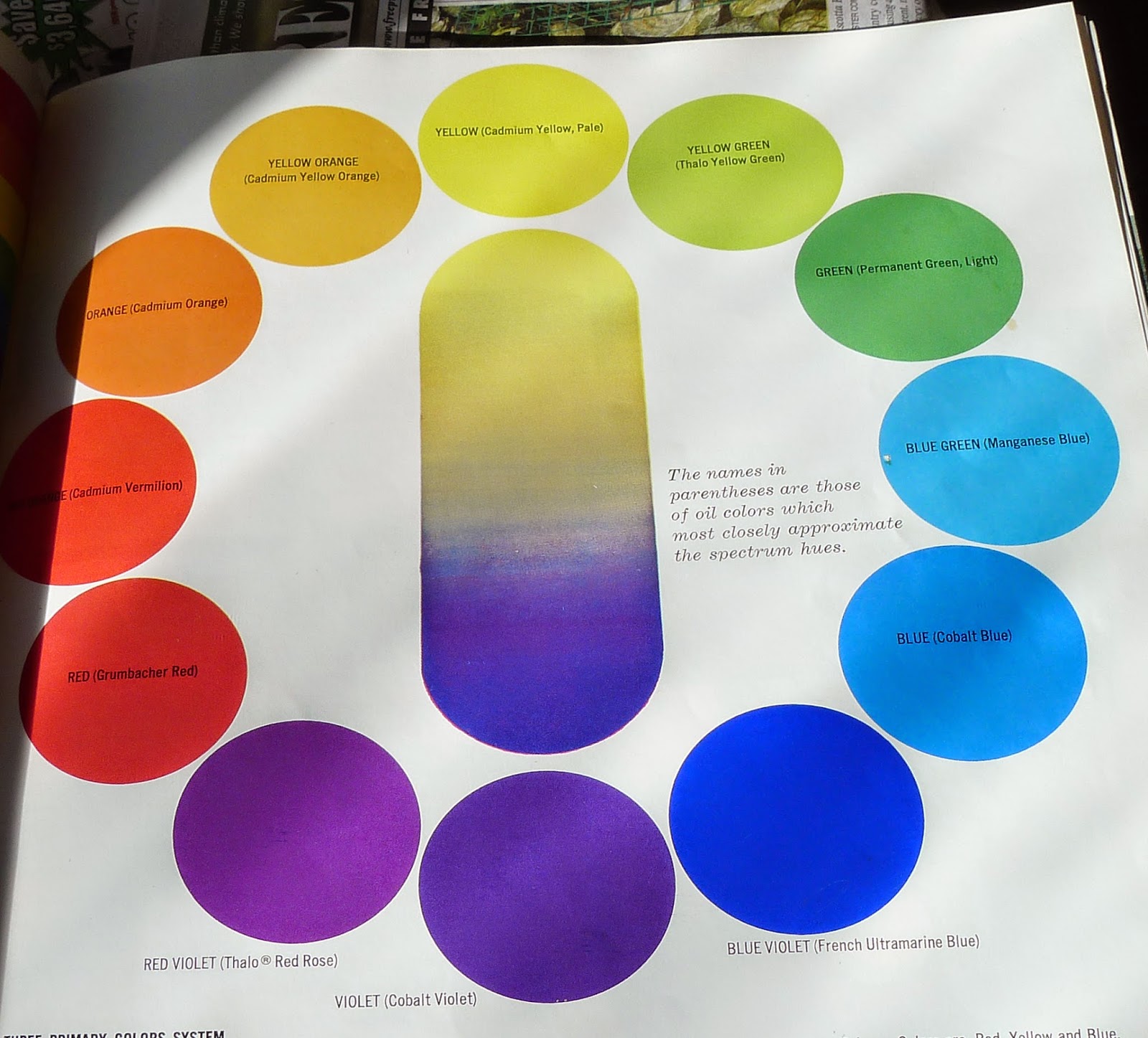
Ignore the names of the pigments on this chart, and notice instead that violet is the darkest pure pigment, and yellow the lightest.

The principles are what matter. Look at the illustration of primary pairings. It shows an essential rule of painting—there are no pure pigments, so you need a warm and cool version of each primary color to get the greatest gamut (or range of colors). In fact, if you set up your palette with paired primaries, you can dispense with the secondaries altogether. There is no real need for orange, purple or green when you have primaries that can mix to them. (I do keep cadmium orange on my palette and dispense with cadmium red, but that’s an idiosyncrasy that I’ve arrived at after years of painting. Consider it the exception that proves the rule.)

The second half of the book includes mixing examples from their suggested palettes. Ignore the specifics and notice how many neutrals they make with high-chroma pigments. Now go repeat this on your own.
P.S. Dressing in the dark undoes the artist’s advantage in matching his or her clothing. I have no idea if my long johns go with my turtleneck this morning.
Let me know if you’re interested in painting with me in Maine in 2015 or Rochester at any time. Click here for more information on my Maine workshops! Download a brochurehere.

The cadmium question

The only cadmium in here is cadmium orange. Peppers, 8X6, oils, by little ol’ me.
Yesterday, my favorite color scientist forwarded me this from Golden:
For environmental protection reasons, the European Community is currently considering a ban on cadmium pigments in artist paints. We would like to gather comments from artists concerning the relative importance of these colors in their work, in an effort to better understand the potential effect of this measure.
To complete a brief survey, click here: GOLDEN Cadmium Survey.
I use only one cadmium—orange, For yellows, I prefer Hansa (arylide). For reds, I use naphthol red and quinacridone violet.
That said, losing cadmium orange from my palette would hurt; it’s one of my workhorse pigments in both landscape and figure. I suspect there are substitutes out there, such as pyrrole orange, but I haven’t tried integrating them into my palette.
Mixing your paints and your wine is probably not the healthiest option.
Moreover, the cadmiums are great pigments. Pigments affect technique, and losing the cadmiums, with their great lightfastness and solidity, would be difficult for many painters. Before they toss them out willy-nilly, it’s worth asking what the environmental impact is, and whether their replacements are any safer.
The risk to artists is low, since cadmium poisoning primarily comes from inhalation or ingestion. Unless you’re working in encaustic, you’re unlikely to inhale paint fumes. Pastel artists should already know to use an air cleaner when working indoors. For all painters, gloves or silicone hand lotion is always advisable.
More difficult is that our use of cadmium pigments might endanger others. We all dispose of pigments into the waste stream when we clean brushes. (I just realized this morning that my long-term habit of solidifying waste pigments and putting them in the solid waste stream is counterproductive if my city burns trash for energy.) The stuff also has to be manufactured and milled before it’s turned into paints, and that may be happening in countries where environmental protections are nil.
My palette doesn’t even usually include a true red, for the same reason that it doesn’t include a true green.
Cadmium is present in cigarettes, and the smoking artist inhales dangerous levels of it every time he or she lights up. It is used in the manufacture of plastics, iron, steel, cement, non-ferrous metals and batteries. What percentage of the overall cadmium stream comes from artists, I don’t know, and it’s an important question. I suspect it’s pretty small, but whether that is a moral green light to keep using it, I can’t say.
As for whether the substitutes are safer or not, that’s also an open question. No known health risks are associated with the other red and yellow pigments I ‘m currently using, but the important caveat is that word, “known.” Recent research, for example, has linked azo pigments with basal cell carcinoma.


Let me know if you’re interested in painting with me in Maine in 2014 or Rochester at any time. My Belfast, ME, workshop is almost sold out. Click 
here for more information on my Maine workshops!