Monday Morning Art School: the color of earth

The earth pigments are our oldest colors, and they’ve served humanity well.

Dry Wash, oil on canvasboard, 12X16, $1159 unframed.

Years ago, I met an artist in Taos who told me that he never used the earths—siennas and umbers—in his paintings. I don’t remember his name, but I vividly remember his rationale. They were too close in color to the rocks of New Mexico. He did better to mix those warm shades.

That is very close to my own rationale for not having greens on my palette. The East is a predominantly-green environment. Using greens straight out of the tube is the best possible way to deaden your painting into a universal dull greenness without variety, sparkle or light.

Old Barnyard in New Mexico, oil on canvasboard, 12X16, $1159 unframed.

I’m teaching in New Mexico this week, so I have to adjust my own palette. My reliance on the earths has to ease up. However, my students are all from the south or east, meaning they’ll go back to a green landscape. I want them to take home the logic behind my palette, not an arbitrary rule.

The earth pigments are minerals that have been used in painting since prehistoric times. They’re primarily iron oxides and manganese oxides. We know them as the ochres, siennas and umbers. They’re extremely lightfast. In watercolor they granulate beautifully because of their large particle size. They’re relatively non-toxic* and they’re cheap. Those are all valuable properties to the painter, which is why they’re so widely used.

On the other hand, they look just like the earth because they’re made of dirt and rust (although we synthesize some of them today). They’re complex colors with lots of overtones. In mixtures they stubbornly retain traces of their own character. In a painting predominated by the natural reds and browns of the west, that can get pretty dull, pretty fast. If you want to know how a reliance on the earth pigments will turn out, see Rembrandt—great for Dutch interiors, not so good for American landscape.
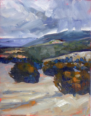
Downdraft snow, oil on canvasboard, 12X16, $1159 unframed.

The world of greens cannot be simulated by something taken from nature. The pigments that give us green in nature—chlorophylls—are not lightfast. Instead, painters rely on an inorganic compound, chromium oxide green, which we know as viridian or chrome green. Chromium oxide is synthetic, but it does appear in nature as a rare mineral. It is relatively low-stain and inexpensive. It too granulates, which makes it valuable to watercolorists.

Chromium oxide green is a good workhorse pigment, far preferable to the deadening sap green that so many painters love. Sap green started as an unstable extract of buckthorn berries. What we buy today is a convenience mix based on phthalo green. That’s also true of the mixture marketed as ‘viridian hue.’ Paints based on phthalocyanine dyes are very high-stain and have a different color profile than the pigments they’re mimicking. That’s not to disparage the phthalo blue and greens; in themselves they’re lightfast, cheap, and have transformed the modern world.

Spring thaw along the upper reaches of the Pecos River, oil on canvasboard, 12X16, $1159 unframed.

Hooker’s Green is another convenience hue. It’s named after an English botanical illustrator, William Hooker, who first put Prussian blue and gamboge together to make a clear, light green. There’s nothing wrong with that mixture—but you should be able to make it yourself, not buy it out of a tube.

That’s true across your palette. You’ll have more flexibility and less expense if you stop buying convenience mixes and ‘hues’.

*Don’t ever fall for the idea that if it’s natural, it’s non-toxic. Mother Nature has hidden a lot of dangerous minerals in this beautiful earth, including cinnabar, galena, lead, asbestos and more.
All-natural

In paint, the old ways can be the most dangerous.

Sketch for ‘The Hay Wain’ c.1820, oil on paper on panel, John Constable, courtesy the Yale Center for British Art

In most disciplines, ‘all-natural’ evokes the idea that something is made of pure, safe, wholesome materials, better for us and the environment than the products of a chemistry lab. That may be true of food, although in America, the “all-natural” label means little or nothing.

In paint, ‘all-natural’ can be a very bad label indeed. The pigments drawn directly from the earth are sometimes the most dangerous ones on the palette.

We know what John Constable’s palette contained, because the artist died unexpectedly in 1837, leaving behind four wooden palettes, a wooden sketching box with brushes, chalk holder, palette knife and pigments in glass phials. There was also a wooden box full of pigments, and a metal field-painting box.

Constable’s metal paint box c.1837, courtesy of the Tate

This box contains eleven paint bladders, a piece of white gypsum and a glass bottle of blue pigment. Constable could have purchased these paints pre-mixed, or mixed the pigments and poppy-seed oil binder himself. Since the paint tube hadn’t been invented yet, the mixed pigments were stored in pig’s bladders tied at the top with twine.

Constable was very forward-looking in terms of technique and materials. He popularized plein air painting, and brought respectability to landscape painting. In a milieu where smooth paint application was a primary virtue, he was flicking colors on with a palette knife.

In one respect, though, he was a traditionalist: he persisted in using ground lazurite instead of synthesized ultramarine. He believed that the natural pigment had a better color range than its synthetic analogue.

In Constable’s paint box were:

Chrome yellow
Yellow ochre
Vermillion
Red madder
Cobalt blue
Prussian blue
Emerald green
Raw sienna
Burnt sienna
Flake (lead) white
Lamp black

Sienna, ochre and umber are the oldest pigments known to mankind, going back to prehistory. All of them are based on iron oxide. They differ in color depending on how much manganese is present and how long they’ve been cooked. They are absolutely safe pigments.

Woman Embroidering, 1812, by Georg Friedrich Kersting, courtesy Kunsthalle Kiel. The 19th century craze for copper-arsenite greens was a health disaster among the fashionable.

But others on Constable’s palette are not so benign. Chrome yellow, along with Naples yellow and flake white, are banned from the modern paintbox because they’re lead-based. Vermillion is made from the mineral cinnabar, which contains toxic levels of mercury. All are absolutely natural—and absolutely deadly.

Constable’s cobalt blue was probably ground glass (smalt). In that form cobalt is benign, but the pigment itself is toxic. And emerald green is copper-acetoarsinite, which in addition to use as a pigment, made a good rodenticide and insecticide. That color, fashionable in the 19th century, was the root of countless deaths from arsenic poisoning, and is posited as the cause of Napoleon’s stomach cancer. Even the innocuous-sounding ‘lamp black’ wasn’t as innocent as its name implies. It was made of soot, which is an inhalation carcinogen.

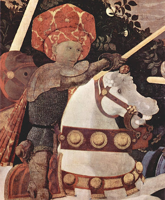
The Battle of San Romano, 1438, Paolo Uccello, courtesy National Gallery. In addition to being toxic, vermillion darkens over time. The horse’s bridle was originally bright red.

Plant and animal pigments are generally not toxic, but they’re not light-fast, either. Red madder was an extract of Rubia tinctorum, the same pigment source as natural alizarin crimson. The synthetic analogues are cheaper and more stable.

The carmine (crimson) of antiquity was extracted from an insect, Kermes vermilio, which lives on oak trees in the Mediterranean basin. Unfortunately, carmine and its close cousin cochineal fade rapidly on exposure to sunlight. That’s not a problem if you’re making food coloring, but it is a problem when you use it for paint.

Most modern pigments were first designed to be used in industrial settings, not for painting. Because of this, they must be light-fast and safe to use in large quantities. An example is phthalo blue, used widely in the printing industry. It’s cheap, plentiful, and not known to be toxic to man or animal. 

Monday Morning Art School: some basic color theory

Mixing paints is simple if you understand how pigments work.

Fallow field, 12X16, oil on canvasboard, available.

In theory, you can paint with just four pigments: red, blue, yellow and white. For beginning painters this is sometimes a good idea, because it’s the fastest way to learn color management. It simplifies the thought process so you have only one decision to make at a time, and it is easier to get a more unified color scheme.

But there is a limiting factor, and that’s the impurity of pigments. They all have overtones that muddy them up in certain mixes. That’s why your local paint dealer uses many, many more pigments than just red, blue, and yellow.

Claude Monet’s palette shifted over time, but included these paints:

  • Chrome yellow
  • Cadmium yellow
  • Viridian green
  • Emerald green
  • French ultramarine
  • Cobalt blue
  • Madder red
  • Vermilion (red)
  • Flake white
  • Ivory black (before 1886)

These are sets of paired pigments. That means he has a warm and a cool of each color, plus black and white. 

I use paired primaries as well, omitting the green but adding in some other earths. (Here are my supply lists for oils,  acrylics, and watercolors.)

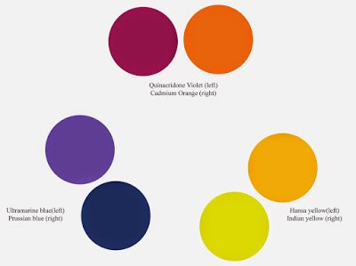
The distinction between warm and cool colors has been important in painting since the Impressionists. Warm colors are said to be hues from red through yellow and cool colors are said to be the hues from green through violet. Each hue around the color wheel also has a warm and a cool version.

There’s no factual hot or cold point because this is just a poetic description that works. Much of what we believe about the psychology of color is hocus-pocus, based on the teachings of 19th century cult leader Madame Blavatsky. However, it’s true that if the light is what we call “warm,” the shadows are what we call “cool,” and vice versa.

Paired primaries are simply warm and cool versions of each color.

When we say that lemon yellow is cooler than cadmium yellow deep, we mean that if you are trying to mix a greenish yellow, you’ll get a clearer shade with the lemon than you will with the cadmium yellow deep. The warm-cool language is just a convenient way of saying that.

Different pigments may look the same when squeezed out of the tube, but there the similarity ends. Pigments are impure, and you have to learn and work around those impurities.

To better understand color space, watch Gamblin’s excellent video on the subject, here.

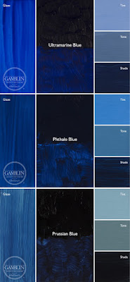
Three blues that look similar out of the tube, but behave very differently. The ‘glaze’ on the left is the undertone. Courtesy Gamblin paints.

Mass tone is the color a pigment is straight out of the tube, dense and unmixed with another color. No real-world pigment, however, is as pure as a color on a video screen. While two pigments may look the same to the naked eye, their behavior when mixed can be radically different.

Undertone is the color revealed when a paint is spread thin enough that light bounces back up from the substrate. Some pigments are fairly consistent when moving from mass tone to undertone. Others have significant color shifts. Not understanding those undertones tones can lead to muddy mixes.

Ultramarine, Prussian and phthalo blue are colors that shift radically from mass tone to undertone. They’re all so dark out of the tube that their differences aren’t apparent to the naked eye. But dilute them, and you’ll find a wide range of blues.

Cadmium Red Hue is usually made with napthol red and a little white. They mix very differently, which is why the hue is a bad substitute for the real pigment. (In its own right, napthol is a fine red, however.) Courtesy Gamblin paints.

Undertones are why buying “hues” instead of pure pigments can be such bad value. Take, for example, cadmium red hue, which is usually a napthol red with a small amount of white added. Out of the tube, the two paints are indistinguishable, but they mix very differently.

To see a pigment’s mass tone, put a small dab of paint on a smooth white board or glass palette and draw it down with a knife, creating a uniform, solid stripe that completely obscures the painting surface.

To see the undertone, draw the sample down again so it is translucent. You should be able to see minute variations in the color, and in the covering power.

Try not to bankrupt your students, fellow teachers

We should remember that pinch in the pocketbook when we draw up our supply lists.
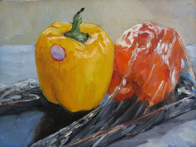
Plastic wrap, by Carol L. Douglas. I can paint without cadmium yellow or cadmium red, but not without cadmium orange.

During my absence last week, one of my students took a workshop with another painter, an excellent artist I quite admire. Studying with other teachers is good practice. It reinforces what is essential. And since every teacher has ideas that are simple preference, it helps put those in perspective, too.

Before she went, we spent time talking over the supply list. A student should go into a class with the materials the teacher has requested; otherwise she is hobbled from the beginning. On the other hand, I have had too much experience to not be skeptical of supply lists, which often include everything but the kitchen sink.
True to form, she came back with three or four unopened tubes of paint. I really wish teachers would stop doing that. It’s expensive and its irresponsible.
Teachers should strive to help students navigate through color space. This was a class exercise by Jennifer Johnson.
I moved a tube of Cadmium Green around for years. It currently lists at $24.95 for 37 ml. It’s a great color for the sallow greens in skin tones, but an effect that can easily be approximated with black and yellow. I was painfully poor the year I took that class, but we never touched the tube.
I’ve come to feel the same way about Cerulean Blue in oil painting. It’s a heavy, dense blue that sells for $34.95 for 37 ml. I learned to paint skies with it, and there is nothing more luscious. Still, skies can be painted quite adequately with Ultramarine or Prussian Blue, which cost exactly a third of what Cerulean costs. 
However, because it’s dense and opaque, Cerulean Blue occupies a niche in watercolor that can’t be easily filled by other pigments; hence it stays on my watercolor palette.
Cobalt violet is beautiful but hardly indispensable.
Cobalt Violet is another very pricey pigment that can be approximated at a fraction of the cost. Note that I said “approximated,” rather than mixed. You can’t mix a respectable Cerulean Blue or Cobalt Violet hue. (For an explanation of hues and other arcana of paint tubes, see here.) You can only learn ways to paint with less expensive pigments. When possible, that should be the starting point for the teacher. Let your students shop for their Cadillacs on their own.
Our responsibility is more than just financial. We have a duty to train up new artists in safe, environmentally-friendly techniques. All three of the colors I mentioned above are toxic inorganic pigments. They’re harmless as paint, unless you eat or bathe in the stuff. The problem lies in their manufacture (and, to a lesser extent, their disposal). There’s only one plant currently making cadmium pigments in the US, under our strict environmental and worker-safety controls. That means the pigments in your paint are probably coming from offshore, and we have no idea if the process is safe or not.
It’s nearly impossible to clear all the inorganic pigments off our paint-tray, but we can minimize their use. My palette still contains cadmium orange, I’m afraid, because I’ve never found an analog that answers.
Part of my goal is to teach people to mix colors rather than buy them.
Then there is the question of substrates. Most beginning students are fine with cheap boards, with the caveat that once they start selling work, they need to move up to an archival-quality board. The problem is in the backing, and that’s an issue for future conservators, not for painting class. When I was a student, we worked as often on gessoed paper as on canvases. There is absolutely no reason to make your students buy archival boards for value exercises.
The exception to this is in watercolor and pastel. In both cases, the substrate is as important as the pigment. But even here, one can buy decent-quality student products.
The flip side of this is the teacher who’s afraid to tell his or her students what to buy at all. I find it’s helpful to just list what you carry and work from there, being mindful that some things are just preference, not necessities. Be specific—if you want sanded pastel paper, specify that, for example. But don’t be so specific as to be restrictive. If a student is using a phthalo blue, there’s no point in having him replace it with Prussian blue. They function in the same niche.
Here are my supply lists:
I’m happy to share them with painting students and as a template for teachers to create their own supply lists, but please don’t copy them without credit!

I’ve got one more workshop available this summer. Join me for Sea and Sky at Schoodic, August 5-10. We’re strictly limited to twelve, but there are still seats open.

Mummy Brown and other figments about pigments

Sometimes gruesome, dangerous, or ridiculous, pigments have a colorful history.
The Last Sleep of Arthur in Avalon, 1881-1888, Edward Burne-Jones, courtesy Museum of Art in Ponce Puerto Rico. This was painted before Burne-Jones had his epiphany about Mummy Brown.

Mummy Brown was a rich brown pigment, located somewhere between the umbers and siennas. Manufactured through the 19th century, it was a mixture of pitch, myrrh, and the ground-up remains of mummies, either human or cat. (Cat mummies were also imported to England for use as fertilizer; they were raised by the ancient Egyptians by the tens of thousands, killed in kittenhood, mummified and sold to pious pilgrims. They were common as dirt.)

An Egyptian mummy dealer selling his wares, c. 1870. Courtesy Harvard Art Museums/Fogg Museum

Mummy Brown was a favorite color of the Pre-Raphaelites. Edward Burne-Jonesonce invited his pal Lawrence Alma-Tademaover for lunch. “Mr. Tadema startled us by saying he had lately been invited to go and see a mummy that was in his colourman’s workshop before it was ground down into paint. Edward scouted the idea of the pigment having anything to do with a mummy — said the name must be only borrowed to describe a particular shade of brown — but when assured that it was actually compounded of real mummy, he left us at once…” wrote Lady Bourne-Jones.

The story was taken up by her nephew, Rudyard Kipling. “He descended in broad daylight with a tube of ‘Mummy Brown’ in his hand, saying that he had discovered it was made of dead Pharaohs and we must bury it accordingly. So we all went out and helped – according to the rites of Mizraim and Memphis, I hope – and to this day I could drive a spade within a foot of where that tube lies.”
Wife of a Donator, c. 1450, Petrus Christus, courtesy National Gallery of Art, Washington. Her gown is Caput Mortuum.
Mummy Brown is not to be confused with Caput Mortuum, although the names were sometimes interchanged. Caput Mortuum was a purple form of hematite iron oxide, popular for painting the robes of saints. It was the by-product of sulfuric acid manufacture.
The pigment called Dragon’s Blood was supposedly a mix of dragon and elephant blood. â€œ[Elephants] have continual warre against Dragons, which desire their blood, because it is very cold: and therefore the Dragon lying awaite as the Elephant passeth by, windeth his taile, being of exceeding length, about the hinder legs of the Elephant, and when the Elephant waxeth faint, he falleth down on the serpent, being now full of blood, and with the poise of his body breaketh him: so that his owne blood with the blood of the Elephant runneth out of him mingled together, which being colde, is congealed into that substance which the Apothecaries call Sanguis Draconis, that is Dragons blood, otherwise called Cinnabaris.” (Alchemist Richard Eden)
The Burning of the Houses of Lords and Commons, 1834-35, JMW Turner, courtesy Philadelphia Museum of Art. Turner used Indian Yellow extensively.
Dragon’s Blood actually comes from the sap of Dracaena cinnabariand is extremely fugitive. Not that true cinnabar was anything to write home about, since it contains toxic levels of mercury. Despite that, it was once a popular cosmetic and art material.
Indian Yellow was said to be made by feeding mango leaves to malnourished cows and collecting their urine. Historian Victoria Finlay searched legal records, visited the town where the stuff was allegedly made, and interviewed elderly locals. She concluded that the story was probably a fable to gin up interest in the color.
All of this leads to the pigment Kidney Hematite. By now, you’re wincing. But Kidney Hematite is just an ore with a distinctive shape. Ground or sculpted, it’s perfectly benign.

It’s about time for you to consider your summer workshop plans. Join me on the American Eagle, at Acadia National Park, at Rye Art Center, or at Genesee Valley this summer.

Mixing complements and making grey

Some people say it doesn’t work. Is that true?

All flesh is as grass, by Carol L. Douglas. Since the Impressionists we have mixed our grays with complements.

Painters use mixes of complementary colors to make neutrals: red and green, blue and orange, or yellow and purple. The exact mixes have to be juggled around depending on the paint, but it’s an efficient system to get soft greys and browns. It’s centuries old and it endures because it’s a useful system.

Yesterday, a student flummoxed me by asking why it works. I could answer in general terms—interference—but I really didn’t know in any detail. I started to read about it and came up with a striking problem: many people don’t believe it actually does work.
From The Natural System of Colours, 1776, by Moses Harris. Courtesy Project Gutenberg. 
The traditional color wheel is a concept that we’ve been tinkering around with since Sir Isaac Newtonand his experiments with light in the 17th century. By the time the Impressionists started their world-changing experiments with light and color, the color wheel was settled in the format we currently use: a triad of so-called primary colors (red, blue and yellow) with secondary colors inserted between them.
A complementary color pair is made up of a primary color and the secondary color that sits across from it on the wheel. For example, yellow is a primary color, and purple is made by mixing red and blue. When yellow and purple paint are mixed, all three primary colors are present.
L’air du soir, c.1893, Henri-Edmond Cross, courtesy MusĂŠe d’Orsay. Pointillism works because the eye averages adjacent spots of color into mixes.
Paints are what we call subtractive color. That means they absorb light. What we see is what’s allowed to bounce back to our eyes. Neutrals happen when no particular color bouncing back to us is able to dominate; the three primary colors cancel each other out.
So why do some scientists and artists say this system doesn’t work? Mostly, it has to do with the impurity of pigment. Historically, all pigments were approximations of pure color, based on what technology could produce.
Our paints never sit exactly on the point of a primary or secondary color. Furthermore, there are a million sets of complements. For this reason, I devised a class exercise based on Stephen Quiller’s painter-specific color wheel, so that my students could find beautiful combinations based on the pigments they actually use. If you missed this lesson, I encourage you to try it now.
Fish Beach, by Carol L. Douglas.
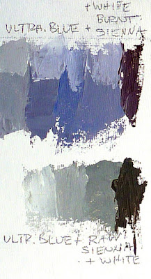
Traditional pigments also change with concentration. We’ve all experienced this: three different reds may look the same out of the tube but end up looking very different when diluted or mixed with white. These imperfections allow us to mix some odd combinations that shouldn’t be possible—ultramarine, which is a violet-blue, can still make a passable green. This is also why we can mix ultramarine and burnt sienna—both on the red side—and get wonderful greys. There are undertones to those pigments that gain prominence when we start manipulating them.
Twentieth century pigments were designed with industrial and commercial applications in mind. They don’t change color with concentration, so mixing historic and new pigments together sometimes yields surprising results.
It’s about time for you to consider your summer workshop plans. Join me on the American Eagle, at Acadia National Park, at Rye Art Center, or at Genesee Valley this summer.

Monday Morning Art School: mastering your color palette

Monday Morning Art School now has a Facebook page, a place for online students to post their homework and look at others’ projects. I’ll look in to see what you’re doing. Try to limit your posts to the class exercises, please.
Today’s project is designed to help you learn more about the colors you’ve chosen and to give you more confidence in mixing colors. You can do this in any medium: oils, acrylics, pastels, gouache, colored pencils, watercolor, or even a dime-store paint kit. The examples were done with a Winsor& Newton field kit by my student Sheryl in my Rockport, ME class.
My wheel, above, is an approximation. Every manufacturer formulates its colors differently. Still, I’ve tried to match a pigment name with each spot on the wheel. The biggest circles are what we call the primary colors, followed in size by the secondary colors, and then the tertiary colors.
The outside of the wheel represents the highest chroma (intensity) colors. The center of the wheel represents low-chroma neutrals. The circles in the middle are the common earth pigments.
Start by drawing two circles, one inside of the other, on a piece of paper or a primed white canvas. Then draw a triangle inside the circle to help position your colors.
We’re going to use paint straight out of the tube. The colors on the outside of the wheel are modern pigments. They’re the highest chroma. The earth tones are historic pigments and less intense. Black falls in the middle.
Use only the paints you carry in your paint kit. No painter has everything. One point of this exercise is to find the holes in your colorspace.
Sheryl’s palette, interpreted on the color wheel above. Note how lacking her palette is in cool tones.
Find the closest thing you have to true red, blue and yellow. Choose paints that don’t have overtones of other colors. You might not have a color that is a true primary. Don’t force another color into that spot. Sheryl’s kit didn’t have a clear blue. She put both her blue dots to the left of the primary blue square, because they were both a little on the violet side. Another common paint is cadmium yellow medium. It’s actually pretty orange, so it goes to the side of true yellow. Label your colors, if you know their names.
You will have some tubes in your paint kit that don’t belong on the outside of the color wheel at all. Besides the earth tones, tubes that contain more than one pigment are less intense than straight pigments. (Pigments are usually listed on the tube.) Approximate where they go. For example, Sheryl has sap green, which is mix. She put it slightly inside the pure-pigment wheel, because it’s on the dull side.
Check your color wheel to see where you have gaps. Sheryl’s paint wheel is strongly weighted toward the warm colors—reds and yellows—and short on the blues and violets.
Sheryl’s finished wheel, showing various mixes of pigments. Yours should look something like this.
Draw a dotted line from two pigments on the outside of your color wheel—say quinacridone rose to ultramarine blue. Then make a mixture of those two colors and put a circle of that paint between the two. Repeat this with different combinations until you get bored.
Note that the holes in Sheryl’s palette means she can’t hit a clear blue-green or a clear purple.

Pastel and pencil artists can fill in the missing points with colors they have in their boxes, or they can mix combinations.
You should notice three things:

  • Mixing across the color wheel gives you beautiful neutral tones. They are far more interesting than mixing black and white to get grey;
  • You can never mix a paint that’s more brilliant than the straight-from-the-tube paints you started with. If all your paints are on the dull side, your finished painting will be dull too.
  • What you learned about primary colors in elementary school is only partially true. I remember my disappointment while trying to mix purple as a kid; that was because the paints I had weren’t true blues or reds.

Note: These lessons are a learning experience for me as well as you. I’ve taught painting for many years, but teaching in print is a new experience for me. I’m still trying to figure it out, so your suggestions and input are appreciated. You can email me here.

A pigment that’s older than modern man himself

In life and in death, our ancestors covered themselves with iron oxide.
Image of a horse colored with yellow ochre from Lascaux cave, France, c 17,300 BC
“What is the oldest pigment?” a reader asked me this week. That’s one of the few questions that archeology can answer definitively.
It’s ochre, one of the iron-oxide pigments. These minerals are common and easy to manipulate. Primitive man needed only to find suitable rocks and scratch or grind them. Adding water, he had paint. Adding milk, he had paint with a protein binder.
Ochre’s history is far older than modern man. A quartzite hammerstone found near the Danube shows a 500,000-year-old partial handprint of ochre. The earliest known cache of milled ochre comes from a Homo erectus site that’s about 285,000 years old. By 250,000 years ago, Neanderthals were using ochre at the Maastricht BelvĂŠdère site in The Netherlands. By 40,000 years ago, ochre was being manufactured in an ongoing process in an Ethiopian cave. That workshop lasted 4500 years.
Image of a human hand created with red ochre in Pech Merle cave, France, c.  25,000 BC
All that makes the Upper Paleolithic cave art at Lascauxseem downright modern.
Sienna, umber and red oxide are other iron-oxide pigments from antiquity, but none are as venerable as ochre. In ancient practice, different hues might have come from different rocks, or they could have been ochre that was heated or treated to change its structure.
The easiest way to manipulate ochre was to toss it in the fire. Burned, it turns red. Evidence of this dates from 100,000 to 70,000 years ago in deposits in Blombos Cave in South Africa.
Ochre filled a large niche in the prehistoric world. In addition to its obvious uses as a paint, it was a medicine, cosmetic, tanning agent and mastic.
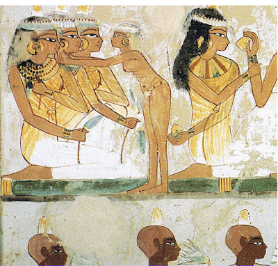
Paintings in the Tomb of Nakht in ancient Egypt, c. 15th century BC
“[It] is not unusual to find a layer of the cave floor impregnated with a purplish red to a depth of eight inches. The size of these ochre deposits raises a problem not yet solved. The colouring is so intense that practically all the loose ground seems to consist of ochre,” wrote archeologist André Leroi-Gourhan of prehistoric Europeans. “One can imagine that the Aurignacians regularly painted their bodies red, dyed their animal skins, coated their weapons, and sprinkled the ground of their dwellings, and that a paste of ochre was used for decorative purposes in every phase of their domestic life. We must assume no less, if we are to account for the veritable mines of ochre on which some of them lived.”
Red ochre is closely associated with prehistoric burial rites. The so-called Red Lady of Pavilandwas a male skeleton dyed with red ochre about 33,000 years ago. 
Remains of the Red Lady of Paviland, Wales, c. 35,000 BC
“I found the skeleton enveloped by a coating of a kind of ruddle … which stained the earth, and in some parts extended itself to the distance of about half an inch around the surface of the bones … Close to that part of the thigh bone where the pocket is usually worn surrounded also by ruddle [were] about two handfuls of the Nerita littoralis. At another part of the skeleton, viz in contact with the ribs [were] forty or fifty fragments of ivory rods [also] some small fragments of rings made of the same ivory and found with the rods … Both rods and rings, as well as the Nerite shells, were stained superficially with red, and lay in the same red substance that enveloped the bones,” wrote its discoverer, the Rev. William Buckland.
Some prehistoric graves used cinnabar in place of ochre. That would have been a costly trade item. Even in death, society has always been divided between the haves and have-nots. Ironically, what they had in this instance was toxic.

The problem with supply lists

I should KonMari my paint collection, not add to it. We go to workshops weighed down with too much stuff.

No, I don’t need any more watercolor pigments.
Many years ago, I took a workshop from a figure painter who specified cadmium green. I came home with an unopened tube and dropped it in a drawer. It’s still unopened.
I have great sympathy for students faced with a new supply list. In some instances, buying from them is redundant. For example, my list calls for Prussian blue, but if you already have phthalo blue, you’ve already got an excellent pigment for that color space.
It helps to understand the instructor’s reasoning. My list is based on paired primaries because I believe it allows the greatest range in color space. It occasionally changes as my painting technique evolves.  
Students usually show up with too much stuff because they don’t want to be caught without something they need. Most of what they carry, they never use. I’m feeling that urge to over-pack as I assemble the materials for Poppy Balser’s workshop in May.  Poppy, like me, is loath to send her students on spending sprees. However, it makes no sense to drive that distance and not be prepared.
And I don’t need a new mixing tray, either.
I trotted out my watercolor basket expecting to have to fill in color gaps. Actually, I should KonMarimy paints. What’s in the picture, above, is probably a quarter of the tubes in my basket. Does anyone really need five tubes of ‘opera pink’? More importantly, what is ‘opera pink,’ anyway?
Manufacturers love labeling convenience mixes with historic names. Consider Naples Yellow, used from the 18th to the 20th century. The real pigment is toxic lead antimonate. Modern paints labeled “Naples yellow” are made with a mix of modern pigments. You can make your own easily enough with white and yellow ochre.
That is the only name that really matters.
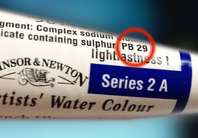
Pigments are listed on the tubes of all major paint makers in the form of Colour Index (CI) numbers. These are in tiny lettering on the side of most paint tubes. If the first letter is a “P,” that’s a pigment; if it’s an “N,” that’s a lake of a naturally-occurring substance like cochineal. The second letter tells you the general color family. The third tells you the actual pigment used.
A glance at my tube of ‘opera pink’ tells me it’s really PR122+BV10. The first is my old friend quinacridone magenta. Unfortunately, the second is a dye, rhodamine B, which bleeds and isn’t lightfast at all. I should pitch all five of those tubes.
My brushes, on the other hand, need help. New Yorkers will recognize some as being from the cheap bin at Pearl Paint.
If there is more than one CI number on the tube, you’re actually buying a hue or convenience mix. Many paint manufacturers sell hues of expensive pigments like the cadmiums and cerulean blue. They’re not consistent across brands, and they never have the handling characteristics of the more expensive paints they’re meant to imitate.
As with opera pink, even if the main pigment is lightfast, its partner may not be. Almost always, using single-pigment paint gives you the most flexibility in mixing.
There are many pigment guides on the web. Here is my favorite. Although it’s meant for watercolor, pigments are consistent across all media.

How to mix any color

Plastic wrap, by Carol L. Douglas. Red—although a primary color—is largely superfluous on the palette, unless you’re using it to modulate greens. You can get to almost every naturally-occurring red with quinacridone magenta and orange.
The last thing I want is to create a school of mini-me painters with a slavish fidelity to my style. But there are ways to make painting easier, and people wouldn’t take my classes and workshops if they didn’t want to learn that.
Victoria Brzustowicz made this color chart based on my workshop palette. Here is a printable PDF.I crossed out the red on the chart because in most cases, it’s unnecessary.

On the other hand, I’m emphatic about how the beginner’s palette is set up. One of my students made the nifty little paint chart above and gave me permission to share it.
Why do I ask my painters to set up like this?
  • It’s efficient;
  • It allows you to mix without thinking;
  • It prevents the beginner’s error of modulating with white or black;
  • It teaches how to mix greens.

The color tints are there as a substitute for straight-up white. If the light is cool use a cool tint; if the light is warm, use a warm tint. (I make an added puddle of lavender to modulate my greens; often that is the most appropriate cool modulator for our northern forest of mixed greens.)
I crossed out the red on the chart because in most cases, it’s unnecessary.
Admittedly, it’s a bit scruffy, but I’ve got all my landscape greens and all my figure skin hues built on the same system.
Is this the only palette organization that works? Of course not! I recently had a funny conversation with a fellow teacher who swears by phthalo green, a paint that I think should be banned by international convention. We each have our rationale, but the pigments we each use are part of our own coherent systems, not purchased higgledy–piggledy. In time, you will branch out in your paint buying, but it makes sense to start with a proven system.
Let me know if you’re interested in painting with me on the Schoodic Peninsula in beautiful Acadia National Park in August 2015. Click here for more information on my Maine workshops! Download a brochure here.