Friday flotsam and jetsam

Whatā€™s a studio visit all about? And how do you prep for it while prepping to go on the road?
Outrunning the Storm, 30X48, is finished and awaiting delivery to Camden Falls Gallery.

Bobbi Heath is co-hosting Leslie Saetaā€™s Artists Helping Artists this month. They discussed this blog yesterday in the segment called What We Can Learn From the Top Rated Artistā€™s Blogs.
Thank you! Artists Helping Artists is the top-rated art show on blogtalk radio.
Bobbi will be recording the next one during the middle of Castine Plein Air. That will be a tough balancing act, since sheā€™s also a participating artist.
My host for Castine texted me yesterday. Sheā€™s in New Jersey and wanted me to know that it was 95Ā° F. there and 59Ā° in Castine. Thatā€™s perfect painting weather.
We donā€™t have or need air conditioning here in coastal Maine. The air off the North Atlantic keeps us comfortable. The average high temperature here is 76Ā° in July and 75Ā° in August. Bear that in mind if youā€™re thinking about my workshop in August.
Iā€™m packing for next weekā€™s events. Yesterday, I got a text from another painter. ā€œIā€™m bringing 14 frames to Castine,ā€ she told me. ā€œI have four that are a different molding than the others. I want to try them out. And most of them are already wired so they aren’t extra work. And I have seven sizes, mostly in pairs. Am I nuts?ā€
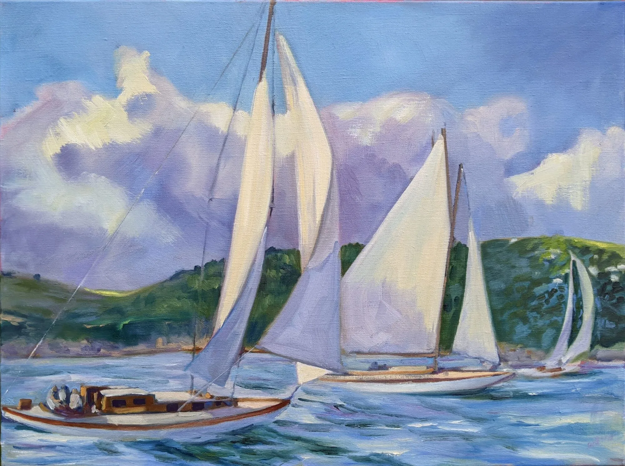
This is what’s on my easel. It’s based on a pre-dawn sail out of Camden last summer.
Thatā€™s a lot of frame for the six paintings sheā€™s limited to, but her car is big enough. I always carry a variety of frames, so I can choose finishes and sizes depending on what I end up finishing.
Iā€™m expecting a studio visit when I get home next weekend. Before I leave, my studio needs to be prepped. I keep regular open hours so itā€™s always presentable, but there are special considerations for a galleristā€™s visit.
Although my studio isnā€™t vast, it is first and foremost a workshop. What Iā€™m working on right now is part of my story. I donā€™t clear it away unless itā€™s unusually fragile.
There are many reasons for a gallerist or collector to visit us: to select work for a show, to see new work, or just to get to know us better. The same rules of hospitality that you apply in your house are appropriate in your studio. Turn off the stereo, ignore your phone and offer your guests refreshment.
Spring at the Boatyard will be going soon as well, en route to the Rye Art Center in Rye, NY.
Some experts recommend preparing a presentation on your work and its evolution. I have a strong internet presence, so I think thatā€™s overkill. If I didnā€™t, a binder with earlier work, postcards and clippings would be appropriate.
If a person is interested in earlier work, I can pull out representative samples from storage. But most people are not interested in my past, but what Iā€™m painting now.
Ready for visitors: neat, clean but not stripped of my work.
My studio functions as a gallery during the summer months, so thereā€™s already a small selection of work hanging. However, the studio visit isnā€™t primarily to ā€˜sellā€™ art; itā€™s really to get to know the artist better. Think of it as a professional visit between two peers.
What do we talk about? The work, mostly: where it was done, what it means to me, and where Iā€™m going with the ideas. Artists tend to be shy about this kind of interaction, especially when nervous. It helps me to remember that I donā€™t need to ā€œsellā€ myself; the visit itself indicates a genuine interest in my work.

However, you donā€™t need to fill dead air space either. Give your visitor a chance to really look at your art.
The problem with supply lists

I should KonMari my paint collection, not add to it. We go to workshops weighed down with too much stuff.

No, I don’t need any more watercolor pigments.
Many years ago, I took a workshop from a figure painter who specified cadmium green. I came home with an unopened tube and dropped it in a drawer. Itā€™s still unopened.
I have great sympathy for students faced with a new supply list. In some instances, buying from them is redundant. For example, my list calls for Prussian blue, but if you already have phthalo blue, youā€™ve already got an excellent pigment for that color space.
It helps to understand the instructorā€™s reasoning. My list is based on paired primaries because I believe it allows the greatest range in color space. It occasionally changes as my painting technique evolves.  
Students usually show up with too much stuff because they donā€™t want to be caught without something they need. Most of what they carry, they never use. Iā€™m feeling that urge to over-pack as I assemble the materials for Poppy Balserā€™s workshop in May.  Poppy, like me, is loath to send her students on spending sprees. However, it makes no sense to drive that distance and not be prepared.
And I don’t need a new mixing tray, either.
I trotted out my watercolor basket expecting to have to fill in color gaps. Actually, I should KonMarimy paints. Whatā€™s in the picture, above, is probably a quarter of the tubes in my basket. Does anyone really need five tubes of ā€˜opera pinkā€™? More importantly, what is ā€˜opera pink,ā€™ anyway?
Manufacturers love labeling convenience mixes with historic names. Consider Naples Yellow, used from the 18th to the 20th century. The real pigment is toxic lead antimonate. Modern paints labeled ā€œNaples yellowā€ are made with a mix of modern pigments. You can make your own easily enough with white and yellow ochre.
That is the only name that really matters.
Pigments are listed on the tubes of all major paint makers in the form of Colour Index (CI) numbers. These are in tiny lettering on the side of most paint tubes. If the first letter is a ā€œP,ā€ thatā€™s a pigment; if itā€™s an ā€œN,ā€ thatā€™s a lake of a naturally-occurring substance like cochineal. The second letter tells you the general color family. The third tells you the actual pigment used.
A glance at my tube of ā€˜opera pinkā€™ tells me itā€™s really PR122+BV10. The first is my old friend quinacridone magenta. Unfortunately, the second is a dye, rhodamine B, which bleeds and isnā€™t lightfast at all. I should pitch all five of those tubes.
My brushes, on the other hand, need help. New Yorkers will recognize some as being from the cheap bin at Pearl Paint.
If there is more than one CI number on the tube, youā€™re actually buying a hue or convenience mix. Many paint manufacturers sell hues of expensive pigments like the cadmiums and cerulean blue. Theyā€™re not consistent across brands, and they never have the handling characteristics of the more expensive paints theyā€™re meant to imitate.
As with opera pink, even if the main pigment is lightfast, its partner may not be. Almost always, using single-pigment paint gives you the most flexibility in mixing.
There are many pigment guides on the web. Here is my favorite. Although it’s meant for watercolor, pigments are consistent across all media.

Observing Lent through the arts

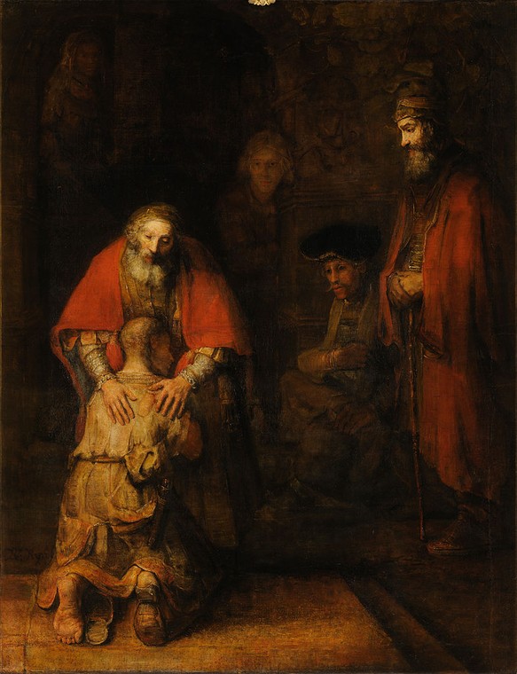
Rembrandt van Rijnā€™s The Return of the Prodigal Son, c. 1661ā€“1669, was used for a devotional on Luke 6:37-38 and Luke 23:34.
The liturgical church has two seasons of preparation: Advent, which leads to Christmas, and Lent, which leads to Easter. Advent is an unabashedly joyous time, in the arts as well as in life. Paintings of the census at Bethlehem, the Annunciation, the birth of Jesus, the shepherds in the fieldsā€”these all make us smile. The Madonna with her infant child is the most painted subject in art history. And even the non-musical among us can croak along to Christmas carols that are centuries old.
Crying Triptych, by Patty Wickman, was paired with a sonnet by John Donne and Psalm 51.
We donā€™t usually associate Lent with the arts, perhaps because the arts are essentially sensory and we see this season as being about repudiation of the sensual. Still, artists have been drawn to the themes of Christā€™s crucifixion and resurrection.  Holy Week will see some of us walking the Stations of the Cross or listening to Bachā€™s St. Matthewā€™s Passion, and both are fundamentally Lenten themes.
The Lent Project by Biola University has assembled a series of daily Lenten devotionals using layered art, music, and Scripture. It continues through the Sunday after Easter. This being its first year, the jury is still out about the selections and their treatment, but why not try it out for yourself?  You can subscribe here.
A note: the credits for music, text and paintings are in an About link at the bottom right corner of each entry. Itā€™s easy to miss.
The Pharisee and the Publican, by James Tissot, was used to amplify Luke 18:9-14. 

Let me know if youā€™re interested in painting with me in Maine in 2014 or Rochester at any time. Click here for more information on my Maine workshops!