I should KonMari my paint collection, not add to it. We go to workshops weighed down with too much stuff.
| No, I don’t need any more watercolor pigments. |
Many years ago, I took a workshop from a figure painter who specified cadmium green. I came home with an unopened tube and dropped it in a drawer. It’s still unopened.
I have great sympathy for students faced with a new supply list. In some instances, buying from them is redundant. For example, my list calls for Prussian blue, but if you already have phthalo blue, you’ve already got an excellent pigment for that color space.
It helps to understand the instructor’s reasoning. My list is based on paired primaries because I believe it allows the greatest range in color space. It occasionally changes as my painting technique evolves.
Students usually show up with too much stuff because they don’t want to be caught without something they need. Most of what they carry, they never use. I’m feeling that urge to over-pack as I assemble the materials for Poppy Balser’s workshop in May. Poppy, like me, is loath to send her students on spending sprees. However, it makes no sense to drive that distance and not be prepared.
| And I don’t need a new mixing tray, either. |
I trotted out my watercolor basket expecting to have to fill in color gaps. Actually, I should KonMarimy paints. What’s in the picture, above, is probably a quarter of the tubes in my basket. Does anyone really need five tubes of ‘opera pink’? More importantly, what is ‘opera pink,’ anyway?
Manufacturers love labeling convenience mixes with historic names. Consider Naples Yellow, used from the 18th to the 20th century. The real pigment is toxic lead antimonate. Modern paints labeled “Naples yellow” are made with a mix of modern pigments. You can make your own easily enough with white and yellow ochre.
 |
| That is the only name that really matters. |
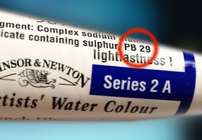
Pigments are listed on the tubes of all major paint makers in the form of Colour Index (CI) numbers. These are in tiny lettering on the side of most paint tubes. If the first letter is a “P,” that’s a pigment; if it’s an “N,” that’s a lake of a naturally-occurring substance like cochineal. The second letter tells you the general color family. The third tells you the actual pigment used.
A glance at my tube of ‘opera pink’ tells me it’s really PR122+BV10. The first is my old friend quinacridone magenta. Unfortunately, the second is a dye, rhodamine B, which bleeds and isn’t lightfast at all. I should pitch all five of those tubes.
| My brushes, on the other hand, need help. New Yorkers will recognize some as being from the cheap bin at Pearl Paint. |
If there is more than one CI number on the tube, you’re actually buying a hue or convenience mix. Many paint manufacturers sell hues of expensive pigments like the cadmiums and cerulean blue. They’re not consistent across brands, and they never have the handling characteristics of the more expensive paints they’re meant to imitate.
As with opera pink, even if the main pigment is lightfast, its partner may not be. Almost always, using single-pigment paint gives you the most flexibility in mixing.
There are many pigment guides on the web. Here is my favorite. Although it’s meant for watercolor, pigments are consistent across all media.
