Mixing paint colors is easy, but practice makes perfect.
 |
|
Balmoral Castle from the Approach (Abergeldie Side), 1852, Watercolor, by Queen Victoria.
|
If you think you’re too busy to paint, consider the above watercolor. It was painted by a mother of nine with a demanding full-time job: Queen Victoria. Note the fine, restrained greens in it and the cool autumn sky. If a queen can do it, so can you.
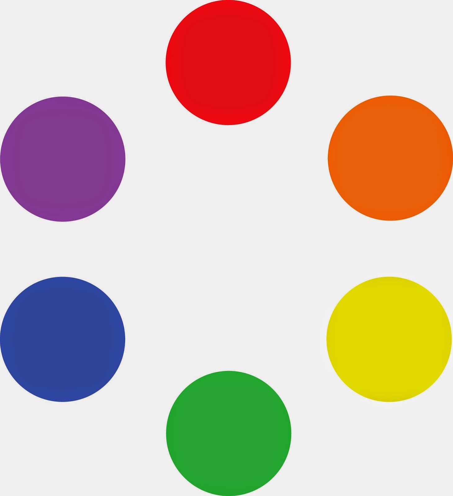
Green is a so-called secondary color, meaning it is made from a combination of two primary colors (yellow and blue). A secondary color is always across the color wheel from a primary color. It’s handy to remember that. If you want to neutralize a color in a hurry, a fast way to do it is to mix it with whatever’s across the color wheel. That’s its complement.
 |
| The conventional color wheel. |
There are no pure paint pigments. They all have overtones that muddy them up in certain mixes. That’s why your local paint dealer uses many, many more pigments than just red, blue, and yellow. Most artist palettes also have duplicates. I use paired primaries, meaning I have a warm and cool blue, warm and cool red, and warm and cool yellow. (Here are my supply lists for oilsacrylics, and watercolors.)
The distinction between warm and cool colors has been important since the Impressionists, who emphasized the color of light in their paintings. Warm colors are said to be hues from red through yellow and cool colors are said to be the hues from green through violet. There is no ‘right’ answer to which colors are the anchors, but convention says the peaks are red-orange and blue-green.
 |
| Paired primaries. |
I should stress that this is a convention, not a fact. In reality, the hottest stars radiate blue light, and cooler ones are red. Much of what we believe about the psychology of color is hocus pocus.
The only part of this that concerns the painter are the attributes of each individual pigment. We say that Hansa yellow is cooler than cadmium yellow deep, even though they’re both ‘warm’ colors. We mean that if you are trying to mix a greenish yellow, you’ll get a clearer shade with the Hansa than you will with the cadmium. If you’re trying to go more orange, start with the cadmium. The warm-cool language is just a convenient way of saying that.
I lay my paints out in hue-order, and encourage my students to do so, too. Not only does this eliminate the “hunt and peck” method of mixing, it makes it easier for you to compare pigments.
The business of mixing color is simple, but it needs to be practiced. First, find the pigment that’s closest to where you want to end up. Then, determine if it needs to be warmer or cooler and modulate it with the appropriate neighbor. If it’s too intense (too high in chroma), you can cut that by adding some of its complement. That’s the color across the color wheel from the original. In oils and acrylics, you lighten the color with white; in watercolor, you dilute it.
In some cases, you might start with a color that’s too dull. For example, chromium oxide green (PG17) is a good, opaque, solid, non-fading green, but it’s relatively low in chroma (intensity). It can only be made even more dull, not tarted up to greater brilliance. If you use that green on your palette, you may need to back up and mix a green with blue (or black) and yellow to get to the appropriate starting point.
A good way to look at this is to imagine the neutral colors as occupying the middle space of the color wheel. You can easily get to neutral by mixing paints across the wheel, but you can never get more intense than your starting point.

Today’s exercise involves stopping at your local hardware store for a few paint swatches. These are Benjamin Moore brand, but you should be able to find similar ones anywhere. There are two off-whites: one cool and one warm. There’s yellow, green, and two soft blues. Your assignment is to mix until you think you’ve hit the exact color. Then put a dot of it on the card to see how close you got. (If you’re working in watercolor, the dot goes on paper instead.)

I also ask my students to make neutrals using combinations of ultramarine blue with burnt sienna and raw sienna. I use the combination of ultramarine blue and burnt sienna as my standard dark neutral, because it can go to the warm or cool side depending on how it is mixed.
These combinations are my starting point for rocks and sands. They’re a variation on the complement set of blue-orange. But you can make good neutrals with other complement sets. Try purple and yellow or red and green. Each has its own character.