Monday Morning Art School: what do different brushes do? (Part 2, watercolor)

Brushes are much more important in watercolor than in oil painting. Here’s what each brush is for.
The more vertical the brush, the more flow.
Recently a student asked me why he was carrying so many different brushes. What were their uses? This is the second part of the answer; I addressed oil painting brushes last week.

Watercolor brushes are softer than oil-painting brushes. The most expensive are sable brushes, and unlike oil-painting brushes, the difference is worth paying for. Natural bristles combine strength with suppleness and hold more paint than synthetics. However, there are some fine synthetic brushes out there. Several of my go-to brushes are Princeton Neptunes. 

Unlike oil-painting brushes, your watercolor brushes should last a lifetime, so buy the best you can afford. The only absolute rule is to never leave them standing in water. Set them down flat between brushstrokes and rinse them thoroughly when you’re done.
Made with the synthetic spalter brush, above.

Except for squirrel mops, watercolor brushes drop more pigment the more vertically they’re held. You can use this to move from a filled area to a broken one in one brush stroke. In all the following examples except for the mop, I’ve held the brush both ways. A good general rule is to carry the vertical brush slowly and in a controlled manner; pull a horizontal brush more rapidly to get the least amount of paint contact with the paper.

The brush I used for the photo montage above is a 2″ flat synthetic mottler or spalter brush. I like this shape for both oils and watercolor. It’s a relatively inexpensive brush that gives a beautiful wash. It’s useful for covering large areas quickly, but with precise edges.

A flat gives you a good even wash. Used on its side, it can give you a controlled line.
And that would be the bright. More punch, less pigment.
Flats and brights give you nice flat washes, but can be used to make expressive lines as well. Brights have more control and carry less paint, just as they do in oil painting. Turn them on their sides to make a controlled line. Twisting the brush while painting gives an infinite variety of shapes. So too does varying the ratio of paint and water.
You can’t do either of these things in any other medium.

Because of the way watercolor bleeds, its brushes can be used in ways not possible in any other medium–a long blend of different pigments, or by painting a shape in clear water and then dropping pigment into it.

Round brushes are just more lyrical than flats.
I don’t normally carry riggers with me in either watercolor or oils. (They’re meant to paint perfect lines, and my world-view apparently doesn’t have many perfect lines in it.) Most of my line work is done with rounds. They do not give as much control on long lines, but they are very expressive.
A mop brush makes a perfect wash, but it does so much more as well.

Squirrel mops are the most uniform wash brush you can use. It’s virtually impossible to make them skip, so use them where a lovely flat wash is a goal.

Mop brush on very textured paper.
But a good mop can also point, hold vast amounts of paint and sweep across the paper in style.
One of my favorite tools, a natural sponge.

Natural sea sponges are multi-purpose painting brushes. Use them to apply or remove paint. They can be as subtle or bold as you wish.

Paint lifted (left) and applied (right) with a sponge.

Your brushwork contributes immeasurably to the quality of your painting. Don’t dab or be diffident; plan your strategy and then execute it with boldness. To do this, of course, you have to practice.


Monday Morning Art School: How to paint a really bad watercolor

Painting horrible watercolors isn’t just my special skill; it’s something anyone can do!

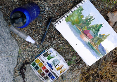
A lot of artists don’t like Winsor & Newton field kits, but they’re still my go-to for extreme backwoods drawing and painting.
Don’t test your colors
Beginning watercolorists usually put down washed-out, delicate colors. These have too much water in the mix. Or, they’ll use too little water, and their unloaded brush will scumble instead of flow. Sometimes they’ll miss the proper color entirely and spend the rest of the painting trying to fix their bad mix.
The answer is to make informal swatches on a scrap piece of paper. Just make sure you use the same paper and brush you plan to use for the final assault.
Pay attention to where excess water might be entering your process. Are you unconsciously washing your brush after every stroke, or not mixing enough paint and trying to stretch it out?
Fiddling
Putting layers and layers of light color down makes great mud. So does putting paint down and then endlessly fussing with it. See above, make the proper color, and lay it down in a few strong strokes.
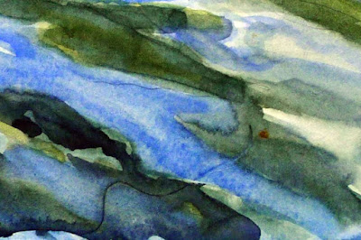
Do a value study, unless your watercolor is a value study. Then do it anyway.
Too small a brush

Small brushes give you less control, not more. They’re harder to hold still and they run out of paint just when you need it most. Worse, artists get diddly with them. Practice with larger brushes and a lighter hand.
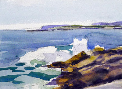
Bloom is almost unavoidable when painting off the deck of an ocean-going boat, but it’s still annoying.
Bloom

More properly known as backflow, this happens because the paper is still wet, even though the surface looks dry. Bloom can be used as a watercolor effect, but it more typically happens because the artist isn’t patient, or because environmental conditions are such that your paper will never dry. Or, in my case, because I’ve spattered water all over everything.
Use bad materials
Good watercolor paper contains sizing to keep paint from sinking into the paper. That allows colors to sparkle, and stops the paper from buckling. Cheap papers aren’t properly sized.
Brushes are more important in watercolor than they are in oils. It’s not necessary to have only expensive brushes, however; my go-to rounds are Princeton Neptunes.
As in all painting, cheap paints are a false economy. Better paints contain more pigment.
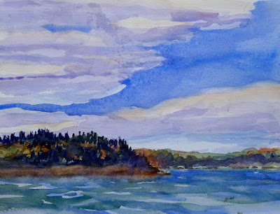
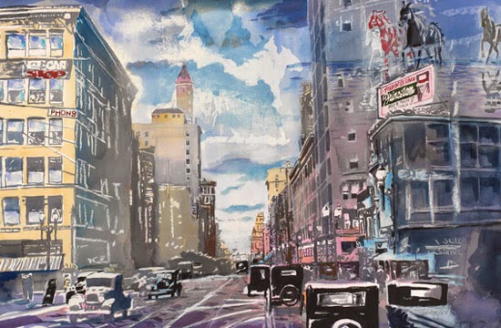
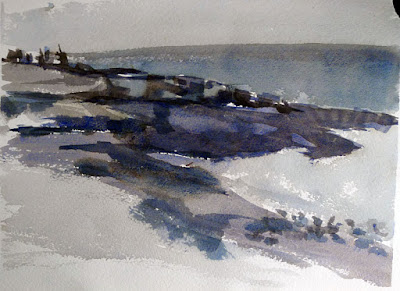
Watercolor can capture the passing scene better than any other medium. This was painted off the deck of American Eagle. The speckling in the sky was caused by salt spray. What a life!
Don’t bother with a preparatory value sketch
Value sketches are critically important in all media, but especially in watercolor. You should start with a plan, and your plain is laid out in lights and darks.
Unlike oils and pastels, you have few options to correct a bad drawing once you start it. It behooves you to work out all the kinks before you lift a brush.
Don’t mix your colors in advance
Time is a critical factor in watercolor, and if you have to stop and mix in the middle of a passage, you’re going to make a muddy, blotchy mess. Instead, mix the colors you think you need for that step and test them on your scrap paper.
Let your paper breathe!
Don’t leave white space
Watercolor is all about paper showing through, so why not let that happen?
Use all the colors
Watercolorists tend to carry far more pigments than oil painters. Want to keep it fresh? Pare down your palette and keep mixes down to three or fewer pigments per pass. And avoid hues and convenience mixes; they’re already mixtures and will further muddy the waters.
Get fussy, fast
Start by thinking out the big shapes first. Too much detail too fast throws the volume relationships off in a painting or drawing.
Watercolorists who fixate on detail at the beginning tend to delineate everything, everywhere. They haven’t given their minds time to sort out what’s important. Detail belongs in the focal point(s) of a painting.

How to make art that stands the test of time

Occasionally, someone wonders whether an emerging painter will end up being a superstar. Can we ever tell?
Iowa Cornfield, 1941, Grant Wood, courtesy Wikipedia.
This week I contemplated a piece of contemporary art with a gallerist. “I don’t see thinking,” she said. “I only see beautiful contours. It’s content-free. There is no struggle.”
I can’t imagine anything more stultifying than striving to be in the Pantheon of Great Artists. However, the question of what makes great art is an important one. Great art must satisfy long after the flash of novelty dissipates. How does it do that?

The Ghent Altarpiece, early 15th century, Hubert and Jan van Eyck, courtesy Wikipedia.
Technique
It ought to go without saying that mastery of one’s craft is the primary job of the artist. Sadly, that’s not always true in contemporary western art, where ephemeral ideas sometimes mean more than specialized competence. However, if one looks back at art which has staying power, it’s always technically superb. How do you get to Carnegie Hall, sister? Practice, practice, practice.
Courage
Art is a process of exploration, a constant revolution. An artist must travel beyond his abilities every time he picks up a brush, or he begins to parody himself. The end of our training is, conversely, the beginning of our real education.
People sometimes tell me that they want to be ‘more consistent’ in their painting. I think that’s a trap, antithetical to the idea of development. A consistent body of work just comes with time.

Saturn Devouring His Son, 1820–23, Francisco Goya, courtesy Wikipedia.

Emotional content
One reason I hate writing artist’s statements is that I believe my real content is inexplicable. You, the outsider, might understand it, but the word-spewing part of my brain never will. Still, I hope my simple trees, boats and rocks convey something greater than their nominal subject.
There’s lots of art that’s didactic, and I’ve produced much of it myself. But didacticism is not necessary. Nor is it the hallmark of real artistic maturity, which somehow moves beyond issues.
The Railway, 1873, Édouard Manet, courtesy Wikipedia.
Within the vision of our times
Johann Sebastian Bach is recognized as one of the greatest composers of history. His period and his style were the Baroque. He was one of its last practitioners. He grew up within its aesthetic and it reached a climax in his writing. He was both within the vision of his time and the full flowering of that vision.
Knowing whether we’re painting within our period is difficult. In my first class with Cornelia Foss, she had me paint an orange on a tray. “If it was 1950, I’d say ‘Brava’,” she said. “But it’s not.” It was the best criticism I’ve ever received—she was telling me my technique was fine, but my style was dated.
We’re not Hudson River painters, we’re not Dutch Golden Age painters. This is the 21st century, and we need to paint what speaks to our peers. That’s often uncomfortable, and frequently a mystery.
You can’t count on your audience for advice with this. They’re as mystified as we are.
Bach was forgotten soon after his death. His works were rediscovered by Felix Mendelssohn. In 1823 Mendelssohn’s grandmother gave him a copy of the score for Bach’s St. Matthew Passion. Five years later, Mendelssohn mounted a performance of this long-forgotten masterpiece. His selfless promotion of a dead artist gave Bach his rightful place in music history.

Old subject, new technology

Yesterday I went all digital on a schooner. Allowing for the learning curve, this has potential.

Underpainting of American Eagle passing Owl’s Head, by Carol L Douglas
I’ve toyed for a while with the idea of doing a large, Fitz Henry Lane-influenced scene of the American Eagle under sail. A large canvas of a boat in motion is not something you do en plein air, but the studies I’ve done in harbor certainly influence it.
A student recently asked me if I like painting ‘just water.’ I do, indeed, because to me there’s no such thing as ‘just water.’ There’s light, reflection, movement, the skipping of the wind, clouds, and promise. I showed him the wave study I did while cruising on the American Eagle last spring. That is the closest I get to a purely personal painting, one that has meaning for me and nobody else.
This field study of waves from last summer was the genesis of the painting above.
It was also the genesis of this larger idea. What better landform to use as a background than Owl’s Head, which sits just outside Rockland harbor, and where I paint many times every season?
When enlarging a sketch to a final composition, I generally use gridding, which I’ve explained here.  It’s laborious and time consuming. It’s also extremely accurate and allows you to execute a pretty decent grisaille on the fly, depending on how much time you want to spend.
The horizon has to be straight on a nautical painting, or else the oceans will run dry.
My daughter gave us a cast-off video projector last year. Yesterday I decided to experiment with it. I haven’t used projection to enlarge a sketch since the demise of 35mm slides. 
These projectors are designed to shoot an image high on a wall, so they are set up to correct for the keystone effect, which is the distortion you get when you project an image at an angle. Once I managed to undo that correction, squaring the image was relatively easy. Making it exactly the size of my canvas was harder.
Level and square relentlessly.
I started with relentless leveling and squaring. The easel was perpendicular to the floor, the canvas leveled, the two lower corners the exact same distance to the projector. Even with all those preparations, the image was slightly canted. Fixing that took a lot of fussing.
From there, it was just a question of tracing the lines in the original sketch. However, my ability to see differences in value was vastly reduced.
I couldn’t see values but it was a neat optical effect.
Lest you think tracing is the answer to all your drawing problems, it’s still possible to make drafting errors. Note the slight sag in the bowsprit. I’ll fix that in the next iteration.
With all my fussing, I was able to finish underpainting this 30X48 canvas in a single day. There’s promise there.
It’s anemic compared to my usual gridding, but I still think it has potential.
I tell my students to use a combination of ultramarine and burnt sienna for their initial drawing, but in practice I generally use leftover paint for this step. The exact color isn’t nearly as important as the value. Yesterday, I chose an old tube of Williamsburg Brown Pink. I don’t use this brand because I find the pigment load in the blues to be too low for my style. 
That wasn’t true with this color. This morning my whole studio is swimming in a butternut-colored haze. There is brown stain everywhere—creeping along the canvas, in my brushes, on my hands, possibly in my hair.

A little knowledge is a dangerous thing

What does one artist teach another, in person, that cannot be learned off the internet? Sometimes it’s about accountability.

Dish of butter, by Carol L. Douglas
Yesterday an alert reader sent me a blog post purporting to show how to draw “the top of the flower pot, the lid on a jar, the base of the barn silo,” in perspective. I don’t want to start a flame war, so I’m not going to give you the link, but the instructions were flat-out wrong. The post started off well. Then the writer tried to apply two-point perspective, not realizing that round shapes have no perspective, at least in that sense.
This is a case where knowing a little math would have helped. A column is just an extruded circle. Any point on a circle is the same as any other point. Seen in space, the top of a column is always symmetrical on the vertical and horizontal axes.
That was wild blueberries, yogurt, milk, oatmeal, cinnamon and ginger, in case you’re wondering.
I demonstrated this to my reader by sending her the photo of my breakfast drink, above. If you doubt me, walk around a glass or vase on a table and tell me if the shape changes. I have an explanation of how to draw this, here.
Not that I haven’t said some amazingly stupid things in my time. I remember once trying to explain the art concept of color temperature in relation to the physical temperature of light. My class included a person I think is terribly smart. I grew nervous. I got lost in a hopeless mishmash of misstatements before I was done. At least I hadn’t committed it to paper.
Wineglasses and opossum, by Carol L. Douglas

Sometimes people will repeat the canard that “teaching beginners is easy.” That’s only true in the sense that they don’t know if you’re right or not. Painting technology is almost unchanged since Jan van Eyck created his system for oil painting at the beginning of the fifteenth century. Watercolor and acrylic are newer, but equally methodical. There are rules for painting and drawing, and that is what a teacher should know and teach.

Unpicking bad teaching is some of the most painful work I do. This is why I like and practice the atelier model in my own studio, which I benefitted from so much at the Art Students League of New York. I don’t think in terms of levels of competence; there are just people who each bring their own experience and I try to help them move forward.
Acrylic paint jars, by Carol L. Douglas
Even old dogs can learn new tricks. I’m about to take my workshop in many, many years. I’ve painted with Poppy Balserenough to know that she’s a stellar technician. In May I’m traveling to Cornwallis Park, Nova Scotia to take a two-day watercolor workshop with her. I’m hoping to up my game in watercolor.
I’m glad it’s not this week. While the National Weather Service coyly predicts “plowable snow” for Maine, the Canadian Maritimes are looking at significant weather again.
“If it doesn’t start melting soon, I’ll have to shovel for my first class on Tuesday,” I whined to my husband. That snow pile in our driveway has consolidated to concrete. Ouch.
There is, by the way, one opening left for this session, so if you’re interested, contact me.

Finding your style

Maple Tree, week 1, by Victoria Brzustowicz.
We all know very competent painters whose best students end up painting exactly like their teachers. This is not what any of us set out to do. It happens because the teacher focuses on technique, not process.
I occasionally talk to my students about mark-making, but only in a cautionary way. “Don’t dab dots of paint,” or “You can draw that line with more authority.” A person’s mark-making is their handwriting. It’s highly individual, and should be left alone as much as possible.
Maple Tree, week 12, by Victoria Brzustowicz.
Most students see their early mark-making as very raw, which it is. They immediately try to cover their insecurities by copying someone else—often their teacher.  This is a mistake. Style is a very slow thing in coming, and it requires its own space to evolve. Decide too soon that your style is blocky brushwork or heavy outlines or impressionism and you’ve consigned yourself to a box you can’t get out of.
Even experienced painters can fall into this trap. When artists start copying themselves, they stop growing.
Maple Tree, week 24, by Victoria Brzustowicz.
Most successful painters don’t really think about style much. The real question is what we’re trying to master at the moment: line, form, color, composition, atmospherics or any of the other millions of things that bedevil our work. True style is just the artifact of personality that gets in the way of perfectly executing our interior vision.
Victoria Brzustowicz is a well-known printmaker and designer with a degree in studio art from Wells. I was flattered when she signed up for my class two years ago.
Victoria needed absolutely no aesthetic guidance. Her goal was to learn to apply paint to a canvas as efficiently as possible, so the process didn’t get in the way of her own ideas. She heard my caution against jumping to conclusions about her style and took it to heart.
Maple Tree, week 33, by Victoria Brzustowicz.
In January, Victoria decided to paint a tree in her own garden once a week for a year. As she has proceeded, her brush has gotten out of her way, and her own internal mark-making is coming to the fore. It’s worth looking at the whole seriesto see the evolution.
“Knowing that I will be painting the tree over and over has made me freer to start with an open mind,” she told me. “I know there is always another painting in which I can explore some other aspect of the composition, the drawing, my palette, or my brush selection. I’ve been able to try what I’ve seen other artists do (or to do what they’ve recommended), and see what works or doesn’t work for me.”
By not locking herself into an artificial style from the beginning, she has managed to get to her authentic voice much faster. She has sidestepped a trap that even experienced painters fall into.

It takes time

The Harvest is Plenty, 36X48, by Carol L. Douglas
On Friday I had the opportunity of hearing Dr. James Romaine give a gallery talk at Roberts Wesleyan. He described a piece of art as working in three spheres. There is the material—your technical approach to the work. There is the subject. The meaning comes from the marriage of technique and subject. A painting is successful if its subject and technique are integrated so that it has meaning.
Yard,11×44″, 2009 by Joel Sheesley. I’d have missed the references to Thomas Cole and romanticism entirely had Dr. Romaine not pointed them out in his talk.
Gustave Flaubert is reputed to have said, “The art of writing is the art of discovering what you believe.” I think this is also true of painting. The artist starts out with a subject and materials and the meaning appears as he or she goes along. The mind is a mysterious and mighty tool. Allowed to work in the background, it comes up with some powerful stuff.
Dr. Romaine analyzed my painting The Harvest is Plenty. He started by pointing out things that came from the conscious side of my mind, even if they weren’t conscious decisions. I believe in a Providential God, for example, and  I know my Dutch Golden Age painters, which he saw in the low, flat horizon and the rainbow. The bottom two-thirds of the painting, he said, was fairly standard in its composition.
Dr. Romaine talked about Luvon Sheppard’s marriage of the mystical with a real sense of place. To me, it’s awfully important that the place is Rochester, because it tells me what my mission field is.
Then he talked about the storm cloud. It takes up half the canvas; it rises out of the frame over the head of the viewer. When I painted The Harvest is Plenty, I was recovering from a cancer treatment in which I hemorrhaged. Chaos seemed very close to enveloping me. I recollect that I had a terrible time drawing the storm cloud to match my sketch; it chose its ultimate shape, not me. But until he talked about it, I had no idea how autobiographical that storm cloud was.
Much of what is wrong with contemporary art is that the cart has been put before the horse. We are bludgeoned over the head with artificial meaning by artists who can’t or won’t concentrate on their materials. Artists pursue meaning—even when the meaning is explicitly the lack of meaning—instead of concentrating on the material and subject and allowing the meaning to grow up organically from that.

Let me know if you’re interested in painting with me on the Schoodic Peninsula in beautiful Acadia National Park in 2015 or Rochester at any time. Click here for more information on my Maine workshops! Download a brochure here.

My book of pithy aphorisms

The Mamaroneck River, oil on canvas, by Carol L. Douglas
My teaching year ends at the beginning of June, when I start my summer wanderings. So I was conflicted when V— contacted me about lessons. She is a well-known lithographer and designer. Normally I’d jump at the chance to have her join us, but there’s so little time left in the year. Still, we have time to lay out the basics.

Let’s start with my mantras. These are the things I say so frequently they might even be true.

Slow to Fast

The quality most appreciated in modern painting is assurance.  If you take the time to map out your painting in advance, you will avoid a lot of tentative or corrected brush strokes.
That means doing your measuring, erasing, and composition in the drawing phase.  
Draw, baby, draw…
Dark to Light

In oils, it’s difficult to paint darks over white. However, this rule is appropriate for all media except watercolor.* If you mass in darks first, you can see the value structure. This gives you a pretty good idea whether the painting will work.
A grisaille by any other name. It is still a great way to start an oil painting. This one, by me.
*In watercolor, you start with light washes. The lights are where you omit paint. It’s important for watercolorists to make a value sketch before they start.

Thin to Thick

Your bottom layers should be lean. Your top layers should be thick and creamy. It doesn’t matter if you want your painting to be clinically hyperrealistic or clotted impasto. This is the only way to paint without cracking or obvious pentimenti. That is a beautiful word to describe an ugly problem: visible reminders of how many times you’ve changed your mind.
Eventually you get to impasto, but it’s a treat you work up to.
Let me know if you’re interested in painting with me on the Schoodic Peninsula in beautiful Acadia National Park in 2015 or Rochester at any time. Click here for more information on my Maine workshops! Download a brochure here.

Making it look easy

Renocation of the Kirkland Hotel, acrylic on canvas, by Bruce Bundock.

Remember my pal Bruce Bundock from Kingston? He’s on a roll this year. The catalog for his Faces of Vassar is out. And he is featured in this month’s Acrylic Artist Magazine as one of five winners in the 60th anniversary show of the National Society of Painters in Casein and Acrylic.

The Kirkland Hotel at Kingston is on the National Register of Historic Places. Bundock painted it not as a tidy, quaint renovated place, but in the process of shedding its old skin and acquiring its new. “My painting is a form of investigative reporting on light, form and content,” he says.
Renovation of the Kirkland Hotel, #2 by Bruce Bundock
Bruce started by making plein air studies from the parking lot of the hotel and proceeded to a large scale drawing. From there he gridded and painted the finished work. In other words, he works hard to make it look easy.
Bruce’s drawing of the Kirkland Hotel project.
Let me know if you’re interested in painting with me on the Schoodic Peninsula in beautiful Acadia National Park in 2015 or Rochester at any time. Click here for more information on my Maine workshops! Download a brochure here. 

Sometimes things don’t go as planned

A whole pile of potential. Stock cut for seven frames.
I chose a thin, contemporary molding for my show at Roberts Wesleyan’s Davison Gallery, because it’s a sleek, contemporary space. I had a feeling this frame stock might be somewhat slender for such large pictures, so it was no big surprise when I released the clamp from the first frame I’d glued and the joints peeled apart in my hand. No matter how strong the glue, wood is heavy and a tiny contact surface can’t support a lot of weight. (Frame shops use V-nailers or underpinners to join miters, but they start at around $1200, so aren’t appropriate for the casual framer. And in most cases, glue is sufficient.)
I prefer doing this job in my outdoor wood shop but it was 12° F. when I started. The glue would have frozen instead of setting. Next best place: my studio. The tools you need (in addition to a miter saw) are a drill, wood glue, strap clamps, a paintbrush to assure you’ve applied the glue evenly, and a mallet to tap the corners down so the two sides are flush with each other.
We’re a one-car family and my husband was off playing his bass. That might have been a real problem, but I was saved by technology. I visited a big box store’s website, identified the correct flat corner braces, found a store that had enough of them in stock, and bought them online. They texted my husband’s phone when the order was ready for pickup. He collected them on his way home. It was a matter of two hours to install the plates, and now I’m relatively certain that these frames could survive a minor earthquake.
You’re not going to get that mending plate on there straight without carefully marking and drilling pilot holes. At this point, the joints have been glued and clamped; the mending plate is the icing on the cake.

Interestingly, the depth of the molding wasn’t even from piece to piece, but as long as the mending plate was the same distance from the edge, I was happy.

I’ve posted about how to make frames before. If you can cut an accurate 45° angle (which is as much about having a good saw as it is about having woodworking skills) you can make decent frames in a home workshop. Affixing mending plates to a thin molding is a bit trickier, because they must be aligned perfectly so that they don’t show from the front and don’t impede installing the painting from the back. The only way I know how to do that is by careful marking and drilling pilot holes.
Two hours later, a whole heap of happiness. I can curse the never-ending winter or thank God I have a spare room in which these big frames can rest until they’re needed. Which will be tomorrow morning, of course.
Despite the supports, I’ll affix the hangers to the stretchers, not the frames. No sense tempting fate.


Let me know if you’re interested in painting with me in Maine in 2014 or Rochester at any time. Click here for more information on my Maine workshops!