Constant overdrive

My strategic plan for 2022 seems to be in tatters. That’s the price of constant overdrive.

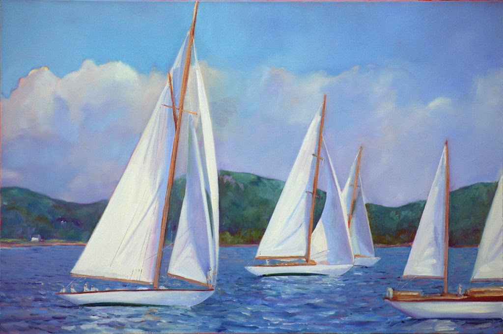
Skylarking, 24X36, oil on canvas, available.

At the end of last year, pastor Quinton Self challenged us to stop with the busy work and focus on what matters. That includes moments of rest. He and I are the same psychological profile (with the test scores to prove it), so when he zings me in a sermon, I figure he’s also talking to himself. In February, when he’d just finished a fast-paced, five-week teaching program on top of his other work, I asked him: “so, how’s that Sabbath rest thing going for you, PQ?” He smiled. It’s a constitutional problem for both of us.

Every year recently I’ve said, “this is the latest I’ve ever done my taxes.” This year’s record will stand. I can’t get much later and not file for an extension. That’s a terrible idea; it just prolongs the agony. What’s scary is that I didn’t even think about taxes until I was flying back from Phoenix two weeks ago.

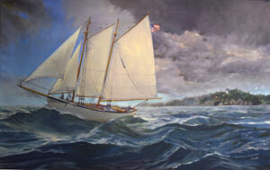
Breaking Storm, 48X30, oil on canvas, available.

I had coffee with my Canadian pal Poppy Balser last week. I don’t really envy our Canadian neighbors their economic system. However, when I’m calculating income tax, I wish we could streamline our ponderous system and replace it with something like theirs. As a sole proprietor, I keep records on all kinds of things that are irrelevant to the average taxpayer—household repairs, utility bills, and the cost of operating my car.

It’s time-consuming and tedious, and I’m good with numbers. I can’t imagine what it’s like for my math-phobic fellow artists.

Admin is the curse of all sole proprietors. We write our own ads, maintain our own websites, do our own strategic planning, keep books, and somehow churn out a product. I am, for some reason, drowning in admin right now.

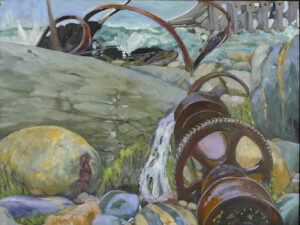
Wreck of the SS Ethie, 18X24, oil on canvas, available.

“Did I ever send you the materials for next year’s ad?” I asked Anthony Anderson of the Maine Gallery Guide yesterday. No, he replied, but if I can get it to him next week, I’ll be fine. I could hire my student Lori Galan or my old friend Victoria Brzustowiczto lay it out for me. Either of them would probably forgive me my hair-raising lateness. However, I don’t even have a clue what I want to say. And that ad is the most important one I’ll run all year.

Being in constant overdrive is corrosive. It forces a person to be reactive, batting balls back out as fast as they come in. Instead, intelligent people are proactive, thinking out a strategy and sticking with it.

I did that at the beginning of the year, by the way. It’s in tatters.

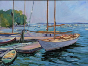
Beautiful Dream, 12X16, oil on birch panel, available.

But help is on the way. When we’re in overload, things have a way of falling on us and slowing us down. Another Canadian artist friend, Cathy LaChance, put it very succinctly when she was diagnosed with COVID this week: “My turn to be forced to rest.”

Call it the Universe, if you want; I prefer to credit God with this good design. 

The problem with frenetic people is that we are sometimes so busy we can’t hear the “still small voice” of God. That’s why it is often accompanied by the wind and earthquake (or COVID)—to get our attention.

I’d rather not wait that long.

Monday Morning Art School: the color of Spring (part 1)

It’s time to assemble the proper pigments to paint beautiful greens this spring.
Fog over Whiteface Mountain, by Carol L. Douglas.
If March didn’t exactly come in like a lamb this year, it at least came in like a sheep. Don’t be fooled. Some of our most brutal winter storms have been known to happen in March. Walking to church, I pondered the depleted state of our woodpile. I wasn’t the only person thinking on these lines. My pal Naomi told me she was going home to move wood “while the ground is still frozen.”
That doesn’t mean that color is not peeping through here and there. The days are growing longer. We may see snowdrops and winter aconite appearing along granite foundations this week. Back in western New York, two witch hazels ought to be blooming, planted by me.
Spring arrives in a host of rich colors, and we’ll discuss that next week. But we must start with the predominant color, which is green. In my own yard, the green moss on the stone wall and my shed roof are the only visible cues that the season is changing. They tell me that growth and warmth are happening under the surface.
Beaver Dam on Quebec Brook, by Carol L. Douglas
Michael Wilcox published a famous watercolor pigment guide called Blue and Yellow Don’t Make Green. Most of what it tells you can now be found on the internet, but it’s where I first got the idea to add back the banned black.
His point was that there are many routes to the same destination, and that to really mix colors, you need to understand what pigments you’re using, not work from trade names for colors. Consider sap green, for example—a staple of many plein air painters’ toolkit. It’s really a convenience mix made of a phthalo blue and some kind of yellow. The same is true of Hooker’s Green.
Mixed greens, in oils.
The single-pigment (‘true’) greens available are chromium oxide green, viridian, and cobalt green. Chromium oxide green is a lovely, heavy, natural green. Unfortunately, it outweighs everything it’s mixed with. Viridian and cobalt green are lovely, but expensive. Beware viridian hue—it’s just another phthalo in disguise. Any other greens you buy in a tube are just variations of those pigments, or convenience mixes.
To make a whole range of beautiful greens, make sure you have the following pigments in your toolkit. Since they’re all-around useful colors, they make a lot more sense than carrying several greens.

  • Black
  • Ultramarine blue
  • Prussian (or phthalo) blue
  • Hansa (or Cadmium lemon) yellow light
  • Diarylide (“Indian”) yellow
  • Yellow ochre

The rookie error of landscape painting is to make all your greens using the same basic color, modulating lighter or darker for highlights and shadows. You’ll have much more life in your trees if you know all the different ways you can get to leafy green. 

Chart courtesy of Victoria Brzustowicz
In fact, the best way to navigate the colors of foliage is to avoid greens out of a tube altogether. A system of paired primaries gives you more options, avoiding the acidity of phthalo, the weight of chromium oxide green, or the soul-sucking darkness of sap green.
In my experience, bad paint mixing causes paintings to go wrong faster than anything else. Constantly over-daubing to modulate the paint color distorts the original drawing and makes a grey mush. If you’re confident of the color, you can apply it fast and accurately.
Green modulation swatches by student Jennifer Johnson.
I make my greens on a matrix, which I’ve shown you both mixed and on a chart. After mixing greens according to the chart, you can then experiment with modulating your resulting greens with tints (meaning a mix of white and a color). The specific tints are unimportant, but the most useful one for landscape is a mix of white, ultramarine and quinacridone violet, making a pale lavender. It is great for atmospheric perspective.
Note that blue/black pigments are much stronger than the yellows. You need about half the amount of blue or black as you do yellow.

Monday Morning Art School: the need for green

A fast, easy route to mixing plausible summer greens.

Overlooking Lake Champlain, by Carol L. Douglas. Every green in this painting came from the matrix below. And, yes, there’s a scrape in it. It tumbled off a bluff.

The need for green came early to class this year, paradoxically because it’s been cold this spring. There’s little green peeping out in nature, even here on the coast.
Last week in class we worked on salvaging failed paintings. That meant pulling out work from summers past. Most of them included some greens, so we had to mix a green chart.
A basic mixing chart for greens, made by my friend and student Victoria Brzustowicz.
We are only weeks away from painting greens again, in all their light, airy delicacy. Even now, the osier and willows have red and yellow in their branches. By June, we will be wrapped in a blanket of immature foliage ranging in color from pale emerald to pink. It’s a good time to brush up on some color theory.
By August, the color will have settled into a deeper, more uniform tone. The only way to navigate this is to avoid greens out of a tube. A system of paired primaries gives you more options, avoiding the acidity of phthalo green, the weight of chromium oxide green, or the soul-sucking darkness of sap green.
If you look carefully at supposedly-uniform foliate, you will see patches where the color leans toward khaki, yellow, teal, violet and orange. They are what gives life to greens, just as accidental tones give life to human skin.
Michael Wilcox published a watercolor pigment guide called Blue and Yellow Don’t Make Green. Of course they do, but his point was that there are many routes to the same destination. One of the most useful landscape greens is black and cadmium lemon or Hansa yellow. Of all the greens I mix, this and ultramarine with yellow ochre are the two I use the most.
The above chart, mixed in oils. It works just as well in water-based media.

In my experience, bad paint mixing causes paintings to go wrong faster than anything else. Constantly over-daubing to modulate the paint color distorts the original drawing and makes a grey mush. If you’re confident of the color, you can apply it fast and accurately.

Above is the matrix of greens I’ve used for almost twenty years. The range of results is infinite. It depends on the proportions you choose and the brand of paint you use. However, blue/black pigments are always much stronger than their yellow mates. In any mixture, you need about half the amount of blue or black as you do yellow. This has nothing to do with color theory. It’s because darker pigments have more staining power than do lighter pigments.
Victoria Brzustowicz made this color chart based on my workshop palette. Here is a printable PDF.I crossed out the red on the chart because, while I do use it in the studio, in most field painting it’s unnecessary.
Once you’ve finished mixing that matrix, it’s time to tie it to the bigger palette. I encourage students to arrange their paints as above because:
  • It’s efficient;
  • It allows you to mix without thinking;
  • It encourages you to use the full color range in every painting;
  • It prevents the beginner’s error of modulating with white or black;

You can modulate your greens using tints of your other colors. For atmospheric greens, modulate with blues and violets. For warm, lighter greens, modulate with warmer tones.
Mount Hope Cemetery in the Spring, by Carol L. Douglas
Above is a photograph I took several summers ago. Your mission is to use the green chart I’ve made and mix tones similar to the different greens in the photo. If you get the mixing right, painting this scene will be a snap.

You can never have too many easels

My super-lightweight pochade box has served me well, but my field paintings have grown in size. What’s next?
Still the best pochade box for intertidal zone painting. (Photo by Ed Buonvecchio)
Four years ago, I made myself a super-lightweight pochade box. The instructions are here; they’ve been viewed thousands of times and I still occasionally correspond with people interested in making a similar one.
I built this box because I had hiked down Kaaterskill Falls with a heavier, earlier kit and developed a Baker’s cyst from the tremendous pressure on my knee. I decided right there that a lighter painting kit was necessary for extreme plein air. When you hike in to your destination, a kit weighing more than a few pounds is uncomfortable and sometimes dangerous.
The box when new.
The box I made answered that problem very well. It is compact and at 18 oz., doesn’t add much to the weight of my checked baggage. Between trips, I slide it in a waterproof stuff sack and toss it in the freezer. It has traveled many, many miles with me by car and by airplane.
However, it’s no longer serving as well for my primary easel, because things have changed:
  1. The maximum size it holds without jury-rigging is 12X16, and that’s become almost the minimum size I paint these days.
  2. The incessant wind along the coast causes my box to thrum. (For this reason, I seldom use an umbrella these days, either.)
  3. Because it has no frame, it’s gotten somewhat deformed by traveling in my checked bag on airlines.
It’s gotten a little beaten-up from traveling in my checked bag.
Kirk Larsen looked at it in Parrsboro and suggested that I have it copied in carbon fiber. I talked to a boatbuilder last week. He thought that fiberglass would do just as well. He’s going to work one up for me, and then I’ll field test it and see how it works.
Meanwhile, Jennifer Johnson decided to make a box like mine, but her husband ordered the wrong binder. It was a fortuitous accident, because her box is both smaller and stronger than mine. It pairs up perfectly with her Mabef M-27 field easel without any drilling or special machining. Larger canvases might be a stretch, but a clip should hold them steady. Weights can be hung as needed.

Jennifer Johnson’s box is in some ways superior.
I’ve had an earlier version of this Mabef field easel for about twenty years. I heartily recommend it to students as best value for money. Adding the $30 paint box is an elegant solution to the problem of a palette.
Or, you can use Victoria Brzustowicz’ simple solution. She hinged two aluminum baking sheets from the Dollar Store together with a strip of duct tape. Open, it’s a paint box; closed, it goes in a plastic bag in the freezer. It cost her all of $2.
Victoria Brzustowicz’ $2 solution. (Photo courtesy of Victoria Brzustowicz.)
Meanwhile, I’m packing for Cape Elizabeth Paint for Preservation 2018. They want us to paint big, so I’m reviewing my collection of older, heavier easels to see what will suit. If you’re in Portland this weekend and want to stop by, I’ll be at Fort Williams Park.
I’ve got one more workshop available this summer. Join me for Sea and Sky at Schoodic, August 5-10. We’re strictly limited to twelve, but there are still seats open.

Finding your style

Maple Tree, week 1, by Victoria Brzustowicz.
We all know very competent painters whose best students end up painting exactly like their teachers. This is not what any of us set out to do. It happens because the teacher focuses on technique, not process.
I occasionally talk to my students about mark-making, but only in a cautionary way. “Don’t dab dots of paint,” or “You can draw that line with more authority.” A person’s mark-making is their handwriting. It’s highly individual, and should be left alone as much as possible.
Maple Tree, week 12, by Victoria Brzustowicz.
Most students see their early mark-making as very raw, which it is. They immediately try to cover their insecurities by copying someone else—often their teacher.  This is a mistake. Style is a very slow thing in coming, and it requires its own space to evolve. Decide too soon that your style is blocky brushwork or heavy outlines or impressionism and you’ve consigned yourself to a box you can’t get out of.
Even experienced painters can fall into this trap. When artists start copying themselves, they stop growing.
Maple Tree, week 24, by Victoria Brzustowicz.
Most successful painters don’t really think about style much. The real question is what we’re trying to master at the moment: line, form, color, composition, atmospherics or any of the other millions of things that bedevil our work. True style is just the artifact of personality that gets in the way of perfectly executing our interior vision.
Victoria Brzustowicz is a well-known printmaker and designer with a degree in studio art from Wells. I was flattered when she signed up for my class two years ago.
Victoria needed absolutely no aesthetic guidance. Her goal was to learn to apply paint to a canvas as efficiently as possible, so the process didn’t get in the way of her own ideas. She heard my caution against jumping to conclusions about her style and took it to heart.
Maple Tree, week 33, by Victoria Brzustowicz.
In January, Victoria decided to paint a tree in her own garden once a week for a year. As she has proceeded, her brush has gotten out of her way, and her own internal mark-making is coming to the fore. It’s worth looking at the whole seriesto see the evolution.
“Knowing that I will be painting the tree over and over has made me freer to start with an open mind,” she told me. “I know there is always another painting in which I can explore some other aspect of the composition, the drawing, my palette, or my brush selection. I’ve been able to try what I’ve seen other artists do (or to do what they’ve recommended), and see what works or doesn’t work for me.”
By not locking herself into an artificial style from the beginning, she has managed to get to her authentic voice much faster. She has sidestepped a trap that even experienced painters fall into.