Students show up at all levels of experience, and the goal is to meet them where they are and usher them to the next phase.
An inexperienced student is a tabula rasa on which the painting teacher can sketch out an orderly system for painting. (This is a sweet privilege, and one of the reasons I like teaching teenagers so much.) When working with experienced students, the challenge is to get them to let go of what they know in order to embrace the whole range of what they couldknow.
I was the worst kind of painting student. I’m skeptical, have a strong inner vision, and am an autodidact by nature. When I first started teaching painting, Marilyn Feinberg would tell me “That’s karma; you deserve that,” when I got a student who refused to hear. She was so right.
Most people who take workshops are, in fact, fairly accomplished artists. I know I recently said otherwise, but my primary job isn’t really to know where the bathrooms are. Rather, it’s to help students discern and possess the next step in their painting journey, whatever that may be.
Teaching painting is a great privilege.
The pitfalls are plentiful. Some teachers churn out exact replicas of themselves, so that you can walk into a gallery and immediately know, “That person studied with X.” Others are so fearful of stirring the mixture that they do nothing to advance their students’ skills, providing only vague affirmation. Still others teach systems of rendering—“This is how you paint an eye;” “This is how you paint an apple”—instead of teaching their student to observe and describe with an authentic voice.
That first moment in a new class or workshop can be fraught, especially if you know nobody. Many of us feel a need to excel (or at least I do). That is generally a good thing, but in the creative arts, it can also make us anxious, defensive, and hypersensitive to criticism. My first job is to help the student lay that aside, allowing the best true artist within himself to blossom.
I asked my friend and fellow artist Sandra Sibley—who also works with therapeutic riding programs—if there was an analogy in training horses. This was her response:
I don’t think there’s an analogy to training horses, as horses pretty much live in the moment and if you keep at it with repetition they learn what’s current.
Riders (and in my case, the volunteers who have horses) are another matter. I think we cling to that which feels comfortable. And with riding, that’s coupled with your brain thinking you are doing something different than what your body is actually doing. I can see that comparison to art, as so many beginners see a tree as green leaves and a brown trunk. Their brain is thinking they have it right, but it comes out wrong on the canvas.
The challenge with teaching riding to beginners is finding the right words/analogy that clicks in their brain to get them to do what you want them to do. IE, move your hips with the motion of the horse…move those hips like you’re salsa dancing. Breathe through your diaphragm… make a Santa belly when you breathe, etc.
Thanks, Sandy. You always do get to the heart of the matter.
——————————————————————–
I had lunch with a middle-school teacher from Delaware today and broached yesterday’s question. “Some people believe that nobody should have anything nice,” she said. And that, of course is a big part of it. There are many people in our culture who want to elevate the tone, but there are others—a few—who resent beauty or success. I guess the best we can hope for is that the creators outnumber and outwork the destroyers.
August and September are sold out for my workshop at Lakewatch Manor in Rockland, ME… and the other sessions are selling fast. Join us in June, July and October, but please hurry! Check here for more information.
New garden, run over. Excuse the bad photo, but it’s monsoon season in Rochester. I don’t dare carry my camera, and my cell phone kept fogging up..
Last evening I talked with a Pittsford farmer (really) about the different ways in people are creative. He has two “artistic” sisters, whereas he likes building and growing things. He figured they’re two sides of the same coin, and, of course, I agree.
This morning, I noticed that a truck had plowed across a brand-new garden here overnight, digging deep ruts into the earth, smashing new shrubs and plants, and fracturing an antique sandstone accent curb. (It would have been nearly impossible for this to be accidental.)
This is petty vandalism in the grand scheme of things, but it still irks me. If this keeps up, will the owner let the lot revert to the packed dirt, weeds and broken glass that is so sadly common in the commercial-industrial areas of our cities?
The worst act of vandalism I ever committed was unintentional: I walked into a sodden, newly seeded lawn before realizing why the owner had a temporary string barrier around it. Thirty years later, it still bothers me. That is not because I’m some kind of moral paragon; it’s because my personality is fundamentally creative, rather than destructive.
Of course, most people’s minds are wired the same way as mine. But what goes on in the heads of that small minority who take joy in defacing or destroying what others do?
Perhaps in some instances, the driving force may be envy or resentment, but I imagine that in most cases it’s some kind of pure spirit of rage—a sort of angry equivalent to the bubbling effervescence most of us experience from time to time. But I really wouldn’t know.
I can’t imagine why running here makes us think about aesthetics. Since I’ll never paint from a photo, you can enjoy the reflections and shadows now.
Mary and I are running on the canal bank, discussing opening and delayed adverbs and adjectives. (I think middle school teachers invented them to torture students.) She gives an example: “Gracefully, Carol runs along the canal.” (Heh.)
I stop and stare at her—any excuse for a break. “Why would anyone teach a kid to write in such an antiquated manner?”
Mary’s a writer, and she’s in love with words. “It might be useful,” she protests. “Chiaroscuro might be obsolete, but there must be times you use it.”
I shudder involuntarily. “Never. It would never work with direct painting.”
This is from Gamblin’s very fine explanation of indirect painting, which you can find here. The monochromatic phase of an indirect painting is basically a value study.
Mary knows that as long as I’m talking about painting I keep running, so she asks me the difference between direct and indirect painting, and how Rembrandt and other classical painters built up their work. Huffing only slightly, I tell her that the artist started with an imprimatura, an earth tone base, and built up successive layers of transparent warm glazes. These were allowed to show through as dark tones in the final work. Opacity was added on the top, as light tones which glowed against the darks.
In the second phase, the artist has added lights, which are also opaques.
The Impressionists essentially invented an entirely new system of painting—direct painting—where a painting is done in opaque layers rather than built up from transparency. This radical technological shift was possible because modern chemistry was developing so many new pigments.
The finished work allows the imprimatura to show through (although in this example, the artist has muddied the darks and let it show through in the midtones).
I tell her a bit of my own story: I learned to paint indirectly and was doing it until I went to the Art Students League to study. There, Cornelia Foss told me, “If this were 1950, I’d say ‘brava,’ but it’s not.” Tough words, but the best painting advice I ever got.
“But why is that?” Mary asks. “What about direct painting made it right for the 20th century?”
I speculate: indirect painting is more conducive to well-reasoned, planned paintings of academic or religious themes; direct painting is conducive to emotion expression. This puts it in sync with the overstimulated, nervous, energetic pulse of modern life.
“It’s kind of like the difference between a home-cooked and a restaurant meal,” Mary says.
I stop and stare again. Really, at times Mary boggles my mind.
“A home-cooked meal takes a long time to prepare. It is often, literally, a love offering,” she explains. “A restaurant meal—even the best of them—is quicker, and is more an expression of what the chef can do.”
Somehow, that goes right to the heart of the matter. Until the end of the 18th century, painters were looking outward—as missionaries of faith and social justice, or as teachers of classical myth and history. We may think those subjects are dated, but they show that the artist was primarily concerned with his audience. After the rise of the Cult of Genius, the artist’s personal vision became paramount.
So I think Mary’s metaphor is apt: indirect painting was a love offering, and direct painting is all about me.
Every day I do one task to prepare for my June workshop in Rockland, ME. Today’s was cleaning the Prius. Meanwhile, what are you doing to get ready for it? August and September are sold out for my workshop at Lakewatch Manor in Rockland, ME… and the other sessions are selling fast. Join us in June, July and October, but please hurry! Check here for more information.
Slik tripod, Guerrilla painter easel head, and En Plein Air Pro shelf.
After I posted last week about my search for a new plein air easel, I found this little number on Amazon. Oddly, while it is listed as being made by Guerrilla Painter, it isn’t on their website. Perhaps it’s a discontinued item.
My brother had actually drawn up a plan to make me a very similar item, but I know he’s relieved to be excused. It seems absurdly overpriced to me, but it’s also exactly what I needed to retrofit my existing tripod into an easel. Like all Guerrilla Painter items, it’s extremely well made. Unlike my Guerrilla Box, however, it’s very lightweight.
Or, I can turn the head 90 degrees and put my palette to the side. Not sure why I’d do that, but it’s nice to know I can.
I have a Slik tripod that’s a little heavier than I’d wanted—about 5 pounds—but very strong and easy to set up and take down. The Plein Air Pro shelf fits it perfectly, and the easel head works very well with its quick-release head.
I like being able to move my painting to different angles, which is why my lightweight Mabef beechwood field easel with its pivoting head has been the easel I’ve returned to after each flirtation with a different (and mostly more expensive) system.
I don’t generally watercolor like this in the field, but if I wanted to… or, I could put a board in there and a tablecloth over the whole thing and serve afternoon tea. Or, I could take the easel head off and use the tripod to take photos!
This being a component system, I can easily buy a replacement carbon-fiber tripod that will weigh less than 3 lbs. and set me back—oh—not more than $450. But right now, that extra two pounds seems bearable for the price.
The bubble-level is there for leveling a camera. But I think this means I can stop carrying a separate level around in my kit.
The En Plein Air Pro shelf is really intended for watercolorists, but I’ve decided the cup-holder might come in handy for coffee. (Not that it will really show when my palette is open.)
Dismantled and dumped on my steps. Will fit easily in my backpack.
This set-up means the only wooden box I’ll be carrying is my palette. All my other tools are in plastic bags or bins—lighter in weight, easy to toss if they get gummed up, and easily replaced at the hardware store.
It does need to be field-tested, and I’ll be doing that tomorrow. I’m especially interested in how the tripod and my umbrellaget along.
And if you haven’t signed up for my Rochester classes or Maine workshops, what on earth are you waiting for? August and September are sold out for my workshop at Lakewatch Manor in Rockland, ME… and the other sessions are selling fast. Join us in June, July and October, but please hurry! Check here for more information.
Penobscot East Resource Center works to rebuild a small-scale diversified fishery where fishermen and their communities are a part of the governance of fishing. They serve 50 communities from Penobscot Bay to the Canadian border. This is the most fishery-dependent stretch of the East Coast.
I seldom get attached to my work, but the Mermaid Madonna resonated with me. The Mermaid herself is based on Elisabeth Jerichau Baumann’s Havfrue(1873), and her tiny son is just a confection from my mind. The Mermaid Madonna’s tail wraps all the way around the buoy to touch her baby’s tail. A lone lobsterman works in the distance.
Front view of the Mermaid Madonna.
The baby’s hair, I decided, needed to be the seaweed equivalent of a towhead, so I painted it a brilliant green, low on the back of his head where baby hair first comes in. And his little Mer-bottom was great fun to paint.
Side view showing the Mermaid Madonna’s tail reaching around to touch her baby.
When I was first asked to paint this buoy, I was completely stumped for a subject. A seascape on a buoy would be predictable coming from me, I thought. I pondered the primordial Greek sea goddess Thalassa (Θάλασσα) as a subject. From there, mermaids were the next logical step.
A lone lobsterman working in the distance on the back of the buoy.
“So God created the great creatures of the sea and every living thing with which the water teems and that moves about in it, according to their kinds, and every winged bird according to its kind.And God saw that it was good.” (Gen 1:21)
A few years ago, we had a young woman living with us named Abi; she was obsessed with drawing mermaids. I tried to get her to diversify, but now I owe her an apology; mermaids can easily become an obsession.
Packing her was almost as difficult as painting her, but I figured that mounting the buoy on two pieces of plywood would keep it stable in its box… which was marked in huge letters, “Fragile!” With all the rain and dampness we’ve had, the buoy still wasn’t completely dry.
I’m confident my Mermaid Madonna will go to a good home, but if you want to bid on her, contact Penobscot East Resource Center here and ask them how you can place a remote bid in the auction.
August and September are sold out for my workshop at Lakewatch Manor in Rockland, ME. Join us in June, July and October, but please hurry! Check here for more information.
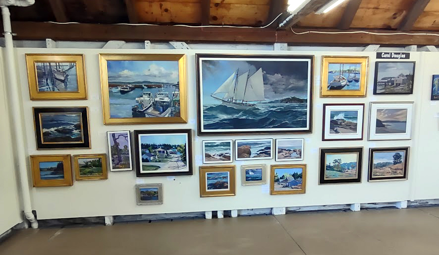
My wall at Red Barn Gallery. If luxurious surroundings scare people off, then it makes sense to not have luxurious surroundings.
Charge by the inch, of course. (I’m not kidding.)
This is the most emotionally-fraught question I hear from beginning painters. You can simplify the issue greatly by setting aside your emotional involvement with your art and basing your selling price on the size of the piece and your selling history.
If you’ve never sold anything before,there is no way to deduce a selling history: only the market can do that. But most beginners price their work too cheaply. That can actually hinder sales. Nobody else is going to value what you don’t value yourself.
Survey other artists with the same level of experience and set your first prices in line with theirs. Experience and competence are not synonymous. Most artists are terrible judges of their own work, seesawing between believing they’re geniuses and believing they’re hopeless. Such a subjective judgment should never guide pricing.
It’s not just brushwork that sets market price. Check out the regional market in which your competitors are selling, their affiliations, and their history of shows and sales. Be honest with yourself. Thomas Kinkead may have been a lousy painter, but his canvases are worth many times what mine are. He was an extremely talented marketer who created a nationwide niche for his work.
I believe in giving paintings to non-profits for their charitable auctions. It’s a good way to leverage your talent to help others. It gives exposure and a sales history, and if you err in the pricing, it’s not a fatal mistake. (But don’t do it for a tax deduction; these donations are generally not deductible.)
Once you’ve sold something—to a friend or family member, or at a charitable auction—you have a sales history, albeit an imperfect one. From this, you can extrapolate a pricing structure.
Let’s say you gave an 8X10 watercolor of the Old Red Mill to your local historical society, which turned around and sold it for $100. Great! You have a sales history from which to calculate prices. Just figure out the value per square inch and calculate from there.
Knowing that many artists are arithmetic impaired, I’m going to spell this out for you. Square inches=height times width, so your 8X10 painting is 80 square inches. Dividing the $100 selling price by 80 gives you a value of $1.25/square inch.
So to use this to calculate other sizes, you’d end up with: 6X8: $60 9X12: $135 11X14: $240 12X16: $315
Now, on the edges, I might adjust a little, since charging $15 for a 3X4 painting would be absurd, and charging $1500 for a 30X40 would surpass what anyone would pay for an untried painter. But it’s a formula I’ve used successfully for years. Framing costs scale up and down in the same way, and the bigger the painting, the more work it generally represents (unless you’re playing games and your large canvas is merely a schmear).
I would not set my prices in stone on the basis of one sale, of course. You should continuously update your prices based on your average sale prices for the prior year or two. The goal of every artist ought to be to sell at constantly rising prices. When you find yourself “painting on a treadmill” to have enough work for your next show, it’s definitely time to charge more. Each time you show, your work will be better known, and over time your prices will rise.
When I first started painting, I used to factor in two things I’ve since learned are totally irrelevant: how much time I’d spent, and how good I thought it was. Frequently I’ll struggle with a canvas for months, working out a problem I don’t even know I have, and the next painting will be faster, fresher, and more successful. You’ll also eventually realize you’re not the best judge of your own work. The work you think is brilliant may ring nobody else’s bells, while the painting you considered tossing may actually sell very quickly.
Everything I’ve sorted so far pales in comparison to the business of sorting paintings with a critical eye… there are works that aren’t mine, works I can’t assess the quality of, and works I hope to finish some day.
The Duchy is perched on the side of Rochester’s only hill. This makes it prone to short bursts of flooding. Given the monsoon-like rains of this week, Coach and I suspended our regular workout in favor of clearing storm drains with a hoe and a trowel.
Too much of a good thing leads inexorably to trouble.
New York is lush in late spring, and the Duchy tends to go for over-the-top horticultural displays. I confess I’ve contributed my share of them, having designed and planted St. Thomas’ Episcopal Church’s gardens as well as growing a profusion of roses, peonies and ornamental trees on my own small plot.
Blossoms, seed pods, soil, mulch, and clippings… all creating concrete in the storm drains.
Of course, a surfeit of good things can be as troublesome as any bad thing. The Duchy’s trees are lavishly shedding blossoms and seed pods. That has combined with soil, mulch and clippings washing down from gardens and along the gutters. Now, blossoms and seed pods and soil, mulch and clippings are all great things, but in excess they’ve packed the storm drains up like concrete.
Winnowing is an ugly job… but absolutely necessary.
This brings my thoughts inexorably back to my own studio. There are stacks and stacks of my field sketches, and paintings by my students, and unfinished canvases for which I still harbor some hope, not to mention art supplies that I may use someday. All are unabashedly good things, but taken as a whole, they’ve blocked my studio up as surely as those storm drains.
The hidden stashes don’t count if they’re in a dark closet, do they?
This, then, is the next big step in the winnowing process.
And if you haven’t signed up for my Rochester classes or Maine workshops, what on earth are you waiting for? August and September are sold out for my workshop at Lakewatch Manor in Rockland, ME… and the other sessions are selling fast. Join us in June, July and October, but please hurry! Check here for more information.
I can do anything when I have bungee cords, including painting on all sides of a buoy. (Yesterday’s objections retracted.)
It was 54°, rumbling, and pouring rain here this morning. Nobody wanted to be outside; my suggestions to walk were summarily rejected by my son, my husband, and my personal coach, in that order. So I went upstairs and spent some time with the mermaid I’m painting for the Penobscot East Resource Center. “You’re complaining?” she whispered in my ear. “That’s typical weather for us mermaids. Why do you think we wear these silly shell bras?”
Back of the buoy, a lobster boat.
As soon as she dries, she is going in a box and traveling back to Maine.
August and September are sold out for my workshop at Lakewatch Manor in Rockland, ME. Join us in June, July and October, but please hurry! Check here for more information.
When this buoy arrived in the mail a few weeks ago, certain members of my family were flummoxed. “Who sent us an oversized dreidel?” Since I was expecting it, I recognized it for what it was, but then wondered whether it was supposed to go dreidel-side up or dreidel-side down. A cursory search on the internet was useless—evidently, Mainers are not into social conventions like which end is up.
I took a guess, and put the stick on the bottom. Too late to worry if it’s wrong.
How do you paint on a buoy? Lash it to your easel.
I am painting it for a fundraiser for the Penobscot East Resource Center to be held later this month in Rockland, ME (more on that later). One would imagine it was a simple matter of filling, sanding and priming the surface, but, as usual, I’m pressed for time.
The biggest problem in painting on a curved surface turned out not keeping the figure proportional (as I expected) but drawing a straight horizon line. It’s very difficult to lay a ruler down on a cylinder. Tomorrow I’ll mark it with string.
There was a time when I used these wee little brushes a lot. That was a long time ago.
Eventually I bungee-corded it to an easel, but I’m only going to be able to paint on one side at a time. So much for working all parts of a painting at the same rate of development.
Sandy just told me she learned in her Renaissance art history courses that the infant Jesus always looks so weird in order to prefigure Christ’s death. I think that’s a fiction that comes from art historians never actually painting. Just try drawing a squirming, wailing baby—without photography, you’d have to drug the little darlings to get them to hold still. My mermaid is a little hackneyed, but her baby is coming along well.
Baby’s cute. Mom needs work.
I have to leave in a few minutes to go teach at Schoen Place on the Erie Canal. There are no buoys there; there are (to my knowledge) no fresh-water mermaids either. Have a happy evening!
August and September are sold out for my workshop at Lakewatch Manor in Rockland, ME. Join us in June, July and October, but please hurry! Check here for more information.
Oh, BTW, what did the sea say to the mermaid? Nothing. It just waved.
Years ago, I took a figure workshop from a well-known American figure painter. On receiving his supply list, I noted several pigments that are not normally on my palette. Two were transparent earth colors; one was Naples yellow; one was cadmium green. I duly bought them, took the workshop, and came home having never touched them. The transparent earths were occasionally useful for glazing, but that $20 tube of cadmium green sat in my cabinet until it thickened and died.
I never want to do that to anyone. (Not that I’m totally immune to it; my oldest students will remember my infatuation with Payne’s Grey back in the day.)
Here are my paint supply lists for both local plein air painting (in Rochester) and workshop painting in Maine this summer:
I expect that experienced painters already have a palette they like and tools they’re comfortable with. If you have questions about why I have something included, just ask; you may already have something that can substitute.
Nevertheless, there are certain paints I recommend at the expense of others. For example, it never makes sense to buy alizarin crimson. The real thing (PR83) is extremely fugitive,* so many manufacturers have decided to make “hue” formulations that mimic it. Many of these are either also fugitive and or so high-stain that they tend to bleed up through drying paint. Yet alizarin crimson is a staple in the paintboxes of so-called traditionalists.
How much more sensible it is to buy straight up quinacridone magenta (PR122) and mix it to the color you want when you need it!
Another example is Naples yellow, which was originally made of yellow antimony (PY 41) and is one of the oldest of pigments. Unfortunately, it’s also extremely toxic. There are a million proximates on the market—so called “convenience mixes”—because that dense, chalky yellow is extremely useful in landscape painting. But why carry a convenience mix when you can make up something equally as useful from yellow ochre and white, which both have a million other uses on the palette? (Yes, I know some of you watercolorists take great pride in never using white, but when you use a Naples yellow you’re using white whether or not you admit it.)
On the other hand, there arepigments that make reasonable substitutions. For example, I want oil painters to have a high-stain greenish blue, but phthalo blue cyan (PB15:3) will just do as well as Prussian blue (PB 27) if that’s what you have.
Recently I wrote about hues and the Color Index system. Handprint has a more detailed explanation here. For the sake of efficient painting, I urge you to avoid hues and convenience mixes. Single pigment paints are most efficient in the field.
And if you haven’t signed up for my Rochester classes or Maine workshops, what on earth are you waiting for? August and September are sold out for my workshop at Lakewatch Manor in Rockland, ME… and the other sessions are selling fast. Join us in June, July and October, but please hurry! Check here for more information.
*”Fugitive” just means the pigment fades over time, and real alizarin crimson—an extract of the madder plant—is among the most fugitive pigments of all.


