

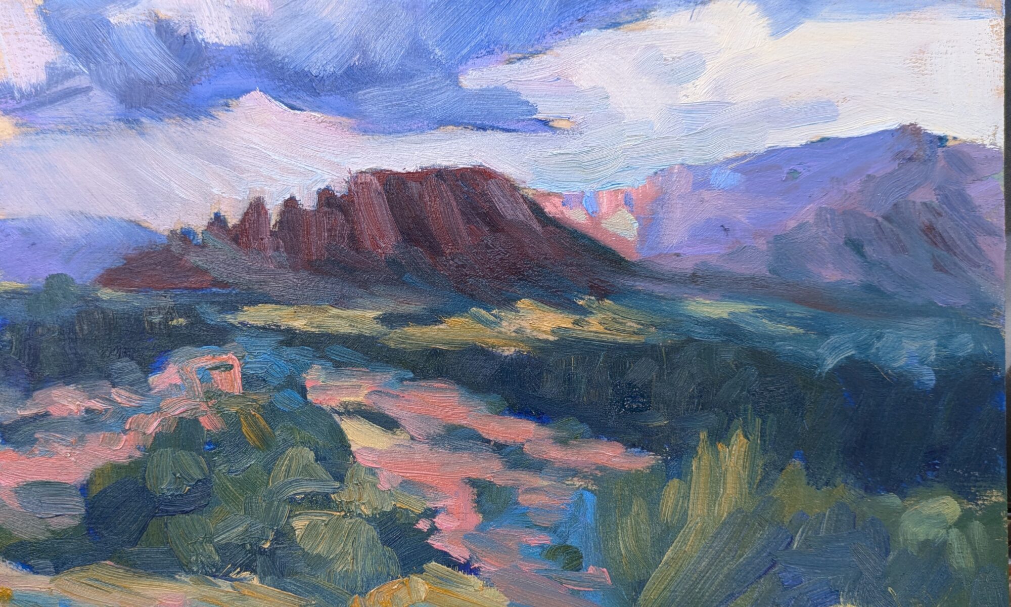
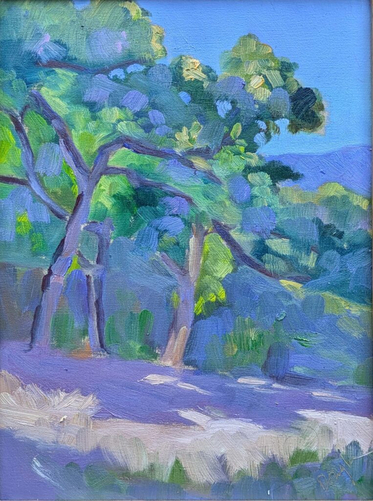
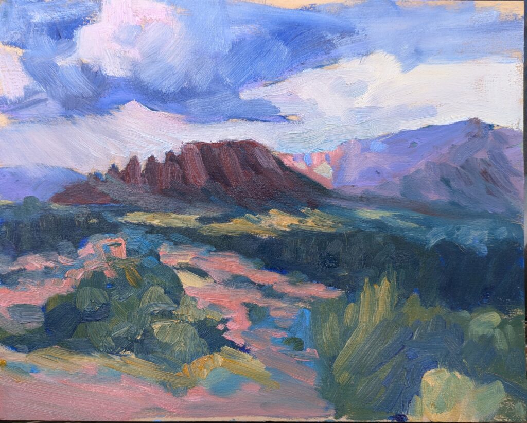
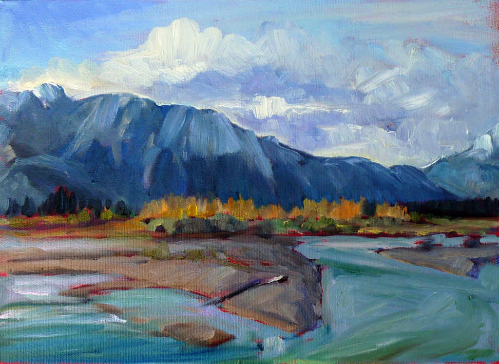
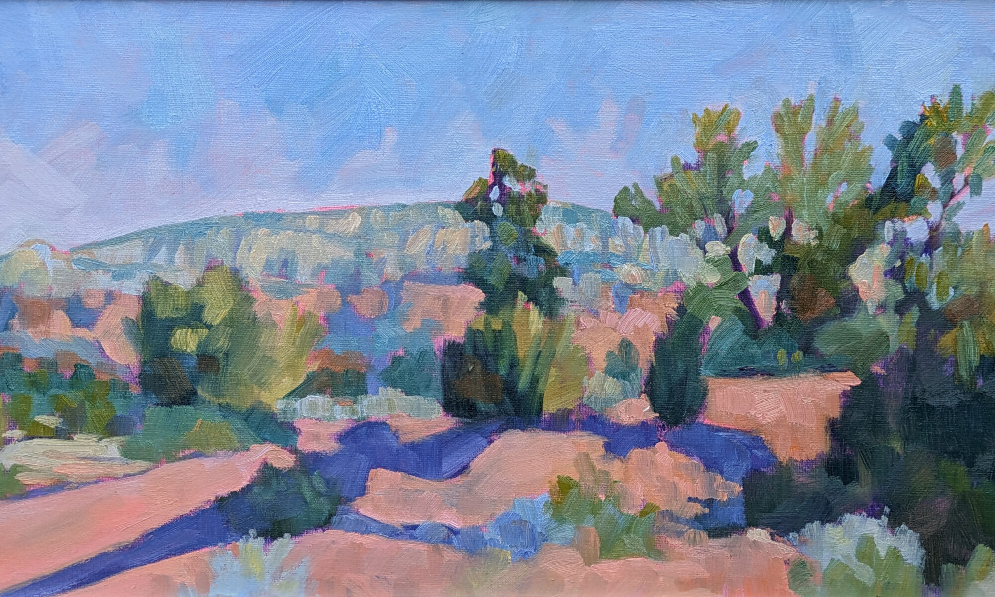
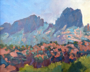
Last week I taught a plein air workshop in Sedona, AZ. One of my students did a superlative sketch but somehow managed to flatten out the diagonals when transferring to her watercolor paper. Gridding is harder in watercolor than it is in oils and acrylics, but it is a skill that needs to be mastered when learning to paint. In watercolor, just use very light pencil lines and erase, or use tiny cross marks at each intersection. Or, if you’re transferring a drawing of the same size, use Saral transfer paper.
Why grid instead of freehand?
We use preliminary value sketches to work out questions of composition. They allow us to take risks that we can’t when going straight to canvas. Why reinvent the wheel, or worse, regularize our risky decisions in the final painting? Gridding is a fast and easy way to set our best drawings in paint.
On Friday, I wrote about free apps like Grid Maker, GridMyPic, etc. that allow us to paste grids directly over photographs in our phones. I’m looking forward to using them for gridding over my drawings, although for reasons of artistic control, I’d never grid across a photo. I have many notebooks full of gridded drawings that I wish I could make whole again.
First, consider aspect ratio
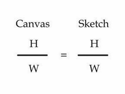
To start transferring your drawing to your canvas, work out whether the aspect ratio of your sketch is the same as the canvas. This is the proportional relationship between height and width. Sometimes this is very obvious. For example, a 9X12 sketch is the same aspect ratio as an 18X24 canvas. But sometimes, you’re starting with a peculiar little sketch drawn on the back of an envelope.
By the way, I never sketch into a box; I always sketch and then draw the box around my drawing. This allows me the freedom to explore what’s important in the scene without worrying about squeezing it into a preformed box. After, I can draw a box around it in the proper aspect ratio.
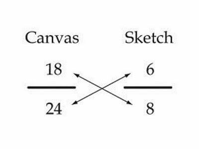
Everything starts with ratios
Remember learning that 1/2 was the same as 2/4? We want to force our sketch into a similar equivalent ratio with our canvas.
Let’s assume that you’ve cropped your sketch to be 8” across. You want to know how tall your crop should be to match your canvas.
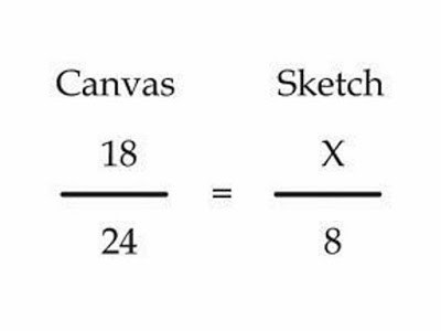
Write out the ratios of height to width as above.
To make them equivalent, you cross-multiply the two fixed numbers, and divide by the other fixed number, as below:
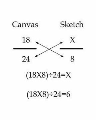
Use your common sense here. If it doesn’t look like they should be equal, you probably made a mistake. And you can work from a known height as easily as from a known width; it doesn’t matter if the variable is on the top or the bottom, the principle is the same.
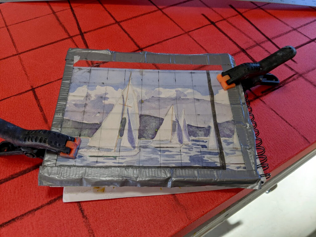
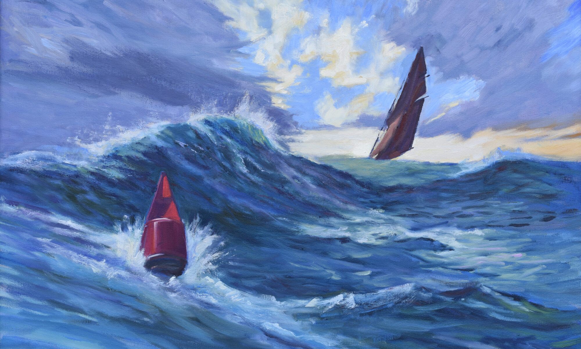
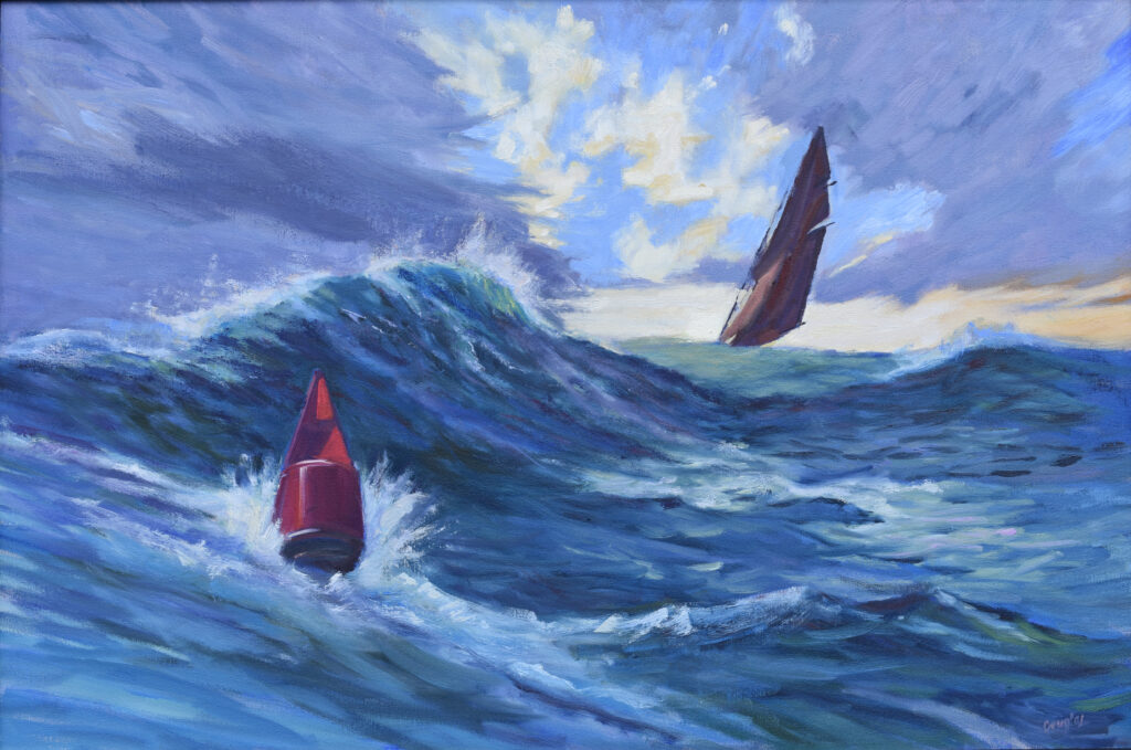
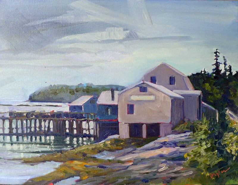
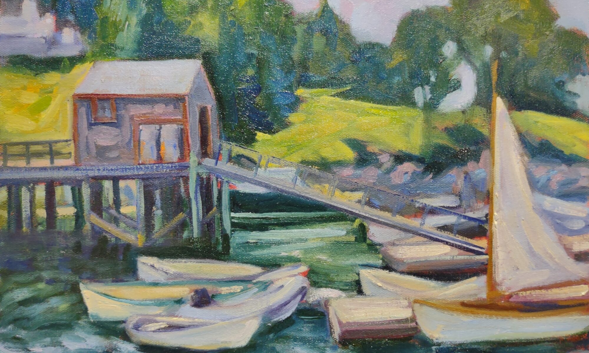
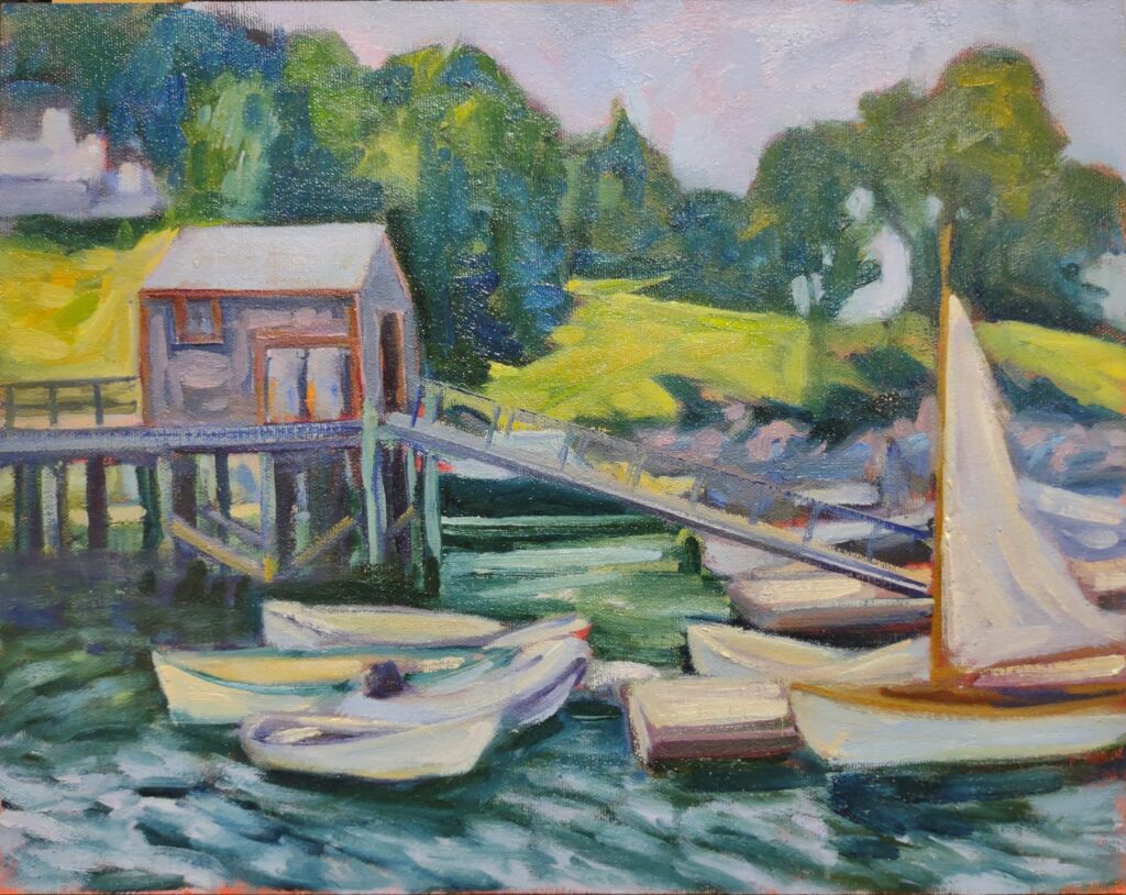
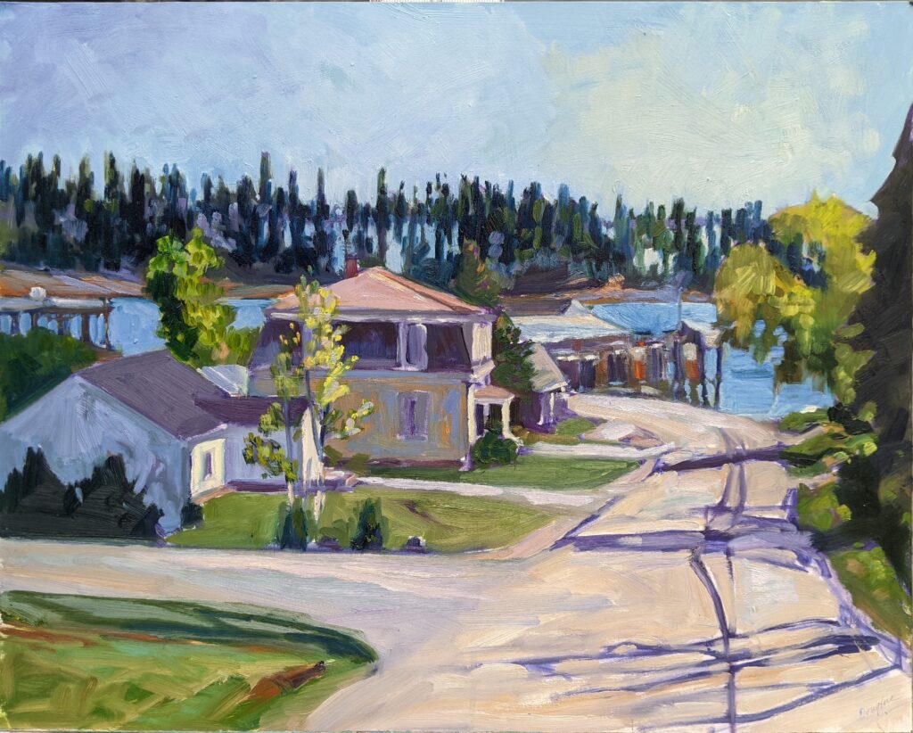
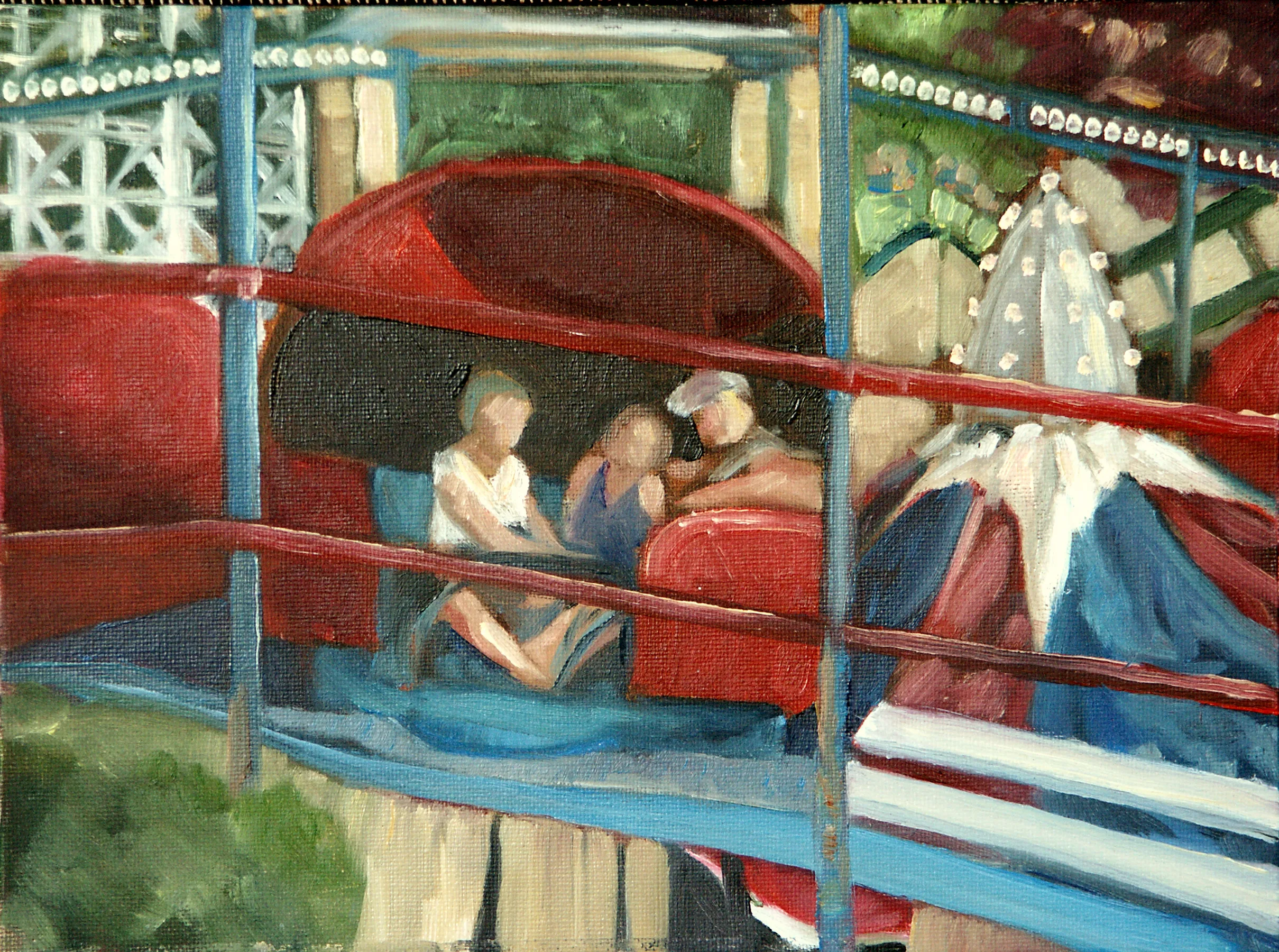
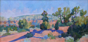
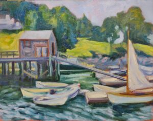
The next step is to grid both the canvas and sketch equally. In my painting above, my grid was an inch square on the sketch and 4″ square on the canvas, but as long as you end up with the same number of squares on both, the actual measurements don’t matter. You can just keep dividing the squares until you get a grid that’s small enough to be useful. For a small painting, that could be as simple as quartering the sketch and the canvas. I use a T-square and charcoal, and I’m not crazy about the lines being perfect; I adjust constantly as I go. The last step is to transfer the little drawing, rectangle by rectangle, to the larger canvas. I look for points of intersection on the grid, and from there it’s easy to transfer my drawing. It may seem time-consuming, but it saves a lot of work in the long run and will give you a painting that more closely matches the dynamic energy of your original sketch.
Registration is now open for workshops in 2026! Reserve your spot:
- Advanced Plein Air Painting | Rockport, ME, July 13-17, 2026
- Sea & Sky | Acadia National Park, ME, August 2–7, 2026
- Find your Authentic Voice in Plein Air | Berkshires, MA, August 10-14, 2026
- New! Color Clinic 2026 | Rockport, ME, October 3-4, 2026
- New! Composition Week 2026 | Rockport, ME, October 5-9, 2026
Can’t commit to a full workshop? Work online at your own pace:

