fbpx

Let’s talk limited palette

Sunset sail, 14X18, oil on linen, $1594 framed includes shipping and handling in the continental US.

Last week I mailed a small sample of paints to a student in South Carolina. She was frustrated with her paints and I was equally frustrated watching her try and fail to hit color notes. What I sent her was a simple, primary-color limited palette: QoR brand Ultramarine Blue, Nickel Azo Yellow, and Quinacridone Magenta. This is what she did with them:

A color chart done with just three pigments: ultramarine blue, nickel-azo yellow, and quinacridone magenta.

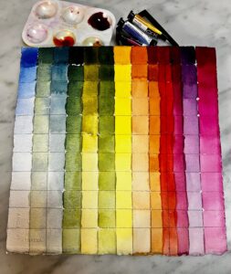
There are disadvantages to limited palette-for example D. couldn’t hit a brilliant green because the red tones in her blue and yellow partially cancel out green. (I’ve explained that in greater depth here.) But the range she did hit is amazing.

Quality, please

You’re far better off with a high-pigment-load, professional-quality limited palette than a dozen badly-chosen paints. Yes, I know the lure of the bargain bin at the art store, but those pigments are in there because they’re unnecessary or, worse, useless.

Sometimes you’ll read rapturous nonsense about pigments. For example, cobalt violet is sometimes described as “deep, richly glowing, and unmatchable by mixing.” I like the color but not enough to bypass my desire to avoid metal pigments wherever possible. Cobalt violet has a lovely weightiness in oils, but it’s hardly unmatchable. In fact, D. did it in the second column from the right, with just magenta and blue.

Clary Hill Blueberry Barrens, watercolor on Yupo, ~24X36, $3985 framed includes shipping and handling in continental US.

Tastes differ

I like my paint to be able to hit intensely saturated colors, because you can always kill chroma, but you can never intensify it. A more traditional palette, like my Winsor & Newton field kit, never seems brilliant enough. It has convenience mixes like Sap Green and Payne’s Grey, along with umbers and alizarin crimson. Those colors cannot compete with knockout 20th century pigments. When I weigh the convenience of sliding a palette in my pocket vs. having the colors I want, I invariably come down on the side of more color.

Autumn Farm, Evening Blues, oil on canvasboard, $1449 framed includes shipping and handling in continental US.

I’ve observed that the more experienced I get, the less stuff I buy. I know what I need, and I’m not tempted to deviate. Having said that, I recently updated my supply lists to replace Prussian blue with phthalo blue. Their color profiles are very similar, but phthalo is just a little clearer than Prussian. The downside is that phthalo is a more heavily-staining pigment. But after dithering for years, I’ve finally decided that clarity outweighs staining. Of course, both are excellent pigments, and can easily substitute for each other (except in acrylic, where Prussian blue is not available).

I make my supply lists for watercolors, oils, pastels, acrylic and gouache freely available to my readers (although this is copyrighted material; you don’t have permission to appropriate them and pass them off as your own). These are paired primary palettes with limited earths added, just because they’re cheap and useful. I have an entire cabinet of samples, gifts and bad purchases myself; I never touch any of them. These pigments are sufficient.

My 2024 workshops:

Monday Morning Art School: are your paints toxic?

Sunset sail, 14X18, oil on linen, $1594 framed includes shipping and handling in the continental US.

Unless you’re eating it, modern paint poses no known health risks. (Pastelists and encaustic painters are more exposed and should follow special rules for handling their materials and breathing fumes.)

That, unfortunately, is not the whole story.

Many people think watercolors are somehow safer than oils. That is not true. The binders for oil paints are siccative oils. The major ones are linseed (flax seed), walnut and safflower oil, all of which are edible. Some people have a sensitivity to odorless mineral spirits, but if you’re not drinking them or bathing in them, the current consensus is that they’re harmless.

What can be toxic are the pigments, and they’re pretty much universal across all mediums. That includes tattoo inks, which are a toxicological risk to human health.

Buffalo Color (foreground) and Bethlehem Steel (background), and the filth they were spewing into the Buffalo River in 1967. Photo courtesy EPA remediation project.

Making pigments is a messy business. Buffalo Color (formerly part of National Aniline and Chemical) manufactured pigments along the Buffalo River in my hometown, and pigment deposits remained along the shore as late as the 1980s. The photo above shows the condition of the river from Buffalo Color and Bethlehem Steel, now both gone.

Environmental legislation stopped wholesale polluters across a variety of industries in the US. That didn’t mean we weren’t still creating pollution; we just outsourced it to the developing world.

Cobalt, cadmium, and lead aren’t going to injure you as a painter, but they can injure the people who mine and refine them. Today’s emphasis is on mica, which gives us the glitter in makeup, car finishes and, yes, iridescent paints. Mica is mined in the US, but the top two producers in the world are China and Russia. India, the world’s eighth-largest producer of mica, is known to use child labor in mica mining.

Two Peppers, oil on archival canvasboard, 6X8, $435.00 includes shipping and handling in continental US.

Since the mid-1990s, pigment production grew quickly in mainland China and India. They are now the first and second producers of pigments in the world. The number one producer of cadmium? China. Of cobalt? Congo and China. Lead? China. Child labor is a real phenomenon in China; about 7.75% of children ages 10-15 work. So too is forced labor, using both minorities and prisoners. Congo’s child labor situation is more dire, with roughly 40,000 children in the cobalt mines, some as young as six. (The majority owners of these mines are Chinese.)

Cobalt, cadmium, and lead are all, to varying degrees, mutagenic (causes mutations), teratogenic (interferes with fetal development) and carcinogenic (causes cancer). In the modern world, we can’t avoid them entirely; for example, we need cobalt for lithium-ion batteries. But we can reduce our use of them where it’s less critical, and pigment is one of these areas.

For years, I’ve given my students a palette based largely on 20th century pigments, using the iron-oxide pigments as chasers. The one exception has been cadmium orange, because there’s still no reasonable substitute in oils; in watercolor, the quinacridone oranges are great. I’m not worried about my students; I’m worried about the children, involuntary workers, and those driven by poverty to work in unsafe conditions.

Brilliant Summer Day, 6X8, oil on archival canvasboard, $435 includes shipping and handling in continental US.

The 20th century pigments were developed first for the automobile industry, with other manufacturing applications branching out from there. Because they were intended to be used in American factories, they are safe, cheap, brilliant, and lightfast. In fact, they are far superior to their historical antecedents in almost every way.

Regardless of what pigments you’re using, waste should never be disposed of in our sewers or on the ground. For water-based paints, let the old paint water dry and put the residue in the solid-waste stream. For oil-based paints, let the solvent settle, pour off the clear liquid and reuse it, and let the remainder evaporate for disposal.

My 2024 workshops: